
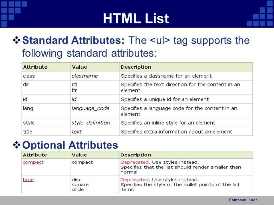
Unsupporting Browsers
At the time of this writing, datalists for text inputs are supported in Internet Explorer 10, Firefox 4+, Chrome 20+, and Opera, which unfortunately leaves out a large number of users.
Unlike with many new HTML5 features, for most use cases, no extra work needs to be done in browsers that do not support datalists. By default, the list of options you provide are merely suggestions; therefore, users with browsers that lack support will simply need to fill in the text field without any suggestions.
However, some fallback options can be used to provide a fuller experience to users running unsupporting browsers.
Option Elements
The first is that Internet Explorer version 9 and earlier all require that option elements be immediate children of select elements. If they are not, these versions do not recognize them, and they will not be visible to the polyfill.
Luckily, this is easy to work around. By using conditional comments, you can place a select element around the options only for these versions of Internet Explorer. Refer to this example:
Internet Explorer version 9 and earlier will now detect the options appropriately. Internet Explorer 10 will not be affected since conditional comments were removed from the parser in Internet Explorer 10. All other browsers will also ignore the comments.
3type lists style
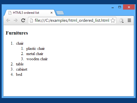
1.Ordered HTML List.
2.Unordered HTML List.
3.Description HTML Lists (Other list).
1.Ordered HTML List.
HTML <li> Tag
In this tutorial, we will create a table of contents with an ordered list. In an ordered list the list items will be numbered.
We will be using the following tags:
Ordered list implementation tags
- Opening tag <ol>
- Closing tag </ol>
List item tags
- Opening tag <li>
- Closing tag </li>
The code below will provide a very basic table of contents with two list items. Firstly type the Table of contents in a standard font. You can alter this font at a later stage. Within the opening and closing tags for an ordered list, we will add each list item with the tag and close with the tag.
Ordered list
output:-
- red
- green
- blue
- white
- yellow
2.Unordered HTML List
HTML <ul> Tag
For each item in the ordered list, we will be adding a few submenu items with an unordered list. For example, The Links sub items will be input within the and tags after the links tag. See the output below for what will be displayed on a browser.
Unordered List
output:-
- red
- green
- blue
- white
- yellow
3.Description HTML Lists (Other list).
Displays elements in definition form like HTML description list or definition list dictionary.
<dl>, <dt> and <dd> Tags are used to define the description list.
<dl> the Tag defines the outline list, the<dt> the Tag defines the term (name), and also the<dd> the Tag describes every term:
output:-
- Black
- – black color
- yellow
- – banana color
How to create orderlist
First, you <ol> tag open and close </ol> tags. Under tags, type <li> the tag and in it, you write the word of your order list and close </li> tag. If you want more information, I have given the example play below.
example:-
If you want more information, I have given the example play below.
example:-
There are 5 ways to show up in the Ordered list
- type = “1” All list type 1 2 3 4 5 number format
- type = “A” All list type A B C D E uppercase letters format
- type = “a” All list type a b c d e lowercase letters format
- type = “I” All list type I II III IV V uppercase roman numbers format
- type = “i” All list type i ii iii iv v lowercase roman numbers format
- red
- green
- blue
- white
- yellow
- red
- green
- blue
- white
- yellow
- red
- green
- blue
- white
- yellow
- red
- green
- blue
- white
- yellow
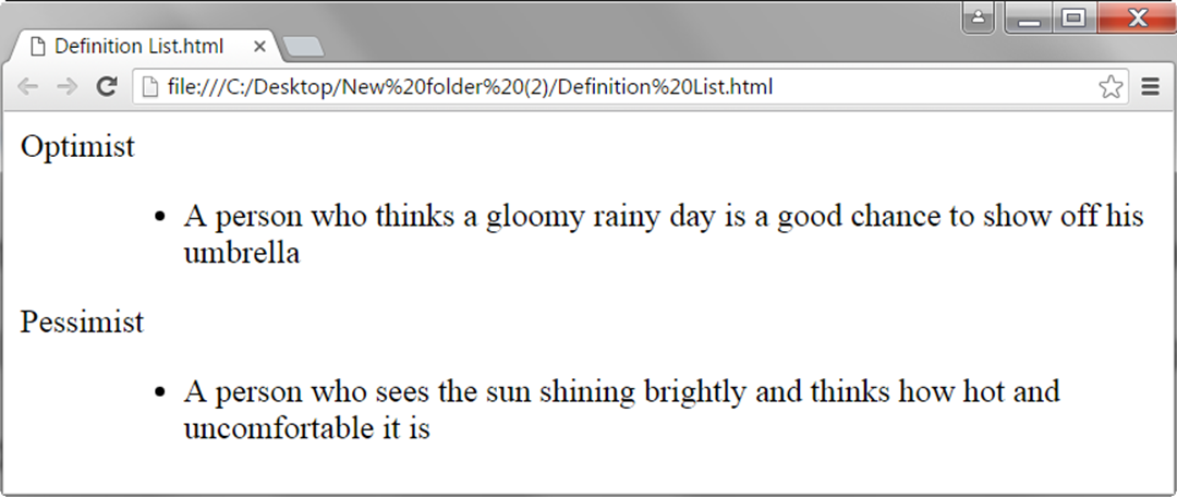
HTML Definition Lists
HTML and XHTML supports a list style which is called definition lists where entries are listed like in a dictionary or encyclopedia. The definition list is the ideal way to present a glossary, list of terms, or other name/value list.
Definition List makes use of following three tags.
- <dl> − Defines the start of the list
- <dt> − A term
- <dd> − Term definition
- </dl> − Defines the end of the list
Example
<!DOCTYPE html>
<html>

   <head>
      <title>HTML Definition List</title>
   </head>

   <body>
      <dl>
         <dt><b>HTML</b></dt>
         <dd>This stands for Hyper Text Markup Language</dd>
         <dt><b>HTTP</b></dt>
         <dd>This stands for Hyper Text Transfer Protocol</dd>
      </dl>
   </body>

</html>
This will produce the following result −
HTML name attribute
The HTML name attribute defines the name of an input element. The name and value attribute are included in HTTP request when we submit the form.
Output:
Note: If you will not use name attribute in any input field, then that input field will not be submitted, when submit the form.
The HTML value attribute defines the initial value or default value of an input field.
Output:
Note: In password input filed the value attribute will always unclear
HTML required attribute HTML5
HTML required is a Boolean attribute which specifies that user must fill that filed before submitting the form.
Output:
The autofocus is a Boolean attribute which enables a field automatically focused when a webpage loads.
HTML placeholder attribute HTML5
The placeholder attribute specifies a text within an input field which informs the user about the expected input of that filed.
When the user enters the value, the placeholder will be automatically removed.
Output:
HTML disabled attribute
The HTML disabled attribute when applied then it disable that input field. The disabled field does not allow the user to interact with that field.
The disabled input filed does not receive click events, and these input value will not be sent to the server when submitting the form.
<input type=»text» name=»uname» disabled><br><br>
Test it Now
Output:
HTML size attribute
The size attribute controls the size of the input field in typed characters.
<label>Account holder name</label><br>
<input type=»text» name=»uname» size=»40″ required><br><br>
<label>Account number</label><br>
<input type=»text» name=»an» size=»30″ required><br><br>
<label>CVV</label><br>
<input type=»text» name=»cvv» size=»1″ required><br><br>
Test it Now
Output:
Output:
Content versus IDL attributes
In HTML, most attributes have two faces: the content attribute and the IDL (Interface Definition Language) attribute.
The content attribute is the attribute as you set it from the content (the HTML code) and you can set it or get it via or . The content attribute is always a string even when the expected value should be an integer. For example, to set an element’s to 42 using the content attribute, you have to call on that element.
The IDL attribute is also known as a JavaScript property. These are the attributes you can read or set using JavaScript properties like . The IDL attribute is always going to use (but might transform) the underlying content attribute to return a value when you get it and is going to save something in the content attribute when you set it. In other words, the IDL attributes, in essence, reflect the content attributes.
Most of the time, IDL attributes will return their values as they are really used. For example, the default for elements is «text», so if you set , the element will be of type text (in the appearance and the behavior) but the «type» content attribute’s value will be «foobar». However, the IDL attribute will return the string «text».
IDL attributes are not always strings; for example, is a number (a signed long). When using IDL attributes, you read or set values of the desired type, so is always going to return a number and when you set , it wants a number. If you pass another type, it is automatically converted to a number as specified by the standard JavaScript rules for type conversion.
IDL attributes can such as unsigned long, URLs, booleans, etc. Unfortunately, there are no clear rules and the way IDL attributes behave in conjunction with their corresponding content attributes depends on the attribute. Most of the time, it will follow , but sometimes it doesn’t. HTML specifications try to make this as developer-friendly as possible, but for various reasons (mostly historical), some attributes behave oddly (, for example) and you should read the specifications to understand how exactly they behave.
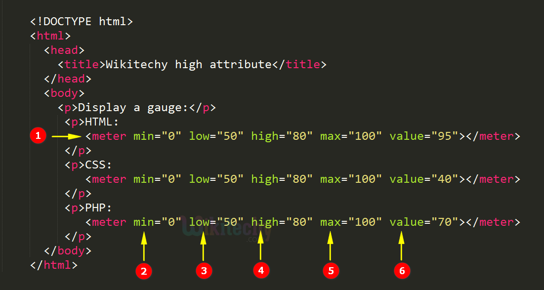
When to Use a Datalist
Since datalists have no built-in mechanism to require that a user select a provided option, they are well suited for inputs that can accept any value. The earlier example of providing a sports team fits here. While the datalist suggested teams, the user was free to input any value.
Conversely, the U.S. state example fails this test because there is a limited set of valid values that the user must provide. Such a use case is better handled by the select element because it forces a selection.
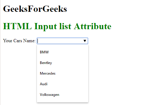
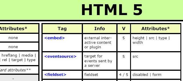
One exception to this is inputs with a large number of valid selections. For example, consider the traditional country drop-down list shown in Figure 6.
This list impedes users by forcing them to sift through hundreds of options to find the one they’re looking for. An autocomplete feature fits this use case well because a user can quickly filter the list by typing one or two characters.
Here’s how country selection can be implemented with a datalist:
Figure 7 shows what the user will see after typing a U.
HTML required attribute HTML5
HTML required is a Boolean attribute which specifies that user must fill that filed before submitting the form.
The autofocus is a Boolean attribute which enables a field automatically focused when a webpage loads.
HTML placeholder attribute HTML5
The placeholder attribute specifies a text within an input field which informs the user about the expected input of that filed.
When the user enters the value, the placeholder will be automatically removed.
HTML disabled attribute
The HTML disabled attribute when applied then it disable that input field. The disabled field does not allow the user to interact with that field.
The disabled input filed does not receive click events, and these input value will not be sent to the server when submitting the form.
<input type=»text» name=»uname» disabled><br><br>
Test it Now
HTML size attribute
The size attribute controls the size of the input field in typed characters.
<label>Account holder name</label><br>
<input type=»text» name=»uname» size=»40″ required><br><br>
<label>Account number</label><br>
<input type=»text» name=»an» size=»30″ required><br><br>
<label>CVV</label><br>
<input type=»text» name=»cvv» size=»1″ required><br><br>
Test it Now
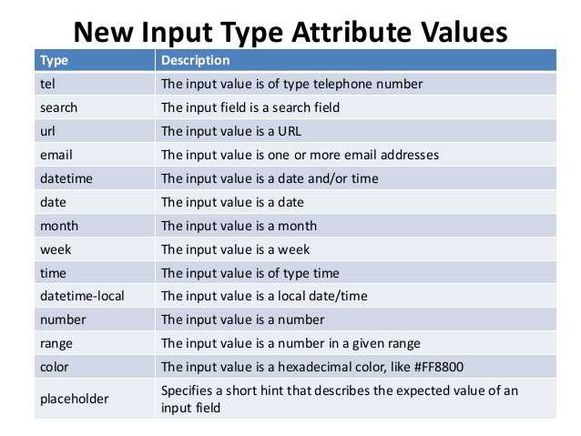
Other Input Types
While autocompletion is traditionally associated with textual input, datalists can also be used on a number of the new HTML5 input types. Consider the range input type, which allows for the creation of a slider form element. By combining this with a datalist, you can suggest points on the range to the user.
For example, the following input asks the user to provide a donation between $5 and $200 dollars.
Figure 3 and Figure 4 show the display of a range input in Chrome 24 and Internet Explorer 10, respectively.
You can see that each browser displays a tick mark for each datalist option provided. Additionally, Chrome will snap the slider to these predefined values as the user moves the slider near them.
Unfortunately, Internet Explorer and Chrome are the only browsers to support datalists on range inputs at this time. Figure 5 shows support of datalists on common input types in modern browsers.
The start Attribute
You can use start attribute for <ol> tag to specify the starting point of numbering you need. Following are the possible options −
<ol type = "1" start = "4">    - Numerals starts with 4.
<ol type = "I" start = "4">    - Numerals starts with IV.
<ol type = "i" start = "4">    - Numerals starts with iv.
<ol type = "a" start = "4">    - Letters starts with d.
<ol type = "A" start = "4">    - Letters starts with D.
Example
Following is an example where we used <ol type = «i» start = «4» >
<!DOCTYPE html>
<html>

   <head>
      <title>HTML Ordered List</title>
   </head>

   <body>
      <ol type = "i" start = "4">
         <li>Beetroot</li>
         <li>Ginger</li>
         <li>Potato</li>
         <li>Radish</li>
      </ol>
   </body>

</html>
This will produce the following result −
Enforcing a Value
While datalists do not natively allow you to require that an option be selected, you can easily add validation that does so. For example, the following code makes use of the to add such validation:
The constraint validation API is implemented in all browsers that support datalists, so if the datalist works, the validation should work as well. Now, when the user attempts to submit a form with an input that has a datalist (and they have not selected an option), they will see the error shown in Figure 8.
It’s important to note that the constraint validation API does not remove the need for server-side validation. Users working with older browsers will not have the constraint validation API available, and malicious users can easily subvert client-side scripts.
While this approach works in modern browsers, it presents an unusable UI to users running browsers that lack support. Users are told that they must select a valid value, but if their browser doesn’t support datalists, they cannot see the options. Therefore, if you plan on using this approach, it’s essential to provide a UI that works in all browsers. This can be accomplished by detecting whether the browser supports datalists and then polyfilling appropriately.
Limitations of Datalists
Although datalists are perfect for adding suggestions to text inputs, they suffer from a lack of customization capabilities that many modern Web applications require. For example, you cannot do the following with datalists:
- Use CSS to change its display or the display of its options.
- Control the positioning of the list.
- Control the number of characters typed before the browser displays results to the user.
- Control what is considered a match (case sensitivity, match at beginning of string vs. anywhere, and so on).
- Tie the input to a server-side datasource.
This means that if you need any of this functionality, you need to look into a more robust autocomplete solution. The jQuery UI autocomplete widget provides the ability to do all of this and more. The autocomplete widget also supports all browsers back to Internet Explorer 7 without the need of a polyfill. For more information on the autocomplete widget, check out its demos and API documentation. (The autocomplete widget handles only text-based inputs, therefore it won’t be able to help you for some of the more specialized input types like range and color.)
Атрибут formmethod
Атрибут formmethod указывает метод отправки данных формы на сервер. Атрибут formmethod переопределяет атрибут method элемента <form>.
Атрибут formaction может применяться только с кнопкой отправки или изображения (type=»submit» или type=»image»).
Значение атрибута formmethod по умолчанию — get.
Синтаксис:
Значения атрибута formmethod
| Значение | Описание |
|---|---|
| get | Объединяет данные формы в одну строку, присоединяет полученную строку к URL-адресу обработчика формы (указывается в атрибуте «action» или «formaction») и с помощью полученного URL-адреса передаёт данные формы на сервер. Достоинства и недостатки:
|
| post | Браузер устанавливает связь с сервером, на котором находится обработчик данных формы (URL-адрес обработчика указывается в атрибуте «action» или «formaction») и после установки связи передаёт (в отдельном сеансе связи) данные на сервер. Достоинства и недостатки:
|
The type Attribute
You can use type attribute for <ol> tag to specify the type of numbering you like. By default, it is a number. Following are the possible options −
<ol type = "1"> - Default-Case Numerals.
<ol type = "I"> - Upper-Case Numerals.
<ol type = "i"> - Lower-Case Numerals.
<ol type = "A"> - Upper-Case Letters.
<ol type = "a"> - Lower-Case Letters.
Example
Following is an example where we used <ol type = «1»>
<!DOCTYPE html>
<html>

   <head>
      <title>HTML Ordered List</title>
   </head>

   <body>
      <ol type = "1">
         <li>Beetroot</li>
         <li>Ginger</li>
         <li>Potato</li>
         <li>Radish</li>
      </ol>
   </body>

</html>
This will produce the following result −
Example
Following is an example where we used <ol type = «I»>
<!DOCTYPE html>
<html>

   <head>
      <title>HTML Ordered List</title>
   </head>

   <body>
      <ol type = "I">
         <li>Beetroot</li>
         <li>Ginger</li>
         <li>Potato</li>
         <li>Radish</li>
      </ol>
   </body>

</html>
This will produce the following result −
Example
Following is an example where we used <ol type = «i»>
<!DOCTYPE html>
<html>

   <head>
      <title>HTML Ordered List</title>
   </head>

   <body>
      <ol type = "i">
         <li>Beetroot</li>
         <li>Ginger</li>
         <li>Potato</li>
         <li>Radish</li>
      </ol>
   </body>

</html>
This will produce the following result −
Example
Following is an example where we used <ol type = «A» >
<!DOCTYPE html>
<html>

   <head>
      <title>HTML Ordered List</title>
   </head>

   <body>
      <ol type = "A">
         <li>Beetroot</li>
         <li>Ginger</li>
         <li>Potato</li>
         <li>Radish</li>
      </ol>
   </body>

</html>
This will produce the following result −
Example
Following is an example where we used <ol type = «a»>
<!DOCTYPE html>
<html>

   <head>
      <title>HTML Ordered List</title>
   </head>

   <body>
      <ol type = "a">
         <li>Beetroot</li>
         <li>Ginger</li>
         <li>Potato</li>
         <li>Radish</li>
      </ol>
   </body>

</html>
This will produce the following result −
HTML enctype attribute
The HTML enctype attribute defines the encoding type of form-content while submitting the form to the server. The possible values of enctype can be:
application/x-www-form-urlencoded: It is default encoding type if the enctype attribute is not included in the form. All characters are encoded before submitting the form.
<form action=»action.html» method=»post» enctype=»application/x-www-form-urlencoded» >
multipart/form-data: It does not encode any character. It is used when our form contains file-upload controls.
<form action=»action.html» method=»post» enctype=»multipart/form-data»>
text/plain (HTML5): In this encoding type only space are encoded into + symbol and no any other special character encoded.
Mini Project: Build a Basic Contact Form
Let’s take what we’ve learned about forms and use it to make a simple contact form. I will also introduce a few new concepts as we go to round it all out.
Here’s the HTML:
What’s going on in this HTML code?
First, a element is wrapping every other element. It has an action set to a dummy server where the form data will be received.
After the form element, every other element is also surrounded by a element with a tag right under it.
We use the element to group related inputs together, and the tag contains a caption conveying what the form is about.
They are also validated with the attribute, so the form fails to submit when those fields are empty or when the user fails to type in the values in the appropriate format.
After all that, we’ll have the result in the screenshot below:
How ugly is that? We need to apply some styling!
Here’s the CSS:
What’s the CSS code doing here?
We center everything in the body horizontally with Flexbox, and vertically with a 100% viewport height. We used a font-family of cursive.
We gave the inputs and a width of 100% so they go all the way across. The labels got a minimal line-height of 1.9rem (30.4px), so they don’t stay too close to their respective inputs.
We specifically styled the button (input type button) with the transform property to push it to the center as it was off center a bit. We gave it a padding of 3px for more spacing around it. We then selected a cursive font-family for it with a weight of bold.
Because the button was too close to the , we set a margin-top of 0.6rem to push it down a little bit.
We gave our fieldset element a padding of 20px at the top and bottom, with 40px at the left and right to push apart the border it creates around the elements it is wrapped in.
At the end of it all, we have the beautiful form below:
Polyfilling
One feature the select fallback doesn’t provide is the autocomplete behavior that datalists offer natively. If that is important for the datalists you’re adding, a second fallback option is to polyfill a datalist implementation.
To start, you first need to determine whether the user’s browser supports datalists. The popular feature detection library Modernizr provides such a test, as shown here:
Using this approach, you can now polyfill a datalist implementation for users in unsupporting browsers. While several polyfills are available for datalists, I prefer using jQuery UI’s autocomplete widget. The following code shows a polyfill implementation:
Figure 10 shows the display of the country list example in Safari with the jQuery UI autocomplete polyfill.
You may have noticed that by default, jQuery UI’s autocomplete widget matches characters anywhere in the options, whereas datalists match options only at the beginning of the string. Unlike the native datalist, the autocomplete widget allows you to customize this to match options however you’d like.
The following example shows how you can build an autocomplete feature that matches options only at the beginning of the string:
Creating Datalists
To show how a datalist works, let’s start with a traditional text input:
This field asks a user to provide his or her favorite sports team. By default, the user will be given no additional help to complete the field. But by using a datalist, you can provide a list of options the user can select from to complete the field. To do this, define a datalist with an option element for each suggestion:
To tie a datalist to an input element, give the input element a list attribute and the datalist an id attribute that match. Here’s an example:
Notice that the list attribute of the input and the id attribute of the datalist contain the same value, “team_list”. This provides the link between the two.
That’s it. No JavaScript is required to make a datalist work. Figure 1 shows what the user will see in supporting browsers after typing a D.
Note: Internet Explorer 10 and Opera do not require the user to type a character before seeing suggestions, whereas Firefox and Chrome do.
Option elements can also have a value attribute. This is useful when a user might not know the code associated with a given option. Consider the following U.S. state input:
Here, the user will see a list of full state names, but when the user makes a selection, the text input will be filled with the state’s code rather than the full name. An example is shown in Figure 2.
HTML value attribute
The HTML value attribute defines the initial value or default value of an input field.
Note: In password input filed the value attribute will always unclear
HTML required attribute HTML5
HTML required is a Boolean attribute which specifies that user must fill that filed before submitting the form.
The autofocus is a Boolean attribute which enables a field automatically focused when a webpage loads.
HTML placeholder attribute HTML5
The placeholder attribute specifies a text within an input field which informs the user about the expected input of that filed.
When the user enters the value, the placeholder will be automatically removed.
HTML disabled attribute
The HTML disabled attribute when applied then it disable that input field. The disabled field does not allow the user to interact with that field.
The disabled input filed does not receive click events, and these input value will not be sent to the server when submitting the form.
<input type=»text» name=»uname» disabled><br><br>
Test it Now
HTML size attribute
The size attribute controls the size of the input field in typed characters.
<label>Account holder name</label><br>
<input type=»text» name=»uname» size=»40″ required><br><br>
<label>Account number</label><br>
<input type=»text» name=»an» size=»30″ required><br><br>
<label>CVV</label><br>
<input type=»text» name=»cvv» size=»1″ required><br><br>
Test it Now
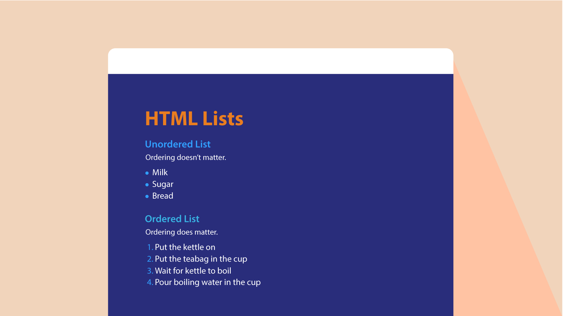
HTML Lists
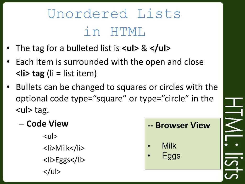
Most of the time it is necessary to list down all your items in a webpage and it is no more a difficult task with HTML list tags. For example, in the above example you can display all your skills with bulleted list using list tag. You can create three types of lists in HTML.
- <UL> – Unordered or Unnumbered list
- <OL> – Ordered or Numbered list
- <DL> – Definition or description list
Each item in the list is to be separated with Item tags. We will discuss each of these lists in the following section with examples.
Unordered or Unnumbered Lists
Let us look at a simple HTML list structure and understand each element.
So how does that look?
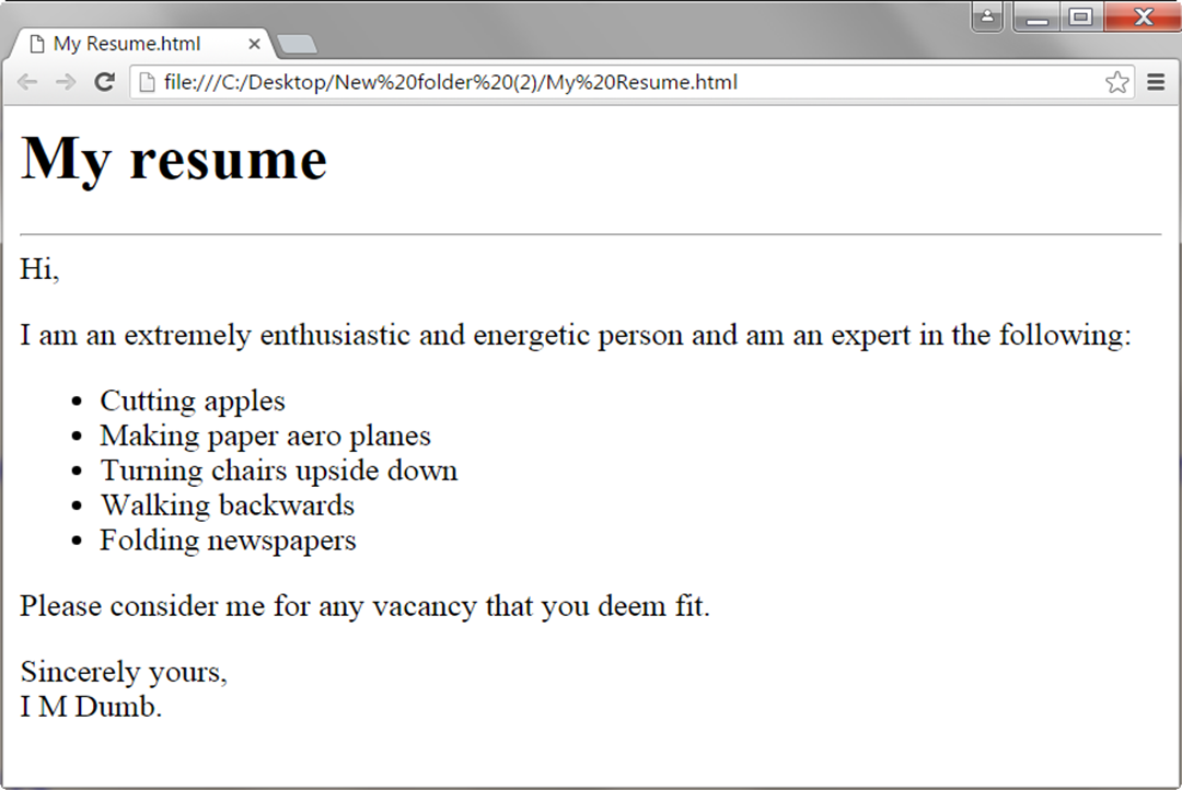
Using Unordered List in a Resume Page
<UL> List Attributes
The default style of the bullet is a disc style, but you can customize it by using the “type” attribute like <UL type=”circle”>. The acceptable values of the “type” attribute are “square”, “disc” and “circle”.
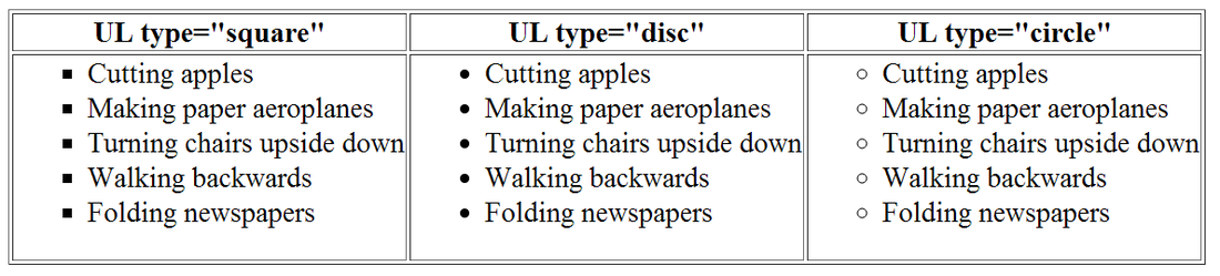 HTML Unordered List Bullet Styles
Ordered or Numbered lists
Suppose you want to have some kind of numbers in the list as below?
- Cutting apples
- Making paper aeroplanes
- Turning chairs upside down
- Walking backwards
- Folding newspapers
Ordered list <OL> tag is used to create a numbered list in HTML and you can replace the <UL>…</UL> tags with <OL>…</OL> tags to create a numbered list.
<OL> List Attributes
By default numbers 1, 2, 3… are used in an ordered list, what if you want to use small Roman numerals or alphabets instead of numbers? Simple! Similar to <UL> tag, <OL> tag can also have an attribute called “type” to customize the numbers. The value of “type” attribute can be “I”, ”i”, ”A” or “a” and the syntax is:
<OL type=”I”>…….</OL>
Below is the table showing various values of the “type” attribute for an ordered list:
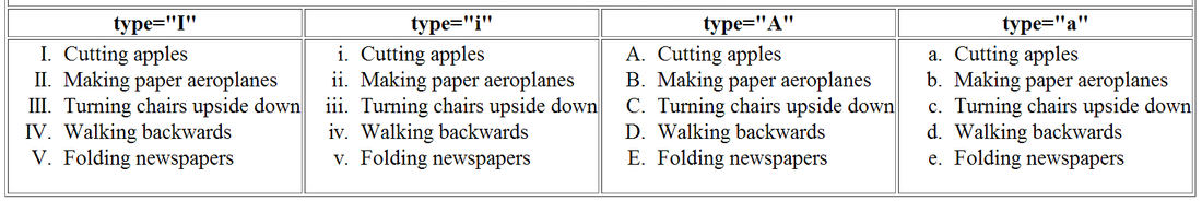 HTML Ordered List Attributes
Definition or Description Lists
This list has a series of terms and their definitions. The definition is usually displayed on a new line with indentation. See the below example to know how it works:
HTML Definition List
Both ordered and unordered lists can be used with definition list. In the above example, the first list item is used with ordered list and the second item is used with unordered list. The code for the example is given below.
A definition list contains two more tags in addition to tag.
- <DT> – This is the Term
- <DD> – This is the Term Definition
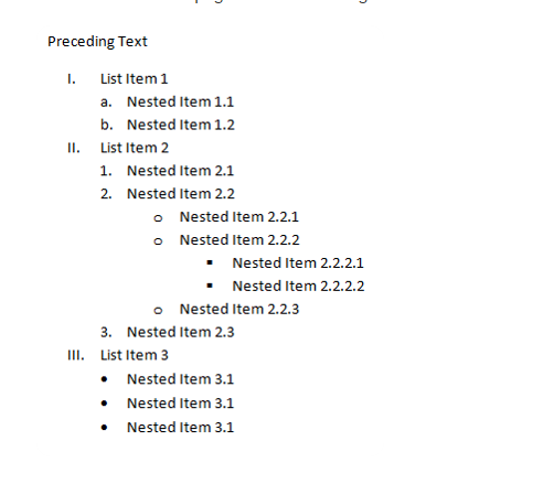
Nested Lists
All three HTML list tags <UL>, <OL> and <DL> can be used in a nested manner according to your requirement. Below is an example of nesting two ordered and unordered lists:
And the result on the browser should be like below:
- Cutting apples
- Making paper aeroplanes
- Turning chairs upside down
- Walking backwards
- Folding newspaper
Complete HTML Tutorial (Index)
- Chapter 1: Creating a Simple Webpage
- Chapter 2: Using Formatting Tags
- Chapter 3: Creating Listed Content
- Chapter 4: Creating and Customizing Tables
- Chapter 5: Linking Text
- Chapter 6: Email Links
- Chapter 7: Image Maps
- Chapter 8: Using Images in HTML
- Chapter 9 : Creating HTML Forms
- Chapter 10: HTML Frames
- Chapter 11: Embedding Media in HTML5
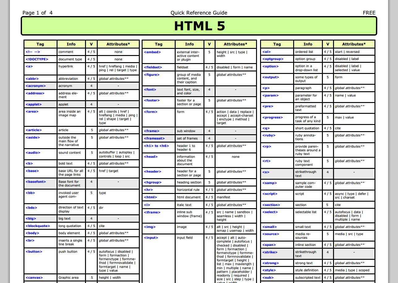
- Chapter 12: HTML5 Tag Reference
Wrapping Up
Datalists provide a quick, native means of displaying input suggestions to the user. Since the options are merely suggestions, for many situations it’s not necessary to provide a fallback for unsupporting browsers; users of these browsers simply will not see the suggestions.

For situations when you do want to provide a functional datalist to all users, you can detect support and polyfill the functionality for browsers that lack support.
While datalists are great for offering suggestions, they are limited in the functionality they provide. If you need a more robust autocomplete solution, jQuery UI’s autocomplete widget is a good place to get started.
HTML novalidate attribute HTML5
The novalidate attribute is newly added Boolean attribute of HTML5. If we apply this attribute in form then it does not perform any type of validation and submit the form.
<form action = «action.html» method = «get» novalidate>
Test it Now
Output:
Try to change the form detials with novalidate atttribute and without novalidate attribute and see the difference.
HTML <input> element attribute
HTML name attribute
The HTML name attribute defines the name of an input element. The name and value attribute are included in HTTP request when we submit the form.
Output:
Note: If you will not use name attribute in any input field, then that input field will not be submitted, when submit the form.
The HTML value attribute defines the initial value or default value of an input field.
Output:
Note: In password input filed the value attribute will always unclear
HTML required attribute HTML5
HTML required is a Boolean attribute which specifies that user must fill that filed before submitting the form.
Output:
The autofocus is a Boolean attribute which enables a field automatically focused when a webpage loads.
HTML placeholder attribute HTML5
The placeholder attribute specifies a text within an input field which informs the user about the expected input of that filed.
When the user enters the value, the placeholder will be automatically removed.
Output:
HTML disabled attribute
The HTML disabled attribute when applied then it disable that input field. The disabled field does not allow the user to interact with that field.
The disabled input filed does not receive click events, and these input value will not be sent to the server when submitting the form.
<input type=»text» name=»uname» disabled><br><br>
Test it Now
Output:
HTML size attribute
The size attribute controls the size of the input field in typed characters.
<label>Account holder name</label><br>
<input type=»text» name=»uname» size=»40″ required><br><br>
<label>Account number</label><br>
<input type=»text» name=»an» size=»30″ required><br><br>
<label>CVV</label><br>
<input type=»text» name=»cvv» size=»1″ required><br><br>
Test it Now
Output:
Output:
The autocomplete Attribute
If the datalists in Figure 1 and Figure 2 look familiar, it’s because browsers have had autocompletion implemented for a long time. All browsers have some mechanism of storing a user’s inputs to be used for autocompletion later.
Authors can use the autocomplete attribute to control whether the browser should attempt to automatically complete the user’s data. The possible values are shown in the following example:
So what’s the difference between the autocomplete attribute and datalists? The autocomplete attribute tells the browser whether to give a user options for completion based on previous input and whether to store the entered value for future completion. Datalists are author-provided lists of suggestions that are always displayed regardless of previous input.
One caveat is that setting the autocomplete attribute to “off” prevents datalists from displaying in Opera. Here’s an example: