WelcomeColor Picker, Color Wheel and all about Color!
Free online Color (USA) or Colour (British) tools: information, gradient generator, color wheels etc.
Creating a unique and what is very essential recognizable site, it’s necessary to take into account the major factor – the color (or colour, British). The success or vice versa the failure of the site depends on the competently chosen color scheme. Color is the most powerful and the most complicated element of the psychological impact. That’s why the scrutiny of the issue is the process of the great importance.
Color is the result of the combination of three components: the source of light, the object and the observer. Every color or the combinations of the colors are perceived differently: visually and psychically, emotionally and psychologically. It is undeniable fact that any web designer, working with the color, is guided by the subjective perception. One should remember the color blend is neatly selected by an expert.
To avoid reinventing the wheel it is worth knowing and using the rules already in existence. Here are the basic concepts. Read information.
HTML named colors
RGB colors
Web safe colors
Random colors
Gradient
HTML Colors in CSS
Using HTML colors is one of the easiest methods for adding color in CSS. That’s because HTML colors are represented as color names, rather than a series of numbers.
There are currently around 140 color names supported by modern browsers. Orange, gold, cyan, maroon, and skyblue are just a few examples. You’ll find a list of color names (along with the related hex codes) later on in this blog.
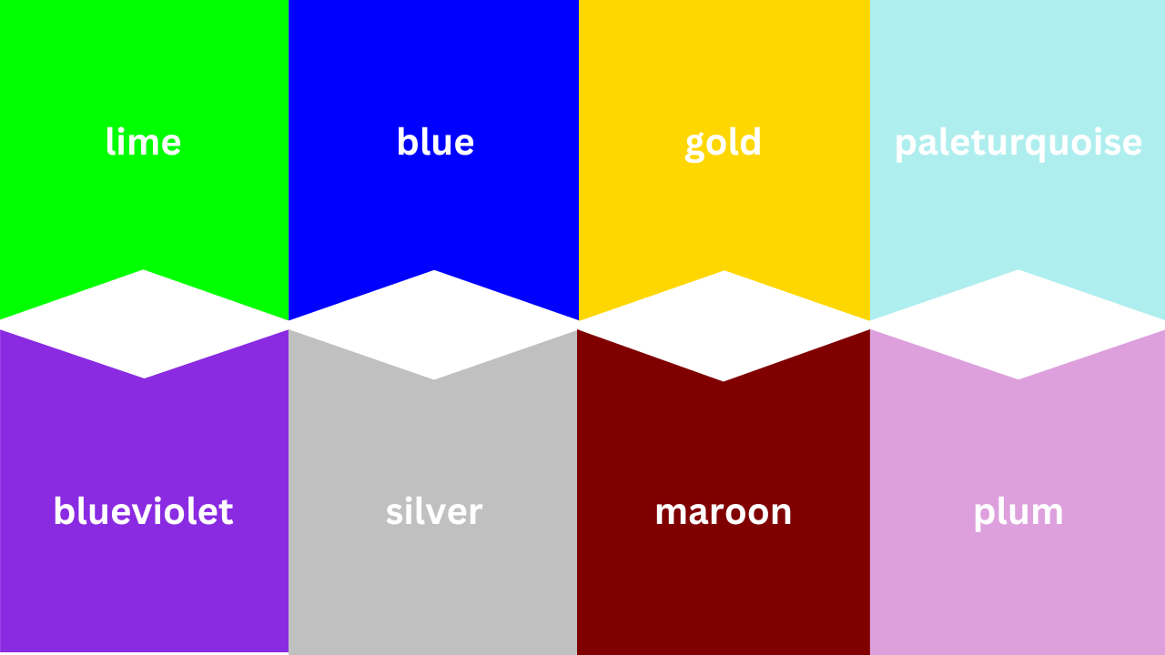
Let’s look at an example. Say you want to change a paragraph of text to red. You’d use a CSS selector to target the paragraph and define the color property with the HTML color name “red.”
See the Pen CSS Colors 1 by HubSpot (@hubspot) on CodePen.
This seems easy enough, right?
However, using HTML color names is not recommended. For one, they’re difficult to remember beyond the standard rainbow. Yes, red, yellow, and navy are easy to memorize, but what about OldLace? Mocassin? The 100+ others?
Secondly, while the approximately 140 color names are a lot to memorize, it’s a small number when you consider how many colors, shades, and hues exist in the world. Using HTML color names will therefore limit your color combinations and ability to create a website color scheme.
Finally, and most importantly, HTML color names introduce imprecision. Your ivory may be another person’s white, which may be another’s seashell — and so on.
To avoid this imprecision online, you can use color codes, rather than names. Let’s take a look at the most popular formats below.
2019 Website Color Schemes:
1. 70’s Inspired – Modern Color Palette
Mountain Shadow Blue: #101357
Old Makeup Pink: #fea49f
Goldenrod Yellow: #fbaf08
Bluebell Light Blue: #00a0a0
Bold 2019 Green: #007f4f
Lightning Blue: #51d0de
Lightning Purple: #bf4aa8
Brain Wrinkle White: #d9d9d9
Blue Popsicle: #0f2862
Redline: #9e363a
Purple Shadow: #091f36
Grey Blue Leaf: #4f5f76
Blueberry: #6B7A8F
Apricot: #F7882F
Citrus: #F7C331
Apple Core: #DCC7AA
Left Blue: #1561ad
Right Blue- Muted: #1c77ac
Blue-Green: #1dbab4
Red-Orange: #fc5226
Redder than you: #ff3a22
Goldi-lots: #c7af6b
Darker Gold: #a4893d
Silver Tongue: #628078
Barely Green: #acb7ae
The Brown-shirts: #82716e
Tan Blonde: #e4decd
Blondey: #c2b490
Green Mountain: #3d7c47
Blue Mountain: #09868b
Light Blue Backdrop: #76c1d4
Barely Gray Edge: #f7f7f7
Grey silver: #bccbde
Lightsaber Blue:#c2dde6
Purple: #431c5d
Orange: #e05915
Yellowbrite: #cdd422
Painful Red: #eb1736
35 Years Old Purple: #5252d4
Lighter purple on the gradient: #7575dd
Shadow Purple Red: #781a44
11. Easter Egg Sandwich
Green: #8bf0ba
Ironic Blues: #0e0fed
Blue Underling: #94f0f1
Pinky Ring: #f2b1d8
Egg Yellows: #ffdc6a
Looking a savvy web design team? Web design niches we serve: Plumbing, HVAC, Law Firm, Financial Services, Construction, Medical. Some cities where we serve clients: Chicago, New York, Detroit, Dallas, Cincinnati.
The Original set of website color schemes:
1. Intellectual Nonchalance
Light Blue Green: #6ed3cf
Soft Purple: #9068be
Tasty Eighties Grey: #e1e8f0
Rich Red: #e62739
Found on Trendy Web Color Palettes from Awwwards
2. Extra Snug
French Laundry Blue: #3a4660
Comfortably Tan: #c9af98
Peachy Kreme: #ed8a63
Brown Bonnet: #845007
Found on Desi Shirt by Filip Dueskau on Behance
3. Dark Horse
Are ya yellow?!: #feda6a
Silver Fox: #d4d4dc
Deep Matte Grey: #393f4d
Dark Slate: #1d1e22
Found on Vintage Rides Concept by Creativa Studio on Dribbble
4. Sleepy Green Streaks
Simpler Lime Green: #7dce94
Scuffed Dark Grey: #3d3d3f
Vanilla Grey: #f6f5f3
White-ish: #f9f8fd
Found on The Jungle Book Website by Watson D/G for Disney
Rose Gold: #bd8c7d
Soft Gold: #d1bfa7
Silver: #8e8e90
Onyx: #49494b
Found on KAE Branding by Socio Design
6. European Bodies
Yellow Hand: #fbf579
Lonely Blue: #005995
Stationary Pink Red: #fa625f
Purpled: #600473
Found on Website Inspiration by Mind Sparkle Mag
7. Simple Brilliant Accents
Red Overlaid: #cd5554
Photographed Brown: #91684a
Algae Green: #00c07f
Heritage Blue: #313d4b
Found on Website Inspiration by Mind Sparkle Mag
Still hungry for more? Check out the amazingness on Mind Spark Mag and page through the awesome examples. Such a great curation of modern, often Swiss-inspired web design.
What is The RGB Color Model?
Generally, colors and colors are identical – they just use a different numeric system and syntax (but the colors are exactly the same).
It really just comes down to personal preference which one you choose to use.
is an acronym that stands for .
Instead of using six hexadecimal characters like we did for the hex color values, with RGB each parameter pair defines the intensity and brightness of each color (red, green, and blue), with an integer number ranging from or a percantage ranging from (0% — 100%).
It expresses colors in terms of the amount of red, green, and blue they are made up of and uses a human counting system in comparisson to hex colors that speak computer language.
The number is a code to represent how dark or bright the color is.
The minimum value of represents that none of the color is being shown, so it is at its darkest. On the other hand, the maximum value of represents that the full amount of color and the full intensity is on display.
RGB Color Syntax
The general look of an declaration is
RGB has the following syntax:
- the keyword followed by a set of parentheses
- three numeric decimal values sepated by commas inside the parentheses (which represent the three colors),
- and finally it ends with a semicolon.
Make sure you don’t leave any spaces between anything.
Taking again the example, the equivalent code is:
The color red is not showing whereas green and blue are at their brightest and at their max.
- White is
- Black is
- Red is
- Green is
- Blue is
Lots of Options with RGB
With RGB, each value is mixed in with the rest and together they create a wide range of hues. You can even create new color combinations, making it the designer’s dream.
In the color system, there are three values you can use, and each value can be one of 256 possible values.
That makes for 256 * 256 * 256 = 16,777,216 color options in total to choose from!
RGB Opacity
By default all colors are fully opaque.
We have the ability to make colors more transparent by changing the opacity with the selector.
The part stays the same, but the fourth value, ,stands for .
We can give a number that is either or to describe how opaque we want our color to be. is totally see-through and trasnparent and is totally opaque.
We’ll use the example again, but this time we’ll make it have half opacity.
In CSS there is also the selector.
We’ll use the previous HTML and add the selector to our element with a class in our CSS:
Notice that this makes the whole tag transparent, including the background, the heading, the heading’s backgorund – everything.

The power of is that it allows us to make just the background see-through, for example, or we can make just the heading transparent. It will not affect the whole tag and all the content inside it.
Now if we remove the line from above and we update the selector to , we see that it doesn’t affect the heading:

Numeric colors #
It is very likely that your first exposure to colors in CSS is via numeric colors. We can work with numerical color values in a few different forms.
Hex colors
Hexadecimal notation (often shortened to hex) is a shorthand syntax for RGB, which assigns a numeric value to red green and blue, which are the three primary colors.
The hexadecimal ranges are 0-9 and A-F. When used in a six digit sequence, they are translated to the RGB numerical ranges which are 0-255 which correspond to the red, green, and blue color channels respectively.
You can also define an alpha value with any numerical colors. An alpha value is a percentage of transparency. In hex code, you add another two digits to the six digit sequence, making an eight digit sequence. For example, to set black in hex code, write . To add a 50% transparency, change it to .
Because the hex scale is 0-9 and A-F, the transparency values are probably not quite what you’d expect them to be. Here are some key, common values added to the black hex code, :
- 0% alpha—which is fully transparent—is 00:
- 50% alpha is 80:
- 75% alpha is BF:
To convert a two digit hex to a decimal, take the first digit and multiply it by 16 (because hex is base 16), then add the second digit. Using BF as an example for 75% alpha:
- B is equal to 11, which when multiplied by 16 equals 176
- F is equal to 15
- 176 + 15 = 191
- The alpha value is 191—75% of 255
RGB (Red, Green, Blue)
RGB colors are defined with the color function, using either numbers or percentages as parameters. The numbers need to be within the 0-255 range and the percentages are between 0% and 100%. RGB works on the 0-255 scale, so 255 would be equivalent to 100%, and 0 to 0%.
To set black in RGB, define it as , which is zero red, zero green and zero blue. Black can also be defined as . White is the exact opposite: or .
An alpha is set in in one of two ways. Either add a after the red, green and blue parameters, or use the function. The alpha can be defined with a percentage or a decimal between 0 and 1. For example, to set a 50% alpha black in modern browsers, write: or . For wider support, using the function, write: or .
HSL (Hue, Saturation, Lightness)
HSL stands for hue, saturation and lightness. Hue describes the value on the color wheel, from 0 to 360 degrees, starting with red (being both 0 and 360). A hue of 180, or 50% would be in the blue range. It’s the origin of the color that we see.
Saturation is how vibrant the selected hue is. A fully desaturated color (with a saturation of ) will appear grayscale. And finally, lightness is the parameter which describes the scale from white to black of added light. A lightness of will always give you white.
Using the color function, you define a true black by writing , or even . This is because the hue parameter defines the degree on the color wheel, which if you use the number type, is 0-360. You can also use the angle type, which is () or . Both saturation and lightness are defined with percentages.
Alpha is defined in , in the same way as by adding a after the hue, saturation and lightness parameters or by using the function. The alpha can be defined with a percentage or a decimal between 0 and 1. For example, to set a 50% alpha black, use: or . Using the function, write: or .
Cool Colors
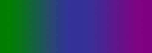
Cool colors include green, blue, and purple, are often more subdued than warm colors. They are the colors of night, of water, of nature, and are usually calming, relaxing, and somewhat reserved.
Blue is the only primary color within the cool spectrum, which means the other colors are created by combining blue with a warm color (yellow for green and red for purple).
Because of this, green takes on some of the attributes of yellow, and purple takes on some of the attributes of red. Use cool colors in your designs to give a sense of calm or professionalism.
Green (Secondary Color)

Green is a very down–to–earth color. It can represent new beginnings and growth. It also signifies renewal and abundance. Alternatively, green can also represent envy or jealousy, and a lack of experience.
Green has many of the same calming attributes that blue has, but it also incorporates some of the energy of yellow. In design, green can have a balancing and harmonizing effect, and is very stable.
It’s appropriate for designs related to wealth, stability, renewal, and nature. Brighter greens are more energizing and vibrant, while olive greens are more representative of the natural world. Dark greens are the most stable and representative of affluence.
Examples
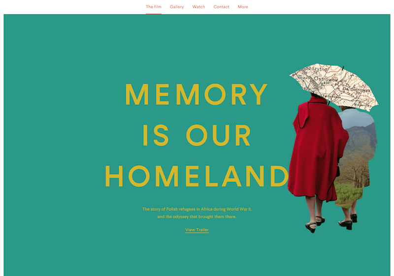 The site for Memory is Our Homeland uses a blue–green hue that’s energized by the yellow typography without being too bright.
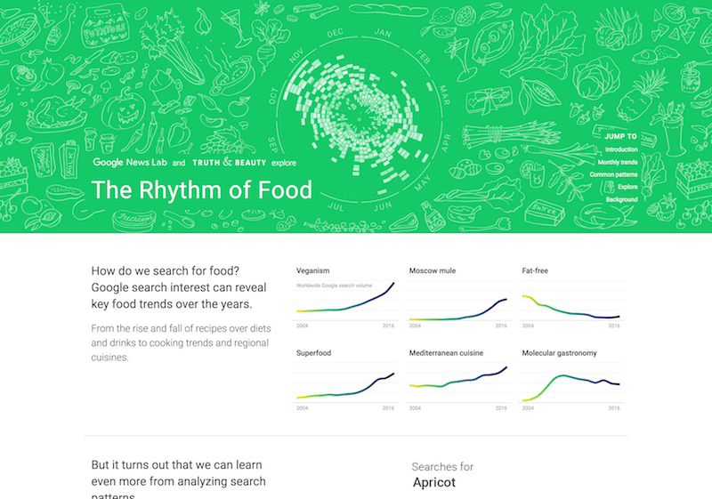 The Rhythm of Food’s site uses a bright kelly green that’s ideal for a site that ties together food and information.
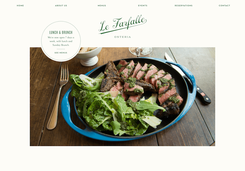 Rich, hunter green makes a great accent color on an elegant restaurant website like Le Farfalle Osteria’s. (2010)
 Anna Rosa Krau’s website has a soft sage green background, which works almost as a neutral for this portfolio.
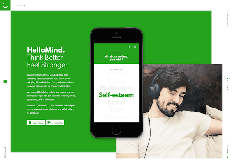 HelloMind’s bright green background is youthful and gives a sense of growth (in line with their product for improving your brain function).
 Studio Farquhar’s lime green accents are punchy and modern, and stand out in their minimalist layout.
Blue (Primary Color)

Blue is often associated with sadness in the English language. Blue is also used extensively to represent calmness and responsibility. Light blues can be refreshing and friendly. Dark blues are more strong and reliable. Blue is also associated with peace and has spiritual and religious connotations in many cultures and traditions (for example, the Virgin Mary is generally depicted wearing blue robes).
The meaning of blue is widely affected depending on the exact shade and hue. In design, the exact shade of blue you select will have a huge impact on how your designs are perceived. Light blues are often relaxed and calming. Bright blues can be energizing and refreshing. Dark blues, like navy, are excellent for corporate sites or designs where strength and reliability are important.
Examples
 The bright blue background of the Future of Design Survey results website homepage stands out, and is then used as an accent color throughout the rest of the site. (2010)
 Versett uses a bright blue as the primary color on their website, along with a number of other bright hues to differentiate different sections. (2010)
 Deep Mind’s website uses various shades of blue for its background, giving it a trustworthy, authoritative feel. (2010)
Purple (Secondary Color)

In ancient times, the dyes used for creating purple hues were extracted from snails and were very expensive, so only royals and the very wealthy could afford them.
Purple is a combination of red and blue and takes on some attributes of both. It’s associated with creativity and imagination, too.
In Thailand, purple is the color of mourning for widows. Dark purples are traditionally associated with wealth and royalty, while lighter purples (like lavender) are considered more romantic.
In design, dark purples can give a sense wealth and luxury. Light purples are softer and are associated with spring and romance.
Examples
 The first project in Filippo Bello’s portfolio uses a purple color scheme that adds to the sense of creativity. (2010)
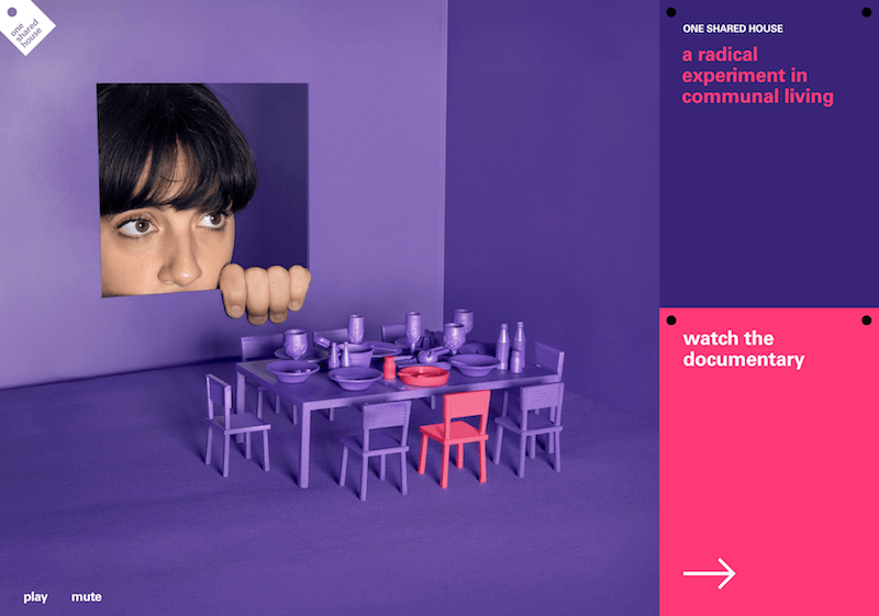 The site for the One Shared House documentary uses a vibrant shade of purple and hot pink accents to give a sense of energy, creativity, and imagination.
 On Content Stack, reddish purple works great as an accent color against a neutral background, and draws attention to important page elements, like buttons.
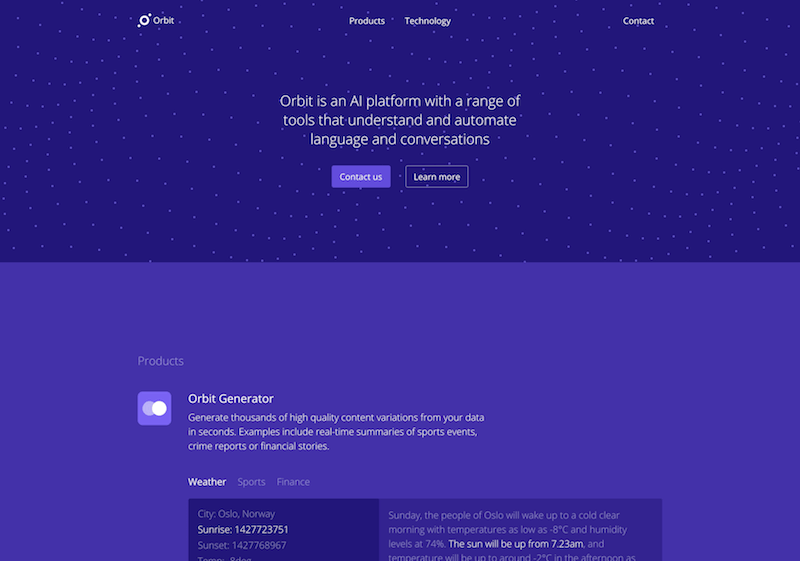 The dark purple hues of Orbit’s website give a sense of sophistication fitting their AI.
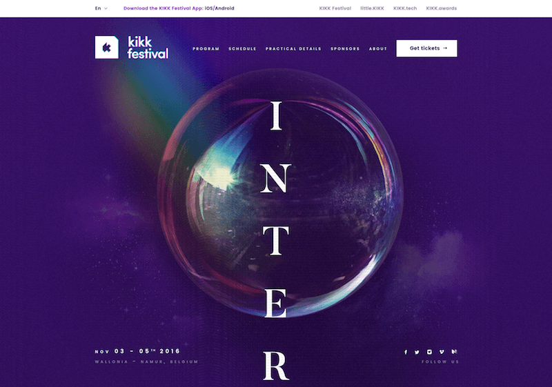 Purple is the perfect hue for a creative endeavor like KIKK Festival 2016.
Part Four – On the interplay of typography and color
Typography, color, layout. None of these elements stand alone in any composition, and to talk about one without the other leaves an incomplete picture. Always be paying attention to how the character of your web design color scheme plays with your typographical elements. Fonts should be hand-selected for their attributes, not selected haphazardly.
Golden top: #d8ab4e
Golden bottom: #b48c36
Charcoal Black: #040404
19B. Font Pairings to compliment the color Choices – Gin Rough and Amiri
Gin Rough – by Fort Foundry, Available on MyFonts – By taking the high-end feeling gold gradient and pairing it with very intentional shaped typographic elements, the designers of this site juxtaposed the rugged and elegant.
Amiri Rough – Available through – Looks gorgeous as a testimonial or call out quote.
Found on Web Design Inspiration for Gentlemen Barber Clubs (You need to see the full site)
Cotton Red: #c53211
Clean Deep Grey: #2e3830
Khaki: #e6dbc9
20B. Font Pairings to compliment the color Choices – Futura Bold and Museo Slab
Futura Bold – is as classic as it is simple. Common similar fonts like Gotham Black, Montserrat, or Proxima Nova can allow you a similar but different flavor. Still, Futura Bold will be useful for a lot of situations – and plays well in this simple red, gray, tan color scheme as uppercase titles.
Museo Slab – As both the 100 weight in the blockquote above and the paragraph text (font-weight: 400), Museo Slab provides readability, whether big and small. Futura, Museo Slab over these comfortably simple colors feel not necessarily classic, but modern and original. The restraint in both color choices and typography leads to a very cohesive feel that leaves the whole website feeling integrated and branded.
Pastel Peach: #dea6af
Sky Blue: #8cbcd0
Pastel Pink: #e6dbc9
21B. Font Pairing to complement the color Choices – Calibre – the European Design Ketchup
Calibre – I love the look that many modern European websites achieve with this mature, swiss feeling typeface. It’s going to see a lot more use in America before it gets overdone here. The no-frills application below shows you the confidence with which a lot of European designers are using it. Impeccably played.
The design found on CSS Design Awards – Buy Calibre typeface
No matter what colors you use, your website will be better if it uses a very well thought out typeface or two. Finding a balance between the color and the fonts is not necessarily scientific – it requires a certain poetic association, but that doesn’t mean it’s entirely subjective. The colors can either be diametrically opposed to the personality/personalities of the typeface(s), or be in direct alignment with them.
In Brief
While the information contained here might seem just a bit overwhelming, color theory is as much about the feeling a particular shade evokes than anything else. But here’s a quick reference guide for the common meanings of the colors discussed above:
- Red: Passion, Love, Anger
- Orange: Energy, Happiness, Vitality
- Yellow: Happiness, Hope, Deceit
- Green: New Beginnings, Abundance, Nature
- Blue: Calm, Responsible, Sadness
- Purple: Creativity, Royalty, Wealth
- Black: Mystery, Elegance, Evil
- Gray: Moody, Conservative, Formality
- White: Purity, Cleanliness, Virtue
- Brown: Nature, Wholesomeness, Dependability
- Tan or Beige: Conservative, Piety, Dull
- Cream or Ivory: Calm, Elegant, Purity
RGB Color Codes in CSS
RGB is another color model based on the combination of the primary colors — hence, the shorthand for Red, Green, Blue. RBG color codes are composed of three numbers separated by commas. Each number represents the intensity of the respective primary color as an integer between 0 and 255. These numbers are then wrapped in parentheses and preceded by a lowercase “rgb.”
So rgb (0, 0, 0) is black, rgb (255, 0, 0) is red, and rgb (0, 0, 255) is blue.
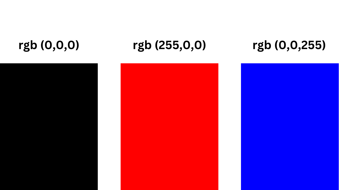
The major benefit of using RGB color codes is that you can not only control the color of an element — you can also control the opacity of that color. To do so, you simply add an “a” to the rgb() prefix and a fourth value inside the parentheses. Ranging from 0 to 1, this value sets the transparency of the color. 0 is completely transparent and 1 is completely opaque. So the value 0.5 would render the color at 50% opacity.
Let’s look at an example. Say you want to change the background color of a heading and paragraph on your page. You want both elements to have the same background color. To ensure the heading is more eye-grabbing, however, you’ll set the background color of the paragraph to be 30% opaque.
See the Pen CSS Colors 3 by HubSpot (@hubspot) on CodePen.
Before we proceed, here’s an interesting color fact. Both magenta and fuchsia, and cyan and aqua, share the same RGB color code and hex code. Take a look below.
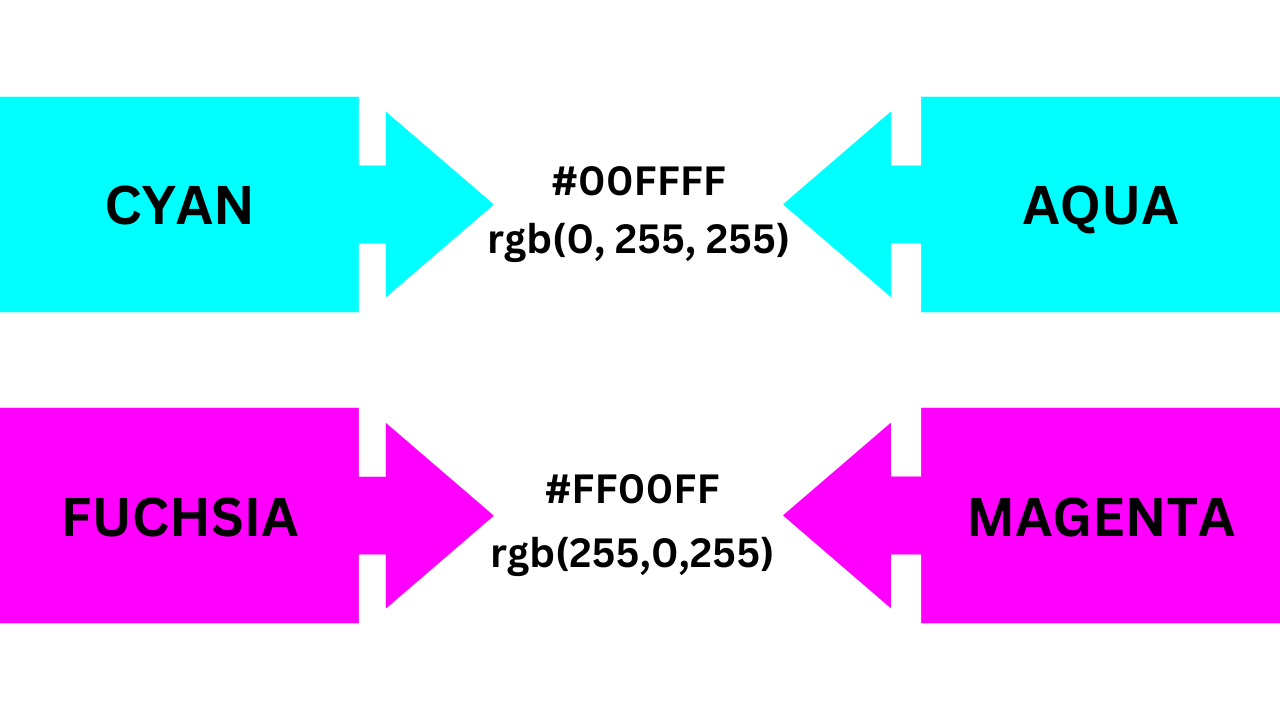
What are Hexadecimal Colors in CSS?
Computers count in the hexadecimal counting system compared to we humans who use the decimal counting system.
This system is comprised of alphanumeric values which include these characters : .
A hex color starts with a to denote that it is indeed a hex color and is then followed by of the characters mentioned above.
These numbers and letters represent the amount of in the color.
Converting the keyword color, , from earlier to it’s equivalent hex color value would be:
The first pair () represents the amount of red. The next pair () represents the amount of green. And the last one () represents the amount of blue.
The minimum value hex colors can use is which is fully off, and the maxiumum value is which is fully on.
The color white in hex is or for its shorthand notation and the color black is or .
Part Two – Observations on interplay and color in context
Elements of color are essential not only in the way they pair with other complementary shades but also in the quantity and placement in relationship to those other colors and in how it relates to other patterns and photographic elements next to it and elsewhere on the website. In this section, I will share/curate websites with beautiful color schemes, hexadecimal codes, and just a brief note about why color being used works in context as well.
8. Blue Red
Deep Red: #b11a21 – In an overlay, juxtaposed against flat blue, the photographic background gives depth.
Lighter Red: #e0474c – The smiling face coming through the red, makes it feel striking.
Blue Beans: #7acfd6 – The flat blue provides a contrast to the photo behind the red.
Light Classy Grey: #f1f0ee – Simple light grey is used to provide depth behind a later photographic section, with white below.
Found on Website Inspiration by Mind Sparkle Mag
9. Sunny and Calm
Morning Sky: #CAE4DB – Never underestimate a color palette created by a photograph to set the tone of your design.
Honey: #DCAE1D – In this case, the palette is set with the photo and then echoed in the subtitle.
Cerulean: #00303F – Cerulean is incredibly classy as a black or dark grey alternative if used consistently throughout.
Mist: #7A9D96 – This clean, natural color is established in the photo but could be used on a lower full-width block or buttons as well.
Found on Inspiring Website Color Schemes by Canva
9. Dark and Orange
Dark Grey: #393939 – Dark designs take a little bit more fore-thought but can provide tons of contrast if used well.
Deep Orange: #FF5A09 – With different shades of oranges, there is depth and gradient, without venturing into totally new colors.
Light Orange: #ec7f37 – Utilizing illustrative elements, requires a bit of flexibility for the natural lightness and darkness to contour objects.
Orange Yellow: #be4f0c – Using on color over on the color wheel can keep the palette looking classy, bold, and restrained.
Found on Great Color Schemes by One Extra Pixel
10. Squeaky
Fresh: #4ABDAC – Once again the color overlaid over the photographic elements provides a classy modern touch
Vermillion: #FC4A1A – A figure in the foreground is worked into the context, still paying attention to how it complements the overall structure of the design. In fact, one might even be able to surmise that the design was down around this figure.
Sunshine: #F7B733 – The Yellow provides only a juxtaposed call to action and highlights important parts
Clean: #DFDCE3 – Clean grey, utilized in the photograph, keeps the structure un-encumbered by more colors or patterns in these sharp headshots.
Found on Inspiring Website Color Schemes by Canva
11. Basic blue-green
Ol’ trusty blue: #368cbf – Blue wins for trust in color psychology, but make sure it’s a tasteful hue, as some blues are too out of the box. Just like my art teacher said with paints, you should always mix them before applying to canvas, lest you get something that looks like you just slapped the colors out of the box.
Accent color green: #7ebc59 – Corporate Blue + Eco-conscious green = Every website ever. But don’t overlook the use of common color schemes just because their common. Wield familiar colors together when it serves your purpose of feeling trustworthy.
Dark Slate: #33363b – Breaking up white space with a darker header, footer, or full-width sections provides relief from things that are too repetitive.
Light grey: #eaeaea – This truly is one of the most common color schemes around the website, particularly for technology companies. Are you sick of it yet? I like it.
Found on Free awesome WordPress Themes by ColorLib
The vital part of this section is a reminder that colors don’t live in a vacuum. How they relate to each other is complex, and pairing them not only with other colors that complement them but in degrees and quantities that work well together is important. When I show that orange and yellow are working well together, always keep in mind the context and how much of each are present. There might be a tiny sliver of yellow, so it’s not just that they work well, but how much of each and where.
CSS Color Names
Here is a table of the CSS color names. These are based on the X11 colors, and are supported by all major browsers.
Try clicking on a value. This will open a color tester where you can test different colors against the page background.
| Color Name | Hex Code RGB |
Decimal Code RGB |
|---|---|---|
| Reds | ||
| IndianRed | CD5C5C | 205,92,92 |
| LightCoral | F08080 | 240,128,128 |
| Salmon | FA8072 | 250,128,114 |
| DarkSalmon | E9967A | 233,150,122 |
| LightSalmon | FFA07A | 255,160,122 |
| Crimson | DC143C | 220,20,60 |
| Red | FF0000 | 255,0,0 |
| FireBrick | B22222 | 178,34,34 |
| DarkRed | 8B0000 | 139,0,0 |
| Pinks | ||
| Pink | FFC0CB | 255,192,203 |
| LightPink | FFB6C1 | 255,182,193 |
| HotPink | FF69B4 | 255,105,180 |
| DeepPink | FF1493 | 255,20,147 |
| MediumVioletRed | C71585 | 199,21,133 |
| PaleVioletRed | DB7093 | 219,112,147 |
| Oranges | ||
| Coral | FF7F50 | 255,127,80 |
| Tomato | FF6347 | 255,99,71 |
| OrangeRed | FF4500 | 255,69,0 |
| DarkOrange | FF8C00 | 255,140,0 |
| Orange | FFA500 | 255,165,0 |
| Yellows | ||
| Gold | FFD700 | 255,215,0 |
| Yellow | FFFF00 | 255,255,0 |
| LightYellow | FFFFE0 | 255,255,224 |
| LemonChiffon | FFFACD | 255,250,205 |
| LightGoldenrodYellow | FAFAD2 | 250,250,210 |
| PapayaWhip | FFEFD5 | 255,239,213 |
| Moccasin | FFE4B5 | 255,228,181 |
| PeachPuff | FFDAB9 | 255,218,185 |
| PaleGoldenrod | EEE8AA | 238,232,170 |
| Khaki | F0E68C | 240,230,140 |
| DarkKhaki | BDB76B | 189,183,107 |
| Purples | ||
| Lavender | E6E6FA | 230,230,250 |
| Thistle | D8BFD8 | 216,191,216 |
| Plum | DDA0DD | 221,160,221 |
| Violet | EE82EE | 238,130,238 |
| Orchid | DA70D6 | 218,112,214 |
| Fuchsia | FF00FF | 255,0,255 |
| Magenta | FF00FF | 255,0,255 |
| MediumOrchid | BA55D3 | 186,85,211 |
| MediumPurple | 9370DB | 147,112,219 |
| BlueViolet | 8A2BE2 | 138,43,226 |
| DarkViolet | 9400D3 | 148,0,211 |
| DarkOrchid | 9932CC | 153,50,204 |
| DarkMagenta | 8B008B | 139,0,139 |
| Purple | 128,0,128 | |
| RebeccaPurple | 102,51,153 | |
| Indigo | 4B0082 | 75,0,130 |
| MediumSlateBlue | 7B68EE | 123,104,238 |
| SlateBlue | 6A5ACD | 106,90,205 |
| DarkSlateBlue | 483D8B | 72,61,139 |
| Color Name | Hex Code RGB |
Decimal Code RGB |
|---|---|---|
| Greens | ||
| GreenYellow | ADFF2F | 173,255,47 |
| Chartreuse | 7FFF00 | 127,255,0 |
| LawnGreen | 7CFC00 | 124,252,0 |
| Lime | 00FF00 | 0,255,0 |
| LimeGreen | 32CD32 | 50,205,50 |
| PaleGreen | 98FB98 | 152,251,152 |
| LightGreen | 90EE90 | 144,238,144 |
| MediumSpringGreen | 00FA9A | 0,250,154 |
| SpringGreen | 00FF7F | 0,255,127 |
| MediumSeaGreen | 3CB371 | 60,179,113 |
| SeaGreen | 2E8B57 | 46,139,87 |
| ForestGreen | 228B22 | 34,139,34 |
| Green | 0,128,0 | |
| DarkGreen | 0,100,0 | |
| YellowGreen | 9ACD32 | 154,205,50 |
| OliveDrab | 6B8E23 | 107,142,35 |
| Olive | 128,128,0 | |
| DarkOliveGreen | 556B2F | 85,107,47 |
| MediumAquamarine | 66CDAA | 102,205,170 |
| DarkSeaGreen | 8FBC8F | 143,188,143 |
| LightSeaGreen | 20B2AA | 32,178,170 |
| DarkCyan | 008B8B | 0,139,139 |
| Teal | 0,128,128 | |
| Blues/Cyans | ||
| Aqua | 00FFFF | 0,255,255 |
| Cyan | 00FFFF | 0,255,255 |
| LightCyan | E0FFFF | 224,255,255 |
| PaleTurquoise | AFEEEE | 175,238,238 |
| Aquamarine | 7FFFD4 | 127,255,212 |
| Turquoise | 40E0D0 | 64,224,208 |
| MediumTurquoise | 48D1CC | 72,209,204 |
| DarkTurquoise | 00CED1 | 0,206,209 |
| CadetBlue | 5F9EA0 | 95,158,160 |
| SteelBlue | 4682B4 | 70,130,180 |
| LightSteelBlue | B0C4DE | 176,196,222 |
| PowderBlue | B0E0E6 | 176,224,230 |
| LightBlue | ADD8E6 | 173,216,230 |
| SkyBlue | 87CEEB | 135,206,235 |
| LightSkyBlue | 87CEFA | 135,206,250 |
| DeepSkyBlue | 00BFFF | 0,191,255 |
| DodgerBlue | 1E90FF | 30,144,255 |
| CornflowerBlue | 6495ED | 100,149,237 |
| RoyalBlue | 4169E1 | 65,105,225 |
| Blue | 0000FF | 0,0,255 |
| MediumBlue | 0000CD | 0,0,205 |
| DarkBlue | 00008B | 0,0,139 |
| Navy | 0,0,128 | |
| MidnightBlue | 25,25,112 |
| Color Name | Hex Code RGB |
Decimal Code RGB |
|---|---|---|
| Browns | ||
| Cornsilk | FFF8DC | 255,248,220 |
| BlanchedAlmond | FFEBCD | 255,235,205 |
| Bisque | FFE4C4 | 255,228,196 |
| NavajoWhite | FFDEAD | 255,222,173 |
| Wheat | F5DEB3 | 245,222,179 |
| BurlyWood | DEB887 | 222,184,135 |
| Tan | D2B48C | 210,180,140 |
| RosyBrown | BC8F8F | 188,143,143 |
| SandyBrown | F4A460 | 244,164,96 |
| Goldenrod | DAA520 | 218,165,32 |
| DarkGoldenrod | B8860B | 184,134,11 |
| Peru | CD853F | 205,133,63 |
| Chocolate | D2691E | 210,105,30 |
| SaddleBrown | 8B4513 | 139,69,19 |
| Sienna | A0522D | 160,82,45 |
| Brown | A52A2A | 165,42,42 |
| Maroon | 128,0,0 | |
| Whites | ||
| White | FFFFFF | 255,255,255 |
| Snow | FFFAFA | 255,250,250 |
| Honeydew | F0FFF0 | 240,255,240 |
| MintCream | F5FFFA | 245,255,250 |
| Azure | F0FFFF | 240,255,255 |
| AliceBlue | F0F8FF | 240,248,255 |
| GhostWhite | F8F8FF | 248,248,255 |
| WhiteSmoke | F5F5F5 | 245,245,245 |
| Seashell | FFF5EE | 255,245,238 |
| Beige | F5F5DC | 245,245,220 |
| OldLace | FDF5E6 | 253,245,230 |
| FloralWhite | FFFAF0 | 255,250,240 |
| Ivory | FFFFF0 | 255,255,240 |
| AntiqueWhite | FAEBD7 | 250,235,215 |
| Linen | FAF0E6 | 250,240,230 |
| LavenderBlush | FFF0F5 | 255,240,245 |
| MistyRose | FFE4E1 | 255,228,225 |
| Greys | ||
| Gainsboro | DCDCDC | 220,220,220 |
| LightGray | D3D3D3 | 211,211,211 |
| LightGrey | D3D3D3 | 211,211,211 |
| Silver | C0C0C0 | 192,192,192 |
| DarkGray | A9A9A9 | 169,169,169 |
| DarkGrey | A9A9A9 | 169,169,169 |
| Gray | 128,128,128 | |
| Grey | 128,128,128 | |
| DimGray | 105,105,105 | |
| DimGrey | 105,105,105 | |
| LightSlateGray | 119,136,153 | |
| LightSlateGrey | 119,136,153 | |
| SlateGray | 112,128,144 | |
| SlateGrey | 112,128,144 | |
| DarkSlateGray | 2F4F4F | 47,79,79 |
| DarkSlateGrey | 2F4F4F | 47,79,79 |
| Black | 0,0,0 |


