
Things Which Prevent Margin Collapsing
Margins never collapse if an item has absolute positioning, or is floated. However, assuming you have run into one of the places where margins collapse outlined above, how can you stop those margins collapsing?
The first thing that stops collapsing is situations where there is something between the elements in question.
For example, a box completely empty of content will not collapse it’s top and bottom margin if it has a border, or padding applied. In the example below I have added 1px of padding to the box. There is now a 50-pixel margin above and below the box.
See the Pen (https://codepen.io/rachelandrew/pen/gNeMpg) by Rachel Andrew.
See the Pen Margins: empty boxes with padding do not collapse by Rachel Andrew.
This has logic behind it, if the box is completely empty with no border or padding, it is essentially invisible. It might be an empty paragraph element thrown into the markup by your CMS. If your CMS was adding redundant paragraph elements, you probably wouldn’t want them to cause large gaps between the other paragraphs due to their margins being honored. Add anything to the box, and you will get those gaps.
Similar behavior can be seen with margins on first or last children which collapse through the parent. If we add a border to the parent, the margins on the children stay inside.
See the Pen (https://codepen.io/rachelandrew/pen/vqRKKX) by Rachel Andrew.
See the Pen Margins: margin on first and last child doesn’t collapse if the parent has a border by Rachel Andrew.
Once again, there is some logic to the behavior. If you have wrapping elements for semantic purposes that do not display visually, you probably don’t want them to introduce big gaps in the display. This made a lot of sense when the web was mostly text. It is less useful as behavior when we are using elements to lay out a design.
Creating a Block Formatting Context
A new Block Formatting Context (BFC) will also prevent margin collapsing through the containing element. If we look again at the example of the first and last child, ending up with their margins outside of the wrapper, and give the wrapper , thus creating a new BFC, the margins stay inside.
See the Pen (https://codepen.io/rachelandrew/pen/VJXjEp) by Rachel Andrew.
See the Pen Margins: a new Block Formatting Context contains margins by Rachel Andrew.
To find out more about , read my article “Understanding CSS Layout And The Block Formatting Context”. Changing the value of the property to will have the same effect, as this also creates a new BFC, although it may also create scrollbars that you didn’t want in some scenarios.
Flex And Grid Containers
Flex and Grid containers establish Flex and Grid formatting contexts for their children, so they have different behavior to block layout. One of those differences is that margins do not collapse:
If we take the example above and make the wrapper into a flex container, displaying the items with , you can see that the margins are now contained by the wrapper. Additionally, margins between adjacent flex items do not collapse with each other, so we end up with 100 pixels between flex items, the total of the 50 pixels on the top and bottom of the items.
See the Pen (https://codepen.io/rachelandrew/pen/mZxreL) by Rachel Andrew.
See the Pen Margins: margins on flex items do not collapse by Rachel Andrew.
Почему в статье я использую именно inline-block?
На самом деле «Проблема» пробелов для inline-block и обычных инлайн элементов — является общей. Т.е. и с теми и с другими происходят идентичные вещи. Ненавистные отступы, появляются у тех и у других. Просто дело в том, что:Во-первых, inline-block имеет больше возможностей, таких например, как задание ширины или высоты и т.д.Во-вторых, мне всё-таки хотелось немного объяснить вам, что такое inline-block и что они из себя представляют, всё-же они относятся к строкам, как-никак.Ну и в-третьих это то, что с inline-block связаны определённые проблемы в браузере Safari, о которых мне бы хотелось, чтобы вы знали.
Так что я думаю, что знакомство с этим поведением строчно-блочного элемента будет для вас полезным делом и, безусловно, расширит ваш кругозор.
CSS Справочники
CSS СправочникCSS ПоддержкаCSS СелекторыCSS ФункцииCSS ЗвукCSS Веб шрифтыCSS АнимацииCSS ДлиныCSS Конвертер px-emCSS Названия цветаCSS Значения цветаCSS по умолчаниюCSS Символы
CSS Свойства
align-content
align-items
align-self
all
animation
animation-delay
animation-direction
animation-duration
animation-fill-mode
animation-iteration-count
animation-name
animation-play-state
animation-timing-function
backface-visibility
background
background-attachment
background-blend-mode
background-clip
background-color
background-image
background-origin
background-position
background-repeat
background-size
border
border-bottom
border-bottom-color
border-bottom-left-radius
border-bottom-right-radius
border-bottom-style
border-bottom-width
border-collapse
border-color
border-image
border-image-outset
border-image-repeat
border-image-slice
border-image-source
border-image-width
border-left
border-left-color
border-left-style
border-left-width
border-radius
border-right
border-right-color
border-right-style
border-right-width
border-spacing
border-style
border-top
border-top-color
border-top-left-radius
border-top-right-radius
border-top-style
border-top-width
border-width
bottom
box-decoration-break
box-shadow
box-sizing
caption-side
caret-color
@charset
clear
clip
color
column-count
column-fill
column-gap
column-rule
column-rule-color
column-rule-style
column-rule-width
column-span
column-width
columns
content
counter-increment
counter-reset
cursor
direction
display
empty-cells
filter
flex
flex-basis
flex-direction
flex-flow
flex-grow
flex-shrink
flex-wrap
float
font
@font-face
font-family
font-kerning
font-size
font-size-adjust
font-stretch
font-style
font-variant
font-weight
grid
grid-area
grid-auto-columns
grid-auto-flow
grid-auto-rows
grid-column
grid-column-end
grid-column-gap
grid-column-start
grid-gap
grid-row
grid-row-end
grid-row-gap
grid-row-start
grid-template
grid-template-areas
grid-template-columns
grid-template-rows
hanging-punctuation
height
hyphens
@import
isolation
justify-content
@keyframes
left
letter-spacing
line-height
list-style
list-style-image
list-style-position
list-style-type
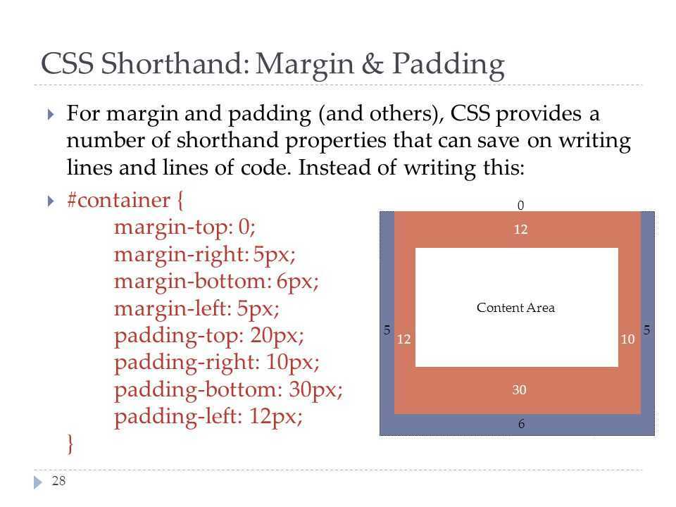
margin
margin-bottom
margin-left
margin-right
margin-top
max-height
max-width
@media
min-height
min-width
mix-blend-mode
object-fit
object-position
opacity
order
outline
outline-color
outline-offset
outline-style
outline-width
overflow
overflow-x
overflow-y
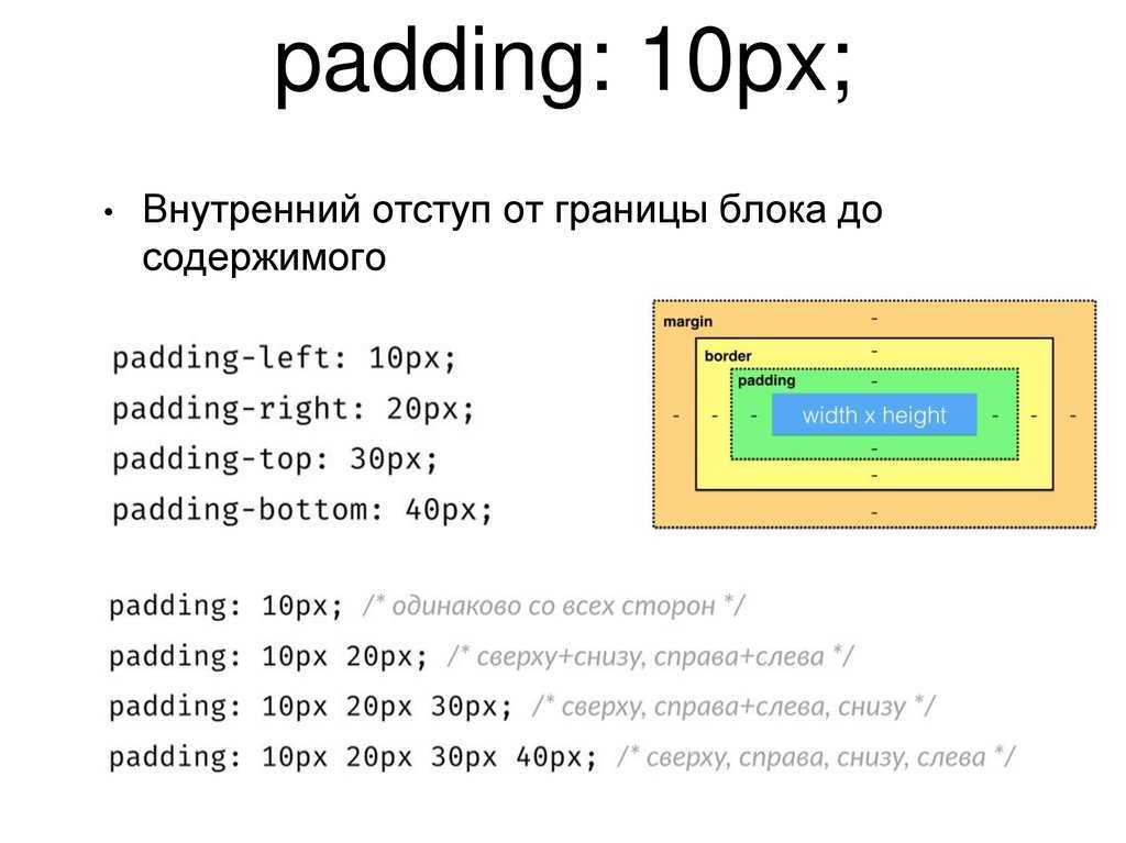
padding
padding-bottom
padding-left
padding-right
padding-top
page-break-after
page-break-before
page-break-inside
perspective
perspective-origin
pointer-events
position
quotes
resize
right
tab-size
table-layout
text-align
text-align-last
text-decoration
text-decoration-color
text-decoration-line
text-decoration-style
text-indent
text-justify
text-overflow
text-shadow
text-transform
top
transform
transform-origin
transform-style
transition
transition-delay
transition-duration
transition-property
transition-timing-function
unicode-bidi
user-select
vertical-align
visibility
white-space
width
word-break
word-spacing
word-wrap
writing-mode
z-index
Summary
The CSS property sets the margin space required on the left side of a box associated with an element. A negative value is also allowed.
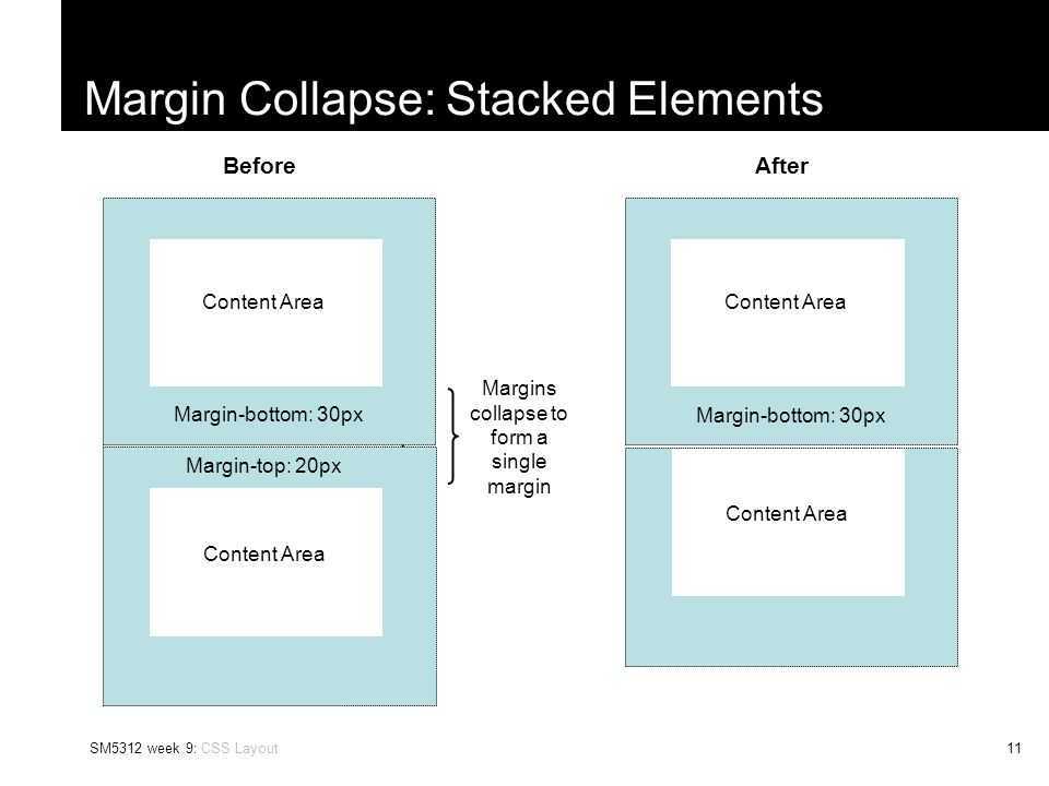
The vertical margins of two adjacent boxes may fuse. This is called margin collapsing.
In the rare cases where width is overconstrained (that is when all of , , , , the content area and are defined), is ignored, and will have the same calculated value as if the value was specified.
| Initial value | |
|---|---|
| Applies to | all elements, except elements with table types other than , and . It also applies to . |
| Inherited | no |
| Percentages | refer to the width of the containing block |
| Media | visual |
| Computed value | the percentage as specified or the absolute length |
| Animatable | yes, as a |
| Canonical order | the unique non-ambiguous order defined by the formal grammar |
Syntax
/* <length> values */
margin-left: 10px;  /* An absolute length */
margin-left: 1em;   /* A length relative to the text size */
margin-left: 5%;    /* A margin relative to the nearest block container's width */

/* Keyword values */
margin-left: auto;

/* Global values */
margin-left: inherit;
margin-left: initial;
margin-left: unset;
Values
- Is a specifying a fixed width: it can be absolute width, e.g. in , or a width relative to the text size, e.g. in , or relative to the viewport size, e.g. in .
- Is a relative to the width of the nearest containing block.
- Is a keyword indicating that the left margin receives a share of the remaining space, defined mainly by the current layout mode.. If there several values for or , the calculated space is evenly distributed between all the values. This table summarizes the different cases:
Value of Value of Value of Computed value of Comment , , any or Inline layout mode , , , , , , , any or , except if both and are set to . In this case, it is set to the value centering the element inside its parent. Block layout mode , , , , , , , or or Block layout mode (floating element) any , except any any Internal elements don’t have margins, use instead any, except , , or any or , except if both and are set to . In this case, it is set to the value centering the border area inside the available , if fixed. Absolutely positioned layout mode , any any , except if there is any positive horizontal free space. In this case, it is evenly distributed to all horizontal margins. Flexbox layout mode
Отступ текста в HTML при помощи padding
Этот способ очень похож на предыдущий, но если margin задавал отступ до текста как бы снаружи тега, то padding будет задавать отступ внутри.

PHP
<div style=”paddint-top:20px;”> Текст блока </div>
| 1 | <div style=”paddint-top20px;”>Текстблока<div> |
Так же можно присвоить класс в HTML коде или воспользоваться уже существующим и дописать это свойство ему:
CSS:
PHP
.text-block {
padding: 20px 10px 15px 20px;
}
|
1 |
.text-block{ padding20px10px15px20px; } |

С его помощью так же можно задать разные отступы текста в HTML:
- padding-left — слева
- padding-right — справа
- padding-top — сверху
- padding-bottom — расстояние снизу
- padding: 25px; — отступ со всех сторон.
Margin Strategies For Your Site
Due to margin collapsing, it is a good idea to come up with a consistent way of dealing with margins in your site. The simplest thing to do is to only define margins on the top or bottom of elements. In that way, you should not run into margin collapsing issues too often as the side with a margin will always be adjacent to a side without a margin.
Note: Harry Roberts has an excellent post detailing the reasons why setting margins only in one direction is a good idea, and not just due to solving collapsing margin issues.
This solution doesn’t solve the issues you might run into with margins on children collapsing through their parent. That particular issue tends to be less common, and knowing why it is happening can help you come up with a solution. An ideal solution to that is to give components which require it , as a fallback for older browsers you could use to create a BFC, turn the parent into a flex container, or even introduce a single pixel of padding. Don’t forget that you can use feature queries to detect support for so only old browsers get a less optimal fix.
![[ в закладки ] css: использование внутренних и внешних отступов](https://rwvt.ru/wp-content/uploads/d/4/b/d4b28a821c2475c592c5fe4931e280ea.jpeg)
Most of the time, I find that knowing why margins collapse (or didn’t) is the key thing. You can then figure out on a case-by-case basis how to deal with it. Whatever you choose, make sure to share that information with your team. Quite often margin collapsing is a bit mysterious, so the reason for doing things to counter it may be non-obvious! A comment in your code goes a long way to help — you could even link to this article and help to share the margin collapsing knowledge.
I thought that I would round up this article with a few other margin-related pieces of information.
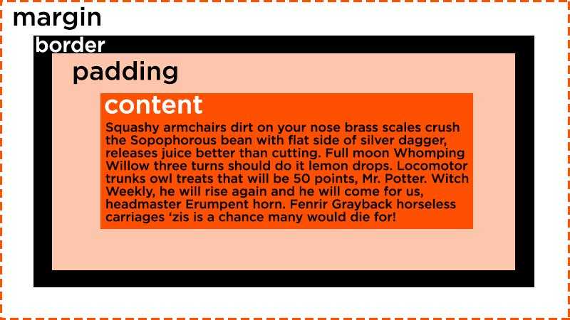
Border
At the edge of the content plus the padding you defined is the start of the element’s border. By default, an element will not have a border, but you can define one with the property.
The syntax for it is the width or thickness of the border, the style, and then the color.
For example, if you wanted a blue, dashed, 2 pixels thick border, it would look like this:
- HTML
- CSS
- <div class=»blue-border»>Sweet border!</div>
-
.blue-border {
border: 2px dashed blue;
padding: 1rem;
}
Example of a border.
Here are other border styles you can use:
Borders can be applied to most elements.
Border Radius
One way you can customize borders is by setting a border radius. You can round off the borders of your element using , like this:
- HTML
- CSS
- <div class=»rounded-corners»>Rounded corners!</div>
-
.rounded-corners {
border: 0.5rem solid purple;
padding: 1rem;
border-radius: 1rem;
}
Example of a border radius.
The value for this property is any length of your choosing. The default value is , which means that the border will not be rounded. You can also use to round off the border fully.
Box Shadow
You can add a shadow to an element by using the property. The syntax is the same as for borders, but you can also use and to make the shadow appear inside or outside of the element.
For the most common uses of this property, it takes five values, the horizontal offset, the vertical offset, the blur radius, the size of the shadow and finally, the color. The color is optional, and if you don’t specify it, the shadow will be . Here’s an example:
- HTML
- CSS
- <div class=»box-shadow»>Box shadow!</div>
-
.box-shadow {
background-color: lightpink;
border: 0.25rem solid red;
padding: 1rem;
margin: 2rem;
box-shadow: 0.5rem 0.5rem 0.25rem darkgray;
}
Example of a box shadow.
Box shadows can be applied to most elements.
Отступы в CSS
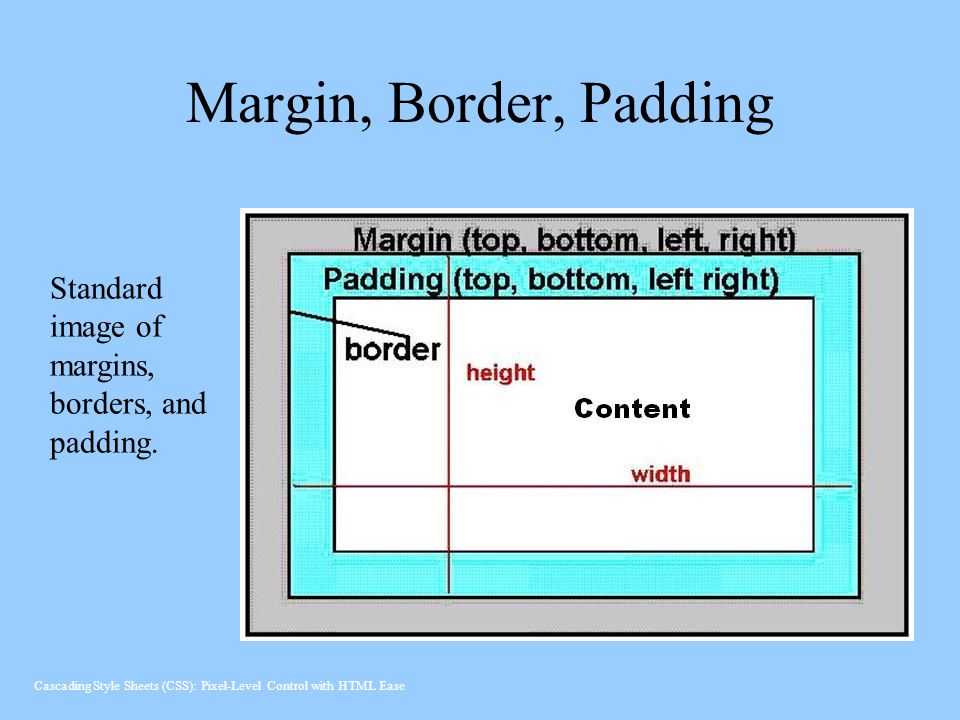
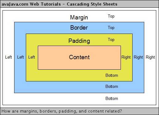
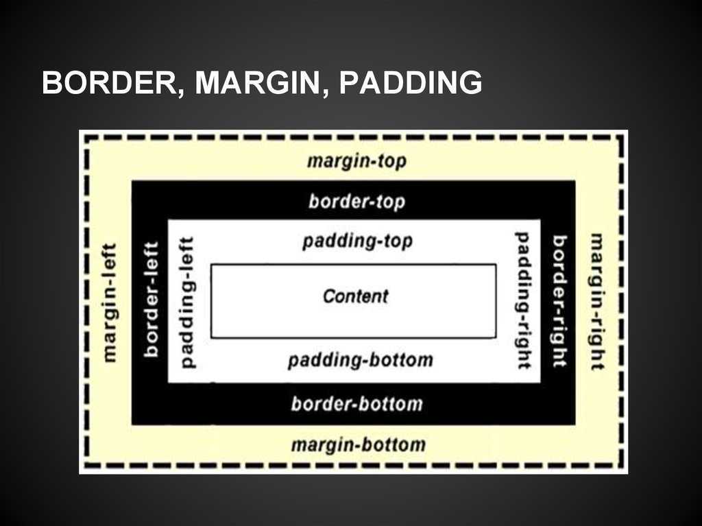
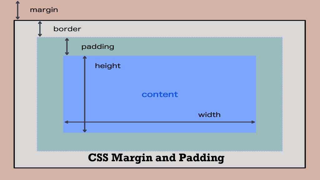
Элемент в html — это прямоугольник, для которого можно указать величины внутренних и внешних отступов, а также границу, которая разделяет их.
Отступы в CSS устанавливаются, например, для блочных элементов и таблиц. Рассмотрим основные свойства CSS для установки отступов:
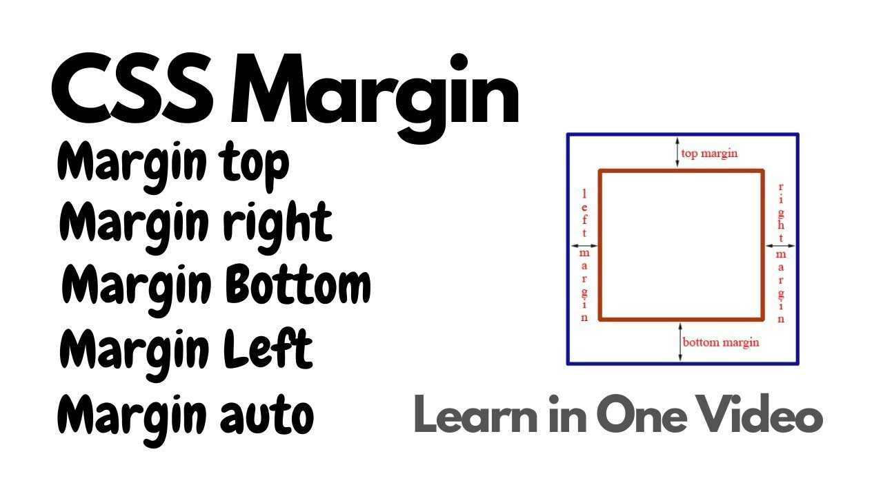
Внешние отступы
Внешние отступы в CSS задаются при помощи свойства , которое устанавливает величину отступа от границ текущего элемента до внутренней границы его родительского элемента.Свойство:
- (нижний отступ)
- (отступ слева)
- (отступ справа)
- (верхний отступ)
Значения:
- величина: или
Краткая запись:
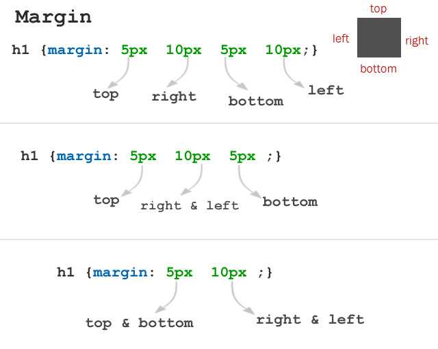
marginmargin-top margin-right margin-bottom margin-left; margin10px 20px 20px 30px; |
Пример:
... <style type="text/css"> |
p{
	border5px solid red; /* красная рамка */
	margin20px;
}
div{
	border5px solid green; /* зеленая рамка */
}
|
<style><head> <body> <div> Агния Барто - стихи <p> Я на уроке в первый раз.<br> Теперь я ученица.<br> Вошла учительница в класс,-<br> Вставать или садиться?<br> <p> ... |
Результат:
Агния Барто — стихи
Я на уроке в первый раз.
Теперь я ученица.
Вошла учительница в класс,-
Вставать или садиться?
Внутренние отступы
Внутренние отступы в css создаются при помощи свойства , которое устанавливает значение полей от внутреннего края рамки элемента до воображаемого прямоугольника, ограничивающего его содержимое.
Свойства:
- (нижний отступ)
- (отступ слева)
- (отступ справа)
- (верхний отступ)
Значения:
- величина: или
Краткая запись:
paddingpadding-top padding-right padding-bottom padding-left; padding10px 20px 20px 30px; |
Пример:
... <style type="text/css"> |
p{
	border5px solid red; /* красная рамка */
	padding20px; /* внутренний отступ */
}
|
<style><head> <body> <p> Я на уроке в первый раз.<br> Теперь я ученица.<br> Вошла учительница в класс,-<br> Вставать или садиться?<br> <p> ... |
Результат:
Я на уроке в первый раз.
Теперь я ученица.
Вошла учительница в класс,-
Вставать или садиться?
Некоторые приемы с границей
Рамка вокруг изображения
Пример:
img{
	padding20px; /* Поля вокруг изображения */
	margin-right10px; /* отступ справа */
	margin-bottom10px; /* отступ снизу */
	outline1px solid #666; /* параметры границы */
	background#f0f0f0; /* цвет фона */
}
|
Результат:
Двойная рамка с использованием CSS
Пример:
p{
	border5px solid red;
	outline6px solid orange;
}
|
Результат:
Путь осилит идущий,
И поэтому я иду.
Через горы и пущи,
Через радость мою и беду.
Эффектные рамки для изображений
Пример:
...
.photo {
	width	 150px;
	padding	 10px 10px 20px 10px;
	border	 1px solid #BFBFBF;
	background-color	 white;
	-webkit-box-shadow	 2px 2px 3px rgba(135, 139, 144, 0.4);
	-moz-box-shadow	 2px 2px 3px rgba(135, 139, 144, 0.4);
	box-shadow		 2px 2px 3px rgba(135, 139, 144, 0.4);
}
|
<style><head> <body> <div class="photo"> <img src="2.JPG" width="150" alt=""> <p>Не ешь меня!!!<p> <div> ... |
Результат:
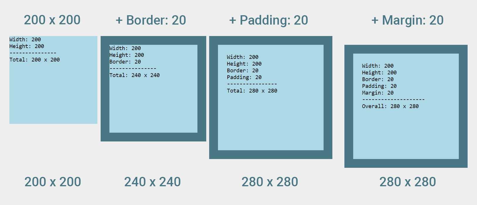
CSS Padding vs. Margins vs. Borders: Differences
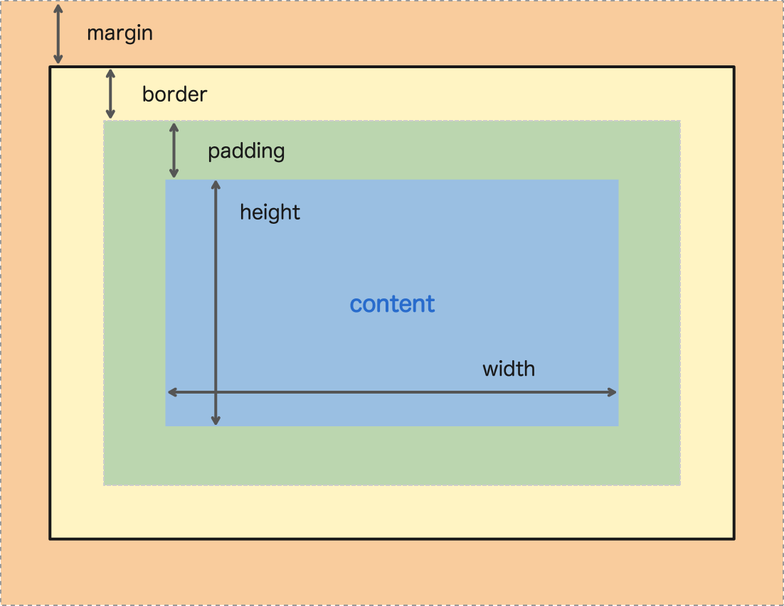
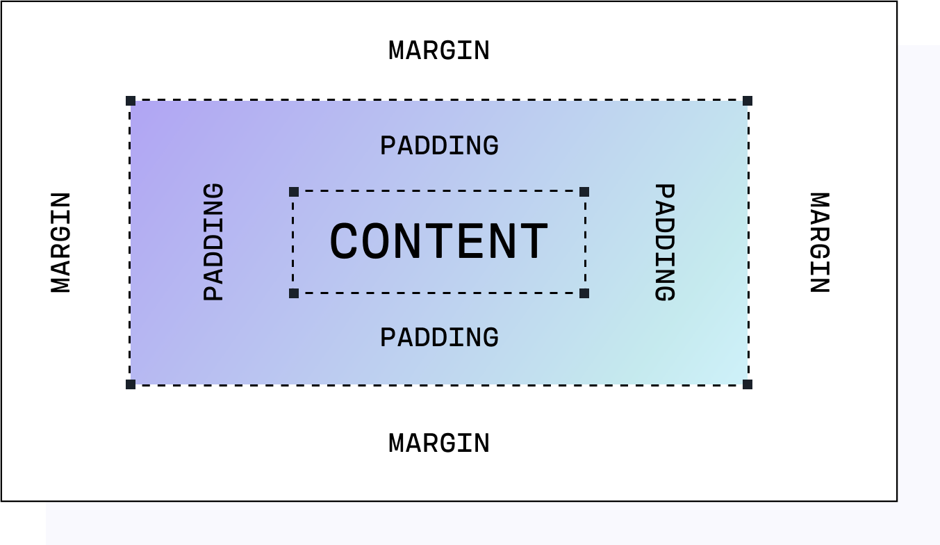
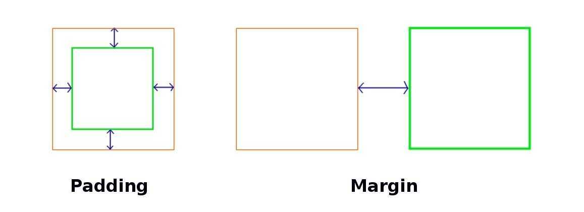
The main difference between CSS padding and margin is that padding is the space between the element’s content and border (within the element itself), while margin is the space around the border of an element.
Padding is a CSS property that works only on elements that have borders. It creates the space between the border and the content of an element. So, keep in mind that padding has no effect on elements that don’t have borders.
Margins form the space outside the borders of elements. Unlike padding, margins can still affect an element whether or not it has borders.
Another difference is that the background color of padding and borders can be customized, while margins are transparent – with them, the website’s theme background color will show.
Внешние границы (outline)
Внешние границы в CSS создаются при помощи свойства , одновременно устанавливающее цвет, стиль и толщину внешней границы на всех четырех сторонах элемента. В отличие от линии, задаваемой через , свойство не влияет на положение блока и его ширину.
Значения:
- (цвет)
- (в системе rgb)
- (в шестнадцатеричной системе)
- (инвертированный, противоположный)
Значения:
- (тонкая)
- (средняя)
- (толстая)
- значение
outline-style (стиль границы)
Значения:
- (без границы)
- (из точек)
- (пунктирная)
- (сплошная)
- (двойная)
- (трехмерная)
- (трехмерная)
- (трехмерная с тенью)
- (трехмерная с тенью)
Краткая запись:
outlineoutline-color outline-style outline-width; outline #0f0 solid thick; |
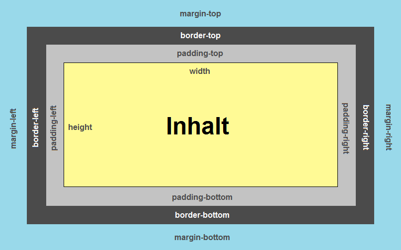
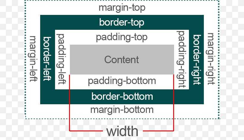
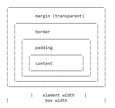
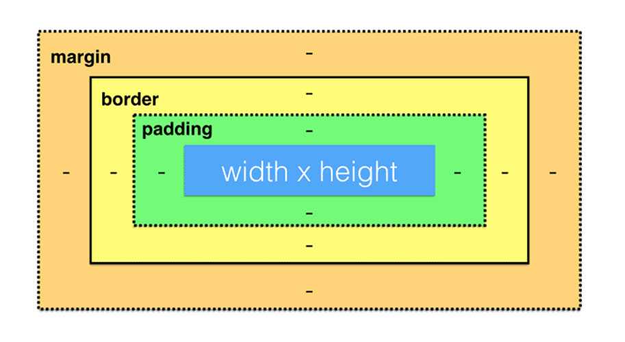
8.1 Box dimensions
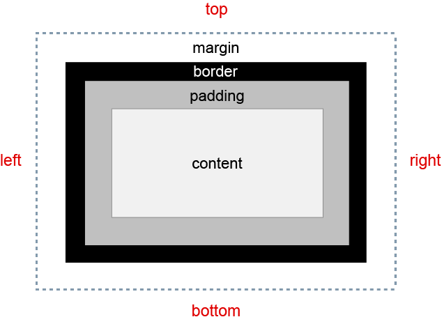
Each box has a
content area (e.g.,
text, an image, etc.) and optional surrounding
padding,
border, and
margin areas; the size
of each area is specified by properties defined below. The following
diagram shows how these areas relate and the terminology used to refer
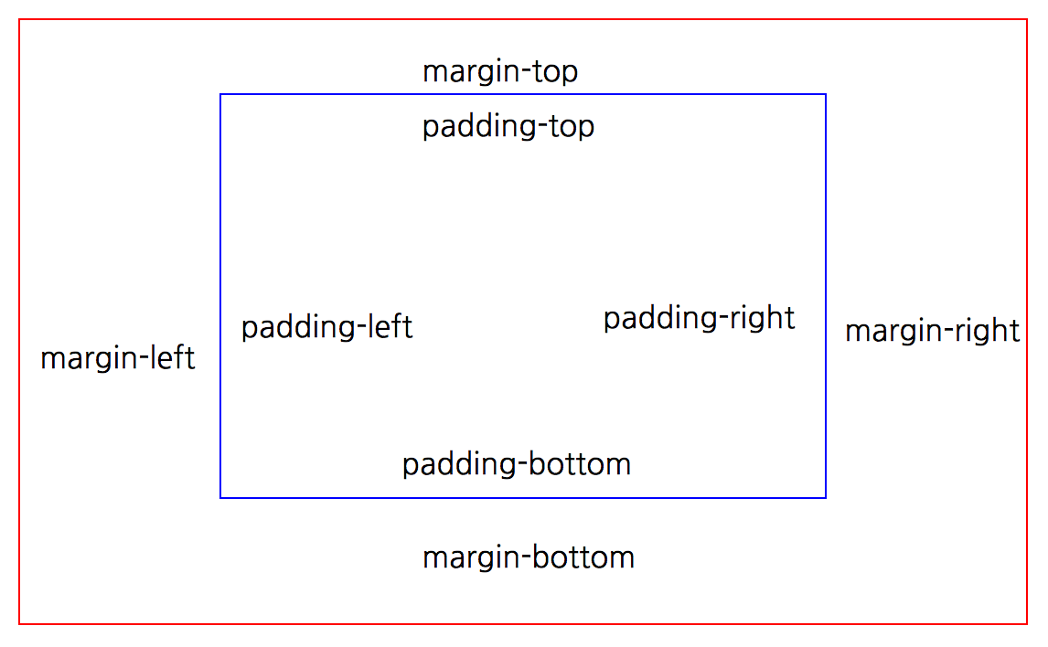
to pieces of margin, border, and padding:

The margin, border, and padding can be broken down into top, right,
bottom, and left segments (e.g., in the diagram, «LM» for left margin,
«RP» for right padding, «TB» for top border, etc.).
The perimeter of each of the four areas (content, padding, border,
and margin) is called an «edge», so each box has four edges:
-
content edge
or inner edge - The content edge surrounds the rectangle given by the and
of the box, which often depend on the element’s .
The four content edges define the
box’s content box. - padding edge
- The padding edge surrounds the box padding. If the padding
has 0 width, the padding edge is the same as the content edge.
The four padding edges define the
box’s padding box. - border edge
- The border edge surrounds the box’s border. If the border
has 0 width, the border edge is the same as the padding edge.
The four border edges define the box’s border
box. -
margin edge
or outer
edge - The margin edge surrounds the box margin. If the margin
has 0 width, the margin edge is the same as the border edge.
The four margin edges define the box’s margin
box.
Each edge may be broken down into a top, right, bottom, and left
edge.
The dimensions of the content area of a box — the content width and content height —
depend on several factors: whether the element generating
the box has the
or property
set, whether the box contains text or other boxes, whether the
box is a table, etc. Box widths and heights are discussed
in the chapter on visual formatting
model details.
The background style of the content, padding, and border areas of a
box is specified by the property of the
generating element. Margin backgrounds are always transparent.
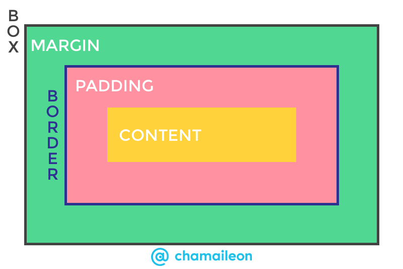
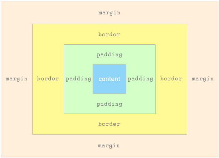
The CSS Box Model
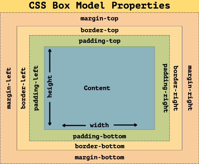
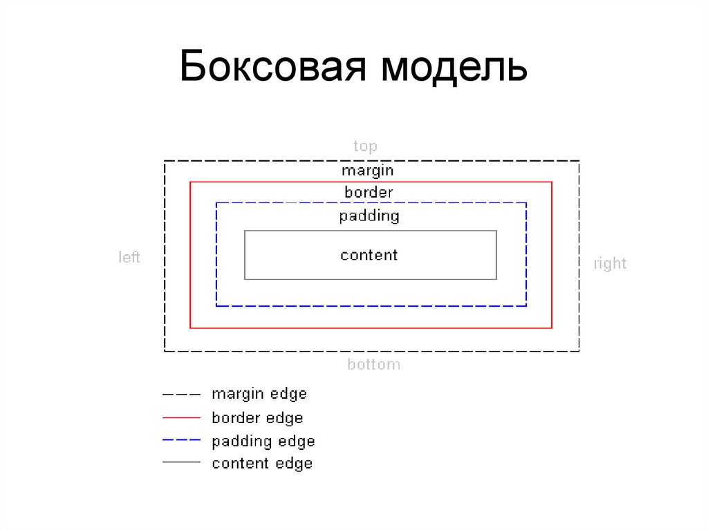
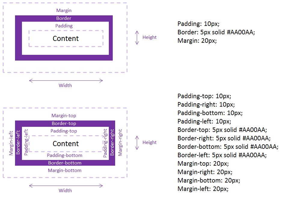
As with all articles about parts of the CSS Box Model, we should define what we mean by that, and how the model has been clarified through versions of CSS. The Box Model refers to how the various parts of a box — the content, padding, border, and margin — are laid out and interact with each other. In CSS1, shown in the image below.
The four margin properties for each side of the box and the shorthand were all defined in CSS1.
The CSS2.1 specification has an illustration to demonstrate the Box Model and also defines terms we still use to describe the various boxes. The specification describes the , , , and , each being defined by the edges of the content, padding, border, and margin respectively.
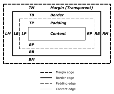
There is now a Level 3 Box Model specification as a Working Draft. This specification refers back to CSS2 for the definitions of the Box Model and , therefore it is the CSS2 definition we will be using for the majority of this article.
Percentage Margins
When you use a percentage in CSS, it has to be a percentage of something. Margins (and padding) set using percentages will always be a percentage of the inline size (width in a horizontal writing mode) of the parent. This means that you will have equal-sized padding all the way around the element when using percentages.
In the CodePen example below, I have a wrapper which is 200 pixels wide, inside is a box which has a 10% margin, the margin is 20 pixels on all sides, that being 10% of 200.
See the Pen (https://codepen.io/rachelandrew/pen/orqzrP) by Rachel Andrew.
See the Pen Margins: percentage margins by Rachel Andrew.
8.2 Example of margins, padding, and borders
This example illustrates how margins, padding, and borders
interact. The example HTML document:
<!DOCTYPE HTML PUBLIC "-//W3C//DTD HTML 4.01//EN">
<HTML>
  <HEAD>
    <TITLE>Examples of margins, padding, and borders</TITLE>
    <STYLE type="text/css">
      UL {
        background: yellow;
        margin: 12px 12px 12px 12px;
        padding: 3px 3px 3px 3px;
                                     /* No borders set */
      }
      LI {
        color: white;                /* text color is white */
        background: blue;            /* Content, padding will be blue */
        margin: 12px 12px 12px 12px;
        padding: 12px 0px 12px 12px; /* Note 0px padding right */
        list-style: none             /* no glyphs before a list item */
                                     /* No borders set */
      }
      LI.withborder {
        border-style: dashed;
        border-width: medium;        /* sets border width on all sides */
        border-color: lime;
      }
    </STYLE>
  </HEAD>
  <BODY>
    <UL>
      <LI>First element of list
      <LI class="withborder">Second element of list is
           a bit longer to illustrate wrapping.
    </UL>
  </BODY>
</HTML>
results in a with
(among other relationships) a UL element that has two LI
children.
The first of the following diagrams illustrates what this example
would produce. The second illustrates the relationship between the
margins, padding, and borders of the UL elements and those of its
children LI elements. (Image is not to scale.)
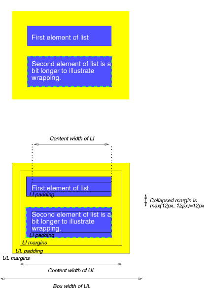
Note that:
-
The for each LI box is
calculated top-down; the for each LI box is established by the UL element. -
The margin box height of each LI box depends on its , plus top and bottom
padding, borders, and margins. Note that vertical margins between the
LI boxes -
The right padding of the LI boxes has been set to zero width
(the property). The
effect is apparent in the second illustration. -
-
The margins of the LI boxes are transparent — margins are always
transparent — so the background color (yellow) of the UL padding and
content areas shines through them. - The second LI element specifies a dashed border (the
property).

Padding
Padding is space added between the content and the border of its own box. You can declare it using the property, and giving it a length.
Here’s an example:
- HTML
- CSS
-
<div class=»no-padding»>I have no padding</div>
<br>
<div class=»some-padding»>I have some padding</div> -
div {
background-color: lightblue;
}.no-padding {
padding: 0;
}.some-padding {
padding: 2rem;
}
Example of padding.
As the image shows, the element that got some padding appears larger than the element that got zero padding. The blue background helps to illustrate where the element’s borders are.
You can also set padding on each side individually, by using , , , or .
Центрирование и auto
Каждое из свойств также может принимать значение . Значение в основном указывает браузеру определить поле за вас. В большинстве случаев значение auto будет эквивалентно значению 0 (которое является значением по умолчанию для каждого отступа). Тем не менее удобен для горизонтального центрирования:
Ниже показан пример такого центрирования.
See the Pen
margin auto by Андрей (@adlibi)
on CodePen.
В этом примере для центрирования блока по горизонтали в пределах доступного пространства выполняются две вещи:
- элементу задается ширина;
- Левое и правое поля устанавливаются в .
Без указанной ширины значения не имело бы никакого эффекта.
Также следует отметить, что полезен только для горизонтального центрирования, а его использование для верхнего и нижнего полей не центрирует элемент по вертикали, что может сбить с толку новичков.
CSS Свойства
align-contentalign-itemsalign-selfallanimationanimation-delayanimation-directionanimation-durationanimation-fill-modeanimation-iteration-countanimation-nameanimation-play-stateanimation-timing-functionbackface-visibilitybackgroundbackground-attachmentbackground-blend-modebackground-clipbackground-colorbackground-imagebackground-originbackground-positionbackground-repeatbackground-sizeborderborder-bottomborder-bottom-colorborder-bottom-left-radiusborder-bottom-right-radiusborder-bottom-styleborder-bottom-widthborder-collapseborder-colorborder-imageborder-image-outsetborder-image-repeatborder-image-sliceborder-image-sourceborder-image-widthborder-leftborder-left-colorborder-left-styleborder-left-widthborder-radiusborder-rightborder-right-colorborder-right-styleborder-right-widthborder-spacingborder-styleborder-topborder-top-colorborder-top-left-radiusborder-top-right-radiusborder-top-styleborder-top-widthborder-widthbottombox-decoration-breakbox-shadowbox-sizingcaption-sidecaret-color@charsetclearclipcolorcolumn-countcolumn-fillcolumn-gapcolumn-rulecolumn-rule-colorcolumn-rule-stylecolumn-rule-widthcolumn-spancolumn-widthcolumnscontentcounter-incrementcounter-resetcursordirectiondisplayempty-cellsfilterflexflex-basisflex-directionflex-flowflex-growflex-shrinkflex-wrapfloatfont@font-facefont-familyfont-kerningfont-sizefont-size-adjustfont-stretchfont-stylefont-variantfont-weightgridgrid-areagrid-auto-columnsgrid-auto-flowgrid-auto-rowsgrid-columngrid-column-endgrid-column-gapgrid-column-startgrid-gapgrid-rowgrid-row-endgrid-row-gapgrid-row-startgrid-templategrid-template-areasgrid-template-columnsgrid-template-rowshanging-punctuationheighthyphens@importisolationjustify-content@keyframesleftletter-spacingline-heightlist-stylelist-style-imagelist-style-positionlist-style-typemarginmargin-bottommargin-leftmargin-rightmargin-topmax-heightmax-width@mediamin-heightmin-widthmix-blend-modeobject-fitobject-positionopacityorderoutlineoutline-coloroutline-offsetoutline-styleoutline-widthoverflowoverflow-xoverflow-ypaddingpadding-bottompadding-leftpadding-rightpadding-toppage-break-afterpage-break-beforepage-break-insideperspectiveperspective-originpointer-eventspositionquotesresizerighttab-sizetable-layouttext-aligntext-align-lasttext-decorationtext-decoration-colortext-decoration-linetext-decoration-styletext-indenttext-justifytext-overflowtext-shadowtext-transformtoptransformtransform-origintransform-styletransitiontransition-delaytransition-durationtransition-propertytransition-timing-functionunicode-bidiuser-selectvertical-alignvisibilitywhite-spacewidthword-breakword-spacingword-wrapwriting-modez-index