

Примеры с различными границами рамок CSS border
2.1. Пример. Разные стили оформления границы рамки border-style
Вот как это выглядит на странице:
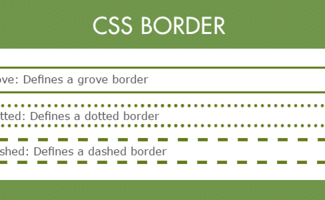
border-style: dotted
border-style: dashed
border-style: solid
border-style: double
border-style: groove
border-style: ridge
border-style: inset
border-style: outset
Четыре разных рамки
2.2. Пример. Изменения цвета рамки при наведении курсора мыши
Этот пример очень простой, но интересный. Он показывает, как можно использовать псевдокласс :hover и рамку CSS border для создания простых эффектов (например, для меню).
Вот как это выглядит на странице:
При наведении курсора мыши на блок цвет рамки изменится
2.3. Пример. Как сделать прозрачную рамку border
Рамку можно сделать прозрачной. Этот эффект редко, но иногда может быть очень полезен для веб-дизайнеров. Для задания прозрачности надо воспользоваться заданием цвета в виде RGBA (R, G, B, P), где последним параметром задается прозрачность (вещественное число от 0.0 до 1.0)
Вот как это выглядит на странице:
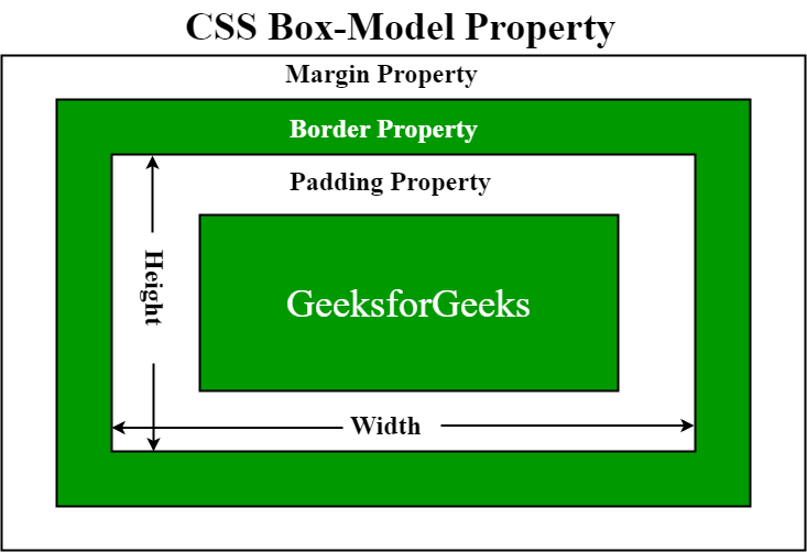
8.1 Box dimensions
Each box has a
content area (e.g.,
text, an image, etc.) and optional surrounding
padding,
border, and
margin areas; the size
of each area is specified by properties defined below. The following
diagram shows how these areas relate and the terminology used to refer
to pieces of margin, border, and padding:
The margin, border, and padding can be broken down into top, right,
bottom, and left segments (e.g., in the diagram, «LM» for left margin,
«RP» for right padding, «TB» for top border, etc.).
The perimeter of each of the four areas (content, padding, border,
and margin) is called an «edge», so each box has four edges:
-
content edge
or inner edge - The content edge surrounds the rectangle given by the and
of the box, which often depend on the element’s .
The four content edges define the
box’s content box. - padding edge
- The padding edge surrounds the box padding. If the padding
has 0 width, the padding edge is the same as the content edge.
The four padding edges define the
box’s padding box. - border edge
- The border edge surrounds the box’s border. If the border
has 0 width, the border edge is the same as the padding edge.
The four border edges define the box’s border
box. -
margin edge
or outer
edge - The margin edge surrounds the box margin. If the margin
has 0 width, the margin edge is the same as the border edge.
The four margin edges define the box’s margin
box.
Each edge may be broken down into a top, right, bottom, and left
edge.
The dimensions of the content area of a box — the content width and content height —
depend on several factors: whether the element generating
the box has the
or property
set, whether the box contains text or other boxes, whether the
box is a table, etc. Box widths and heights are discussed
in the chapter on visual formatting
model details.
The background style of the content, padding, and border areas of a
box is specified by the property of the
generating element. Margin backgrounds are always transparent.
CSS Справочники
CSS СправочникCSS ПоддержкаCSS СелекторыCSS ФункцииCSS ЗвукCSS Веб шрифтыCSS АнимацииCSS ДлиныCSS Конвертер px-emCSS Названия цветаCSS Значения цветаCSS по умолчаниюCSS Символы
CSS Свойства
align-content
align-items
align-self
all
animation
animation-delay
animation-direction
animation-duration
animation-fill-mode
animation-iteration-count
animation-name
animation-play-state
animation-timing-function
backface-visibility
background
background-attachment
background-blend-mode
background-clip
background-color
background-image
background-origin
background-position
background-repeat
background-size
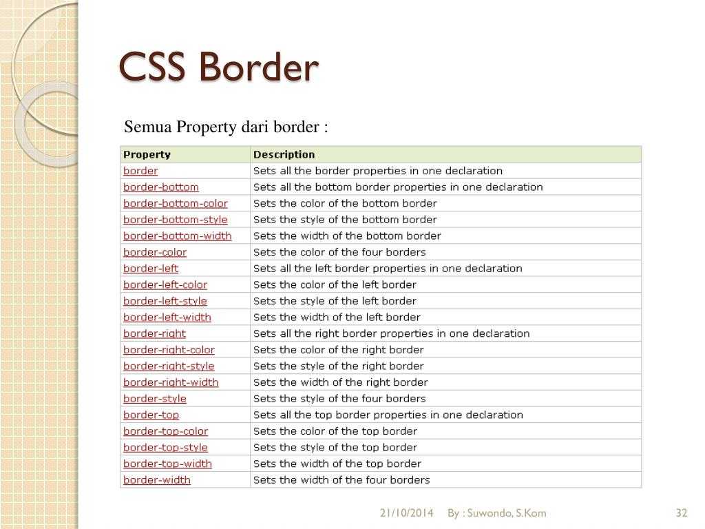
border
border-bottom
border-bottom-color
border-bottom-left-radius
border-bottom-right-radius
border-bottom-style
border-bottom-width
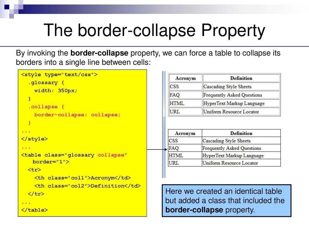
border-collapse
border-color
border-image
border-image-outset
border-image-repeat
border-image-slice
border-image-source
border-image-width
border-left
border-left-color
border-left-style
border-left-width
border-radius
border-right
border-right-color
border-right-style
border-right-width
border-spacing
border-style
border-top
border-top-color
border-top-left-radius
border-top-right-radius
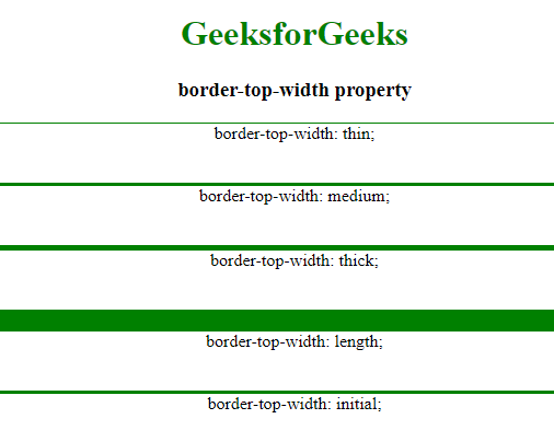
border-top-style
border-top-width
border-width
bottom
box-decoration-break
box-shadow
box-sizing
caption-side
caret-color
@charset
clear
clip
color
column-count
column-fill
column-gap
column-rule
column-rule-color
column-rule-style
column-rule-width
column-span
column-width
columns
content
counter-increment
counter-reset
cursor
direction
display
empty-cells
filter
flex
flex-basis
flex-direction
flex-flow
flex-grow
flex-shrink
flex-wrap
float
font
@font-face
font-family
font-kerning
font-size
font-size-adjust
font-stretch
font-style
font-variant
font-weight
grid
grid-area
grid-auto-columns
grid-auto-flow
grid-auto-rows
grid-column
grid-column-end
grid-column-gap
grid-column-start
grid-gap
grid-row
grid-row-end
grid-row-gap
grid-row-start
grid-template
grid-template-areas
grid-template-columns
grid-template-rows
hanging-punctuation
height
hyphens
@import
isolation
justify-content
@keyframes
left
letter-spacing
line-height
list-style
list-style-image
list-style-position
list-style-type
margin
margin-bottom
margin-left
margin-right
margin-top
max-height
max-width
@media
min-height
min-width
mix-blend-mode
object-fit
object-position
opacity
order
outline
outline-color
outline-offset
outline-style
outline-width
overflow
overflow-x
overflow-y
padding
padding-bottom
padding-left
padding-right
padding-top
page-break-after
page-break-before
page-break-inside
perspective
perspective-origin
pointer-events
position
quotes
resize
right
tab-size
table-layout
text-align
text-align-last
text-decoration
text-decoration-color
text-decoration-line
text-decoration-style
text-indent
text-justify
text-overflow
text-shadow
text-transform
top
transform
transform-origin
transform-style
transition
transition-delay
transition-duration
transition-property
transition-timing-function
unicode-bidi
user-select
vertical-align
visibility
white-space
width
word-break
word-spacing
word-wrap
writing-mode
z-index
Syntax
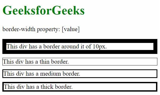
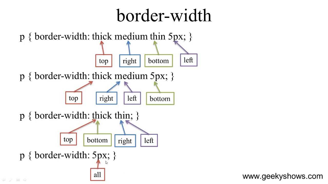
The CSS border-width property can be expressed with one, two, three or four values provided.
Syntax — One Value
The syntax for the CSS border-width property (with 1 value) is:
When one single value is provided, the border-width value will apply to all four sides of the box (ie: top, right, bottom, left).
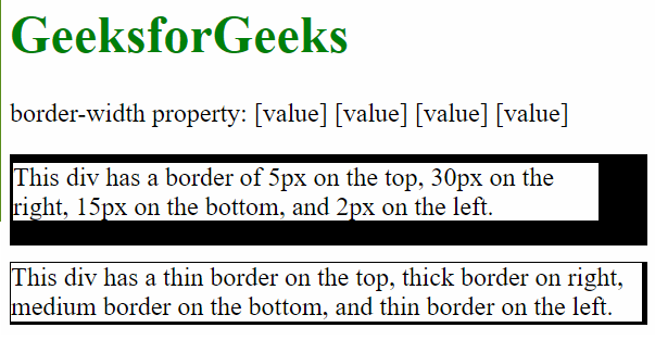
Syntax — Two Values
The syntax for the CSS border-width property (with 2 values) is:
When two values are provided, the first value will apply to the top and bottom of the box. The second value will apply to the left and right sides of the box.
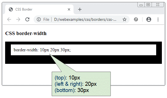
Syntax — Three Values
The syntax for the CSS border-width property (with 3 values) is:
When three values are provided, the first value will apply to the top of the box. The second value will apply to the right and left sides of the box. The third value will apply to the bottom of the box.
Syntax — Four Values
The syntax for the CSS border-width property (with 4 values) is:
When four values are provided, the first value will apply to the top of the box. The second value will apply to the right side of the box. The third value will apply to the bottom of the box. The fourth value will apply to the left side of the box.
The top, right, bottom, and left padding values can be one of the following:
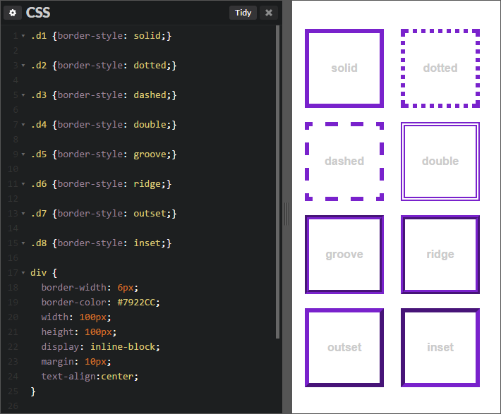
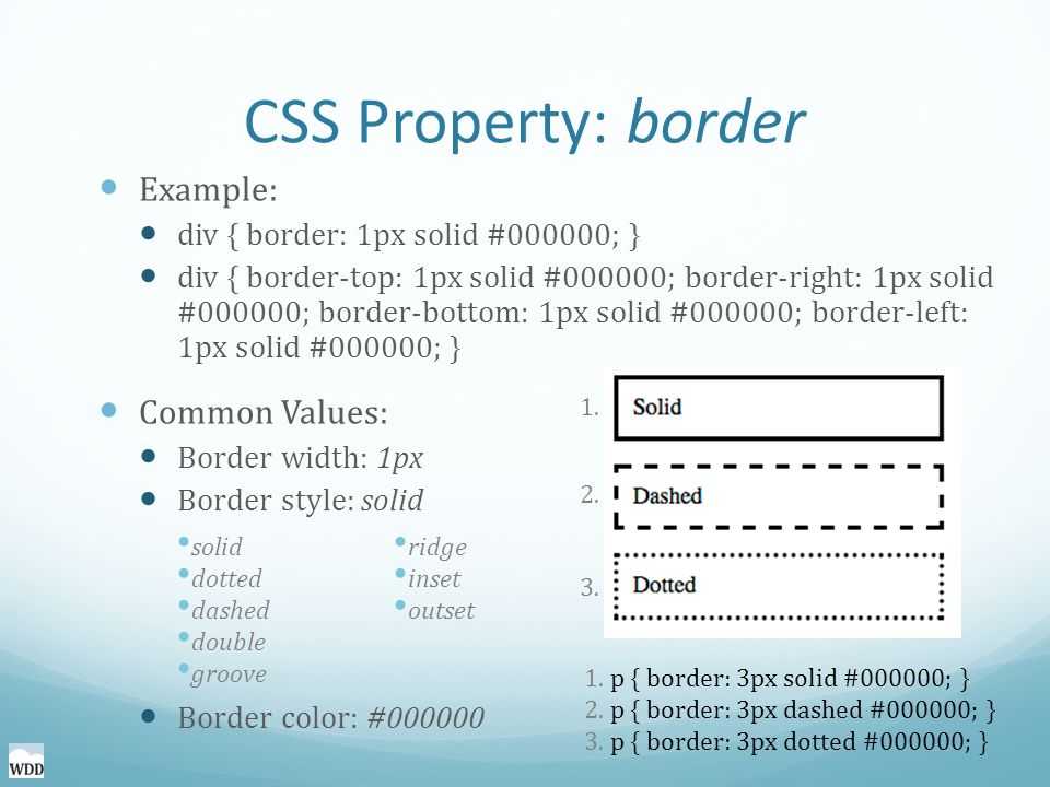
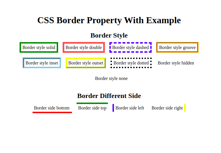
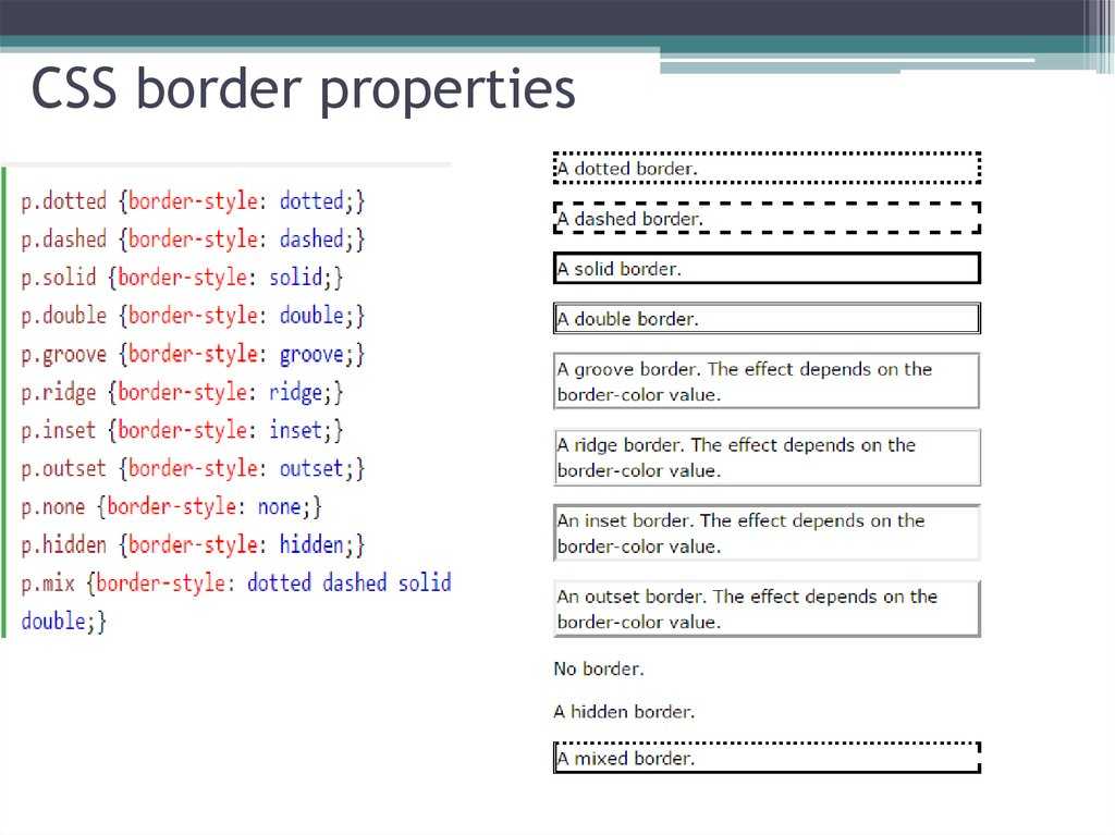
CSS Border Style
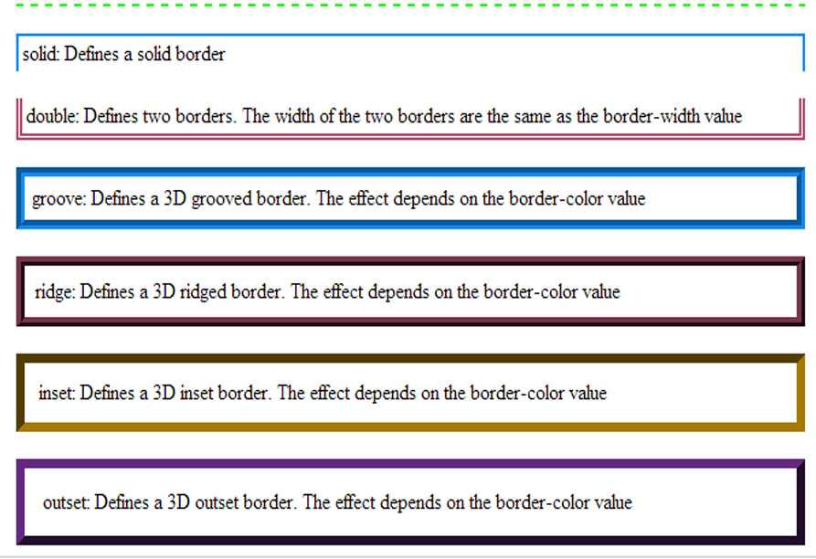
The border-style property specifies what kind of border to display. Following values can be passed to border-style:
| Value | Description |
|---|---|
| none | No border |
| hidden | A hidden border, same as ‘none’ except for table elements |
| dotted | A series of dots |
| dashes | A series of short dashes |
| solid | A single solid line |
| double | Two parallel lines with a small gap between them |
| groove | A border that appears to be carved into the page |
| ridge | A border that appears to be slightly raised above the page |
| inset | A border that appears embedded into the page |
| outset | A border that appears slightly raised out of the page |
The border-style property can have upto four values in one statement where we can specify the border style for top, right, bottom and left border.
Example
The following example to show border-style properly with different values −
<html>
<body>
   <p style="border-style: none;">No border.</p>
   <p style="border-style: hidden;">Hidden border.</p>
   <p style="border-style: dotted;">Dotted border.</p>
   <p style="border-style: dashed;">Dashed border.</p>
   <p style="border-style: solid;">Solid border.</p>
   <p style="border-style: double;">Double border.</p>
   <p style="border-style: groove;">Groove border.</p>
   <p style="border-style: ridge;">Ridge border.</p>
   <p style="border-style: inset;">Inset border.</p>
   <p style="border-style: outset;">Outset border.</p>
   <p style="border-style: none dashed solid dotted;">A mixed border.</p>
</body>
<html>
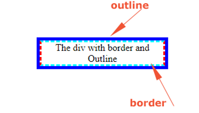
What is the difference between CSS outline and Border?
https://www.jquery-az.com/css-outline/
Regarding styling HTML elements, borders, and outlines are two of the most commonly used properties. While they may seem similar at first glance, they have several key differences. The most apparent difference between borders and outlines is their visual appearance. Borders are displayed around the outside of an element, while outlines are displayed around the border of an element. In other words, borders are inside the padding box of an element, whereas outlines are outside of the border box.
Another key difference between borders and outlines is their behavior regarding sizing. Borders are included in an element’s size calculations, while outlines are not. This means that if you add a border to an element, it will increase the width and height of that element accordingly. However, adding an outline to an element will not affect the element’s size. Regarding styling options, borders offer more flexibility than outlines. Borders can be customized in terms of color, width, style, and even their radius. On the other hand, outlines are typically limited to a few basic options like color and style. Watch this ten minute video as a recap!
One important thing to keep in mind is that while borders and outlines are similar in some ways, they cannot be used interchangeably. If you need to create a visual border around an element that affects its size, you should use the property. If you need to create a non-visual outline around an element that does not affect its size, you should use the property.
border property
Here’s an example of how to use the property:
<style>
  .box {
    border: 2px solid #000;
    padding: 10px;
    width: 200px;
    height: 100px;
  }
</style>

<div class="box">This is a box with a border.</div>
outline property
And here’s an example of how to use the property:
<style>
  .box {
    outline: 2px solid #000;
    padding: 10px;
    width: 200px;
    height: 100px;
  }
</style>

<div class="box">This is a box with an outline.</div>
As you can see, the visual difference between the two properties is subtle but important. The border is inside the padding box of the element and affects its size, while the outline is outside of the border box and does not affect its size. Here’s a table comparing the two:
| Property | Description | Affects Element Size | Customization Options |
| Adds a visual border around an element | Yes | Color, width, style, radius, etc. | |
| Adds a non-visual outline around an element | No | Color, width, style, etc. |
As you can see, the property affects an element’s size, while the property does not. Additionally, borders offer more customization options than outlines.
How do CSS borders work?
CSS borders work by creating a visible edge around an HTML element. The border is added to the element’s box model, which includes the content, padding, and margin. You can use the border CSS property to customize borders with different thicknesses, styles, and colors. Here’s how to use CSS border in 2 minutes:
The border CSS property has three components: border-width, border-style, and border-color. Border-width controls the border’s thickness, border-style controls the style of the border, and border-color controls the border’s color. Combine these components to create a wide variety of border styles.
Borders apply to any HTML element, including images, text, and containers. People often use borders to create visual separations between elements, highlight specific content, or create visual interest. For example, you might use a thick, red border to draw attention to a warning message or a dotted border to create a decorative effect around an image.
CSS borders are a simple yet effective way to enhance the visual design of a website and create a more engaging user experience. But how do we use it?
8.2 Example of margins, padding, and borders
This example illustrates how margins, padding, and borders
interact. The example HTML document:
<!DOCTYPE HTML PUBLIC "-//W3C//DTD HTML 4.01//EN">
<HTML>
  <HEAD>
    <TITLE>Examples of margins, padding, and borders</TITLE>
    <STYLE type="text/css">
      UL {
        background: yellow;
        margin: 12px 12px 12px 12px;
        padding: 3px 3px 3px 3px;
                                     /* No borders set */
      }
      LI {
        color: white;                /* text color is white */
        background: blue;            /* Content, padding will be blue */
        margin: 12px 12px 12px 12px;
        padding: 12px 0px 12px 12px; /* Note 0px padding right */
        list-style: none             /* no glyphs before a list item */
                                     /* No borders set */
      }
      LI.withborder {
        border-style: dashed;
        border-width: medium;        /* sets border width on all sides */
        border-color: lime;
      }
    </STYLE>
  </HEAD>
  <BODY>
    <UL>
      <LI>First element of list
      <LI class="withborder">Second element of list is
           a bit longer to illustrate wrapping.
    </UL>
  </BODY>
</HTML>
results in a with
(among other relationships) a UL element that has two LI
children.
The first of the following diagrams illustrates what this example
would produce. The second illustrates the relationship between the
margins, padding, and borders of the UL elements and those of its
children LI elements. (Image is not to scale.)
Note that:
-
The for each LI box is
calculated top-down; the for each LI box is established by the UL element. -
The margin box height of each LI box depends on its , plus top and bottom
padding, borders, and margins. Note that vertical margins between the
LI boxes -
The right padding of the LI boxes has been set to zero width
(the property). The
effect is apparent in the second illustration. -
The margins of the LI boxes are transparent — margins are always
transparent — so the background color (yellow) of the UL padding and
content areas shines through them. - The second LI element specifies a dashed border (the
property).
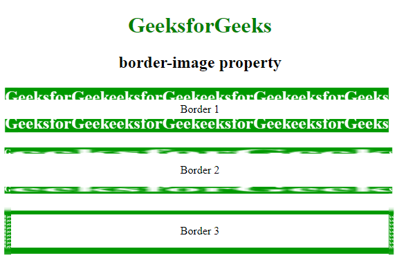
Border images #
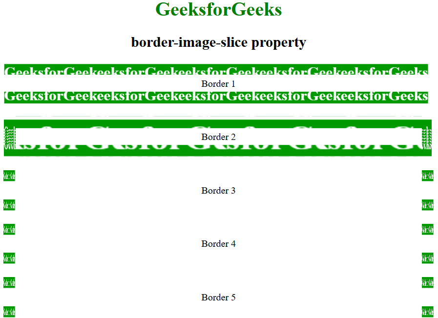
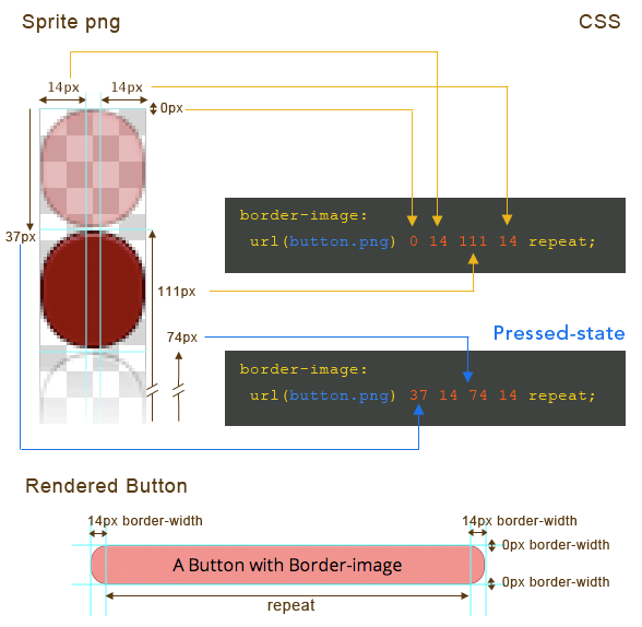
You don’t just have to use a stroke-based border in CSS. You can also use any type of image, using . This shorthand property allows you to set the source image, how that image is sliced, the image width, how far the border is outset from the edge and how it should repeat.
The property is like : it is how you set the width of your border image. The property lets you set the distance between your border image and the box that it wraps around.
The (source of the border image) can be a for any valid image, which includes CSS gradients.
The property is a useful property that allows you to slice an image into 9 parts, made up of 4 split lines. It works like the shorthand where you define the top, right, bottom and left offset value.
With the offset values defined, you now have 9 sections of the image: 4 corners, 4 edges and a middle section. The corners are applied to the corners of the element with the border image. The edges are applied to the edges of that element. The property defines how those edges fill their space and the property controls the size of the slices.
Lastly, the keyword determines whether the middle section, left by the slicing, is used as the element’s background image or not.
is how you instruct CSS how you would like your border image to repeat. It works the same as .
- The initial value is , which stretches the source image to fill available space where possible.
- The value tiles the source image’s edges as many times as possible, and may clip the edge regions to achieve this.
- The value is the same as repeat, but instead of clipping the image edge regions to fit as many as possible, it stretches the image as well as repeating it to achieve a seamless repeat
- The value is again, the same as repeat, but this value adds space between each edge region to create a seamless pattern.
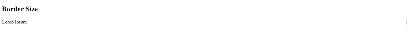
Example # 03: Using the Tailwind CSS Style Sheet to Alter Border Size Using the Border Class
In this example, we will use the Tailwind CSS style sheet to change the size of a border using a border class defined in this style sheet. The border class has several predefined sizes for the border, which we will explore in this example by implementing this in Notepad++.
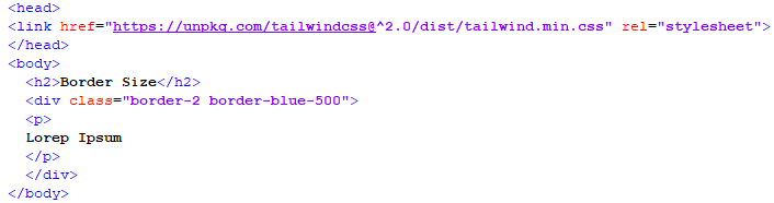
In the above script, we will be adding the link to the Tailwind CSS style sheet using the link tag in the header of the file. Then we will open the body tag and give a heading to it. Then we will open the div tag, which we will call the class of border-2 with border color code, and then the paragraph tag will have the body text of the div container enclosed in it. Now we will save this file and open it on our browser to see how the border turns out.

As we can see that the border size is very thin and can be adjusted to a bigger size, so we will increase the size by calling the border-8 class and see how it changes the border size.
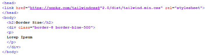

As we can see in the above snippet, the border is now thicker than before because of the border-8 class.
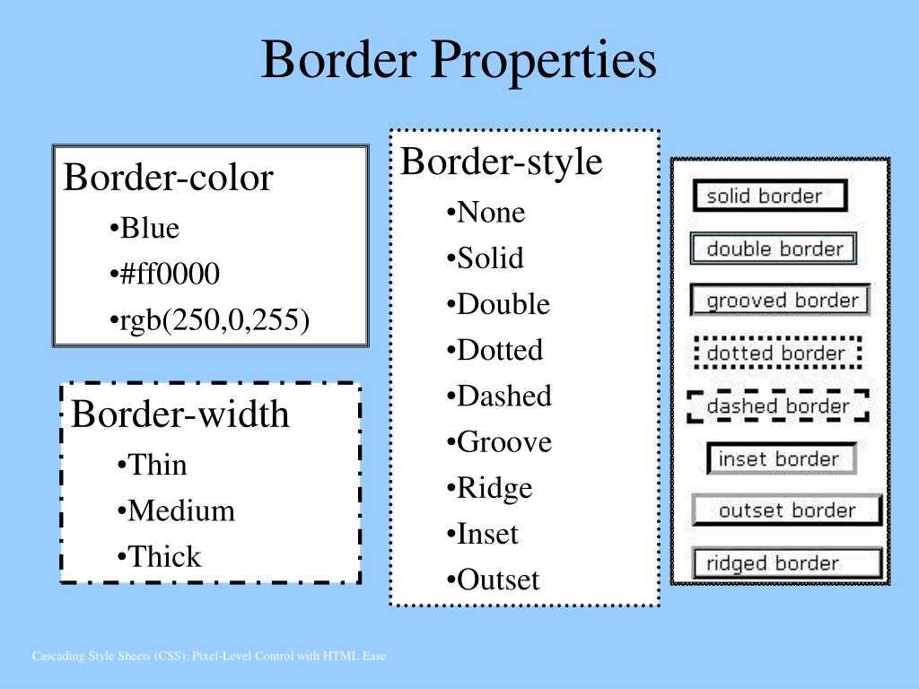
border-color
Цвет рамки можно задавать несколькими способами:
- словом – названием предустановленного цвета на английском языке – red, green, pink и т.д.;
- с помощью шестнадцатеричного числа, например #ff0099;
- с помощью RGB-модели – rgb (интенсивность каждого из цветов выражается числом от 0 до 255 или в процентах; значения разделяются запятыми).
- Посредством RGBA-модели, при которой четвертый параметр цвета – степень его прозрачности.
Цвет по умолчанию – black (черный). Установка значения transparent (border-color: transparent) означает полностью прозрачную рамку.
Примеры записи цвета:
CSS Border Radius
CSS border-radius property is used to create rounded corners on an element’s border.
The border-radius property can have from one to four values.
- If one value is given, it applies to all four corners.
- If two values are given, the first applies to the top-left and bottom-right corners, and the second applies to the top-right and bottom-left corners.
- If three values are given, the first applies to the top-left corner, the second applies to the top-right and bottom-left corners, and the third applies to the bottom-right corner.
- If four values are given, they apply to the top-left, top-right, bottom-right, and bottom-left corners, respectively.
CSS border-radius example
border-radius
border-radius: 5px;border-radius: 10px 20px;border-radius: 20px 10px;border-radius: 5px 10px 20px;border-radius: 5px 10px 15px 20px;
This is an example text.
Example
Try it
Example # 02: Creating a Class in CSS Style Tag to Control the Size of a Border in an HTML File
In this example, we will create a special class of CSS styling in which we will define every aspect of styling that we want throughout the file. This is a very helpful method because we can distinguish different designs in a single HTML file and classify them into different classes. In this example, we will classify the styling of a border of any container. To achieve that, we will write the following script:
As we can see in this script, we have opened a style tag in the header of the HTML file. In this style tag, we have created a class for the paragraph tag styling in which we have defined two properties for the border, which are style and width. The style property is set to solid, which means that the border will be a uniform, straight line, and the width property is set to thin, which means that the border size will be thin. After this, we closed the style and head tag and moved toward the body tag. In the body tag, we have given a heading and a paragraph to the HTML page. In the Paragraph tag, we have called the “p.bw1” class, which has the border properties predefined in it. We will close the tags and save this file so that we can run this on our browser.
After running this script on our browser, we will get the above output. As we can see, the style class for the paragraph tag has added a solid and thin border to the paragraph present in the body.
Now we will vary the size of the border present in the above script and observe the effect of these variations on the border.
In this situation, we have edited the width from thin to medium, and after running this script, we will get the following output:

In this output, the border size has changed from thin to medium and is now much more visible. After this, we will change the size from medium to thick, as shown in the script below:
After running this script, we will get the following output:

After changing the width to thick, we can see that the border is very broader in size and quite easily visible.
A small project: How to Use the CSS border Property to Make the Olympic Rings
We can take what we’ve learned about the property and combine it with CSS Positioning and Flexbox to make the Olympic Rings.
So what’s going on in this code?
The Olympic Rings have 5 circles – 3 at the top and 2 at the bottom – with colors blue, black, red, yellow, and green, respectively.
To make a circle with the border-radius property, we set the width and height to 12.5rem each, then the itself to 50%. This is how you make a circle with CSS.
We placed the top and bottom rings in a parent container, so we’re able to place them one on top of each other with CSS Flexbox. But that didn’t complete the job, so we used the transform property of CSS animation to get it done.
Finally, we made some little tweaks with CSS Positioning to get the rings interlocked.
In the end, we get the result below:
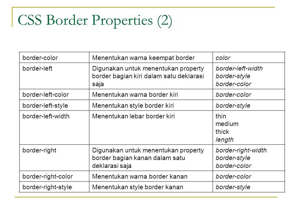
CSS Border Color — Single Side
The property border-color can be set independently for each single-side. The same set of values can be passed to each single-side for border-color:
- border-top-color
- border-right-color
- border-bottom-color
- border-left-color
Example
Let us see an example:
<html>
<head>
<style>
   p {
      border-style: solid;  padding: 2em;
      order-top-color: red; border-right-color: #0000ff;
      border-bottom-color: rgb(100,123,111); border-left-color: rgba(50,123,111,0.4)
   }
</style>
</head>
<body>
   <h2>border-color (single-side)</h2>
   <p>Different border colors on all the sides.</p>
</body>
</html>
Граница элемента (рамка)
Граница элемента в CSS устанавливается при помощи свойства .
border-style (стиль границы)
Значения:
- (без границы)
- (из точек)
- (пунктирная)
- (сплошная)
- (двойная)
- (трехмерная)
- (трехмерная)
- (трехмерная с тенью)
- (трехмерная с тенью)
Пример:
none
dotted
dashed
solid
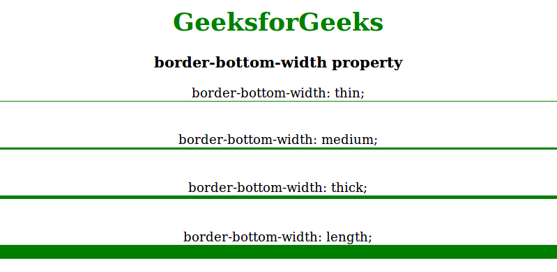
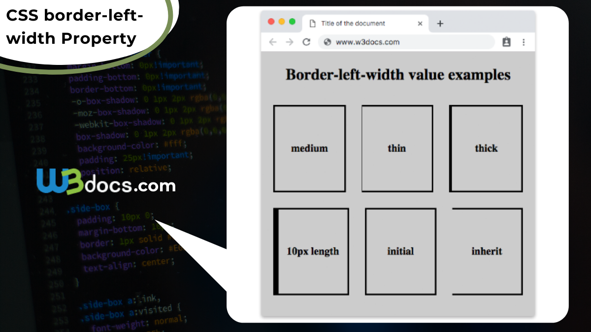
border-width (ширина границы)
Значения:
- (тонкая)
- (средняя)
- (толстая)
- значение
Пример:
<style type="text/css"> |
p.one{
	border-stylesolid;
	border-width5px;
}
p.two{
	border-stylesolid;
	border-widthmedium;
}
|
<style><head> <body> <p class="one"> Я на уроке в первый раз.<br> Теперь я ученица.<br> Вошла учительница в класс,-<br> Вставать или садиться?<br> <p> <p class="two"> Как надо парту открывать,<br> Не знала я сначала,<br> И я не знала, как вставать,<br> Чтоб парта не стучала.<br> <p> |
Результат:
Я на уроке в первый раз.
Теперь я ученица.
Вошла учительница в класс,-
Вставать или садиться?
Как надо парту открывать,
Не знала я сначала,
И я не знала, как вставать,
Чтоб парта не стучала.
border-color (цвет границы)
Значения:
- (цвет)
- (в системе rgb)
- (в шестнадцатиричной системе)
- (прозрачная)
Для каждой стороны границы можно задать свой стиль:
p{
	border-top-stylesolid;
	border-right-styledotted;
	border-bottom-styledashed;
	border-left-stylenone;
	border-top-color#0f0;
	border-right-color#f00;
}
|
Результат:
Я на уроке в первый раз.
Теперь я ученица.
Вошла учительница в класс,-
Вставать или садиться?
Краткая запись:
borderborder-width border-style border-color; border 1px solid #000; |
border width shorthand
We can set the border width of each sides using the following shorthands.
This is a sample paragraph.
The above rule will set:
- border-top-width = 1px
- border-right-width = thin
- border-bottom-width = medium
- border-left-width = thick
This is a sample paragraph.
The above rule will set:
- border-top-width = thin
- border-right-width = medium
- border-bottom-width = thick
- border-left-width = medium
This is a sample paragraph.
The above rule will set:
- border-top-width = thin
- border-right-width = thick
- border-bottom-width = thin
- border-left-width = thick
This is a sample paragraph.
The above rule will set:
- border-top-width = 1px
- border-right-width = 1px
- border-bottom-width = 1px
- border-left-width = 1px