
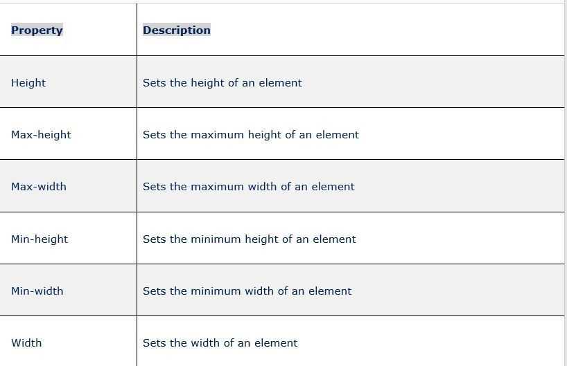
CSS Properties
align-contentalign-itemsalign-selfallanimationanimation-delayanimation-directionanimation-durationanimation-fill-modeanimation-iteration-countanimation-nameanimation-play-stateanimation-timing-functionbackface-visibilitybackgroundbackground-attachmentbackground-blend-modebackground-clipbackground-colorbackground-imagebackground-originbackground-positionbackground-repeatbackground-sizeborderborder-bottomborder-bottom-colorborder-bottom-left-radiusborder-bottom-right-radiusborder-bottom-styleborder-bottom-widthborder-collapseborder-colorborder-imageborder-image-outsetborder-image-repeatborder-image-sliceborder-image-sourceborder-image-widthborder-leftborder-left-colorborder-left-styleborder-left-widthborder-radiusborder-rightborder-right-colorborder-right-styleborder-right-widthborder-spacingborder-styleborder-topborder-top-colorborder-top-left-radiusborder-top-right-radiusborder-top-styleborder-top-widthborder-widthbottombox-decoration-breakbox-shadowbox-sizingcaption-sidecaret-color@charsetclearclipclip-pathcolorcolumn-countcolumn-fillcolumn-gapcolumn-rulecolumn-rule-colorcolumn-rule-stylecolumn-rule-widthcolumn-spancolumn-widthcolumnscontentcounter-incrementcounter-resetcursordirectiondisplayempty-cellsfilterflexflex-basisflex-directionflex-flowflex-growflex-shrinkflex-wrapfloatfont@font-facefont-familyfont-kerningfont-sizefont-size-adjustfont-stretchfont-stylefont-variantfont-weightgridgrid-areagrid-auto-columnsgrid-auto-flowgrid-auto-rowsgrid-columngrid-column-endgrid-column-gapgrid-column-startgrid-gapgrid-rowgrid-row-endgrid-row-gapgrid-row-startgrid-templategrid-template-areasgrid-template-columnsgrid-template-rowshanging-punctuationheighthyphens@importisolationjustify-content@keyframesleftletter-spacingline-heightlist-stylelist-style-imagelist-style-positionlist-style-typemarginmargin-bottommargin-leftmargin-rightmargin-topmax-heightmax-width@mediamin-heightmin-widthmix-blend-modeobject-fitobject-positionopacityorderoutlineoutline-coloroutline-offsetoutline-styleoutline-widthoverflowoverflow-xoverflow-ypaddingpadding-bottompadding-leftpadding-rightpadding-toppage-break-afterpage-break-beforepage-break-insideperspectiveperspective-originpointer-eventspositionquotesresizerightscroll-behaviortab-sizetable-layouttext-aligntext-align-lasttext-decorationtext-decoration-colortext-decoration-linetext-decoration-styletext-indenttext-justifytext-overflowtext-shadowtext-transformtoptransformtransform-origintransform-styletransitiontransition-delaytransition-durationtransition-propertytransition-timing-functionunicode-bidiuser-selectvertical-alignvisibilitywhite-spacewidthword-breakword-spacingword-wrapwriting-modez-index
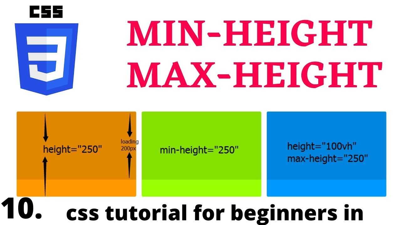
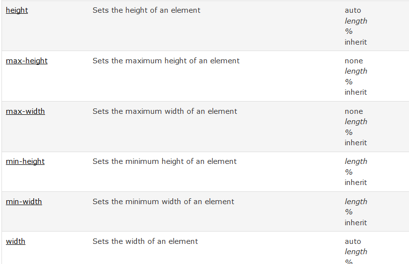
min-height and max-height Properties
In addition to the minimum and maximum width properties, we have the same properties as the height.
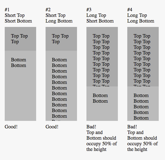
Min Height
When setting the value of , its benefit lies in preventing the used value for property from becoming less than the specified value for . Note that the default value for is , which resolves to .
Let’s take an example to demonstrate a simple use case.
We have a section with a description text. The goal is to have a minimum height for the section, so it can handle short or long content. Consider the below basic case:
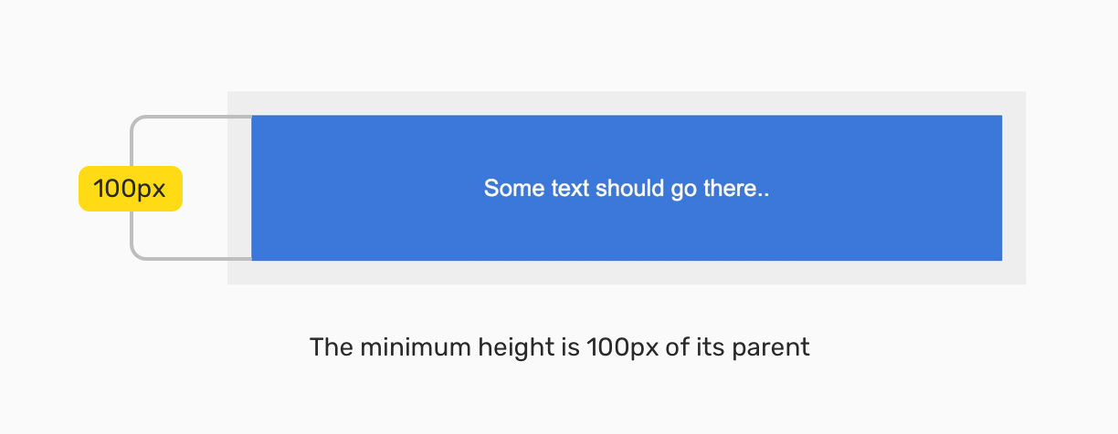
The minimum height is , and with flexbox, the content is centered horizontally and vertically. What would happen if the content were longer? For example, a paragraph?
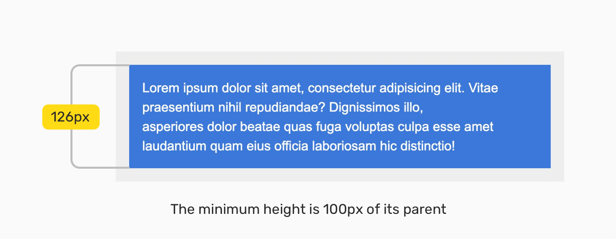
Yes, you guessed it! The height of the section will expand to contain the new content. By having that, we can build components that are fluid and responsive to its content.
See the Pen
Min Height — Example 1 by Ahmad Shadeed (@shadeed)
on CodePen.
Max Height
When setting the value of , its benefit lies in preventing the used value for property from becoming more than the specified value for . Note that the default value for is .
Consider the below example where I set for the content. But, because it’s bigger than the specified space, there is an overflow. The text is out of its parent boundaries due to that.

А нужна ли тогда вообще высота?
Для декоративных элементов и картинок указывать высоту уместно, особенно если вы уверены, что ничего не поменяется через время. Для блоков с контентом рекомендуем использовать свойство , оно даёт возможность элементам меняться, но сохранять важные значения.
— задаёт высоту элемента
— минимальная высота элемента
— максимальная высота элемента
Представим, что вам нужно сверстать кнопку. Если не укажете , то высота кнопки будет меняться в зависимости от контента — при добавлении слов кнопка вытянется.
Если вы зададите , то при увеличении количества слов, они не вместятся и выпадут из кнопки.
При заданном значении внутрь кнопки можно добавлять сколько угодно слов, она будет растягиваться. При этом если убрать всё содержимое, кнопка останется минимальной высоты, которую вы укажете.
Свойство применяется, если важно сохранить определённую максимальную высоту, больше которой элемент не должен растягиваться. Поэтому при добавлении дополнительных слов, часть из них выйдут за рамки контейнера
See the Pen
height by midler (@midler)
on CodePen.
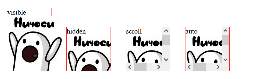
Если важно сохранить максимальную высоту, но нужно добавить текст, поможет свойство. Когда контент превышает указанную высоту или ширину, свойство позволяет поместить всё в блок, при этом не увеличивая его площадь
Возможные значения :
-
(по умолчанию) — дополнительный текст выйдет за рамки блока;
-
— добавленный текст будет скрыт и не отобразится, обрежется по границам родительского блока без прокрутки;
-
— новый контент тоже обрежется. В отличие от hidden запрещает любую прокрутку, границы родительского блока рассчитываются с учётом внутренних отступов;
-
— при переполнении блока контентом добавятся полосы прокрутки;
-
— значение похоже на , но полосы прокрутки видны всегда, даже если переполнения нет.
 Источник
Спецификация
Каждая спецификация проходит несколько стадий одобрения.
- Recommendation ( Рекомендация ) — спецификация одобрена W3C и рекомендована как стандарт.
- Candidate Recommendation ( Возможная рекомендация ) — группа, отвечающая за стандарт, удовлетворена, как он соответствует своим целям, но требуется помощь сообщества разработчиков по реализации стандарта.
- Proposed Recommendation ( Предлагаемая рекомендация ) — на этом этапе документ представлен на рассмотрение Консультативного совета W3C для окончательного утверждения.
- Working Draft ( Рабочий проект ) — более зрелая версия черновика после обсуждения и внесения поправок для рассмотрения сообществом.
- Editor’s draft ( Редакторский черновик ) — черновая версия стандарта после внесения правок редакторами проекта.
- Draft ( Черновик спецификации ) — первая черновая версия стандарта.
Обязательно ли указывать высоту элементам?
Рассмотрим простой текстовый блок. По макету блок занимает определённое пространство, поэтому, чтобы размер совпадал, пропишем блоку высоту.
Корневая папка проекта — это рабочая область. В ней находятся все файлы и папки, необходимые для его работы.
Хранилище — это содержимое скрытой папки , которая добавляется в проект при инициализации.
В блоке на примере два абзаца текста, высота указана, всё четко по макету, кажется, работа сделана отлично. А что, если нам понадобится добавить ещё один абзац?
Пример
Корневая папка проекта — это рабочая область. В ней находятся все файлы и папки, необходимые для его работы.
Хранилище — это содержимое скрытой папки , которая добавляется в проект при инициализации.
В этой папке хранятся все версии рабочей области и служебная информация.
Тогда текст вылезет за рамки блока, и вёрстка нарушится. Какое решение?
Для блоков с контентом (например, с текстом) лучше не использовать . Сайт и содержание отдельного блока в любой момент могут измениться, возможно появление дополнительной информации.
Для таких случаев больше подойдёт свойство — минимальная высота блока, меньше которой он не может быть. Если текст добавится, то он растянет блок и полностью поместится.
Пример
Корневая папка проекта — это рабочая область. В ней находятся все файлы и папки, необходимые для его работы.
Хранилище — это содержимое скрытой папки , которая добавляется в проект при инициализации.
В этой папке хранятся все версии рабочей области и служебная информация.
Browser compatibility
- Desktop
- Mobile
| Feature | Chrome | Firefox (Gecko) | Internet Explorer | Opera | Safari (WebKit) |
|---|---|---|---|---|---|
| Basic support | 1.0 | 3.0 (1.9) | 7.0 | 4.0 | 1.0 2.0.2 (416) for positioned elements |
| applies to | No support | (Yes) | No support | (Yes) | No support |
| , , , and | No support | No support | No support | No support | 9 |
| Obsolete since Gecko 22 | 21.0 | 16.0 (16.0) | No support | 12.10 | No support |
| as initial valueObsolete since Gecko 22 | 21.0 | 18.0 (18.0) | No support | 12.10 | No support |
| Feature | Android | Firefox Mobile (Gecko) | IE Phone | Opera Mobile | Safari Mobile |
|---|---|---|---|---|---|
| Basic support | ? | ? | ? | ? | 9 |
CSS 2.1 explicitly leaves the behavior of with undefined. Therefore any behavior is CSS2.1-compliant; newer CSS specifications may define this behavior, so Web developers shouldn’t rely on a specific one now.
Due to bug (bug 307866) Firefox doesn’t handle on elements with .
In Internet Explorer 10-11 (but not 12+), a declaration on a column-direction flex container doesn’t apply to the container’s flex items. See for more info.
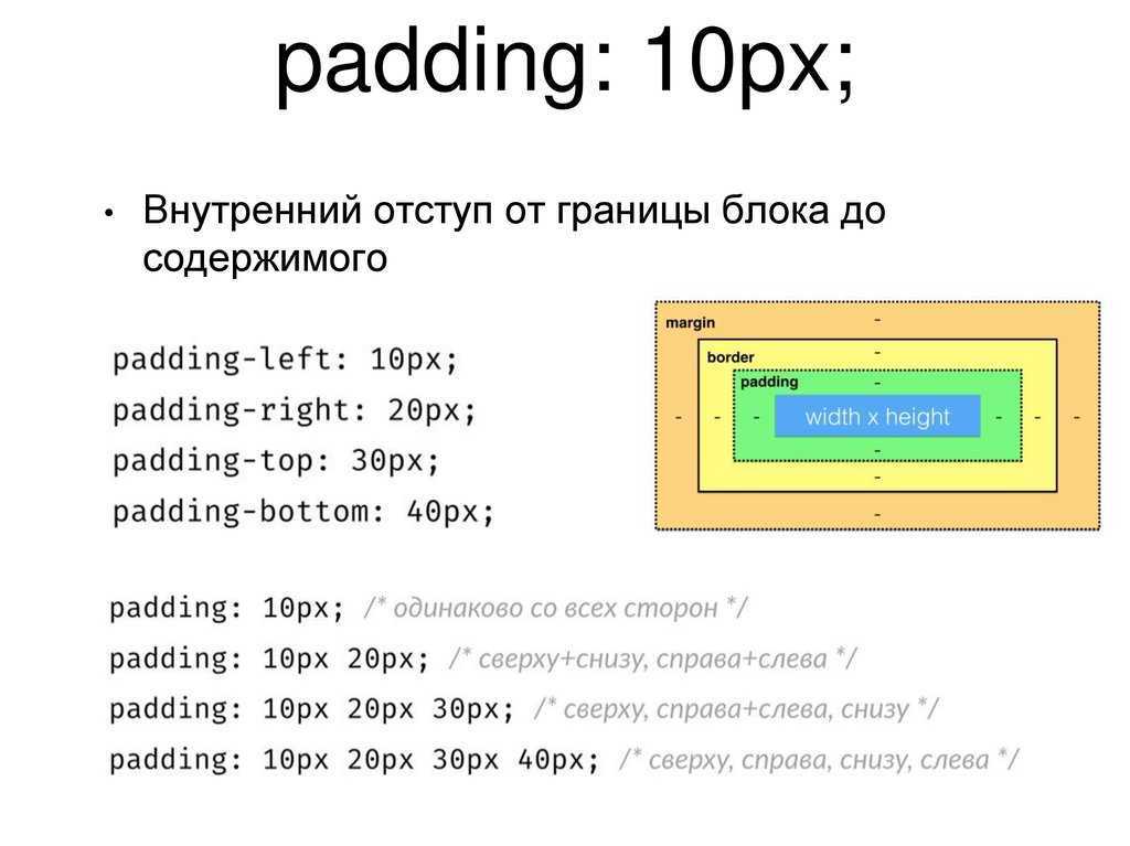
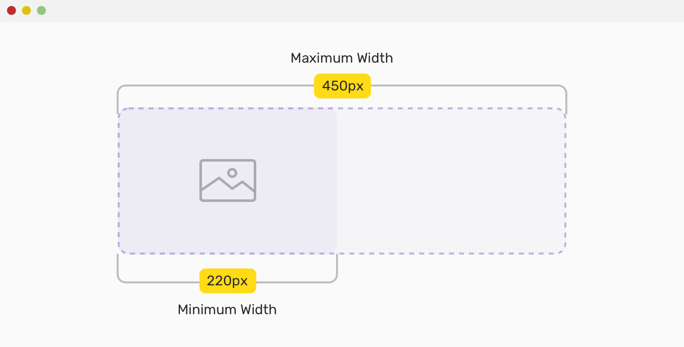
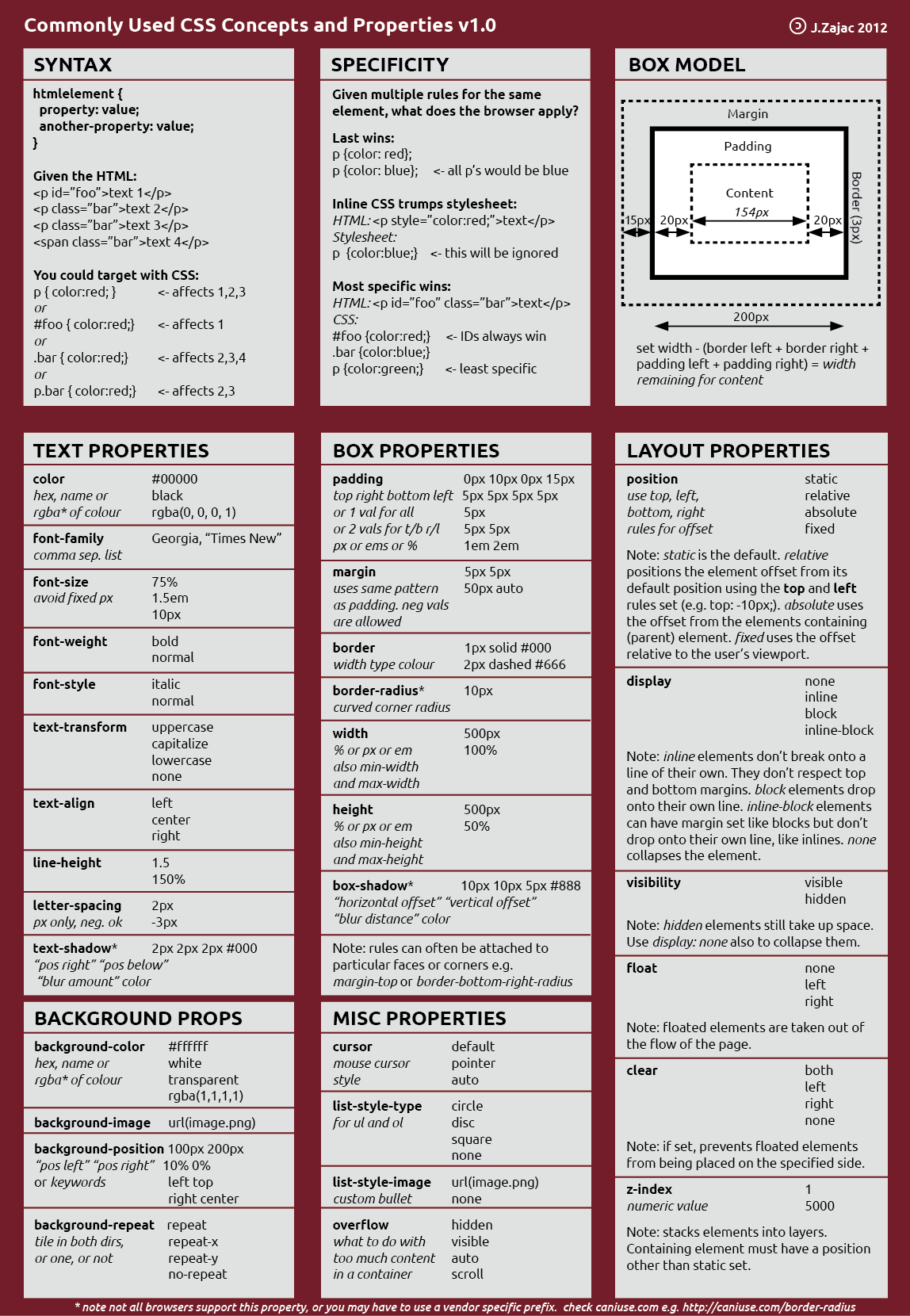
Настройка максимальной ширины и высоты
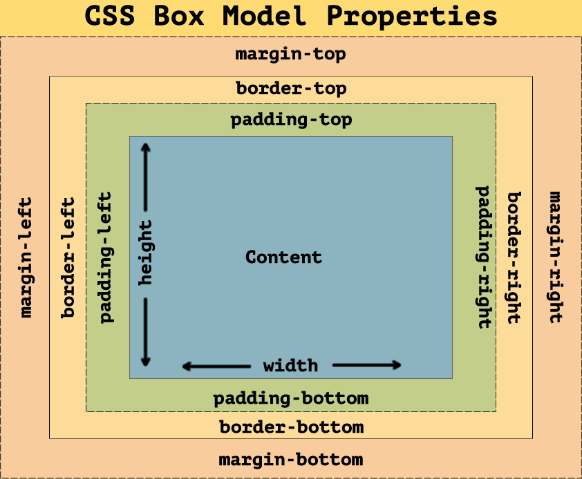
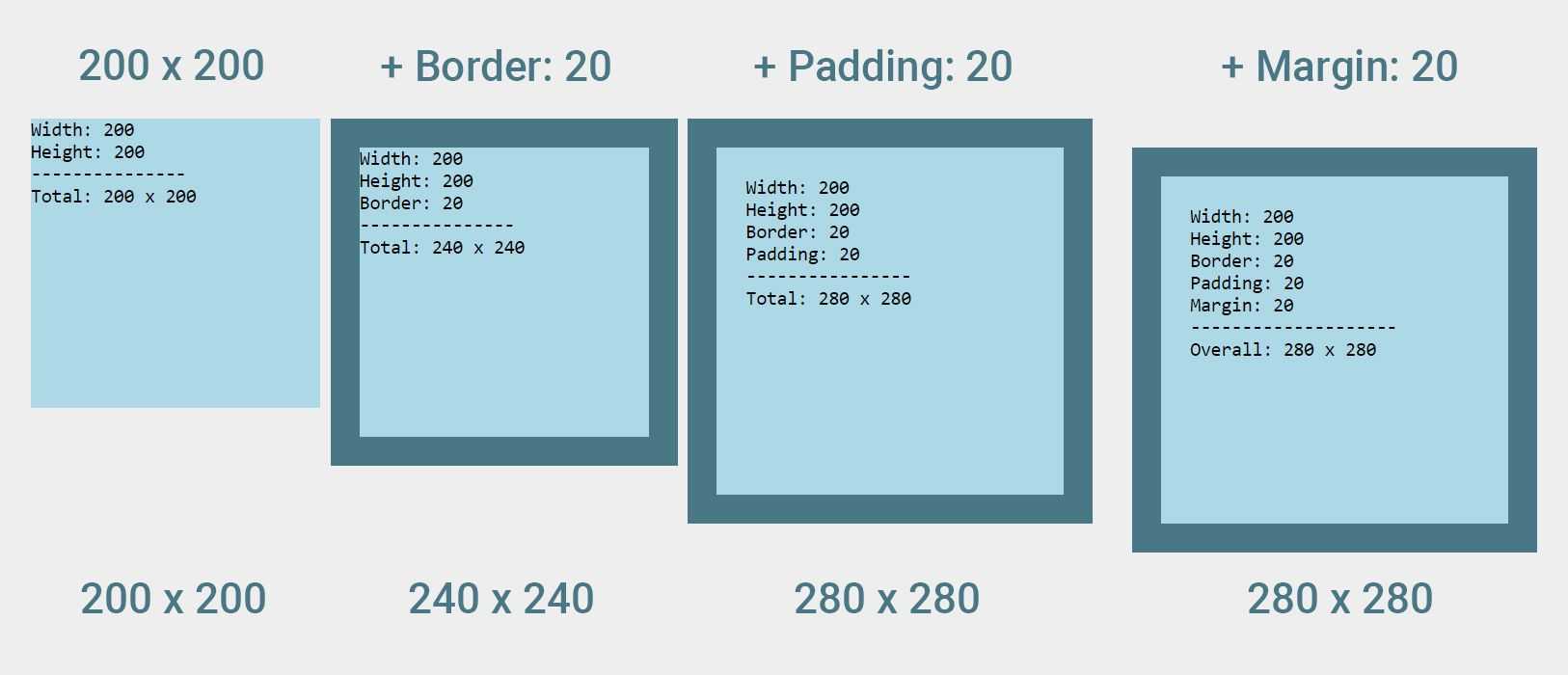
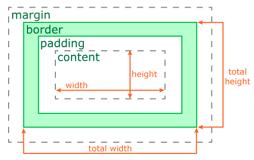
Вы можете использовать свойство и , чтобы указать максимальную ширину и высоту области содержимого. Эта максимальная ширина и высота не включает отступы (), границы () или поля ().
Элемент не может быть шире, чем значение , даже если для свойства установлено большее значение. Например, если установлена в , а установлена в , фактическая ширина элемента будет . Давайте посмотрим на пример:
Если свойство указано со значением, превышающим значение свойства , то будет использовано значение .
Аналогично, элемент, к которому применено , никогда не будет выше указанного значения , даже если для свойства установлено большее значение. Например, если установлено на , а установлено на , фактическая высота элемента будет .
Если свойство указано со значением, превышающим значение свойства , то будет использовано значение .
CSS Справочники
CSS СправочникCSS ПоддержкаCSS СелекторыCSS ФункцииCSS ЗвукCSS Веб шрифтыCSS АнимацииCSS ДлиныCSS Конвертер px-emCSS Названия цветаCSS Значения цветаCSS по умолчаниюCSS Символы
CSS Свойства
align-content
align-items
align-self
all
animation
animation-delay
animation-direction
animation-duration
animation-fill-mode
animation-iteration-count
animation-name
animation-play-state
animation-timing-function
backface-visibility
background
background-attachment
background-blend-mode
background-clip
background-color
background-image
background-origin
background-position
background-repeat
background-size
border
border-bottom
border-bottom-color
border-bottom-left-radius
border-bottom-right-radius
border-bottom-style
border-bottom-width
border-collapse
border-color
border-image
border-image-outset
border-image-repeat
border-image-slice
border-image-source
border-image-width
border-left
border-left-color
border-left-style
border-left-width
border-radius
border-right
border-right-color
border-right-style
border-right-width
border-spacing
border-style
border-top
border-top-color
border-top-left-radius
border-top-right-radius
border-top-style
border-top-width
border-width
bottom
box-decoration-break
box-shadow
box-sizing
caption-side
caret-color
@charset
clear
clip
color
column-count
column-fill
column-gap
column-rule
column-rule-color
column-rule-style
column-rule-width
column-span
column-width
columns
content
counter-increment
counter-reset
cursor
direction
display
empty-cells
filter
flex
flex-basis
flex-direction
flex-flow
flex-grow
flex-shrink
flex-wrap
float
font
@font-face
font-family
font-kerning
font-size
font-size-adjust
font-stretch
font-style
font-variant
font-weight
grid
grid-area
grid-auto-columns
grid-auto-flow
grid-auto-rows
grid-column
grid-column-end
grid-column-gap
grid-column-start
grid-gap
grid-row
grid-row-end
grid-row-gap
grid-row-start
grid-template
grid-template-areas
grid-template-columns
grid-template-rows
hanging-punctuation
height
hyphens
@import
isolation
justify-content
@keyframes
left
letter-spacing
line-height
list-style
list-style-image
list-style-position
list-style-type
margin
margin-bottom
margin-left
margin-right
margin-top
max-height
max-width
@media
min-height
min-width
mix-blend-mode
object-fit
object-position
opacity
order
outline
outline-color
outline-offset
outline-style
outline-width
overflow
overflow-x
overflow-y
padding
padding-bottom
padding-left
padding-right
padding-top
page-break-after
page-break-before
page-break-inside
perspective
perspective-origin
pointer-events
position
quotes
resize
right
tab-size
table-layout
text-align
text-align-last
text-decoration
text-decoration-color
text-decoration-line
text-decoration-style
text-indent
text-justify
text-overflow
text-shadow
text-transform
top
transform
transform-origin
transform-style
transition
transition-delay
transition-duration
transition-property
transition-timing-function
unicode-bidi
user-select
vertical-align
visibility
white-space
width
word-break
word-spacing
word-wrap
writing-mode
z-index
Food For Thought
There are some talking points that you will run into the more use CSS min-height. At most times, these points are questions that you’ll ask yourself. We took our time to identify these questions, and we will explain each one, these explanations will give you the answers that you’ve been searching for.
These questions are:
- What is min height of 100vh in CSS?
- How do you reset min height in CSS?
- Does min height include padding?
- What is the difference between height and min-height in CSS?
– What is Min Height 100vh in CSS?
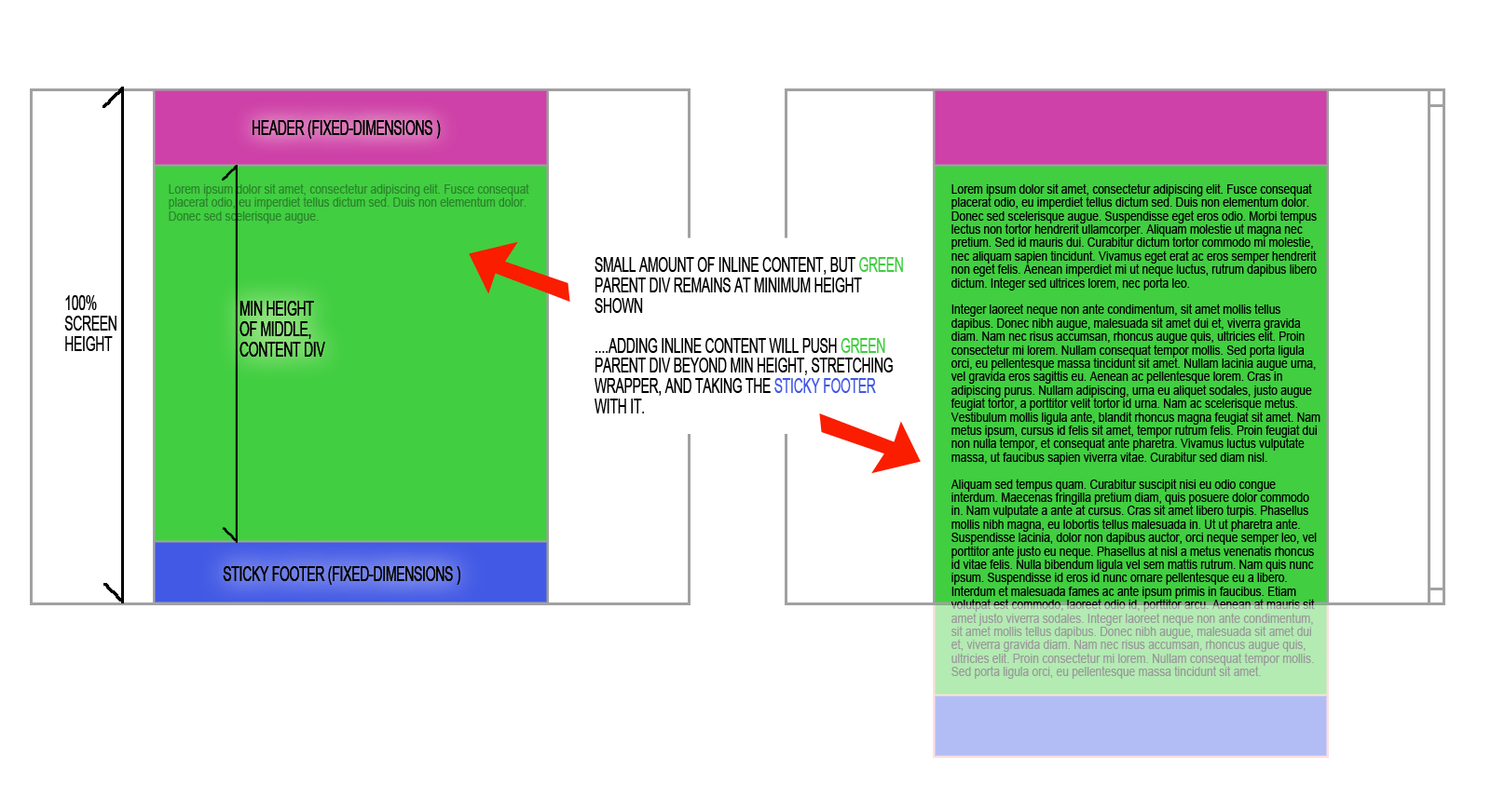
Min height 100vh means the element should occupy the web browser viewport height. This is always 100 percent of the web browser’s viewport height. If there is more content, the element will stretch more than the viewport’s height, which is a code example that will clear things up.
The next HTML has an empty < main > tag with an empty paragraph tag. Add some text to the paragraph, and run the code in your web browser. Observe how the < main > tag stretches more than the height of the viewport.
| <main> <p><!– Add about 500 characters of text here –></p> </main> * { margin: 0; padding: 0; box-sizing: border-box; } body { display: grid; place-items: center; } main { width: 50%; border: 5px solid #8e2a70; padding: 2em; font-size: 1.2em; line-height: 1.168; position: relative; min-height: 100vh; /* Note this */ } p { outline: 2px solid #1a1a1a; font-size: 5em; } |
After that, change min-height to height. You’ll notice two things:
- The border of the <main> tag sits at the edge of the viewport.
- The paragraph text will overflow more than the <main> tag.
– How Do You Reset Min Height In CSS?
If you need to reset min-height in CSS, set its value to zero and not auto. This is a special case in a CSS Flexbox column when you need a flex item to be shorter than its content.
In the next code block, the <main> tag has a height of 150 pixels, the paragraph, within it, has a border and a big font size. Due to the height of the <main> tag, the paragraph and its border will spill out of the <main> tag, with min-height set to zero, you’ll observe that the paragraph returns to the <main> tag. This is evident by the new location of its borders, though, there is an overflow due to the large font size.
| <main> <p>This is a big dummy text</p> </main> * { margin: 0; padding: 0; box-sizing: border-box; } body { display: grid; align-items: center; place-items: center; height: 100vh; } main { width: 50%; border: 5px solid #bd1515; padding: 2em; font-size: 1.2em; line-height: 1.168; display: flex; flex-direction: column; height: 150px; } p { outline: 2px solid #1a1a1a; font-size: 4em; /** * Reset the height of the flex * item. Delete it, and observe the * result in your web browser */ min-height: 0; } |
– Does Min Height Include Padding?
Yes, it does. The reason why is that min-height revolves around the content area. As a result, vertical padding, margin, or border gets added to the min height.
You can confirm this by doing the following:
- Create content with a defined min-height
- Add some padding
Observe the increase in the min height after the addition of the padding.
– What Is the Difference Between Height and Min-height in CSS?
The difference is that height in CSS defines CSS height values i.e how tall the element can be. Min-height defines a value that an element can grow beyond if needed.


Our next code block illustrates the difference between height and min-height. The first paragraph has a height of 200 pixels. The second paragraph has a min-height of 200 pixels. When you run the code, you’ll observe that both paragraphs have the same content, however, there is an overflow in the first paragraph and not the second one.
| <main> <div class=”first-text”> <p>This paragraph <strong>height</strong> is <strong>200px</strong>. It will cause an overflow when the text height is more than 200px.</p> </div> <div class=”second-text”> <p>This paragraph <strong>min-height</strong> is <strong>200px</strong>. It will <strong>not</strong> cause an overflow when the height is more than 200px.</p> </div> </main> * { margin: 0; padding: 0; box-sizing: border-box; } body { display: grid; place-items: center; height: 100vh; } main { width: 50%; border: 5px solid #1560bd; padding: 2em; font-size: 1.2em; line-height: 1.168; position: relative; } p { outline: 2px solid #1a1a1a; min-height: 3em; font-size: 3em; } .first-text p { height: 200px; margin-bottom: 0.2em; overflow-y: auto; } .second-text p { min-height: 200px; } |
CSS Reference
CSS ReferenceCSS Browser SupportCSS SelectorsCSS FunctionsCSS Reference AuralCSS Web Safe FontsCSS AnimatableCSS UnitsCSS PX-EM ConverterCSS ColorsCSS Color ValuesCSS Default ValuesCSS Entities
CSS Properties
align-content
align-items
align-self
all
animation
animation-delay
animation-direction
animation-duration
animation-fill-mode
animation-iteration-count
animation-name
animation-play-state
animation-timing-function
backface-visibility
background
background-attachment
background-blend-mode
background-clip
background-color
background-image
background-origin
background-position
background-repeat
background-size
border
border-bottom
border-bottom-color
border-bottom-left-radius
border-bottom-right-radius
border-bottom-style
border-bottom-width
border-collapse
border-color
border-image
border-image-outset
border-image-repeat
border-image-slice
border-image-source
border-image-width
border-left
border-left-color
border-left-style
border-left-width
border-radius
border-right
border-right-color
border-right-style
border-right-width
border-spacing
border-style
border-top
border-top-color
border-top-left-radius
border-top-right-radius
border-top-style
border-top-width
border-width
bottom
box-decoration-break
box-shadow
box-sizing
caption-side
caret-color
@charset
clear
clip
clip-path
color
column-count
column-fill
column-gap
column-rule
column-rule-color
column-rule-style
column-rule-width
column-span
column-width
columns
content
counter-increment
counter-reset
cursor
direction
display
empty-cells
filter
flex
flex-basis
flex-direction
flex-flow
flex-grow
flex-shrink
flex-wrap
float
font
@font-face
font-family
font-kerning
font-size
font-size-adjust
font-stretch
font-style
font-variant
font-weight
grid
grid-area
grid-auto-columns
grid-auto-flow
grid-auto-rows
grid-column
grid-column-end
grid-column-gap
grid-column-start
grid-gap
grid-row
grid-row-end
grid-row-gap
grid-row-start
grid-template
grid-template-areas
grid-template-columns
grid-template-rows
hanging-punctuation
height
hyphens
@import
isolation
justify-content
@keyframes
left
letter-spacing
line-height
list-style
list-style-image
list-style-position
list-style-type
margin
margin-bottom
margin-left
margin-right
margin-top
max-height
max-width
@media
min-height
min-width
mix-blend-mode
object-fit
object-position
opacity
order
outline
outline-color
outline-offset
outline-style
outline-width
overflow
overflow-x
overflow-y
padding
padding-bottom
padding-left
padding-right
padding-top
page-break-after
page-break-before
page-break-inside
perspective
perspective-origin
pointer-events
position
quotes
resize
right
scroll-behavior
tab-size
table-layout
text-align
text-align-last
text-decoration
text-decoration-color
text-decoration-line
text-decoration-style
text-indent
text-justify
text-overflow
text-shadow
text-transform
top
transform
transform-origin
transform-style
transition
transition-delay
transition-duration
transition-property
transition-timing-function
unicode-bidi
user-select
vertical-align
visibility
white-space
width
word-break
word-spacing
word-wrap
writing-mode
z-index
Browser Compatibility
- Desktop
- Mobile
| Feature | Chrome | Firefox (Gecko) | Internet Explorer | Opera | Safari (WebKit) |
|---|---|---|---|---|---|
| Basic support | 1.0 | 3.0 (1.9) | 7.0 | 4.0 | 1.0 2.0.2 (416) for positioned elements |
| applies to | No support | (Yes) | No support | (Yes) | No support |
| , , , and | No support | No support | No support | No support | 9 |
| Obsolete since Gecko 22 | 21.0 | 16.0 (16.0) | No support | 12.10 | No support |
| as initial valueObsolete since Gecko 22 | 21.0 | 18.0 (18.0) | No support | 12.10 | No support |
| Feature | Android | Firefox Mobile (Gecko) | IE Phone | Opera Mobile | Safari Mobile |
|---|---|---|---|---|---|
| Basic support | ? | ? | ? | ? | 9 |
CSS 2.1 explicitly leaves the behavior of with undefined. Therefore any behavior is CSS2.1-compliant; newer CSS specifications may define this behavior, so Web developers shouldn’t rely on a specific one now.
Due to bug (bug 307866) Firefox doesn’t handle on elements with .
Browser Support
The property works in all major browsers: Chrome, Firefox, Safari, Opera, Internet Explorer, and on Android and iOS.
The new experimental values added in CSS3 are not yet supported in all browsers, and some of them have different equivalents supported in some browsers. The browser support for the new values is shown in the following table:
Intrinsic & Extrinsic Sizing
Allows for the heights and widths to be specified in intrinsic values using the `max-content`, `min-content`, `fit-content` and `stretch` (formerly `fill`) properties.
W3C Working Draft
Supported from the following versions:
Mobile / Tablet
- 16
- 116
- No
- 116
- 116
* denotes prefix required.
- Supported:
- Yes
- No
- Partially
- Polyfill
Stats from
The property works in Safari on positioned elements.
Немного теории
Принцип действия очень простой. У каждого DOM-элемента, который может содержать контент, есть readonly-свойство scrollHeight (scrollWidth) которое и содержит так нужную нам, истинную высоту элемента, такую, при которой все содержимое этого элемента будет видно пользователю. Все, что нам требуется — при изменении текстового поля, вычислять значение scrollHeight/scrollWidth и присваивать его текстовому полю.
А для того, чтобы текстовое поле могло еще и возвращаться к своему исходному виду, перед изменением, будем сбрасывать установленную ранее высоту до нуля, для того чтобы свойство scrollHeight корректно бы показало нам, есть ли контент, не умещающийся в текстовом поле.
Варианты решения
Самый первый, приходящий в топ выдачи гугла — это просто взять и заменить инпут на div с атрибутом — и вот оно, проблема решена! Вот вам адаптивный по высоте/ширине див и редактируемое содержимое. Но если для вас (как и для меня) это не вариант, то смотрим дальше.

Следующий вариант не назовешь слишком изящным, но работающий вот что важно. Основан на том, что где-то позади самого текстового поля мы прячем невидимый блок, куда дублируем содержимое текстового поля при любом изменении
Блок изменяет свои размеры по содержимому, мы вычисляем их с помощью ява-скрипта и присваиваем текстовому полю. Если вас не смущает дополнительный мусор на странице в виде такого вот костыля — смело можно брать на вооружение.
Ну и третий вариант, который мне больше всего пришелся по душе — это все-таки вычислять содержимое текстового инпута и адаптировать его ширину/высоту, чтобы все помещалось. Давайте на него посмотрим чуть более внимательно.
Conclusion
In this article, you’ve learned how to use CSS min-height. Also, we’ve explained some questions you can have about CSS min-height. A summary will help you remember everything that you’ve learned. So, here you go:
- CSS min-height allows you to set the minimum height of an element
- You can use CSS min-height with an em unit, a percentage value, or viewport-lengths
- Min height 100vh in CSS means the element should occupy, at least, the entire height of the viewport
- If you want to reset min height in CSS, set its value to zero
- Yes. CSS padding adds to min height
- CSS height specifies how tall the element will be. CSS Min-height defines a value that an element can grow beyond if needed. This is the difference between these two properties

CSS min-height
Method 3: Using JavaScript/jQuery
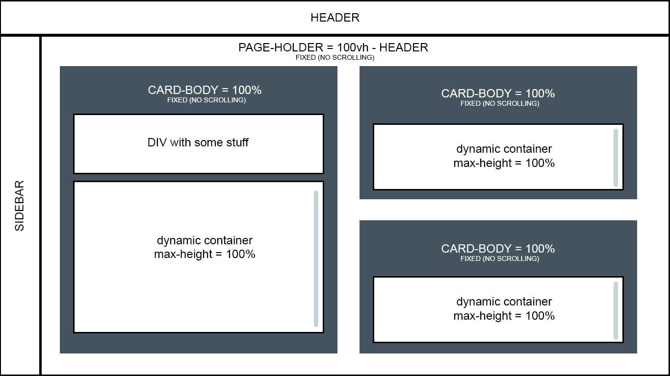
To define a minimum height for tbody in CSS using JavaScript/jQuery, you can use the following code:
This code sets the minimum height of the tbody element to 100 pixels using the jQuery method.
Alternatively, you can use the method to set the height of the tbody element and ensure that it is at least a certain minimum value:
This code iterates over all tbody elements on the page using the method, and for each tbody element, it checks its current height using the method. If the height is less than 100 pixels, it sets the height to 100 pixels using the method.
You can also use the method to include padding and borders in the height calculation:
This code is similar to the previous example, but it uses the method instead of the method to include any padding and borders in the height calculation.
CSS Свойства
align-contentalign-itemsalign-selfallanimationanimation-delayanimation-directionanimation-durationanimation-fill-modeanimation-iteration-countanimation-nameanimation-play-stateanimation-timing-functionbackface-visibilitybackgroundbackground-attachmentbackground-blend-modebackground-clipbackground-colorbackground-imagebackground-originbackground-positionbackground-repeatbackground-sizeborderborder-bottomborder-bottom-colorborder-bottom-left-radiusborder-bottom-right-radiusborder-bottom-styleborder-bottom-widthborder-collapseborder-colorborder-imageborder-image-outsetborder-image-repeatborder-image-sliceborder-image-sourceborder-image-widthborder-leftborder-left-colorborder-left-styleborder-left-widthborder-radiusborder-rightborder-right-colorborder-right-styleborder-right-widthborder-spacingborder-styleborder-topborder-top-colorborder-top-left-radiusborder-top-right-radiusborder-top-styleborder-top-widthborder-widthbottombox-decoration-breakbox-shadowbox-sizingcaption-sidecaret-color@charsetclearclipcolorcolumn-countcolumn-fillcolumn-gapcolumn-rulecolumn-rule-colorcolumn-rule-stylecolumn-rule-widthcolumn-spancolumn-widthcolumnscontentcounter-incrementcounter-resetcursordirectiondisplayempty-cellsfilterflexflex-basisflex-directionflex-flowflex-growflex-shrinkflex-wrapfloatfont@font-facefont-familyfont-kerningfont-sizefont-size-adjustfont-stretchfont-stylefont-variantfont-weightgridgrid-areagrid-auto-columnsgrid-auto-flowgrid-auto-rowsgrid-columngrid-column-endgrid-column-gapgrid-column-startgrid-gapgrid-rowgrid-row-endgrid-row-gapgrid-row-startgrid-templategrid-template-areasgrid-template-columnsgrid-template-rowshanging-punctuationheighthyphens@importisolationjustify-content@keyframesleftletter-spacingline-heightlist-stylelist-style-imagelist-style-positionlist-style-typemarginmargin-bottommargin-leftmargin-rightmargin-topmax-heightmax-width@mediamin-heightmin-widthmix-blend-modeobject-fitobject-positionopacityorderoutlineoutline-coloroutline-offsetoutline-styleoutline-widthoverflowoverflow-xoverflow-ypaddingpadding-bottompadding-leftpadding-rightpadding-toppage-break-afterpage-break-beforepage-break-insideperspectiveperspective-originpointer-eventspositionquotesresizerighttab-sizetable-layouttext-aligntext-align-lasttext-decorationtext-decoration-colortext-decoration-linetext-decoration-styletext-indenttext-justifytext-overflowtext-shadowtext-transformtoptransformtransform-origintransform-styletransitiontransition-delaytransition-durationtransition-propertytransition-timing-functionunicode-bidiuser-selectvertical-alignvisibilitywhite-spacewidthword-breakword-spacingword-wrapwriting-modez-index
Syntax
min-height: 3.5em;


min-height: 10%;


min-height: max-content;
min-height: min-content;
min-height: fit-content;
min-height: fill-available;


min-height: inherit;
min-height: initial;
min-height: unset;
Values
- The fixed minimum height. See for possible units. Negative values make the declaration invalid.
- The fixed minimum height expressed as a of containing block’s height. Negative values make the declaration invalid.
- The default minimum size for flex items, providing a more reasonable default than 0 for other layouts.
- The intrinsic preferred height.
- The intrinsic minimum height.
- The containing block height minus horizontal margin, border and padding. Some browsers implement an ancient name for this keyword, .
- According CSS3 Box, this is a synonym of CSS3 Sizing defines a more complex algorithm, but no browser implements it, even in an experimental way.