
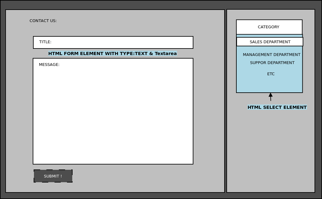
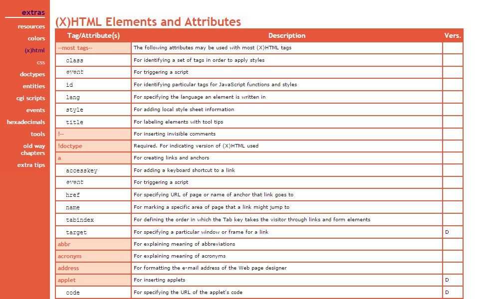
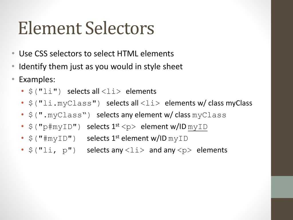
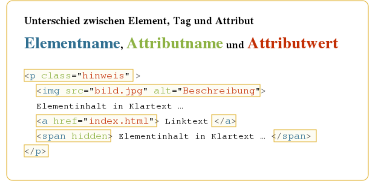
Тег Список с предопределенными значениями
Тег <select> создает внутри формы список с возможными значениями :
Тег <select> имеет следующие атрибуты :
name — задает уникальное имя списка :
size – определяет число одновременно видимых элементов списка :
По умолчанию size имеет значение 1 :
multiple – указывается , что из списка можно выбрать сразу несколько элементов одновременно . Чтобы получить все значения на сервере , после названия списка следует указать квадратные скобки ( это признак массива в языке PHP ) :
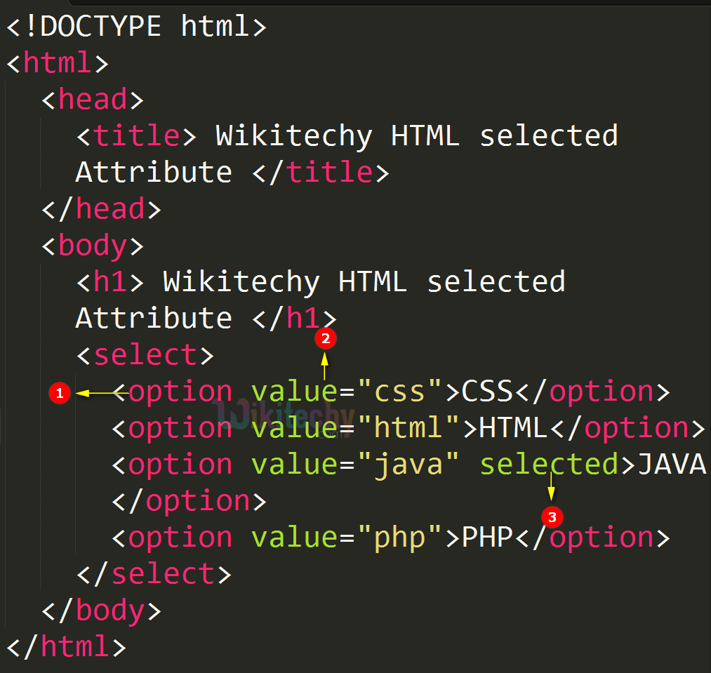
Внутри тегов< select> и </select> располагаются теги <option> , с помощью которых описывается каждый элемент списка .
Тег <option> имеет следующие атрибуты :
value – задает значения , которое будет передано Web – серверу , если пункт списка выбран . Если атрибут не задан , посылается текст этого пункта :
Если выбран пункт (элемент 1) , то посылается «select1″=Элемент1
Если выбран пункт (элемент 2) , то посылается «select2″=Элемент2
selected — указывает , который пункт списка выбран изначально :
Значение атрибута type
text – текстовое поле ввода :
password – текстовое поле для ввода пароля , в котором все вводимые символы заменяются звездочками :
file – поле ввода имени файла с кнопкой Обзор . Позволяет отправить файл на Web – сервер :
checkbox – поле для установки флажка , который можно установить или сбросить :
radio — элемент — переключатель ( иногда их называют радио кнопками ) :
reset – кнопка , при нажатии которой происходит очистка данных , введенных в форму :
submit – кнопка , при нажатии который происходит отправка данных , введенных в форму :
button – обычная командная кнопка :
hidden – скрытый элемент , значение которого отправляется вместе со всеми данными формы . Элемент не показывается пользователю , но позволяет хранить , например , данные из предыдущий формы (если пользователь последовательно заполняет несколько форм ) или уникальное имя пользователя :
name – задает имя элемента управления . Имя должно обязательно указывается латинскими буквами (например , field ) или комбинаций латинских букв и цифр ( например , field1) . Имя элемента не должно начинаться с цифры :
disabled — запрещает доступ к элементу формы . При наличии атрибута элемент отображается серым цветом :
readonly – текстовое поле не может изменяться пользователем.
How to Create a Dropdown Menu with the Select Tag
To create a dropdown menu with the select tag, you firstly need a form element. This is because you will also have a submit button within it (the form element) in order to submit the data to the server.
I’ve added some simple CSS to center the dropdown and button, and give the body a light-grey background:
To make it more elaborate and accessible, you can also attach the select box to a label element, so it gets focused when the label text is clicked. You can do that with this code:
I put a number symbol (#) as a the value of the action attribute so you don’t get a 404 when you click on the submit button.
But now we have to make a little change in the CSS:
In the end, this is the result:
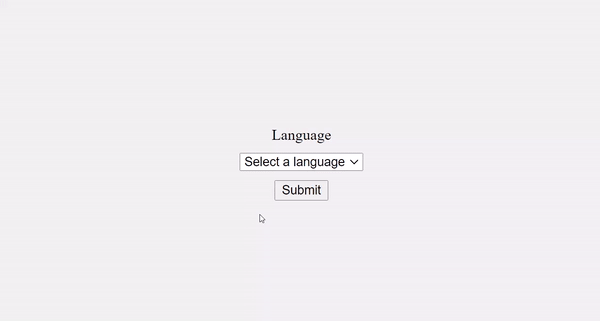
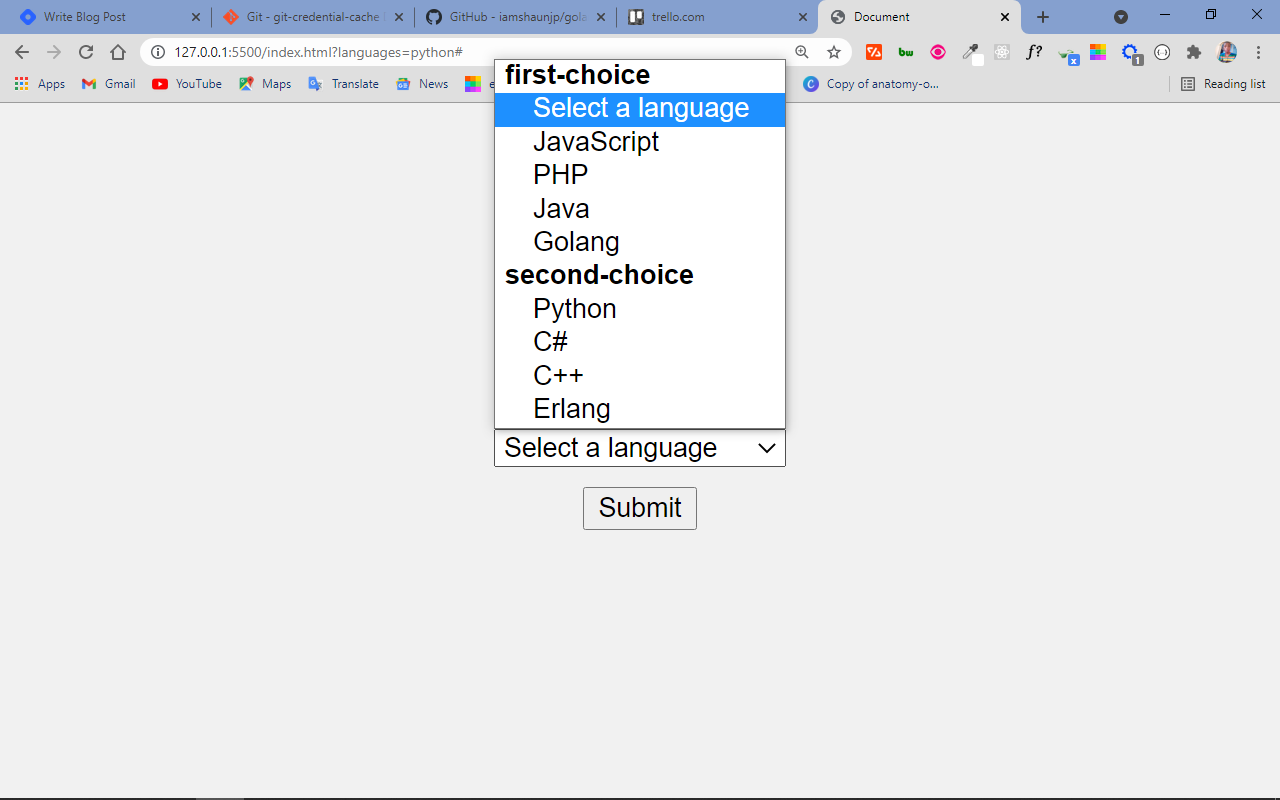
It doesn’t end there. One of the dropdown items appears by default and will be selected if the user clicks on the submit button immediately when they land on the page.
But this isn’t a good user experience. You can get rid of it by coding in “select a language” as the first item of the dropdown.
When the user clicks the select box to select an item, the dropdown is also covering the submit button – another thing that negatively affects good user experience.
You can change this with the attribute, which will show a certain number of items by default and show a scroll for other items in the dropdown.
This also lets you get rid of the dummy first item, because some of the items will be visible to the user automatically.
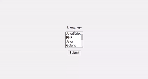
With the attribute, you can allow the user to select multiple items from the dropdown.
This makes 4 items visible by default. To select multiple items, the user has to hold down the shift or ctrl key, then select with the mouse.

That’s not all you can do with the select and tags. You can also make a multi-layer select box with the element inside a tag.
You can convert the already made dropdown to a multi-layer select box like this:
Conclusion
The select tag is very useful when you’re making dropdowns and combo lists in HTML. It is like a radio button and checkbox in one package.
Remember that with radio buttons, you only get to select one item from a list – but with a checkbox, you can select multiple items. Select is more flexible, as you can configure it to accept only a single item or multiple items.
One issue with the select tag is that it is very difficult to style. A reasonable solution is to use a CSS library that offers great utility classes to style a form along with the select element.
I hope this tutorial has made you more familiar with the select tag so you can start using it in your projects.
Thank you for reading and keep coding.
The HTMLSelectElement type
To interact with element in JavaScript, you use the type.
The type has the following useful properties:
- – returns the zero-based index of the selected option. The is if no option is selected. If the element allows multiple selections, the returns the of the first option.
- – returns the property of the first selected option element if there is one. Otherwise, it returns an empty string.
- – returns if the element allows multiple selections. It is equivalent to the attribute.
The property
To select a element, you use the DOM API like or .
The following example illustrates how to get the index of the selected option:
How it works:
- First, select the and elements using the method.
- Then, attach a click event listener to the button and show the selected index using the method when the button is clicked.
The property
The property of the element depends on the element and its HTML attribute:
- If no option is selected, the property of the select box is an empty string.
- If an option is selected and has a attribute, the property of the select box is the value of the selected option.
- If an option is selected and has no attribute, the property of the select box is the text of the selected option.
- If multiple options are selected, the property of the select box is derived from the first selected option based on the previous two rules.
See the following example:
In this example:
- If you select the first option, the property of the is empty.
- If you select the last option, the property of the select box is because the selected option has no attribute.
- If you select the second or third option, the value property will be or .
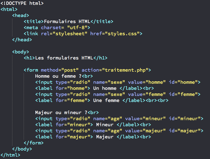
Атрибуты тега
action – Задает URL – адрес программы обработки формы .
method – Определяет , как будут пересылаться данные из формы Web – серверу , имеет два значения – GET и POST :
GET – Данные формы пересылаются путем их добавления к URL – адресу после знака (?) в формате .
Метод GET применяется . Когда объем персональных данных невелик , так как существует придел длины URL – адреса . Длина не может превышать 256 символов .
POST — предназначен для пересылки данных большого объема , файлов и конфиденциальной информации ( например , паролей ):
enctype – задает MIME – тип передаваемых данных . Может принимать два значения :
application/x-www-form-urlencoded — применяется по умолчанию :
multipart/form-data — указывает при пересылке Web – серверу файлов :
name – задает имя формы :
target – указывает , куда будет помещен документ , являющийся результатом обработки данных формы Web – сервером . Атрибут может содержать имя фрейма или одно из зарезервированных значений — _blank , _self или _parent :
autocomplete – Этот атрибут помогает заполнять поля форм текстом, который был введён в них ранее.
Имеет два значения :
on – Включает автозаполнение текста.
Off – Отключает автозаполнение. Это значение обычно используется для отмены сохранения в браузере важных данных (паролей, номеров банковских карт), а также редко вводимых или уникальных данных (капча).
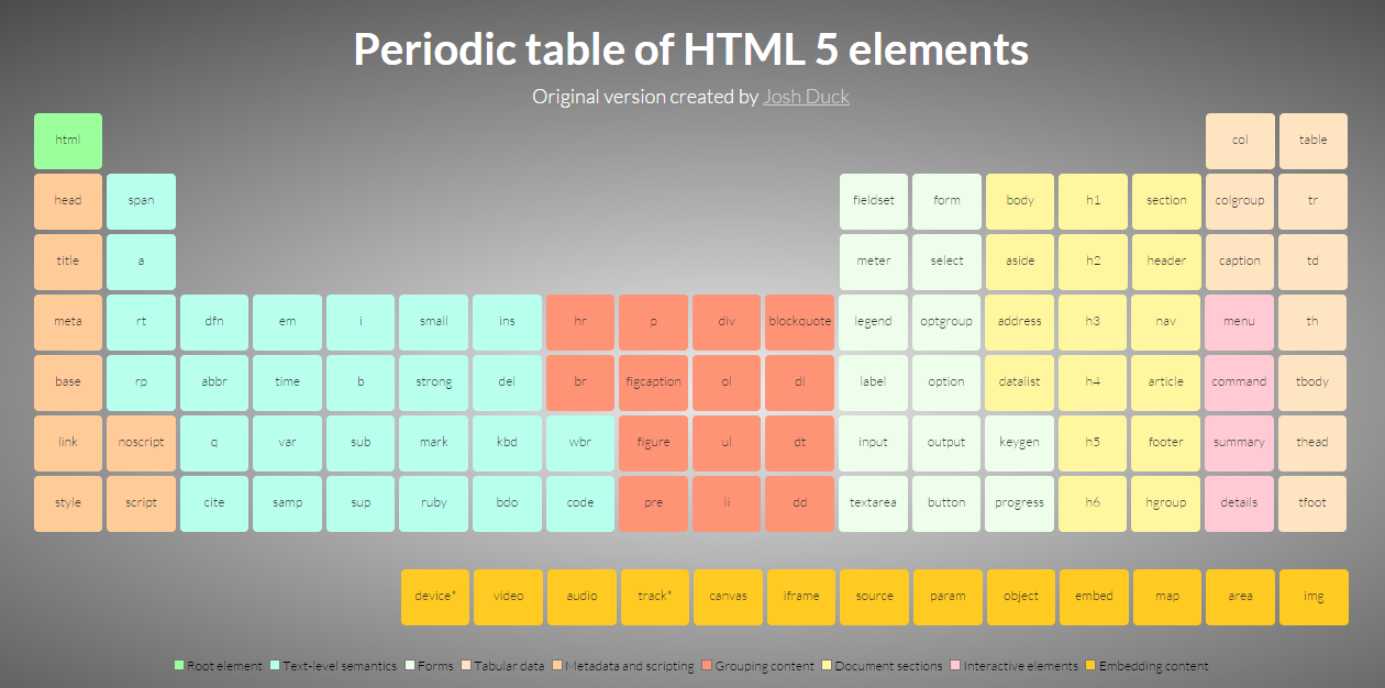
HTML Справочник
HTML по алфавитуHTML по категориямHTML Поддержка браузераHTML АтрибутыHTML Глобальные атрибутыHTML СобытияHTML ЦветаHTML CanvasHTML Аудио/видеоHTML Наборы символовHTML Типы документовHTML URL КодировкаHTML Коды языкаHTML Коды странHTTP СообщенияHTTP МетодыКонвертер PX в EMКомбинации клавиш
HTML Теги
<!—Комментарий—>
<!DOCTYPE>
<a>
<abbr>
<acronym>
<address>
<applet>
<area>
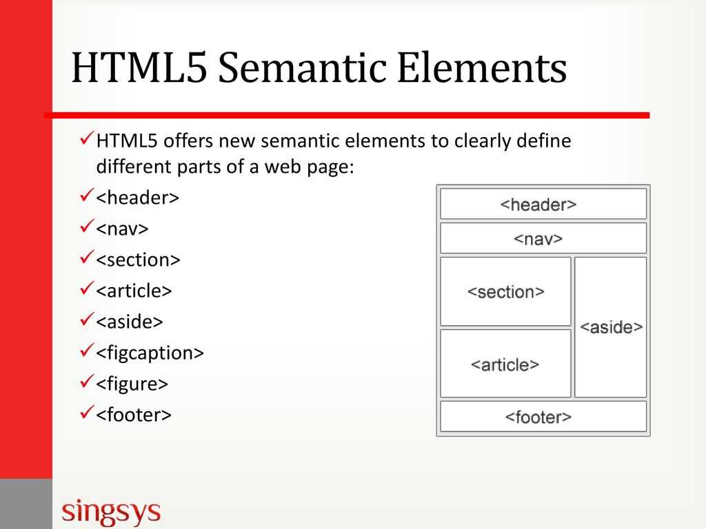
<article>
<aside>
<audio>
<b>
<base>
<basefont>
<bdi>
<bdo>
<big>
<blockquote>
<body>
<br>
<button>
<canvas>
<caption>
<center>
<cite>
<code>
<col>
<colgroup>
<data>
<datalist>
<dd>
<del>
<details>
<dfn>
<dialog>
<dir>
<div>
<dl>
<dt>
<em>
<embed>
<fieldset>
<figcaption>
<figure>
<font>
<footer>
<form>
<frame>
<frameset>
<h1> — <h6>
<head>
<header>
<hr>
<html>
<i>
<iframe>
<img>
<input>
<ins>
<kbd>
<label>
<legend>
<li>
<link>
<main>
<map>
<mark>
<meta>
<meter>
<nav>
<noframes>
<noscript>
<object>
<ol>
<optgroup>
<option>
<output>
<p>
<param>
<picture>
<pre>
<progress>
<q>
<rp>
<rt>
<ruby>
<s>
<samp>
<script>
<section>
<select>
<small>
<source>
<span>
<strike>
<strong>
<style>
<sub>
<summary>
<sup>
<svg>
<table>
<tbody>
<td>
<template>
<textarea>
<tfoot>
<th>
<thead>
<time>
<title>
<tr>
<track>
<tt>
<u>
<ul>
<var>
<video>
<wbr>
The HTMLOptionElement type
In JavaScript, the type represents the element.
The type has the following handy properties:
- – the index of the option inside the collection of options.
- – returns when the option is selected. You set this property to to select an option.
- – returns the option’s text.
- – returns the HTML value attribute.
The element has the property that allows you to access the collection options:
For example, to access the and of the second option, you use the following:
To get the selected option of a element with a single selection, you use the following code:
Then you can access the and of the selected option via and properties:
When a element allows multiple selections, you can use the property to determine which options are selected:
In this example, the is an array-like object, so it doesn’t have the methods like an object.
To borrow these methods from the object, you use the method. For example, the following returns an array of selected options:
And to get the property of the options, you chain the result of the method with the method, like this:
Attributes
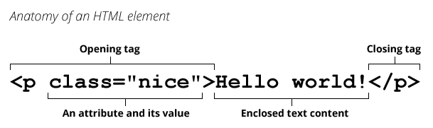
Attributes can be added to an HTML element to provide more information about how the element should appear or behave.
The element accepts the following attributes.
| Attribute | Description |
|---|---|
| Automatically gives focus to this control when the page loads. This allows the user to start using the control without having to select it first. There must not be more than one element in the document with the autofocus attribute specified.
This is a boolean attribute. If the attribute is present, its value must either be the empty string or a value that is an ASCII case-insensitive match for the attribute’s canonical name, with no leading or trailing whitespace (i.e. either or ). Possible values: |
|
| Disables the input control. The form control won’t accept changes from the user. It also cannot receive focus and will be skipped when tabbing.
This is a boolean attribute. If the attribute is present, its value must either be the empty string or a value that is an ASCII case-insensitive match for the attribute’s canonical name, with no leading or trailing whitespace (i.e. either or ). Possible values: |
|
| Specifies the ID of a form to which this control belongs.
Possible values: |
|
| Indicates whether the user can select multiple rows at once.
This is a boolean attribute. If the attribute is present, its value must either be the empty string or a value that is an ASCII case-insensitive match for the attribute’s canonical name, with no leading or trailing whitespace (i.e. either or ). Possible values: |
|
| Assigns a name to the input control. | |
| Specifies that the user is required to select an option before submitting the form.
This is a boolean attribute. If the attribute is present, its value must either be the empty string or a value that is an ASCII case-insensitive match for the attribute’s canonical name, with no leading or trailing whitespace (i.e. either or ). Possible values: |
|
| Specifies the number of options to show to the user. The value must be a valid non-negative integer greater than zero. If the attribute is present, then the attribute’s default value is 4. If the attribute is absent, then the size attribute’s default value is 1. |
Global Attributes
The following attributes are standard across all HTML elements. Therefore, you can use these attributes with the tag , as well as with all other HTML tags.
For a full explanation of these attributes, see HTML 5 global attributes.
Event Handlers
Event handler content attributes enable you to invoke a script from within your HTML. The script is invoked when a certain «event» occurs. Each event handler content attribute deals with a different event.
Most event handler content attributes can be used on all HTML elements, but some event handlers have specific rules around when they can be used and which elements they are applicable to.
For more detail, see HTML event handler content attributes.
HTML Теги
<!—Комментарий—><!DOCTYPE><a><abbr><acronym><address><applet><area><article><aside><audio><b><base><basefont><bdi><bdo><big><blockquote><body><br><button><canvas><caption><center><cite><code><col><colgroup><data><datalist><dd><del><details><dfn><dialog><dir><div><dl><dt><em><embed><fieldset><figcaption><figure><font><footer><form><frame><frameset><h1> — <h6><head><header><hr><html><i><iframe><img><input><ins><kbd><label><legend><li><link><main><map><mark><meta><meter><nav><noframes><noscript><object><ol><optgroup><option><output><p><param><picture><pre><progress><q><rp><rt><ruby><s><samp><script><section><select><small><source><span><strike><strong><style><sub><summary><sup><svg><table><tbody><td><template><textarea><tfoot><th><thead><time><title><tr><track><tt><u><ul><var><video>
Examples
The Element
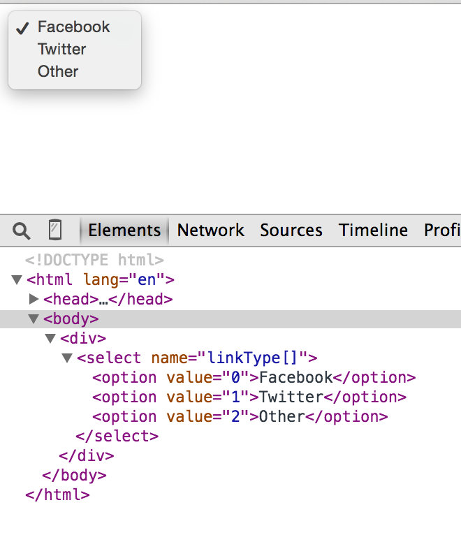
The element allows you to group the elements within your list. This can be useful when there are many list items and they can be sorted into logical groups.
Like this:
The Attribute
The attribute allows the user to select more than one option at a time. Browsers typically present multiple select lists in a different way to a normal select list.
Like this:
The Attribute
If you have many options, you might want to display more options to the user (without them having to scroll or interact with the control first).
You can use the attribute to specify the number of options to show the user.
Like this:
Теги HTML
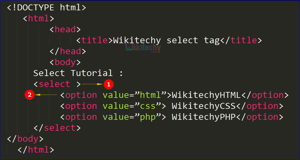
Тег SELECT
Тег <select> и обязательный парный ему </select>
HTML тег <select> создает список или выпадающий список. Каждый элемент списка описывается тегом Option
- size
-
Число отображаемых элементов. Если равно 1 или не указано, то выводится одна строчка. Если значение больше 1, то выводится список с прокруткой
Пример
Это список с прокруткой
Вторая строка
Третья строка
Четвертая строкаЭто выпадающий список
Вторая строка
Третья строка
Четвертая строка
Выбор раздела1 страница2 страница3 страница4 страница5 страница
Вот код:
<SELECT NAME=»navSelect»
ONCHANGE=»top.location.href =
this.options.value»>
<OPTION>Выбор раздела</OPTION>
<OPTION VALUE=»1.html»>1 страница</OPTION>
<OPTION VALUE=»2.html»>2 страница</OPTION>
<OPTION VALUE=»3.html»>3 страница</OPTION>
<OPTION VALUE=»4.html»>4 страница</OPTION>
<OPTION VALUE=»5.html»>5 страница</OPTION>
</SELECT>
Основную работу выполняет обработчик события ONCHANGE. top ссылается на окно браузера, активное в
данный момент. top.location.href —
URL документа, отображаемого этим окном.
Одним из свойств объекта SELECT
является коллекция options,
которая содержит параметры элементов
выбора. Например navSelect.option.value
содержит значение «index.html». Свойство
элемента SELECT selectedIndex
— номер выбранного пункта. Элемент this
внутри элемента ссылается именно на
этот элемент. Вместо него можно было
использовать (в Internet Explorer) ссылку document.all.navSelect,
но this гораздо короче и
работает в обоих браузерах. Я советую
вам всегда использовать элемент this,
когда это возможно.
Приведем еще один пример, когда пользователь сначала выбирает пункт из списка и потом щелкает на кнопке
Вот код:
<FORM>
SELECT NAME=»navSelect»<>
<OPTION>Выбор раздела</OPTION>
<OPTION VALUE=»index.html»>1 страница</OPTION>
<OPTION VALUE=»a.html»>2 страница</OPTION>
<OPTION VALUE=»aaa.html»>3 страница</OPTION>
</SELECT><BR>
<INPUT TYPE=BUTTON NAME=»go» VALUE=»Go!»
ONCLICK=»top.location.href =
this.form.navSelect.options.value»>
</FORM>
Здесь необходимо пояснить, что
каждый элемент формы имеет свойство form,
которое содержит ссылку на его
родительскую форму. Таким образом можно
сослаться на любой элемент формы из
любого другого элемента, чем мы здесь и
воспользовались: this.form.navSelect
ссылается именно на элемент выбора.
КатегорияЭлементы управления тега SELECT
Пример использования
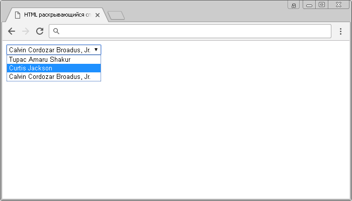
<!DOCTYPE html>
<html>
	<head>
		<title>Пример использования элемента <select></title>
	</head>
	<body>
		<select name = "blacklist">
			<option value = "2PAC">Tupac Amaru Shakur</option>
			<option value = "50cent">Curtis Jackson</option>
			<option value = "Snoop Dogg" selected>Calvin Cordozar Broadus, Jr.</option>
		</select>
	</body>
</html>
В этом примере мы тегом <select> создали раскрывающийся список, внутри него мы поместили три элемента <option>, которые определяют его пункты. Атрибутом selected указали, что третий пункт предопределен (будет выбран по умолчанию вместо первого).

Обращаю Ваше внимание на то, что необходимо использовать атрибут value (значение) тега , чтобы указать какое значение отправляется на сервер для дальнейшей обработки. В браузере это выглядит следующим образом:
В браузере это выглядит следующим образом:
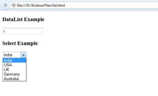
HTML раскрывающийся список.
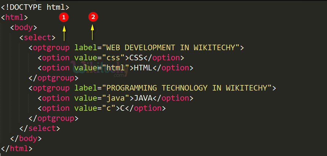
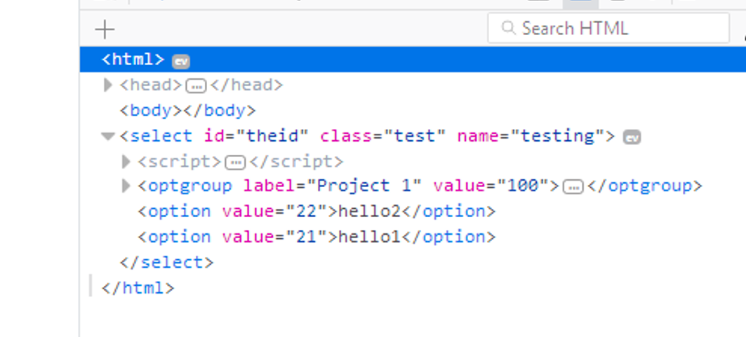
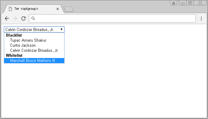
Рассмотрим следующий пример в котором с использованием тега <optgroup> сгруппируем логически две группы в нашем раскрывающемся списке.
<!DOCTYPE html>
<html>
	<head>
		<title>Пример использования HTML тега <optgroup></title>
	</head>
	<body>
		<select  name = "black&white">
			<optgroup label = "Blacklist"> <!--Группа №1 -->
				<option value = "2PAC"> Tupac Amaru Shakur </option>
				<option value = "50cent"> Curtis Jackson </option>
				<option value = "Snoop Dogg" selected > Calvin Cordozar Broadus, Jr. </option>
			</optgroup>
			<optgroup label = "Whitelist"> <!--Группа №2 -->
				<option value = "Eminem">Marshall Bruce Mathers III</option>
			</optgroup>
		</select>
	</body>
</html>
В данном примере мы выделили 2 группы тегом <optgroup>. Атрибут label элемента задает наименование выделенной группы, выполненное полужирным начертанием:
Группировка данных в раскрывающемся списке HTML.
Attributes of the Select Tag
Before I dive deep into whot to create a dropdown menu with the select tag, we need to discuss the attributes the select tag takes.
These are its attributes:
- name: You need to attach the name to every form control as it is used to reference the data after it’s submitted to the server.
- multiple: This attribute lets the user select multiple options from the dropdown menu.
- required: This is typically used for validation. With it, the form won’t submit unless a user selects at least one option from the dropdown.
- disabled: This attribute stops the user from interacting with the options.
- size: Expressed in numbers, the size attribute is used to specify how many options will be visible at a time.
- autofocus: This attribute is used on all form inputs, select inclusive, to specify that the input should be on focus when the page loads.