
The Two Types Of Alignment
When aligning flex and grid items, you have two possible things to align:
- You have the spare space in the grid or flex container (once the items or tracks have been laid out).
- You also have the item itself inside the grid area you placed it in, or on the cross axis inside the flex container.
I showed you a set of properties above, and the alignment properties can be thought of as two groups. Those which deal with distribution of spare space, and those which align the item itself.
Dealing With Spare Space: And
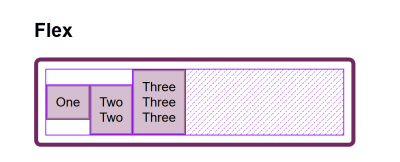
The properties which end in are about space distribution, so when you choose to use or you are distributing available space between grid tracks or flex items. They don’t change the size of the flex or grid items themselves; they move them around because they change where the spare space goes.
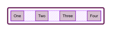
Below, I have a flex example and a grid example. Both have a container which is larger than required to display the flex items or grid tracks, so I can use and to distribute that space.
See the Pen justify-content and align-content by Rachel Andrew.
See the Pen justify-content and align-content by Rachel Andrew.
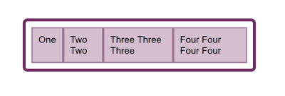
Moving Items Around: , , And
We then have and as applied to individual flex or grid items; you can also use and on the container to set all the properties at once. These properties deal with the actual flex or grid item, i.e. moving the content around inside the Grid Area or flex line.
- Grid LayoutYou get both properties as you can shift the item on the block and inline axis as we have a defined Grid Area in which it sits.
- Flex LayoutYou can only align on the cross axis as the main axis is controlled by space distribution alone. So if your items are a row, you can use to shift them up and down inside the flex line, aligning them against each other.
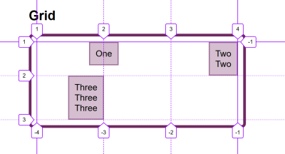
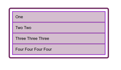
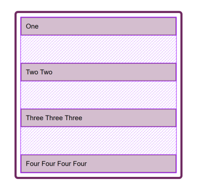
In my example below, I have a flex and a grid container, and am using and in Flexbox to move the items up and down against each other on the cross axis. If you use Firefox, and inspect the element using the Firefox Flexbox Inspector, you can see the size of the flex container and how the items are being moved vertically inside of that.
In grid, I can use all four properties to move the items around inside their grid area. Once again, the Firefox DevTools Grid Inspector will be useful when playing with alignment. With the grid lines overlaid, you can see the area inside which the content is being moved:
Play around with the values in the CodePen demo to see how you can shift content around in each layout method:
See the Pen justify-self, align-self, justify-items, align-items by Rachel Andrew.
See the Pen justify-self, align-self, justify-items, align-items by Rachel Andrew.
CSS Tutorial
CSS HOMECSS IntroductionCSS SyntaxCSS SelectorsCSS How ToCSS CommentsCSS Colors
Colors
RGB
HEX
HSL
CSS Backgrounds
Background Color
Background Image
Background Repeat
Background Attachment
Background Shorthand
CSS Borders
Borders
Border Width
Border Color
Border Sides
Border Shorthand
Rounded Borders
CSS Margins
Margins
Margin Collapse
CSS PaddingCSS Height/WidthCSS Box ModelCSS Outline
Outline
Outline Width
Outline Color
Outline Shorthand
Outline Offset
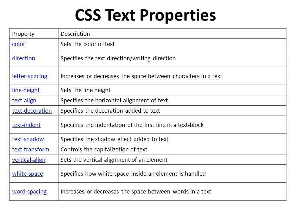
CSS Text
Text Color
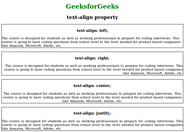
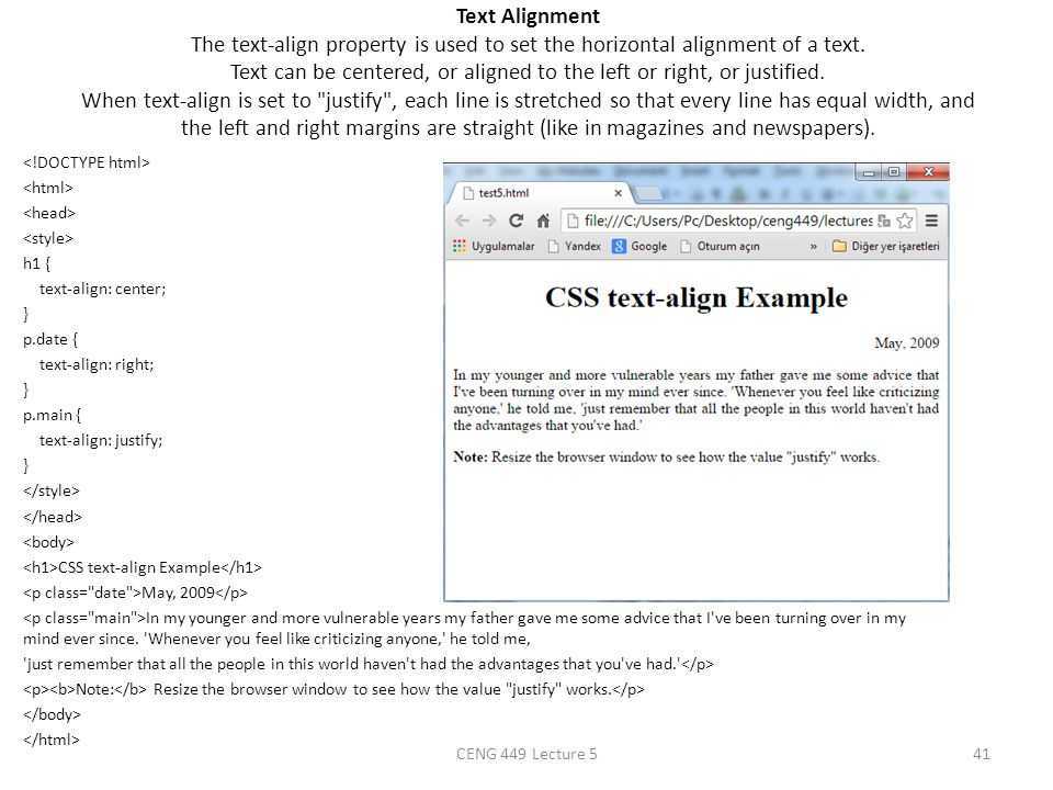
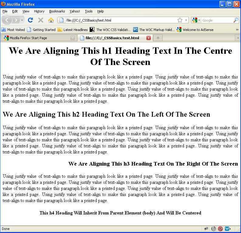
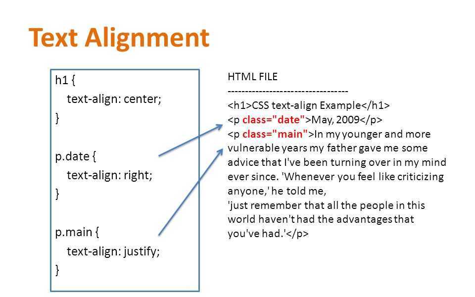
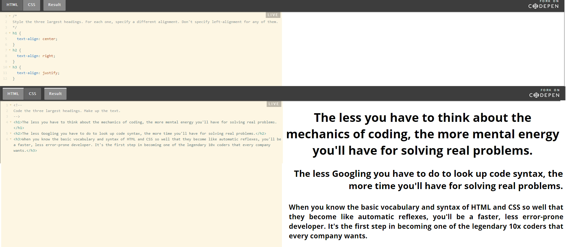
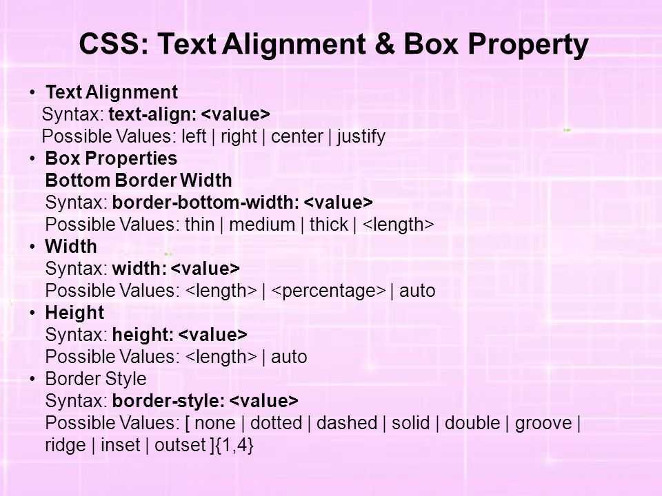
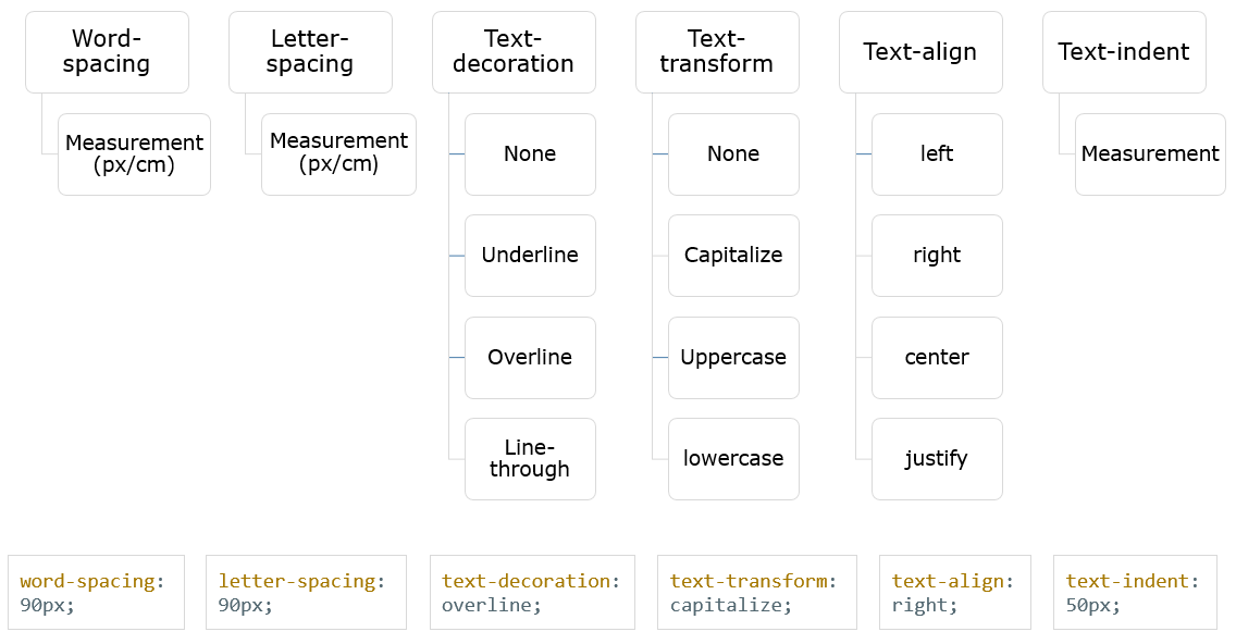
Text Alignment
Text Decoration
Text Transformation
Text Spacing
Text Shadow
CSS Fonts
Font Family
Font Web Safe
Font Fallbacks
Font Style
Font Size
Font Google
Font Pairings
Font Shorthand
CSS IconsCSS LinksCSS ListsCSS Tables
Table Borders
Table Size
Table Alignment
Table Style
Table Responsive
CSS DisplayCSS Max-widthCSS PositionCSS Z-indexCSS OverflowCSS Float
Float
Clear
Float Examples
CSS Inline-blockCSS AlignCSS CombinatorsCSS Pseudo-classCSS Pseudo-elementCSS OpacityCSS Navigation Bar
Navbar
Vertical Navbar
Horizontal Navbar
CSS DropdownsCSS Image GalleryCSS Image SpritesCSS Attr SelectorsCSS FormsCSS CountersCSS Website LayoutCSS UnitsCSS SpecificityCSS !importantCSS Math Functions
CSS Справочники
CSS СправочникCSS ПоддержкаCSS СелекторыCSS ФункцииCSS ЗвукCSS Веб шрифтыCSS АнимацииCSS ДлиныCSS Конвертер px-emCSS Названия цветаCSS Значения цветаCSS по умолчаниюCSS Символы
CSS Свойства
align-content
align-items
align-self
all
animation
animation-delay
animation-direction
animation-duration
animation-fill-mode
animation-iteration-count
animation-name
animation-play-state
animation-timing-function
backface-visibility
background
background-attachment
background-blend-mode
background-clip
background-color
background-image
background-origin
background-position
background-repeat
background-size
border
border-bottom
border-bottom-color
border-bottom-left-radius
border-bottom-right-radius
border-bottom-style
border-bottom-width
border-collapse
border-color
border-image
border-image-outset
border-image-repeat
border-image-slice
border-image-source
border-image-width
border-left
border-left-color
border-left-style
border-left-width
border-radius
border-right
border-right-color
border-right-style
border-right-width
border-spacing
border-style
border-top
border-top-color
border-top-left-radius
border-top-right-radius
border-top-style
border-top-width
border-width
bottom
box-decoration-break
box-shadow
box-sizing
caption-side
caret-color
@charset
clear
clip
color
column-count
column-fill
column-gap
column-rule
column-rule-color
column-rule-style
column-rule-width
column-span
column-width
columns
content
counter-increment
counter-reset
cursor
direction
display
empty-cells
filter
flex
flex-basis
flex-direction
flex-flow
flex-grow
flex-shrink
flex-wrap
float
font
@font-face
font-family
font-kerning
font-size
font-size-adjust
font-stretch
font-style
font-variant
font-weight
grid
grid-area
grid-auto-columns
grid-auto-flow
grid-auto-rows
grid-column
grid-column-end
grid-column-gap
grid-column-start
grid-gap
grid-row
grid-row-end
grid-row-gap
grid-row-start
grid-template
grid-template-areas
grid-template-columns
grid-template-rows
hanging-punctuation
height
hyphens
@import
isolation
justify-content
@keyframes
left
letter-spacing
line-height
list-style
list-style-image
list-style-position
list-style-type
margin
margin-bottom
margin-left
margin-right
margin-top
max-height
max-width
@media
min-height
min-width
mix-blend-mode
object-fit
object-position
opacity
order
outline
outline-color
outline-offset
outline-style
outline-width
overflow
overflow-x
overflow-y
padding
padding-bottom
padding-left
padding-right
padding-top
page-break-after
page-break-before
page-break-inside
perspective
perspective-origin
pointer-events
position
quotes
resize
right
tab-size
table-layout
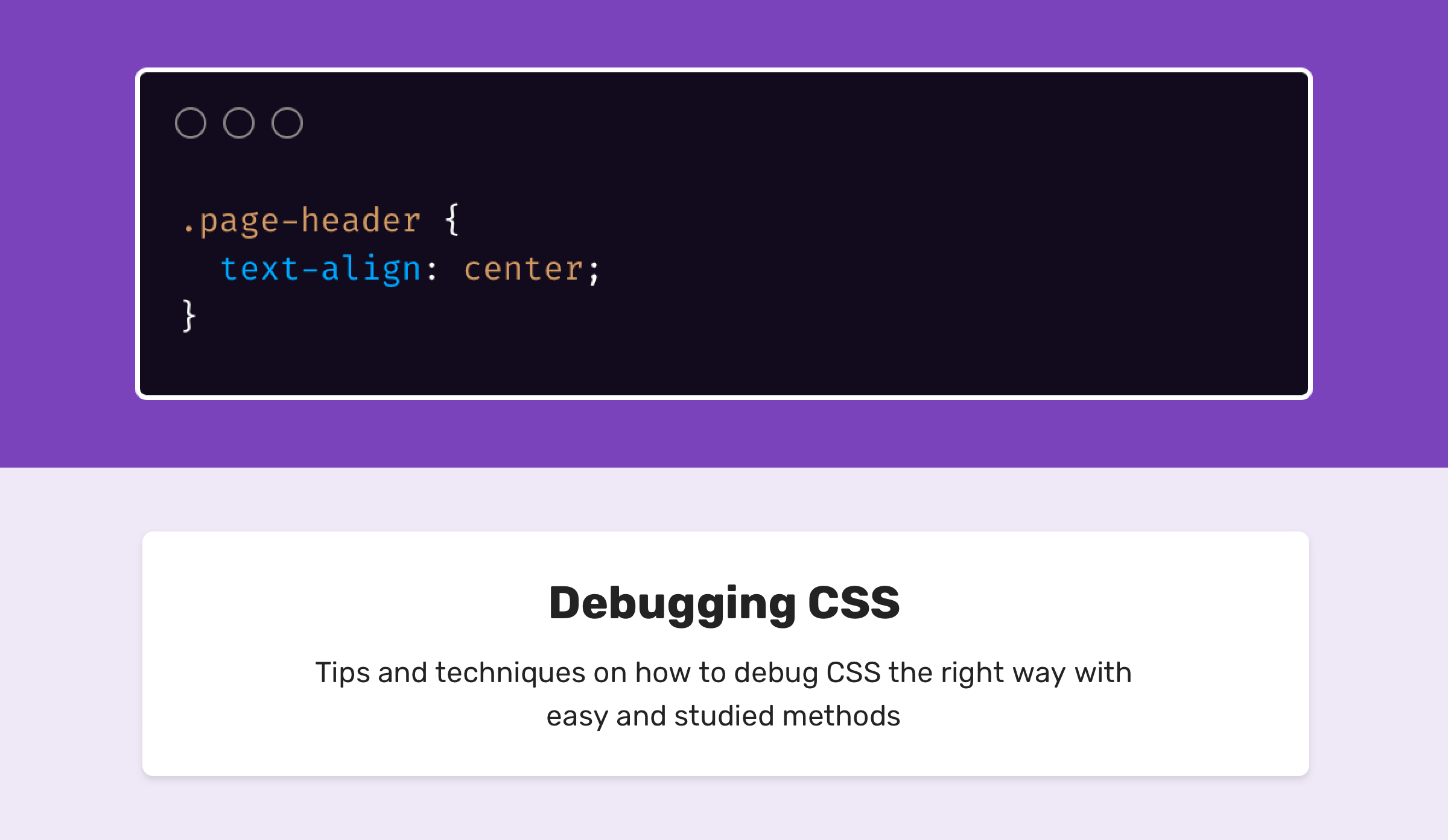
text-align
text-align-last
text-decoration
text-decoration-color
text-decoration-line
text-decoration-style
text-indent
text-justify
text-overflow
text-shadow
text-transform
top
transform
transform-origin
transform-style
transition
transition-delay
transition-duration
transition-property
transition-timing-function
unicode-bidi
user-select
vertical-align
visibility
white-space
width
word-break
word-spacing
word-wrap
writing-mode
z-index
Aligning Text And Inline Elements
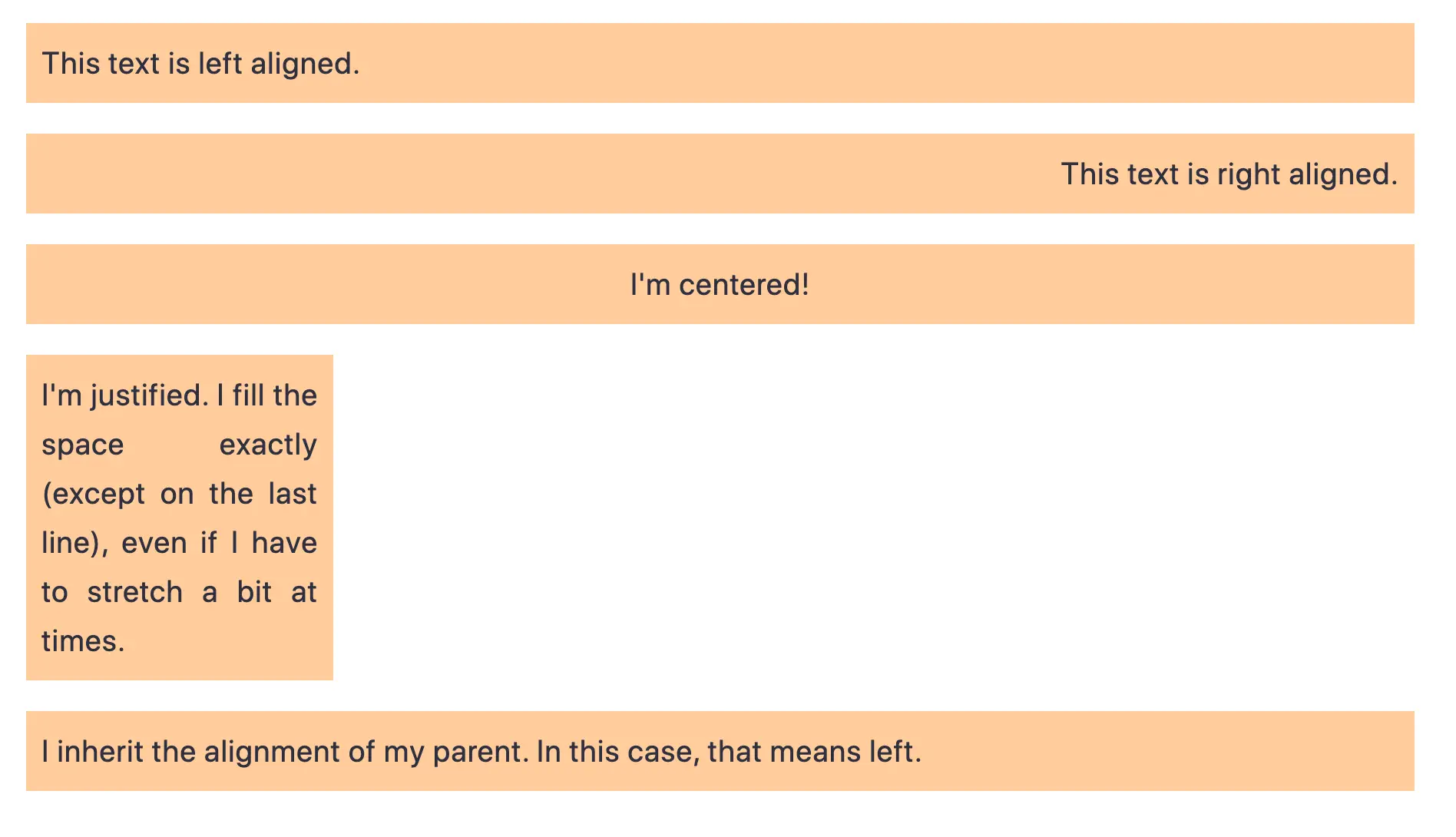
When we have some text and other inline elements on a page, each line of content is treated as a line box. The property will align that content on the page, for example, if you want your text centered, or justified. Sometimes, however, you may want to align things inside that line box against other things, for example, if you have an icon displayed alongside text, or text of different sizes.
In the example below, I have some text with a larger inline image. I am using on the image to align the text to the middle of the image.
See the Pen Vertical Alignment example by Rachel Andrew.
See the Pen Vertical Alignment example by Rachel Andrew.
The Property And Alignment
Remember that the property will change the size of the line-box and therefore can change your alignment. The following example uses a large line-height value of 150px, and I have aligned the image to . The image is aligned to the top of the line box and not the top of the text, remove that line-height or make it less than the size of the image and the image and text will line up at the top of the text.
See the Pen Vertical Alignment and line-height by Rachel Andrew.
See the Pen Vertical Alignment and line-height by Rachel Andrew.
It turns out that and indeed the size of text is pretty complicated, and I’m not going to head down that rabbit hole in this article. If you are trying to precisely align inline elements and want to really understand what is going on, I recommend reading “Deep Dive CSS: Font Metrics, And .”
When Can I Use The Property?
The property is useful if you are aligning any inline element. This includes elements with . The content of table cells can also be aligned with the property.
The property has no effect on flex or grid items, and therefore if used as part of a fallback strategy, will cease to apply the minute the parent element is turned into a grid or flex Container. For example, in the next pen, I have a set of items laid out with and this means that I get the ability to align the items even if the browser does not have Flexbox:
See the Pen inline-block and vertical-align by Rachel Andrew.
See the Pen inline-block and vertical-align by Rachel Andrew.
In this next pen, I have treated the as a fallback for Flex layout. The alignment properties no longer apply, and I can add to align the items in Flexbox. You can tell that the Flexbox method is in play because the gap between items that you will get when using is gone.
See the Pen inline-block flex fallback by Rachel Andrew.
See the Pen inline-block flex fallback by Rachel Andrew.
The fact that works on table cells is the reason that the trick to vertically center an item using works.
Now that we do have better ways to align boxes in CSS (as we will look at in the next section), we don’t need to employ the and properties in places other than the inline and text elements for which they were designed. However, they are still completely valid to use in those text and inline formats, and so remember if you are trying to align something inline, it is these properties and not the Box Alignment ones that you need to reach for.
Flexbox And Micro-Components
One of the things I think is often overlooked is how useful Flexbox is for doing tiny layout jobs, where you might think that using is the way to go. I often use Flexbox to get neat alignment of small patterns; for example, aligning an icon next to text, baseline aligning two things with different font sizes, or making form fields and buttons line up properly. If you are struggling to get something to line up nicely with , then perhaps try doing the job with Flexbox. Remember that you can also create an inline flex container if you want with .
See the Pen inline-flex example by Rachel Andrew.
See the Pen inline-flex example by Rachel Andrew.
There is no reason not to use Flexbox, or even Grid for tiny layout jobs. They aren’t just for big chunks of layout. Try the different things available to you, and see what works best.
People are often very keen to know what the right or wrong way to do things is. In reality, there often is no right or wrong; a small difference in your pattern might mean the difference between Flexbox working best, where otherwise you would use .
CSS Advanced
CSS Rounded CornersCSS Border ImagesCSS BackgroundsCSS ColorsCSS Color KeywordsCSS Gradients
Linear Gradients
Radial Gradients
Conic Gradients
CSS Shadows
Shadow Effects
Box Shadow
CSS Text EffectsCSS Web FontsCSS 2D TransformsCSS 3D TransformsCSS TransitionsCSS AnimationsCSS TooltipsCSS Style ImagesCSS Image ReflectionCSS object-fitCSS object-positionCSS MaskingCSS ButtonsCSS PaginationCSS Multiple ColumnsCSS User InterfaceCSS Variables
The var() Function
Overriding Variables
Variables and JavaScript
Variables in Media Queries
CSS Box SizingCSS Media QueriesCSS MQ ExamplesCSS Flexbox
CSS Flexbox
CSS Flex Container
CSS Flex Items
CSS Flex Responsive
CSS Свойства
align-contentalign-itemsalign-selfallanimationanimation-delayanimation-directionanimation-durationanimation-fill-modeanimation-iteration-countanimation-nameanimation-play-stateanimation-timing-functionbackface-visibilitybackgroundbackground-attachmentbackground-blend-modebackground-clipbackground-colorbackground-imagebackground-originbackground-positionbackground-repeatbackground-sizeborderborder-bottomborder-bottom-colorborder-bottom-left-radiusborder-bottom-right-radiusborder-bottom-styleborder-bottom-widthborder-collapseborder-colorborder-imageborder-image-outsetborder-image-repeatborder-image-sliceborder-image-sourceborder-image-widthborder-leftborder-left-colorborder-left-styleborder-left-widthborder-radiusborder-rightborder-right-colorborder-right-styleborder-right-widthborder-spacingborder-styleborder-topborder-top-colorborder-top-left-radiusborder-top-right-radiusborder-top-styleborder-top-widthborder-widthbottombox-decoration-breakbox-shadowbox-sizingcaption-sidecaret-color@charsetclearclipcolorcolumn-countcolumn-fillcolumn-gapcolumn-rulecolumn-rule-colorcolumn-rule-stylecolumn-rule-widthcolumn-spancolumn-widthcolumnscontentcounter-incrementcounter-resetcursordirectiondisplayempty-cellsfilterflexflex-basisflex-directionflex-flowflex-growflex-shrinkflex-wrapfloatfont@font-facefont-familyfont-kerningfont-sizefont-size-adjustfont-stretchfont-stylefont-variantfont-weightgridgrid-areagrid-auto-columnsgrid-auto-flowgrid-auto-rowsgrid-columngrid-column-endgrid-column-gapgrid-column-startgrid-gapgrid-rowgrid-row-endgrid-row-gapgrid-row-startgrid-templategrid-template-areasgrid-template-columnsgrid-template-rowshanging-punctuationheighthyphens@importisolationjustify-content@keyframesleftletter-spacingline-heightlist-stylelist-style-imagelist-style-positionlist-style-typemarginmargin-bottommargin-leftmargin-rightmargin-topmax-heightmax-width@mediamin-heightmin-widthmix-blend-modeobject-fitobject-positionopacityorderoutlineoutline-coloroutline-offsetoutline-styleoutline-widthoverflowoverflow-xoverflow-ypaddingpadding-bottompadding-leftpadding-rightpadding-toppage-break-afterpage-break-beforepage-break-insideperspectiveperspective-originpointer-eventspositionquotesresizerighttab-sizetable-layouttext-aligntext-align-lasttext-decorationtext-decoration-colortext-decoration-linetext-decoration-styletext-indenttext-justifytext-overflowtext-shadowtext-transformtoptransformtransform-origintransform-styletransitiontransition-delaytransition-durationtransition-propertytransition-timing-functionunicode-bidiuser-selectvertical-alignvisibilitywhite-spacewidthword-breakword-spacingword-wrapwriting-modez-index
Box Alignment
The Box Alignment Specification deals with how we align everything else. The specification details the following alignment properties:
You might already think of these properties as being part of the Flexbox Specification, or perhaps Grid. The history of the properties is that they originated as part of Flexbox, and still exist in the Level 1 specification; however, they were moved into their own specification when it became apparent that they were more generally useful. We now also use them in Grid Layout, and they are specified for other layout methods too, although current browser support means that you won’t be able to use them just yet.
Therefore, next time someone on the Internet tells you that vertical alignment is the hardest part of CSS, you can tell them this (which even fits into a tweet):
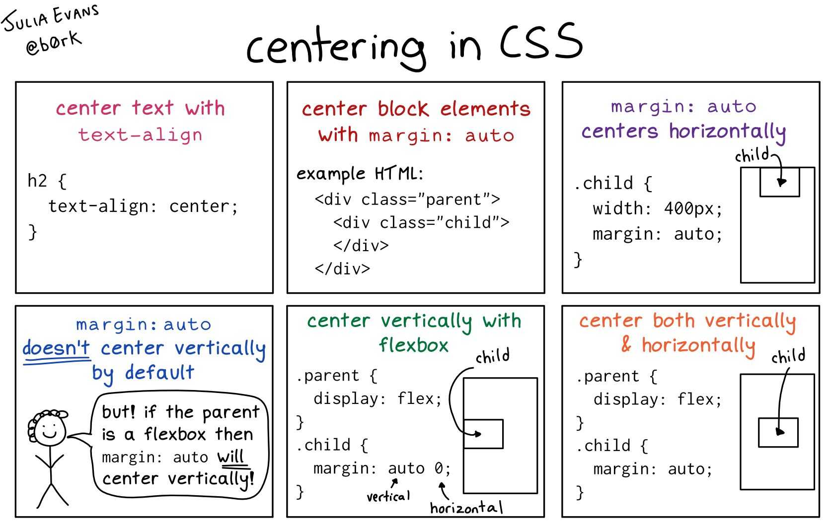
In the future, we may even be able to dispense with , once the Box Alignment properties are implemented for Block Layout. At the moment, however, making the parent of the thing you want centering a flex container is the way to get alignment horizontally and vertically.
Why Is There No justify-self In Flexbox?
Grid Layout implements all of the properties for both axes because we always have two axes to deal with in Grid Layout. We create tracks (which may leave additional space in the grid container in either dimension,) and so we can distribute that space with or . We also have Grid Areas, and the element in that area may not take up the full space of the area, so we can use or to move the content around the area (or , to change the alignment of all items).
Flexbox does not have tracks in the way that Grid layout does. On the main axis, all we have to play with is the distribution of space between the items. There is no concept of a track into which a flex item is placed. So there is no area created in which to move the item around in. This is why there is no property on the main axes in Flexbox.
Sometimes, however, you do want to be able to align one item or part of the group of items in a different way. A common pattern would be a split navigation bar with one item being separated out from the group. In that situation, the specification advises the use of auto margins.
An auto margin will take up all of the space in the direction it is applied, which is why we can center a block (such as our main page layout) using a left and right margin of auto. With an auto margin on both sides, each margin tries to take up all the space and so pushes the block into the middle. With our row of flex items, we can add to the item we want the split to happen on, and as long as there is available space in the flex container, you get a split. This plays nicely with Flexbox because as soon as there is no available space, the items behave as regular flex items do.
See the Pen Alignment with auto margins by Rachel Andrew.
See the Pen Alignment with auto margins by Rachel Andrew.
Wrapping Up
To wrap up, I have a quick summary of the basics of alignment. If you remember these few rules, you should be able to align most things with CSS:
- Are you aligning text or an inline element? If so, you need to use , , and .
- Do you have an item or items you want to align in the center of the page or container? If so, make the container a flex container then set and .
- For Grid Layouts, the properties that start with work in the Block direction; those which start with work in the inline direction.
- For Flex Layouts, the properties that start with work on the Cross Axis; those which start with work on the main axis.
- The and properties distribute extra space. If you have no extra space in your flex or grid container, they will do nothing.
- If you think you need in Flexbox, then using an auto margin will probably give you the pattern you are after.
- You can use Grid and Flexbox along with the alignment properties for tiny layout jobs as well as main components — experiment!
For more information about alignment, see these resources:
- CSS Box Alignment (MDN web docs)
- Everything You Need To Know About Alignment In Flexbox
- Box Alignment Cheatsheet
(il)
When justify-content Or align-content Do Not Work
The and properties in Grid and Flexbox are about distributing extra space. So the thing to check is that you have extra space.
Here is a Flex example: I have set and I have three items. They don’t take up all of the space in the flex container, so I have spare space on the main axis, the initial value for is and so my items all line up at the start and the extra space is at the end. I am using the Firefox Flex Inspector to highlight the space.
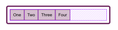
If I change flex-direction to , that extra space is now distributed between the items:
If I now add more content to my items so they become larger and there is no longer any additional space, then does nothing — simply because there is no space to distribute.
A common question I’m asked is why isn’t working when is . This is generally because there is no space to distribute. If you take the above example and make it , the items will display as a column, but there will be no additional space below the items as there is when you do . This is because when you make a Flex Container with you have a block level flex container; this will take up all possible space in the inline direction. In CSS, things do not stretch in the block direction, so no extra space.
Add a height to the container and — as long as that is more than is required to display the items — you have extra space and therefore will work on your column.
Confused By align And justify
One of the cited issues with people remembering the alignment properties in Grid and Flexbox, is that no one can remember whether to align or to justify. Which direction is which?
For Grid Layout, you need to know if you are aligning in the Block or Inline Direction. The Block direction is the direction blocks lay out on your page (in your writing mode), i.e. for English that is vertically. The Inline direction is the direction in which sentences run (so for English that is left to right horizontally).
To align things in the Block Direction, you will use the properties which start with . You use to distribute space between grid tracks, if there is free space in the grid container, and or to move an item around inside the grid area it has been placed in.
The below example has two grid layouts. One has (which is the default for English) and the other . This is the only difference between them. You can see that the alignment properties which I have applied work in exactly the same way on the block axis in both modes.
See the Pen Grid Block Axis Alignment by Rachel Andrew.
See the Pen Grid Block Axis Alignment by Rachel Andrew.
To align things in the inline direction, use the properties which begin with . Use to distribute space between grid tracks, and or to align items inside their grid area in the inline direction.
Once again, I have two grid layout examples so that you can see that inline is always inline — no matter which writing mode you are using.
See the Pen Grid Inline Alignment by Rachel Andrew.
See the Pen Grid Inline Alignment by Rachel Andrew.
Flexbox is a little trickier due to the fact that we have a main axis which can be changed to or . So, let’s first think about that main axis. It is set with the property. The initial (or default) value of this property is which will lay the flex items out as a row in the writing mode currently in use — this is why when working in English, we end up with items laid out horizontally when we create a flex container. You can then change the main axis to and the items will be laid out as a column which means they are laid out in the block direction for that writing mode.


As we can do this axis switching, the most important factor in Flexbox is asking, “Which axis is my main axis?” Once you know that, then for alignment (when on your main axis) you simply use . It doesn’t matter if your main axis is row or column. You control space between the flex items with .
See the Pen justfy-content in Flexbox by Rachel Andrew.
See the Pen justfy-content in Flexbox by Rachel Andrew.
On the cross axis, you can use which will align the items inside the flex container or flex line in a multi-line flex container. If you have a multi-line container using and have space in that container, you can use to distribute the space on the cross axis.
In the example below, we are doing both with a flex container displayed as a row and a column:
See the Pen Cross axis alignment in Flexbox by Rachel Andrew.
See the Pen Cross axis alignment in Flexbox by Rachel Andrew.