
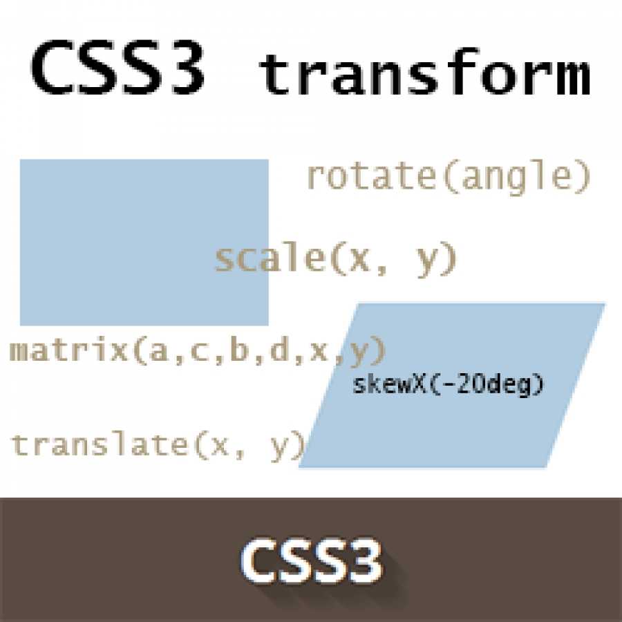
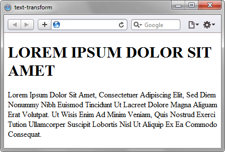
Possible Values
flat | preserve-3d
Explanation of these values:
- Specifies that the children of the element should be positioned in the 3D-space.
- Specifies that the children of the element are lying in the plane of the element itself.
In addition, all CSS properties also accept the following CSS-wide keyword values as the sole component of their property value:
- Represents the value specified as the property’s initial value.
- Represents the computed value of the property on the element’s parent.
- This value acts as either or , depending on whether the property is inherited or not. In other words, it sets all properties to their parent value if they are inheritable or to their initial value if not inheritable.
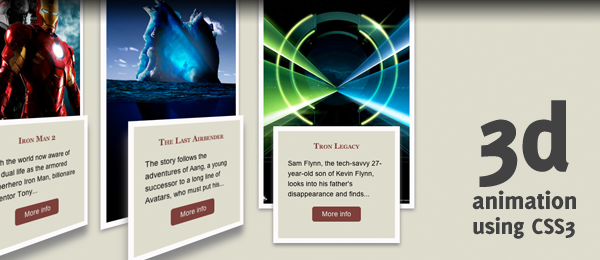
Slide-flip
Take another look at the Weather App 3-D transition. You’ll notice that it’s not quite the same effect as our previous demo. If you follow the right edge of the card, you’ll find that its corners stay within the container. Instead of pivoting from the horizontal centre, it pivots on that right edge. But the transition is not just a rotation – the edge moves horizontally from right to left. We can reproduce this transition just by modifying a couple of lines of CSS from our original card flip demo.
The pivot point for the rotation occurs at the right side of the card. By default, the of an element is at its horizontal and vertical centre ( or ). Let’s change it to the right side:
That flip now needs some horizontal movement with . We’ll set the rotation to so it flips right side out.
 Creating a slide-flip from the right edge of the card
Vendor Prefixes
For maximum browser compatibility many web developers add browser-specific properties by using extensions such as for Safari, Google Chrome, and Opera (newer versions), for Internet Explorer, for Firefox, for older versions of Opera etc. As with any CSS property, if a browser doesn’t support a proprietary extension, it will simply ignore it.
This practice is not recommended by the W3C, however in many cases, the only way you can test a property is to include the CSS extension that is compatible with your browser.
The major browser manufacturers generally strive to adhere to the W3C specifications, and when they support a non-prefixed property, they typically remove the prefixed version. Also, W3C advises vendors to remove their prefixes for properties that reach Candidate Recommendation status.
Many developers use Autoprefixer, which is a postprocessor for CSS. Autoprefixer automatically adds vendor prefixes to your CSS so that you don’t need to. It also removes old, unnecessary prefixes from your CSS.
You can also use Autoprefixer with preprocessors such as Less and Sass.
CSS Свойства
align-contentalign-itemsalign-selfallanimationanimation-delayanimation-directionanimation-durationanimation-fill-modeanimation-iteration-countanimation-nameanimation-play-stateanimation-timing-functionbackface-visibilitybackgroundbackground-attachmentbackground-blend-modebackground-clipbackground-colorbackground-imagebackground-originbackground-positionbackground-repeatbackground-sizeborderborder-bottomborder-bottom-colorborder-bottom-left-radiusborder-bottom-right-radiusborder-bottom-styleborder-bottom-widthborder-collapseborder-colorborder-imageborder-image-outsetborder-image-repeatborder-image-sliceborder-image-sourceborder-image-widthborder-leftborder-left-colorborder-left-styleborder-left-widthborder-radiusborder-rightborder-right-colorborder-right-styleborder-right-widthborder-spacingborder-styleborder-topborder-top-colorborder-top-left-radiusborder-top-right-radiusborder-top-styleborder-top-widthborder-widthbottombox-decoration-breakbox-shadowbox-sizingcaption-sidecaret-color@charsetclearclipcolorcolumn-countcolumn-fillcolumn-gapcolumn-rulecolumn-rule-colorcolumn-rule-stylecolumn-rule-widthcolumn-spancolumn-widthcolumnscontentcounter-incrementcounter-resetcursordirectiondisplayempty-cellsfilterflexflex-basisflex-directionflex-flowflex-growflex-shrinkflex-wrapfloatfont@font-facefont-familyfont-kerningfont-sizefont-size-adjustfont-stretchfont-stylefont-variantfont-weightgridgrid-areagrid-auto-columnsgrid-auto-flowgrid-auto-rowsgrid-columngrid-column-endgrid-column-gapgrid-column-startgrid-gapgrid-rowgrid-row-endgrid-row-gapgrid-row-startgrid-templategrid-template-areasgrid-template-columnsgrid-template-rowshanging-punctuationheighthyphens@importisolationjustify-content@keyframesleftletter-spacingline-heightlist-stylelist-style-imagelist-style-positionlist-style-typemarginmargin-bottommargin-leftmargin-rightmargin-topmax-heightmax-width@mediamin-heightmin-widthmix-blend-modeobject-fitobject-positionopacityorderoutlineoutline-coloroutline-offsetoutline-styleoutline-widthoverflowoverflow-xoverflow-ypaddingpadding-bottompadding-leftpadding-rightpadding-toppage-break-afterpage-break-beforepage-break-insideperspectiveperspective-originpointer-eventspositionquotesresizerighttab-sizetable-layouttext-aligntext-align-lasttext-decorationtext-decoration-colortext-decoration-linetext-decoration-styletext-indenttext-justifytext-overflowtext-shadowtext-transformtoptransformtransform-origintransform-styletransitiontransition-delaytransition-durationtransition-propertytransition-timing-functionunicode-bidiuser-selectvertical-alignvisibilitywhite-spacewidthword-breakword-spacingword-wrapwriting-modez-index
CSS Reference
CSS ReferenceCSS SelectorsCSS FunctionsCSS Reference AuralCSS Web Safe FontsCSS AnimatableCSS UnitsCSS PX-EM ConverterCSS ColorsCSS Color ValuesCSS3 Browser Support
CSS Properties
align-content
align-items
align-self
all
animation
animation-delay
animation-direction
animation-duration
animation-fill-mode
animation-iteration-count
animation-name
animation-play-state
animation-timing-function
backface-visibility
background
background-attachment
background-blend-mode
background-clip
background-color
background-image
background-origin
background-position
background-repeat
background-size
border
border-bottom
border-bottom-color
border-bottom-left-radius
border-bottom-right-radius
border-bottom-style
border-bottom-width
border-collapse
border-color
border-image
border-image-outset
border-image-repeat
border-image-slice
border-image-source
border-image-width
border-left
border-left-color
border-left-style
border-left-width
border-radius
border-right
border-right-color
border-right-style
border-right-width
border-spacing
border-style
border-top
border-top-color
border-top-left-radius
border-top-right-radius
border-top-style
border-top-width
border-width
bottom
box-shadow
box-sizing
caption-side
clear
clip
color
column-count
column-fill
column-gap
column-rule
column-rule-color
column-rule-style
column-rule-width
column-span
column-width
columns
content
counter-increment
counter-reset
cursor
direction
display
empty-cells
filter
flex
flex-basis
flex-direction
flex-flow
flex-grow
flex-shrink
flex-wrap
float
font
@font-face
font-family
font-size
font-size-adjust
font-stretch
font-style
font-variant
font-weight
hanging-punctuation
height
justify-content
@keyframes
left
letter-spacing
line-height
list-style
list-style-image
list-style-position
list-style-type
margin
margin-bottom
margin-left
margin-right
margin-top
max-height
max-width
@media
min-height
min-width
nav-down
nav-index
nav-left
nav-right
nav-up
opacity
order
outline
outline-color
outline-offset
outline-style
outline-width
overflow
overflow-x
overflow-y
padding
padding-bottom
padding-left
padding-right
padding-top
page-break-after
page-break-before
page-break-inside
perspective
perspective-origin
position
quotes
resize
right
tab-size
table-layout
text-align
text-align-last
text-decoration
text-decoration-color
text-decoration-line
text-decoration-style
text-indent
text-justify
text-overflow
text-shadow
text-transform
top
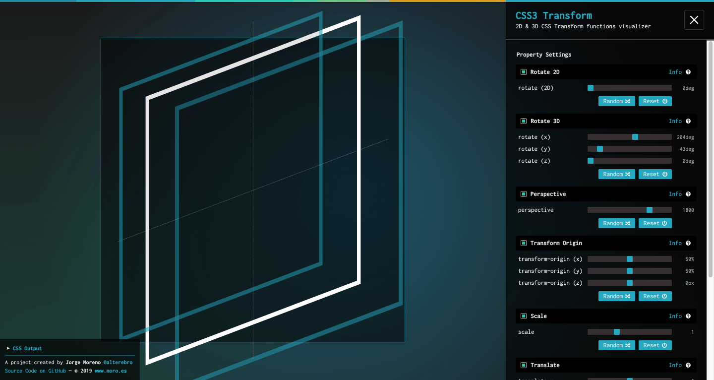
transform
transform-origin
transform-style
transition
transition-delay
transition-duration
transition-property
transition-timing-function
unicode-bidi
vertical-align
visibility
white-space
width
word-break
word-spacing
word-wrap
z-index
Property Values
| Value | Description |
|---|---|
| none | Defines that there should be no transformation |
| matrix(n, n, n, n, n, n) | Defines a 2D transformation, using a matrix of six values |
| matrix3d(n, n, n, n, etc….) | Defines a 3D transformation, using a 4×4 matrix of 16 values |
| translate(x, y) | Defines a 2D translation |
| translate3d(x, y, z) | Defines a 3D translation |
| translateX(x) | Defines a translation, using only the value for the X-axis |
| translateY(y) | Defines a translation, using only the value for the Y-axis |
| translateZ(z) | Defines a 3D translation, using only the value for the Z-axis |
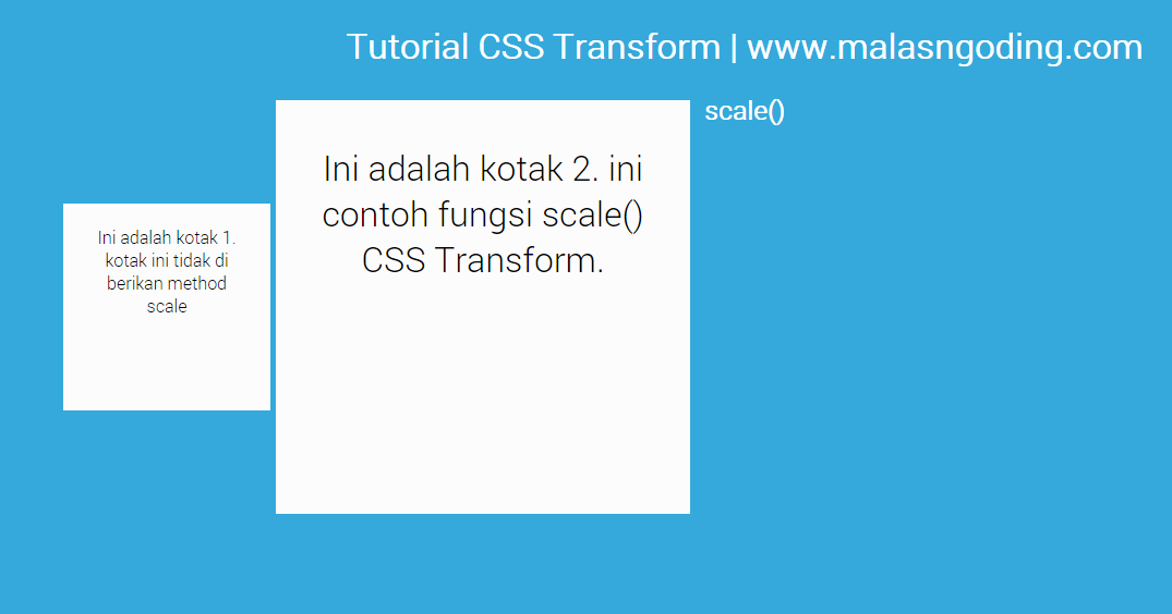
| scale(x, y) | Defines a 2D scale transformation |
| scale3d(x, y, z) | Defines a 3D scale transformation |
| scaleX(x) | Defines a scale transformation by giving a value for the X-axis |
| scaleY(y) | Defines a scale transformation by giving a value for the Y-axis |
| scaleZ(z) | Defines a 3D scale transformation by giving a value for the Z-axis |
| rotate(angle) | Defines a 2D rotation, the angle is specified in the parameter |
| rotate3d(x, y, z, angle) | Defines a 3D rotation |
| rotateX(angle) | Defines a 3D rotation along the X-axis |
| rotateY(angle) | Defines a 3D rotation along the Y-axis |
| rotateZ(angle) | Defines a 3D rotation along the Z-axis |
| skew(x-angle, y-angle) | Defines a 2D skew transformation along the X- and the Y-axis |
| skewX(angle) | Defines a 2D skew transformation along the X-axis |
| skewY(angle) | Defines a 2D skew transformation along the Y-axis |
| perspective(n) | Defines a perspective view for a 3D transformed element |
| initial | Sets this property to its default value. Read about initial |
| inherit | Inherits this property from its parent element. Read about inherit |
Setting the stage for our animation
The ‘stage’ is the element in which our animation takes place. The
animation will move and rotate in relation to the stage element, which
itself remains fixed to the page.


The optional perspective attribute defines how extreme the
3D effect will be as elements move up and down the Z-axis (come out of
the page). The larger this distance the less obvious the effect.
Without this attribute there is no perspective effect at all.
The next element is the one to which the animation is applied. We do
this by referring to the keyframes by name. We also define a transition timing function and set the
number of iterations (or infinite in this case for perpetual
motion). Each iteration will last 6 seconds.
You can assign different timing functions for each individual
keyframe in the block if you want to create more physically realistic
animations.
The hover effect will pause the animation when the mouse is
over the element. This property can also be toggled between ‘running’
and ‘paused’ using JavaScript to control the state of the animation.
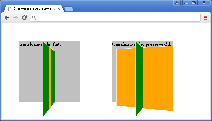
The preserve-3d setting is important if you want to be able
to transform other elements with relation to this one, which we do.
Without this all child elements are rendered flat in the same plane.
Prior to Chrome 12.0 neither the perspective nor
preserve-3d attribute was recognised so the 3D animations where
all ‘flattened’. This has been addressed for later versions, but
preserve-3d is still missing as of Internet Explorer
11.
One interesting effect can be achieved by setting the timing function
to ‘ease-in-out’ and adding a new property
-webkit-animation-direction: alternate;. This will result in
an animation that spins first one way and then the other.
Example Code
Working Example within an HTML Document
<!doctype html>
<title>Example</title>
<style>
.container {
position: relative;
left:80px;
top:60px;
height: 200px;
width: 200px;
margin: 1px;
border: 1px dotted firebrick;
perspective: 250px;
}
.rotate {
padding:10px;
width: 200px;
height: 200px;
text-align:center;
background-color: gold;
opacity: 0.8;
transform-style: preserve-3d;
animation: rotate 7s linear 0s infinite reverse none;
}
.container:hover .rotate {
transform-style: flat;
}
@keyframes rotate {
from { transform: rotateX(0); }
to { transform: rotateX(360deg); }
}
.rotate > div {
position: absolute;
top: 40px;
left: 40px;
width: 80px;
height: 50px;
padding: 10px;
box-sizing: border-box;
}
.rotate > :first-child {
width:80px;
height:70px;
background-color: chartreuse;
transform: translateZ(-80px) rotateY(35deg);
}
.rotate > :last-child {
width:100px;
height:50px;
background-color: plum;
transform: translateZ(50px) rotateX(50deg);
transform-origin: 50% top;
}
</style>
<p>Hover over the rotating boxes to see what happens when the <code>transform-style</code> goes from <code>preserve-3d</code> to <code>flat</code>.</p>
<div class=»container»>
<div class=»rotate»>Rotating box…
<div>First Child</div>
<div>Last Child</div>
</div>
</div>
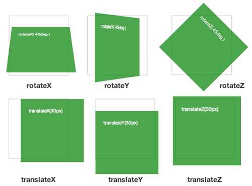
Rotation Functions
The 2D function actually rotates elements around the z-axis and is identical to . For example:

rotates around the horizontal axis and around the vertical.
Angles can be defined in:
- — e.g. is half a turn clockwise
- — degrees, e.g. is one quarter turn clockwise
- — radians, e.g. is half a turn counter-clockwise
- — gradians. One full turn is , so is half a turn counter-clockwise.
Three axes of rotation can be set with the function. Somewhat confusingly, it accepts four values, which describe a vector:
- — the x-coordinate of the vector denoting the axis of rotation (0 to 1).
- — the y-coordinate of the vector denoting the axis of rotation (0 to 1).
- — the z-coordinate of the vector denoting the axis of rotation (0 to 1).
- — the angle of rotation. A positive angle denotes clockwise rotation and negative is counter-clockwise.
Math masochists can read full details of at MDN.
CSS Reference
CSS ReferenceCSS SelectorsCSS FunctionsCSS Reference AuralCSS Web Safe FontsCSS AnimatableCSS UnitsCSS PX-EM ConverterCSS ColorsCSS Color ValuesCSS3 Browser Support
CSS Properties
align-content
align-items
align-self
all
animation
animation-delay
animation-direction
animation-duration
animation-fill-mode
animation-iteration-count
animation-name
animation-play-state
animation-timing-function
backface-visibility
background
background-attachment
background-blend-mode
background-clip
background-color
background-image
background-origin
background-position
background-repeat
background-size
border
border-bottom
border-bottom-color
border-bottom-left-radius
border-bottom-right-radius
border-bottom-style
border-bottom-width
border-collapse
border-color
border-image
border-image-outset
border-image-repeat
border-image-slice
border-image-source
border-image-width
border-left
border-left-color
border-left-style
border-left-width
border-radius
border-right
border-right-color
border-right-style
border-right-width
border-spacing
border-style
border-top
border-top-color
border-top-left-radius
border-top-right-radius
border-top-style
border-top-width
border-width
bottom
box-shadow
box-sizing
caption-side
clear
clip
color
column-count
column-fill
column-gap
column-rule
column-rule-color
column-rule-style
column-rule-width
column-span
column-width
columns
content
counter-increment
counter-reset
cursor
direction
display
empty-cells
filter
flex
flex-basis
flex-direction
flex-flow
flex-grow
flex-shrink
flex-wrap
float
font
@font-face
font-family
font-size
font-size-adjust
font-stretch
font-style
font-variant
font-weight
hanging-punctuation
height
justify-content
@keyframes
left
letter-spacing
line-height
list-style
list-style-image
list-style-position
list-style-type
margin
margin-bottom
margin-left
margin-right
margin-top
max-height
max-width
@media
min-height
min-width
nav-down
nav-index
nav-left
nav-right
nav-up
opacity
order
outline
outline-color
outline-offset
outline-style
outline-width
overflow
overflow-x
overflow-y
padding
padding-bottom
padding-left
padding-right
padding-top
page-break-after
page-break-before
page-break-inside
perspective
perspective-origin
position
quotes
resize
right
tab-size
table-layout
text-align
text-align-last
text-decoration
text-decoration-color
text-decoration-line
text-decoration-style
text-indent
text-justify
text-overflow
text-shadow
text-transform
top
transform
transform-origin
transform-style
transition
transition-delay
transition-duration
transition-property
transition-timing-function
unicode-bidi
vertical-align
visibility
white-space
width
word-break
word-spacing
word-wrap
z-index
Другие значения transform
Мы рассмотрели самые основные значения transform. Рассмотрим остальные возможности.


- none — отсутствие преобразований (по умолчанию включено оно);
- matrix(x,x,x,x,x,x) — преобразование 2D с помощью матрицы из 6 значений;
- matrix3d(x,x,x,x,x,x,x,x,x,x,x,x,x,x,x,x) — преобразование 3D с помощью матрицы из 16 значений;
- translate3d(x,y,z) — перемещение 3d (по сравнению с обычным перемещением, здесь добавлена еще третья координата);
- scale3d(x,y,z) — масштабирование в 3d (по сравнению с обычным масштабированием, здесь добавлена еще третья координата);
- rotate3d(x,y,z) — вращение в 3d (по сравнению с обычным вращением, здесь добавлена еще третья координата);
- rotateX(x) — 3d вращение по оси X;
- rotateY(x) — 3d вращение по оси Y;
- rotateZ(x) — 3d вращение по оси Z;
- perspective(n) — перспектива для преобразования 3D элемента;
В JavaScript свойство CSS transform доступно по следующим свойствам:
Возможно, вы зададите вопрос «а зачем вообще использовать transform, когда можно просто изменять данные объекта как нам нужно. Например, изменив размеры объекта?» Разница в том, что свойств transform при трансформации никак не сдвигает другие элементы на странице. В случае же простого изменения размеров объекта это неминуемо приводит к сдвигу соседних объектов вокруг, что, как правило, некрасиво.
Как делается куб на HTML и CSS
Сделать куб на HTML и CSS благодаря возможностям CSS-функциям 3D трансформации очень просто. Всё, что представляется из себя данная геометрическая фигура — это развернутые на требуемые углы и смещенные в определенные стороны полигоны, то есть блочные элементы (div, article или подобное).
Изначально у нас есть набор из шести блоков обернутые в основной блок с классом . Зададим основному блоку размер 300px, указав свойства left и height в его классе. Позиционируем блок абсолютно , чтобы можно было разместить его в любой точке экрана. Эту точку мы обозначим свойствами top и left, рассчитав с помощью CSS-функции calc() центр видимой области страницы. Затем, нам нужно указать основному блоку будущего куба с помощью свойства , что он должен отображать дочерние элементы (будущие грани) в трехмерном представлении. Чтобы увидеть куб во всей красе, к нему нужно сразу применить некоторую подобную трансформацию .Если этого не сделать, то мы просто увидим одну сторону куба, в то время как другие просто спрячутся за ней. С помощью функции perspective() указывается что-то вроде фокусного расстояния в 3D пространстве, без которого куб будет выглядеть неестественным. А функциями rotateX() и rotateY() мы просто повернем наш HTML куб на презентабельные углы.
Теперь, займемся сторонами куба. Назначим каждому элементу класс соответственно тому, какую сторону он займет. Укажем элементам размеры равные 100%, то есть идентичные родительскому блоку. Позиционируем блоки абсолютно, чтобы они расположились относительно одной и той же точки внутри родительского блока . Зададим фон блокам. Я указал градиент и добавил границ с помощью теней box-shadow, чтобы выделить ребра куба.
И вот мы добрались до самого интересного. Если мы одному дочернему блоку с помощью CSS-трансформации зададим поворот по оси X равным 90° и сместим этот блок на половину его размера по оси оказавшейся перпендикулярной этому блоку, то таким образом мы получим верхнюю грань куба. Аналогично этому, если мы уже развернем другой блок на -90° и так же сместим, то получим нижнюю грань. Фронтальная грань и так развернута как нужно, поэтому для нее потребуется только смещение. А вот для боковых сторон куба поворот нужно осуществлять уже по оси Y.
Таким образом должны получится подобные свойства для граней HTML куба:
.back   {transform: rotateX(-180deg) translateZ(150px);}
.top    {transform: rotateX( 90deg)  translateZ(150px);}
.front  {transform:                  translateZ(150px);}
.bottom {transform: rotateX(-90deg)  translateZ(150px);}
.left   {transform: rotateY(-90deg)  translateZ(150px);}
.right  {transform: rotateY( 90deg)  translateZ(150px);}
Обратите внимание, что порядок перечисления CSS-функций трансформации важен. Каждая следующая трансформация выполняется относительно результата предыдущей функции
Поэтому не стоит удивляться, что смещение для всех граней куба в 3D-пространстве выполнено только по оси Z.
И вот, куб готов! И теперь таких можно сделать сколько угодно много на странице, просто копируя HTML и меняя лишь значения позиционирования копиям. И тут всё слишком просто, чтобы остановиться на этом. Поэтому пойдем дальше и займемся CSS-анимацией получившегося 3D HTML-объекта.
transform:rotate(x) — вращение объекта
Чтобы вращать элемент существует команда rotate(x). Она позволяет повернуть объект на x градусов по часовой или против часовой стрелке. Значение х нужно указывать в градусах deg
Пример #1. Вращение объекта в html через трансформацию
На странице преобразуется в следующее
Примечание
Свойства:
Нужны для корректной работы в старых версиях браузеров. В следующих примерах мы также будем их писать.
Пример #2. Вращение объекта в html при наведении курсора
Создадим класс kvadrat2 и пропишем для него псевдокласс :hover, в котором и будет прописано вращение и смена цвета на более светлый (с #444 на #888).
На странице преобразуется в следующее
Но это вращение происходит резко и не смотрится «эффектно». Это можно легко исправить сделав сглаживание. В следующем примере будет реализована анимация.
Пример #3. Плавное вращение при наведении курсора (анимация) в html
Для плавного вращения (или другими словами сглаживания) необходимо прописать еще одно свойство transition. Это свойство отвечает за время и эффект сглаживания. В данном примере рассматривается самый простой случай с переходом за 1 секунду с линейной скоростью linear
На странице преобразуется в следующее
Стало гораздо симпатичнее и такая анимация дает множество возможностей для создания эффектов на сайте только за счет CSS.
CSS Справочники
CSS СправочникCSS ПоддержкаCSS СелекторыCSS ФункцииCSS ЗвукCSS Веб шрифтыCSS АнимацииCSS ДлиныCSS Конвертер px-emCSS Названия цветаCSS Значения цветаCSS по умолчаниюCSS Символы
CSS Свойства
align-content
align-items
align-self
all
animation
animation-delay
animation-direction
animation-duration
animation-fill-mode
animation-iteration-count
animation-name
animation-play-state
animation-timing-function
backface-visibility
background
background-attachment
background-blend-mode
background-clip
background-color
background-image
background-origin
background-position
background-repeat
background-size
border
border-bottom
border-bottom-color
border-bottom-left-radius
border-bottom-right-radius
border-bottom-style
border-bottom-width
border-collapse
border-color
border-image
border-image-outset
border-image-repeat
border-image-slice
border-image-source
border-image-width
border-left
border-left-color
border-left-style
border-left-width
border-radius
border-right
border-right-color
border-right-style
border-right-width
border-spacing
border-style
border-top
border-top-color
border-top-left-radius
border-top-right-radius
border-top-style
border-top-width
border-width
bottom
box-decoration-break
box-shadow
box-sizing
caption-side
caret-color
@charset
clear
clip
color
column-count
column-fill
column-gap
column-rule
column-rule-color
column-rule-style
column-rule-width
column-span
column-width
columns
content
counter-increment
counter-reset
cursor
direction
display
empty-cells
filter
flex
flex-basis
flex-direction
flex-flow
flex-grow
flex-shrink
flex-wrap
float
font
@font-face
font-family
font-kerning
font-size
font-size-adjust
font-stretch
font-style
font-variant
font-weight
grid
grid-area
grid-auto-columns
grid-auto-flow
grid-auto-rows
grid-column
grid-column-end
grid-column-gap
grid-column-start
grid-gap
grid-row
grid-row-end
grid-row-gap
grid-row-start
grid-template
grid-template-areas
grid-template-columns
grid-template-rows
hanging-punctuation
height
hyphens
@import
isolation
justify-content
@keyframes
left
letter-spacing
line-height
list-style
list-style-image
list-style-position
list-style-type
margin
margin-bottom
margin-left
margin-right
margin-top
max-height
max-width
@media
min-height
min-width
mix-blend-mode
object-fit
object-position
opacity
order
outline
outline-color
outline-offset
outline-style
outline-width
overflow
overflow-x
overflow-y
padding
padding-bottom
padding-left
padding-right
padding-top
page-break-after
page-break-before
page-break-inside
perspective
perspective-origin
pointer-events
position
quotes
resize
right
tab-size
table-layout
text-align
text-align-last
text-decoration
text-decoration-color
text-decoration-line
text-decoration-style
text-indent
text-justify
text-overflow
text-shadow
text-transform
top
transform
transform-origin
transform-style
transition
transition-delay
transition-duration
transition-property
transition-timing-function
unicode-bidi
user-select
vertical-align
visibility
white-space
width
word-break
word-spacing
word-wrap
writing-mode
z-index
JavaScript
JS Array
concat()
constructor
copyWithin()
entries()
every()
fill()
filter()
find()
findIndex()
forEach()
from()
includes()
indexOf()
isArray()
join()
keys()
length
lastIndexOf()
map()
pop()
prototype
push()
reduce()
reduceRight()
reverse()
shift()
slice()
some()
sort()
splice()
toString()
unshift()
valueOf()
JS Boolean
constructor
prototype
toString()
valueOf()
JS Classes
constructor()
extends
static
super
JS Date
constructor
getDate()
getDay()
getFullYear()
getHours()
getMilliseconds()
getMinutes()
getMonth()
getSeconds()
getTime()
getTimezoneOffset()
getUTCDate()
getUTCDay()
getUTCFullYear()
getUTCHours()
getUTCMilliseconds()
getUTCMinutes()
getUTCMonth()
getUTCSeconds()
now()
parse()
prototype
setDate()
setFullYear()
setHours()
setMilliseconds()
setMinutes()
setMonth()
setSeconds()
setTime()
setUTCDate()
setUTCFullYear()
setUTCHours()
setUTCMilliseconds()
setUTCMinutes()
setUTCMonth()
setUTCSeconds()
toDateString()
toISOString()
toJSON()
toLocaleDateString()
toLocaleTimeString()
toLocaleString()
toString()
toTimeString()
toUTCString()
UTC()
valueOf()
JS Error
name
message
JS Global
decodeURI()
decodeURIComponent()
encodeURI()
encodeURIComponent()
escape()
eval()
Infinity
isFinite()
isNaN()
NaN
Number()
parseFloat()
parseInt()
String()
undefined
unescape()
JS JSON
parse()
stringify()
JS Math
abs()
acos()
acosh()
asin()
asinh()
atan()
atan2()
atanh()
cbrt()
ceil()
cos()
cosh()
E
exp()
floor()
LN2
LN10
log()
LOG2E
LOG10E
max()
min()
PI
pow()
random()
round()
sin()
sqrt()
SQRT1_2
SQRT2
tan()
tanh()
trunc()
JS Number
constructor
isFinite()
isInteger()
isNaN()
isSafeInteger()
MAX_VALUE
MIN_VALUE
NEGATIVE_INFINITY
NaN
POSITIVE_INFINITY
prototype
toExponential()
toFixed()
toLocaleString()
toPrecision()
toString()
valueOf()
JS OperatorsJS RegExp
constructor
compile()
exec()
g
global
i
ignoreCase
lastIndex
m
multiline
n+
n*
n?
n{X}
n{X,Y}
n{X,}
n$
^n
?=n
?!n
source
test()
toString()
(x|y)
.
\w
\W
\d
\D
\s
\S
\b
\B
\0
\n
\f
\r
\t
\v
\xxx
\xdd
\uxxxx
JS Statements
break
class
continue
debugger
do…while
for
for…in
for…of
function
if…else
return
switch
throw
try…catch
var
while
JS String
charAt()
charCodeAt()
concat()
constructor
endsWith()
fromCharCode()
includes()
indexOf()
lastIndexOf()
length
localeCompare()
match()
prototype
repeat()
replace()
search()
slice()
split()
startsWith()
substr()
substring()
toLocaleLowerCase()
toLocaleUpperCase()
toLowerCase()
toString()
toUpperCase()
trim()
valueOf()
Perspective
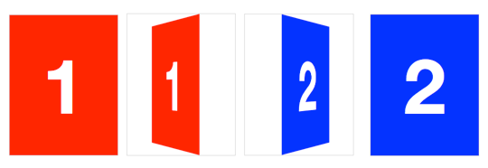
To activate 3-D space, an element needs perspective. This can be applied in two ways: using the property, with the perspective as a functional notation:
or using the property:
 The red element on the left uses functional notation; the blue element on the right uses the property
These two formats both trigger a 3-D space, but there is a difference. The first, functional notation is convenient for directly applying a 3-D transform on a single element (in the previous example, I use it in conjunction with a transform). But when used on multiple elements, the transformed elements don’t line up as expected. If you use the same across elements with different positions, each element will have its own vanishing point. To remedy this, use the property on a parent element, so each child shares the same 3-D space.
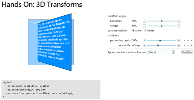


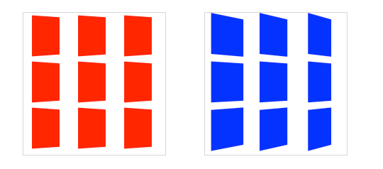 Each red box on the left has its own vanishing point within the parent container; the blue boxes on the right share the vanishing point of the parent container
The value of determines the intensity of the 3-D effect. Think of it as a distance from the viewer to the object. The greater the value, the further the distance, so the less intense the visual effect. yields a subtle 3-D effect, as if we were viewing an object from far away. produces a tremendous 3-D effect, like a tiny insect viewing a massive object.
By default, the vanishing point for a 3-D space is positioned at its centre. You can change the position of the vanishing point with property.