
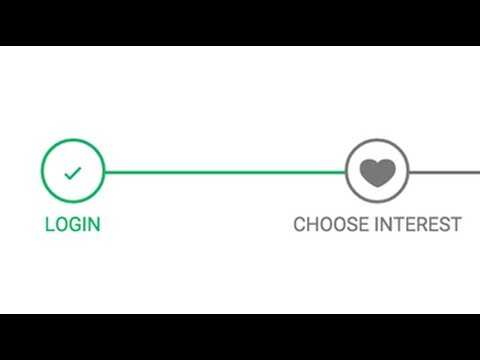
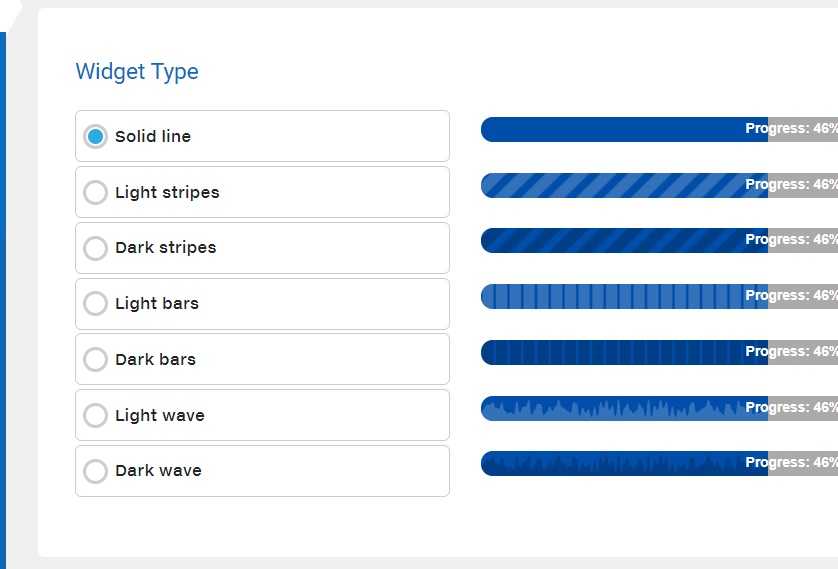
Styles #
The progress element is a bit tricky when it comes to styling. Built-in HTML elements have special hidden parts that can be difficult to select and often only offer a limited set of properties to be set.
Layout
The layout styles are intended to allow some flexibility in the progress element’s size and label position. A special completion state is added that can be a useful, but not required, additional visual cue.
Layout
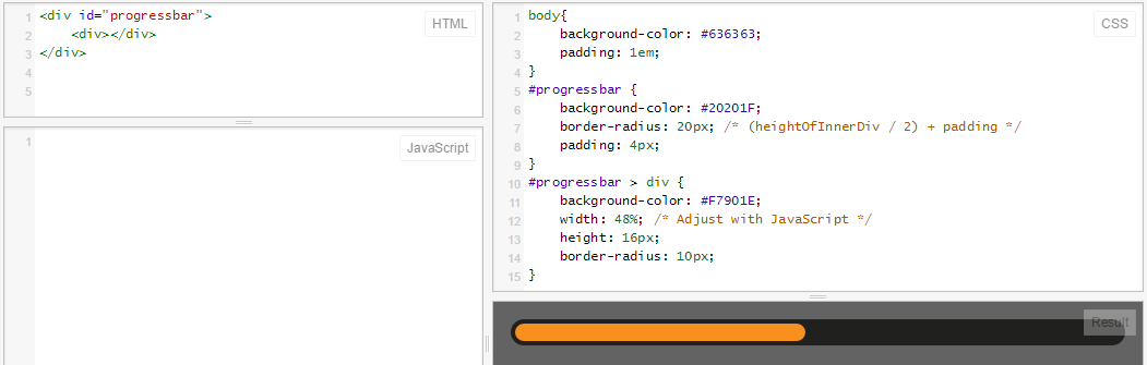
The width of the progress element is left untouched so it can shrink and grow with the space needed in the design. The built-in styles are stripped out by setting and to . This is done so the element can be normalized across browsers, since each browser has its own styles for their element.
The value of for uses scientific number notation to express a large number so the is always rounded. It’s equivalent to . I like to use this because my aim is to use a value large enough that I can set it and forget it (and it’s shorter to write than ). It is also easy to make it even larger if needed: just change the 3 to a 4, then is equivalent to .
is used and has been a contentious style. It made a few things easy, such as not needing to pass values down to the track, and track fill elements; but it also meant no children of the progress could live outside of the element. Another iteration on this custom progress element could be done without and it may open up some opportunities for animations or better completion states.
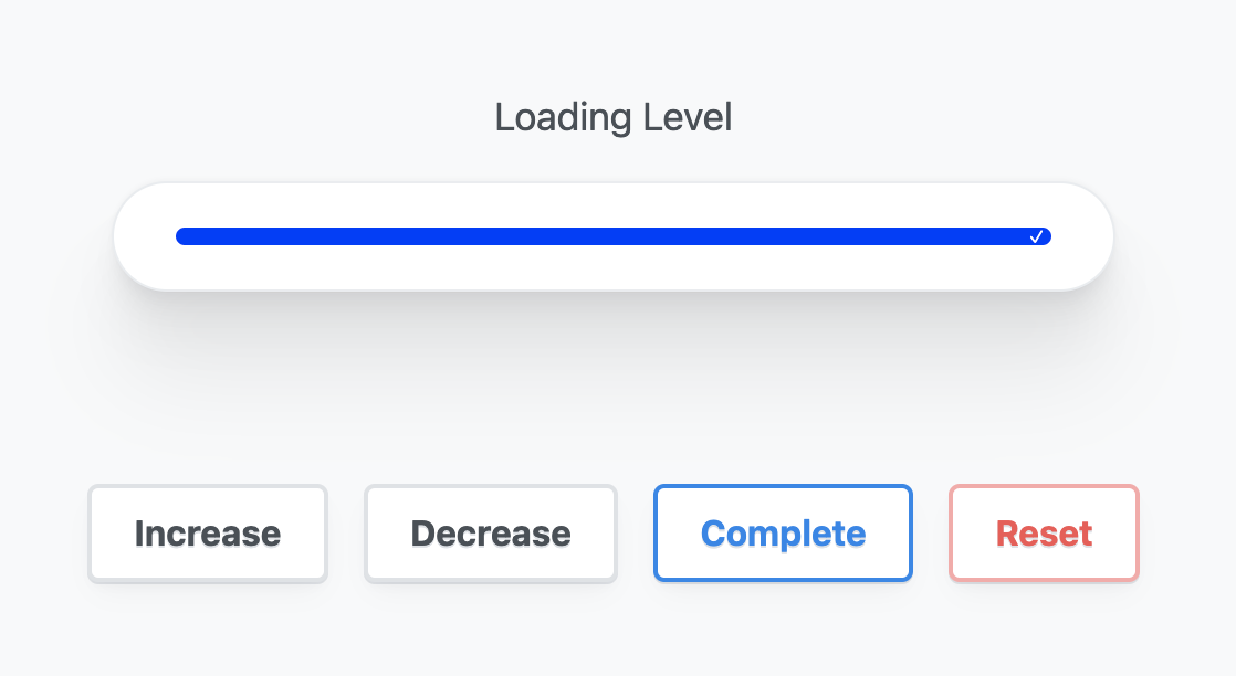
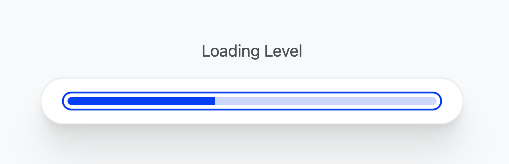
Progress complete
CSS selectors do the tough work here by comparing the maximum with the value, and if they match, then the progress is complete. When complete, a pseudo-element is generated and appended to the end of the progress element, providing a nice additional visual cue to the completion.
Color
The browser brings its own colors for the progress element, and is adaptive to light and dark with just one CSS property. This can be built upon with some special browser-specific selectors.
To opt your site into a dark and light adaptive element, is all that is required.
Single property progress filled color
To tint a element, use .
Notice the track background color changes from light to dark depending on the . The browser is ensuring proper contrast: pretty neat.
Fully custom light and dark colors
Set two custom properties on the element, one for the track color and the other for the track progress color. Inside the media query, provide new color values for the track and track progress.
Focus styles
Earlier we gave the element a negative tab index so it could be programmatically focused. Use to customize focus to opt into the smarter focus ring style. With this, a mouse click and focus won’t show the focus ring, but keyboard clicks will. The YouTube video goes into this in more depth and is worth reviewing.
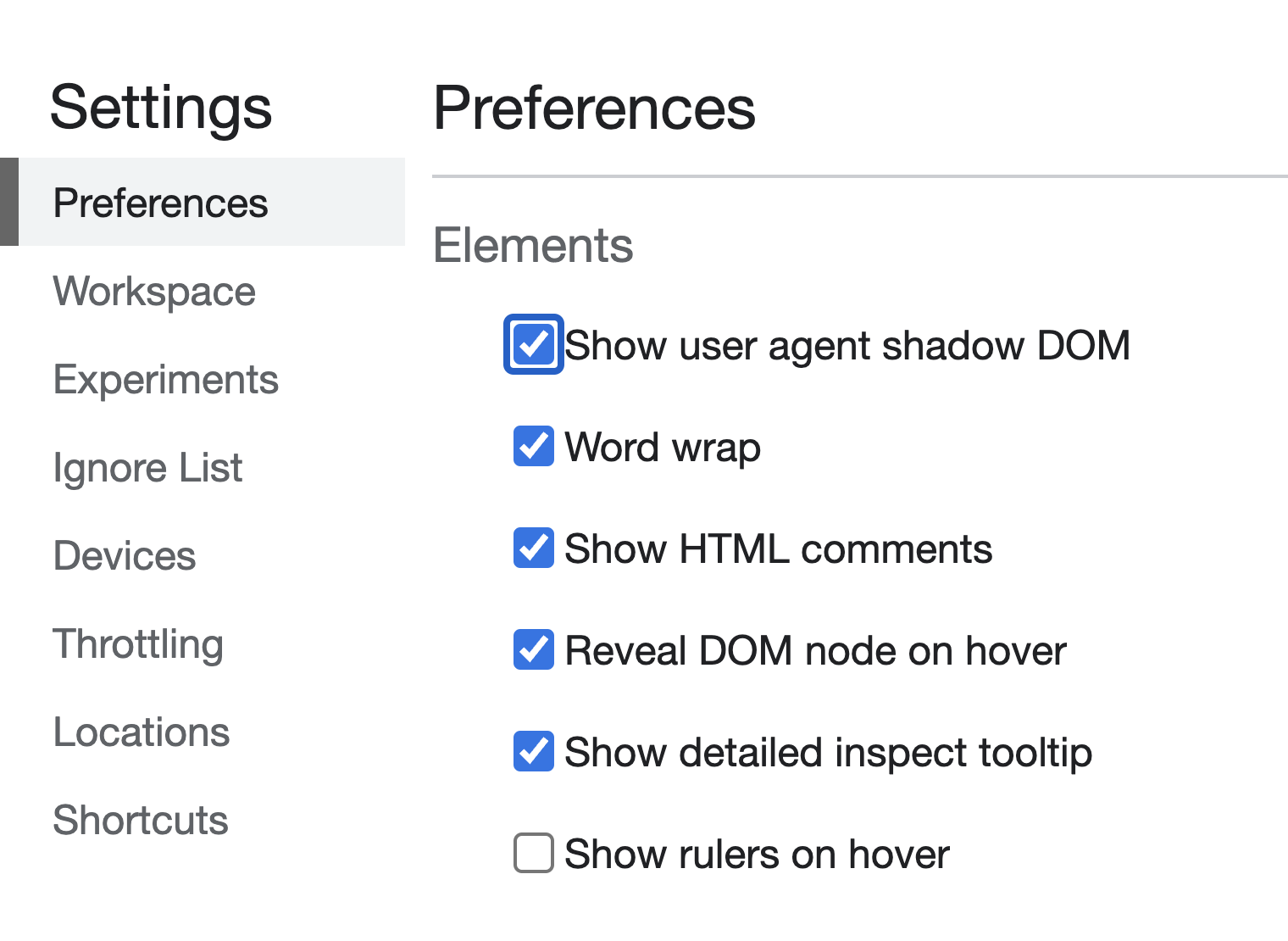
Custom styles across browsers
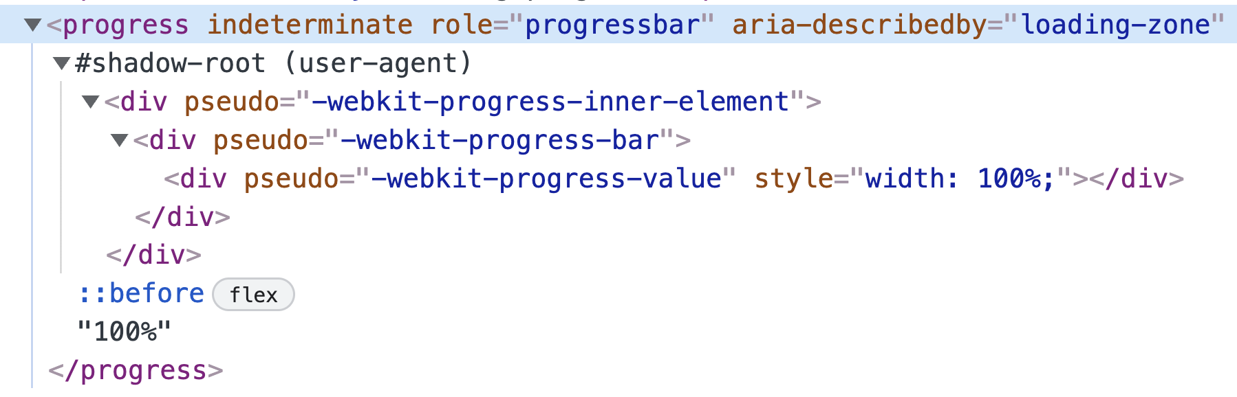
Customize the styles by selecting the parts of a element that each browser exposes. Using the progress element is a single tag, but it’s made of a few child elements that are exposed via CSS pseudo selectors. Chrome DevTools will show these elements to you if you enable the setting:
- Right-click on your page and select Inspect Element to bring up DevTools.
- Click the Settings gear in the top-right corner of the DevTools window.
- Under the Elements heading, find and enable the Show user agent shadow DOM checkbox.
Safari and Chromium styles
WebKit-based browsers such as Safari and Chromium expose and , which allow a subset of CSS to be used. For now, set using the custom properties created earlier, which adapt to light and dark.
Firefox styles
Firefox only exposes the pseudo selector on the element. This also means we can’t tint the track directly.
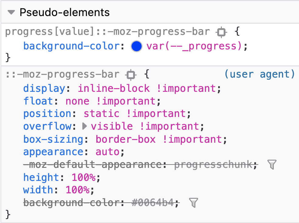
Notice that Firefox has a track color set from while iOS Safari has a light blue track. It’s the same in dark mode: Firefox has a dark track but not the custom color we’ve set, and it works in Webkit-based browsers.
Метки
Добавляйте метки к индикаторам выполнения, помещая текст в .
25%
Обратите внимание, что по умолчанию содержимое внутри контролируется , поэтому оно не выходит за пределы полосы. Если ваш индикатор выполнения короче, чем его метка, содержимое будет ограничено и может стать нечитаемым
Чтобы изменить это поведение, вы можете использовать из утилит переполнения, но не забудьте также определить явный , чтобы текст оставался читабельным. Однако имейте в виду, что в настоящее время этот подход не учитывает цветовые режимы.
Длинный текст метки для индикатора выполнения, установленный на темный цвет
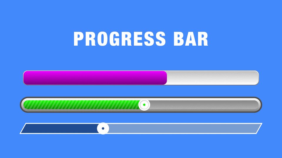
Gradients
CSS supports gradients, so why not use them in our progress bars? Just be sure to include each browser’s specific implementation of the gradient property:
/* Firefox */
progress.test_bar::-moz-progress-bar {
        background-image: -moz-linear-gradient(
                center bottom,
                rgb(43,194,83) 37%,
                rgb(84,240,84) 69%
        );
}

/* Chrome */
progress.test_bar::-webkit-progress-value {
        background-image: -webkit-gradient(
                linear,
                left bottom,
                left top,
                color-stop(0, rgb(43,194,83)),
                color-stop(1, rgb(84,240,84))
        );
        background-image: -webkit-linear-gradient(
                center bottom,
                rgb(43,194,83) 37%,
                rgb(84,240,84) 69%
        );
}

/* Polyfill */
progress.test_bar:before {
        background-image: -moz-linear-gradient(
                center bottom,
                rgb(43,194,83) 37%,
                rgb(84,240,84) 69%
        );
        background-image: -ms-linear-gradient(
                center bottom,
                rgb(43,194,83) 37%,
                rgb(84,240,84) 69%
        );
        background-image: -o-linear-gradient(
                center bottom,
                rgb(43,194,83) 37%,
                rgb(84,240,84) 69%
        );
}
The above code produces a green progress bar with a gradient that progressively lightens from the bottom up:
Что необходимо учитывать при использовании структурных и блочных тегов HTML5.
Мы можем начать использовать новые тэги сразу же, но после применения некоторых приемов, для того чтобы обойти некоторые несогласования со старыми браузерами. Новые блоковые тэги в старых браузерах будут обработаны как встроенные элементы, поэтому мы должны определить в нашем CSS для новых блочных тегов свойство display:block; чтобы они должным образом отображались. Что касается старых версий Internet Explorer, то необходимо так же добавить следующее:
<script>
document.createElement('header');
document.createElement('footer');
document.createElement('section');
document.createElement('aside');
document.createElement('article');
document.createElement('nav');
</script>
Добавить это нужно, потому что IE не понимает CSS, присоединенных к неизвестным тегам. HTML5 предполагает, что у тега <script> есть type=»text/javascript» по умолчанию, поэтому его мы можем не добавлять.
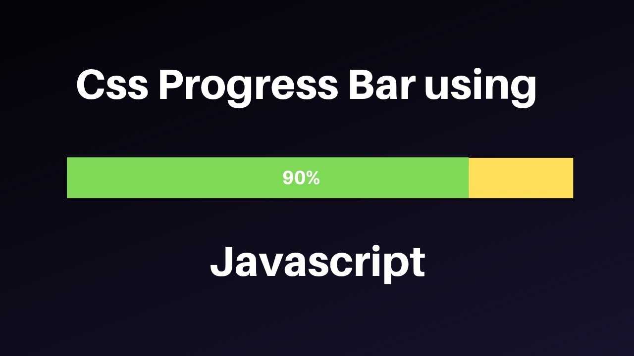
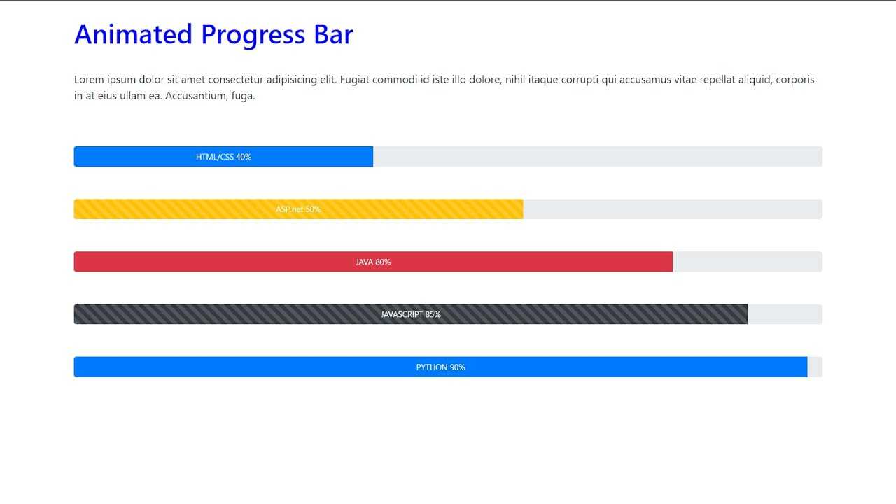
Animation #
While working with browser built-in pseudo selectors, it’s often with a limited set of permitted CSS properties.
Animating the track filling up
Adding a transition to the of the progress element works for Chromium but not for Safari. Firefox also does not use a transition property on it’s .
Animating the state
Here I get a bit more creative so I can provide an animation. A pseudo-element for Chromium is created and a gradient is applied that is animated back and forth for all three browsers.
The custom properties
Custom properties are great for many things, but one of my favorites is simply giving a name to an otherwise magical looking CSS value. Following is a fairly complex , but with a nice name. Its purpose and use cases can be clearly understood.
Custom properties will also help the code stay DRY since once again, we can’t group these browser-specific selectors together.
The keyframes
The goal is an infinite animation that goes back and forth. The start and end keyframes will be set in CSS. Only one keyframe is needed, the middle keyframe at , to create an animation that returns to where it started from, over and over again!
Targeting each browser
Not every browser allows the creation of pseudo-elements on the element itself or allows animating the progress bar. More browsers support animating the track than a pseudo-element, so I upgrade from pseudo-elements as a base and into animating bars.
Chromium pseudo-element
Chromium does allow the pseudo-element: used with a position to cover the element. The indeterminate custom properties are used, and the back and forth animation works very well.
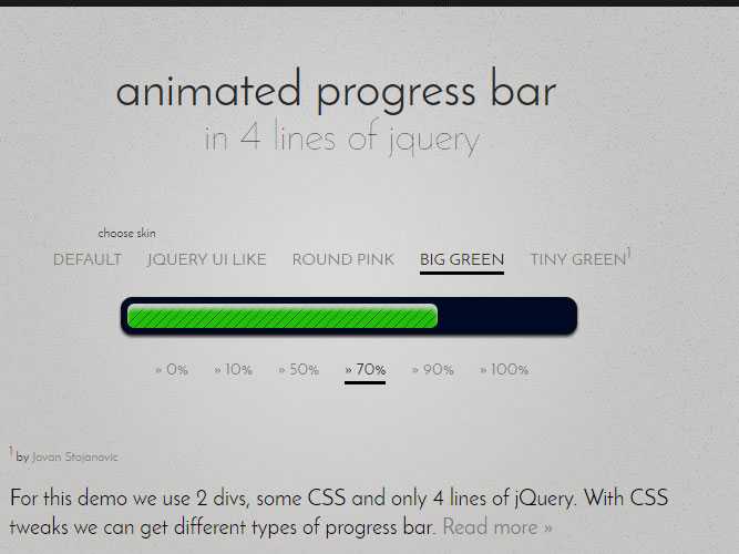
The quickest and easiest CSS progress bar
In its simplest form, a progress bar just needs two elements:
- One element to create a gap or space that will be filled (you might call it the ‘track’ or ‘container’)
- Another element to actually fill that space (the bar itself)
To be fair to Tony Stark, this simple option is the one he went for when stuck in the cave. It’s pretty easy to set up — in fact, lets’s replicate the one Stark made:
So is the container, and is the element that will fill it up and indicate progress. Now for the CSS:
Set whatever height and width you need for , and give it a border. You’ll basically just end up with a rectangle. To replicate the bar in the movie, I’ve added 2px of padding, which creates a little gap between the progress bar itself and the area it’s filling up.
For , I’ve set the height to 100% and width to 0%. BUT… I’ve added an animation, which increases the width from 0 to 100%. I’ve set that animation to repeat every 3 seconds.
Here’s how it looks:
See the Pen
on CodePen.
Pretty nice!
Of course, to show the actual progress of something, we can’t just have an automatic animation. We’d have to match the percentage width of to the percentage completion of the thing your user is waiting for — whether that’s files loading, data processing, or whatever. You’ll need JavaScript for this — we’ll come back to it in a bit.
But first, let’s investigate some ways to style these progress bars.
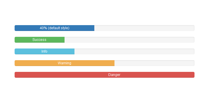
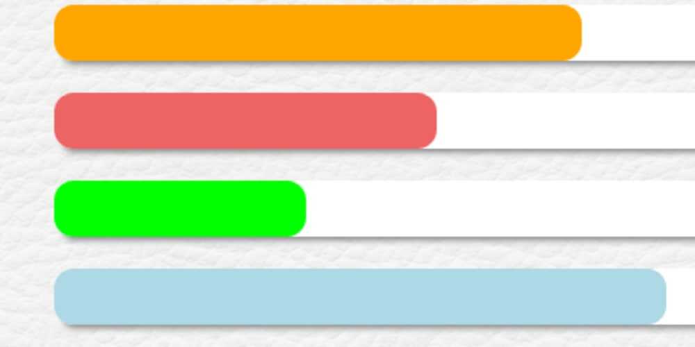
Фоны
Используйте фоновые служебные классы, чтобы изменить внешний вид отдельных индикаторов выполнения.
Совет по специальным возможностям. Использование цвета для добавления смысла обеспечивает только визуальную индикацию, которая не будет передана пользователям вспомогательных технологий, таких как программы чтения с экрана. Убедитесь, что смысл очевиден из самого содержимого (например, видимый текст с ) или включается с помощью альтернативных средств, таких как дополнительный текст, скрытый с помощью класса .
Если вы добавляете метки к индикаторам выполнения с настраиваемым цветом фона, не забудьте также установить соответствующий , чтобы метки оставались читаемыми и иметь достаточную контрастность.
25%
50%
75%
100%
Кроме того, вы можете использовать новые комбинированные вспомогательные классы цвет и фон.
75%
Новые теги HTML5
В HTML5 появились следующие новые теги:
<header>
<footer>
<nav>
<menu>
<section>
<article >
<aside>
<figure>
<dialog>
<m> (mark)
<time>
<meter>
<progress>
<video>
<audio>
<details>
<canvas>
<command>
Остальное остается прежним, кроме некоторых тегов которые не являются актуальными и не рекомендуются для использования:
<acronym>
<applet>
<basefont>
<big>
<center>
<dir>
<font>
<frame>
<frameset>
<isindex>
<noframes>
<s>
<strike>
<tt>
<u>
Поэтому если вы знакомы с HTML4 и XHTML, то у вас не возникнет никаких проблем в изучении HTML5. Новые тэги и атрибуты безусловно помогут вам в создании новых и модернизации старых сайтов, благодаря новым возможностям это будет намного легче, чем это было со старым хорошим HTML4.
Хорошо, но будет ли HTML5 работать со старыми браузерами? Ответ — «ДА», кроме новых тегов, естественно. Новые страницы, сделанные в HTML5 будут отображаться во всех браузерах, но пользователи новых браузеров увидят немного больше, а в некоторых случаях страница будет вообще смотреться по-другому.
Индикатор прогресса HTML5
В HTML5 появился элемент индикатора прогресса, который выводит состояние процесса выполнения определенных задач, например, таких как загрузка данных на сервер.
В данном уроке мы рассмотрим, как добавлять такой элемент в документ, как определять для него стили CSS и анимировать индикатор прогресса.
Основы
Индикатор прогресса добавляется с помощью элемента <progress> . Значение индикатора определяется атрибутами value , min и max :
Так как базовая реализация использует стандартные формы, то визуальное представление будет зависеть от платформы реализации. Ниже приводится пример того, как выглядит индикатор прогресса в Windows и OSX.
Теперь определим стили для индикатора прогресса, чтобы он выглядел одинаково на любых платформах.
Стили для индикатора прогресса
В таблице стилей мы можем использовать селектор элемента для выбора элемента и добавления правил для элемента <progress> . В ниже приведенном примере мы изменяем фоновый цвет, удаляем обводку и скругляем углы на радиус равный половине высоты элемента.
Однако, каждый браузер обрабатывает правила немного по своему.
В Firefox стили влияют на полоску индикатора, а на текущее значение не оказывают воздействия.
В Chrome и Safari стили не используются и применяются установки Webkit (в текущий момент времени).
Поэтому потребуется больше действий.
В Chrome и Safari элемент прогресса преобразуется следующим образом.
Таким образом для изменения полоски индикатора и текущего значения в браузере нужно добавить псевдо-классы:
Firefox также имеет специальный псевдо-класс ::-moz-progress-bar. В отличие от Chrome и Safari данный псевдо-класс ссылается на текущее значение:
В завершение представим все селекторы для определения стилей HTML5 индикатора прогресса.
Анимирование прогресса
Теперь рассмотрим, как анимировать индикатор прогресса. Обычно, полоска расширяется слева направо по мере выполнения задачи.
Идея заключается в том, что индикатор прогресса расширяется от 0 и останавливается в момент достижения максимального значения. Мы также будем выводить числовое значение прогресса. Ниже приводится структура HTML.
В данном примере мы используем jQuery для анимации индикатора прогресса. Поэтому добавляем jQuery в документ:
Затем мы добавляем скрипт, который выполняет расширение полоски прогресса. Сначала сохраняем элемент индикатора прогресса, текущее и максимальное значения, а также и частоту кадров:
Затем мы создаем переменную, которая хранит функцию анимации. В нашем примере она называется loading .
Внутри выше приведенной функции устанавливаем интервал прогресса. Будем увеличивать данное значение на 1 за один кадр — можно увеличивать значение на большую величину, чтобы ускорить ход индикатора.
А затем мы добавляем результат к полоске прогресса.
Мы также показываем значение рядом с индикатором прогресса:
Затем мы создаем новую функцию для выполнения анимации:
В данной точке анимация уже работает, но значение будет увеличиваться бесконечно. Поэтому нам надо создать условное выражение для остановки анимации в момент достижения максимального значения.
Сохраним выше приведенную функцию в переменной:
В переменной loading добавляем условное выражение:
Выше приведенный код после достижения максимального значения сбрасывает интервал, что останавливает анимацию.
Приведем полный код анимации индикатора прогресса:
Поддержка в браузерах
Элемент HTML5 для индикатора прогресса поддерживается в следующих браузерах: Firefox 16+, Chrome 8+, Safari 6+ и Opera 11+.
Данный урок подготовлен для вас командой сайта ruseller.com Источник урока: www.hongkiat.com/blog/html5-progress-bar/ Перевел: Сергей Фастунов Урок создан: 4 Марта 2013 Просмотров: 39467 Правила перепечатки
Реализация забавных подсказок
Небольшой концепт забавных подсказок, которые реализованы на SVG и anime.js. Помимо особого стиля в примере реализована анимация и трансформация графических объектов.
Солнцезащитные очки от первого лица
Прикольный эксперимент веб страницы отображение которой осуществляется “от первого лица” через солнцезащитные очки.
Мультимедийные теги.
В HTML5 имеется два новых тэга, предназначенных для вывода мультимедиа <audio> и <video>.
Вот пример применения тега <audio>:
...
<audio src="/music.mp3" autoplay="autoplay" loop="1"> <p>Сейчас играет ...</p> </audio>
...
У этого тега имеется три атрибута:
src — путь к звуковому файлу; autoplay — определяет, начать ли проигрываться файлу сразу после загрузки страницы в браузере; loop — определяет, сколько раз аудио должно проигрываться.
Тег <audio> позволяет разместить внутри себя другие тэги, содержащие некоторую информацию.
Тег <video> используется для того, чтобы вывести на страницу видеофайлы.
...
<video src="/clip.avi">Клип...</video>
...
Атрибут src определяет путь к видео файлу.
Мультимедийные теги позволяют вывести аудио- и видео-файлы непосредственно в HTML документе и способствуют их индексации поисковыми системами.
JavaScript #
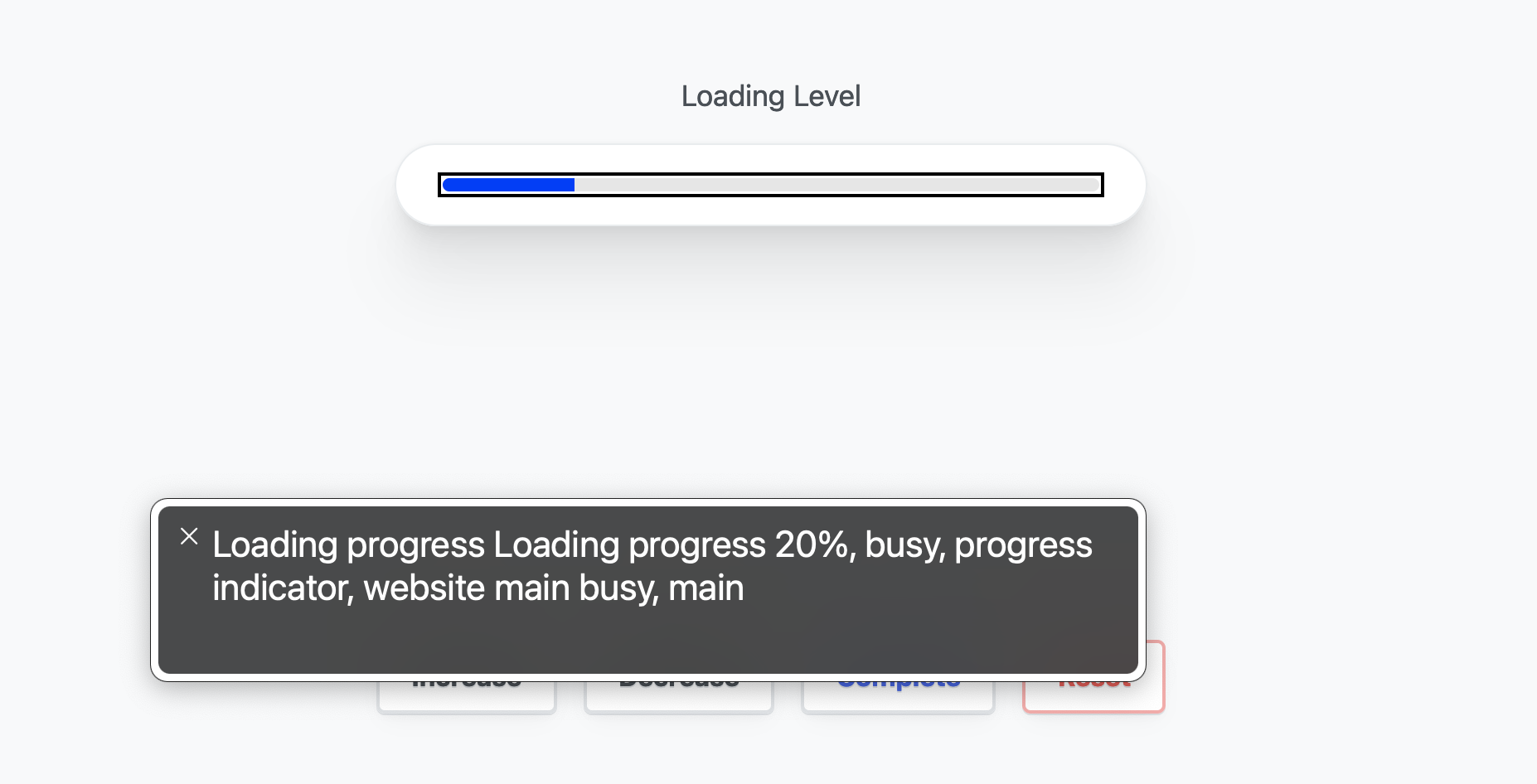
JavaScript plays an important role with the element. It controls the value sent to the element and ensures enough information is present in the document for screen readers.
The demo offers buttons for controlling the progress; they update and then call a function for updating the DOM.
This function is where the UI/UX orchestration occurs. Get started by creating a function. No parameters are needed because it has access to the object, progress element, and zone.
Setting the loading status on the zone
Fix JavaScript decimal math issues
Since I chose to stick with the progress default maximum of 1, the demo increment and decrement functions use decimal math. JavaScript, and other languages, are not always great at that. Here’s a function that will trim the excess off the math result:
Round the value so it can be presented and is legible:
The value is used in three locations in the DOM:
- The element’s attribute.
- The attribute.
- The inner text content.
Giving the progress focus
With the values updated, sighted users will see the progress change, but screen reader users are not yet given the announcement of change. Focus the element and the browser will announce the update!
Атрибуты
Для элемента в спецификации обозначены четыре атрибута: ,
, и . Перед тем как приступить к поочерёдному разбору
этих атрибутов, несколько важных примечаний о них:
- если указан атрибут , индикатор прогресса считается определённым
(т.е. у него есть чёткие предельные значения). В противном случае он считается
неопределённым. - Если атрибут не указан, по умолчанию диапазон допустимых значений для
индикатора прогресса будет между 0.0 и 1.0 включительно. - Желательно всегда добавлять текущее значение и максимальное значение (если они
используются) в виде встроенного текста в элементе чтобы
пользователи старых версий браузеров тоже их увидели.
А сейчас давайте более внимательно рассмотрим каждый атрибут:
Атрибут — это число с плавающей запятой, которое обозначает какой объем
работы должен быть выполнен в общем для завершения задачи. Значение по умолчанию — 1.0.

Это число с плавающей запятой, которое представляет текущий прогресс выполнения
задачи. Его значение должно быть больше или равно 0.0 и меньше или равно 1.0
или меньше или равно значению атрибута , если он указан.
Этот атрибут доступен только для считывания. Он возвращает текущее состояние
элемента . Его значение равно значению атрибута деленному
на значение атрибута для определённого индикатора прогресса и для
неопределённого индикатора прогресса (так как текущее состояние не может быть
рассчитано точно).
Этот атрибут также доступен только для считывания, он возвращает список меток
для элемента (если они есть в наличии).
Progress bars that don’t need JavaScript
Note that not all progress bars need to be dynamically updated in this way.
One example is a little sneaky. Have you ever gone to something like a price comparison site, where you put in a query and get one of those «Now checking 6 billion businesses to get you the best price!» screens, and a little progress bar pops up with it?
Well, sometimes, those progress bars are completely fake! Developers often put them in to create a fake delay of 1 or 2 seconds, so that it looks like the server is working really really hard for you.
This is a little deceptive, but the argument is that if people expect something to take a little processing time, but then it appears instantly, they might get suspicious. They might doubt that any processing happened at all — maybe they’ll think the site just recommended the ones that give them the highest referral fee.
So if you have a use-case like this, where you just need a progress bar just for the visual effect, you can use the animated versions we talked about at the beginning of this post.
There are also cases when you do need the progress bar to accurately represent progress, but where JavaScript isn’t needed — for example if the progress is happening across multiple pages of the site. For example, maybe you have a multi-page checkout process, or a job application where first you put in your personal details, then your education, then your work history etc.
In these cases, you can just put a static progress bar up on each separate page, with the of the bar set to an appropriate amount based on the user’s progress so far.
Animating the Button#
The next step is to animate the button. We want to double its width to create a feel like we turned the button into a progress bar. For this, modify your according to the following:
styles.css
Copied to clipboard! Copy
It uses a slower (+300ms) transition for the of the element.
Get Access to Webtips
Looking to improve your skills? Check out our interactive course to master JavaScript from start to finish.

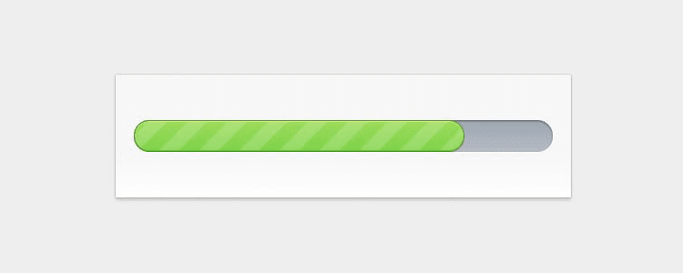
Animating Stripes
To create the stripes, we can use the pseudo-element of the . We will use a as the background image to create the stripes.
styles.css
Copied to clipboard! Copy
Changing the degree to -45° and changing colors every 25% creates the desired effect. We can simply increase progress by increasing the width of the element. Don’t forget to set a fixed , otherwise, the stripes will get thicker as the width increases.
You may have noticed that when it’s near 1%, the element looks squashed. This is because, for small widths, you can’t have a large . And since the element overflows the button, the distortion is visible. To fix this, add to your .
Making Progress
To see it in action, let’s create a function that simulates a download. There’s only one problem. You can’t change — at the time of writing this article — the style of a pseudo-element through JavaScript. To work around this, we will use CSS variables.
styles.diff
Copied to clipboard! Copy
Add a new variable for the element and use it in your . We will change the value of this through JavaScript. Open your file and add the following:
app.js
Copied to clipboard! Copy
Only line:9–10 remained the same. The new function, defined on line:1 will resolve a new Promise every 50ms. We can then have a loop that goes from 0 to 100 and increase by one in each iteration.
This is where we can rewrite the CSS variable using on line:22. The if statement is for updating the property only every 5%. If we try this out now, we should have a loading animation.
Get Access to Webtips
Looking to improve your skills? Check out our interactive course to master JavaScript from start to finish.
Finishing Up
All that’s left to do is to indicate to the user when the download has finished. To do this, let’s switch the class to . We will need two more styles for this:
styles.css
Copied to clipboard! Copy
Everything else can be handled inside the click event listener:
app.js
Copied to clipboard! Copy
I’ve also outsourced the selector into a variable as we use it multiple times. At line:14, the class is switched to . Because we remove it, we don’t have to worry about repositioning the texts. They will return to their initial positions.
If you would also like to update the “Loading” text with ellipsis, add this line to your :
app.js
Copied to clipboard! Copy
The final end result
Summary
With the use of CSS transitions, you can create pretty complex animations. Apart from a few exceptions, you can transition almost any CSS property. Now your users will have no problem understanding what’s going on.
If you would like to tweak around with the finished project, you can clone it from this GitHub repository. Thank you for taking the time to read this article, happy styling!
If you would like to learn more about CSS, check out what are some steps you can take to quickly improve the architecture of your stylesheets.
Adding JavaScript to show actual progress
Finally, we just need to update our progress bar in-line with the actual progress of the operation.
This is a lot simpler that it sounds — remember all we have to do is update the property of our element, which we can do easily in JavaScript:
This function:
- Accepts a value, which we’ve called .
- Checks if is between 0 and 100 (as we’re setting the as a percentage, it needs to be in this range).
- If so, it goes to the element with the of (which we stored in the variable), and sets its width (note: that you’ll also need to add the ID to the element, so that JS can select it).
To make the progress bar move smoothly, you can give it a CSS property:
Now you’ve got the code that will move the progress bar, all you need to do is call in your JavaScript, and pass it a new .
Exactly how to do this will of course depend on what exactly you’re measuring the progress of. For example, if it’s a file download, you could pass an updated after each individual file has been downloaded — and the value you pass could be based on the size of the file.
It’ll work like this:
See the Pen
on CodePen.
If you type a value into the input box and click Submit, a function called function will be called. That function will take your input, and pass it to . The bar will then move to the new point that you specified — and the time it takes to get there will be whatever value you set in the property of — in this case, 0.3 seconds.
meter
Тег определяет скалярное значение в пределах известного диапазона или дробного значения. Другими словами, определяет меру чего-либо (gauge).
Этот тег не должен использоваться в качестве индикатора прогресса.
Для обеспечения доступности совместно с рекомендуется использовать тег .
Атрибуты:
- — текущее числовое значение между и
- — нижняя числовая граница диапазона
- — верхняя числовая граница диапазона
- — верхняя числовая граница нижнего предела диапазона. Должна быть больше , но меньше и
- — нижняя числовая граница верхнего предела диапазона
- — оптимальное числовое значение между и . Расположение этого атрибута определяет предпочтительную часть диапазона. Например, если находится между и , значит, предпочтительным является нижний диапазон
- — определяет элемент , с которым связан
Так можно записать уровень заряда батареи вашего устройства в значение :
Making Progress#
To see it in action, let’s create a function that simulates a download. There’s only one problem. You can’t change — at the time of writing this article — the style of a pseudo-element through JavaScript. To work around this, we will use CSS variables.
styles.diff
Copied to clipboard! Copy
Add a new variable for the element and use it in your . We will change the value of this through JavaScript. Open your file and add the following:
app.js
Copied to clipboard! Copy
Only line:9–10 remained the same. The new function, defined on line:1 will resolve a new Promise every 50ms. We can then have a loop that goes from 0 to 100 and increase by one in each iteration.
This is where we can rewrite the CSS variable using on line:22. The if statement is for updating the property only every 5%. If we try this out now, we should have a loading animation.


Get Access to Webtips
Looking to improve your skills? Check out our interactive course to master JavaScript from start to finish.
Finishing Up
All that’s left to do is to indicate to the user when the download has finished. To do this, let’s switch the class to . We will need two more styles for this:
styles.css
Copied to clipboard! Copy
Everything else can be handled inside the click event listener:
app.js
Copied to clipboard! Copy
I’ve also outsourced the selector into a variable as we use it multiple times. At line:14, the class is switched to . Because we remove it, we don’t have to worry about repositioning the texts. They will return to their initial positions.
If you would also like to update the “Loading” text with ellipsis, add this line to your :
app.js
Copied to clipboard! Copy
The final end result
Summary
With the use of CSS transitions, you can create pretty complex animations. Apart from a few exceptions, you can transition almost any CSS property. Now your users will have no problem understanding what’s going on.
If you would like to tweak around with the finished project, you can clone it from this GitHub repository. Thank you for taking the time to read this article, happy styling!
If you would like to learn more about CSS, check out what are some steps you can take to quickly improve the architecture of your stylesheets.
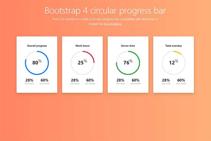
Круговой прогресс бар
Для этой части нашего руководства мы собираемся создать трекер для нашего индикатора выполнения. Поэтому мы немного скорректируем нашу разметку, а также наш CSS. Проверьте разметку ниже.
<div class="container">
    <div class="title">Tracker</div>
    <div class="bar">
        <span class="bar-unfill">
            <span class="bar-fill-tracker"></span>
            <span class="track-wrap">
                <span class="track"></span>
            </span>
        </span>
    </div>
</div>
Как вы видите, мы добавили c классами и внутри . Они будут содержать наш круговой прогресс бар, а затем анимировали его с помощью другого правила . Давайте напишем стили для наших классов и .
.track-wrap {
    position:relative;
    top:-18px;
    -webkit-animation:progressbar2 7s infinite;
    animation:progressbar2 7s infinite
}

.track {
    height:20px;
    display:block;
    background:#e74c3c;
    width:20px;
    border-radius:10px;
    position:relative;
    left:-12px
}

/* Chrome, Safari, Opera */

@-webkit-keyframes progressbar2 {
    from {
        left:0
    }
    to {
        left:100%
    }
}

/* Standard syntax */

@keyframes progressbar2 {
    from {
        left:0
    }
    to {
        left:100%
    }
}
Как вы можете видеть выше, мы установили положение c классом относительно верхнего -18px, а затем установили свойство . Затем установили стили класса , который является фактическим трекером, и установили ему на 10px и положение слева на -12px. Еще одна вещь, которую мы добавили, — это новая анимация с использованием правила и именем .
video
Тег используется для встраивания видео-контента (видеоклип и др.) в веб-страницу.
Для определения видео-источника используется либо атрибут , либо тег . Последний используется для определения нескольких источников, из которых браузер выбирает наиболее подходящий (для определения типа видео-контента используется атрибут ).
Текст между и отображается только в случае, когда браузер не поддерживает элемент .
В настоящее время поддерживается три формата видео: , и .
Атрибуты:
- — автовоспроизведение (блокируется большинством браузеров)
- — панель управления
- — определяет, что воспроизведение, после завершения, начнется сначала
- — воспроизведение без звука (позволяет преодолеть блокировку )
- — определяет, должен ли видео-контент загружаться после загрузки страницы. Возможные значения: , , . Значение не позволит работать с видео с помощью
- — путь к видеофайлу
- — изображение, отображаемое при загрузке видео или до нажатия пользователем кнопки воспроизведения
- — ширина элемента в пикселях
- — высота элемента в пикселях
предоставляет множество свойств, методов и событий для работы с элементами и .
CONCLUSION
For many developers, creating highly customizable and modern HTML progress bars without the use of any jQuery plugins or libraries just by using simple HTML and CSS would be a big revelation. Even though HTML5 progress element enjoys excellent browser support, still developers need to be mindful of colossal variations across browsers resulting from different rendering engines and ensure that consistency in styling is properly enforced. Keep exploring complex gradient patterns, creative CSS styling coupled with JavaScript scroll based animations which can help to push the limits of your HTML progress bars to the zenith.
CONCLUSION
For many developers, creating highly customizable and modern HTML progress bar without the use of any jQuery plugins or libraries just by using simple HTML and CSS would be a big revelation. Even though HTML5 progress element enjoys excellent browser support, still developers need to be mindful of colossal variations across browsers resulting from different rendering engines and ensure that consistency in styling is properly enforced. Keep exploring complex gradient patterns, bar relative CSS styling coupled with JavaScript scroll based animations which can help to push the limits of your HTML progress bar to the zenith.
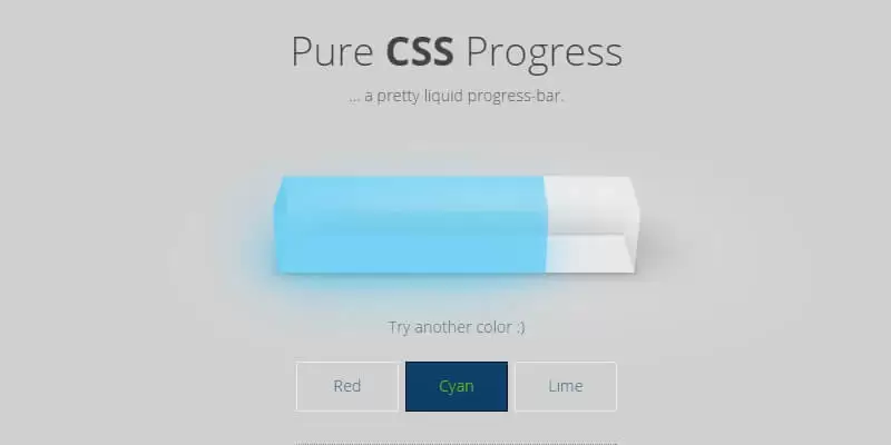
Простой прогресс бар CSS
Класс будет иметь точную ширину 30%, чтобы сделать наш прогресс бар адаптивным. Мы также поместим в класс вверху и внизу слева, чтобы придать ему простой дизайн в стиле flat (плоский).
.container {
    width:30%;
    margin:0 auto
}

.title {
    background:#545965;
    color:#fff;
    padding:15px;
    float:left;
    position:relative;
    -webkit-border-top-left-radius:5px;
    -webkit-border-bottom-left-radius:5px;
    -moz-border-radius-topleft:5px;
    -moz-border-radius-bottomleft:5px;
    border-top-left-radius:5px;
    border-bottom-left-radius:5px
}
Теперь давайте сначала нарисуем незаполненный участок и выделим его белым фоном ER диаграммы.
.bar-unfill {
    height:15px;
    display:block;
    background:#fff;
    width:100%;
    border-radius:8px
}
Далее мы стилизуем наш класс и зададим ему ширину 100%. Затем в классе мы присвоим ему ширину 0% в качестве начальной ширины. Мы также добавим CSS3 , чтобы сделать нашу анимацию плавной. Наконец, мы добавим CSS3 , содержащую имя нашей анимации, продолжительность и свойство .
.bar-fill {
    height:15px;
    display:block;
    background:#45c9a5;
    width:0;
    border-radius:8px;
    -webkit-transition:width .8s ease;
    -moz-transition:width .8s ease;
    transition:width .8s ease;
    -webkit-animation:progressbar 7s infinite;
    animation:progressbar 7s infinite
}
Чтобы сделать это анимированным, мы будем использовать правило CSS3 @keyframe, чтобы установить ширину от 0 до 100%. Вы также можете настроить настройки ниже по своему усмотрению.
/* Chrome, Safari, Opera */
@-webkit-keyframes progressbar {
    from {
        width:0
    }
    to {
        width:100%
    }
}
/* Стандартный синтаксис */
@keyframes progressbar {
    from {
        width:0
    }
    to {
        width:100%
    }
}
Примеры
Теперь давайте рассмотрим примеры применения элемента , а также как
его можно обновлять с помощью JavaScript.
Простой неопределённый индикатор прогресса
Поскольку мы понятия не имеем сколько времени потребуется на выполнение задачи,
браузер просто будет отображать индикатор прогресса пока задача не будет
завершена и мы не спрячем индикатор прогресса, либо не заменим его сообщением
«задача выполнена».
Простой определённый индикатор прогресса
И JavaScript для его обновления:
Обратите внимание, что в этом примере 70 — это максимальное значение которое
может принимать индикатор прогресса, потому обращение к будет
иметь значение между 0 и 70. Кроме того, значение также отображается в элементе
как простая строка с процентами для пользователей старых версий
браузеров