Логика адаптивной вёрстки Desktop First
Предположим, есть макет шириной 1170px. Верстаем его в браузере на большом экране. Пишем основные стили. Когда десктоп версия макета готова, начинаем делать адаптивную вёрстку.
Устанавливаем ширину окна браузера в 1200px — минимальная ширина до первого @media запроса .
Проверяем вёрстку при этих размерах. Если вёрстка соответствует макету, элементы не выходят за границы окна браузера, и не появляется горизонтальной полосы прокрутки, то продолжаем.
Устанавливаем ширину браузера в 992px — минимальная ширина до следующего @media запроса
Делаем первый @media запрос —
При ширине окна браузера 992px элементы сужаются, выходят за границы окна браузера, создают горизонтальную полосу прокрутки (scrollbar). Поэтому внутри @media запроса начинаем переназначать предыдущие стили элементов так, чтобы вёрстка выглядела корректно — уменьшаем отступы, размер шрифта, какие-то элементы переносим или скрываем и так далее — все зависит от требований к макету.
Обратите внимание, что мы не должны переписывать все свойства элементов, а только переназначаем необходимые свойства
Если дизайнер не предоставил макеты на определенную ширину или заказчик не указал требования к адаптивной вёрстке, делаем на своё усмотрение, но соблюдая основную идею дизайна — уменьшать элементы и отступы пропорционально и переносить/скрывать блоки так, чтобы логика сохранялась
Когда вёрстка при ширине браузера 992px выглядит корректно, то устанавливаем браузеру ширину в 768px — минимальная ширина до следующего @media запроса .
Переназначаем стили в блоке @media запроса , чтобы вёрстка выглядела корректно теперь при ширине 768px
Далее устанавливаем ширину 576px и переназначаем стили в блоке
Если дизайнер/заказчик не указали минимальную ширину для адаптивной вёрстки, то устанавливаем 320px. Для этой ширины переназначаем стили элементов в блоке @media запроса
Когда вёрстка будет выглядеть корректно при всех вышеописанных размерах браузера (1200px, 992px, 768px, 576px, 320px), проверяем вёрстку плавно изменяя размер окна от большего к меньшему, чтобы убедиться что при промежуточных размерах вёрстка не ломается. При неоходимости корректируем стили элементов в том блоке @media запроса, где элементы отображаются некорректно, для этого используем инструменты разработчика (devtools) в браузере
min-height and max-height Properties
In addition to the minimum and maximum width properties, we have the same properties as the height.
Min Height
When setting the value of , its benefit lies in preventing the used value for property from becoming less than the specified value for . Note that the default value for is , which resolves to .
Let’s take an example to demonstrate a simple use case.
We have a section with a description text. The goal is to have a minimum height for the section, so it can handle short or long content. Consider the below basic case:
The minimum height is , and with flexbox, the content is centered horizontally and vertically. What would happen if the content were longer? For example, a paragraph?
Yes, you guessed it! The height of the section will expand to contain the new content. By having that, we can build components that are fluid and responsive to its content.
See the Pen
Min Height — Example 1 by Ahmad Shadeed (@shadeed)
on CodePen.
Max Height
When setting the value of , its benefit lies in preventing the used value for property from becoming more than the specified value for . Note that the default value for is .
Consider the below example where I set for the content. But, because it’s bigger than the specified space, there is an overflow. The text is out of its parent boundaries due to that.
Using custom values
Customizing your theme
By default, Tailwind’s width scale is a combination of the as well as some additional values specific to widths.
You can customize your spacing scale by editing or in your file.
tailwind.config.js
To customize width separately, use the section of your file.
tailwind.config.js
Learn more about customizing the default theme in the documentation.
Arbitrary values
If you need to use a one-off value that doesn’t make sense to include in your theme, use square brackets to generate a property on the fly using any arbitrary value.
Learn more about arbitrary value support in the documentation.
Попробуйте сами — Примеры
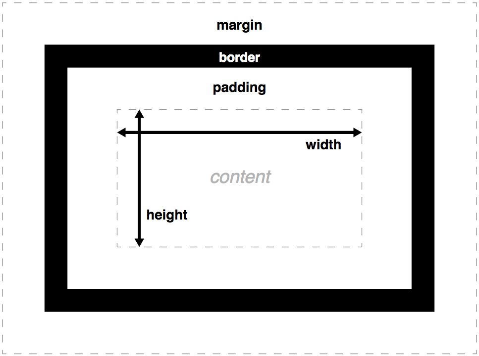
Установите высоту и ширину элементовЭтот пример демонстрирует, как установить высоту и ширину различных элементов.
Установите высоту и ширину изображения, используя процентыЭтот пример демонстрирует, как установить высоту и ширину изображения, используя процентное значение.
Установите минимальную ширину и максимальную ширину элементаЭтот пример демонстрирует, как установить минимальную ширину и максимальную ширину элемента, используя значение в пикселях.
Установите минимальную высоту и максимальную высоту элементаЭтот пример демонстрирует, как установить минимальную высоту и максимальную высоту элемента, используя значение в пикселях.
Все свойства CSS Размеров
| Свойство | Описание |
|---|---|
| height | Устанавливает высоту элемента |
| max-height | Устанавливает максимальную высоту элемента |
| max-width | Устанавливает максимальную ширину элемента |
| min-height | Устанавливает минимальную высоту элемента |
| min-width | Устанавливает минимальную ширину элемента |
| width | Устанавливает ширину элемента |
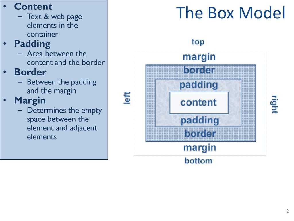
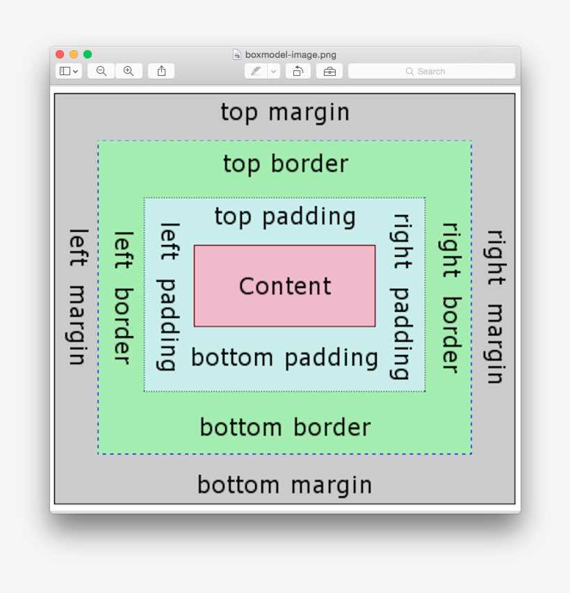
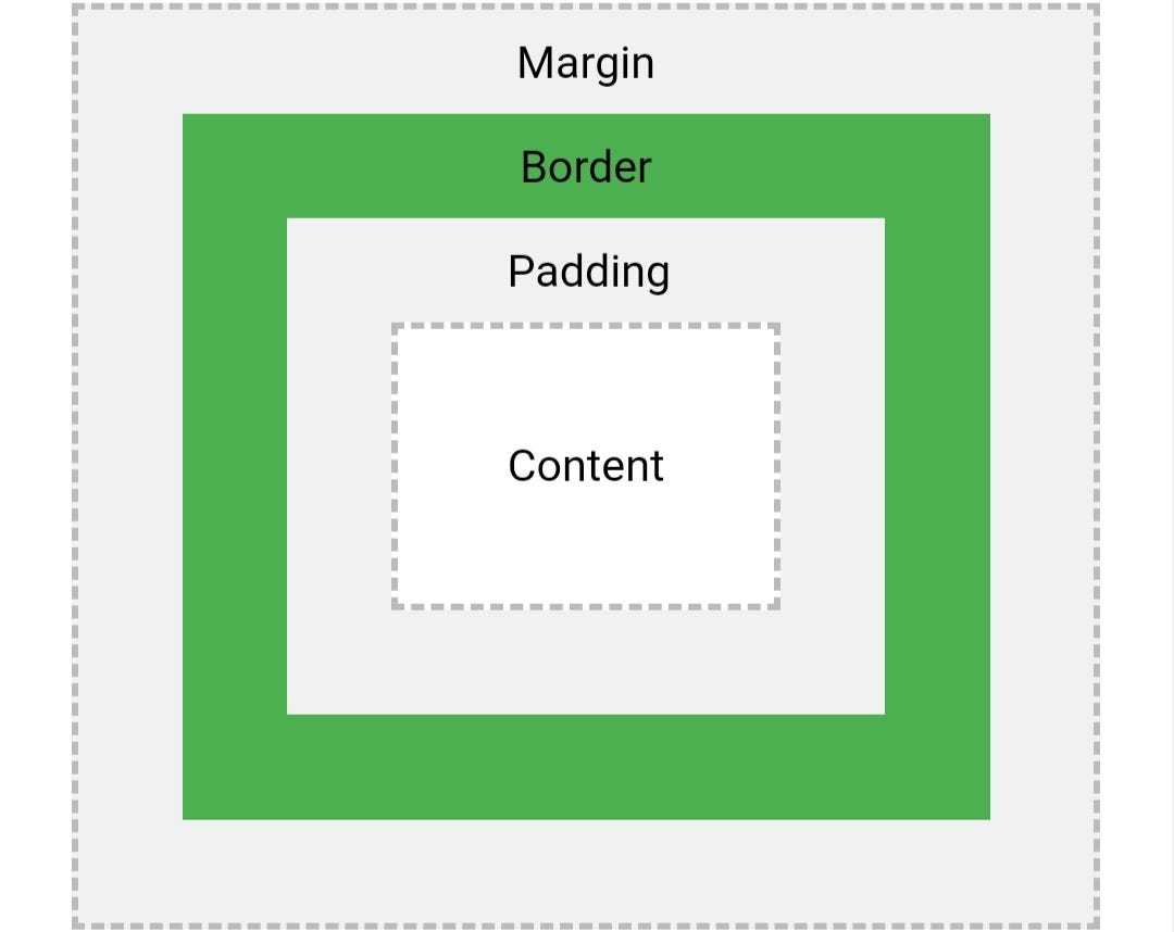
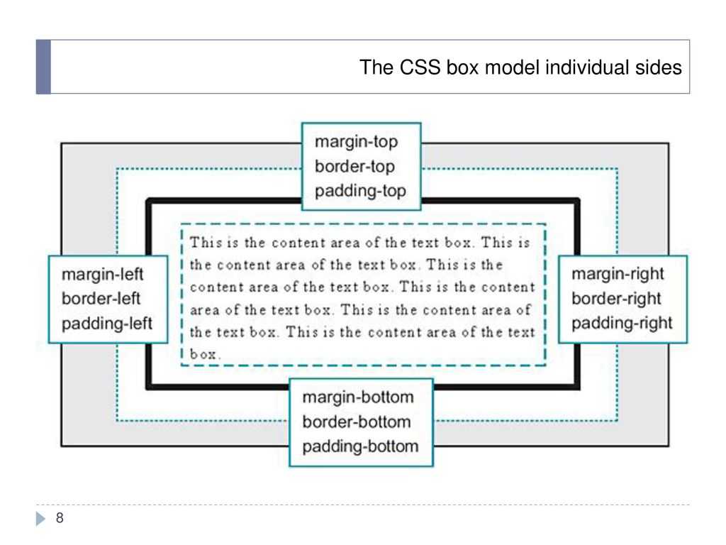
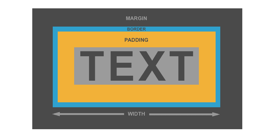
The border Property
To add a border to an image, we use the border property.
The border property is shorthand for three properties:
- Border-width: this specifies the width of the border.
- Border-style: specifies what style the border will be. There are several values that can be applied. We’ll explore them soon.
- Border-color: specifies the color of the border.
When specifying the border, the order is:border: border-width border-style border-color
Example using the border shorthand
Result
Example without the border shorthand
The values of the border-color property can be set using:
- Color names: i.e red
- Hexadecimal: i.e #ff0000
- RGB values: rgb(255,0,0)
- HSL values: i.e hsl(0, 100%, 50%)
The border-width property can be specified using units such as px, percentage(%), rem, and em.
The border-style property has several values. These include:
- Solid: draws a solid line around the image.
- Dashed: draws square dashes around the image
- Dotted: draws a dotted line around the image.
- Double: draws two lines around the image
- None: this is the default value where no border is drawn.
- Hidden: the border is invisible.
Example
Ошибка: значение метатега viewport не задано
Сообщение о том, что значение метатега viewport не задано, обычно говорит о том, что инструменту проверки не удалось найти в HTML-коде нужное правило.
Чтобы исправить эту ошибку, убедитесь, что метатег viewport размещен внутри блока <head></head>. Рекомендуется использовать для проверки не оригинальный код страницы, а панель разработчика в браузере. В оригинальном коде может быть ошибка, которая сдвигает правило в блок <body></body>. Через панель разработчика в браузере вы это сразу увидите.

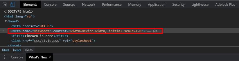
Если метатег стоит в правильном месте, с подходящими атрибутами и значениями, то, возможно, ошибся инструмент проверки. Такое бывает: вебмастера жалуются, что Яндекс и Google периодически сообщают им о такой проблеме, хотя на самом деле ее нет.
Инструменты разработчика (devtools)
Инструменты разработчика позволяют быстро найти элемент, посмотреть его размеры, отступы, стили, расположение стилей, использование @media запросов, менять значение свойств прямо в браузере
Открыть инструменты разработчика можно нажатием клавиши F12
Чтобы просмотреть сразу расположение элемента и отобразить его свойства нажимаем правой кнокой мыши на элемент и выбираем Исследовать элемент в Mozilla Firefox или Просмотреть код в Google Chrome
Например, хотим узнать про элемент заголовка карточки, нажимаем на нём правой кнопкой мыши и выбираем Исследовать элемент в Mozilla Firefox
Открывается окно инструментов, где с левой стороны видим расположение элемента в HTML, а справой стороны CSS свойства элемента
Чтобы визуально посмотреть размеры и отступы элемента, в левой части инструментов разработчика наводим курсор мыши на элемент, и в браузере будут отображены свойства элемента
В правой части инструментов разработчика можно выбрать значение CSS свойства и назначить другое значение, в браузере сразу же будут видны изменения.
Значение можно писать вручную или постепенно менять значение стрелками вверх или вниз на клавиатуре.
При вводе значения вручную будут выводиться подсказки
Если значение некорректно и не применяется, то будет перечеркнуто
Можно самостоятельно отключить необходимое свойство, нажав на чекбокс перед этим свойством
Можно назначить новое свойство, нажав на пустое место в пределах блока свойств элемента. Также будут выведены подсказки возможных свойств
Все эти изменения сразу отображаются в браузере, что удобно при разработке и отладке адаптивной вёрстки. После перезагрузки страницы изменения сбрасываются
Также можно посмотреть расположение стилей — указывается имя файла, строка в файле и использование @media запросов
Quick Overview of Length Units
Length units are often separated into two main categories: absolute and relative.
Absolute Length Units
Absolute length units are considered absolute because they are not relative to any other element. These units will not scale to browser size and will always remain the same size. These include the following:
pt – points
px – pixels
in – inches
cm – centimeters
mm – millimeters
pc – picas
Pixels are really the only absolute CSS length unit we should consider using for the web. The others are mostly used for physical (not digital) measurement (like print). A pixel unit refers to the size of one “dot” of your device display (which will vary slightly with each device). Because of this, pixels are commonly used for things that don’t necessarily need to scale with browser sizes.
Relative Length Units
Relative Length units are considered relative because they change/scale depending on the length of other elements. One common example is percentage, which is dependant on the length of the parent element.
em – relative to the element’s font-size
rem – relative to the root element’s font-size
vw – relative to 1% of your browser’s viewport width
vh – relative to 1% of your browser’s viewport height
vmin – relative to 1% of the smaller of the two browser viewport dimensions (height or width).
vmax – relative to 1% of the larger of the two browser viewport dimensions (height or width).
% – relative to 1/100 of the parent element’s width.
All of these units are used for the web. For this post, I won’t be concentrating on rem, vmin, or vmax because they are less common and do not work as well with Divi. Although I would love to hear suggested use cases.
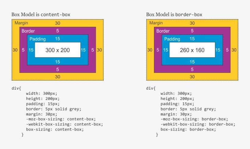
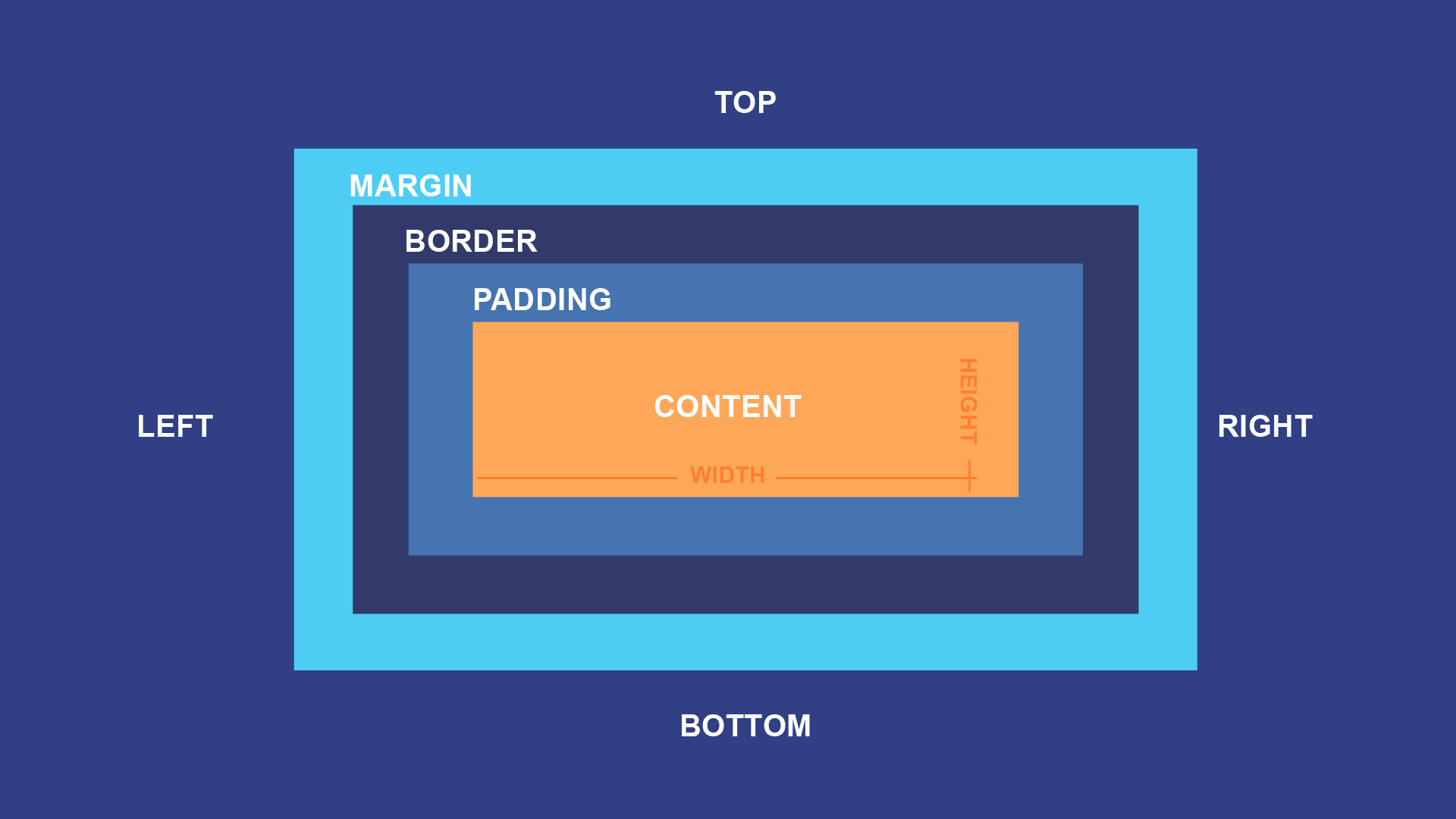
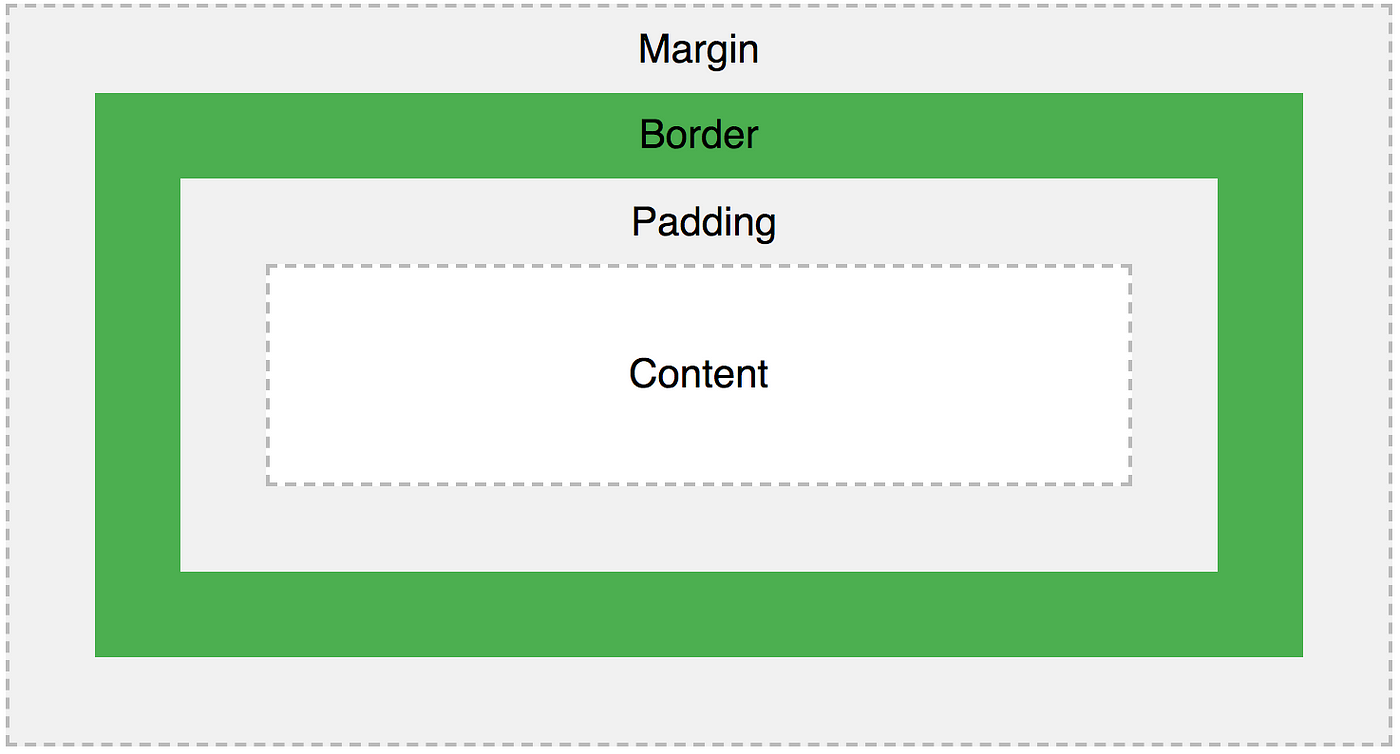
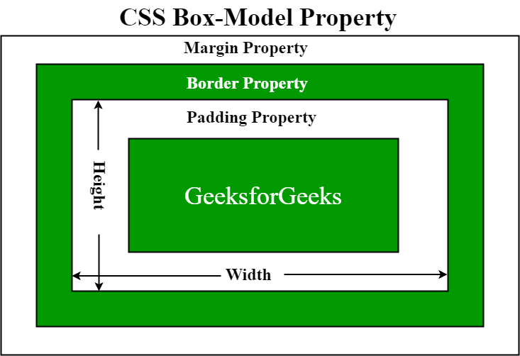
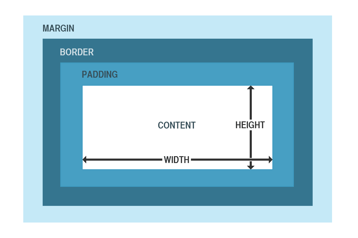
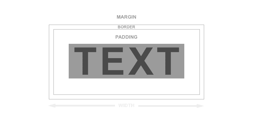
Divi’s Box Sizing
Divi determines box sizing with the border-box CSS property. This basically means the width and height of a section, row or module is determined by the sum of its content, padding and border. If you have built websites with Divi, you already know how this works. Think of a row as a box.
Let’s say you create a row that has a width of 1000px. Adding content to the row (like other boxes/modules) will not change the width of the row. Adding padding to the row will not change the width of the row either but will be applied inside the box. If you add a border to the row, the border will also be applied inside the box and will not affect the set width. In other words, adding 50px of right and left padding will not result in a 1100px row just as adding a 10px border around your row will not make your row 1020px wide. The only thing that will change is the height as you add more content padding or border. Margin is what adds space outside of the box and is what is used to separate boxes (sections, rows, and modules) on the page.
I mention this because it is helpful to understand the building block (or boxes) of how Divi works so you can know what adding length unit values (30px, 5em, 50% etc.) to elements on your page actually does.
Управление переполнением блочных элементов
В процессе верстки у вас будут возникать такие ситуации, когда содержимое элемента будет отображаться за пределами границ элемента. По умолчанию браузер отображает такое содержимое (переполнение элемента отображается), что в некоторых случаях приводит к визуальным ошибкам. За такое поведение браузера отвечает CSS свойство overflow. Рассмотрим его возможные значения:
| Значение | Описание |
|---|---|
| visible | Переполнение не обрезается, содержимое выходит за пределы размеров элемента. Это значение по умолчанию. |
| hidden | Переполнение обрезается (контент, который выходит за размеры будет невидимым). |
| scroll | Переполнение обрезается, но добавляется полоса прокрутки, позволяющая увидеть содержимое, которое выходит из заданных размеров. |
| auto | Если переполнение обрезается, то полоса прокрутки будет добавлена автоматически, чтобы увидеть содержимое, которое выходит из заданных размеров. |
Давайте рассмотрим следующий пример:
<!DOCTYPE html>
<html>
<head>
<title>Пример управления переполнением элемента</title>
<style>
div {
display: inline-block;  /*  устанавливаем элементы <div> как блочно-строчные (выстраиваем в линейку)  */
width: 125px; /* устанавливаем ширину блока */
height: 100px;  /* устанавливаем высоту блока */
padding: 5px;  /* устанавливаем внутренний отступ для всех сторон */
border: 1px solid orange;  /* устанавливаем сплошную границу 1px оранжевого цвета */
vertical-align: top; /* верх элемента выравнивается по верху самого высокого элемента в строке (вертикальное позиционирование) */
}
.test {
overflow: visible; /* переполнение не обрезается */
}
.test2 {
overflow: hidden; /* переполнение обрезается */
}
.test3 {
overflow: scroll; /* переполнение обрезается, но добавляется полоса прокрутки */
}
.test4 {
overflow: auto; /* если переполнение обрезается, то полоса прокрутки будет добавлена автоматически */
}
</style>
</head>
<body>
	<div class = "test"><p>overflow: visible</p>Съешь же ещё этих мягких французских булок да выпей чаю.</div>
	<div class = "test2"><p>overflow: hidden</p>Съешь же ещё этих мягких французских булок да выпей чаю.</div>
	<div class = "test3"><p>overflow: scroll</p>Съешь же ещё этих мягких французских булок да выпей чаю.</div>
	<div class = "test4"><p>overflow: auto</p>Съешь же ещё этих мягких французских булок да выпей чаю.</div>
</body>
</html>
В данном примере мы разместили четыре блока фиксированной ширины и высоты, для которых указали различные значения CSS свойства overflow:
- Первый блок (значение visible) – содержимое выходит за границы элемента (значение по умолчанию).
- Второй блок (значение hidden) – содержимое, которое переполняет элемент обрезается.
- Третий блок (значение scroll) – переполнение обрезается, но добавляется полоса прокрутки.
- Четвертый блок (значение auto) – как и при значении scroll, только полоса прокрутки будет добавлена автоматически, если произойдет переполнение блока по определенной оси (x — горизонтальной, либо y — вертикальной), а не отображается на странице постоянно.
Результат нашего примера:
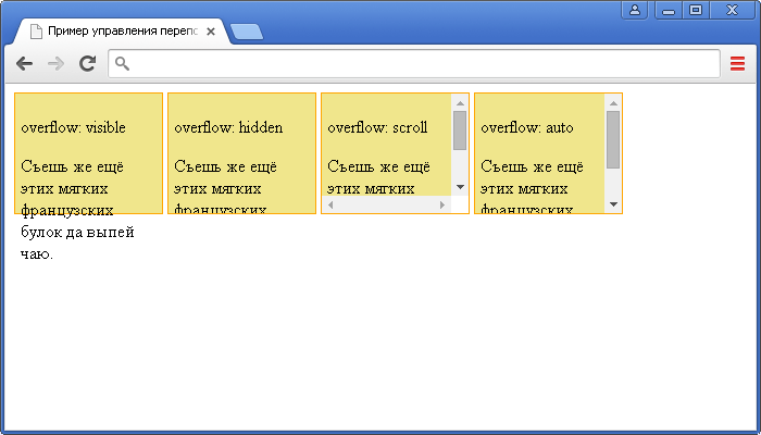
Рис. 104 Пример управления переполнением элемента.
Переполнение по определённой оси
С выходом стандарта CSS 3 были добавлены свойства, которые способны управлять по отдельности горизонтальным переполнением (ось x) – overflow-x и вертикальным переполнением (ось y) – overflow-y. В отличии от свойства overflow, данные свойства отвечают только за одну ось (x, либо y) при этом значения и синтаксис аналогичен свойству overflow (таблица выше).
Давайте рассмотрим пример, в котором нам необходимо добавить полосу прокрутки для блока текста, если содержимое переполнит элемент по горизонтали:
<!DOCTYPE html>
<html>
<head>
	<title>Пример управления переполнением элемента по горизонтальной оси</title>
<style>
pre {
width: 300px; /* устанавливаем ширину элемента */
overflow-x: scroll; /* переполнение обрезается, но добавляется полоса прокрутки */
background-color: orange; /* задаем цвет заднего фона */
}
</style>
</head>
	<body>
		<pre>
			Съешь же ещё этих мягких французских булок да выпей чаю.
		</pre>
	</body>
</html>
В данном примере мы использовали элемент <pre>, который сохраняет все пробелы и переносы строк (текст может выходить из отведённой области), что нам и помогло продемонстрировать возможности свойства overflow-x. В нашем случае текст вышел за пределы ширины размера элемента <pre> и браузер добавил горизонтальный бегунок прокрутки, что нам и требовалось.
Результат нашего примера:
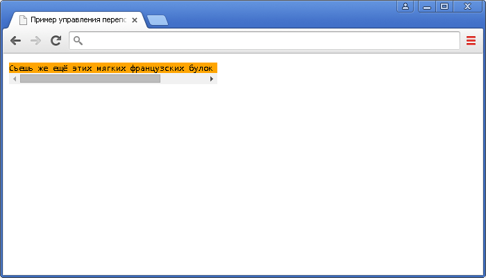
Рис. 105 Пример управления переполнением элемента по горизонтальной оси.
Text
Suggested Length Units: px, em, and maybe vw
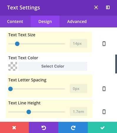
The Divi Builder Allows you to add custom length values to customize your text. These options include text size, letter spacing, and line-height.
You can use any of the CSS length values for these text options, but for this post I’m going to cover the most common – px, em, and vw.
Using px for Text Size
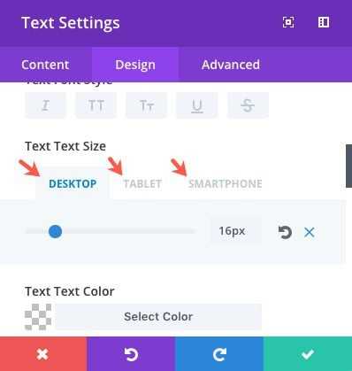
It is common to set your font sizes to a pixel value because you want those sizes to remain consistent. You can still change the font size according to browser width using media queries. Divi makes this really easy to do by allowing you to enter three different device font sizes within all Divi modules.
Using px for Letter Spacing
It is common to use px for letter spacing. Just note that if you plan on changing the size of your font considerably between devices, you will probably have to adjust the letter spacing as well. To make letter spacing scalable with your text size, you could use the em length value instead.
Using px for Line Height
The px unit is not the best option for line height because it becomes a hassle to change the line height everytime you change the font size. That is why em is normally used (more on this later).
Using em for font sizes
You can use em for custom font sizes. The value of 1em will equal the font size of the most immediate parent tag. When adding an em value to a text element in a module, the most immediate parent tag font size is whatever you have set in the theme customizer. So, in Divi, if you have your body font set to 16px, 1em is equal to 16px, 2em is equal to 32px, and so on.
Using em for Line-Height
Let’s say you are using a text module and change the body font to 18px. Since em is always relative to the most immediate parent tag, the value of em changes for that module and now 1em equals 18px. This is helpful to understand why Divi sets the line-height to an em length value. Setting your text font of 18px to have a 1.5em value will set the line-height to 27px (1.7 times 18px). So if you decide to change the font size later on, the em line height will adjust accordingly.
Using em for letter spacing
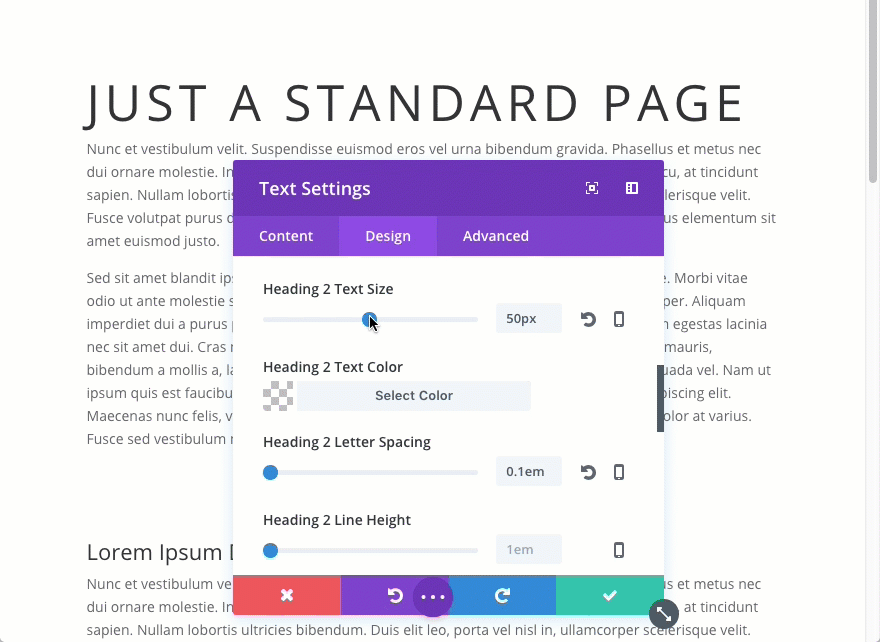
Using em for letter spacing can be useful and I would definitely recommend it. The main reason to use em for letter spacing is so that the space will increase and decrease depending on the size of your text.
Look at the letter spacing in the following image. Notice how the 5px letter spacing doesn’t change as you change the size of the header text.
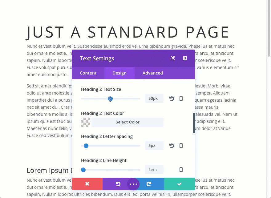
Now look at the same example text using 0.1em for the letter spacing. If the font size is 50px, 0.1em is going to equal 5px. But if you decrease the font size down to 25px, 0.1em is going to equal 2.5px.
Using rem for Text Elements
Using rem is generally more predictable than using em because it is always relative to the root font size. The root element in your html tag. This is the tag that wraps your entire website. In Divi the html is actually set to have a font-size of 100%. This may seem a little strange. I mean, 100% of what exactly? Actually, this is pretty common practice. You may not know this but setting your root/html font size to 100% is a way to declare the same font size as your browser. Most browsers have a default font size of 16px, so, in Divi, the value of 1rem is actually 16px (or the font size set in your browser settings). It isn’t what you have set as the default body text in the theme customizer.
For example, Notice what happens when I add 1rem to the body text size of a text module. The text actually increases in size from 14px (what I have set as theme body font in the theme customizer) to 16px (my default browser font size).
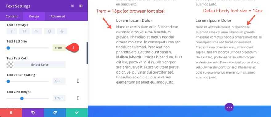
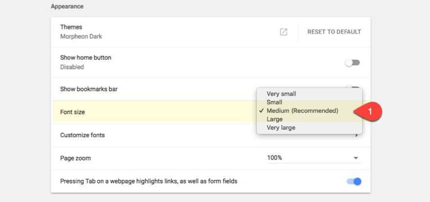
Now if I change my browser font size to something larger, the text in that text module will also increase.
So if you are interested in having text that adjusts to the users browser settings, the rem value may be helpful. But, for the most part, using rem in Divi will just be more trouble than it is worth unless you want to start changing the basic framework of the Divi Theme (ie. change the root font-size to something else).
Using vw for Text Elements
This is perhaps the most interesting length value to use for text. I’m not going to go into great detail on the possibilities here, but I will introduce you to the idea.
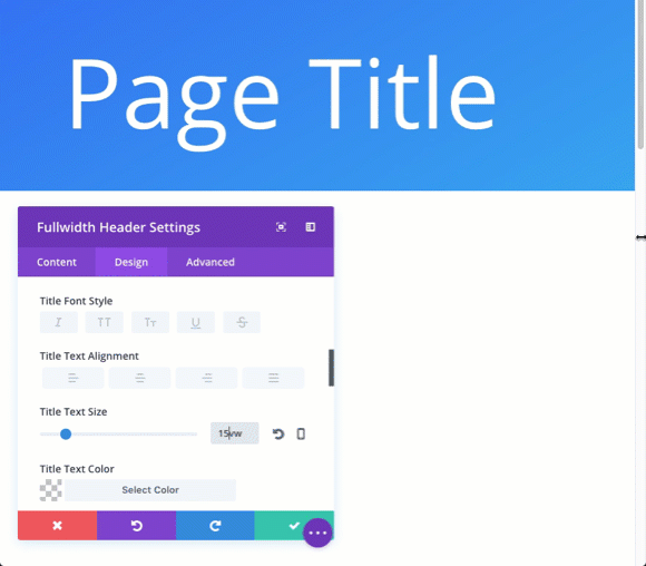
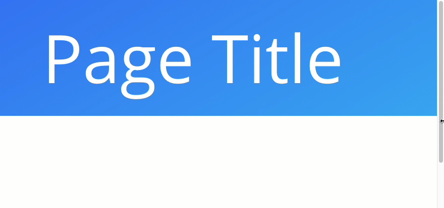
Using vw for font size allows you to completely scale your text with your browser window. This can be useful if want the line length to remain constant.
Look what happens to this title text when I adjust the size of my browser viewport/window. The title has a text size of 15vw (which is 15% of the broswer viewport).
If you wanted to take this a step further, you can set a custom em padding for the title that will automatically scale with the title text. This will only work if you apply the em padding to the title tag so you would need to add it to the custom CSS title box under the advanced tab.
Notice how the padding above and below the title scales with the title.
@media запросы
Существует два подхода адаптивной вёрстки по размерам области просмотра (viewport) — Mobile First и Desktop First.
При Mobile First верстаем от меньшего экрана к большему и применяем
При Desktop First верстаем от большего экрана к меньшему и применяем
На практике Mobile First встречается реже, чем Desktop First, поэтому обычно сначала верстаем макет для больших экранов, затем с помощью @media запросов адаптируем макет под меньшие экраны, используя контрольные точки (breakpoints).
@media запросы записываются в CSS файле следующим образом
Разница в 0.02px нужна для избежания пересечения @media запросов, чтобы разные стили не применялись для двух разных @media запросов одновременно
В зависимости от размеров экрана — гибко, но надо перепроверять на разных экранах
Чтобы не зависеть от размера пикселей, а масштабировать элементы в зависимости от размера экрана, придумали другие единицы измерения:
- vh — это 1% от высоты окна;
- vw — это 1% от ширины окна.
Получается, программисту уже не надо думать, сколько пикселей надо сделать картинку, чтобы она занимала половину ширины экрана на разных экранах. Вместо этого достаточно указать так:
В этом случае браузер сделает так:
- Посмотрит, что за единица измерения — vw, значит нужна ширина экрана.
- Узнает, какой ширины в пикселях окно, в котором открывается эта страница.
- Поделит её на 100, чтобы узнать размер одного vw в пикселях.
- Умножит это значиние на 50, чтобы понять размер в пикселях нужного нам элемента.
- Установит это значение в пикселях при вёрстке.
- Если в процессе просмотра у браузера поменяется размер экрана — он сам всё пересчитает и отрисует заново.
Используем страницу из предыдущего раздела и немного переделаем её — установим такой размер блоков:
- первый блок — 10vw
- второй блок — 20vw
- третий — 50vw
Если нам нужно, чтобы блоки по высоте занимали всю высоту экрана, то для этого достаточно указать в стилях div такой параметр:
Блоки стали такой же высоты, как и экран
Ещё есть vmin и vmax, которые работают так:
- vmin находит минимальное значение из пары (vh, vw);
- а vmax находит максимальное значение из пары (vh, vw).
Это нужно, например, для адаптивной вёрстки, когда вам требуется привязаться к короткой стороне экрана и в зависимости от её размеров построить всю остальную страницу.
HTML Атрибуты
acceptaccept-charsetaccesskeyactionaltasyncautocompleteautofocusautoplaycharsetcheckedciteclasscolscolspancontentcontenteditablecontextmenucontrolscoordsdatadata-dirdraggabledropzoneformformactionheadersheighthiddenhighhrefhreflanghttp-equividitemiditempropitemrefitemscopeitemtypeismapkeytypekindlabellanglistlooplowmanifestmaxmaxlengthmediamethodminminlengthmultiplemutednamenovalidateonabortonafterprintonbeforeprintonbeforeunloadonbluroncanplayoncanplaythroughonchangeonclickoncopyoncutondblclickondragondragendondragenterondragleaveondragoverondragstartondropondurationchangeonemptiedonerroronfocusonhashchangeoninputoninvalidonkeydownonkeypressonkeyuponloadonloadeddataonloadedmetadataonloadstartonmousedownonmousemoveonmouseoutonmouseoveronmouseuponmousewheelonofflineononlineonpagehideonpageshowonpasteonpauseonplayonplayingonprogressonratechangeonresetonresizeonscrollonsearchonseekedonseekingonselectonshowonstalledonsubmitonsuspendontimeupdateontoggleonunloadonvolumechangeonwaitingonwheelopenoptimumpatternplaceholderposterpreloadreadonlyrelrequiredreversedrowsrowspansandboxscopescopedselectedshapesizesizesspanspellchecksrcsrcdocscrlangsrcsetstartstepstyletabindextargettitletranslatetypeusemapvaluewidth