
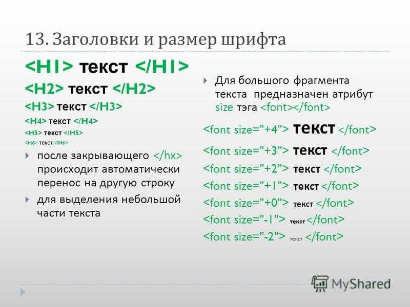
How to style tag?
Common properties to alter the visual weight/emphasis/size of text in <select> tag:
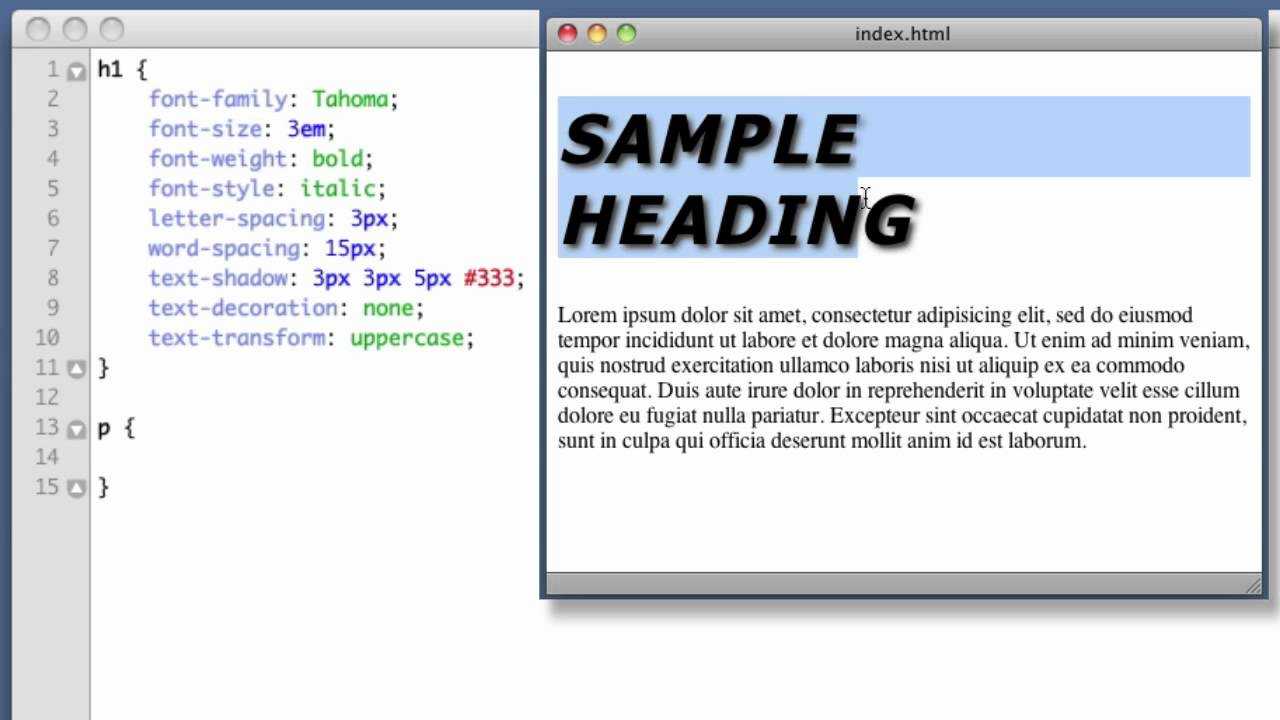
- CSS font-style property sets the style of the font. normal | italic | oblique | initial | inherit.
- CSS font-family property specifies a prioritized list of one or more font family names and/or generic family names for the selected element.
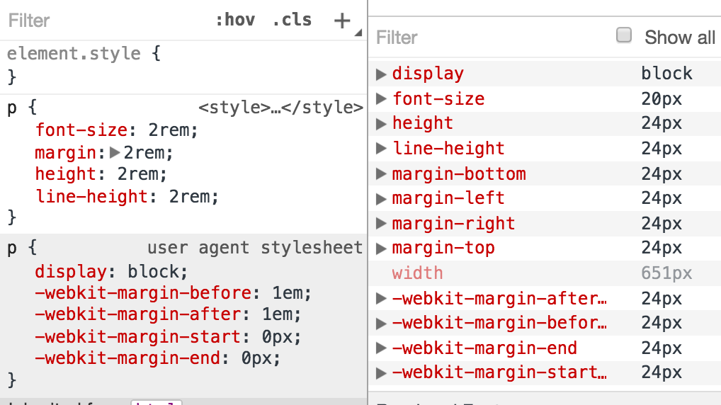
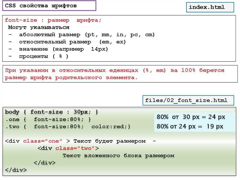
- CSS font-size property sets the size of the font.
- CSS font-weight property defines whether the font should be bold or thick.
- CSS text-transform property controls text case and capitalization.
- CSS text-decoration property specifies the decoration added to text, and is a shorthand property for text-decoration-line, text-decoration-color, text-decoration-style.
Coloring text in <select> tag:
- CSS color property describes the color of the text content and text decorations.
- CSS background-color property sets the background color of an element.
Text layout styles for <select> tag:
- CSS text-indent property specifies the indentation of the first line in a text block.
- CSS text-overflow property specifies how overflowed content that is not displayed should be signalled to the user.
- CSS white-space property specifies how white-space inside an element is handled.
- CSS word-break property specifies where the lines should be broken.
Other properties worth looking at for <select> tag:
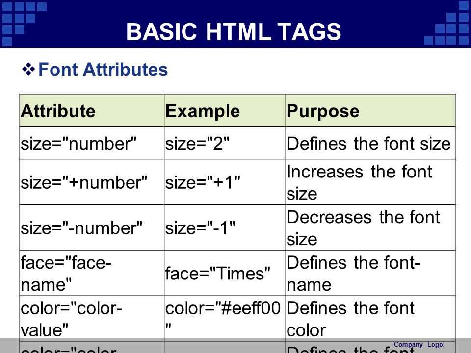
Attributes
| Attribute | Value | Description |
|---|---|---|
| autofocus | autofocus | Defines that the list should be focused after the page loads. |
| disabled | disabled | Indicates that the list is disabled, the user cannot interact with it. |
| form | form_id | Defines the form which the element is connected with.Is not supported in Firefox. |
| multiple: | multiple: |
Indicates that more than one options can be chosen. The method of choosing more than one option depends on the operating system. In Windows, you need to keep CTRL button pressed, in Mac CMD button. |
| name | name | Defines a name for the drop down menu. It can be used to access the data of the form after it has been sent or to link to JavaScript element. |
| required | required | Indicated that the the choice of an option is required. |
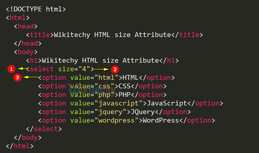
| size | number | Indicated the count of the options in drop down list. If the value of «size» attribute is bigger than 1 and smaller than the total number of the options in the list, the browser will automatically add a scroll to indicate that there are more options to view. |
The <select> tag supports Global attributes and the Event Attributes.
The sizes Attribute:
The actual implementation where you’d want a different size image (different height, width) on different screen sizes is accomplished by using attribute along with the of attribute. Let’s again learn through a couple of examples:
Example 1
Say you want the image to be viewed in half of the viewport width. You’ll type:
The browser will now decide which image to download based on the browser width and the device pixel ratio. For example:
-
If the browser width is 500 CSS pixels, the image will be displayed 250px wide (because of 50vw). Now, this is equivalent to specifying:
- So, for a 1.5x display, will be downloaded by a browser, since it gives a device-pixel ratio of 1.6x (which is most suitable for a 1.5x display).
Example 2
You want the image to be displayed in half of the viewport width when the viewport width is greater than 40em, but the image should occupy the complete width when the viewport width is less than or equal to 40em. This is how you’ll approach it:
This is very similar to media queries. So, for a viewport which is wide, evaluates to true, which means , that is, the image is as wide as the viewport. If the viewport is the browser window and if the browser width is 500 CSS pixels, the image will be displayed 500px wide. This is equivalent to specifying:
Similar to above, the browser will decide which image to pick from above for a specific display.
For a viewport which is wide, evaluates to false, which means , that is, the image is half as wide as the viewport.
The next element we’ll see is the element, but before that I need a quick recap 
| Use-case | Solution |
|---|---|
| I want the same image to be displayed across all devices, but I want to display it in a higher resolution on devices which can support it. The height and width of the image should remain fixed. | Make multiple assets of the same image (space-needle.jpg, space-needle-hd.jpg). Use with x descriptor. |
| I want the same scenario as above, but I should be able to customize height and width of the image based on the viewport. | Use and with w descriptor (again, make multiple assets of the same image) |
| I’m doubtful that if I use the same image for a smaller screen size, the primary subject of my image may become too small in size. I want to display a different image (more focused on the primary subject) in a different screen size, but I still want to display separate assets of the same image based on device-pixel ratio, and I want to customize height and width of the image based on viewport. | ? |
The solution to ‘?’ is element!
Related Resources
- How to Style a <select> Box Drop-Down with Only CSS?
- How to Create a Placeholder for an HTML5 <select> Box by Using Only HTML and CSS?
- How to Remove and Style the Border Around Text Input Boxes in Google Chrome
- How to Disable the Browser Autocomplete and Autofill on HTML Form and Input Fields
- Input Types for HTML Forms
- HTML Form Templates
- HTML <form> Tag
- HTML <option> Tag
- HTML <optgroup> Tag
- HTML <input> Tag
- How to Create Contact Form With CSS
- How to Get the Value of Selected Option in a Select Box
- What is the Difference Between the «id» and «name» Attributes
- How to Use the «required» Attribute on the <select> Element in HTML5
- How to Change Selected Value of a Drop-Down List Using jQuery
- How to Add and Remove Multiple or Single Select Options using jQuery
- How to Get the Value of a Textarea using jQuery
- Is It Possible to Nest an HTML <button> Element Inside an <a> Element in HTML5
WebP format
Lastly, let us not forget about the WebP format. WebP formatted images are on average 26% smaller than PNG formatted images and 25-34% smaller than JPEG formatted images. This means just converting your images to WebP can decrease the size of your pages by about 25%. However, WebP formatted images are not accepted by every browser, which is where the attribute becomes useful in the element, for example:
As we already know, the will only be used if the condition is true, which means in our example above WebP images will be used where accepted, PNG images will be used where WebP images are not accepted, and if all else fails the element will be used. The class applied to the image used in the element will be pulled from attribute in the element.
What is a Responsive Image?
In simple terms, a responsive image is an image which is displayed in its best form on a web page, depending on the device your website is being viewed from. The term ‘best form’ could mean multiple things:
- You want to show a separate image asset based on the user’s physical screen size. For example: you want to show a separate image asset on a 13.5 inch laptop and a 5 inch mobile phone (on a maximized browser).
- You want to show a separate image based on the resolution of the device (or, the device-pixel ratio, which is the ratio of device pixel and CSS pixel).
- You want to show an image in a specified image format (JPEG XR, for example) if the browser supports it, probably because of the higher compression that format supports.
The building blocks for responsive are included in most modern browsers including Microsoft Edge (starting Windows Insider Build 10547). You can view the Web Platform status of features like here.
HTML Справочник
HTML Теги по алфавитуHTML Теги по категорииHTML ПоддержкаHTML АтрибутыHTML ГлобальныеHTML СобытияHTML Названия цветаHTML ХолстHTML Аудио/ВидеоHTML ДекларацииHTML Набор кодировокHTML URL кодHTML Коды языкаHTML Коды странHTTP СообщенияHTTP методыКовертер PX в EMКлавишные комбинации
HTML Теги
<!—…—>
<!DOCTYPE>
<a>
<abbr>
<acronym>
<address>
<applet>
<area>
<article>
<aside>
<audio>
<b>
<base>
<basefont>
<bdi>
<bdo>
<big>
<blockquote>
<body>
<br>
<button>
<canvas>
<caption>
<center>
<cite>
<code>
<col>
<colgroup>
<data>
<datalist>
<dd>
<del>
<details>
<dfn>
<dialog>
<dir>
<div>
<dl>
<dt>
<em>
<embed>
<fieldset>
<figcaption>
<figure>
<font>
<footer>
<form>
<frame>
<frameset>
<h1> — <h6>
<head>
<header>
<hr>
<html>
<i>
<iframe>
<img>
<input>
<ins>
<kbd>
<label>
<legend>
<li>
<link>
<main>
<map>
<mark>
<meta>
<meter>
<nav>
<noframes>
<noscript>
<object>
<ol>
<optgroup>
<option>
<output>
<p>
<param>
<picture>
<pre>
<progress>
<q>
<rp>
<rt>
<ruby>
<s>
<samp>
<script>
<section>
<select>
<small>
<source>
<span>
<strike>
<strong>
<style>
<sub>
<summary>
<sup>
<svg>
<table>
<tbody>
<td>
<template>
<textarea>
<tfoot>
<th>
<thead>
<time>
<title>
<tr>
<track>
<tt>
<u>
<ul>
<var>
<video>
<wbr>

HTML Теги
<!—…—><!DOCTYPE><a><abbr><acronym><address><applet><area><article><aside><audio><b><base><basefont><bdi><bdo><big><blockquote><body><br><button><canvas><caption><center><cite><code><col><colgroup><data><datalist><dd><del><details><dfn><dialog><dir><div><dl><dt><em><embed><fieldset><figcaption><figure><font><footer><form><frame><frameset><h1> — <h6><head><header><hr><html><i><iframe><img><input><ins><kbd><label><legend><li><link><main><map><mark><meta><meter><nav><noframes><noscript><object><ol><optgroup><option><output><p><param><picture><pre><progress><q><rp><rt><ruby><s><samp><script><section><select><small><source><span><strike><strong><style><sub><summary><sup><svg><table><tbody><td><template><textarea><tfoot><th><thead><time><title><tr><track><tt><u><ul><var><video>
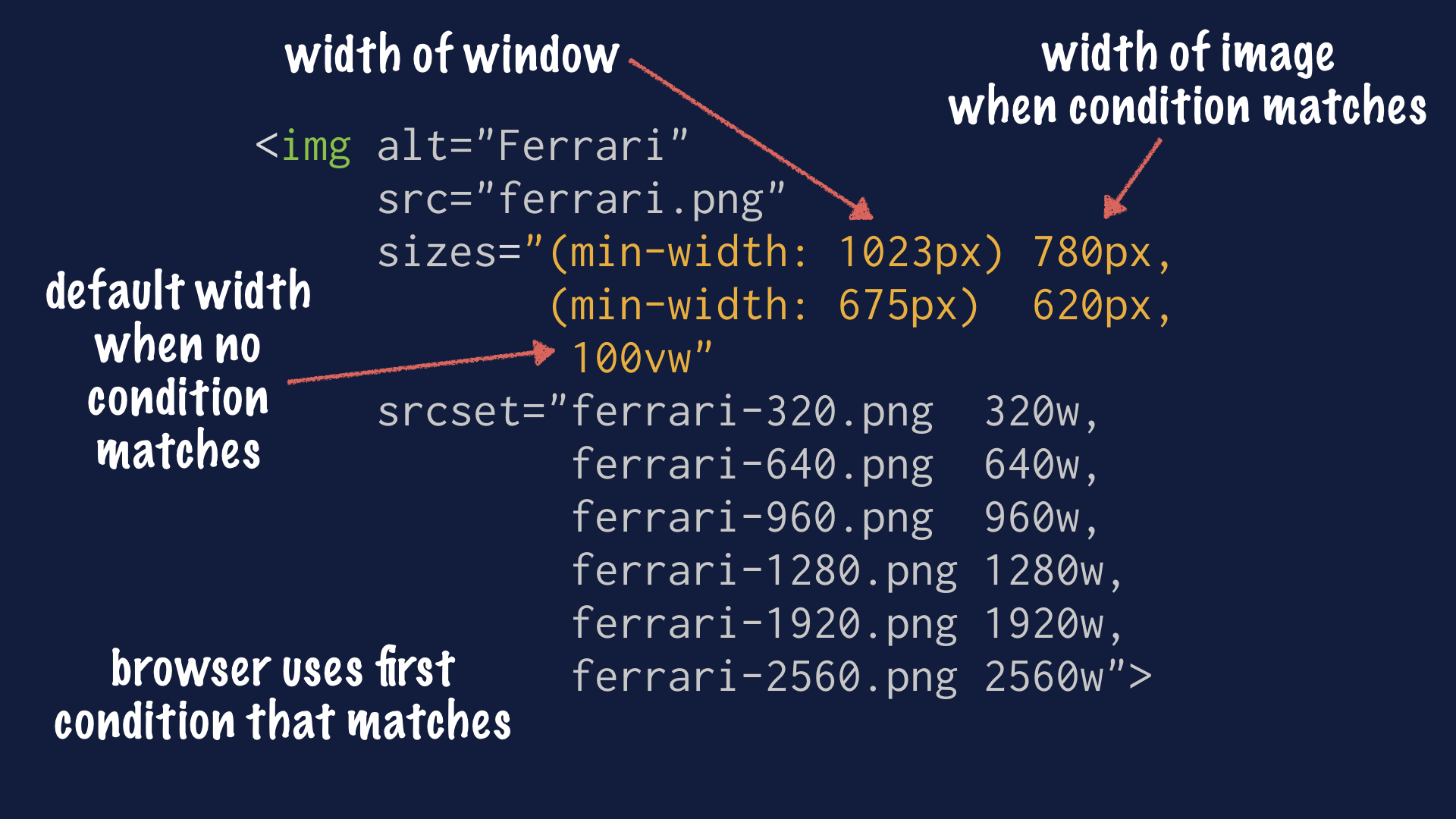
What are the srcset, sizes, and media attributes?
The , , and attributes allow the and elements to be extended by offering the browser additional information, such as different image sources as well as different display sizes and media conditions. This offers browsers the ability to display a specific image when a rule is met.
The attribute allows image sources to be defined. This can be done by defining the absolute or relative path to the images and optionally the pixel density descriptors (e.g. , , and ). This attribute can be used in the and elements.
Both the and attributes are nearly identical. Both allow different display sizes to be defined through various media conditions. However, the attribute allows an image size to defined either alone or in relation to a media condition. The attribute can be used in the and elements, whereas the attribute can be used in the element but not the element.
In all cases the element needs to be a direct child of the element.
How to use the srcset, sizes, and media attributes
To cover the basics, all that is actually required to insert an image is the tag and attribute, for example:
The attribute will let the browser know where to make the image request. If an absolute path is defined, as shown above, the browser will make a request using the scheme and hostname of website where the element is placed.
However, it is highly recommended to add the attribute as this attribute is important for search engines and screen readers. The and attributes can define size, but this could lead to an image larger than the device viewing it. That is why it is common to see the attribute to style the image instead, for example:
The problem with using the element above is that it will result in a single image being delivered across all devices. While using CSS to scale the image to fit across all devices does make the image responsive, which in our case is accomplished by using the class, this would lead to a significant amount of unnecessary data being delivered. Serving an unscaled image will slow performance, increase the overall page size, and waste bandwidth. This is where the responsive , , and attributes come to the rescue.
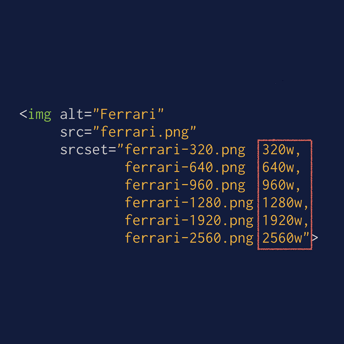
The attribute can be used in the and elements. We simply add the width of the images after the file name, such as 730w, 610w, and 350w. However the problem with this method is that you are relying solely on the size of the viewport to tell the browser which image to load, for example:
Luckily for us, this is where the and attributes comes into play.
The attribute tells the browser exactly what size the image will be in relation to the size of the viewport through media conditions, which are similar to media queries. This can be used in conjunction with the , for example:
The attribute is very helpful when using the element, however, if you are using the element it is often makes more sense to use the attribute instead.
The attribute allows a media condition to be defined. This can be used in the element if its a direct child of the element. If the condition is true that element is used, if false it is skipped, for example:
In addition to being able to define what image is used based on the viewport size, it is also possible to define what image is used based on the pixel density of the display.
Pixel density descriptors
The pixel density descriptors, also referred to as display or screen density descriptors, are an extremely helpful way of displaying high resolution images on high resolution displays. These descriptors are defined using , , and . They allow an image to be displayed that is either two or three times larger than the original while retaining the same dimensions as the original image, for example:
The or attributes are not required when using the pixel density descriptors, however, the actual or image does need to be two or three times larger. You can reduce the size of the scaled images even further by using the next generation image format, WebP.
The picture Element
As we saw above, element is used when you want to show a different image depending on the rendered size of the image. The element is a container which contains other elements that control the image to be downloaded. Let’s look at an example:
The first element whose attribute’s media query holds true is chosen.
So, if the max width of viewport is , the corresponding image source is selected from the directory, based on the device-pixel ratio. All the images within one are usually multiple assets of the same image.
The element itself does not display anything. Even the element within the element does not represent anything of its own. The element must contain the attribute and it may have , and attributes. It’s necessary to add element within . You won’t see any image without the element. All the elements within the element are just there to feed the image a source.
You can also do an image selection based on the image format supported by the browser. This is especially useful when there are good savings on the image size just based on the format. For example, JPEG-XR, an efficient image format, which usually takes less image size as compared to JPG, is supported by Microsoft Edge and IE9+. Using attribute within the element, you can test for this format:
When it is used, both the attributes: attribute and the attribute should resolve to true for that element to be chosen. If the browser can’t understand any of the formats, it falls back to .
Putting It All Together
After understanding how responsive images work, let’s look at a complete example which utilizes all the three together – , and .
In this example, we’ve used which contains multiple elements. The first one is chosen if the max width is 700px. If this is chosen, the attribute then decides the size of the image to be displayed based on the width breakpoints we have mentioned. The implementation is exactly similar to what we have seen in attribute. So, if the max width is 500px (width ranges from 0px-500px), the image will occupy half of the viewport. And the image source is chosen based on the device-pixel ratio. However, if the viewport width is greater than 500px (but , because we are within the first element), then the image will occupy just 1/10 of the viewport.
Similarly, the second element is chosen if the max width is 1400px (which means now the width ranges from 701px to 1400px). The attribute ensures that if the viewport width ranges from 701px to 1000px, the image’s width is same as the viewport width, and if the viewport width ranges from 1001px to 1400px, the image occupies half of the viewport width. To verify all the cases, I simply resize the browser and check. In real-world use, your website will be accessed through different devices and that is where you’ll see the actual use of responsive images. Here is the output:
(Please note all the image sources and the image width set here are just for the demo, and as you can see, I make some funny stick figures!)
Viewport width set between 1001px and 1400px: the image width is half of the viewport width (Image source being used is stick-figure.png)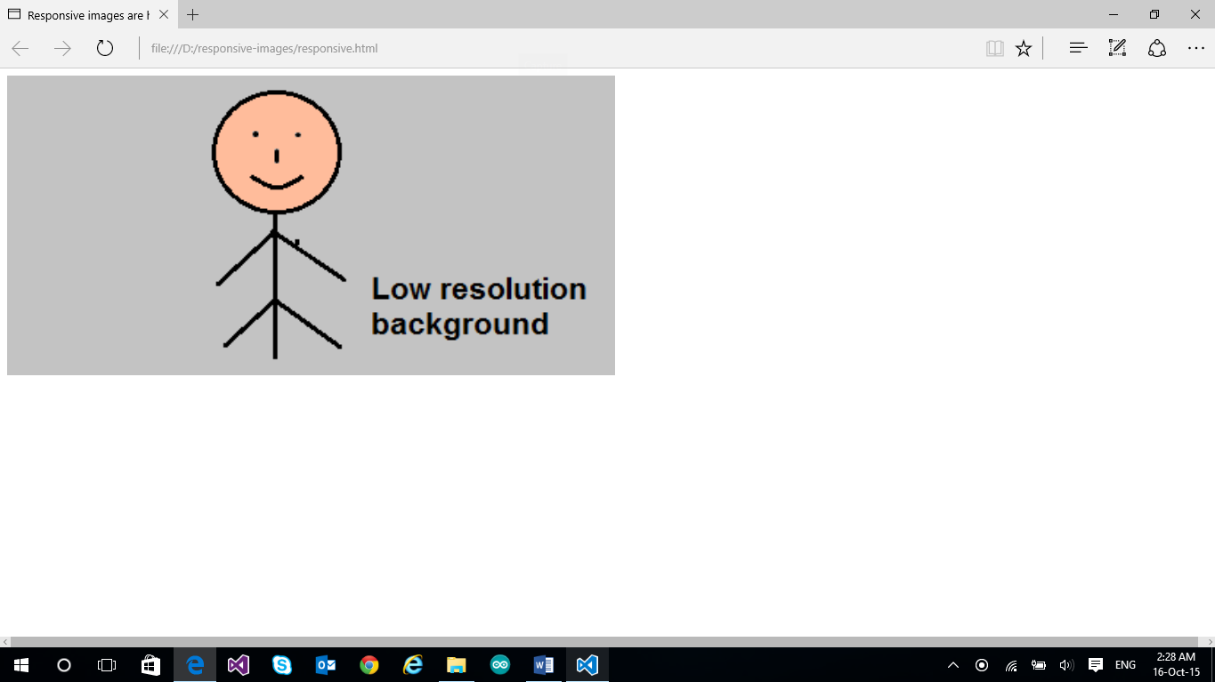
Viewport width set between 701px and 1000px: the image width is same as the viewport width. (Image source being used is stick-figure.png)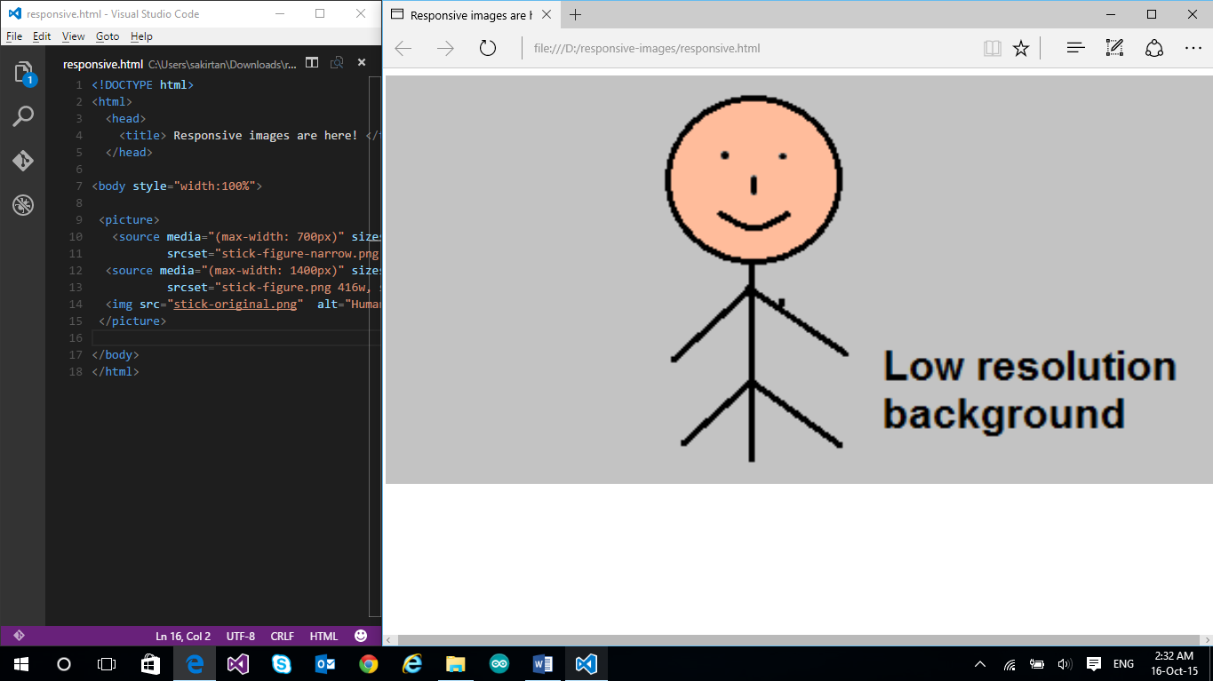
Viewport width set between 501px and 700px: The image width is 1/10 of the viewport width. (Image source being used is stick-figure-narrow.png)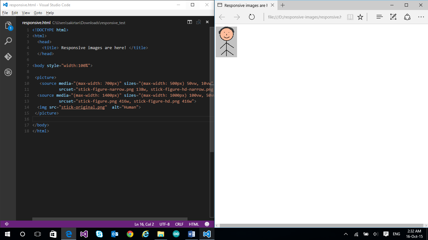
Viewport width set between 0px and 500px: The image width is half of the viewport width. (Image source being used is stick-figure-narrow.png)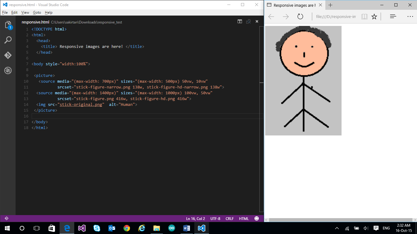
How to Enable Responsive Images
There are a number of ways to enable responsive behavior of images. One of the older methods (not recommended) is by simple scripting, but this leads to a couple of problems. One, if a script determines which image to download, but the script itself is loaded after the images specified in the HTML have been downloaded, you may potentially end up with two downloaded images. Two, if you don’t specify any image in HTML and want to load only the image as defined by the script, you’ll end up with no image at all for the browsers which have scripting disabled.
Hence, we need a better way to deal with responsive images. And thankfully, there is! The recommended way is to use:
- attribute
- attribute
- element
Let’s delve a little deeper.
Why are responsive images important?
The reason responsive images are so important all comes down to file sizes. On smaller devices, there is no reason to download an image that is 1460 x 730 pixels. It is a waste of bandwidth and resources. How much of a waste? We can take a look at the image sizes we used in the examples above, for example:

| File Name | Size |
|---|---|
| responsive-images.jpg | 30.7 KB |
| responsive-images-lg.jpg | 24.1 KB |
| responsive-images-md.jpg | 19.7 KB |
| responsive-images-sm.jpg | 10.6 KB |
If a small device, such as a phone, has a display size of 375 pixels, serving the scaled image would be 10.6 KB. If we compare that to the original unscaled image (which CSS would have to scale down) at 30.7 KB, that is a decrease of 65.47%! This will vary depending on whether or not pixel density descriptors are used, however, serving scaled images will always reduce the overall page weight.
With more complex and higher resolution images you would likely have an even higher decrease. Furthermore, over time this can save quite a bit of bandwidth from your hosting or CDN provider, which in turn saves you money.
More Hands-on with Web Development
This article is part of the web development series from Microsoft tech evangelists on practical JavaScript learning, open source projects, and interoperability best practices including Microsoft Edge browser and the new EdgeHTML rendering engine.
We encourage you to test across browsers and devices including Microsoft Edge – the default browser for Windows 10 – with free tools on dev.modern.IE:
- Scan your site for out-of-date libraries, layout issues, and accessibility
- Use virtual machines for Mac, Linux, and Windows
- Remotely test for Microsoft Edge on your own device
- Coding Lab on GitHub: Cross-browser testing and best practices
In-depth tech learning on Microsoft Edge and the Web Platform from our engineers and evangelists:
- Microsoft Edge Web Summit 2015 (what to expect with the new browser, new supported web platform standards, and guest speakers from the JavaScript community)
- Woah, I can test Edge & IE on a Mac & Linux! (from Rey Bango)
- Advancing JavaScript without Breaking the Web (from Christian Heilmann)
- The Edge Rendering Engine that makes the Web just work (from Jacob Rossi)
- Unleash 3D rendering with WebGL (from David Catuhe including the vorlon.JS and babylonJS projects)
- Hosted web apps and web platform innovations (from Kevin Hill and Kiril Seksenov including the manifold.JS project)
More free cross-platform tools & resources for the Web Platform: