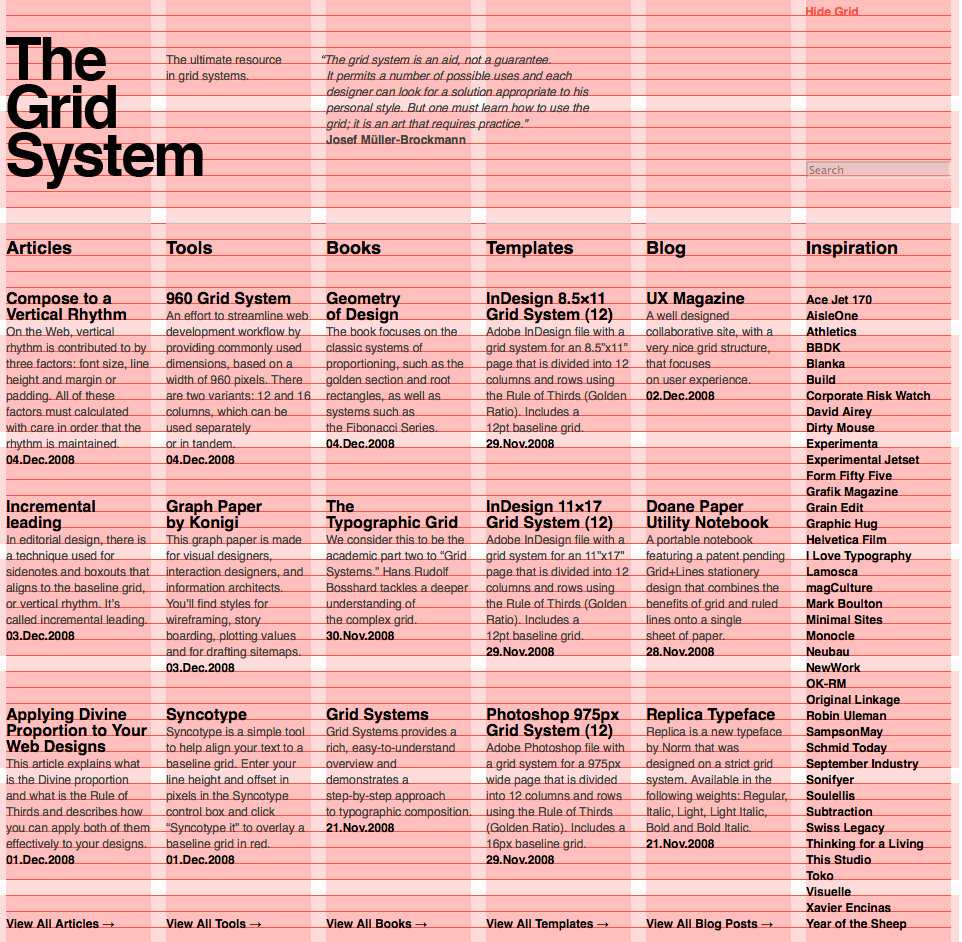
HTML Теги
<!—…—><!DOCTYPE><a><abbr><acronym><address><applet><area><article><aside><audio><b><base><basefont><bdi><bdo><big><blockquote><body><br><button><canvas><caption><center><cite><code><col><colgroup><data><datalist><dd><del><details><dfn><dialog><dir><div><dl><dt><em><embed><fieldset><figcaption><figure><font><footer><form><frame><frameset><h1> — <h6><head><header><hr><html><i><iframe><img><input><ins><kbd><label><legend><li><link><main><map><mark><meta><meter><nav><noframes><noscript><object><ol><optgroup><option><output><p><param><picture><pre><progress><q><rp><rt><ruby><s><samp><script><section><select><small><source><span><strike><strong><style><sub><summary><sup><svg><table><tbody><td><template><textarea><tfoot><th><thead><time><title><tr><track><tt><u><ul><var><video>
HTML References
HTML by AlphabetHTML by CategoryHTML Browser SupportHTML AttributesHTML Global AttributesHTML EventsHTML ColorsHTML CanvasHTML Audio/VideoHTML Character SetsHTML DoctypesHTML URL EncodeHTML Language CodesHTML Country CodesHTTP MessagesHTTP MethodsPX to EM ConverterKeyboard Shortcuts
HTML Tags
<!—>
<!DOCTYPE>
<a>
<abbr>
<acronym>
<address>
<applet>
<area>
<article>
<aside>
<audio>
<b>
<base>
<basefont>
<bdi>
<bdo>
<big>
<blockquote>
<body>
<br>
<button>
<canvas>
<caption>
<center>
<cite>
<code>
<col>
<colgroup>
<data>
<datalist>
<dd>
<del>
<details>
<dfn>
<dialog>
<dir>
<div>
<dl>
<dt>
<em>
<embed>
<fieldset>
<figcaption>
<figure>
<font>
<footer>
<form>
<frame>
<frameset>
<h1> — <h6>
<head>
<header>
<hr>
<html>
<i>
<iframe>
<img>
<input>
<ins>
<kbd>
<label>
<legend>
<li>
<link>
<main>
<map>
<mark>
<meta>
<meter>
<nav>
<noframes>
<noscript>
<object>
<ol>
<optgroup>
<option>
<output>
<p>
<param>
<picture>
<pre>
<progress>
<q>
<rp>
<rt>
<ruby>
<s>
<samp>
<script>
<section>
<select>
<small>
<source>
<span>
<strike>
<strong>
<style>
<sub>
<summary>
<sup>
<svg>
<table>
<tbody>
<td>
<template>
<textarea>
<tfoot>
<th>
<thead>
<time>
<title>
<tr>
<track>
<tt>
<u>
<ul>
<var>
<video>
<wbr>
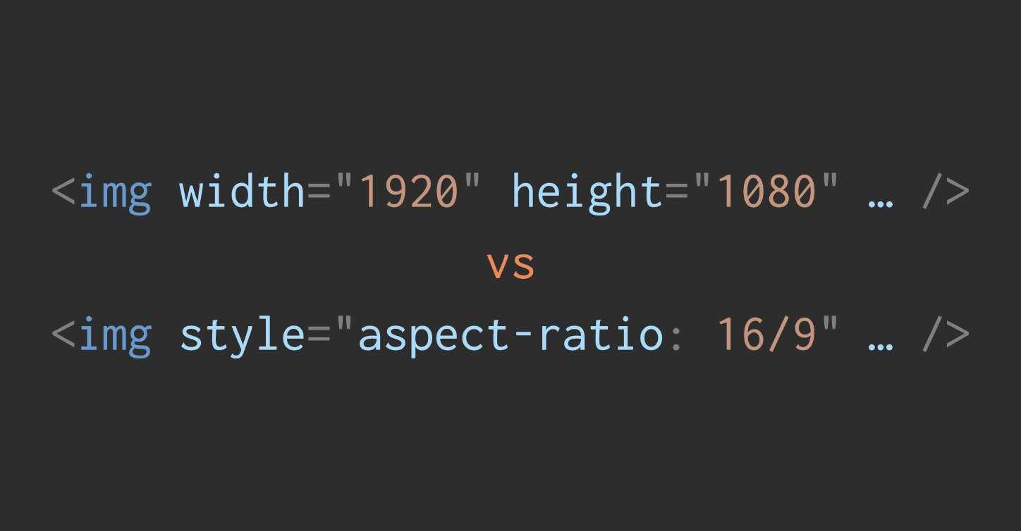
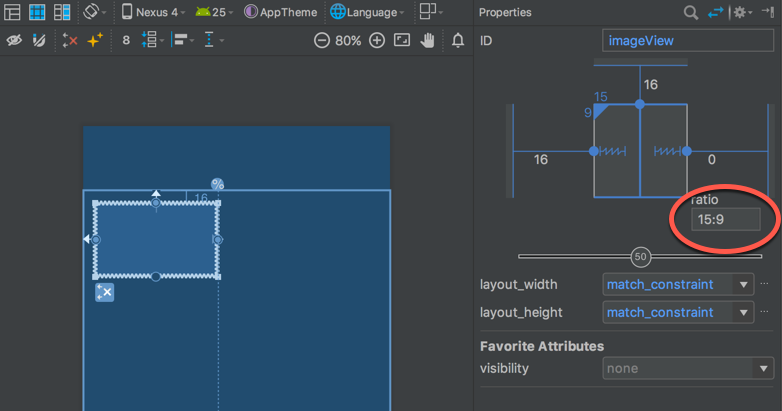
HTML Height and Width (Percentage):
This image is now pixelated, having been rendered to fill the 400×200 table element. The reason we are seeing a low-quality, pixelated rendering of the image is because the actual image file is much smaller than 400×200 and has been stretched by the web browser because we coded it to do so.
Here’s a few things to remember when trying to place images on your web page:
- Maintain the same height to width ratio. The ratio is critical, and must be maintained to avoid skewing.
- Always scale down. — Larger images will always scale down nicely and continue to look sharp.
If no height or width attribute is specified inside the <img> tag, the browser will use the actual dimensions of the image file to render the image. This can cause problems with the page layout if the picture file is too large, as other HTML elements will be moved further down the page in the event of an over-sized image.
Another concept to keep in mind is that as a browser begins rendering HTML components, it handles them one after another in sequence. Before it can move from one element on to the next, the browser needs to know the size and shape of an element. If this information is provided in the tag, that’s one less step required by the browser to render an image element and will result in the page loading faster for your users.
HTML — Alternative Attribute
The alt attribute specifies alternate text to be displayed if for some reason the browser cannot find the image, or if a user has image files disabled in their web browser settings. Text-only browsers greatly depend on the alt attribute since they are not capable of displaying pictures.
HTML Alternative Text Attribute:
The alt attribute is also an attribute that search engines may look for when displaying images. The text value contained within this attribute must reflect the substance of the image in order to receive «credit» from a search engine.
HTML — Horizontally Align Images
Images can be aligned horizontally to the right or to the left of other elements using the align attribute. Image elements are aligned to the left by default.
- align
- right
- left
HTML Image Align: Right:
As you can see, the image’s right edge has now been aligned with the right edge of the display box. Since the display box is the parent element, this is the desired behavior for the align attribute. If we take this example a step further, you can achieve some really great designs by embedding aligned images inside of paragraph <p> elements.
HTML Image Align Code:
<p>This is paragraph 1, yes it is...</p>
<p>
<img src="sunset.gif" align="right">
The image will appear along the...isn't it?
</p>
<p>This is the third paragraph that appears...</p>
Image Wrap Around:
This is paragraph 1, yes it is. I think this paragraph serves as a nice example to show how this image alignment works.
The image will appear along the right-hand side of the paragraph. As you can see this is very nice for adding a little eye candy that relates to the specified paragraph. If we were talking about beautiful tropical sunsets, this picture would be perfect. But we aren’t talking about that, so it’s rather a waste, isn’t it?
This is the third paragraph that appears below the paragraph with the image!
HTML Gifs vs. Jpegs vs. PNGs
Gifs are best used for banners, clip art, and buttons. The main reason for this is that .gif files can have transparent backgrounds — a priceless attribute when it comes to web design. On the down side, .gif files are limited to only 256 colors and any .gif image containing more than a few colors tends to have a larger file size than their .jpeg or .png counterparts. Large picture files are a plague of web design!
Jpegs have an unlimited color wheel and a high compression rate, which downsizes your load times and saves on hard drive space. Although .jpeg (or .jpg) files don’t allow for transparent backgrounds, their size/quality ratio is outstanding. It’s best to use .jpeg files for photo galleries or artwork. Avoid using .jpeg files for graphical designs, though; stick to using them for thumbnails, backgrounds, and photo galleries.
PNG image files are the best of both worlds. They have a large color wheel, low file size, and allow for transparencies like .gif images do. With a high-compression rate and transparent coloring, they might just be the best format for any web graphics.
When in doubt, try saving an image in multiple formats and decide which is better, keeping file size and quality in mind.
- Continue
Tips
- Find a good graphics editing program to edit your images with.
- Defining a height and width for your images will allow your page to load gracefully
How CSS Interacts With Element Widths And Heights
Widths and heights on an image can cause issues when you try to alter them using CSS. For example, if you want to limit your images to a certain width you might use the following CSS:
This will override the of the image and constrain it when necessary, but if you have explicitly set the on the image tag, then we are not overriding that (only the width) and you will end up with a stretched or squashed image, as we have no longer maintained the aspect ratio of the image:
This is actually very easily fixed by adding a line to the CSS so the height attribute from the HTML is overridden too:
However, I find it still catches people by surprise and sometimes leads to them not specifying image dimensions in the HTML instead. With no image dimensions, you can get away with just specifying in the CSS without having to specify and the browser will automatically figure out the height itself — once it has the image.
So, once we add the dimensions and that the trick, we get the best of both worlds, right? No layout shifts, but also the ability to resize images using CSS? Well until very recently you might have been surprised to find out the answer was in fact: no (I was — hence why I decided to write this article).
For example, take the code below:
This would have resulted in this load:
Wait, what’s going on here? We’re back to the first problem. I thought I said that by specifying the image dimensions in the HTML you could avoid this layout shift problem? Well, this is where it gets interesting and will lead on to the main point of this article.
The problem is that, unless you were giving explicit and CSS values to your images — and who wants to limit themselves like that in a responsive world where you want the image to expand or shrink to fill up the available space — then CSS will need the dimensions from the image file itself to figure out the part of the dimensions. It ignored any and attributes set in the HTML.
The implication of all this is that specifying and attributes on images often wasn’t actually that useful in a lot of cases. Yes, when an image is being shown at full size, without any CSS changing any dimensions, it is useful to resolve the layout shifting problem. However, when you use CSS like below to ensure images do not overflow their available space, then you run into problems as soon as the available width becomes smaller than the actual image size.
This affects any page where we constrain the image size in a responsive manner — i.e. small screen mobile devices. These are likely to be the very users suffering with network constraints and limited processing power that will suffer most from layout shifts! Of course, we ideally should be delivering appropriately sized images for the screen size, but you cannot cover every device size, so often images will need some resizing by the browser, particularly on mobile.
Many websites may not bother to specify s and s on their tags. That could be because they weren’t aware this was useful, or because they were all too aware of what we talked about here and knew it actually wasn’t that useful in a lot of cases. Whatever the reason is beside the point, they are frequently not provided. (How can we even evangelize putting the effort into using them given what I’ve just described?) Even the popular Lighthouse auditing tool doesn’t flag when you don’t do this (though in light of some of the things we’re about to talk about, that is under discussion again).
Conclusion
I love improvements that just work without any effort required of website owners. That is not to ignore the hard work required by the browser developers and standardization teams, of course, but it’s often rolling out to websites that is the real difficulty. The less friction we can add to introduce these improvements, the more likely they will be adopted, and there’s no better friction than none at all! Fixing the impact of layout shifts on users for responsive images seems to be one such improvement and the web is all the better for it.
The one change that is required of us web developers is to ensure we are providing and attributes in our markup. It’s a habit we shouldn’t really have gotten out of, and many CMS and publishing tools make this relatively easy. I queried the HTTPArchive and it looks like 62% of tags have or , which is way higher than I expected to be honest — but let’s try to increase that statistic even more now we have a reason to again. So, I implore you to check that you are doing this on your sites and, if not, start to. It will improve the experience for your users and ultimately make them happier, and who doesn’t want that?
(jw, yk, il)
Working Around The Problem
The limitations for responsive images have been known for a long time and many workarounds, including the so-called padding-bottom hack, have been created to work around the issue. This uses the fact that percentages (including ) are always based on the container width (to ensure a consistent padding even if height and width differ). This fact can therefore be used to create a container with where the height is set based on a ratio of the width. For example for, let’s say we have an image with an aspect-ratio of 16:9, then the following CSS code will create the appropriately sized space for the image:
The three main downsides of this technique are the following:
- It requires a hard-coded ratio to be calculated ( — 9÷16 — in this example), so it potentially requires custom CSS for each different image.
- The CSS code is not exactly easy to remember — forgetting or removing a single line of the above CSS code will break the whole thing. Not to mention this technique requires all images to be wrapped in an extra container element.
- This is a more advanced technique that not all web developers know about or use.
And, let’s be honest — it’s a bit of a hack! So, we really should fix this properly, shouldn’t we?
object-fit CSS property
You can use the CSS property on the element to specify how the image should be resized & cropped to fit the container. Before this CSS property was introduced, we had to resort to using a background image.
Along with , , and , there are 5 more possible values for object-fit:
- : It preserves the original aspect ratio of the image, but the image is resized so that it is fully visible. The longest of either the height or width will fit in the given dimensions, regardless of the size of the containing box.
- : It preserves the original aspect ratio but resizes the image to cover the entire container, even if it has to upscale the image or crop it.
- : This is the default value. The image will fill its given area, even if it means losing its aspect ratio.
- : The image is not resized at all, and the original image size fills the given area.
- : The smaller of either contain or none.
You can use to control the starting position of the image in case a cropped part of the image is being rendered.
Let’s understand these with examples.
The following image’s original width is 1280px and height is 854px. Here it is stretching to maximum available width using .
object-fit:contains
The original aspect ratio of the image is same, but the image is resized so that it is fully visible. We have added border around the image to showcase this.
object-fit:cover
The original aspect ratio is preserved but to cover the whole area image is clipped from the left and right side.
object-fit:fill
Image is forced to fit into a 200px wide container with height 300px, the original aspect ratio is not preserved.
object-fit:none
object-fit:scale-down
object-fit:cover and object-position:right
The Problem: Layout Shifts
The message above mentioned something called “CLS”—what’s up with that?
CLS stands for cumulative layout shift, one of the many metrics that Lighthouse considers in an audit. As its name implies, a layout shift occurs when elements visibly shift around on a page. Typically, layout shifts occur either due to user interactions or as a page is loading.
The “cumulative” part of CLS means that Lighthouse considers layout shifts in the aggregate—many different things can cause layout shifts, and those are factored into a final CLS score. In this article, we’ll focus on a specific source of layout shifts: images that don’t have a width and height.
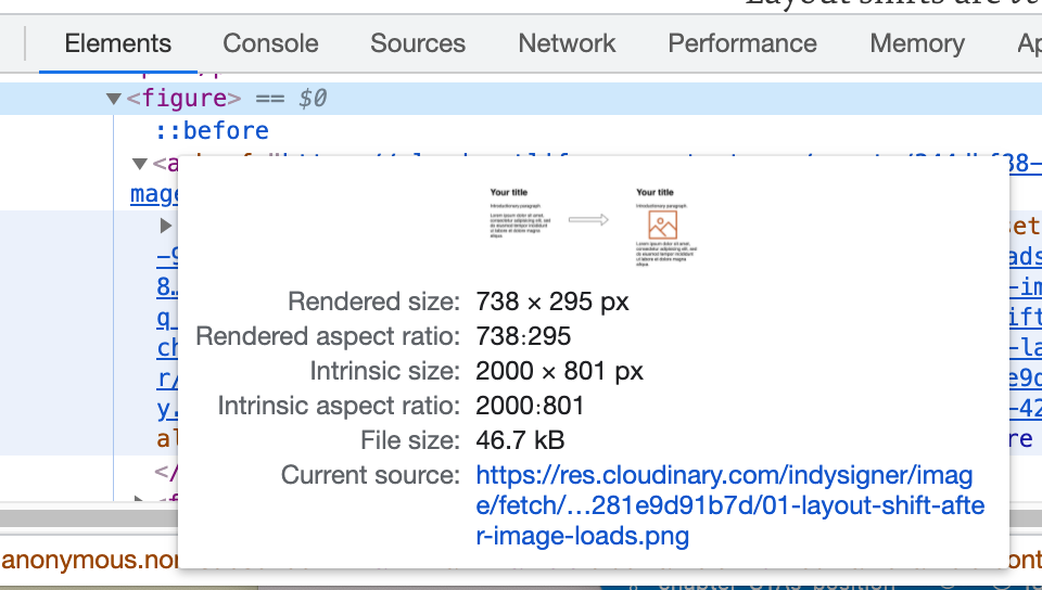
When the page loads, your browser doesn’t know how much vertical space it should reserve for images since this varies from one image to another. Until the image has downloaded, the browser won’t have access to that metadata. This means that the your browser renders the page for the first time, dimensionless images will initially collapse to a height of zero until they’ve been fully downloaded, at which point the browser will correct the space that those images occupy. Thus, elements after the image will initially be positioned above their true location, like the second paragraph in this diagram:
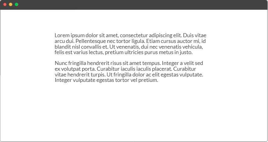
Once the image has downloaded, it will push its siblings down and take its rightful place:
These kinds of layout shifts are unpleasant and can make your design look sloppy and poorly optimized. In the following sections, we’ll learn how setting a width and height on images can reduce layout shifts.
Атрибуты тега <td>
height — с помощью этого атрибута задается высота ячейки, значение дается в пикселях. Если данный атрибут не задан, то высота ячейки растягивается по величине содержимого контента (текста). Если для всей таблицы (для тега <table>) задан атрибут height, а для ячейки (для тега <td>) данный атрибут не задан, то ячейка будет вытягиваться относительно заданной высоты для всей таблицы. Пример написания кода: <td height=»30px»>
width — с помощью этого атрибута задается ширина ячейки, значение дается в пикселях. Если данный атрибут не задан, то ширина ячейки растягивается по величине содержимого контента (текста). Если для всей таблицы (для тега <table>) задан атрибут width, а для ячейки (для тега <td>) данный атрибут не задан, то ячейка будет вытягиваться относительно заданной ширины для всей таблицы. Пример написания кода: <td width=»60px»>
bgcolor — атрибут для изменения цвета фона ячейки. В качестве значения для этого атрибута можно использовать любой цвет. Пример написания кода: <td bgcolor=»yellow»>
align — атрибут для выравнивания содержимого ячейки по горизонтали. Этому атрибуту могут быть даны следующие значения:left — выравнивает содержимое ячейки по левому краю. right — выравнивает содержимое ячейки по правому краю. center — выравнивает содержимое ячейки по центру. Пример написания кода: <td align=»center»>
valign — атрибут для выравнивания содержимого ячейки по вертикали. Этому атрибуту могут быть даны следующие значения:top — выравнивает содержимое ячейки по верхнему краю. middle — выравнивает содержимое ячейки посередине. bottom — выравнивает содержимое ячейки по нижнему краю. Пример написания кода: <td valign=»middle»>
Применим знания на практике.
В этом уроке мы рассмотрели основные атрибуты которые используются при создании таблиц. Выучивать всю эту информацию смысла нет, не забивайте себе голову. Всегда можно зайти и посмотреть подсказки.
Теперь, на основе данных которые размещены на этой странице мы создадим таблицу. Давайте сделаем таблицу из 4 строк и 2-ух столбцов. Чтобы у нас получилось 2 столбца нам нужно будет в каждой строчке создавать по 2 ячейки.
Комментарии к коду:1) Для тега <table> мы задали атрибут border и дали ему значение 1. Это означает, что ширина границ нашей таблицы 1 пиксель. 2) Еще для тега <table> мы задали атрибут cellspacing и дали ему значение . Это означает, что расстояние между нашими ячейками равно 0. Если бы мы не задали этот атрибут, то по умолчанию расстояние между ячейками составляло бы 2 пикселя. 3) Для 1-ой строки мы задали атрибут bgcolor и дали ему значение green. С помощью данного атрибута мы задали зеленый цвет фона всем ячейкам находящимся в этой строке. 4) Еще для 1-ой строки мы задали атрибут height и дали ему значение 50px. С помощью данного атрибута мы задали высоту ячеек первой строки. Данная строка будет выше, чем все другие, так как в нашем случае она является «шапкой» таблицы. 5) Для 1-ой ячейки первой строки мы задали атрибут width и дали ему значение 150px. С помощью этого атрибута мы задали ширину данной ячейки
Теперь внимание! Автоматически все ячейки которые располагаются под этой ячейкой, тоже будут иметь ширину 150px. 6) Тоже самое мы сделали и со 2-ой ячейкой первой строки, отличается только значение атрибута, для этой ячейки задана ширина 110px
Все нижние ячейки в этом столбце, соответственно, тоже будут иметь ширину 110px.7) И для 1-ой и для 2-ой ячейки первой строки мы задали атрибут align и дали ему значение center. С помощью данного атрибута мы выравняли текст по центру ячеек.  Для других трех строк мы задали атрибут bgcolor и дали ему значение yellow. С помощью данного атрибута мы задали желтый цвет фона всем ячейкам этих строк. 9) Так же для этих трех строк мы задали одинаковую высоту с помощью тега height дав ему значение 30px.
Вы что-то не поняли из этого урока? Спрашивайте!
— vadimgreb@yandex.ru
Использование пользовательских значений
Настройка вашей темы
По умолчанию масштаб ширины Tailwind представляет собой комбинацию , а также некоторых дополнительных значений, специфичных для ширины.
Вы можете настроить масштаб интервалов, отредактировав или в вашем файле .
tailwind.config.js
Чтобы настроить ширину отдельно, используйте раздел Вашего файла .
tailwind.config.js
Дополнительные сведения о настройке темы по умолчанию смотрите в документации .
Произвольные значения
Если вам нужно использовать одноразовое value, которое не имеет смысла включать в вашу тему, используйте квадратные скобки, чтобы сгенерировать свойство на лету, используя любое произвольное значение.
Узнайте больше о поддержке произвольных значений в документации по .
Дополнительно
Немного дополнительной информации по адаптивной вёрстке
@media запросы по размерам viewport могут быть как по ширине, так и по высоте, но используется обычно реже
@media запросы можно комбинировать, например нужны только стили для планшетных экранов в диапазоне от 576px до 767.98px
Стили назначенные в таком @media запросе будут применены только если все условия выполнены
Можно определять свойства сразу для нескольких разных условий — такой @media запрос выполняется если хотя бы одно из перечисленных условий выполнено, например экраны меньше 575.98px и больше 1440px
Для упрощения адаптивной вёрстки желательно использовать Flexbox, Grid.
Желательно стараться использовать не фиксированные, а относительные величины (%, vw, vh, em, rem и так далее)