

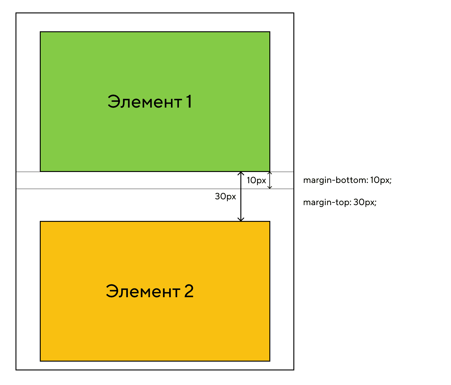
Крах полей
Верхнее и нижнее поля элементов иногда происходит (крах) получается единое поле, равная по величине из двух полей.
Этого не происходит на горизонтальных (левого и правого) полях! Только вертикальных (верхнего и нижнего) полях!
Посмотрите на следующий пример:
Пример
p.a { margin: 30px 0;}p.b { margin: 20px 0;}
В примере выше, элемент <p class=»a»> имеет верхние и нижние поля в 30 пикселей. Элемент <p class=»b»> имеет верхние и нижние поля в 20px.
Это означает, что вертикальные поля между <p class=»a»> и <p class=»b»> должно быть 50 пикселей (30 пикселей + 20 пикселей). Но в связи с распадом полей фактическая маржа заканчивается 30 пикселей!
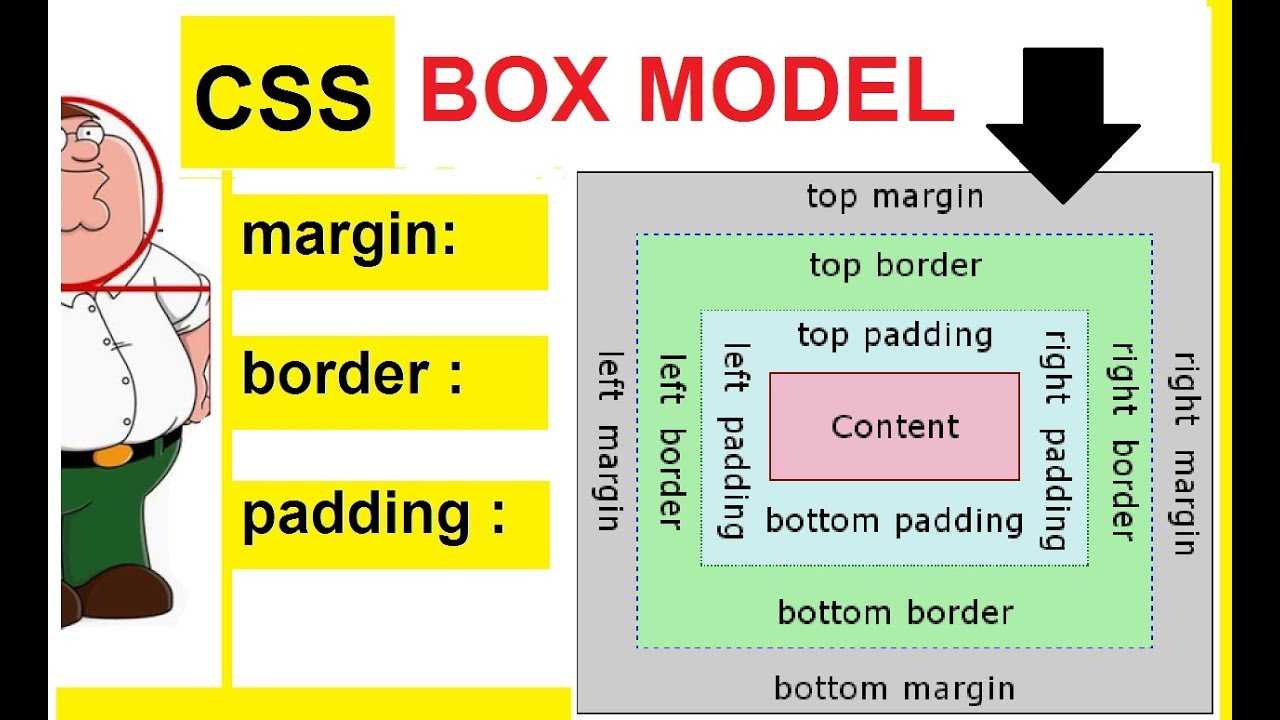
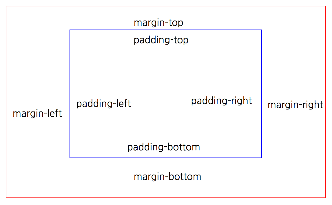
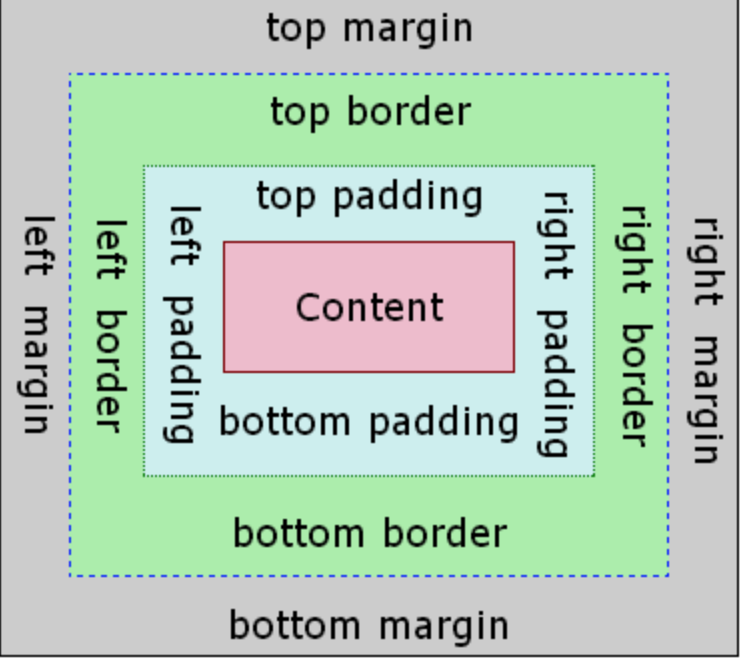
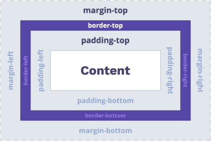
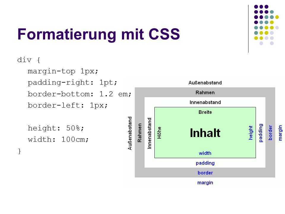
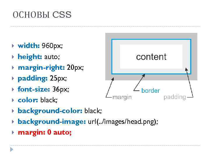
Дочерние свойства margin и padding.
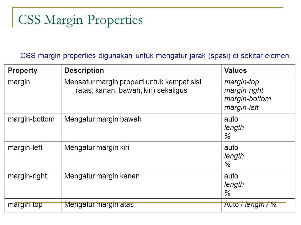
Свойства CSS margin и padding являются базовыми и имеют ряд дочерних свойств.
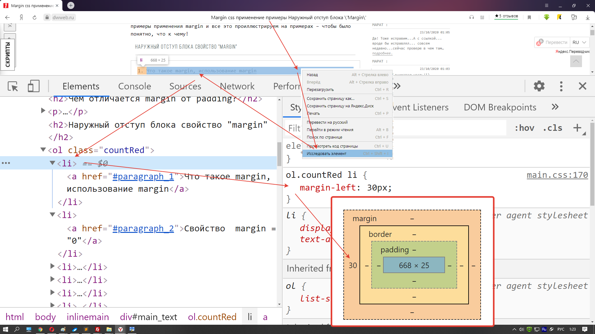
У margin зто:
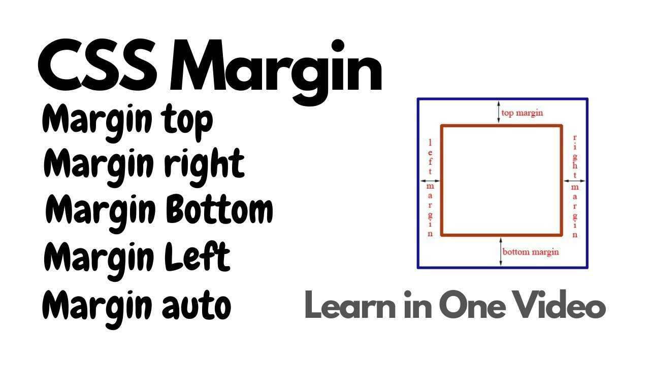
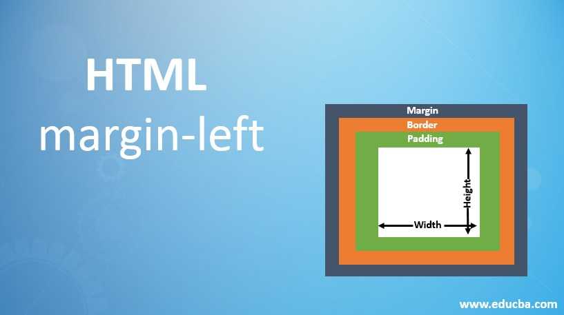
- margin-top — Поле от верхней границы элемента родителя,
- margin-left — Поле от левой границы элемента родителя,
- margin-right — Поле от правой границы элемента родителя,
- margin-bottom — Поле от нижней границы элемента родителя.
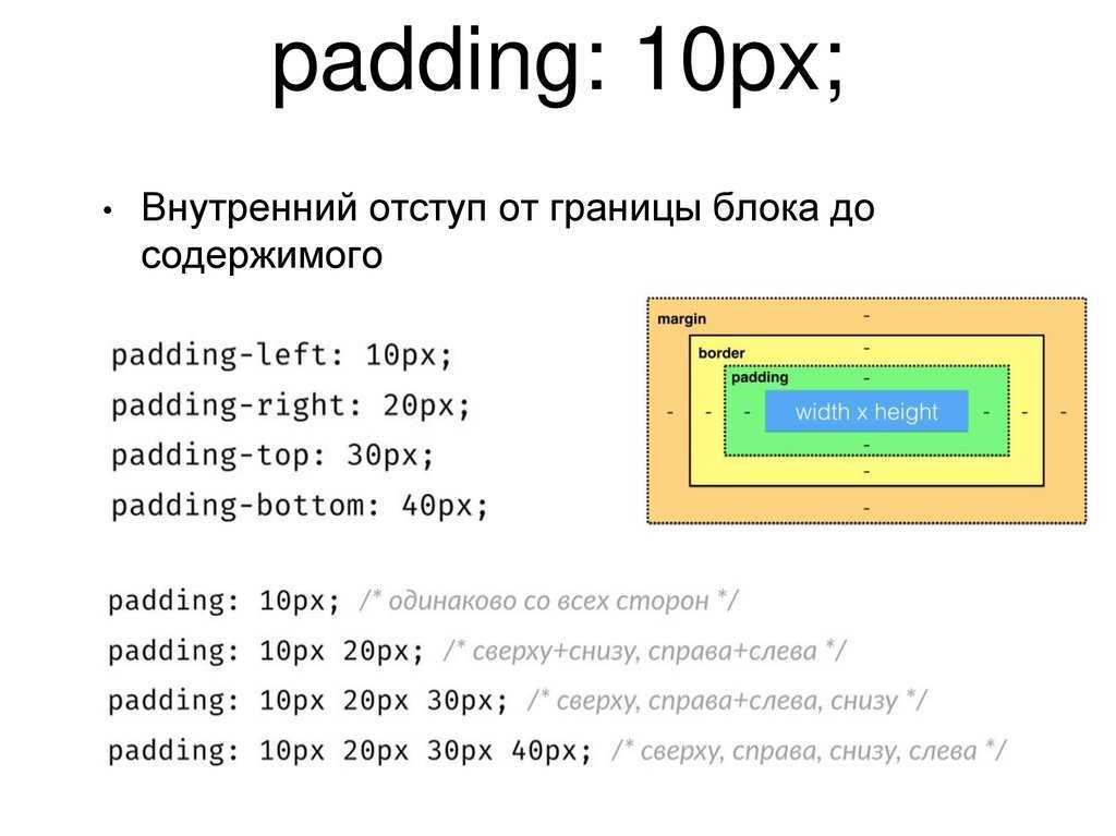
И у padding соответственно:
- padding-top — Отступ от верхней границы элемента до его содержания,
- padding-left — Отступ от левой границы элемента до его содержания,
- padding-right — Отступ от правой границы элемента до его содержания,
- padding-bottom — Отступ от нижней границы элемента до его содержания.
Ну думаю понятно.. если возникает необходимость определить отступ или поле от одной единственной стороны элемента лучше воспользоваться одним из вышеперечисленных свойств.
Пример:
<!DOCTYPE HTML PUBLIC «-//W3C//DTD HTML 4.01 Transitional//EN» «http://www.w3.org/TR/html4/loose.dtd»><html><head><title>Поля и отступы</title></head><body><div style=»width: 250px; background-color: #c5ffa0; border: 2px solid #a68754″><div style=»background-color: #c0e4ff; border: 2px solid #a68754; margin-left:40px; padding-right: 50px«><samp>Осмысливая мысли в смысле смысла, есть смысл помыслить о немыслимом!</samp></div><br><div style=»background-color: #c0e4ff; border: 2px solid #a68754; margin-right:40px; padding-left: 50px«><samp>Мало кто знает, как много надо знать, для того чтобы знать, как мало мы знаем!</samp></div></div></body></html>
смотреть пример
Margin-top не работает?
Еще одна из самых распространенных проблем, которую часто решают с помощью паддингов, вместо того, чтобы разобраться, в чем дело.
Эта проблема известна как схлопывание полей.
Представим, что один элемент расположен внутри другого. Если назначить внутреннему блоку, то он появится у внешнего, а отступ потомка от родителя не изменится.

Есть целых 6 решений этой проблемы (но не все из них хороши).
- display: inline-block для дочернего элемента;
- display: inline-block для родительского элемента;
- overflow: hidden для родительского элемента;
- position: absolute для родительского элемента;
- установка прозрачной рамки для родителя;
- установка верхнего паддинга для родителя (можно использовать очень маленькие значения, десятые доли пикселя).
Первый и второй способ решают проблему за счет того, что один из элементов перестает быть блочным. Проблема схлопывания актуальна только для этого типа отображения.
Пятый и шестой варианты действуют за счет оформления верхней границы родительского элемента. Если на пути маргина встает рамка или паддинг, схлопывание не происходит.
Третье и четвертое решение неочевидны и имеют свои подводные камни, поэтому по возможности лучше их не использовать. Отмена стандартного схлопывания в этих случаях является побочным эффектом.
После применения любого из этих способов результат будет такой:

Расстояние между инлайн-блочными элементами
С этой проблемой сталкивался каждый CSS-новичок.
Самая раздражающая ситуация, когда у вас есть родительский контейнер и внутри него два элемента, между которыми вы хотите поровну поделить пространство.
Предполагается, что каждому нужно назначить ширину в 50%, однако это не работает. Непонятное расстояние между ними заставляет второй элемент сползать на следующую строчку, так как итоговая сумма размеров превышает 100% родителя.
В этом моменте начинаются истерики и появляются костыли с волшебными цифрами вроде .
Разберемся на примере: есть два элемента с одинаковой шириной и высотой, и требуется, чтобы они занимали 50/50 доступного пространства внутри своего родителя.
Добавляем стили:
и получаем вот это:
Есть 2 распространенных способа решения этой проблемы.
- использовать комментарии;
- удалить пространство между тегами в HTML-файле.
Теперь все нормально:

Примечание переводчика:Строчно-блочные элементы воспринимаются браузером как обычные слова в предложении, поэтому он разделяет их пробелом, ширина которого примерно равна 4px. Оба способа позволяют убрать этот пробел на физическом уровне.Также можно воспользоваться CSS и установить для контейнера нулевой размер шрифта. При этом пробел сохранится, но будет иметь нулевую длину. Этот способ часто используется, но подходит не для всех ситуаций.
Notes
As of Microsoft Internet Explorer 4.0 or later, you can specify possible length values relative to the height of the element’s font () or the height of the letter “x” (). In Microsoft Internet Explorer 3.0, the specified margin value is added to the default value of the object. In Internet Explorer 4.0 or later, the margin value is absolute. The margin properties do not work with the td and tr objects in Internet Explorer 4.0, but they do work in Internet Explorer 3.0. To set margins in the cell for Internet Explorer 4.0 or later, apply the margin to an object, such as div or p, within the td. As of Microsoft Internet Explorer 5.5, this property applies to inline elements. With earlier versions of Windows Internet Explorer, inline elements must have an absolute position or layout to use this property. Element layout is set by providing a value for the height property or the width property. For inline elements, the value of this property is used to compute the border area of a surrounding inline element, if present. This value does not contribute to the height of a line. Negative margins are supported, except for top and bottom margins on inline objects.
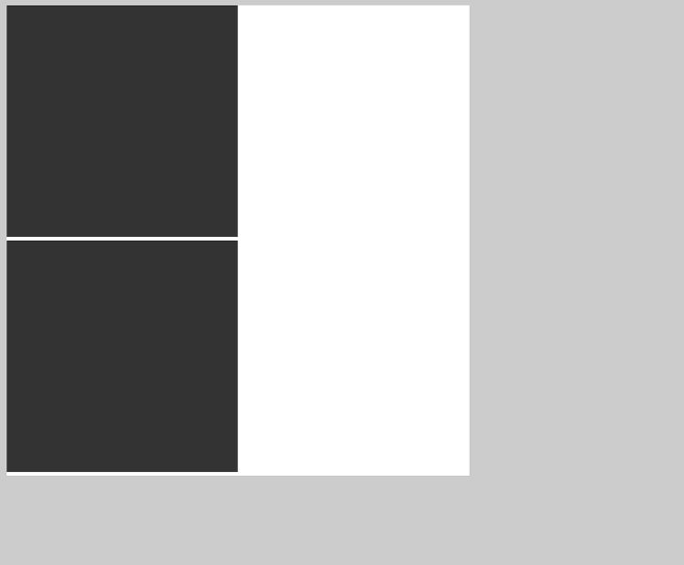
Margin Collapse
Top and bottom margins of elements are sometimes collapsed into a single
margin that is equal to the largest of the two margins.
This does not happen on horizontal (left and right) margins! Only vertical
(top and bottom) margins!
Look at the following example:
Example
p.a { margin: 30px 0;}p.b { margin: 20px 0;}
In the example above, the <p class=»a»> element has a top and bottom margin of 30px. The <p
class=»b»>
element has a top and bottom margin of 20px.
This means that the vertical margin between <p class=»a»> and <p class=»b»>
should be 50px (30px + 20px). But due to margin collapse, the actual margin ends
up being 30px!
CSS Свойства
align-contentalign-itemsalign-selfallanimationanimation-delayanimation-directionanimation-durationanimation-fill-modeanimation-iteration-countanimation-nameanimation-play-stateanimation-timing-functionbackface-visibilitybackgroundbackground-attachmentbackground-blend-modebackground-clipbackground-colorbackground-imagebackground-originbackground-positionbackground-repeatbackground-sizeborderborder-bottomborder-bottom-colorborder-bottom-left-radiusborder-bottom-right-radiusborder-bottom-styleborder-bottom-widthborder-collapseborder-colorborder-imageborder-image-outsetborder-image-repeatborder-image-sliceborder-image-sourceborder-image-widthborder-leftborder-left-colorborder-left-styleborder-left-widthborder-radiusborder-rightborder-right-colorborder-right-styleborder-right-widthborder-spacingborder-styleborder-topborder-top-colorborder-top-left-radiusborder-top-right-radiusborder-top-styleborder-top-widthborder-widthbottombox-decoration-breakbox-shadowbox-sizingcaption-sidecaret-color@charsetclearclipcolorcolumn-countcolumn-fillcolumn-gapcolumn-rulecolumn-rule-colorcolumn-rule-stylecolumn-rule-widthcolumn-spancolumn-widthcolumnscontentcounter-incrementcounter-resetcursordirectiondisplayempty-cellsfilterflexflex-basisflex-directionflex-flowflex-growflex-shrinkflex-wrapfloatfont@font-facefont-familyfont-kerningfont-sizefont-size-adjustfont-stretchfont-stylefont-variantfont-weightgridgrid-areagrid-auto-columnsgrid-auto-flowgrid-auto-rowsgrid-columngrid-column-endgrid-column-gapgrid-column-startgrid-gapgrid-rowgrid-row-endgrid-row-gapgrid-row-startgrid-templategrid-template-areasgrid-template-columnsgrid-template-rowshanging-punctuationheighthyphens@importisolationjustify-content@keyframesleftletter-spacingline-heightlist-stylelist-style-imagelist-style-positionlist-style-typemarginmargin-bottommargin-leftmargin-rightmargin-topmax-heightmax-width@mediamin-heightmin-widthmix-blend-modeobject-fitobject-positionopacityorderoutlineoutline-coloroutline-offsetoutline-styleoutline-widthoverflowoverflow-xoverflow-ypaddingpadding-bottompadding-leftpadding-rightpadding-toppage-break-afterpage-break-beforepage-break-insideperspectiveperspective-originpointer-eventspositionquotesresizerighttab-sizetable-layouttext-aligntext-align-lasttext-decorationtext-decoration-colortext-decoration-linetext-decoration-styletext-indenttext-justifytext-overflowtext-shadowtext-transformtoptransformtransform-origintransform-styletransitiontransition-delaytransition-durationtransition-propertytransition-timing-functionunicode-bidiuser-selectvertical-alignvisibilitywhite-spacewidthword-breakword-spacingword-wrapwriting-modez-index
Примеры
<!DOCTYPE html>
<html>
<head>
	<meta charset="utf-8">
	<title>Пример №1</title>

	<style>
		/* Прием предварительного обнуления */
		/* всех отступов у всех элементов */
		*{
		margin: 0;
		padding: 0;
		outline: 0;
		}

		p{
		width: 500px;
		border: solid 2px green;
		}

		/* Внешние и внутренние отступы в одном объявлении */
		.all_in_one{
		margin: 50px 0px 50px 100px;
		padding: 20px 10px 20px 10px;
		}

		/* Внешние и внутренние отступы по отдельности */
		.separate{
		margin-top: 50px;
		margin-right: 0px;
		margin-bottom: 50px;
		margin-left: 100px;
		padding-top: 20px;
		padding-right: 10px;
		padding-bottom: 20px;
		padding-left: 10px;
		}

	</style>

</head>
<body>
	<p class="all_in_one">
		Внешние и внутренние отступы в одном объявлении<br>
		margin: 50px 0px 50px 100px;<br>
		padding: 20px 10px 20px 10px;
	</p>

	<p class="separate">
		Тоже самое, но по отдельности<br>
		margin-top: 50px;<br>
		margin-right: 0px;<br>
		margin-bottom: 50px;<br>
		margin-left: 100px;<br><br>

		padding-top: 20px;<br>
		padding-right: 10px;<br>
		padding-bottom: 20px;<br>
		padding-left: 10px;
	</p>
</body>
</html>
Пример №1
<!DOCTYPE html>
<html>
<head>
	<meta charset="utf-8">
	<title>Пример №2</title>

	<style>
		p{
		width: 500px;
		border: solid 2px green;
		}

		/* Отступы в процентах в одном объявлении */
		.all_in_one{
		margin: 10%;
		padding: 5%;
		}

		/* Отступы в процентах по отдельности */
		.separate{
		margin-top: 10%;
		margin-right: 10%;
		margin-bottom: 10%;
		margin-left: 10%;
		padding-top: 5%;
		padding-right: 5%;
		padding-bottom: 5%;
		padding-left: 5%;
		}

	</style>

</head>
<body>
	<p class="all_in_one">
		Отступы в процентах в одном объявлении<br>
		margin: 10%;<br>
		padding: 5%;
	</p>

	<p class="separate">
		Тоже самое, но по отдельности<br>
		margin-top: 10%;<br>
		margin-right: 10%;<br>
		margin-bottom: 10%;<br>
		margin-left: 10%;<br><br>

		padding-top: 5%;<br>
		padding-right: 5%;<br>
		padding-bottom: 5%;<br>
		padding-left: 5%;
	</p>
</body>
</html>
Пример №2
<!DOCTYPE html>
<html>
<head>
	<meta charset="utf-8">
	<title>Пример №3</title>

	<style>

		div{
		width: 500px;
		height: 300px;
		margin-top: 7em;
		border: solid 3px blue;
		background-color: yellow;
		}

		p{
		width: 300px;
		padding: 10%;
		border: solid 2px green;
		background-color: violet;
		}

		/* Отрицательные отступы в одном объявлении */
		.all_in_one{
		margin: -30px 30px 30px -30px;
		}

		/* Отрицательные отступы по отдельности */
		.separate{
		margin-top: -30px;
		margin-right: 30px;
		margin-bottom: 30px;
		margin-left: -30px;
		}

	</style>

</head>
<body>

	<div>
		<p  class="all_in_one">
			Отрицательные отступы в одном объявлении<br>
			margin: -30px 30px 30px -30px;
		</p>
	</div>

	<div>
		<p  class="separate">
			Тоже самое, но по отдельности<br>
			margin-top: -30px;<br>
			margin-right: 30px;<br>
			margin-bottom: 30px;<br>
			margin-left: -30px;
		</p>
	</div>

</body>
</html>
Пример №3
<!DOCTYPE html>
<html>
<head>
	<meta charset="utf-8">
	<title>Пример №4</title>

	<style>
		/* Прием предварительного обнуления */
		/* всех отступов у всех элементов */
		*{
		margin: 0;
		padding: 0;
		outline: 0;
		}

		p{
		width: 300px;
		height: 50px;
		margin: 1em;
		border: solid 2px green;
		}

		/* Переопределяем вертикальные отступы */
		.p_1{
		margin-top: 5em;
		margin-bottom: 10em;
		}

		.p_2{
		margin-top: 5em;
		}

		span{
		width: 50px;
		border: solid 2px violet;
		}

		/* Внешние и внутренние отступы в одном объявлении */
		span.all_in_one{
		margin: 20px 20px 20px 20px;
		}

		/* Внешние отступы по отдельности */
		span.separate{
		margin-top: 20px;
		margin-right: 20px;
		margin-bottom: 20px;
		margin-left: 20px;
		}

	</style>

</head>
<body>

	<p class="p_1">
		<!-- У строчных элементов вертикальные -->
		<!-- внешние отступы не работают, а -->
		<!-- горизонтальные суммируются -->
		<span class="all_in_one">11111</span>
		<span class="all_in_one">22222</span>
		<span class="all_in_one">33333</span>
	</p>

	<!-- У блочных элементов вертикальные -->
	<!-- внешние отступы схлопываются до -->
	<!-- размера большего из них -->

	<p class="p_2">
		<span class="separate">11111</span>
		<span class="separate">22222</span>
		<span class="separate">33333</span>
	</p>

</body>
</html>
Пример №4
Вернуться назад
Правила внешних отступов
Схлопывание
️ margin collapsing — это схлопывание внешних отступов. Такое поведение наблюдается только у вертикальных внешних отступов.
Когда вертикальные отступы двух блочных элементов соприкасаются, они не складываются, а накладываются друг на друга, образуя общее пространство, равное большему из отступов.
 Нижний отступ первого элемента схлопывается с верхним отступом следующего элемента
Вертикальные отступы не схлопываются между элементами с .
А также, если у родительского элемента указано свойство или , то отступы дочерних элементов не схлопнутся.
Правило, которое поможет избежать схлопывания:
Задавайте элементам только нижний отступ — .
У каждого сайта есть направление — поток — это последовательность вывода элементов на страницу. Поток всегда идёт сверху вниз, поэтому логично выставлять отступы по его направлению. В этом случае у элемента есть нижний отступ, которым он примыкает к следующему элементу без верхнего отступа. Таким образом отступы не схлопываются, и мы можем точно рассчитать расстояние между элементами.
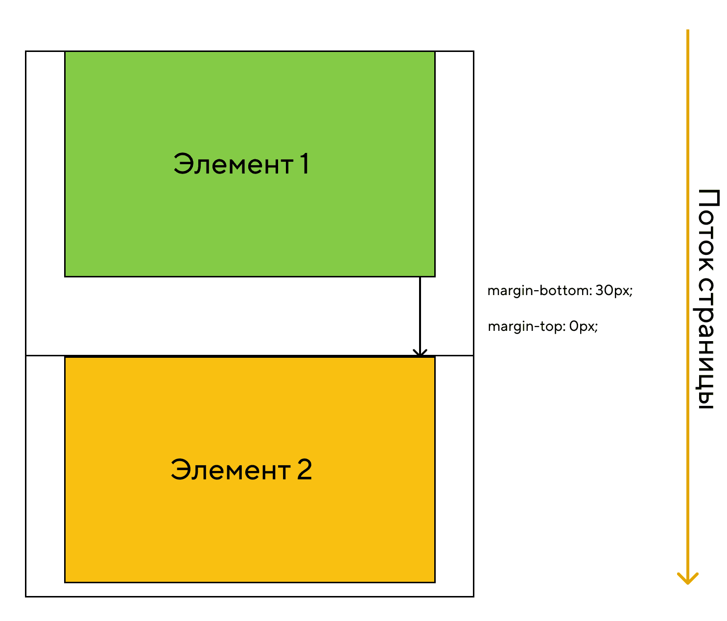 Верхние отступы равны нулю, элемент соприкасается нижним отступом по следующим элементом
Выпадение отступов
Бывают случаи, когда отступы не схлопываются, а выпадают из контейнера. Если задать родительскому элементу нулевые отступы, то внешние отступы его первого и последнего дочерних элементов выйдут за границу контейнера, что может нарушить вёрстку.
 Верхний отступ первого элемента выпадает из контейнера
Чтобы вертикальные отступы дочерних элементов не выпадали и не мешали расчётам при вёрстке рекомендуется:
- всегда обнулять верхние отступы —
- обнулять нижний отступ у последнего дочернего элемента
Вставка изображений
Если вы добавляете изображение на страницу с помощью тега , то не забывайте, что по спецификации элемент имеет свойство со значением . Поэтому изображение выравнивается по базовой линии и под ним появляется небольшое пространство, предназначенное для выносных элементов букв.
![[ в закладки ] css: использование внутренних и внешних отступов](https://rwvt.ru/wp-content/uploads/a/0/5/a05d3ff11a867fd33daa6fa5687a7dff.jpeg)
 При вставке изображений появляется небольшое пространство под картинкой
Чтобы убрать пространство под изображением, нужно сменить тип отображения на .
Шпаргалка по правилам:
-
Сбрасывайте браузерные стили по умолчанию.
-
Задавайте текстовым элементам нижний отступ .
-
Сбрасывайте вертикальные отступы последнего дочернего элемента.
-
Изображениям, добавленным с помощью тега , меняйте тип отображения на .
Поля и отступы
Присваивайте удобные для восприятия значения или элементу или подмножеству его сторон с помощью сокращенных классов. Включает поддержку отдельных свойств, всех свойств, а также свойств по вертикали и горизонтали. Классы строятся из карты Sass по умолчанию в диапазоне от до .
Используете модуль макета CSS Grid? Рассмотрите возможность использования .
Примечание
Утилиты интервалов, которые применяются ко всем контрольным точкам, от до , не имеют в них аббревиатуры контрольные точки. Это связано с тем, что эти классы применяются начиная с и выше и поэтому не связаны медиа-запросом. Остальные контрольные точки, однако, содержат аббревиатуру контрольные точки.
Классы именуются в формате для и для , , , и .
Где свойство — одно из:
- — для классов, которые устанавливают
- — для классов, которые устанавливают
Где стороны — одна из:
- — для классов, которые устанавливают или
- — для классов, которые устанавливают или
- — для классов, которые устанавливают или в LTR, или в RTL
- — для классов, которые устанавливают или в LTR, или в RTL
- — для классов, которые устанавливают оба и
- — для классов, которые устанавливают оба и
- — для классов, которые устанавливают a или со всех 4 сторон элемента
Где размер — один из:
- — или классы, устраняющие или установив его на
- — (по умолчанию) для классов, которые устанавливают the или равным
- — (по умолчанию) для классов, которые устанавливают the или равным
- — (по умолчанию) для классов, которые устанавливают the или равным
- — (по умолчанию) для классов, которые устанавливают the или равным
- — (по умолчанию) для классов, которые устанавливают the или равным
- — для классов, которые устанавливают равным авто
(Вы можете добавить другие размеры, добавив записи в переменную Sass map .)
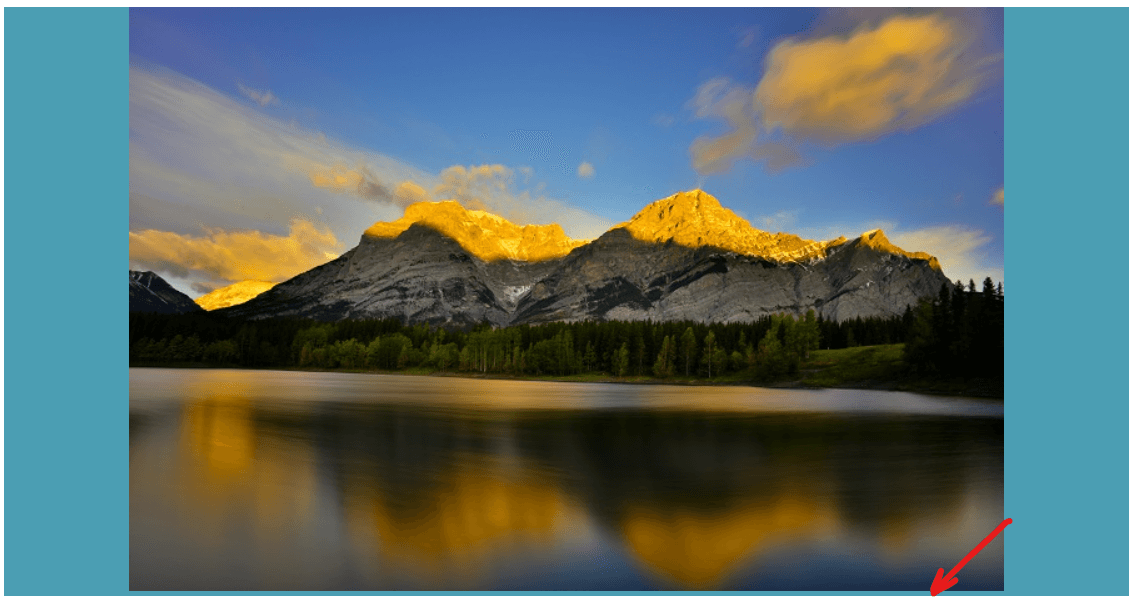
Горизонтальное центрирование
Кроме того, Bootstrap также включает класс для горизонтального центрирования содержимого уровня блока фиксированной ширины, то есть содержимого, имеющего набор и , путем установки горизонтальных полей на .
Центрированный элемент
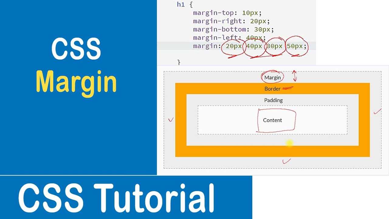
Margin Shorthand Property
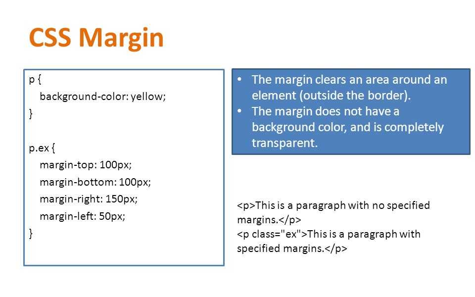
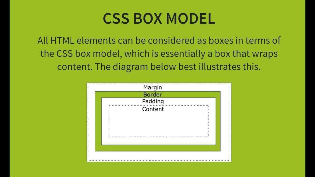
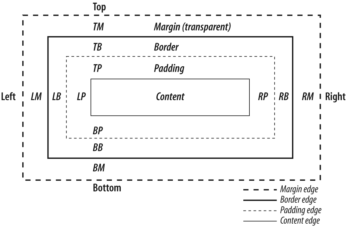
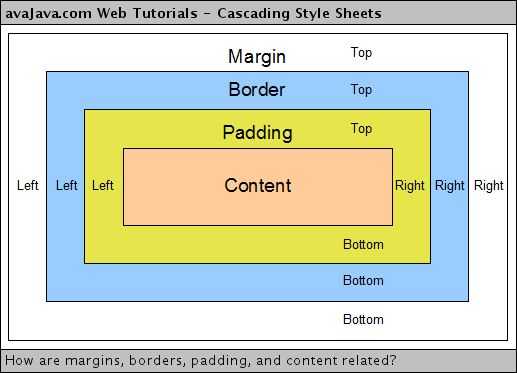
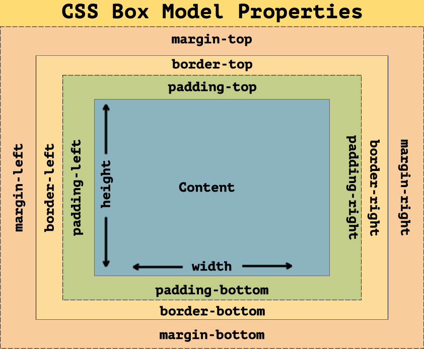
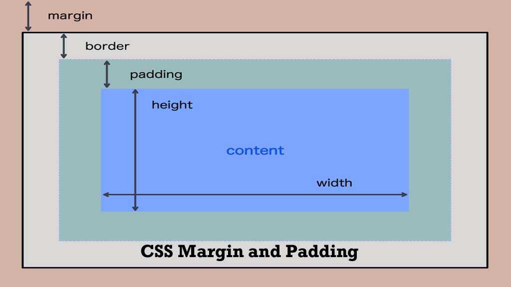
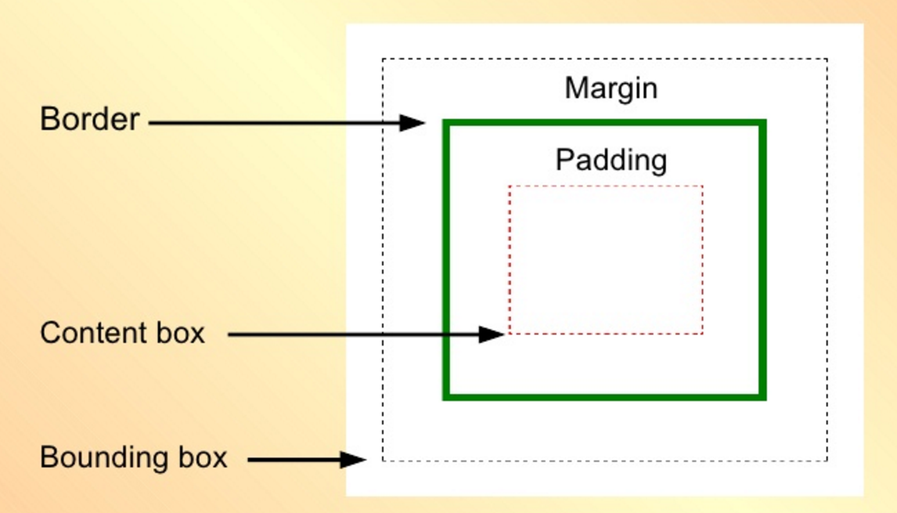
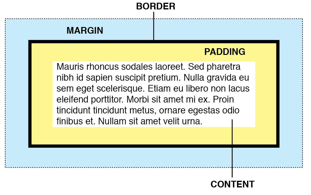
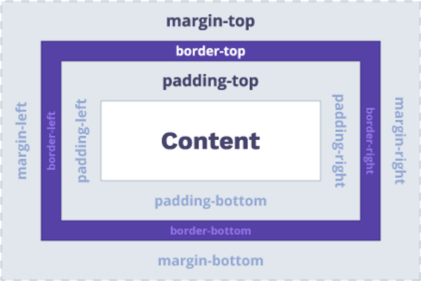
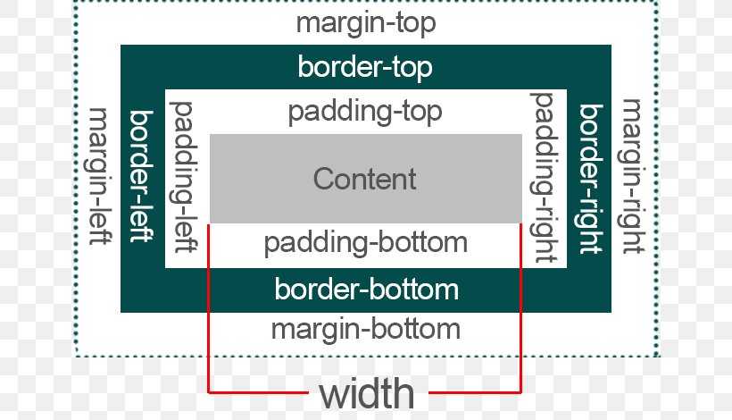
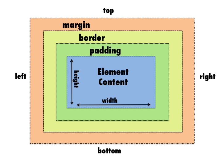
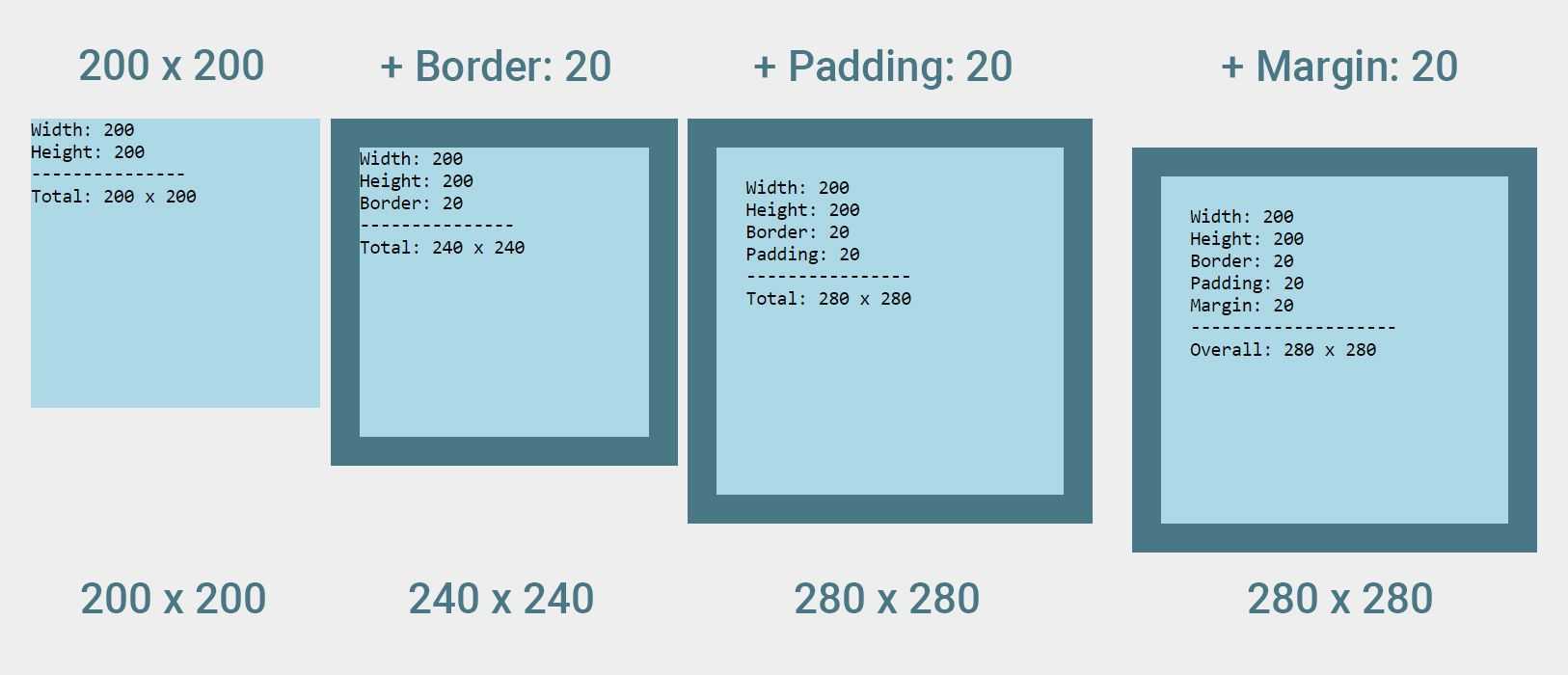
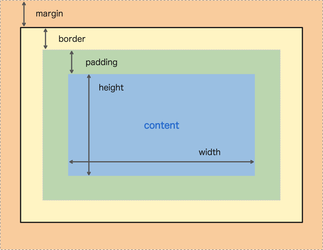
The Box Model below indicates how separate parts of a box interact with each other. This model in CSS consists of several components: the content, padding, border, and margin.
CSS margins have four parts:
With the shorthand, you can set all the properties above in one declaration.
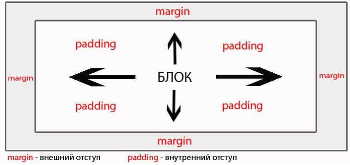
Margin vs Padding
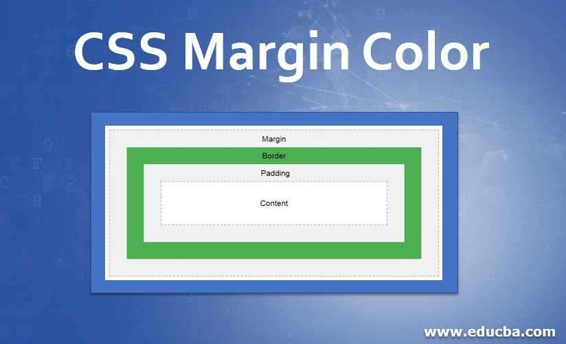
- Both margins and padding belong to the Box Model.
- The main difference is that adds space around an element, while creates a space within an element.
- You cannot use value to make browsers automatically set .
-
vs discussion occurs because these components are similar, but their use cases differ.
- separates elements from other blocks outside the element.
- shifts content inside elements further from the edges.
Setting One or Multiple Values
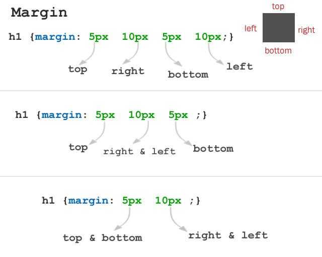
The margins in CSS can have one, two, three, or four values:
- One value uses the same margin to all sides.
- Two values: the first margin sets the top and bottom. The second sets the left and right sides.
- Three values: the first sets the top. The second sets the left and right. The third sets the bottom.
- Four values: order of values goes like this — top, right, bottom, and left.
Example Copy
I have margins!
The example above has all four values: . CSS assigns them to the element like this:
- Top margin size is 10px
- Right margin size is 20px
- Bottom margin size is 30px
- Left margin size is 70px
In the example below, we have three values: . We will get these results:
Example Copy
I have margins!
- Top margin size is 10px
- Right and left margin size is 20px
- Bottom margin size is 30px
The following example assigns two values: to the element:
Example Copy
I have margins!
- Top and bottom margin size is 10px each
- Right and left margin size is 20px each
To set all four margins the same, you only need to specify one value:
Example Copy
I have margins!
The example below illustrates individual margins with values specified in pixels.
I have margins!
Example Copy
 Pros
Pros
- Easy to use with a learn-by-doing approach
- Offers quality content
- Gamified in-browser coding experience
- The price matches the quality
- Suitable for learners ranging from beginner to advanced
Main Features
- Free certificates of completion
- Focused on data science skills
- Flexible learning timetable
EXCLUSIVE: 50% OFF  Pros
Pros
- Simplistic design (no unnecessary information)
- High-quality courses (even the free ones)
- Variety of features
Main Features
- Nanodegree programs
- Suitable for enterprises
- Paid Certificates of completion
15% OFF  Pros
Pros
- Easy to navigate
- No technical issues
- Seems to care about its users
Main Features
- Huge variety of courses
- 30-day refund policy
- Free certificates of completion
AS LOW AS 14.99$
Usage
- When calculating the height and width of an element, DO NOT include the margins in your calculations (i.e. include everything else: content area, padding, and border). However, DO include margin size when calculating available space within an element’s containing element.
- When two margins collide, for example when one block level element has a bottom margin set, immediately followed by another block level element with a top margin, the larger of the two margins remains, and the smaller one collapses and disappears.
- Margins are always transparent.
Best Practices
When possible, use margin shorthand (i.e. {margin: 10px 15px 20px 15px;}) to specify margin-widths rather than writing out each margin’s specifications as this clutters code and makes it difficult to read. Use margin-bottom if there is a specific reason to call attention to it (e.g. one element has a different bottom margin than the rest in its class, etc.).
CSS Справочники
CSS СправочникCSS ПоддержкаCSS СелекторыCSS ФункцииCSS ЗвукCSS Веб шрифтыCSS АнимацииCSS ДлиныCSS Конвертер px-emCSS Названия цветаCSS Значения цветаCSS по умолчаниюCSS Символы
CSS Свойства
align-content
align-items
align-self
all
animation
animation-delay
animation-direction
animation-duration
animation-fill-mode
animation-iteration-count
animation-name
animation-play-state
animation-timing-function
backface-visibility
background
background-attachment
background-blend-mode
background-clip
background-color
background-image
background-origin
background-position
background-repeat
background-size
border
border-bottom
border-bottom-color
border-bottom-left-radius
border-bottom-right-radius
border-bottom-style
border-bottom-width
border-collapse
border-color
border-image
border-image-outset
border-image-repeat
border-image-slice
border-image-source
border-image-width
border-left
border-left-color
border-left-style
border-left-width
border-radius
border-right
border-right-color
border-right-style
border-right-width
border-spacing
border-style
border-top
border-top-color
border-top-left-radius
border-top-right-radius
border-top-style
border-top-width
border-width
bottom
box-decoration-break
box-shadow
box-sizing
caption-side
caret-color
@charset
clear
clip
color
column-count
column-fill
column-gap
column-rule
column-rule-color
column-rule-style
column-rule-width
column-span
column-width
columns
content
counter-increment
counter-reset
cursor
direction
display
empty-cells
filter
flex
flex-basis
flex-direction
flex-flow
flex-grow
flex-shrink
flex-wrap
float
font
@font-face
font-family
font-kerning
font-size
font-size-adjust
font-stretch
font-style
font-variant
font-weight
grid
grid-area
grid-auto-columns
grid-auto-flow
grid-auto-rows
grid-column
grid-column-end
grid-column-gap
grid-column-start
grid-gap
grid-row
grid-row-end
grid-row-gap
grid-row-start
grid-template
grid-template-areas
grid-template-columns
grid-template-rows
hanging-punctuation
height
hyphens
@import
isolation
justify-content
@keyframes
left
letter-spacing
line-height
list-style
list-style-image
list-style-position
list-style-type
margin
margin-bottom
margin-left
margin-right
margin-top
max-height
max-width
@media
min-height
min-width
mix-blend-mode
object-fit
object-position
opacity
order
outline
outline-color
outline-offset
outline-style
outline-width
overflow
overflow-x
overflow-y
padding
padding-bottom
padding-left
padding-right
padding-top
page-break-after
page-break-before
page-break-inside
perspective
perspective-origin
pointer-events
position
quotes
resize
right
tab-size
table-layout
text-align
text-align-last
text-decoration
text-decoration-color
text-decoration-line
text-decoration-style
text-indent
text-justify
text-overflow
text-shadow
text-transform
top
transform
transform-origin
transform-style
transition
transition-delay
transition-duration
transition-property
transition-timing-function
unicode-bidi
user-select
vertical-align
visibility
white-space
width
word-break
word-spacing
word-wrap
writing-mode
z-index