Momentum-based scrolling on touch devices
Use to use momentum-based scrolling (where supported) on touch devices.
Lorem ipsum dolor sit amet, consectetur adipiscing elit. Mauris eleifend rutrum auctor. Phasellus convallis sagittis augue ut ornare. Vestibulum et gravida lectus, sed ultrices sapien. Nullam aliquet elit dui, vitae hendrerit lectus volutpat eget. In porttitor tincidunt egestas. Pellentesque laoreet ligula at est vulputate facilisis. Etiam tristique justo ut odio placerat ornare. Cras bibendum, orci at ornare tincidunt, lacus nunc gravida enim, sit amet euismod nunc lectus in lectus. Ut dictum nulla et arcu aliquet ornare. Aliquam et dapibus lectus. Aenean mattis elit mi, sed ultricies augue consectetur id. Sed id magna malesuada, luctus urna a, bibendum tortor. Cras cursus cursus ex. Nulla fringilla elit vitae imperdiet scelerisque. Donec ac sem eu diam convallis mollis a sed leo. Proin congue augue turpis, eget rutrum dolor ultricies non. Nulla blandit venenatis dapibus. Sed tincidunt mollis elit, quis suscipit nibh eleifend quis. Donec ex lorem, auctor eu rutrum in, blandit id dolor. Nulla molestie arcu turpis. In id felis vulputate, tempor massa eget, malesuada mauris. Quisque fringilla consequat metus, luctus scelerisque leo fringilla vel.
Use to use normal non-momentum-based scrolling on touch devices.
This is mostly useful for undoing at larger screen sizes.
Lorem ipsum dolor sit amet, consectetur adipiscing elit. Mauris eleifend rutrum auctor. Phasellus convallis sagittis augue ut ornare. Vestibulum et gravida lectus, sed ultrices sapien. Nullam aliquet elit dui, vitae hendrerit lectus volutpat eget. In porttitor tincidunt egestas. Pellentesque laoreet ligula at est vulputate facilisis. Etiam tristique justo ut odio placerat ornare. Cras bibendum, orci at ornare tincidunt, lacus nunc gravida enim, sit amet euismod nunc lectus in lectus. Ut dictum nulla et arcu aliquet ornare. Aliquam et dapibus lectus. Aenean mattis elit mi, sed ultricies augue consectetur id. Sed id magna malesuada, luctus urna a, bibendum tortor. Cras cursus cursus ex. Nulla fringilla elit vitae imperdiet scelerisque. Donec ac sem eu diam convallis mollis a sed leo. Proin congue augue turpis, eget rutrum dolor ultricies non. Nulla blandit venenatis dapibus. Sed tincidunt mollis elit, quis suscipit nibh eleifend quis. Donec ex lorem, auctor eu rutrum in, blandit id dolor. Nulla molestie arcu turpis. In id felis vulputate, tempor massa eget, malesuada mauris. Quisque fringilla consequat metus, luctus scelerisque leo fringilla vel.
Scroll vertically if needed
Use to allow vertical scrolling if needed.
Lorem ipsum dolor sit amet, consectetur adipiscing elit. Mauris eleifend rutrum auctor. Phasellus convallis sagittis augue ut ornare. Vestibulum et gravida lectus, sed ultrices sapien. Nullam aliquet elit dui, vitae hendrerit lectus volutpat eget. In porttitor tincidunt egestas. Pellentesque laoreet ligula at est vulputate facilisis. Etiam tristique justo ut odio placerat ornare. Cras bibendum, orci at ornare tincidunt, lacus nunc gravida enim, sit amet euismod nunc lectus in lectus. Ut dictum nulla et arcu aliquet ornare. Aliquam et dapibus lectus. Aenean mattis elit mi, sed ultricies augue consectetur id. Sed id magna malesuada, luctus urna a, bibendum tortor. Cras cursus cursus ex. Nulla fringilla elit vitae imperdiet scelerisque. Donec ac sem eu diam convallis mollis a sed leo. Proin congue augue turpis, eget rutrum dolor ultricies non. Nulla blandit venenatis dapibus. Sed tincidunt mollis elit, quis suscipit nibh eleifend quis. Donec ex lorem, auctor eu rutrum in, blandit id dolor. Nulla molestie arcu turpis. In id felis vulputate, tempor massa eget, malesuada mauris. Quisque fringilla consequat metus, luctus scelerisque leo fringilla vel.
CSS Справочники
CSS СправочникCSS ПоддержкаCSS СелекторыCSS ФункцииCSS ЗвукCSS Веб шрифтыCSS АнимацииCSS ДлиныCSS Конвертер px-emCSS Названия цветаCSS Значения цветаCSS по умолчаниюCSS Символы
CSS Свойства
align-content
align-items
align-self
all
animation
animation-delay
animation-direction
animation-duration
animation-fill-mode
animation-iteration-count
animation-name
animation-play-state
animation-timing-function
backface-visibility
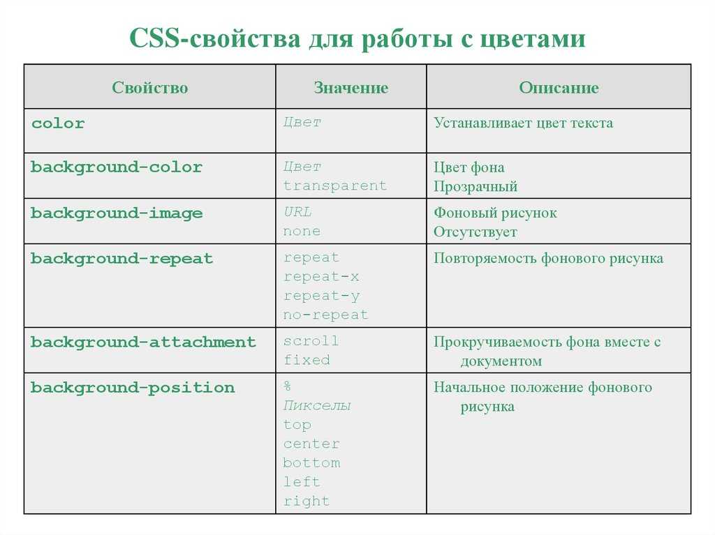
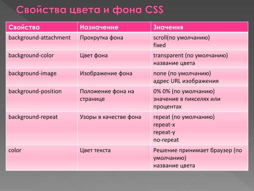
background
background-attachment
background-blend-mode
background-clip
background-color
background-image
background-origin
background-position
background-repeat
background-size
border
border-bottom
border-bottom-color
border-bottom-left-radius
border-bottom-right-radius
border-bottom-style
border-bottom-width
border-collapse
border-color
border-image
border-image-outset
border-image-repeat
border-image-slice
border-image-source
border-image-width
border-left
border-left-color
border-left-style
border-left-width
border-radius
border-right
border-right-color
border-right-style
border-right-width
border-spacing
border-style
border-top
border-top-color
border-top-left-radius
border-top-right-radius
border-top-style
border-top-width
border-width
bottom
box-decoration-break
box-shadow
box-sizing
caption-side
caret-color
@charset
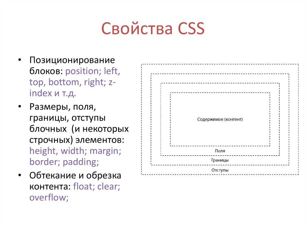
clear
clip
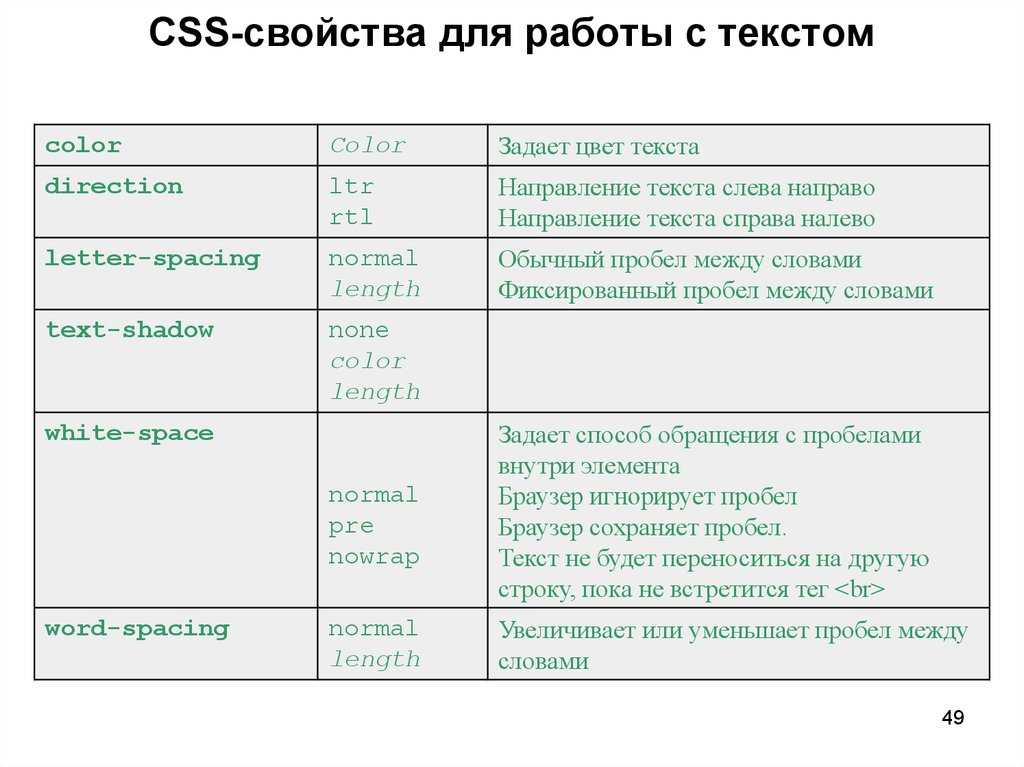
color
column-count
column-fill
column-gap
column-rule
column-rule-color
column-rule-style
column-rule-width
column-span
column-width
columns
content
counter-increment
counter-reset
cursor
direction
display
empty-cells
filter
flex
flex-basis
flex-direction
flex-flow
flex-grow
flex-shrink
flex-wrap
float
font
@font-face
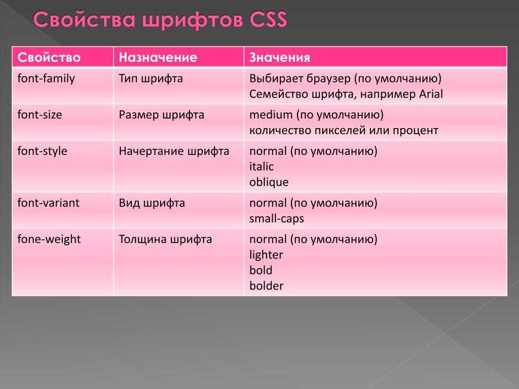
font-family
font-kerning
font-size
font-size-adjust
font-stretch
font-style
font-variant
font-weight
grid
grid-area
grid-auto-columns
grid-auto-flow
grid-auto-rows
grid-column
grid-column-end
grid-column-gap
grid-column-start
grid-gap
grid-row
grid-row-end
grid-row-gap
grid-row-start
grid-template
grid-template-areas
grid-template-columns
grid-template-rows
hanging-punctuation
height
hyphens
@import
isolation
justify-content
@keyframes
left
letter-spacing
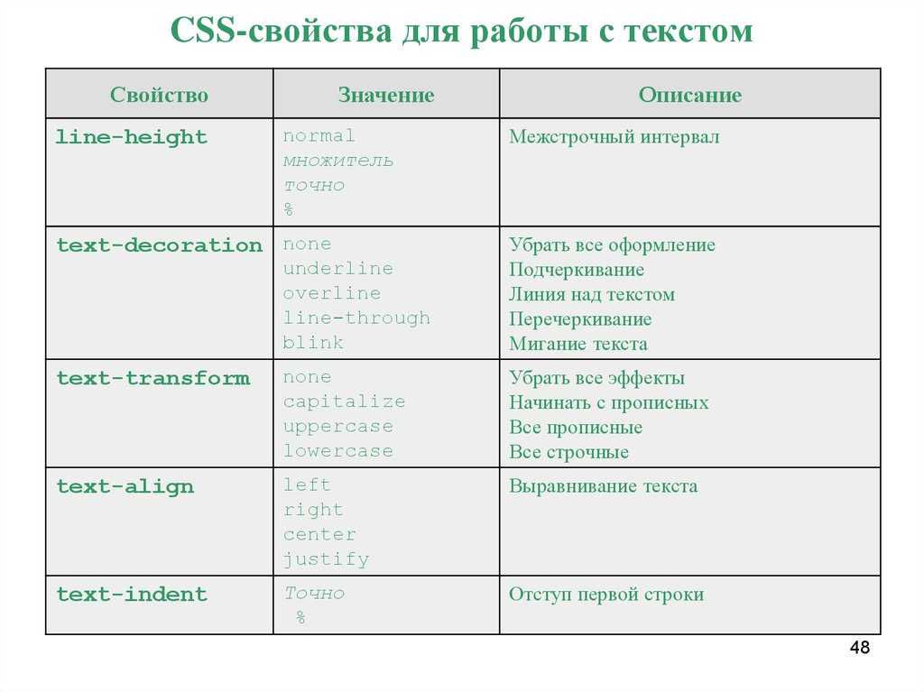
line-height
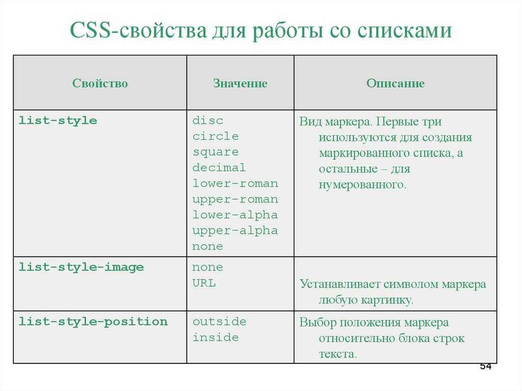
list-style
list-style-image
list-style-position
list-style-type
margin
margin-bottom
margin-left
margin-right
margin-top
max-height
max-width
@media
min-height
min-width
mix-blend-mode
object-fit
object-position
opacity
order
outline
outline-color
outline-offset
outline-style
outline-width
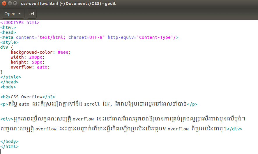
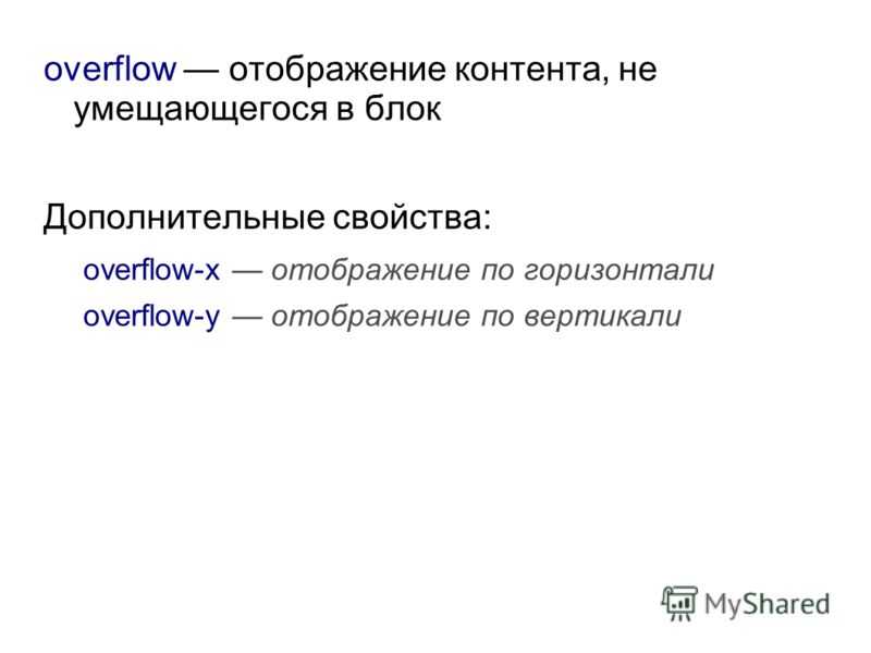
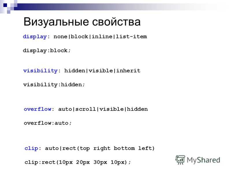
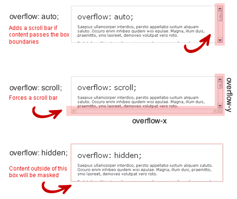
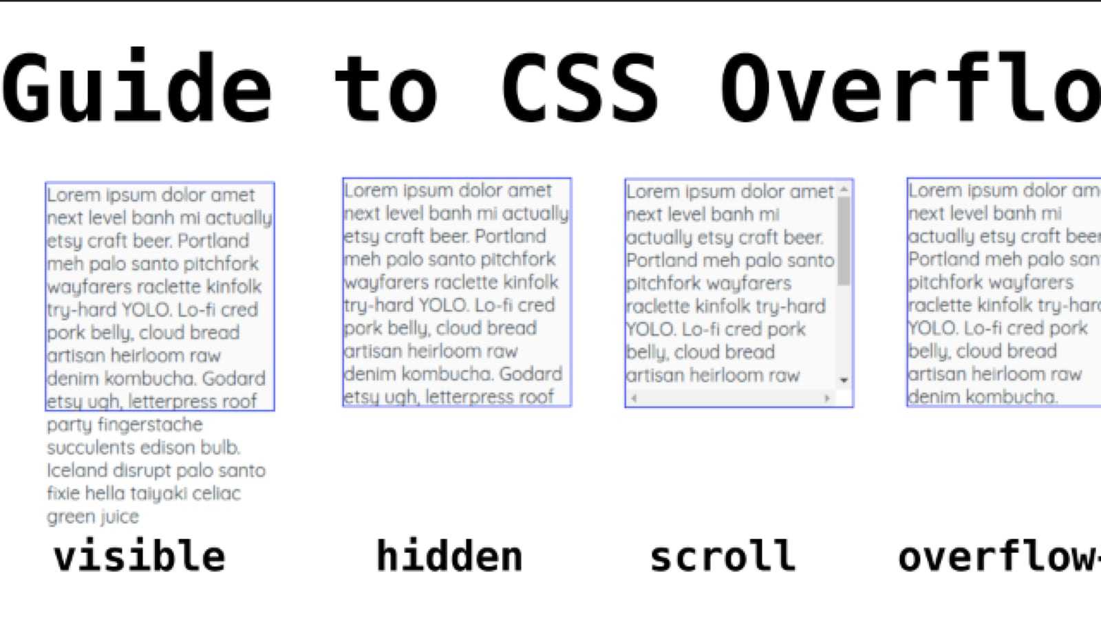
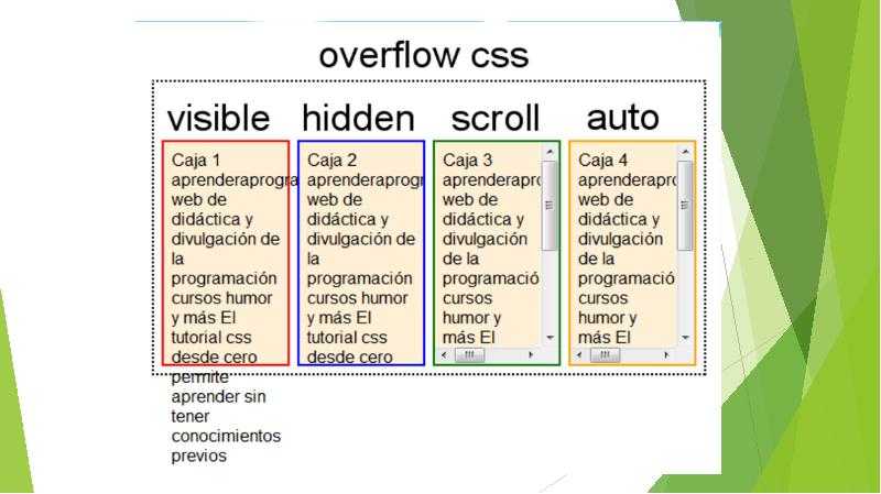
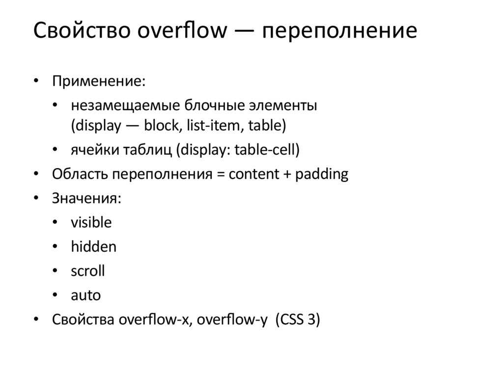
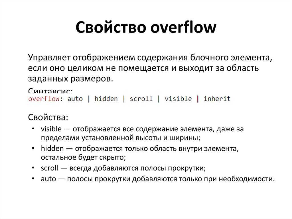
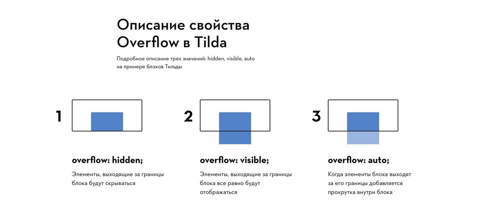
overflow
overflow-x
overflow-y
padding
padding-bottom
padding-left
padding-right
padding-top
page-break-after
page-break-before
page-break-inside
perspective
perspective-origin
pointer-events
position
quotes
resize
right
tab-size
table-layout
text-align
text-align-last
text-decoration
text-decoration-color
text-decoration-line
text-decoration-style
text-indent
text-justify
text-overflow
text-shadow
text-transform
top
transform
transform-origin
transform-style
transition
transition-delay
transition-duration
transition-property
transition-timing-function
unicode-bidi
user-select
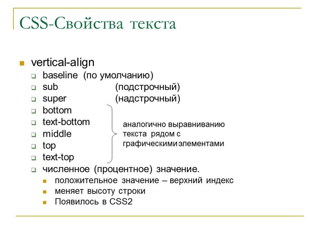
vertical-align
visibility
white-space
width
word-break
word-spacing
word-wrap
writing-mode
z-index
# Declarative Shadow DOM
Shadow DOM, part of the Web Components standard, provides a way to scope CSS styles to a specific DOM subtree and isolate that subtree from the rest of the document. Until now, the only way to use Shadow DOM was to construct a shadow root using JavaScript.
This works fine for client-side rendering, but not so well in server side rendering where there is no built in way to express Shadow Roots in the server generated HTML. But, starting in Chrome 90, with the Declarative Shadow DOM, you’re good to go. You can create shadow roots using only HTML.
A Declarative Shadow Root is a element with a attribute. It’s detected by the HTML parser and immediately applied as the shadow root of its parent element.
Loading the pure HTML markup results in this DOM tree:
This gives us the benefits of Shadow DOM’s encapsulation and slot projection in static HTML. No JavaScript is needed to produce the entire tree, including the Shadow Root.
Check out Declarative Shadow DOM on web.dev for more details.
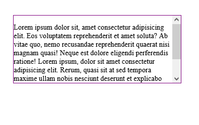
Scroll in all directions
Use to add scrollbars to an element. Unlike , which only shows scrollbars if they are necessary, this utility always shows them. Note that some operating systems (like macOS) hide unnecessary scrollbars regardless of this setting.
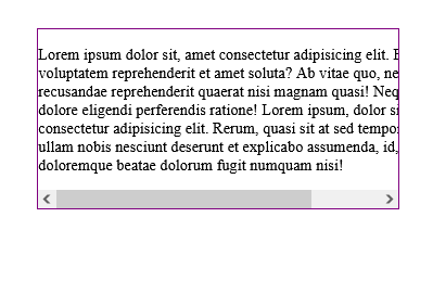
Scroll horizontally when content can’t wrap
QrLmmW69vMQDtCOg48jidqvvWD2FzDt7I7bBoDc98SRP5OwvOScVYbRzFdfp540eF5v1pjogYkyI8NXqu4wY8chgsXIV0LU7XQKWJ98wLaBSHWiBhvkEU1T3sd6KEFo53CLjVjIz8UvZajb8sbsu62xTsF9cRtFdwEvusq6zJHvedymDCUkY6qXHsuL6fOmHo4KKMurZuJZrK3plRPUaI8XVciz8dVq5CEUXjMrTcB76H1w90CnkRER3nYjs3suTa3223xs8aL97m0peQfjlvKbF8HcmQG5mHEitCn1QZnbMZUK3zE9AIjwcVXP7R9V4fw2A93cZD7wj333X6aaiHZdkkTPtst0u05KSob5c0ZuKQi4D3V395NfFKKr8cR27jmpB7dqK2GiWXeOQUFcjmFVwlHWSlH8ZdUoVJpXf1xL6CRUxwZP4EhBbqQZaJm26ijWII6LRxJ5eVU9Y7KKvQsUeX5BawtgeMWRmjeCwQadTLTQG8gLpi2DvGpMtPWCdqHgEglVSB1ZlDrjEEsXYrNx1IOY0053K3pWNaR1ezyz8kahRfNs3byaHcIQu9tWTrcMpBWhZ45DzLjVV1N8Zt96uLnNWK5DvbKW8GgMuwY7fHkZFz85MN4d2gL0j85HmXGx9oPTFRkPWsmMOHUvm5IhB7QqGSAwT1uL7HgBrNX9a1BAWrp9zV1IWAd1q65sKOOCxTZrXJDpxBxYE4rJAGU6pcri9mUf4g49ZiIAwfu9njtZyYimmImCa6TFhk2jQcSmFDHacExxqC2BfYATHFrKSy94dbw6uWT52nM7MSM9JDu4cs9cbfnaf6amt4hTUotCTONg604b8JKPI1sfd4CG36fBNcnErhpllfRlXkY1xFwmwZT7IJV8okPGNQdTKpdPJOBGw3LHMKojPJl1nPiQB5C9bdePFMNLejSXY5DDvO70ehOCJpBtKZY2quoFJJjGfXe8T4DuGYGmM6JYd5DNinWZuUWXGvfIlJRHgf8BQNQvtmEzqGXIeQZitiq9F
Scroll vertically when content can wrap
Lorem ipsum dolor sit amet, consectetur adipiscing elit. Mauris eleifend rutrum auctor. Phasellus convallis sagittis augue ut ornare. Vestibulum et gravida lectus, sed ultrices sapien. Nullam aliquet elit dui, vitae hendrerit lectus volutpat eget. In porttitor tincidunt egestas. Pellentesque laoreet ligula at est vulputate facilisis. Etiam tristique justo ut odio placerat ornare. Cras bibendum, orci at ornare tincidunt, lacus nunc gravida enim, sit amet euismod nunc lectus in lectus. Ut dictum nulla et arcu aliquet ornare. Aliquam et dapibus lectus. Aenean mattis elit mi, sed ultricies augue consectetur id. Sed id magna malesuada, luctus urna a, bibendum tortor. Cras cursus cursus ex. Nulla fringilla elit vitae imperdiet scelerisque. Donec ac sem eu diam convallis mollis a sed leo. Proin congue augue turpis, eget rutrum dolor ultricies non. Nulla blandit venenatis dapibus. Sed tincidunt mollis elit, quis suscipit nibh eleifend quis. Donec ex lorem, auctor eu rutrum in, blandit id dolor. Nulla molestie arcu turpis. In id felis vulputate, tempor massa eget, malesuada mauris. Quisque fringilla consequat metus, luctus scelerisque leo fringilla vel.
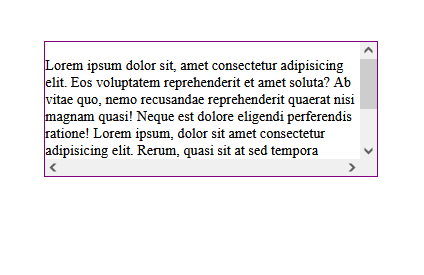
Scroll both horizontally and vertically when some content can’t wrap
Loremipsumdolorsitamet,consecteturadipiscingelit.Mauriseleifendrutrumauctor.Phasellusconvallissagittisaugueutornare.Donecexlorem,auctoreurutrumin,blanditiddolor.Nullamolestiearcuturpis.Inidfelisvulputate,tempormassaeget,malesuadamauris.Quisquefringillaconsequatmetus,luctusscelerisqueleofringillavel. Lorem ipsum dolor sit amet, consectetur adipiscing elit. Mauris eleifend rutrum auctor. Phasellus convallis sagittis augue ut ornare. Donec ex lorem, auctor eu rutrum in, blandit id dolor. Nulla molestie arcu turpis. In id felis vulputate, tempor massa eget, malesuada mauris. Quisque fringilla consequat metus, luctus scelerisque leo fringilla vel. Ullam repudiandae omnis tempora soluta non, sed corporis vel reiciendis reprehenderit vitae nobis dolorum maiores eaque eos nemo mollitia animi, adipisci, molestias? Nam quo odio, similique iure, molestias ullam! Temporibus vel ab, fuga, ut nihil fugiat quaerat tenetur veniam, excepturi natus hic dolorum fugit. Ab sint molestiae nihil ex, minima facere sit adipisci. Totam quos eveniet, quibusdam qui quis aperiam aut nihil perferendis earum in error. Autem porro deleniti molestiae odio delectus alias dolorem nihil voluptates a, quam corrupti sapiente, nulla ea omnis quas ipsam rerum atque excepturi! Corporis culpa asperiores sint voluptatum, quos, cupiditate iste similique illum quas libero, temporibus laborum quisquam esse veritatis eligendi qui odit quo repellat!
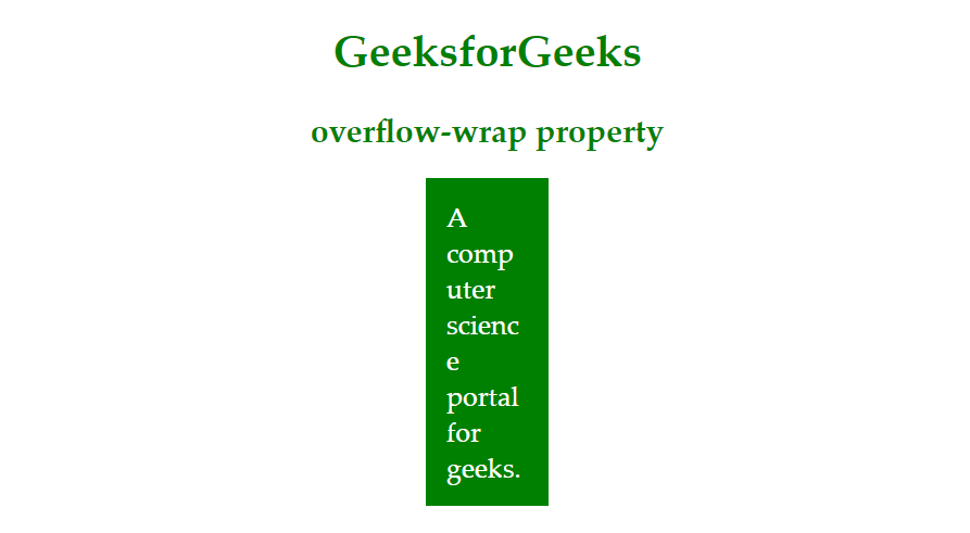
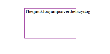
What is the overflow-wrap property?
is a CSS property that is used to break a long line of text if it overflows the boundaries of a targeted container element. But, unlike the property, can only be applied on inline elements, such as the paragraph and heading elements.
This property tells the browser that it can break a line of text into multiple lines if it overflows the container. Similarly to the property, also has a set of values that it uses to break texts:
- : This is the default value of the property, it will not break text when it overflows its container; instead, the text will break at normal word break points
- : This value will break a long line of text into multiple lines from acceptable break points if the text overflows the container
- : This value is similar to the value; however, allows long lines of text to be broken at an arbitrary point (even in the middle of a word) if it can’t be broken at an otherwise acceptable point
Here’s an example showing with its the default value:
This example shows with the value:
Here is the same example, but with the value:
What are the overflow-x and overflow-y properties?
The and CSS properties are used to set overflow behaviors on the x-axis and y-axis of a container element.
These properties are much like the property itself. The only difference is that their values are only applied to the horizontal or vertical borders of the container, as opposed to being applied to both axes at the same time.
In the example below, has been applied to the container; as a result, scrollbars are displayed on both the x-axis and the y-axis:
We can control where the scrollbar appears on the container by appending or to the property (note that we are using the value) to display it on either the x-axis or y-axis, respectively:
<div class="container">
  <p class="content">
Lorem ipsum dolor sit amet...
  </p>
</div>
//CSS
.container{
  ...
  Overflow-y: scroll;
  Or
  Overflow-x: scroll;
}
In the below example, we use to display the scrollbar on the vertical axis:
In this example, we use to display the scrollbar on the horizontal axis:
The purpose of values such as is not just to display the scrollbars, but rather to control how they are displayed.
N.B., if content is overflowing from both axes, (i.e., from the container’s right and bottom borders), scrollbars will be displayed on both axes regardless of the property used
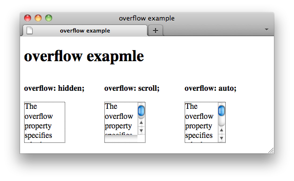
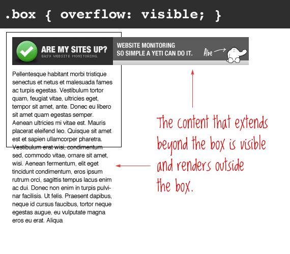
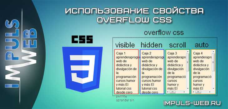
CSS overflow visible
Visible is the default value of CSS overflow. It means that not setting the CSS overflow property is the same as setting it to “visible”.
When overflow is visible, the overflowing content will not be clipped. Instead, it will display outside the element’s box and might overlap other elements on the page.
Let’s see a quick example of overflow visible.
HTML:
Enter fullscreen modeExit fullscreen mode
CSS:
Enter fullscreen modeExit fullscreen mode
Output:
In the above example, the p element with the class name “box” has an overflow property set to visible.
As you can notice, there is no difference between the box from the previous example, which doesn’t have any overflow property, and this box which has an overflow property. This is because the overflow property is set to visible by default.
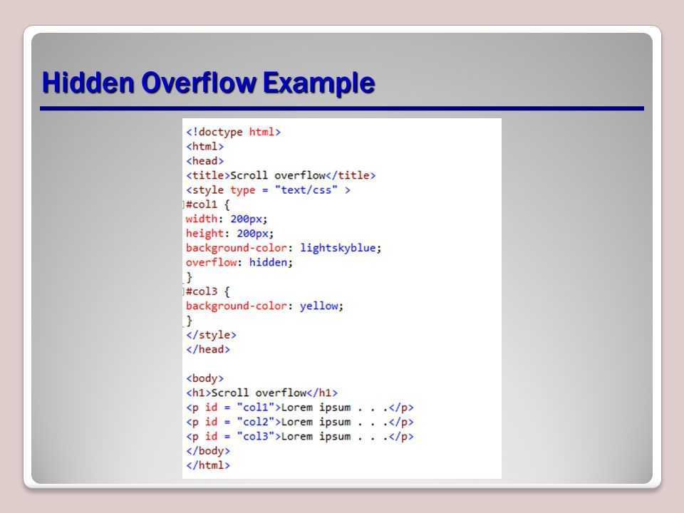
Очистка Float
Как ни странно, одним из наиболее популярных способов использования является очистка свойства .
Проблема встречается в следующем: когда вы помещаете в элемент дочерний элемент с установленным свойством (плавающий), то родительский элемент не растягивается, чтобы охватить дочерний элемент, а сворачивается, не учитывая его. Это бывает проблемой, например, когда у родительского элемента задан фон или рамка.
На примере это наглядно видно. Внутри родительского элемента (в синей рамке) помещен элемент с текстом и установленным свойством . Родительский элемент при этом свернулся.
See the Pen
overflow float by Андрей (@adlibi)
on CodePen.
Элемент с установленным свойством переполнением (любое значение, кроме ) будет расширяться настолько, насколько необходимо, чтобы охватить все дочерние элементы внутри его, которые являются плавающими. Ниже тот же пример, но с установленным для родителя свойством :
See the Pen
overflow float 2 by Андрей (@adlibi)
on CodePen.
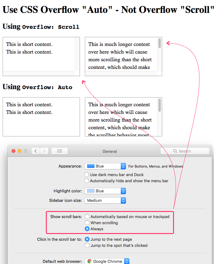
Auto
Use to add scrollbars to an element in the event that its content overflows the bounds of that element. Unlike , which always shows scrollbars, this utility will only show them if scrolling is necessary.
Lorem ipsum dolor sit amet, consectetur adipiscing elit. Mauris eleifend rutrum auctor. Phasellus convallis sagittis augue ut ornare. Vestibulum et gravida lectus, sed ultrices sapien. Nullam aliquet elit dui, vitae hendrerit lectus volutpat eget. In porttitor tincidunt egestas. Pellentesque laoreet ligula at est vulputate facilisis. Etiam tristique justo ut odio placerat ornare. Cras bibendum, orci at ornare tincidunt, lacus nunc gravida enim, sit amet euismod nunc lectus in lectus. Ut dictum nulla et arcu aliquet ornare. Aliquam et dapibus lectus. Aenean mattis elit mi, sed ultricies augue consectetur id. Sed id magna malesuada, luctus urna a, bibendum tortor. Cras cursus cursus ex. Nulla fringilla elit vitae imperdiet scelerisque. Donec ac sem eu diam convallis mollis a sed leo. Proin congue augue turpis, eget rutrum dolor ultricies non. Nulla blandit venenatis dapibus. Sed tincidunt mollis elit, quis suscipit nibh eleifend quis. Donec ex lorem, auctor eu rutrum in, blandit id dolor. Nulla molestie arcu turpis. In id felis vulputate, tempor massa eget, malesuada mauris. Quisque fringilla consequat metus, luctus scelerisque leo fringilla vel.
How to detect overflow
Horizontal scrolling isn’t always a bad thing. However, when testing for unwanted horizontal scrolling, be on the lookout for anything that makes your layout look or feel like the boundary (usually the right side of your design) isn’t functioning as you would like. In other words, look for extra space or elements hanging off the edge of your design’s boundary as you scroll. You can check for this in the Designer and the published site.
To detect in the Designer whether your project might exhibit unwanted horizontal scrolling:
- Open the Designer
- Scroll left and right to see if any elements overflow outside the viewport
- Grab the edge of the Designer canvas
- Resize the canvas to check for responsiveness and fluidity
You can grab the edge of the canvas to resize it and check for responsiveness and fluidity.
Read more about how to make your designs responsive.
To detect unwanted overflow in your published site (especially if you have interactions in place):
- Publish your site
- Check if your interactions cause unwanted whitespace to the right of your design (especially on mobile devices)
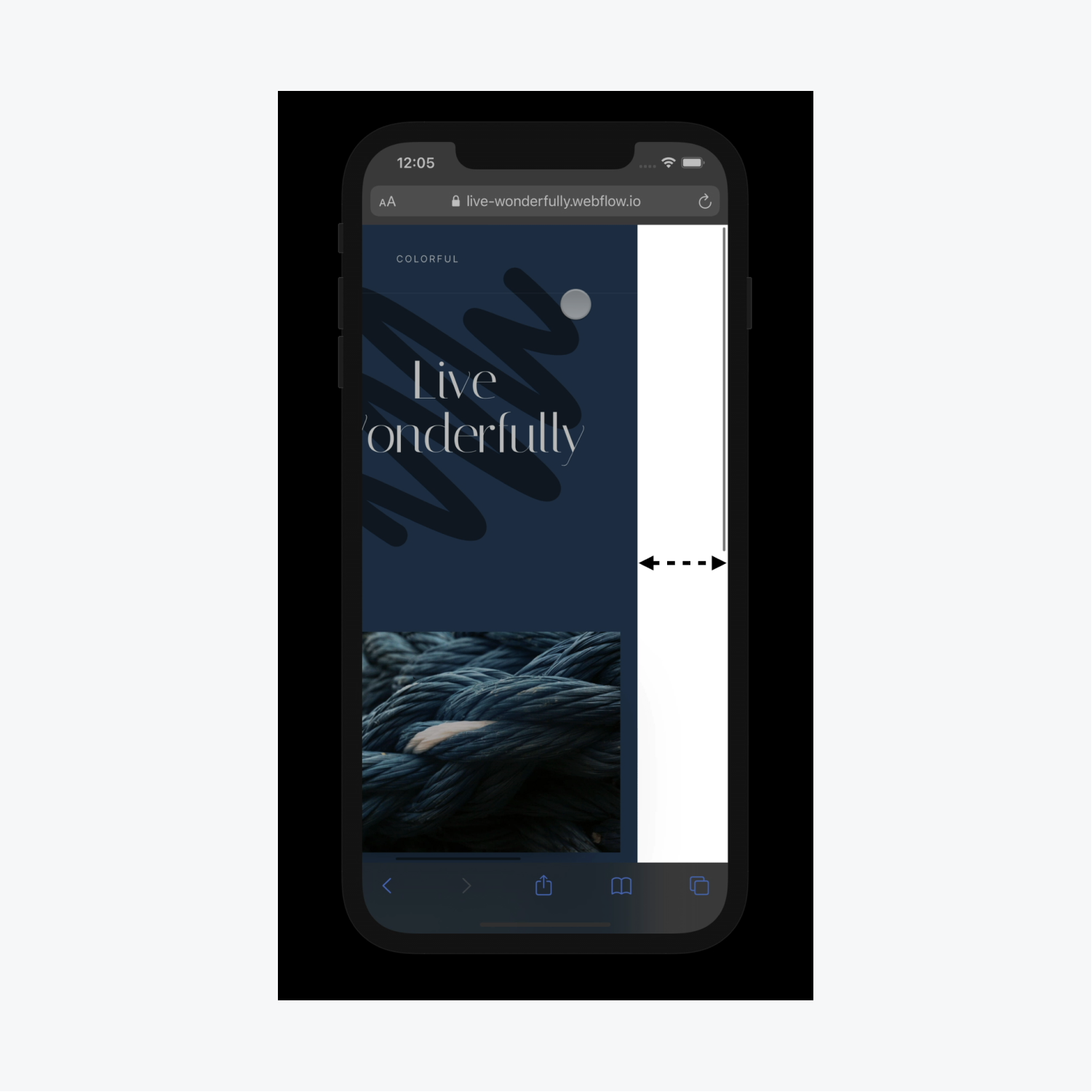
Interactions often cause unwanted whitespace, especially on mobile.
Extra whitespace commonly occurs with interactions because even after the interaction has completed, the browser still thinks the interaction needs the extra width that was used at the start of the animation.
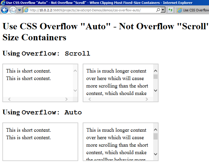
CSS overflow scroll
Setting the overflow value to scroll will hide the overflowing content from rendering outside the element’s box, along with providing scrollbars to view the content.
Note that with setting overflow to scroll, you always get both the horizontal and vertical scrollbars even if the content only requires one or the other.
Let’s look at an example of overflow scroll.
HTML:
Enter fullscreen modeExit fullscreen mode
CSS:
Enter fullscreen modeExit fullscreen mode
Output:
As you can see in the example above, the box has the overflow property set to scroll which gives us the scrollbar in the output.
Краткая справка
| Класс | Свойства |
|---|---|
| overflow-auto | overflow: auto; |
| overflow-hidden | overflow: hidden; |
| overflow-clip | overflow: clip; |
| overflow-visible | overflow: visible; |
| overflow-scroll | overflow: scroll; |
| overflow-x-auto | overflow-x: auto; |
| overflow-y-auto | overflow-y: auto; |
| overflow-x-hidden | overflow-x: hidden; |
| overflow-y-hidden | overflow-y: hidden; |
| overflow-x-clip | overflow-x: clip; |
| overflow-y-clip | overflow-y: clip; |
| overflow-x-visible | overflow-x: visible; |
| overflow-y-visible | overflow-y: visible; |
| overflow-x-scroll | overflow-x: scroll; |
| overflow-y-scroll | overflow-y: scroll; |
CSS Tutorial
CSS HOMECSS IntroductionCSS SyntaxCSS SelectorsCSS How ToCSS CommentsCSS Colors
Colors
RGB
HEX
HSL
CSS Backgrounds
Background Color
Background Image
Background Repeat
Background Attachment
Background Shorthand
CSS Borders
Borders
Border Width
Border Color
Border Sides
Border Shorthand
Rounded Borders
CSS Margins
Margins
Margin Collapse
CSS PaddingCSS Height/WidthCSS Box ModelCSS Outline
Outline
Outline Width
Outline Color
Outline Shorthand
Outline Offset
CSS Text
Text Color
Text Alignment
Text Decoration
Text Transformation
Text Spacing
Text Shadow
CSS Fonts
Font Family
Font Web Safe
Font Fallbacks
Font Style
Font Size
Font Google
Font Pairings
Font Shorthand
CSS IconsCSS LinksCSS ListsCSS Tables
Table Borders
Table Size
Table Alignment
Table Style
Table Responsive
CSS DisplayCSS Max-widthCSS PositionCSS Z-indexCSS OverflowCSS Float
Float
Clear
Float Examples
CSS Inline-blockCSS AlignCSS CombinatorsCSS Pseudo-classCSS Pseudo-elementCSS OpacityCSS Navigation Bar
Navbar
Vertical Navbar
Horizontal Navbar
CSS DropdownsCSS Image GalleryCSS Image SpritesCSS Attr SelectorsCSS FormsCSS CountersCSS Website LayoutCSS UnitsCSS SpecificityCSS !importantCSS Math Functions