
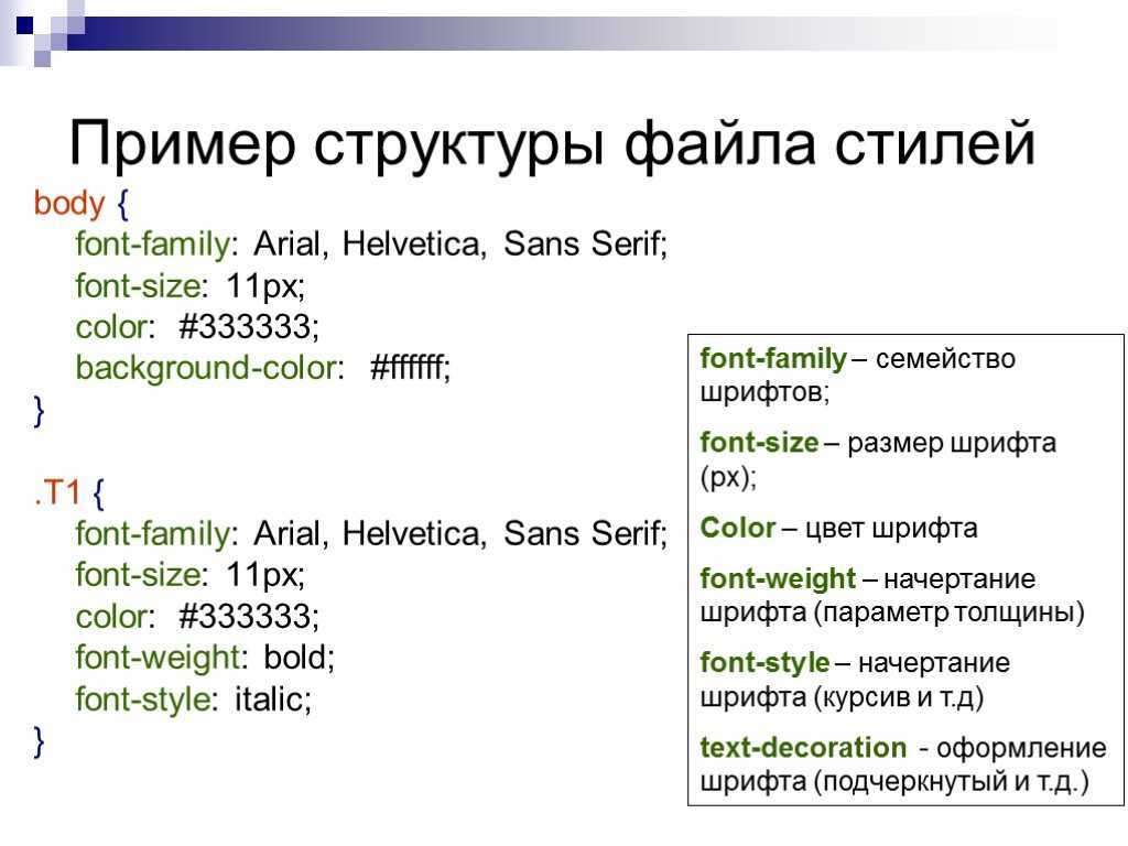
Browser compatibility
The compatibility table on this page is generated from structured data. If you’d like to contribute to the data, please check out https://github.com/mdn/browser-compat-data and send us a pull request.
| Chrome | Edge | Firefox | Internet Explorer | Opera | Safari | Android webview | Chrome for Android | Firefox for Android | Opera for Android | Safari on iOS | Samsung Internet | |
|---|---|---|---|---|---|---|---|---|---|---|---|---|
|
Chrome Full support 1 |
Edge Full support 12 |
Firefox Full support 1 |
IE Full support 3 |
Opera Full support 3.5 |
Safari Full support 1 |
WebView Android Full support ≤37 |
Chrome Android Full support 18 |
Firefox Android Full support 4 |
Opera Android Full support 10.1 |
Safari iOS Full support 1 |
Samsung Internet Android Full support 1.0 |
|
| Deprecated |
Chrome No support No |
Edge No support No |
Firefox No support 1 — 23 |
IE No support No |
Opera No support 4 — 15 |
Safari No support No |
WebView Android No support No |
Chrome Android No support No |
Firefox Android No support 4 — 23 |
Opera Android No support 10.1 — 14 |
Safari iOS No support No |
Samsung Internet Android No support No |
| Shorthand |
Chrome Full support 57 |
Edge Full support 79 |
Firefox Full support 36 |
IE No support No |
Opera Full support 44 |
Safari Full support 8 Prefixed |
WebView Android Full support 57 |
Chrome Android Full support 57 |
Firefox Android Full support 36 |
Opera Android Full support 43 |
Safari iOS Full support 8 Prefixed |
Samsung Internet Android Full support 7.0 |
|
included in shorthand |
Chrome No support No |
Edge No support No |
Firefox Full support 70 |
IE No support No |
Opera No support No |
Safari No support No |
WebView Android No support No |
Chrome Android No support No |
Firefox Android No support No |
Opera Android No support No |
Safari iOS No support No |
Samsung Internet Android No support No |
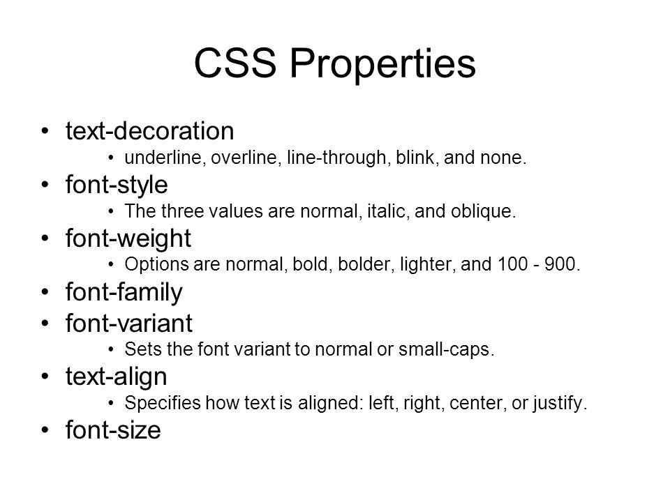
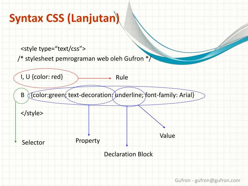
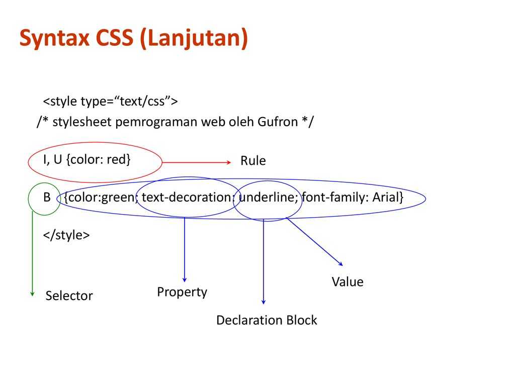
CSS Properties
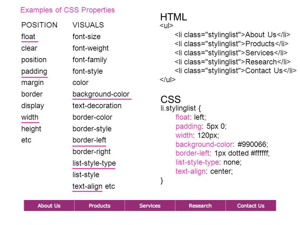
align-contentalign-itemsalign-selfallanimationanimation-delayanimation-directionanimation-durationanimation-fill-modeanimation-iteration-countanimation-nameanimation-play-stateanimation-timing-functionbackface-visibilitybackgroundbackground-attachmentbackground-blend-modebackground-clipbackground-colorbackground-imagebackground-originbackground-positionbackground-repeatbackground-sizeborderborder-bottomborder-bottom-colorborder-bottom-left-radiusborder-bottom-right-radiusborder-bottom-styleborder-bottom-widthborder-collapseborder-colorborder-imageborder-image-outsetborder-image-repeatborder-image-sliceborder-image-sourceborder-image-widthborder-leftborder-left-colorborder-left-styleborder-left-widthborder-radiusborder-rightborder-right-colorborder-right-styleborder-right-widthborder-spacingborder-styleborder-topborder-top-colorborder-top-left-radiusborder-top-right-radiusborder-top-styleborder-top-widthborder-widthbottombox-shadowbox-sizingcaption-sideclearclipcolorcolumn-countcolumn-fillcolumn-gapcolumn-rulecolumn-rule-colorcolumn-rule-stylecolumn-rule-widthcolumn-spancolumn-widthcolumnscontentcounter-incrementcounter-resetcursordirectiondisplayempty-cellsfilterflexflex-basisflex-directionflex-flowflex-growflex-shrinkflex-wrapfloatfont@font-facefont-familyfont-sizefont-size-adjustfont-stretchfont-stylefont-variantfont-weighthanging-punctuationheightjustify-content@keyframesleftletter-spacingline-heightlist-stylelist-style-imagelist-style-positionlist-style-typemarginmargin-bottommargin-leftmargin-rightmargin-topmax-heightmax-width@mediamin-heightmin-widthnav-downnav-indexnav-leftnav-rightnav-upopacityorderoutlineoutline-coloroutline-offsetoutline-styleoutline-widthoverflowoverflow-xoverflow-ypaddingpadding-bottompadding-leftpadding-rightpadding-toppage-break-afterpage-break-beforepage-break-insideperspectiveperspective-originpositionquotesresizerighttab-sizetable-layouttext-aligntext-align-lasttext-decorationtext-decoration-colortext-decoration-linetext-decoration-styletext-indenttext-justifytext-overflowtext-shadowtext-transformtoptransformtransform-origintransform-styletransitiontransition-delaytransition-durationtransition-propertytransition-timing-functionunicode-bidivertical-alignvisibilitywhite-spacewidthword-breakword-spacingword-wrapz-index
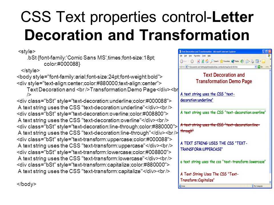
Pitfalls and tips for using text decoration properties
Older browsers including all versions of Internet Explorer only understand as it was defined in CSS 2.
If you use as a shorthand property, Internet Explorer will ignore it completely:
You can set twice, as recommended in the specification:
However, not all browsers that support CSS Text Decoration Module Level 4 support the shorthand property – notably, Safari will ignore the second declaration even though it supports all of the properties individually.
To get the best browser support, set as a longhand property, then set the various text decoration sub-properties independently:
Remember the ‘tricky edge case’ with shorthand properties that was mentioned earlier? If you set after any of the properties, all of those properties will be reset back to their initial value.
As an example, consider a modifier class that’s designed to remove underlines from links, except when active or hovered over:
The link will have no underline except when hovered or active, when you might reasonably expect it to have a 4px navy dotted underline.
But, in a browser that treats it as a shorthand property it’s effectively the same as doing this:
As a result, the thickness, colour and style are all reset to their initial user-agent defaults, and when hovering over our link we just get a boring default underline.
The exception to this is, once again, Safari, where is not a shorthand property, and instead acts like a sort of alias for . Unlike other browsers it does not set the other properties back to .
One option is to set the longhand property directly, like this:
However, this won’t remove the underline in browsers that only support the CSS 2 property, like Internet Explorer, as they don’t recognise .
If that’s something you care about, you could do this instead:
This is and should work in all browsers except IE6-8 and Safari 3.1, which do not support .
I mentioned in the introduction that we’ve made the link underlines consistently 1px thick, but that was a slight over-simplification.
If a user zooms their browser in, the underlines would scale accordingly. However, if a user has instead changed the font size in their browser, the underlines would remain 1px thick.
We were concerned that users who do this might not see the underline, so we made sure that the underlines scale appropriately by calculating the underline thickness in rem as well as pixels, and taking whichever value is bigger using the function.
Diving 1px by 16px (the default font size in most browsers) gives us a value of 0.0625rem:
This means that underlines will always be at least 1px thick, but a user who sets the font size in their browser to 32px will see 2px underlines (because 32px × 0.0625 = 2px).
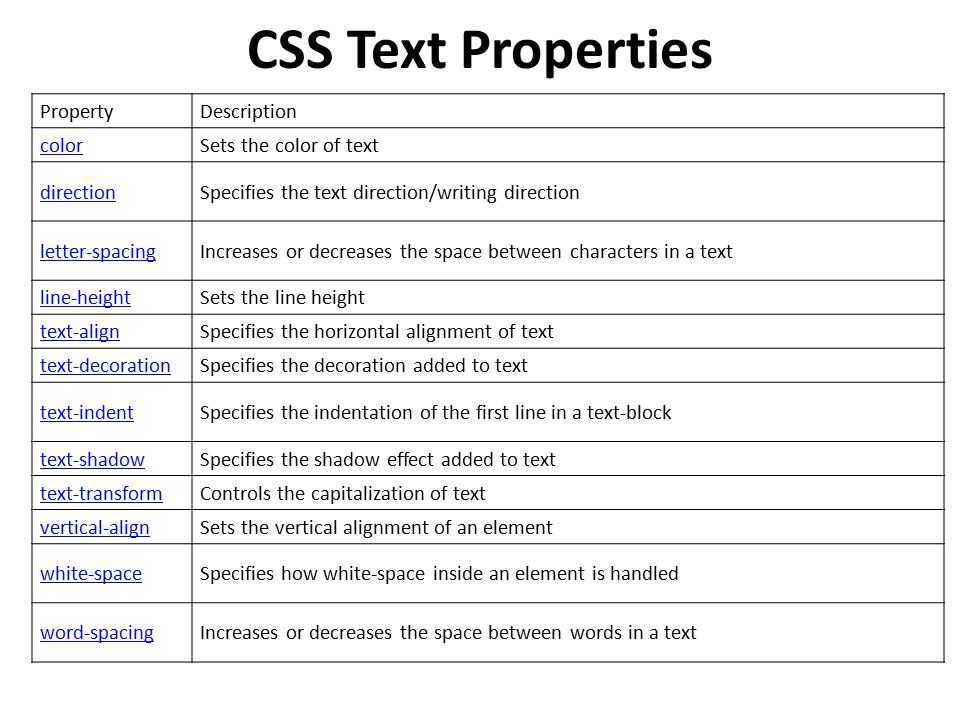
Text Spacing
There are three main ways to control the spacing around and between text.
Line Height
When you want to change the height of the lines, use the property. Since this adjusts the height of a line of text, when lines are stacked, this basically increases or decreases the spacing between those lines.
The value will be a percentage, a length in any unit, or . The default value is .
Example of different line heights.
Letter Spacing
If you want to change how much space is between individual letters, use the property. The value will be a length in any unit. The default value is . The value can also be negative.
Example of letter spacing.
Word Spacing
Word spacing is similar to letter spacing, except that the space you’re adjusting is between the words instead of the letters. You declare this with the property. The value will be a length in any unit. The default value is . The value can also be negative.
Example of word spacing.
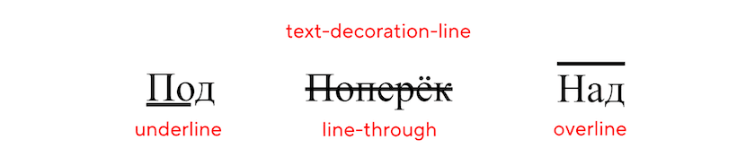
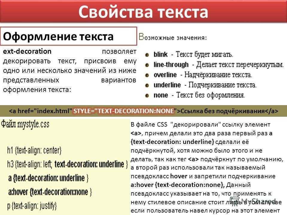
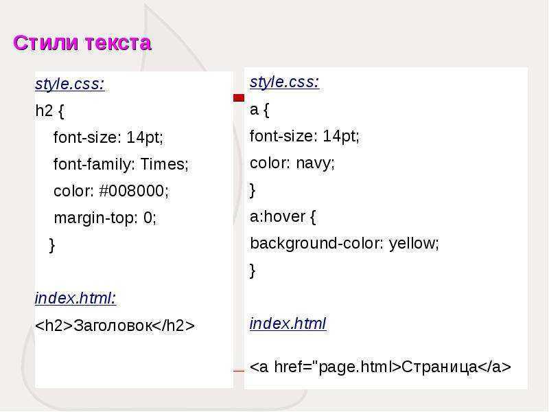
Свойство text-decoration
Значения :
- — зачёркивание посередине текста;
- — надчёркивание, над текстом;
- — подчёркивание, под текстом;
- — не используется декор;
- — наследуется.
Например, свойство для подчёркнутого текста записывается просто как
— это сокращённая форма записи для набора CSS-свойств , , и . Перечисленные свойства используются для более тонкой настройки параметров подчёркивания.
text-decoration-line
— отвечает за тип линии: подчёркнуто, перечёркнуто, без подчёркивания, подчёркивание над текстом, а не под ним.
может принимать сразу несколько значений, например, . В этом случае у текста будет подчёркивание и зачёркивание.
управляет цветом подчёркивания. По умолчанию он, то есть цвет подчёркивания, совпадает с цветом текста.
text-decoration-style
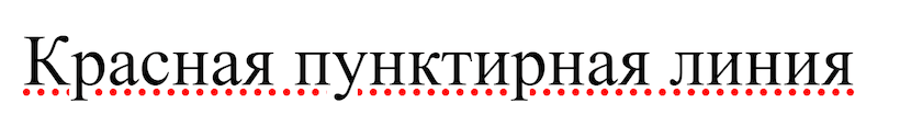
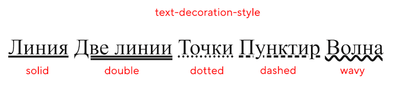
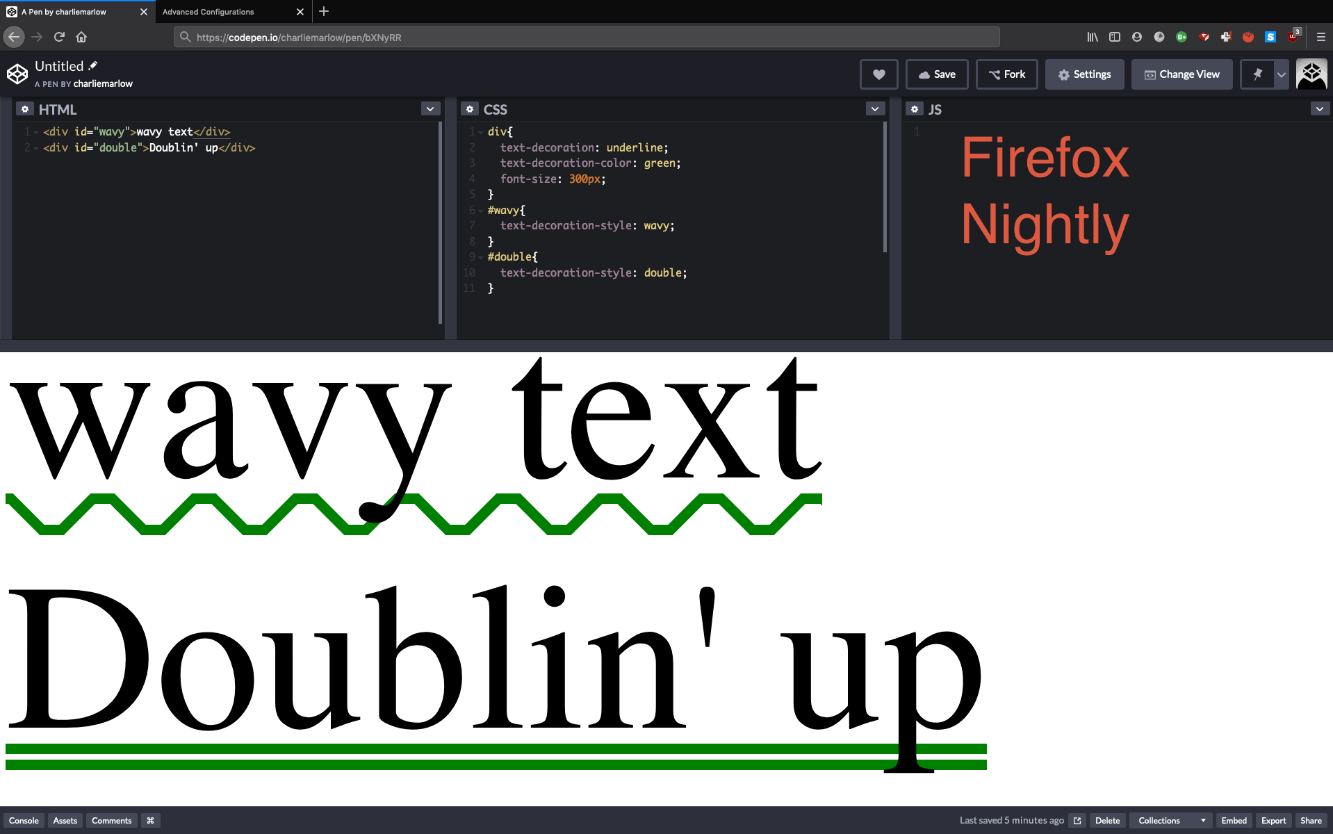
Стиль линии (сплошная, волнистая, точками, тире и другие) настраивается через CSS-свойство .
- — обычная сплошная линия;
- — двойная линия;
- — пунктирная линия (пунктир из точек);
- — тоже пунктирная линия, но пунктир из коротких линий;
- — волнистая линия.
задаёт толщину линии.
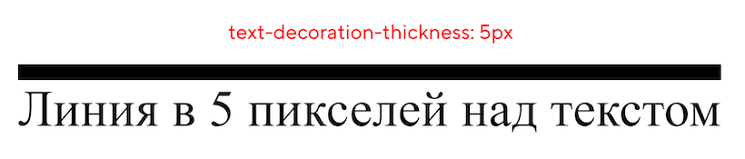 5 пикселей — художественная условность
text-underline-offset
До недавнего времени внешним видом подчёркивания управляли только эти четыре CSS-свойства (, , и ). Но были ситуации, когда перечисленных свойств было недостаточно. К примеру, нужно реализовать выделение активного пункта меню на сайте:
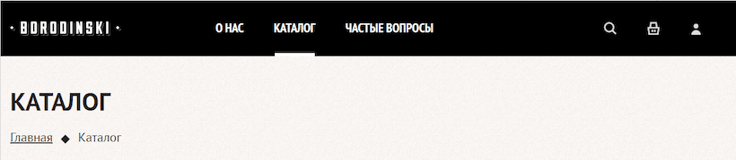 Активный пункт меню выделен нестандартным подчёркиванием
Если использовать только , нужное подчёркивание не реализовать. Его, конечно, можно добавить за счёт нижней границы, стилизации через псевдоэлементы или другими странными методами.
Но всё упростилось с появлением . Свойство устанавливает смещение подчёркивания от его исходного положения и используется в связке со свойством .
У свойства хорошая браузерная поддержка, оно работает в большинстве современных браузеров, кроме Firefox под Android.
What is the HTML Code for Underline? The HTML U Element
The HTML U element, shorthand for underline, applies an underline to the enclosed text. It works much like the SPAN element, but adds semantic meaning to the content.
It you need to convey meaning to assistive technologies or search engine spiders using elements like U can make it easier for these automated tools understand the emphasis.
The U element typically has the same default styles as the SPAN element. This means it has a display:inline-block. This allows it to be used within a string of text (typically within a P tag) without changing the larger body of text’s flow.
You would not want underline text to add line breaks or suddenly change the justification settings, etc. That would disrupt the reader’s engagement.
You can also add styles via classes to a U element to further control how underlined text is rendered. For example you could change the color, font-face and letter spacing.
To further help assistive technologies you will want to add the aria-{underline setting}. Remember adding meta values to elements is very helpful to these technologies. They may also be used by search engines.
A brief history of text-decoration
In these earliest versions of CSS, that only accepted the values , , , , and :
So, you could use it to add decoration to your text, but you had no control over its appearance – you were constrained to a solid line with its colour and thickness based on the text.
introduced new , and properties.
Now you could change the colour of the underline independently of the text colour, and choose between solid, double, dotted, dashed or wavy lines:
But it also , allowing you to set line, style and color in a single declaration:
CSS Text Decoration Module Level 4, which is still a working draft, introduces the and properties, allowing you control over the thickness of the line and the offset of the line from the text baseline respectively:
Again, it changes the shorthand property to include the new .
However, the property is intentionally excluded from the shorthand property, and has to be set separately:
Пример использования
Обращаю Ваше внимание, что свойство имеет ограниченную поддержку браузерами
<!DOCTYPE html>
<html>
<head>
<title>Пример использования свойства text-decoration-style</title>
<style>
p {
text-decoration : underline; /* добавляем декорирование текста для абзацев (линия снизу) */
font-size : 24px; /* устанавливаем размер шрифта для абзацев */
}
.test {
-webkit-text-decoration-style : solid; /* добавляем стиль декоративной линии (с префиксом производителя)*/
-moz-text-decoration-style : solid; /* добавляем стиль декоративной линии (с префиксом производителя) */
text-decoration-style : solid; /* добавляем стиль декоративной линии - сплошная */
}
.test2 {
-webkit-text-decoration-style : double; /* добавляем стиль декоративной линии (с префиксом производителя)*/
-moz-text-decoration-style : double; /* добавляем стиль декоративной линии (с префиксом производителя) */
text-decoration-style : double; /* добавляем стиль декоративной линии - двойная */
}
.test3 {
-webkit-text-decoration-style : dotted; /* добавляем стиль декоративной линии (с префиксом производителя)*/
-moz-text-decoration-style : dotted; /* добавляем стиль декоративной линии (с префиксом производителя) */
text-decoration-style : dotted; /* добавляем стиль декоративной линии - точечная */
}
.test4 {
-webkit-text-decoration-style : dashed; /* добавляем стиль декоративной линии (с префиксом производителя)*/
-moz-text-decoration-style : dashed; /* добавляем стиль декоративной линии (с префиксом производителя) */
text-decoration-style : dashed; /* добавляем стиль декоративной линии - пунктирная */
}
.test5 {
-webkit-text-decoration-style : wavy; /* добавляем стиль декоративной линии (с префиксом производителя)*/
-moz-text-decoration-style : wavy; /* добавляем стиль декоративной линии (с префиксом производителя) */
text-decoration-style : wavy; /* добавляем стиль декоративной линии - волнистая */
}
</style>
</head>
	<body>
		<p class = "test">text-decoration-style: solid ;</p>
		<p class = "test2">text-decoration-style: double ;</p>
		<p class = "test3">text-decoration-style: dotted ;</p>
		<p class = "test4">text-decoration-style: dashed ;</p>
		<p class = "test5">text-decoration-style: wavy ;</p>
	</body>
</html>
Результат нашего примера:
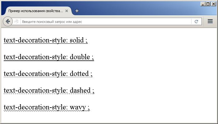
Пример использования свойства text-decoration-style(устанавливает стиль декоративной линии).CSS свойства
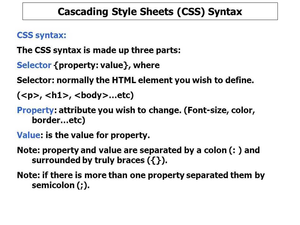
Syntax
Syntax
text-decoration-style: enter value for decoration
| 1 | text-decoration-styleenter value fordecoration |
Example
<style>
h2{
text-decoration-color:red;
text-decoration-line: overline;
text-decoration-style: wavy;
}
.div-align{
text-align:justify;
text-align-end:right;
border:1px solid yellow;
border-radius:20px;
padding:10px;
}
</style>
<h2>This is the heading</h2>
<div class=»div-align»>
<p>This is the HTML paragraph inside the div to show right alignment of text. This uses text align property to align the content.</p>
</div>

|
1 |
<style> h2{ text-decoration-colorred; text-decoration-lineoverline; text-decoration-stylewavy; } .div-align{ text-alignjustify; text-align-endright; border1pxsolidyellow; border-radius20px; padding10px; } </style> <h2>Thisisthe heading<h2> <div class=»div-align»> <p>Thisisthe HTML paragraph inside the div toshow right alignment of text.Thisuses text align propertytoalign the content.<p> <div> |
Output
CSS text decoration style values list
| Sr. No. | value | Description |
|---|---|---|
| 1 | solid | Used to define the single line decoration of the text. The value for this is solid. |
| 2 | double | Used to define the double line decoration of the text. The value for this is double. |
| 3 | dotted | Used to define the dotted line decoration of the text. The value for this is dotted. |
| 4 | dashed | Used to define the dashed line decoration of the text. The value for this is dashed. |
| 5 | wavy | Used to define the wavy line decoration of the text. The value for this is wavy. |
| 6 | initial | Used to define as the property initial value. |
| 7 | inherit | Used to define the computed value of property on the elements parent. |
| 8 | unset | Used to define the property either acts as inherit or initial, depending on the property if it is inherited or not. |
Text Decoration #
Set decoration for the inline text elements such as underline, line through or uppercase using classes from Tailwind CSS.
Underline
Underline text by using the class or disable it using .
Edit on GitHub
Toggle full view
Toggle full screen
Toggle tablet view
Toggle tablet view
Toggle mobile view
Toggle mobile view
Toggle dark/light mode
Toggle dark mode
Copy
Copy to clipboard
Track work across the enterprise through an open, collaborative platform. and ingest data from other tools, so your IT support and operations teams have richer contextual information to rapidly respond to , , and .
Line through
Set a strikethrough line on a text element using the class.
Edit on GitHub
Toggle full view
Toggle full screen
Toggle tablet view
Toggle tablet view
Toggle mobile view
Toggle mobile view
Toggle dark/light mode
Toggle dark mode
Copy
Copy to clipboard
$109$79
Uppercase
Force uppercase characters for a given portion of text using the class.
Edit on GitHub
Toggle full view
Toggle full screen
Toggle tablet view
Toggle tablet view
Toggle mobile view
Toggle mobile view
Toggle dark/light mode
Toggle dark mode
Copy
Copy to clipboard
The crypto identity primitive.
Animated Underline on Hover
Let’s now create an animated underline of menu buttons on hover. We’ll need this markup:
Here are common styles for 4 examples that will follow next:
We’ll remove the standard text-decoration and add a border using CSS pseudo-elements. This border would be then animated with CSS transition properties.

Read more tips on styling a menu: How To Create a Navigation Bar: 6 Useful Tricks.
Animated underline with the box-shadow property
You can also create an underline with the box-shadow property that attaches a shadow to an HTML element. You can make this shadow larger on hover by increasing the vertical offset. See the example below.
Here we attach two shadowsto our <a> element:
- inset changes the shadow from an outer shadow (outset) to an inner shadow
- 0 -30px 0 rgba(50,85,127,0.5): 0 is the horizontal offset, -30px the vertical offset, 0 the blur radius, and rgba(50,85,127,0.5) is a half-transparent (0.5 opacity) shade of blue
- 0 2px 0 rgba(50,85,127,0.5): 0 is the horizontal offset, 2px the vertical offset, 0 the blur radius
Read more on CSS shadows in our article CSS Shadows.
Значение свойств
| Значение | Описание | Воспроизвести |
|---|---|---|
| solid | Значение по умолчанию. Линия будет отображаться как одна строка | Воспроизвести » |
| double | Линия будет отображаться как двойная линия | Воспроизвести » |
| dotted | Линия будет отображаться в виде пунктирной линии | Воспроизвести » |
| dashed | Линия будет отображаться в виде пунктирной линии | Воспроизвести » |
| wavy | Линия будет отображаться в виде волнистой линии | Воспроизвести » |
| initial | Устанавливает для этого свойства значение по умолчанию. Прочитайте о initial | Воспроизвести » |
| inherit | Наследует это свойство от родительского элемента. Прочитайте о inherit |
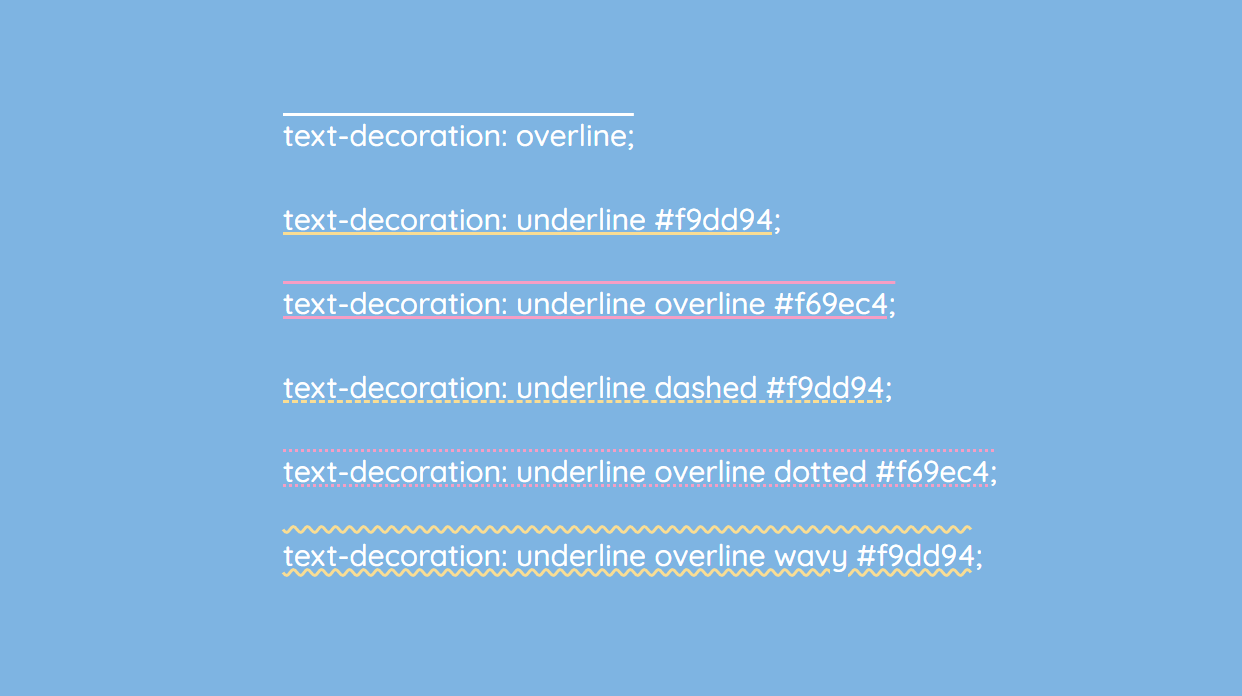
How Do You Underline Text in CSS Using text-decoration?
A more flexible way to underline text is with the text-decoration property. It can also be used to remove underlines in hyperlinked text and add overlines.
An overline is the opposite of an underline. It renders a line above the text.
You can also use both underline and overline values for the same class definition.
Some examples:
Underline
Overline
Strikethrough
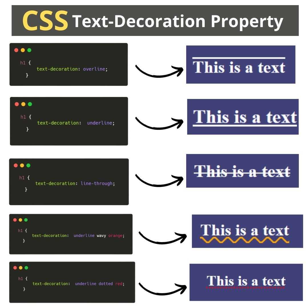
The text-decoration property controls different ways the text can be rendered. By setting text-decoration to underline the text within the element is underlined.
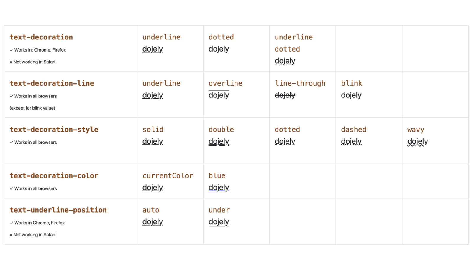
What is the CSS text-decoration Property?
text-decoration is a CSS property that defines the appearance of lines on text. It is can be used for text-decoration-line , text-decoration-color , text-decoration-style, and text-decoration-thickness properties.
The best way to do this, if the text is part of a paragraph or sentence, is to wrap it within a SPAN tag. You can apply the class with the underline property to the containing SPAN tag.
In addition to underling and overlining text you can also apply a strike-through. The line-through value renders a line through eh middle of the enclosed text.
Typically CSS does not convey semantic meaning like an element. This does not mean it won’t be used that way. The Google bot is pretty sophisticated and can interpret styles to convey meaning.
For the most part they are evaluating color contrasts, at least that is my impression. I also think they are looking for underlined, bold and possibly slight color contrasts to look for special text.
I do know they use bold text as small signal toward the keyword you are targeting.
A cool text-decoration trick is combining each value: underline, overline, or line-through as a space-separated list. This applies all the line styles to the text:
It looks something like this: I have lots of lines
Новые свойства text-decoration
Вы помните, что я обещал подробнее поговорить о . Время пришло.
Само по себе это свойство отлично работает, но вы можете добавить несколько экспериментальных свойств для настройки внешнего вида подчеркивания.
Но слишком сильно не радуйтесь… Поддержка в браузерах — как всегда. Такие дела.
text-decoration-color
Свойство позволяет вам изменять цвет подчеркивания отдельно от цвета текста. Поддержка этого свойства лучше, чем можно было ожидать — оно работает в Firefox и с префиксом в Safari. Вот в чем загвоздка: если у вас есть выносные элементы, Safari поместит подчеркивание поверх текста.
Firefox:
Safari:
text-decoration-skip
Свойство включает пропуск выносных элементов в подчеркиваемом тексте.
Это свойство нестандартное и работает сейчас только в Safari, с префиксом . Safari по умолчанию активирует это свойство, поэтому выносные элементы всегда не перечеркиваются.
Если вы используете Normalize, то учтите, что последние версии отключают это свойство ради последовательного поведения браузеров. И если вы хотите, чтобы подчеркивание не затрагивало выносные элементы, вам надо вручную активировать его.
text-decoration-style
Свойство предлагает такие же возможности оформления, что и у свойства , добавляя кроме этого стиль .
Вот список доступных значений:
Сейчас свойство работает только в Firefox, вот скриншот из него:
Чего не хватает
Серия свойств намного более интуитивна в использовании, чем остальные свойства CSS для оформления подчеркивания. Но если взглянуть внимательнее, то для удовлетворения наших запросов не хватает способов задать толщину или позицию линии.
После небольшого исследования, я нашел еще пару свойств:
Судя по всему, они относятся к ранним черновикам CSS, но их так и не реализовали в браузерах из-за отсутствия интереса.
CSS text decoration style values list
| Sr. No. | value | Description |
|---|---|---|
| 1 | solid | Used to define the single line decoration of the text. The value for this is solid. |
| 2 | double | Used to define the double line decoration of the text. The value for this is double. |
| 3 | dotted | Used to define the dotted line decoration of the text. The value for this is dotted. |
| 4 | dashed | Used to define the dashed line decoration of the text. The value for this is dashed. |
| 5 | wavy | Used to define the wavy line decoration of the text. The value for this is wavy. |
| 6 | initial | Used to define as the property initial value. |
| 7 | inherit | Used to define the computed value of property on the elements parent. |
| 8 | unset | Used to define the property either acts as inherit or initial, depending on the property if it is inherited or not. |
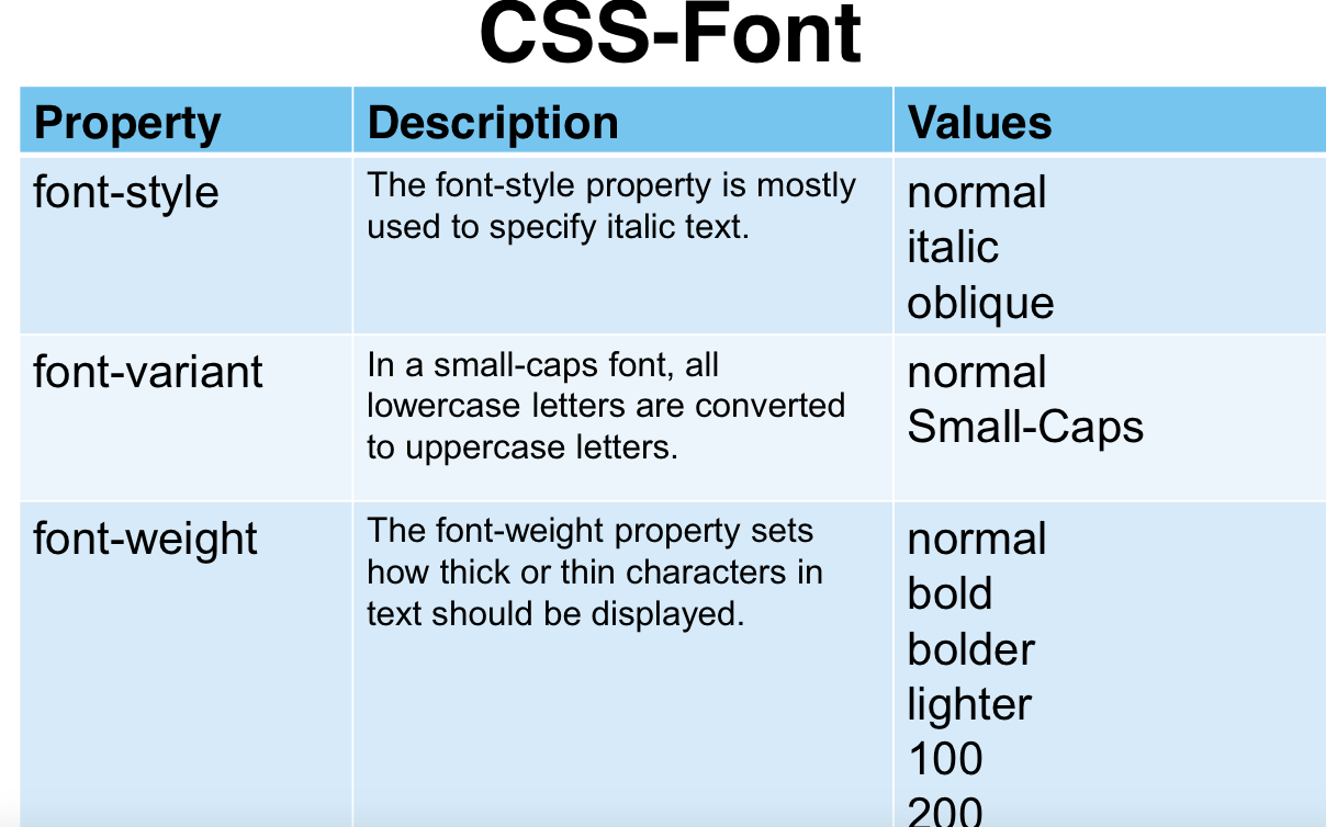
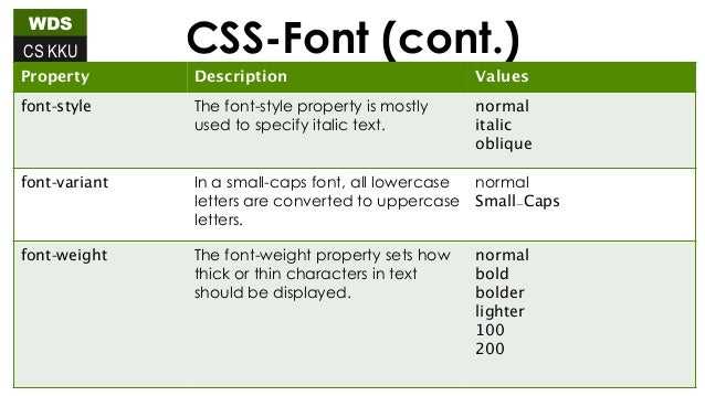
Font Family
To change the font that is used to render text, you specify it using the property. The value of this property is a list of font names, separated by commas.
CSS allows you to specify fallback fonts in case your user did not have the font you originally specified. For example, if you wanted to use the font followed by a font as a backup, it would look like this:
Here is a list of fonts that are generally deemed safe to use on the web, also known as web safe fonts.
- Arial
- Helvetica
- Times New Roman
- Times
- Courier New
- Courier
- Verdana
- Georgia
- Palatino
- Garamond
- Bookman
- Comic Sans MS
- Trebuchet MS
- Arial Black
- Impact
Web safe fonts are generally used as fallback fonts for browsers that do not support the font you want to use.
“Handwritten” Animated Underline on Hover
For the finale, let’s create fancy underlines that would appear on hover. The first would remind of a handwritten stroke and the second one of a gentle stroke of a marker.
We’ll do this with the help of Scalable Vector Graphics (SVG). We’ll have an HTML element for SVG and a block for text with links (choose either .ink-svgline or .link-svgmarker).
General structure:
Replace the “Invisible SVG block” comment with the following code:
Here are the CSS rules to hide this element:
And here are CSS rules that are common for both examples that will follow:
First SVG example
Replace the “First SVG example” comment with this piece of code (use whatever text you need, only keep the structure with classes):
CSS:
Second SVG example
Replace the “Second SVG example” comment with this piece of code:
CSS:
The last two examples are inspired by a Tympanus demo.
Read also:
- CSS Borders: 7 Examples
- CSS Tabs: 5 Examples
Text Align #
Use the following examples to align the text content to the left, center, or right side of the page.
Left
Use the class to align the text to the left side of the page.
Edit on GitHub
Toggle full view
Toggle full screen
Toggle tablet view
Toggle tablet view
Toggle mobile view
Toggle mobile view
Toggle dark/light mode
Toggle dark mode
Copy
Copy to clipboard
Get started with an enterprise-level, profesionally designed, fully responsive, and HTML semantic set of web pages, sections and over 400+ components crafted with the utility classes from Tailwind CSS and based on the Flowbite component library
Center
Use the class to align the text content to the center of the page.
Edit on GitHub
Toggle full view
Toggle full screen
Toggle tablet view
Toggle tablet view
Toggle mobile view
Toggle mobile view
Toggle dark/light mode
Toggle dark mode
Copy
Copy to clipboard
Get started with an enterprise-level, profesionally designed, fully responsive, and HTML semantic set of web pages, sections and over 400+ components crafted with the utility classes from Tailwind CSS and based on the Flowbite component library
Right
Use the class to align the text element to the right side of the page.
Edit on GitHub
Toggle full view
Toggle full screen
Toggle tablet view
Toggle tablet view
Toggle mobile view
Toggle mobile view
Toggle dark/light mode
Toggle dark mode
Copy
Copy to clipboard
Get started with an enterprise-level, profesionally designed, fully responsive, and HTML semantic set of web pages, sections and over 400+ components crafted with the utility classes from Tailwind CSS and based on the Flowbite component library
Text justify
Use the class to justify the text content.
Edit on GitHub
Toggle full view
Toggle full screen
Toggle tablet view
Toggle tablet view
Toggle mobile view
Toggle mobile view
Toggle dark/light mode
Toggle dark mode
Copy
Copy to clipboard
Get started with an enterprise-level, profesionally designed, fully responsive, and HTML semantic set of web pages, sections and over 400+ components crafted with the utility classes from Tailwind CSS and based on the Flowbite component library
Как сделать подчеркнутый текст CSS-стилями
Чтобы как-то выделить фрагмент, и сделать его более заметным, мы можем сделать подчеркнутый текст css-стилями, используя свойство text-decoration:underline;
XHTML
<div class=»under-line»>
<p style=»text-decoration:underline;»>Подчеркнутый текст CSS</p>
</div>
|
1 |
<div class=»under-line»> <p style=»text-decoration:underline;»>Подчеркнутый текст CSS</p> </div> |
Подчеркнутый текст CSS
Так же это CSS-свойство имеет и другие интересные значения:
- blink — позволяет сделать слово или предложение мерцающим,
- line-through — перечёркивает слово или предложение,
- overline — позволяет провести линию над словом.
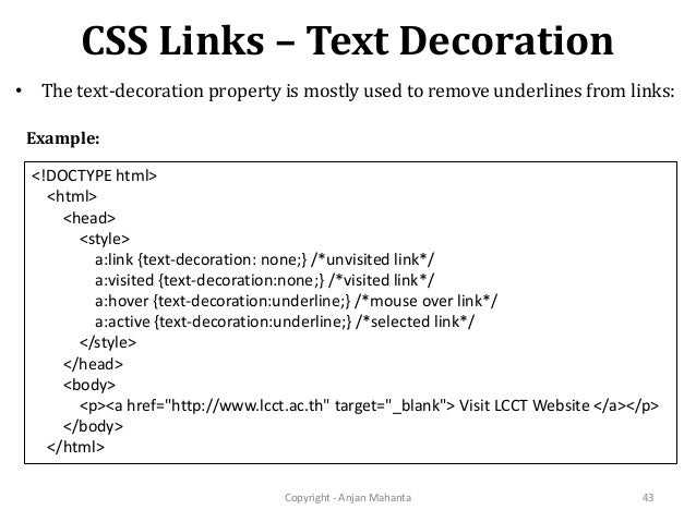
Это свойство так же используется для стилизации отображения ссылок по умолчанию. Поэтому, если вы хотите что бы ссылки на страницах вашего сайта отображались без подчеркивания, вам нужно задать для нее text-decoration: none;
Whitespace #
Configure the whitespace behaviour of inline text elements using classes from Tailwind CSS.
Normal
Use the class to set the default whitespace behaviour.
Edit on GitHub
Toggle full view
Toggle full screen
Toggle tablet view
Toggle tablet view
Toggle mobile view
Toggle mobile view
Toggle dark/light mode
Toggle dark mode
Copy
Copy to clipboard
This is some text. This is some text. This is some text.
This is some text. This is some text. This is some text.
This is some text. This is some text. This is some text.
This is some text. This is some text. This is some text.
Nowrap
Use the class to prevent text being added to a new line when the full width has been reached.
Edit on GitHub
Toggle full view
Toggle full screen
Toggle tablet view
Toggle tablet view
Toggle mobile view
Toggle mobile view
Toggle dark/light mode
Toggle dark mode
Copy
Copy to clipboard
This is some text. This is some text. This is some text.
This is some text. This is some text. This is some text.
This is some text. This is some text. This is some text.
This is some text. This is some text. This is some text.
Pre line
Use the class to add whitespace exactly how it has been set from the source code.
Edit on GitHub
Toggle full view
Toggle full screen
Toggle tablet view
Toggle tablet view
Toggle mobile view
Toggle mobile view
Toggle dark/light mode
Toggle dark mode
Copy
Copy to clipboard
This is some text. This is some text. This is some text.
This is some text. This is some text. This is some text.
This is some text. This is some text. This is some text.
This is some text. This is some text. This is some text.
CSS Text-Decoration Property
The text-decoration property is the most straightforward way to underline text. The main issue with text-decoration, however, is its lack of customizability. We’ll see more customized examples further in this article.
For now, let’s see how we can use text-decoration for a simple CSS underline.
The text-decoration property is a shorthand property for 3 other properties:
- text-decoration-line (required): overline, underline, underline overline, line-through
- text-decoration-style: solid, dotted, dashed, wavy, double
- text-decoration-color: for example, #ccc, blue, currentColor, or inherit
Here are several examples:
To remove the underline, simply use text-decoration: none.
If you want to add CSS underline on hover only, use these CSS rules:
An alternative to text-decoration is the border-bottom property. With border-bottom, you can also add a padding. In the example below, the first link is created with the text-decoration property, and the second one with border-bottom:

Now let’s focus on fancier styling of the CSS underline.
Bugs and quirks
-
The is calculated incorrectly.
The spec says that the ‘zero position’ for the offset should be the text baseline, but instead the offset changes with the thickness of the underline – as you increase the thickness, it moves further away from the text:
This means that offset is inconsistent with other browsers, and so we’ve ended up having to compromise on the offset value in order to get something that looks good everywhere.
When this bug is fixed, all browsers should place the underline consistently, at which point we’ll likely revisit the offset value again.
(Chromium bug #1172623)
-
Changes in text decoration within a multi-column layout are ‘mis-painted’ – hovering over one link in the columns causes other links to be (partially?) underlined:
I recommend playing with the CodePen in a Blink browser (or watching the video attached to the bug report), because I have no idea how to fully describe this rather funky bug.
In GOV.UK Frontend, we decided to disable the link hover state for links in the footer, which is the only component we ship that uses columns.
This means there’s a little inconsistency in the link styles across GOV.UK, but we’re hoping this bug might get fixed soon…
We also flagged this issue in the release notes, and placed these new link styles behind a feature flag that individual teams needed to opt in to.
(Chromium bug #1190987, which we reported)
-
In Chrome 87–88, Edge 87–88 and Opera 73–74 (the first two versions after was introduced), the property does not work unless either:
- is set to something other than
- is set to something other than
(Chromium bug #1154537)
-
Dynamic changes in (for example on hover) have no effect above certain font sizes, unless the link style changes in another way too.
The affected font sizes seem to depend on the underline thickness. In our testing:
- a 2px underline had no effect on text bigger than 15px
- a 3px underline had no effect on text bigger than 19px
- a 5px underline had no effect on text bigger than 27px
You can work around this by also forcing a colour change – even a really subtle one – which is what we’re doing on GOV.UK.
(Webkit bug #224483, which we reported)
-
Webkit’s ink skipping algorithm leaves increasingly large gaps around descenders as you make the underline thicker.
When using a 3px underline, the extra space around the descenders is distracting enough that we ended up disabling ink skipping on hover for GOV.UK.
Past a certain point, the underline on a word with multiple descenders can disappear entirely:
The failing web platform test uses the term dilation to describe this. I’ve no idea if that’s a technical term for it or not…
Blink browsers also seem to dilate the underline more than they need to as well, but not as badly as Webkit browsers do.
(Webkit bug #214464)