
Example of Creating a Box
To understand how the border-bottom property can make a difference, you first need to create a box with actual borders like so:
| <div id=”bordered”> This is a box </div> #bordered{ width: 150px; height: 100px; padding: 5px; border: 2px solid blue; } |
– How To Add the Border-bottom-Width
As you add the border-bottom property, you need to set the CSS border bottom width. Since it will set only the bottom border of the box, you should ensure it is unique. In this case, you can add it to the box you created above like so:
| #bordered{ width: 150px; height: 100px; padding: 5px; border: 2px solid blue; border-bottom-width: 10px; } |
You will notice the bottom border is unique from the other borders.
– How To Add Color to the Border-bottom Property
Since you have already set the border thickness, you can now use the border-bottom-color property to set a unique color for the border. Say, you wish to use orange color for the border-bottom. You can accomplish this as follows:
| #bordered{ width: 150px; height: 100px; padding: 25px; border: 2px solid blue; border-bottom-width: 10px; border-bottom-color: orange; } |
– How To Add Unique Style to the Border-bottom Property
After setting the border width and color, you can now style the border using the border-bottom-style property. Say, for example, that you wish to have a dashed bottom border; You can do this in CSS like so:
| #bordered{ width: 150px; height: 100px; padding: 25px; border: 2px solid blue; border-bottom-width: 10px; border-bottom-color: orange; border-bottom-style: dashed; } |
– How to Style the Bottom Border Using Shorthand
Now, you can combine the three values for the bottom border into one using this border-bottom property. The shorthand lets you group several properties and set them simultaneously. Moreover, you should ensure you separate the values by space. Here is how you can accomplish this:
| #bordered{ width: 150px; height: 100px; padding: 25px; border: 2px solid blue; border-bottom: 10px orange dashed; } |
CSS Справочники
CSS СправочникCSS ПоддержкаCSS СелекторыCSS ФункцииCSS ЗвукCSS Веб шрифтыCSS АнимацииCSS ДлиныCSS Конвертер px-emCSS Названия цветаCSS Значения цветаCSS по умолчаниюCSS Символы
CSS Свойства
align-content
align-items
align-self
all
animation
animation-delay
animation-direction
animation-duration
animation-fill-mode
animation-iteration-count
animation-name
animation-play-state
animation-timing-function
backface-visibility
background
background-attachment
background-blend-mode
background-clip
background-color
background-image
background-origin
background-position
background-repeat
background-size
border
border-bottom
border-bottom-color
border-bottom-left-radius
border-bottom-right-radius
border-bottom-style
border-bottom-width
border-collapse
border-color
border-image
border-image-outset
border-image-repeat
border-image-slice
border-image-source
border-image-width
border-left
border-left-color
border-left-style
border-left-width
border-radius
border-right
border-right-color
border-right-style
border-right-width
border-spacing
border-style
border-top
border-top-color
border-top-left-radius
border-top-right-radius
border-top-style
border-top-width
border-width
bottom
box-decoration-break
box-shadow
box-sizing
caption-side
caret-color
@charset
clear
clip
color
column-count
column-fill
column-gap
column-rule
column-rule-color
column-rule-style
column-rule-width
column-span
column-width
columns
content
counter-increment
counter-reset
cursor
direction
display
empty-cells
filter
flex
flex-basis
flex-direction
flex-flow
flex-grow
flex-shrink
flex-wrap
float
font
@font-face
font-family
font-kerning
font-size
font-size-adjust
font-stretch
font-style
font-variant
font-weight
grid
grid-area
grid-auto-columns
grid-auto-flow
grid-auto-rows
grid-column
grid-column-end
grid-column-gap
grid-column-start
grid-gap
grid-row
grid-row-end
grid-row-gap
grid-row-start
grid-template
grid-template-areas
grid-template-columns
grid-template-rows
hanging-punctuation
height
hyphens
@import
isolation
justify-content
@keyframes
left
letter-spacing
line-height
list-style
list-style-image
list-style-position
list-style-type
margin
margin-bottom
margin-left
margin-right
margin-top
max-height
max-width
@media
min-height
min-width
mix-blend-mode
object-fit
object-position
opacity
order
outline
outline-color
outline-offset
outline-style
outline-width
overflow
overflow-x
overflow-y
padding
padding-bottom
padding-left
padding-right
padding-top
page-break-after
page-break-before
page-break-inside
perspective
perspective-origin
pointer-events
position
quotes
resize
right
tab-size
table-layout
text-align
text-align-last
text-decoration
text-decoration-color
text-decoration-line
text-decoration-style
text-indent
text-justify
text-overflow
text-shadow
text-transform
top
transform
transform-origin
transform-style
transition
transition-delay
transition-duration
transition-property
transition-timing-function
unicode-bidi
user-select
vertical-align
visibility
white-space
width
word-break
word-spacing
word-wrap
writing-mode
z-index
Краткая информация
| CSS | CSS1 |
|---|---|
| Значение по умолчанию | Значение цвета, заданное параметром color |
| Наследуется | Нет |
| Применяется | Ко всем элементам |
| Аналог HTML | <img border > | <table border> |
| Ссылка на спецификацию |
Аргументы
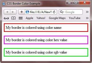
Значение цвета можно задавать тремя способами.
2. По шестнадцатеричному значению
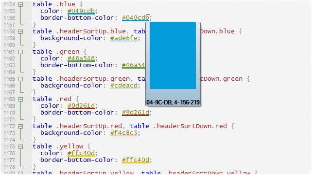
Для задания цветов используются числа в шестнадцатеричном коде. Шестнадцатеричная система, в отличие от десятичной системы, базируется, как следует из ее названия, на числе 16. Цифры будут следующие: 0, 1, 2, 3, 4, 5, 6, 7, 8, 9, A, B, C, D, E, F. Цифры от 10 до 15 заменены латинскими буквами. Числа больше 15 в шестнадцатеричной системе образуются объединением двух чисел в одно. Например, числу 255 в десятичной системе соответствует число FF в шестнадцатеричной системе. Чтобы не возникало путаницы в определении системы счисления, перед шестнадцатеричным числом ставят символ решетки #, например #666999. Каждый из трех цветов — красный, зеленый и синий — может принимать значения от 00 до FF. Таким образом, обозначение цвета разбивается на три составляющие #rrggbb, где первые два символа отмечают красную компоненту цвета, два средних — зеленую, а два последних — синюю. Допускается использовать сокращенную форму вида #rgb, где каждый символ следует удваивать. Так, запись #fe0 следует расценивать как #ffee00.
3. С помощью RGB
Можно определить цвет используя значения красной, зеленой и синей составляющей в десятичном исчислении. Значение каждого из трех цветов может принимать значения от 0 до 255. Также можно задавать цвет в процентном отношении.
Пример
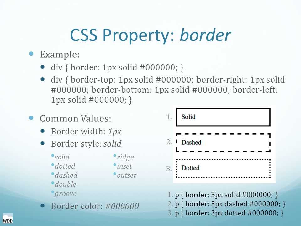
<!DOCTYPE HTML PUBLIC «-//W3C//DTD HTML 4.01//EN» «http://www.w3.org/TR/html4/strict.dtd»> <html> <head> <meta http-equiv=»Content-Type» content=»text/html; charset=utf-8″> <title>border-bottom-color</title> <style type=»text/css»> DIV#panel { background: #ccc; } #panel P { padding: 5px; margin: 0px; } #panel P#title { background: navy; color: white; border-bottom-width: 2px; border-bottom-style: solid; border-bottom-color: white; } </style> </head> <body> <div id=»panel»> <p id=»title»>Lorem ipsum dolor sit amet</p> <p>Lorem ipsum dolor sit amet, consectetuer adipiscing elit, sed diem nonummy nibh euismod tincidunt ut lacreet dolore magna aliguam erat volutpat.</p> </div> </body> </html>
Результат данного примера показан ни рис. 1.
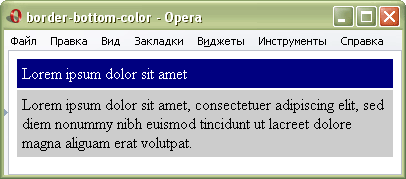
Рис. 1. Применение параметра border-bottom-color
CSS Properties
align-contentalign-itemsalign-selfallanimationanimation-delayanimation-directionanimation-durationanimation-fill-modeanimation-iteration-countanimation-nameanimation-play-stateanimation-timing-functionbackface-visibilitybackgroundbackground-attachmentbackground-blend-modebackground-clipbackground-colorbackground-imagebackground-originbackground-positionbackground-repeatbackground-sizeborderborder-bottomborder-bottom-colorborder-bottom-left-radiusborder-bottom-right-radiusborder-bottom-styleborder-bottom-widthborder-collapseborder-colorborder-imageborder-image-outsetborder-image-repeatborder-image-sliceborder-image-sourceborder-image-widthborder-leftborder-left-colorborder-left-styleborder-left-widthborder-radiusborder-rightborder-right-colorborder-right-styleborder-right-widthborder-spacingborder-styleborder-topborder-top-colorborder-top-left-radiusborder-top-right-radiusborder-top-styleborder-top-widthborder-widthbottombox-shadowbox-sizingcaption-sideclearclipcolorcolumn-countcolumn-fillcolumn-gapcolumn-rulecolumn-rule-colorcolumn-rule-stylecolumn-rule-widthcolumn-spancolumn-widthcolumnscontentcounter-incrementcounter-resetcursordirectiondisplayempty-cellsfilterflexflex-basisflex-directionflex-flowflex-growflex-shrinkflex-wrapfloatfont@font-facefont-familyfont-sizefont-size-adjustfont-stretchfont-stylefont-variantfont-weighthanging-punctuationheightjustify-content@keyframesleftletter-spacingline-heightlist-stylelist-style-imagelist-style-positionlist-style-typemarginmargin-bottommargin-leftmargin-rightmargin-topmax-heightmax-width@mediamin-heightmin-widthnav-downnav-indexnav-leftnav-rightnav-upopacityorderoutlineoutline-coloroutline-offsetoutline-styleoutline-widthoverflowoverflow-xoverflow-ypaddingpadding-bottompadding-leftpadding-rightpadding-toppage-break-afterpage-break-beforepage-break-insideperspectiveperspective-originpositionquotesresizerighttab-sizetable-layouttext-aligntext-align-lasttext-decorationtext-decoration-colortext-decoration-linetext-decoration-styletext-indenttext-justifytext-overflowtext-shadowtext-transformtoptransformtransform-origintransform-styletransitiontransition-delaytransition-durationtransition-propertytransition-timing-functionunicode-bidivertical-alignvisibilitywhite-spacewidthword-breakword-spacingword-wrapz-index
Значения
- <цвет>
- См. цвет
- transparent
- Устанавливает прозрачный цвет.
Пример
<!DOCTYPE html>
<html>
<head>
<meta charset=»utf-8″>
<title>border-bottom-color</title>
<style>
.panel {
background: #fffcd5; /* Цвет фона */
}
.panel p {
padding: 5px; /* Добавляем поля */
margin: 0; /* Убираем отступы у абзаца */
}
.title {
background: #ef7c32; /* Цвет фона */
color: white; /* Цвет текста */
border-bottom-width: 2px; /* Толщина линии внизу */
border-bottom-style: solid; /* Стиль линии внизу */
border-bottom-color: #c4005b; /* Цвет линии внизу */
}
</style>
</head>
<body>
<div class=»panel»>
<p class=»title»>Глиссандирующая ритмоформула</p>
<p>Глиссандирующая ритмоформула, на первый взгляд,
представляет собой разнокомпонентный канал,
однако сами песни забываются очень быстро.</p>
</div>
</body>
</html>
Результат данного примера показан на рис. 1.
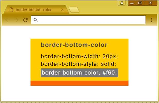
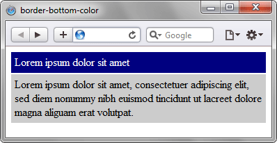
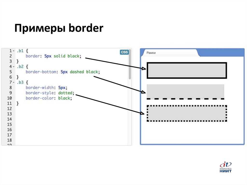
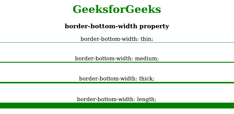
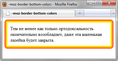
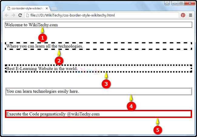
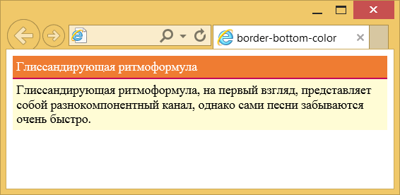
Рис. 1. Применение свойства border-bottom-color
Примечание
Internet Explorer до версии 6.0 включительно не поддерживает значение transparent.
Цвет границы в разных браузерах может несколько различаться при использовании значений стиля groove, ridge, inset или outset.
Спецификация
| Спецификация | Статус |
|---|---|
| Возможная рекомендация | |
| Рекомендация |
Спецификация
Каждая спецификация проходит несколько стадий одобрения.
- Recommendation (Рекомендация) — спецификация одобрена W3C и рекомендована как стандарт.
- Candidate Recommendation (Возможная рекомендация) — группа, отвечающая за стандарт, удовлетворена, как он соответствует своим целям, но требуется помощь сообщества разработчиков по реализации стандарта.
- Proposed Recommendation (Предлагаемая рекомендация) — на этом этапе документ представлен на рассмотрение Консультативного совета W3C для окончательного утверждения.
- Working Draft (Рабочий проект) — более зрелая версия черновика после обсуждения и внесения поправок для рассмотрения сообществом.
- Editor’s draft (Редакторский черновик) — черновая версия стандарта после внесения правок редакторами проекта.
- Draft (Черновик спецификации) — первая черновая версия стандарта.
Браузеры
| 4 | 7 | 12 | 1 | 9.2 | 1 | 1 |
| 1 | 1 | 6 | 1 |
Браузеры
В таблице браузеров применяются следующие обозначения.
- — элемент полностью поддерживается браузером;
- — элемент браузером не воспринимается и игнорируется;
- — при работе возможно появление различных ошибок, либо элемент поддерживается с оговорками.
Число указывает версию браузреа, начиная с которой элемент поддерживается.
Starting Your HTML Page
Building a Box
Starting with the following code sample, you can see that some CSS has been added so that a box is defined with actual borders. This box will contain a “solid” border with a defined color. Starting with a full bordered box will allow you to see the transformations as you progress in this tutorial.
Adding Border-Bottom-Width to the CSS
When adding the border-bottom property, you need to first define the width of the border. This will define only the bottom border of the box and as such, should be defined differently to set it apart from the rest. You can use the values listed above including pixel dimensions to have more control over the exact thickness of the border.
As you can see, the bottom border has now been well defined.
Adding a New Color to the Border-Bottom Property
Now that you have defined the border thickness, it is now time to use the border-bottom-color property to define a specific color to the border.
As you can see, the bottom border has been defined with the dark green color added into the CSS.
Adding a Specific Style to the Border-Bottom Property
Now that you have defined both the border thickness and the border color, it is now time to use the border-bottom-style property to define a specific style to the border.
As you can see, the bottom border has been defined with the dotted style as defined in the CSS.
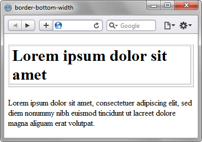
CSS Border Width
The CSS border-width property specifies the width of the border. You can set this property using keyword values or length values. Let’s take a quick look at them below.
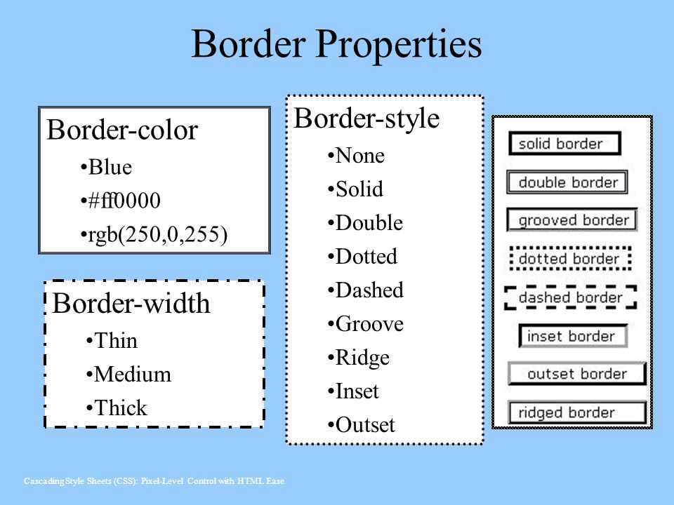

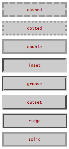
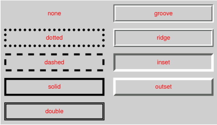
- Keyword values: thin, medium, thick
- Length values: px, pt, em, rem, vh, and more
Like the border-style property, the border-width property can have between one and four values. If only one value is defined, then it applies to all sides of the element. If two values are defined, then the first value represents the top and bottom border widths and the second represents the right and left border widths. If three values are defined, the first value represents the top border width, the second represents the left and right, and the fourth represents the bottom width. If four values are defined, they represent the top, right, bottom, and left, respectively.
Let’s take a look at examples defined by different border-width values below.
See the Pen CSS Border Width by Christina Perricone (@hubspot) on CodePen.
Border Bottom
You can set the color, style and width of the bottom border around an element in one declaration with the border-bottom property.
border-bottom: 1px solid #333333;
Values:
- color
- style
- width
Or you can set each value individually
Border Bottom Color
You can set the color of the bottom border around an element with the border-bottom-color property.
border-bottom-color: value;
Border Bottom Style
You can set the style of the bottom border around an element with the border-bottom-style property.
border-bottom-style: value;
Border Bottom Width
You can set the width of the bottom border around an element with the border-bottom-width property.
border-bottom-width: value;
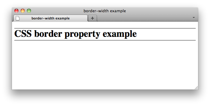
CSS Border Not Showing
If you’ve set the shorthand border property in CSS and the border is not showing, the most likely issue is that you did not define the border style. While the border-width and border-color property values can be omitted, the border-style property must be defined. Otherwise, it will not render.
If values for the border-width and border-color properties are omitted, the border line will be rendered as black and about 3px wide by default.
Here’s an example of a border that shows because it’s been coded correctly, and a border that doesn’t show because it’s been coded incorrectly.
See the Pen CSS Border Not Showing by Christina Perricone (@hubspot) on CodePen.
CSS Свойства
align-contentalign-itemsalign-selfallanimationanimation-delayanimation-directionanimation-durationanimation-fill-modeanimation-iteration-countanimation-nameanimation-play-stateanimation-timing-functionbackface-visibilitybackgroundbackground-attachmentbackground-blend-modebackground-clipbackground-colorbackground-imagebackground-originbackground-positionbackground-repeatbackground-sizeborderborder-bottomborder-bottom-colorborder-bottom-left-radiusborder-bottom-right-radiusborder-bottom-styleborder-bottom-widthborder-collapseborder-colorborder-imageborder-image-outsetborder-image-repeatborder-image-sliceborder-image-sourceborder-image-widthborder-leftborder-left-colorborder-left-styleborder-left-widthborder-radiusborder-rightborder-right-colorborder-right-styleborder-right-widthborder-spacingborder-styleborder-topborder-top-colorborder-top-left-radiusborder-top-right-radiusborder-top-styleborder-top-widthborder-widthbottombox-decoration-breakbox-shadowbox-sizingcaption-sidecaret-color@charsetclearclipcolorcolumn-countcolumn-fillcolumn-gapcolumn-rulecolumn-rule-colorcolumn-rule-stylecolumn-rule-widthcolumn-spancolumn-widthcolumnscontentcounter-incrementcounter-resetcursordirectiondisplayempty-cellsfilterflexflex-basisflex-directionflex-flowflex-growflex-shrinkflex-wrapfloatfont@font-facefont-familyfont-kerningfont-sizefont-size-adjustfont-stretchfont-stylefont-variantfont-weightgridgrid-areagrid-auto-columnsgrid-auto-flowgrid-auto-rowsgrid-columngrid-column-endgrid-column-gapgrid-column-startgrid-gapgrid-rowgrid-row-endgrid-row-gapgrid-row-startgrid-templategrid-template-areasgrid-template-columnsgrid-template-rowshanging-punctuationheighthyphens@importisolationjustify-content@keyframesleftletter-spacingline-heightlist-stylelist-style-imagelist-style-positionlist-style-typemarginmargin-bottommargin-leftmargin-rightmargin-topmax-heightmax-width@mediamin-heightmin-widthmix-blend-modeobject-fitobject-positionopacityorderoutlineoutline-coloroutline-offsetoutline-styleoutline-widthoverflowoverflow-xoverflow-ypaddingpadding-bottompadding-leftpadding-rightpadding-toppage-break-afterpage-break-beforepage-break-insideperspectiveperspective-originpointer-eventspositionquotesresizerighttab-sizetable-layouttext-aligntext-align-lasttext-decorationtext-decoration-colortext-decoration-linetext-decoration-styletext-indenttext-justifytext-overflowtext-shadowtext-transformtoptransformtransform-origintransform-styletransitiontransition-delaytransition-durationtransition-propertytransition-timing-functionunicode-bidiuser-selectvertical-alignvisibilitywhite-spacewidthword-breakword-spacingword-wrapwriting-modez-index
Пример
<!DOCTYPE html>
<html>
<head>
<meta charset=»utf-8″>
<title>border-bottom-color</title>
<style>
.panel {
background: #fffcd5; /* Цвет фона */
}
.panel p {
padding: 5px; /* Добавляем поля */
margin: 0; /* Убираем отступы у абзаца */
}
.title {
background: #ef7c32; /* Цвет фона */
color: white; /* Цвет текста */
border-bottom-width: 2px; /* Толщина линии внизу */
border-bottom-style: solid; /* Стиль линии внизу */
border-bottom-color: #c4005b; /* Цвет линии внизу */
}
</style>
</head>
<body>
<div class=»panel»>
<p class=»title»>Глиссандирующая ритмоформула</p>
<p>Глиссандирующая ритмоформула, на первый взгляд,
представляет собой разнокомпонентный канал,
однако сами песни забываются очень быстро.</p>
</div>
</body>
</html>

Результат данного примера показан на рис. 1.
Рис. 1. Применение свойства border-bottom-color
Синтаксис
Синтаксис
| Описание | Пример | |
|---|---|---|
| <тип> | Указывает тип значения. | <размер> |
| A && B | Значения должны выводиться в указанном порядке. | <размер> && <цвет> |
| A | B | Указывает, что надо выбрать только одно значение из предложенных (A или B). | normal | small-caps |
| A || B | Каждое значение может использоваться самостоятельно или совместно с другими в произвольном порядке. | width || count |
| Группирует значения. | ||
| * | Повторять ноль или больше раз. | * |
| + | Повторять один или больше раз. | <число>+ |
| ? | Указанный тип, слово или группа не является обязательным. | inset? |
| {A, B} | Повторять не менее A, но не более B раз. | <радиус>{1,4} |
| # | Повторять один или больше раз через запятую. | <время># |
Where to Next?
The “How to Apply the CSS Property: border-bottom” tutorial should provide a starting point for further inquiry into the world of HTML properties for customizing your web layout while always keeping in mind the practical applications with HTML and CSS.
Check out “An Introduction to Margins and Padding in CSS and HTML,” and Designing CSS Borders to enhance your understanding and expand your horizon.
HTML is a great way to start learning code, but the professional world demands more and more. Why not supercharge your skills and options by taking it even further. Enroll in our Intro to Programming Nanodegree program today!