
Transcript
Welcome to Learn WordPress. Join me as we explore the difference between padding and margin. Padding and margin are two important properties, and they essentially do the same thing. They create extra space. But the question is, where?
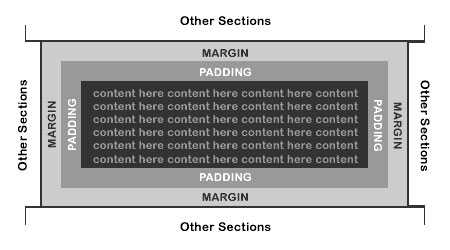
Well, padding is what creates space inside a block, and margin is what creates space around a block. Hopefully, this visual depiction will make it more clear. The margin adds space around the border of a block or element, and padding creates space inside the block or element’s boundary. Various dimension controls are built into different blocks to help you achieve greater customization for your layout and design, especially when combined, and padding and margin are two of these controls that we are talking about today.
You can find the dimension controls in the block settings sidebar under the label Dimensions. Once you are able to see the dimension section, you can click on the three vertical dots and select Margin. You will notice you also have the option to opt-in for Block Spacing. So these are additional dimension controls that you can explore. Some blocks have margin as optional, but some might only allow you to change the padding. Please note a lot of work is being done to add additional controls to more blocks to provide extra flexibility.
So let’s first look at padding settings. As mentioned, this setting impacts the space between a block’s content and its border. You can set the padding for all sides by using the slider in your sidebar settings from zero to double XL. Or you can set a custom size by dragging up and down below padding or using the available slider. When you click on Unlink sides, you have the option to configure the value of each side separately. You will notice now you can change the top or only the right or the bottom or only the left. And when you click on the three vertical dots, you have the option to reset all.
Now, let’s take a closer look at margin. The margin setting impacts the space around a block. Very important, margin is usually used to add gaps between elements on a page. So, for example, you can use the margin setting to add a gap between the Group block and the Heading block in this example. As mentioned previously, to change the margin setting, we have to click on the three vertical dots and select Margin. And to change the margin consistently, we also have the slider option from zero to double XL or we can set a custom size.
One difference you will notice when we change the margin setting is that we are only changing the top and the bottom. When you click on Unlink sides, you once again have the option to configure separate values for the top and bottom margin. Let’s use the slider options again for the top, for the bottom and then if we click on the three vertical dots, we can reset it again. Just one thing to note. When you change the margin settings for a heading or a paragraph, you will be able to change the margin for the top, the left, the bottom and the right.
Let’s finish off by looking at a few examples where we change the padding and the margin to improve the design. In our first example, we are going to change the padding to enlarge the space around the text in our Buttons block. And to do that, we can, of course, use the slider in our sidebar settings, but in this case, I’m going to change the values separately and set a custom size for each.
Firstly, I will change the unit of measurement to pixels and change the vertical value to 10 pixels and the horizontal value to 35 pixels, and there you go. Before we look at our second example, it is worth mentioning that when you add a block, default styling is applied in the Block Editor. But you can, of course, change this by altering the dimension settings. I’ve added two Columns blocks to this page. Firstly, I’m going to add more space around the text and image in the top Columns block by altering the padding settings. So I’ll make sure I select the parent block and then open up my sidebar settings, then I will click on set custom size and change the padding to 60 pixels.
Next, I’m going to add some more space between the two Columns blocks. So I’ll click on the three vertical dots, select margin and this time around, I’m going to use the slider and change the margin to extra large. In the last example, I’ve added a Cover block with some information, and I’m going to change the padding as the text is too far to the left. So to do that, I’m going to select the parent block, the Cover block, and then open the sidebar settings and drag the slider all the way to the right, 100 pixels, and now the information is much better positioned.
What is the Difference Between Margin vs Padding?
Let’s begin with a crucial difference between padding and margin. A margin is the space around an element, while padding is the space inside of an element. You use a margin to ensure that other elements aren’t too close to the element in question. You use padding to make space inside of the element itself.
Let’s start with some simple source code. We’re going to create two boxes; an outer box and an inner box. The outer box will contain the inner box.
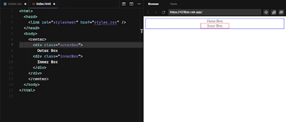
Both these boxes currently have default padding and default margin, which looks like this:
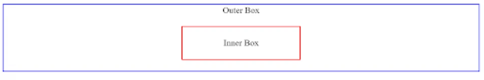
You can see that the image below has no padding throughout; it’s just the “content” of the box, as well as a border.
Now, let’s change the inner box’s margin to 20px.
Here are the results:
As you can see, 20 pixels have been added around the inner box and its border. It actually made the outer box bigger, not the inner box.
Now let’s change the inner box’s padding to 20px.
We update the results:
Now the inner box has 20 pixels added inside of its border as well as outside of its border. Adding the padding made the inner box bigger.
Visually, if we removed all the borders, “margin” and “padding” would operate very similarly. They would all denote space between the content inside the div and the content around the div.
But “margin” will always denote space outside of the div, whereas “padding” will always denote space inside the div — it’s that simple.
|
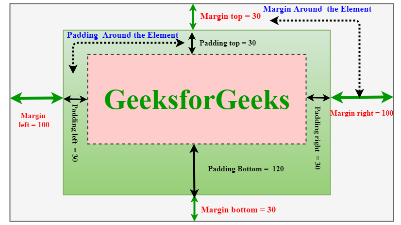
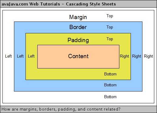
Margin refers to the space just beyond the content and the border. Padding refers to the space between the content and the border. |
Margin #
If you want to add space to the outside of an element, you use the property. Margin is like adding a cushion around your element. The property is shorthand for , , and .
The shorthand applies properties in a particular order: top, right, bottom and left. You can remember these with trouble: TRouBLe.
The shorthand can also be used with one, two, or three values. Adding a fourth value lets you set each individual side. These are applied as follows:
- One value will be applied to all sides. ().
- Two values: the first value will be applied to the top and bottom sides, and the second value will be applied to the left and right sides. ()
- Three values: the first value is , the second value is and , and the third value is . ().
Margin can be defined with a length, percentage or auto value, such as or . If you use a percentage, the value will be calculated based on the width of your element’s containing block.
This means that if your element’s containing block has a width of and your element has a value of : each side of your element will have a computed margin of .
You can also use a value of for margin. For block level elements with a restricted size, an margin will take up available space in the direction that it is applied to. A good example is this one, from the flexbox module, where the items push away from each other.
Another good example of margin is a horizontally centered wrapper which has a max width. This sort of wrapper is often used to create a consistent center column on a website.
Here, margin is removed from the top and bottom (block) sides, and shares the space between the left and right (inline) sides.
Negative margin
Negative values can also be used for margin. Instead of adding space between adjacent sibling elements, it will reduce space between them. This can result in overlapping elements, if you declare a negative value that’s more than the available space.
Margin collapse
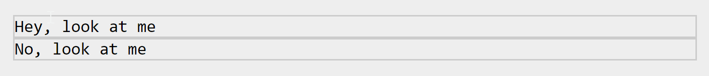
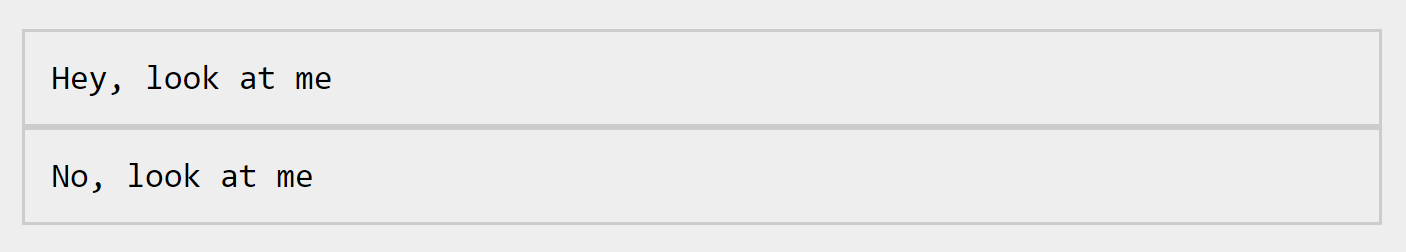
Margin collapse is a tricky concept, but it’s something you’ll run into very commonly when building interfaces. Say you have two elements: a heading and a paragraph that both have vertical margin on them:
At first glance, you would be forgiven for thinking that the paragraph will be spaced from the heading, because and combined calculate to . Because vertical margin collapses, though, the space is actually .
Margin collapse works by selecting the largest value of two adjoining elements with vertical margin set on the adjoining sides. The bottom of the meets the top of the , so the largest value of the ‘s bottom margin and the ‘s top margin is selected. If the were to have of bottom margin, the space between them both would then be because that is larger than . Only block margins collapse, not inline (horizontal) margins.
Margin collapse also helps with empty elements. If you have a paragraph that has a top and bottom margin of , it will only create of space: not . If anything is added to the inside of this element though, including , its margin will no longer collapse in itself and will be treated as any box with content.
If two elements stacked on top of each other both have 20px of top margin and 30px of bottom margin, how much space will there be between them?
10px 20px 30px 40px
Try again!
Not quite
CSS will take the larger of the margin spaces between elements yep!
Try again!
Preventing margin collapse
If you make an element absolutely positioned, using , the margin will no longer collapse. The margin also won’t collapse if you use the property, too.
![[ в закладки ] css: использование внутренних и внешних отступов](https://rwvt.ru/wp-content/uploads/d/4/8/d485acb7cb62c6cdb9a650f9e4b70fe7.jpeg)
If you have an element with no margin between two elements with block margin, the margin won’t collapse either, because the two elements with block margin are no longer adjacent siblings: they are just siblings.
In the layout lesson, you learned that flexbox and grid containers are very similar to block containers, but handle their child elements very differently. This is the case with margin collapse, too.
If we take the original example from the lesson and apply flexbox with column direction, the margins are combined, instead of collapsed. This can provide predictability with layout work, which is what flexbox and grid containers are designed for.
Margin and margin collapse can be tricky to understand, but understanding how they work, in detail, is very useful, so this detailed explainer is strongly recommended.
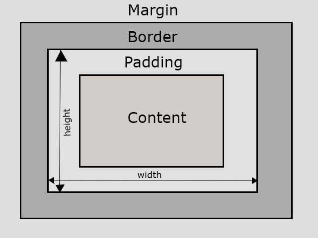
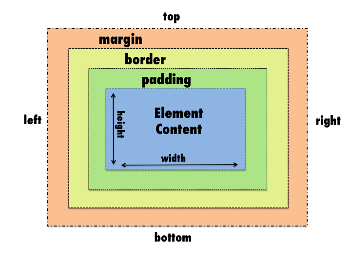
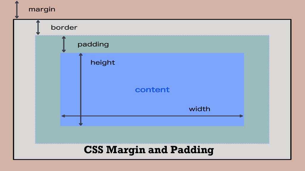
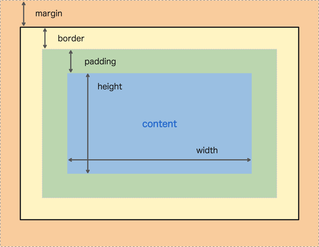
The CSS Box Model
When it comes to designing the layout of a web page, the CSS Box Model is arguably one of the most important concepts to understand. If you know what the CSS Box Model is and how it works, then you’ll better understand the how to use padding and margin the right way.
Why It’s Important
Every web page is composed of nothing but boxes. It’s true. Even if it doesn’t quite look like a box, it’s still a box. That includes circles, text, and triangles too.
To illustrate, here are a few things you might see on a web page that you wouldn’t consider to be very box-shaped.

However, from a web browser’s perspective, these same shapes look like this:
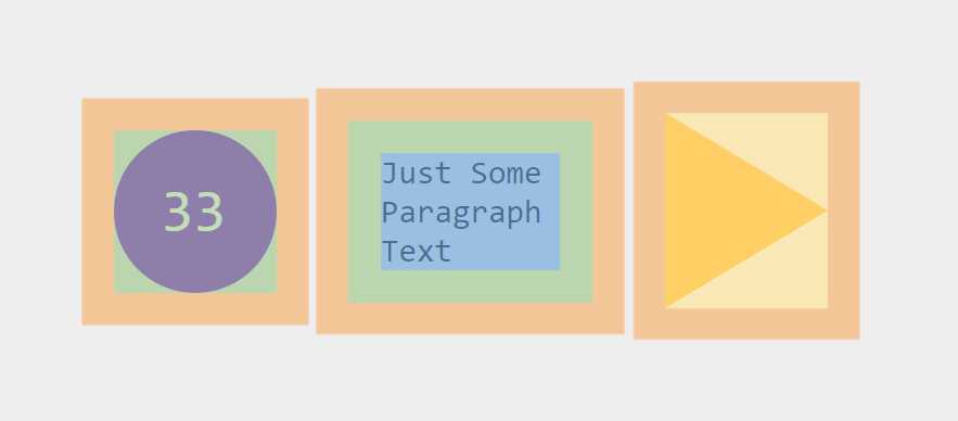
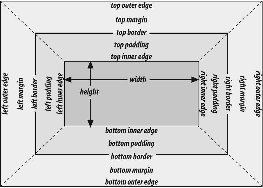
All elements in HTML have a top, bottom, left side, and right side. When you picture elements in this way, the CSS Box Model makes much more sense.
Parts of the CSS Box Model
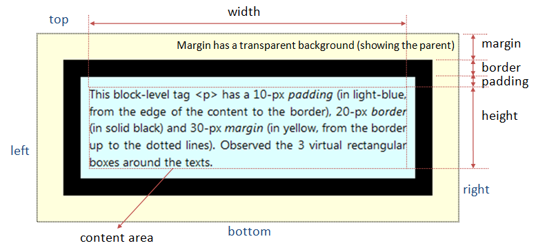
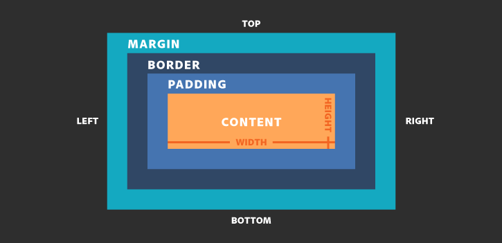
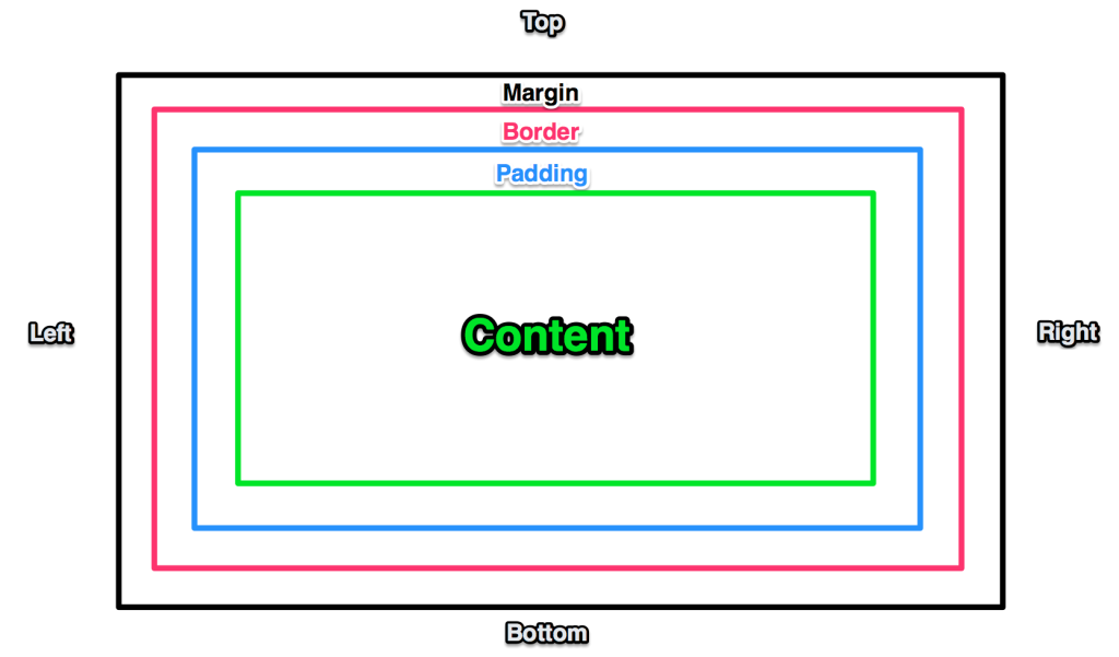
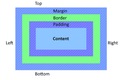
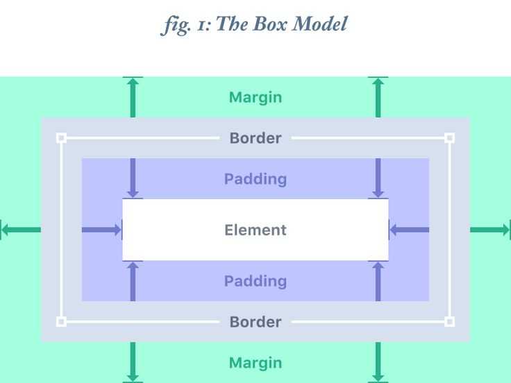
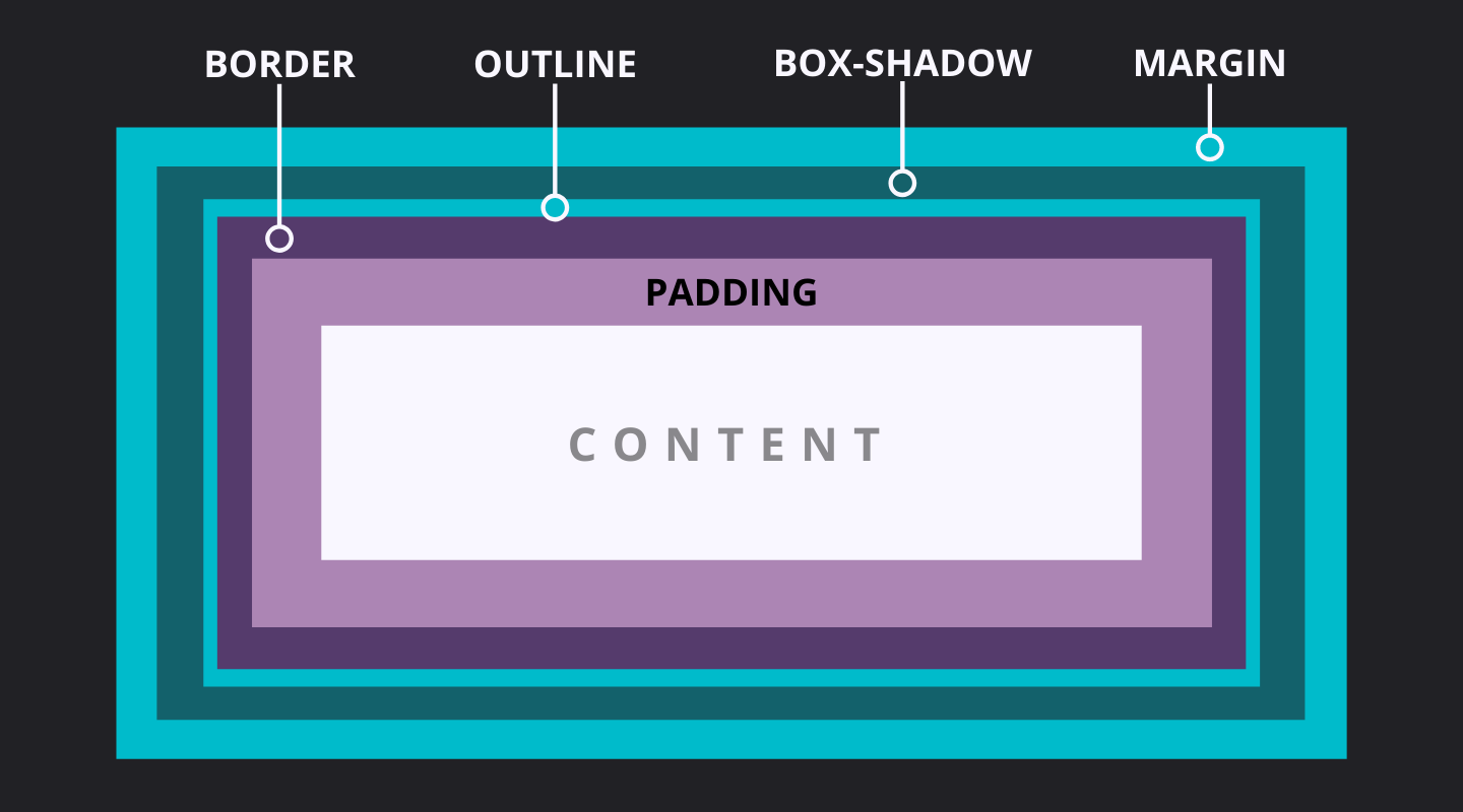
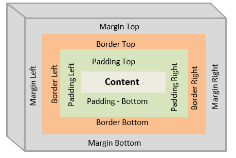
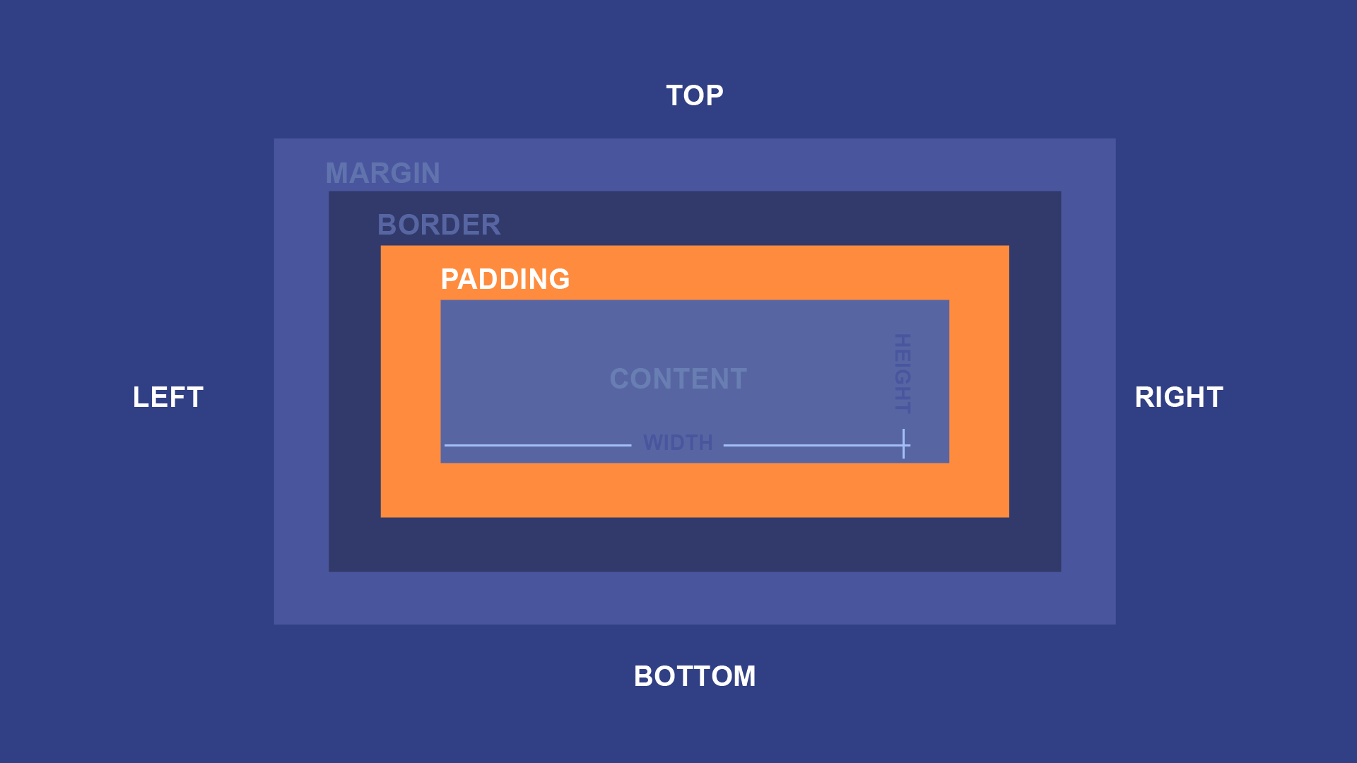
The CSS Box Model consists of 4 parts. Starting from the inside of the box and moving outward, we have the Content, Padding, Border, and Margin.
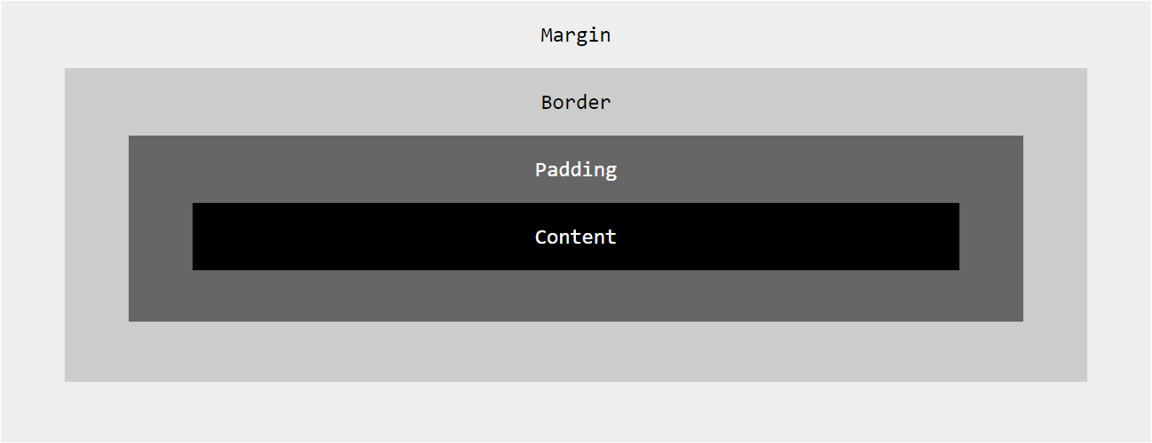
As illustrated above, padding and margin only represent half of the CSS box model. Unfortunately, they happen to be the “invisible” half, which is why it’s difficult to see (pun intended) what the difference is between them.
With this in mind, it’s easier to explain the difference between padding and margin if we include the two “visible” parts of the CSS Box Model: content and border.
Content, Border, Padding, and Margin
Below we have two paragraph tags. Our content can be found between the <p> and </p>. We’ve also specified a border to go around this content in the CSS.
HTML
CSS
Result
Great, now we can see what we’re working with here. How will margin and padding affect these two paragraph elements? Will they do the same thing?
Let’s start with padding and find out. We can give the content a little more “breathing room,” with padding.
CSS
Result
And we can add space “between” the two paragraph tags by adding some margin.
CSS
Result
Now we’ve created space inside and outside of the border. With a border visible it’s easier to “see” the difference between padding and margin.
Combining Padding with CSS Grid and Flexbox
Achieving Layout Consistency with Padding and CSS Grid
CSS Grid is a powerful layout system that provides precise control over the placement and alignment of elements. By incorporating padding within CSS Grid layouts, you can achieve layout consistency and fine-tune the spacing between grid items:
Padding within Grid Cells
Apply padding directly to grid items to create spacing between the content and the cell boundaries. This can be done by setting the property on the grid item:
.grid-item {
    padding: 10px;
}
The padding will create a space between the content and the edges of each grid cell, enhancing readability and visual separation.
Padding for Grid Gaps
CSS Grid allows you to specify gaps between grid rows and columns using the property. By combining padding with grid gaps, you can fine-tune the spacing between grid items and achieve consistent alignment:
.grid-container {
   display: grid;
  grid-template-columns: repeat(3, 1fr);
  grid-gap: 20px;
  padding: 10px;
}
In this example, the padding adds space within the grid container, while the grid-gap property defines the gaps between rows and columns. The combination of padding and grid gaps ensures consistent spacing and alignment of the grid items.
Aligning Elements Using Padding in Flexbox Layouts
Flexbox is another powerful layout system that provides flexibility in arranging elements along a single axis or in multiple dimensions. Padding can be used effectively within Flexbox layouts to control spacing and alignment:
Padding for Flex Items
By applying padding to flex items, you can control the space between the content and the flex container. This is useful for achieving consistent spacing and alignment within a Flexbox layout:
.flex-item {
   padding: 10px;
}
The padding adds space between the content and the edges of the flex items, ensuring consistent spacing and enhancing the overall design.
Padding for Flexbox Alignment
Padding can also be used in combination with Flexbox alignment properties, such as and , to fine-tune spacing and positioning:
.flex-container {
   display: flex;
  justify-content: center;
  align-items: center;
  padding: 20px;
}
In this example, the padding within the flex container creates space between the content and the container edges while maintaining centered alignment of flex items.
By incorporating padding within CSS Grid and Flexbox layouts, you can achieve consistent spacing, enhance alignment, and create visually appealing and well-structured designs.
Learning More About Margin and Padding in CSS
Now you know the differences between margin and padding in CSS and HTML. To reiterate:
- Margin refers to the white space surrounding an element such as a DIV, SPAN, or P.
- Padding refers to the white space within an element such as a DIV, SPAN, or P.
In CSS, both margin and padding can be set as such:
In HTML, you need to use tables:
CSS provides for granular control of many attributes throughout an HTML/CSS page. If you need to modify something on an HTML page, there’s almost guaranteed to be a CSS attribute to do so.

Now that you have expanded your knowledge of margin vs padding in CSS and HTML, consider taking an HTML/CSS course, undergoing an intensive HTML/CSS boot camp, or just referring to a CSS cheat sheet. With these new skills, you’ll be able to build your own website from scratch. we recommend using NameCheap to buy a domain name and web hosting services. They’re the best in the industry and super affordable.
Recommened HTML/CSS Courses from Udemy!

People are also reading:
- Difference Between CSS, CSS2, And CSS3
- 9 Best HTML Certifications to Become a Web Developer
- Best CSS Frameworks for Front-End Developers
- Best HTML Courses for Web Development
- 10 Free HTML Projects for Beginners (With Source Code)
- 10 Best CSS Editors for Windows and Mac
- Top Bootstrap Alternatives
HTML spacing #
HTML itself provides some methods to space elements. The and elements allow you to space elements in the block direction, which if you are in a latin-based language, is top-to-bottom.
If you use a element, it will create a line-break, just like if you were to press your enter key in a word processor.
The creates a horizontal line with space either-side, known as .
Along with using HTML elements, HTML entities can create space. An HTML entity is a reserved string of characters that are replaced with character entities by the browser. For example, if you were to type in your HTML file, it would be converted into a character. The entity is converted into a non-breaking space character, which provides an inline space. Be careful though, because the non-breaking aspect of this character stitches the two elements together, which can result in odd behaviour.
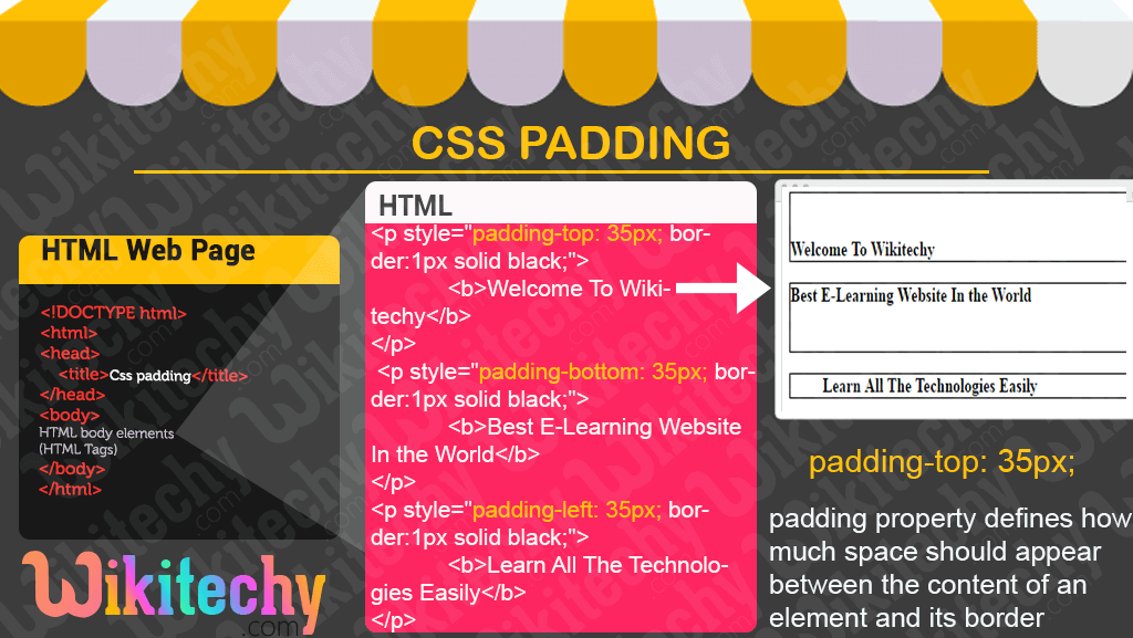
padding-внутренний отступ.
Для того чтобы можно было задать внутренний отступ на сайте есть целый ряд команд, позволяющих задавать отступ с конкретной стороны.
Для того чтобы задать отступ слева нужно применить команду padding-left и указать размер в одной из величин которые приняты в CSS и чаще всего это пиксели.
padding-left:17px;
Отступ справа задается командой padding-right и также само указываете конкретную цифру в одном из принятых единиц измерения.
padding-right:22px;
Для того чтобы задать внутренний отступ сверху нужно применить команду padding-top и указать размер в принятых величинах.
padding-top:20px;
Для задания отступа снизу блока нужна команда padding-bottom с размером.
padding-bottom:25px;
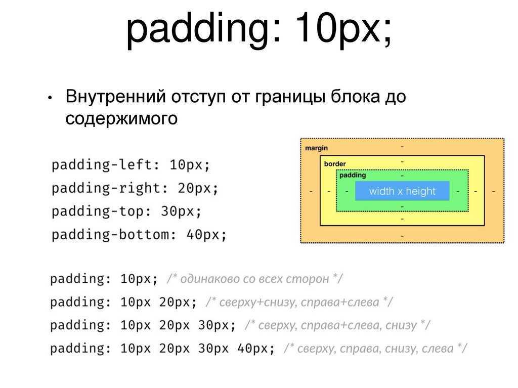
Для того чтобы сократить размер записываемого кода то нужно применить команду padding и сейчас я покажу как это можно сделать.
В данной записи я указал для всех краев отступ в десять пикселей. В данной записи первое значение задает размер сверху, второе справа, третье снизу и четвертое значение слева.
Также можно задать не все значения а только два и тогда первое значение отвечает за отступ сверху и снизу а второе слева и справа.
Пример:padding:10px 20px;
Также можно задать только три значения и тогда первая цифра отвечает за отступ сверху, второе за отступ слева и справа а третье-отступ снизу. Все эти варианты помогут вас существенно сократить размер файла стилей и вам самому будет проще разобраться в нем.
Атрибут стиля margin.
Для того чтобы задать внешний отступ между блоками нам нужно воспользоваться атрибутом стиля margin и сейчас мы посмотрим как все это можно выполнить. Данный атрибут очень похож на предыдущий и с одной только разницей что задает внешний отступ.
Для задания верхнего отступа нам понадобится команда margin-top и вот как это выглядит на практике.
margin-top:10px;
Теперь определенный нами элемент будет иметь верхний отступ от соседних блоков на десять пикселей.
Для отступа снизу мы применим атрибут margin-bottom и укажем точный размер. Например для того чтобы задать нижний отступ на двадцать пикселей нам нужно добавить следующую команду:
margin-bottom:20px;
Отступы слева и справа задаются командами margin-left и margin-right соответственно и для этого нам понадобится следующий код:
Для отступа слева на семнадцать пикселей: margin-left:17px;
И для отступа справа на тот же расстояние: margin-right:17px;
Также как и в предыдущем примере вы можете сократить запись записав просто margin и указав по порядку все параметры через пробел. Примерно так:
margin:10px 17px 20px 17px;
И также само задает первое значение отступ сверху, справа, снизу и слева соответственно.
Теперь давайте посмотрим как это все выглядит на практике. Для примера давайте возьмем каркас с статьи про блоки в CSS. Давайте для начала мы заполним блок основного контента текстом произвольного содержания.
Теперь мы видим что текст прилип непосредственно к границам блока и это выглядит не очень красиво и сейчас мы это исправим при помощи внутреннего отступа. Пропишем в файл стилей следующую команду:
.content{padding:20px 20px 20px 20px;}
Давайте теперь разберемся что мы написали. Точка перед словом content означает что мы задаем параметр для классов а content это название нашего класса. Ну а в скобках мы указываем команду а через двоеточие параметры отступов. На практике это выглядит так:
Как мы видим у нас получилась рамка размером в двадцать пикселей.
Теперь чтобы показать как работает параметр margin зададим для все того же блока отступы от остального содержимого.
.content{margin:10px 17px 20px 17px;}
После применения этих стилей наш блок будет отделен от остальных контейнеров на определенное расстояние.
На этом статья закончена и я думаю что вам теперь понятно как нужно применять на практике параметры стилей padding и margin и вы сможете задать отступ для любого блока и элемента на своей странице.
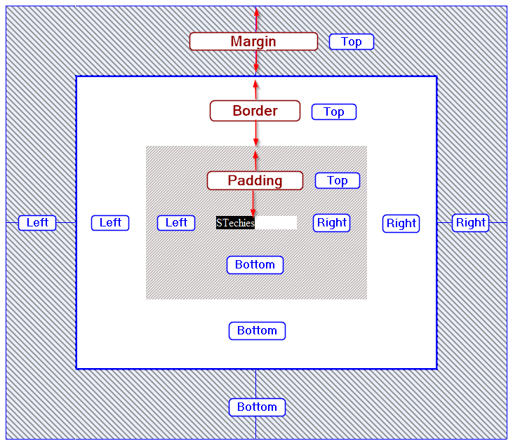
How to Add Margins in CSS
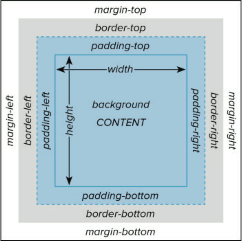
Every HTML element has four margins that you can toggle: top, right, bottom, and left.
To set the same margin value on all four sides of an element, use the margin property. To set the margin for specific sides of an element, use the margin-top, margin-right, margin-bottom, and margin-left properties.

See the Pen CSS Margin vs. Padding — Setting Margins 1 by Christina Perricone (@hubspot) on CodePen.
You can also specify the margin property with two, three, or four values depending on the sides you want to apply margins to. If you want even margins on every side, you’ll only need to apply one value. Otherwise, the order of the values is important:
- Two values apply to the top and bottom, then right and left.
- Three values apply to the top, then right and left, then bottom.
- Four values apply to the top, then right, then bottom, then left.
See the Pen CSS Margin vs. Padding — Setting Margins 2 by Christina Perricone (@hubspot) on CodePen.
Each value can be represented as a fixed length (often in px), a percentage (which defines the value as a percentage of the width of its container), or auto (which lets the browser set the margin).
Padding and Replaced Elements
Padding can be applied to replaced elements whether it is block-level or inline, such as an image, iframe, or video elements. Padding of an inline replaced element does have an effect on the line height.
Replaced elements are those whose representation is outside the scope of CSS. Some of the common replaced elements are:
-
<iframe>
-
<video>
-
<embed>
-
<img>
Let us see an example for padding applied to a replaced element (<img>):
<html>
<head>
<style>
   img {
      padding: 25px; background:#eee; border:1px solid #aaa
   }
</style>
</head>
<body>
   <div>
      <h5>This example demonstrates the padding applied to a replaced elements.</h5>
      <img src="/images/logo.png" alt="logo">
   </div>
</body>
</html>
When to Use Margin vs. Padding
While visually margins and padding may seem similar, there’s an important distinction — a margin doesn’t count as part of the element itself, whereas padding does.
If you were to click on the padding of an element, it would still register as clicking on that element. But if you were to click on the margin, it wouldn’t. This is the most important distinction between margins and padding.
Both margins and padding are generally used to create white space around elements to make them more readable:

In the above passage, padding isn’t set, and the border is uncomfortably close to the text.
Now that the above padding is set, the text feels more readable.
Likewise, let’s say that we added an H2 heading, but we wanted it to have a red banner:
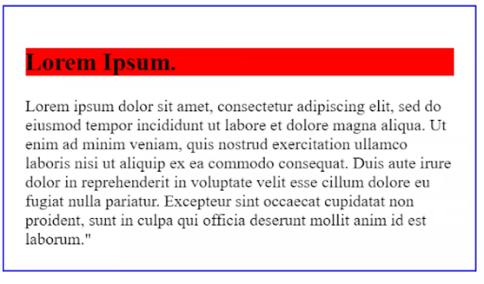
The background cuts off very close to the letters because there’s no padding. Let’s add 10px of padding:
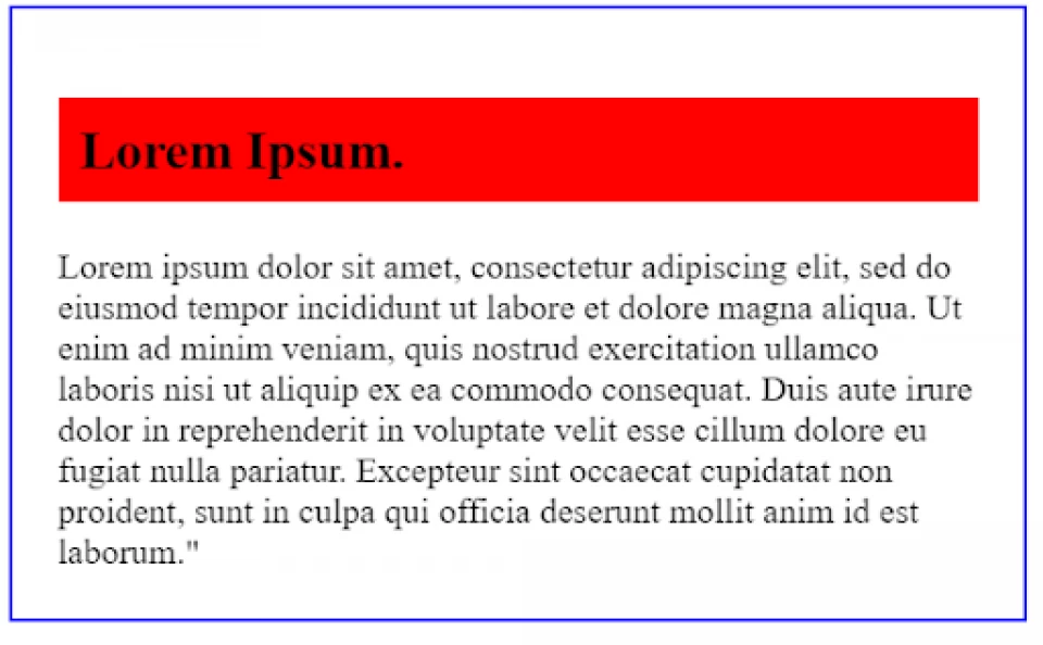
The padding gives the heading text more space to breathe.
And this highlights another important difference in padding vs margin. The margin would have only added space around the H2 — it wouldn’t have helped with the background color because the background color is only applied within the element, not outside of the element.