8.6 The box model for inline elements in bidirectional context
For each line box, UAs must take the inline boxes generated for
each element and render the margins, borders and padding in visual
order (not logical order).
When the element’s property is ‘ltr’, the
left-most generated box of the first line box in which the element
appears has the left margin, left border and left padding, and the
right-most generated box of the last line box in which the element
appears has the right padding, right border and right margin.
When the element’s property is ‘rtl’, the
right-most generated box of the first line box in which the element
appears has the right padding, right border and right margin, and the
left-most generated box of the last line box in which the element
appears has the left margin, left border and left padding.
previous
next
properties
index
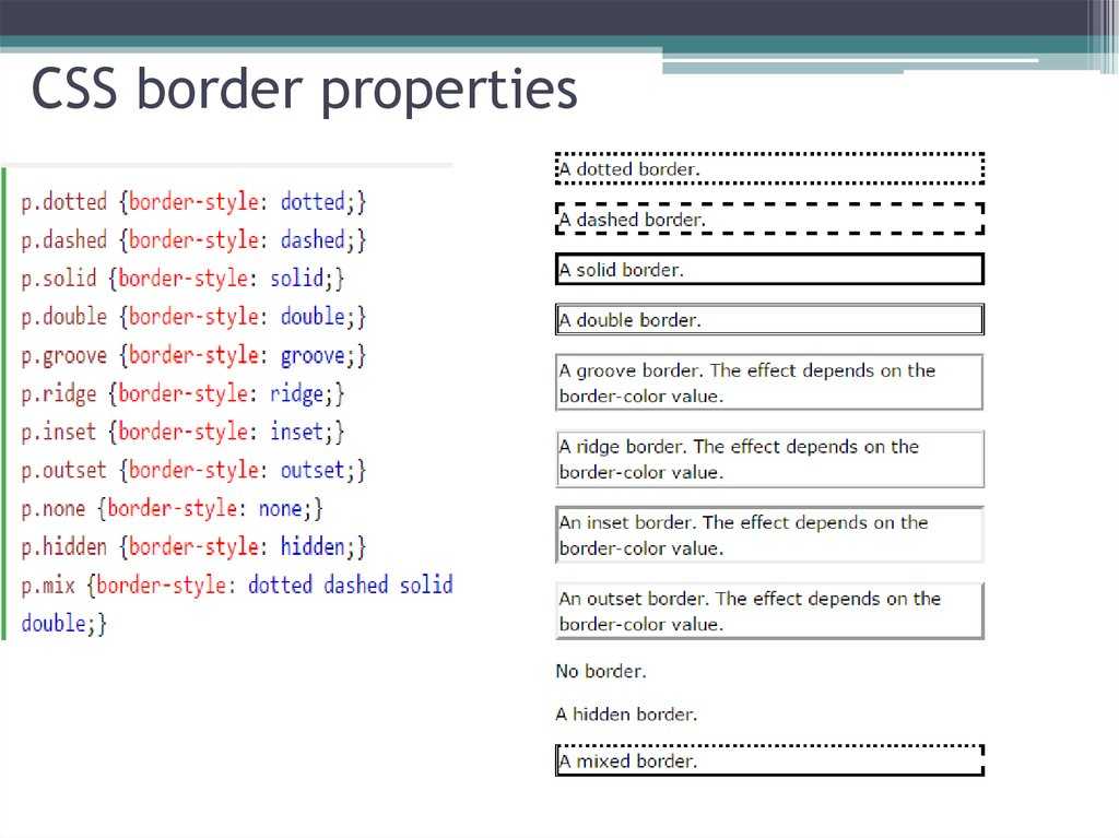
Основы использования css border
Наверняка, вы уже ознакомлены со стандартным использованием border свойства:
border: 1px solid black;
Код выше, выведет рамку в 1px, которая будет черного цвета. Легко и просто. Также можно немного расширить синтаксис:
border-width: thick;
border-style: solid;
border-color: black;
Как дополнение, можно использовать специфические значения свойства border-width, три ключевых слова: thin, medium, thick.
Но использование расширенного синтаксиса не всегда практично. Давайте рассмотрим пример, когда нужно изменить цвет рамки блока, при наведении мыши. В таком случае использование сокращенного синтаксиса гораздо проще:
.box {
    border: 1px solid red;
}
.box:hover {
    border: 1px solid green;
}
Более элегантно и проще можно сделать следующим образом:
.box {
    border: 1px solid red;
}
.box:hover {
    border-color: green;
}
Как видите, расширенная техника также полезна, когда мы меняем только некоторые свойства: width, style, color и другие.
Border-Radius
Border-radius – это «золотое» свойство CSS3 – первое, наиболее распространенное свойство, которое стало практичным и полезным. Исключая IE8 и версии ниже, все браузеры отображают закругленные уголки с помощью этого.
Хотя, необходимо использовать специальные префиксы для Webkit и Mozilla, чтобы стилизация была корректной.
-webkit-border-radius: 10px;
-moz-border-radius: 10px;
border-radius: 10px;
В сегодняшнее время, мы можем убрать специальные префиксы, и использовать стандартную форму border-radius.
Еще одна привилегия в том, что мы можем использовать специальные значения для каждой из сторон блока:
border-top-left-radius: 20px;
border-top-right-radius: 0;
border-bottom-right-radius: 30px;
border-bottom-left-radius: 0;
В коде выше, устанавливая border-top-right-radius и border-bottom-left-radius на «нуль», можно добиться удивительных форм. Хотя элемент может наследовать некоторые свойства, которые нужно будет обнулить.
Наподобие как margin и padding, мы можем сжать синтаксис:
border-radius: 20px 0 30px 0;
Как пример, применения свойства border-radius, покажу вам «лимон», который часто используют дизайнеры при верстке сайтов:
.lemon {
width: 200px; height: 200px;
background: #F5F240;
border: 1px solid #F0D900;
border-radius: 10px 150px 30px 150px;
}
Идем далее основ
Во многих дизайнеров все познания, в области css свойства border, на этом заканчиваются. Но существует еще несколько крутых штук, с помощью которых можно создать потрясающие вещи!
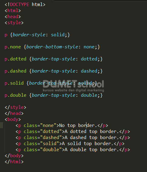
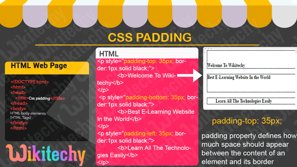
Отступы в CSS
Элемент в html — это прямоугольник, для которого можно указать величины внутренних и внешних отступов, а также границу, которая разделяет их.
Отступы в CSS устанавливаются, например, для блочных элементов и таблиц. Рассмотрим основные свойства CSS для установки отступов: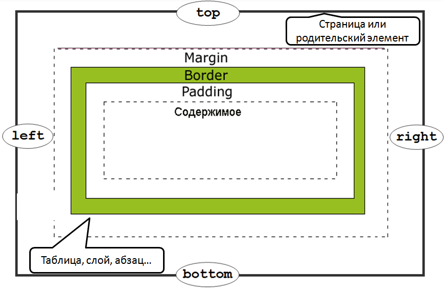
Внешние отступы
Внешние отступы в CSS задаются при помощи свойства , которое устанавливает величину отступа от границ текущего элемента до внутренней границы его родительского элемента.Свойство:
- (нижний отступ)
- (отступ слева)
- (отступ справа)
- (верхний отступ)
Значения:
- величина: или
Краткая запись:
marginmargin-top margin-right margin-bottom margin-left; margin10px 20px 20px 30px; |
Пример:
... <style type="text/css"> |
p{
	border5px solid red; /* красная рамка */
	margin20px;
}
div{
	border5px solid green; /* зеленая рамка */
}
|
<style><head> <body> <div> Агния Барто - стихи <p> Я на уроке в первый раз.<br> Теперь я ученица.<br> Вошла учительница в класс,-<br> Вставать или садиться?<br> <p> ... |
Результат:
Агния Барто — стихи
Я на уроке в первый раз.
Теперь я ученица.
Вошла учительница в класс,-
Вставать или садиться?


Внутренние отступы
Внутренние отступы в css создаются при помощи свойства , которое устанавливает значение полей от внутреннего края рамки элемента до воображаемого прямоугольника, ограничивающего его содержимое.
Свойства:
- (нижний отступ)
- (отступ слева)
- (отступ справа)
- (верхний отступ)
Значения:
- величина: или
Краткая запись:
paddingpadding-top padding-right padding-bottom padding-left; padding10px 20px 20px 30px; |
Пример:
... <style type="text/css"> |
p{
	border5px solid red; /* красная рамка */
	padding20px; /* внутренний отступ */
}
|
<style><head> <body> <p> Я на уроке в первый раз.<br> Теперь я ученица.<br> Вошла учительница в класс,-<br> Вставать или садиться?<br> <p> ... |
Результат:
Я на уроке в первый раз.
Теперь я ученица.
Вошла учительница в класс,-
Вставать или садиться?
Сложные структуры css border
Существует множество техник для создания дизайна с применением сложных структур border. Для примера, разберем следующие…
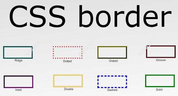
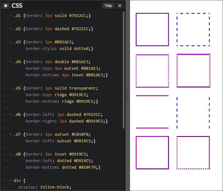
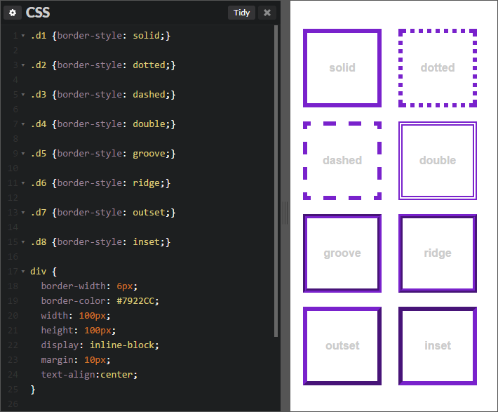
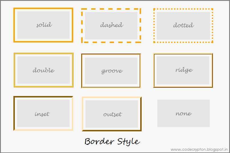
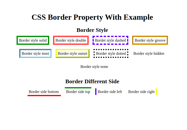
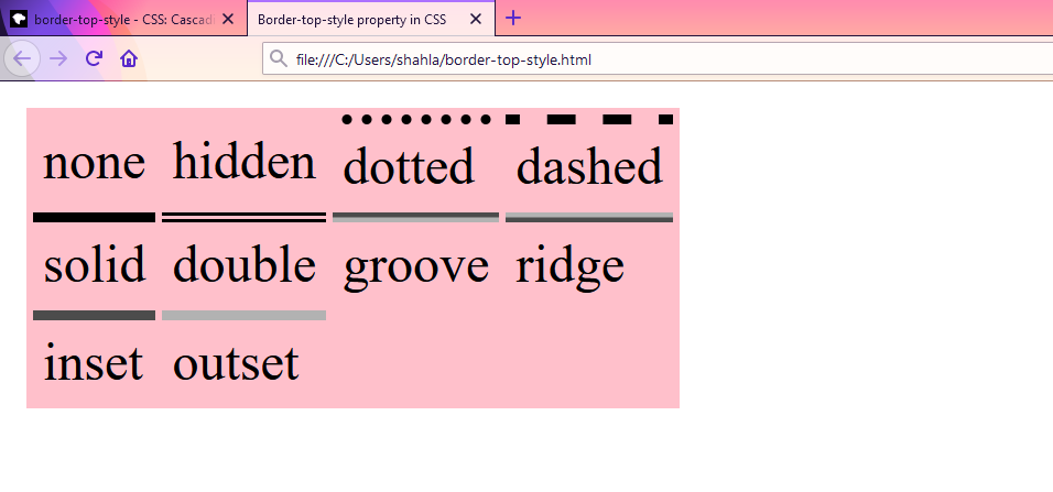
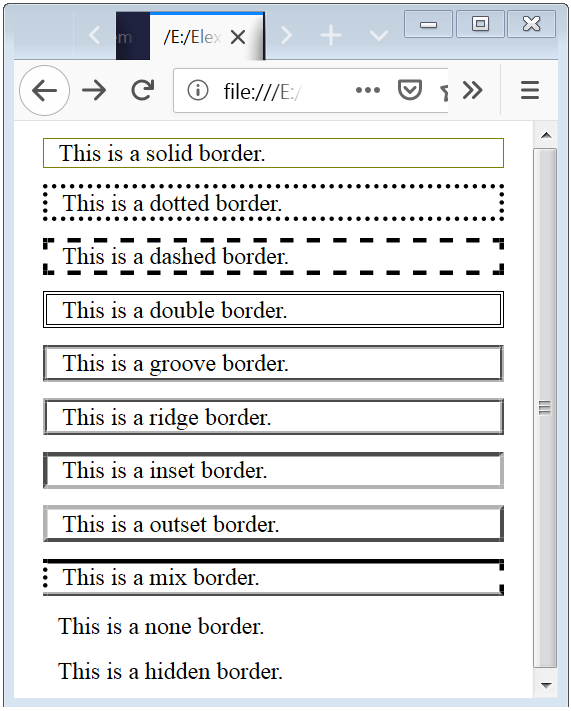
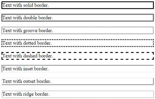
Border-Style
Мы всегда используем наиболее известные свойства solid, dashed и dotted. Но существует парочка иных свойств border-style: groove и ridge.
border: 20px groove #e3e3e3;
Или в расширенном синтаксисе:
border-color: #e3e3e3;
border-width: 20px;
border-style: groove;
Хотя эти свойства и полезны, но они не являются основой создания сложных рамок.
Outline
Наиболее популярная техника создания двойной рамки – использование свойства outline.
.box {
   border: 5px solid #292929;
   outline: 5px solid #e3e3e3;
}
Этот способ работает отлично, хотя, он нас ограничивает только двумя рамками. Иногда бывает нужно создать градиентный border, который состоит из многих слоев… как тогда?
Псевдоэлементы
Когда техники outline не достаточно, альтернативным средством является использование псевдо элементов :before и :after. С помощью которых можно добавить дополнительные рамки к элементу:
.box {
  width: 200px; height: 200px;
  background: #e3e3e3;
  position: relative;

  border: 10px solid green;
}

/* Create two boxes with the same width of the container */
.box:after, .box:before {
  content: '';
  position: absolute;
  top: 0; left: 0; bottom: 0; right: 0;
}

.box:after {
  border: 5px solid red;
  outline: 5px solid yellow;
}

.box:before {
  border: 10px solid blue;
}
На вид не очень элегантно, но по крайней мере, это работает. Немного проблемно разобраться с последовательность цветов в рамках… но понять можно.
Box-Shadow
Интересным «детским способом» создания подобного эффекта, является использование CSS3 свойства box-shadow:
.box {
    border: 5px solid red;
     box-shadow:
       0 0 0 5px green,
       0 0 0 10px yellow,
       0 0 0 15px orange;
}
В этом случае мы были умнее, использовали специально предназначенное свойство box-shadow. Изменяя параметры x, y, blur на «нуль», мы можем использовать разные цвета для создания множества рамок.
Но есть проблемка, в старых браузерах, которые не понимают свойства box-shadow, будет видна только одна красная рамка в 5px.
«Помните! Дизайн сайта должен выглядеть кроссбраузерно, то есть одинаково во всех браузерах. Включая старые версии.»
Изменяем углы
В дополнение к используемому простому значению border-radius, мы можем указать два отдельных – разделяя их через / мы укажем горизонтальный и вертикальный радиус.
Для примера:
border-radius: 50px / 100px; /* horizontal radius, vertical radius */

… это равносильно:
border-top-left-radius: 50px 100px;
border-top-right-radius: 50px 100px;
border-bottom-right-radius: 50px 100px;
border-bottom-left-radius: 50px 100px;

Эта техника подходит, для создания уникальных форм блоков. Для примера, вот создание эффекта завернутой бумаги:
.box {
    width: 200px; height: 200px;
    background: #666;

    border-top-left-radius: 15em 1em;
    border-bottom-right-radius: 15em 1em;

}
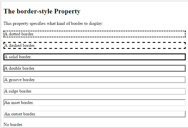
Значения свойства
| Значение | Описание |
|---|---|
| none | Указывает на отсутствие границы. Это значение по умолчанию. |
| hidden | Указывает на отсутствие границы как и значение none, но имеет более высокий приоритет. Например, если в таблице для первой ячейки задано значение none, а для второй (соседней) задана видимая граница, то граница между ячейками отображается. Если для первой ячейки таблицы задано значение hidden, а для второй (соседней) задана видимая граница, то граница между ячейками не будут отображаться. |
| dotted | Точечная граница. |
| dashed | Пунктирная граница. |
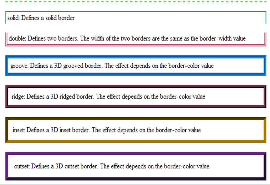
| solid | Сплошная граница. |
| double | Двойная граница. |
| groove | Отображает границы с 3d эффектом (противоположно значению ridge). |
| ridge | Отображает границы с 3d эффектом (противоположно значению groove). |
| inset | Отображает границы с 3d эффектом (противоположно значению outset). При применении к ячейке таблицы с border-collapse : «collapse» — это значение ведет себя как groove. |
| outset | Отображает границы с 3d эффектом (противоположно значению inset). При применении к ячейке таблицы с border-collapse : «collapse» — это значение ведет себя как ridge. |
| initial | Устанавливает свойство в значение по умолчанию. |
| inherit | Указывает, что значение наследуется от родительского элемента. |
Extra Style — Changing CSS Border Corners
Taking the styling a bit further, you can also manipulate the corners of the border itself to provide unique design options for the page. For this example, you can use the “border-radius” property to make the rounded changes. See the code example below to see it in action.
The border-radius property takes a size value in pixels. In this example, the size value provided is set to “50px” to give the effect of a rounded border. The image below reflects this change.
The border-radius settings can also be applied to the individual corner sets as well. This is done by calling each border side in the property as shown in the code example below.
As with other values in CSS, there is an intended order of direction for these entries that needs to be understood. For this, the intended direction is clockwise starting with the top. This means the values correspond to top, right, bottom, and left. This will provide the following output as shown below.
CSS Borders — Inline Elements
Borders can be given to any inline HTML element. The border’s thickness will not have any effect on the line height of element. If left and right borders are specified in an inline element, it will displace the text around the border.

Syntax
strong {border-top: thin solid green; border-bottom: 5px dotted #ff00ff;}
Above code will apply the border to strong text in the paragraph as green, thin and solid border on the top and magenta-colored, 5px dotted border on the bottom side.
Example
Let us see an example:
<html>
<head>
<style>
   strong {
      border-top: thick solid green; border-bottom: 5px dashed #ff00ff;
      background-color: silver;
   }
</style>
</head>
<body>
   <div>
      <h2>CSS Borders on Inline Elements</h2>
      <p>Check the <strong>inline elements with borders</strong> and rest has no border.</p>
   </div>
</body>
</html>
# border-radius
The border-radius property allows you to change the shape of the basic box model.
Every corner of an element can have up to two values, for the vertical and horizontal radius of that corner (for a maximum of 8 values).
The first set of values defines the horizontal radius. The optional second set of values, preceded by a ‘/’ , defines the vertical radius. If only one set of values is supplied, it is used for both the vertical and horizontal radius.
The is the horizontal radius of the top-left-and-bottom-right. And the is the horizontal radius of the top-right-and-bottom-left. The other four values after ‘/’ are the vertical radii for top-left, top-right, bottom-right and bottom-left.
As with many CSS properties, shorthands can be used for any or all
possible values. You can therefore specify anything from one to eight values. The following shorthand allows you to set the horizontal and vertical radius of every corner to the same value:
HTML:
CSS:
Border-radius is most commonly used to convert box elements into circles. By setting the border-radius to half of the length of a square element, a circular element is created:
Because border-radius accepts percentages, it is common to use 50% to avoid manually calculating the border-radius value:
If the width and height properties are not equal, the resulting shape will be an oval rather than a circle.
Browser specific border-radius example:
# border-radius
- The property allows us to round the corners of an element’s border
- If you supply one value (), it applies to all four corners
- If you supply two values (), the first value () applies to the top-left and bottom-right corner, the second value () applies to the top-right and bottom-left corner
- If you supply three values (), the first value () applies to the top-left corner, the second value () applies to the top-right and bottom-left corner and the third value () applies to the bottom-right corner (rarely used)
- If you supply four values (), the first value () applies to the top-left corner, the second value () applies to the top-right corner, the third value () applies to the bottom-right corner and the fourth value () applies to the bottom-left corner (clockwise)
- In theory this property can be applied to any element but obviously, the result will only be noticeable if
- the element has a «visible/colored» border or background
- the element is an image
123
TIP
Use to make a circular image (out of a square image)
| EMMET instruction | result |
|---|---|
| + |
Crossing the Style Border
These options for using the CSS Border Style property are great to get you started in creating new unique looks for elements on an HTML page. Consider how you could apply these options to items such as custom buttons, banners, or even direct navigation menus for the site.
Other options such as padding, animations, and multiple borders also help to extend design options further. Deciding on which to learn first can be a daunting task at first. However, tackling the core basics of CSS will help you to understand not just what to learn, but how to learn it. The direction is just as important in learning as it is in CSS properties.
For more information check out the CSS Content Hub to help guide your choices. Concepts such as the use of the Border Shorthand property can take just moments to learn and provide great enhancements to the overall use of CSS.
Noting how important direction can be, have you considered a path to give you the best outlook on the job market? The modern world runs on code and that code comes from people like you.
If you are looking to fly farther and stronger than ever before, take the first steps with code. Learning to code can help you open doors to those new possibilities of a better you. Embrace Udacity’s Intro to Programming Nanodegree program today to start the journey.
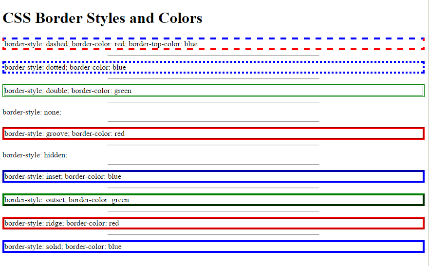
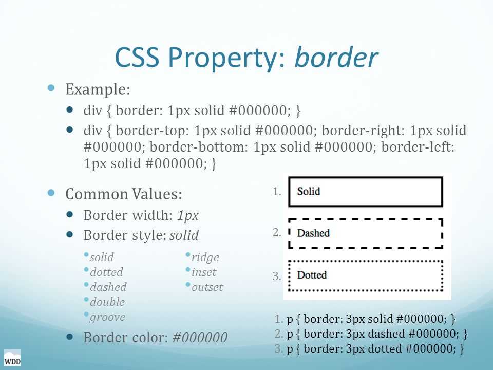
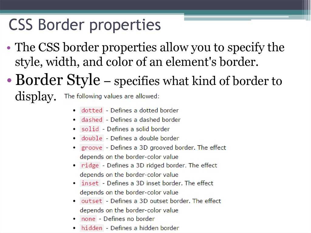
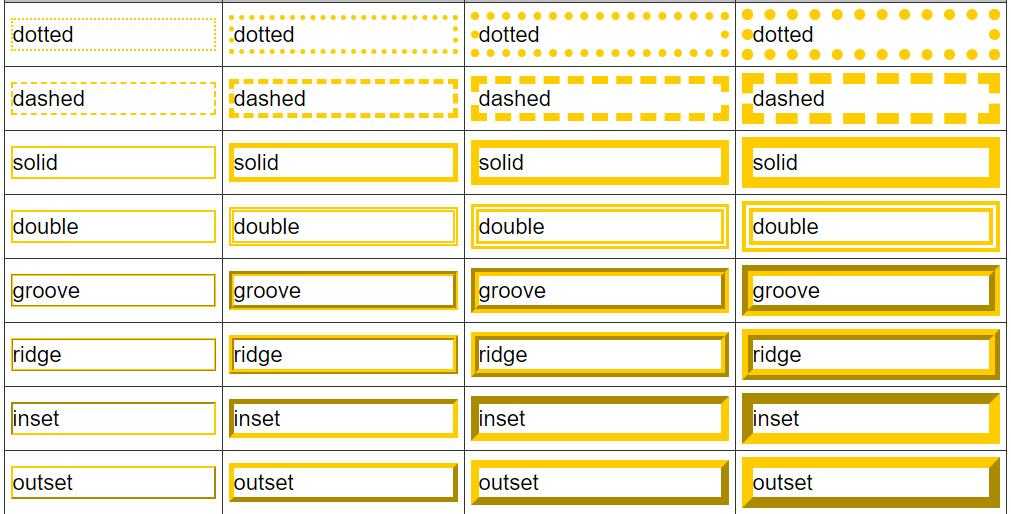
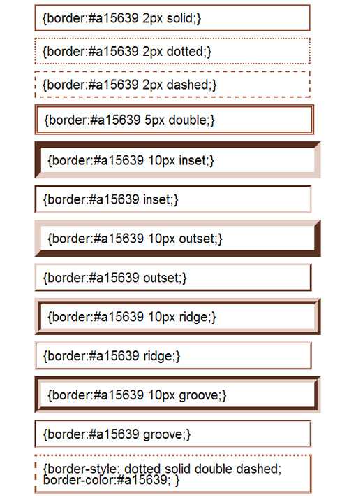
Definition and Usage
The property sets the style of an element’s four borders. This property can have from one to four values.
Examples:
-
border-style: dotted solid double dashed;
- top border is dotted
- right border is solid
- bottom border is double
- left border is dashed
-
border-style: dotted solid double;
- top border is dotted
- right and left borders are solid
- bottom border is double
-
border-style: dotted solid;
- top and bottom borders are dotted
- right and left borders are solid
-
border-style: dotted;
all four borders are dotted
| Default value: | none |
|---|---|
| Inherited: | no |
| Animatable: | no. Read about animatable |
| Version: | CSS1 |
| JavaScript syntax: | object.style.borderStyle=»dotted double» Try it |
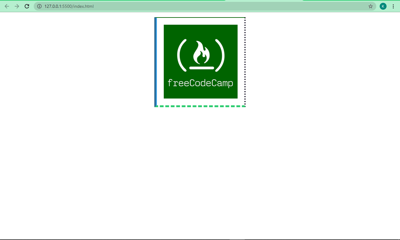
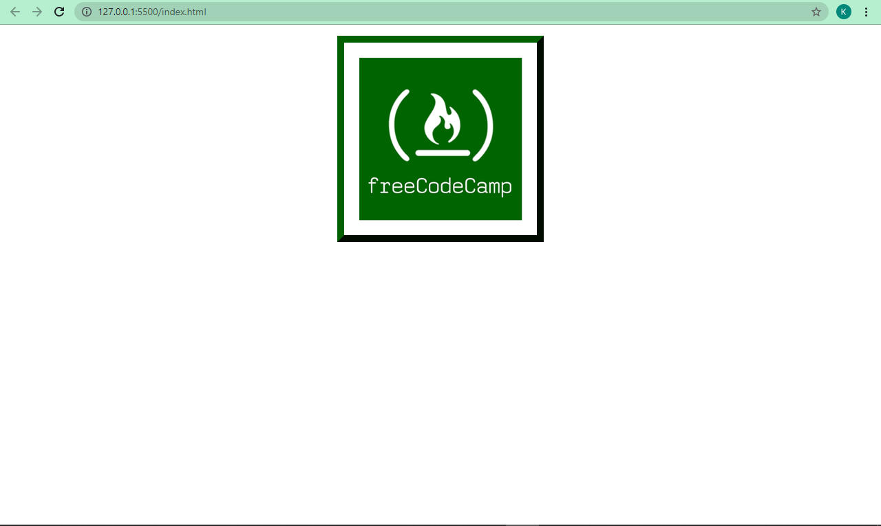
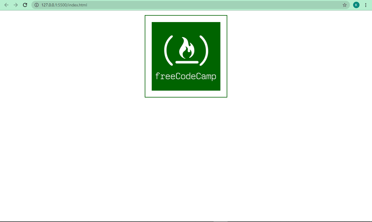
Внешняя рамка элемента, css-свойства outline,outline-style, outline-width и outline-color
Если необходимо выделить элемент внешней рамкой, при этом не влияя на его размеры или положение в документе,
используются ненаследуемые свойства outline,
outline-style,
outline-width,
outline-color (см. пример №9).
Все они могут принимать практически те же значения, что и соответствующие свойства, использующиеся для определения внешнего вида границ элементов.
Отличие есть только у свойства outline-color, принимающего вместо специального значения
transparent значение invert, которое указывает браузеру на необходимость инверсии
цвета для того, чтобы гарантировать видимость границы при любом цвете фона элемента.
<!DOCTYPE html>
<html>
<head>
	<meta charset="utf-8">
	<title>Установка контура элементов</title>

	<style>

		p{
		width: 300px;
		height: 150px;
		margin: 5em;
		padding: 1em;
		}

		/* Сокращенное свойство */
		.p_1{
		border: 5px solid violet;
		outline: dashed 5px green;
		outline-offset: 10px;
		}

		/* Цвет задаем отдельно */
		.p_2{
		border: 5px solid violet;
		outline: groove 8px;
		outline-color: invert;
		outline-offset: 5px;
		}

		/* Стиль задаем отдельно */
		.p_3{
		border: 5px solid violet;
		outline: 5px rgba(0%,0%,100%,0.4);
		outline-style: double;
		outline-offset: 1em;
		}

		/* Ширину задаем отдельно */
		/* Контур будет внутри */
		.p_4{
		border: 5px solid violet;
		outline: inset hsla(240,100%,50%,0.5);
		outline-width: 1em;
		outline-offset: -2em;
		}

	</style>

</head>
<body>

	<p class="p_1">
		Сокращенное свойство<br>
		outline: dashed 5px green;<br>
		outline-offset: 10px;
	</p>

	<p  class="p_2">
		Цвет задаем отдельно<br>
		outline: groove 8px;<br>
		outline-color: invert;<br>
		outline-offset: 5px;
	</p>

	<p  class="p_3">
		Стиль задаем отдельно<br>
		outline: 5px rgba(0%,0%,100%,0.4);<br>
		outline-style: double;<br>
		outline-offset: 1em;
	</p>

	<p  class="p_4">
		Ширину задаем отдельно<br>
		Контур будет внутри<br>
		outline: inset hsla(240,100%,50%,0.5);<br>
		outline-width: 1em;<br>
		outline-offset: -2em;
	</p>

</body>
</html>
Пример №9. Установка контура элементов
Расстояние между внешней и внутренней границами,css-свойство outline-offset
Для внешних границ дополнительно определено еще одно полезное ненаследуемое свойство
outline-offset,
которое позволяет задавать расстояние между внешней и внутренней границами. В качестве значения свойство
принимает величину расстояния в любых доступных единицах измерения CSS (см. пример №9). Кроме того,
разрешается использовать и отрицательные значения, тогда рамка будет отображена внутри самого элемента.
На практике, в процессе верстки страниц желательно использовать распространенный прием обнуления всех отступов, показанный в
примере №10. Дело в том, что разные браузеры могут по-разному задавать внутренние и внешние отступы элементов, что
может приводить к нежелательным эффектам для веб-мастера. Поэтому лучше обнулить все отступы и задавать их самостоятельно в зависимости от
конкретной ситуации.
/* Обнуляем отступы */
*{
margin: 0;		/* Обнуляем внешние отступы */
padding: 0;		/* Обнуляем внутренние отступы */
outline: 0;		/* Обнуляем толщину внешней границы */
}

/* Остальные стили */
Пример №10. Обнуление отступов элементов
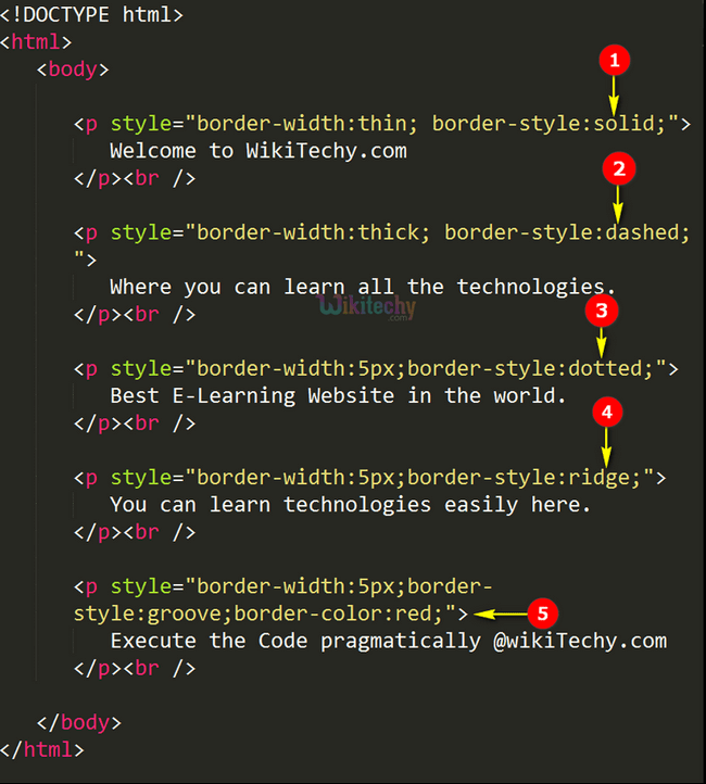
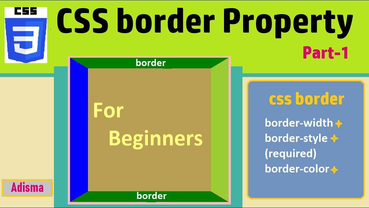
What is the CSS border property?
is not all the border property entails – though it is important to note that it’s a very useful shorthand, which we will get to later in this tutorial.
So, in addition there are the , , , and sub-properties. Let’s take a look at each of them one by one.
CSS property
You use the property to specify the width of a border. The value is commonly expressed in pixels (px), but it can be expressed in rem, em, and percentage (%).
And it doesn’t end there – this property also takes , , and as values.
The property is a shorthand for , , and , moving in a clockwise direction. So, if you want, you can apply different width values to the border-top, border-right, border-bottom, and border-right.

CSS property
With the property, you get access to different styles you can apply to the border of a box. It takes (the default), , , , , , , , and .
Just like , is a shorthand for , , and . So again, you can specify different values for the properties if you don’t want to use the shorthand.
CSS property
The property lets you specify different colors for your border. You can specify this color with named, RGB, and HSL colors – there are no limits.
Black is the default color for this property. So if you don’t specify a value for it, black is automatically set as long as you have the border-width and border-style set to some values.
As it goes with and , you can also specify different colors on all the sides of the border. So, is a shorthand for , , , and .
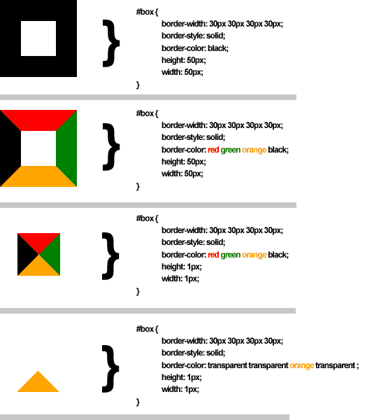
Below are snippets of code and their respective screenshots showing the three sub-properties of in action:

You can play around with the sub-properties to get a better understanding of how they work.
The shorthand
We’ve applied the sub-properties (, , and ) one by one, but they can be applied together with the shorthand.
This shorthand is useful especially when you want all four sides to be the same like I have done below:
CSS property
With , you can remove sharp edges from the borders in order to make them into rounded corners. I think this makes them more beautiful, too.
The value is specified in pixels (px), and percentage (%) too, depending on how you prefer it.

If you want to, you can also specify a different radius for the top, left, bottom and right edges of the border with , , and . This is because is also a shorthand for those four sub-properties.
We can apply some radii to our borders too: