
How do I align text vertically and horizontally in CSS?
To align text both vertically and horizontally in CSS, you can use a combination of properties and techniques. Here are some common methods:
- Using to center horizontally and to center vertically for a single line of text.
- Using on a container and and to center horizontally and vertically.
- Using and properties to position the text at the center of its container.
- Using , , and to center text both vertically and horizontally.
Remember that the best method for aligning text vertically and horizontally will depend on your project’s specific layout and design. You can find the one that works best by experimenting with different methods.
Let’s say you have a banner image with some text overlay that you want to center both horizontally and vertically. Here’s the HTML code for that:
<div class="banner">
  <img src="banner-image.jpg" alt="Banner Image">
  <h1>Welcome to My Website</h1>
</div>
To center the text, you can use the following CSS:
.banner {
  position: relative;
}

.banner h1 {
  position: absolute;
  top: 50%;
  left: 50%;
  transform: translate(-50%, -50%);
  text-align: center;
}
The on the container creates a reference point for the absolutely positioned text. The on the element takes it out of the normal document flow and positions it relative to the nearest positioned ancestor, in this case the container.
The and properties move the text halfway down and halfway across the container respectively, but it’s not centered yet because it’s positioned based on the top-left corner of the text element.
The property adjusts the position of the text element by 50% of its own height and width, respectively, centering it both horizontally and vertically within the container.
Finally, centers the text horizontally within the container.
The text is now centered both horizontally and vertically over the banner image, creating a clean and professional design.
Решение задачи
Из-за всей этой петрушки нам нужно будет снабдить наш HTML-код двумя дополнительными контейнерами. Вот каким образом будет выглядеть наш блок с текстом:
Для div-контейнера класса «textalign» задаются CSS-свойства, которые выравнивают его содержимое по вертикали для всех нормальных браузеров (кроме IE, разумеется):
И ещё два свойства, которые задают ширину и высоту для блока:
Этого вполне достаточно для выравнивания содержимого контейнера по центру относительно вертикали во всех браузерах, кроме IE.
Теперь начинаем дописывать свойства, связанные с выравниванием для браузеров семейства IE (именно для них мы использовали дополнительные блоки «div» и «span»).
Обращаемся к тегу «div» внутри блока класса «textalign». Для этого, нужно сначала указать название класса, а потом, через пробел, тег, к которому мы обращаемся.
Такая конструкция означает: для всех тегов «div» внутри блока с классом «textalign» применить перечисленные свойства.
Если всё оставить так, как есть, то div-контейнер, который находится внутри блока «textalign», будет позиционироваться относительно верхнего левого угла браузера. Нам же нужно, чтобы смещение на 50% по вертикали произошло относительно родительского блока. Для этого достаточно применить CSS-свойство «position: relative» к блоку «textalign». Об этих особенностях я подробно рассказываю в видеоуроке по работе с блоками «div».
Соответственно, стили, заданные для блока «textalign», видоизменяются:
Теперь левая верхняя точка текстового блока смещена вниз на 50%.
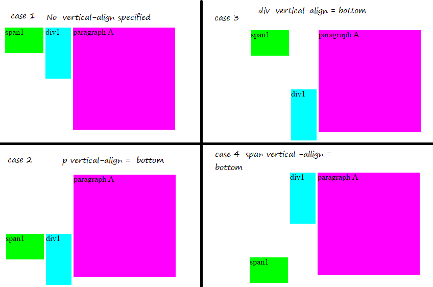
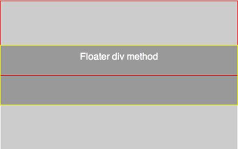
Для пояснения происходящего я нарисовал иллюстрацию:
Как видно из картинки, определённого прогресса мы добились. Но это ещё не всё! Верхняя левая точка жёлтого блока действительно сместилась на 50% вниз относительно родительского (фиолетового) блока. Но нам-то нужно, чтобы на пятидесяти процентах высоты фиолетового блока находился центр жёлтого блока, а не его верхняя левая точка.
Теперь в ход пойдёт тег «span» и его относительное позиционирование:
Тем самым, мы сместили жёлтый блок вверх на 50% его высоты относительно начального положения. Как вы понимаете, высота жёлтого блока равна высоте центрируемого контента. И последняя операция со span-контейнером расположила наш контент посередине фиолетового блока. Ура!
Выравнивание по центру
Чтобы поместить элемент по центру родительского блока (то есть выровнять одновременно по горизонтали и вертикали), иногда достаточно объединить под одним селектором методы горизонтального и вертикального центрирования.
Во всех примерах мы будем использовать один и тот же HTML-код и получать один и тот же результат.
Изображение: Skillbox Media
С помощью свойств position и transform
В этом случае нужно сделать всё то же, что и при вертикальным центрировании, но с двумя изменениями в стилях дочернего элемента:
- добавить свойство left: 50%;
- установить свойству transform значение translate (-50%, -50%).
Через CSS Grid
Этот способ похож на вёрстку флексами. Нужно установить в родительском элементе свойство display: grid — оно превратит его в grid-контейнер. А в дочернем задать автоматические отступы с помощью margin: auto.
Flex for Vertical Centering
It’s fair to claim that the introduction of flex solved a lot of web developers’ design problems, including vertical centering. We can simply create simple, responsive, and uncomplicated vertical centering solutions with this contemporary addition to CSS.
The only disadvantage of these flex-based solutions is that older versions of Internet Explorer do not support them (below IE9). To support older browser versions, you must use the WebKit, Moz, or ms prefix. Even so, flex gives you a lot of versatility when it comes to managing page layouts and element placement.
The align-items and justify-content attributes can be used to control the alignment of items within the parent flexbox. If the flex-direction equals row, set align-items to center vertically centers all items inside the flexbox.
#6 Flex Items and Align Self
This method allows you to vertically center only one element within a flexbox. To place the element in the center, it uses the flex attribute align-self.
#7 Flex Container and Margin Auto
Setting the margin to auto is another way to center a single element in a flex container. The browser then generates proper margins in both directions automatically.
#8 Ghost Items Inside a Flex Container
Using ghost elements to center content isn’t the most attractive solution. However, it completes the task. As a result, you’ll have more vertical spacing flexibility. Multiple items can be stacked inside the flexbox and ghost elements can be used to push them to the center.
Additional Resources
In the sections above I linked to articles specific to each method. Below are some resources that cover more than a single method for centering.
- Vertical Centering With CSS — covers all the methods above except for the padding method
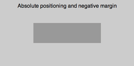
- Two Simple Ways to Vertically Align with CSS — Covers absolute positioning and negative margins and the line height methods
- Vertical centering using CSS — Covers all methods except the floater div method and adds a few more.
- CSS tests and experiments — Contains a variety of css experiments. Search the page for the word vertical and you’ll find several vertical centering experiments, including the 2 links below.
- Centering (horizontally and vertically) an image in a box
- Shrink-wrap and Center
Using JavaScript to Calculate Element Height and Adjust Position
In some cases, it may be necessary to use JavaScript to calculate the height of elements and adjust their position accordingly. This method can be helpful when dealing with dynamic content or when no other CSS methods suit your specific use case.
| Advantages | Disadvantages |
|---|---|
| Can handle dynamic content | Adds extra complexity to your code |
| Provides precise control over element position | Requires JavaScript |
Here’s an example of how to use JavaScript to calculate the height of an element and center it vertically within its parent container:
const parent = document.querySelector('.parent');
const child = document.querySelector('.child');

const parentHeight = parent.offsetHeight;
const childHeight = child.offsetHeight;

child.style.marginTop = (parentHeight - childHeight) / 2 + 'px';
Here’s a breakdown of what’s happening in this example:
- We use JavaScript to select the parent and child elements using .
- We use the property to get the height of both the parent and child elements.
- We use the formula to calculate the margin-top value that will vertically center the child element within the parent container.
- We set the property of the child element to the calculated value.
Using JavaScript to calculate the height of elements and adjust their position can provide precise control over element position and can handle dynamic content. However, it does add extra complexity to your code and requires JavaScript to be enabled in the user’s browser.
Equal Top and Bottom Padding
In the method above we allowed the browser to automatically set the margins of the child element so they would be equal. In this method we’ll do something similar and explicitly set the top and bottom padding of the parent to be equal.
{code type=html}
Content here
{/code}
css
{code type=css}
#parent {
padding: 5% 0;
}
#child {
padding: 10% 0;
}
{/code}
In the css above I’ve set top and bottom paddings on both elements. Setting it on the child will make sure the contents in the child will be vertically centered and setting it on the parent ensures the entire child is centered within the parent.
I’m using relative measurements to allow each div to grow dynamically. If one of the elements or its content needs to be set with an absolute measurement then you’ll need to do some math to make sure things add up.
For example if the parent was 400px in height and the child 100px in height we’d need 150px of padding on both the top and bottom.
150 + 150 + 100 = 400
Using % could throw things off in this case unless our % values corresponded to exactly 150px.
This method works anywhere. The downside is that depending on the specifics of your project you may need to do a little math. However if you’re falling in line with the idea of developing flexible layouts where your measurements are all relative you can avoid the math.
Note: This method works by setting paddings on the outer elements. You can flip things and instead set equal margins on the inner elements. I tend to use padding, but I’ve also used margins with success. Which you choose would depend on the specifics of your project.
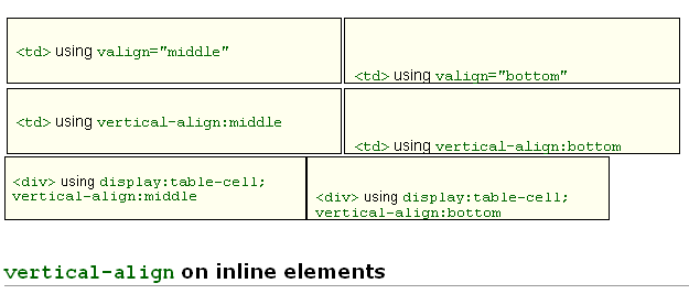
Using Table Display
Table display is a CSS property that allows you to create a table-like layout by setting an element’s display property to “table,” “table-row,” or “table-cell.” This layout can be particularly useful for achieving vertical alignment of elements, as each cell in the table can be easily aligned using the “vertical-align” property.
Advantages and disadvantages of using table display for vertical alignment:
| Advantages | Disadvantages |
|---|---|
| Simple and straightforward method for achieving vertical alignment | Can be less flexible than other methods, particularly for complex layouts |
| Works well for basic layouts with a small number of elements | Can be more difficult to maintain and update |
| Cross-browser compatibility | Not the most semantic option, as tables are intended for displaying tabular data rather than layout purposes |
Let’s see an example of creating a table-like layout using CSS:
<div class="table-container">
  <div class="table-cell">
    <img src="example-image.jpg" alt="Example Image">
    <p>Lorem ipsum dolor sit amet, consectetur adipiscing elit.</p>
  </div>
</div>
/* Step 1: Create a table-like layout */
.table-container {
  display: table;
  height: 200px;
}

/* Step 2: Create a table cell */
.table-cell {
  display: table-cell;

  /* Step 3: Center the element vertically */
  vertical-align: middle;

  /* Step 4: Center the element horizontally */
  text-align: center;
}
In this example, we’re creating a table-like layout using CSS. Here’s a breakdown of each step:
- Create a container element with a class of “table-container.” We set its “display” property to “table,” which tells the browser to treat it as a table element. We also set its “height” property to “200px” to give it a fixed height.
- Then, create a child element with a class of “table-cell.” We set its “display” property to “table-cell,” which tells the browser to treat it as a table cell.
- Set its “vertical-align” property to “middle” to center the child element vertically within the container.
- Finally, set its “text-align” property to “center” to horizontally center the child element within the cell.
By following these steps, we’ve successfully aligned the image and paragraph vertically and horizontally within the container.
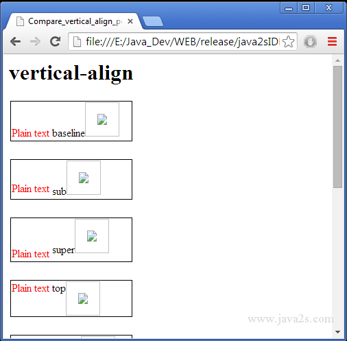
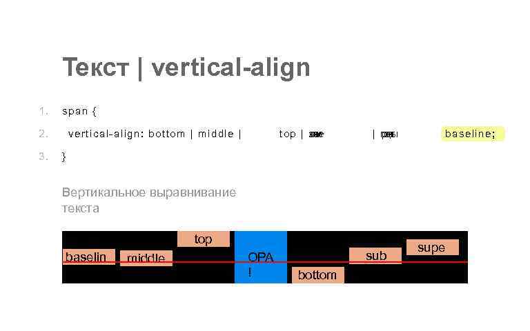
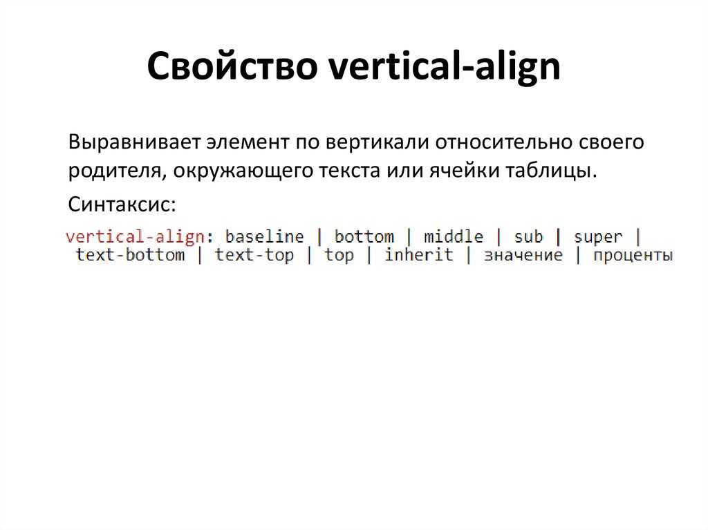
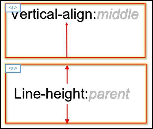
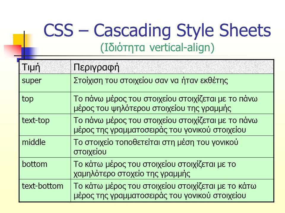
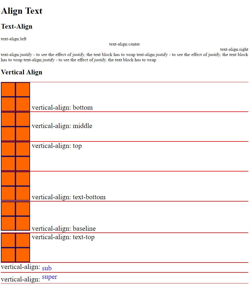
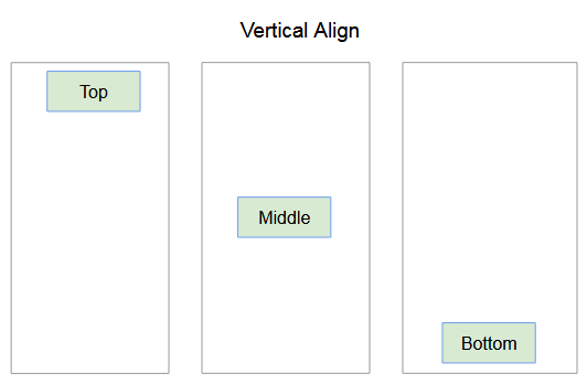
Свойство для вертикального выравнивания vertical-align
Базовым свойством, которое позволяет сделать в CSS выравнивание по вертикали является vertical-align.
В основном для выравнивания текста по вертикали css вам понадобятся значения top, middle, bottom. Они подходят для большинства случаев.
Так, в случае если нам нужно выровнять текст в каком-то блоке, то для начала оборачиваем его в тег </p> и задаем для него стиль vertical-align:middle;
Но на практике все оказывается немного сложней. Дело в том что данное свойство срабатывает только для табличных элементов и для того чтобы оно заработало нужно будет пойти на одну хитрость.
Для родительского элемента, то есть блока, в котором находится текст, мы задаем свойство display:table, а для абзаца с тексом – display:table-cell. В этом случае блок преобразуется в таблицу, а абзац в ячейку таблицы.
CSS
.text-vertical-al{
display:table;
}
.text-vertical-al p{
display:table-cell!important;
vertical-align:middle;
}

![Css vertical align – how to center a div, text, or an image [example code]](https://rwvt.ru/wp-content/uploads/a/4/8/a480cefab886e7a3ca33d5b1cfd1cfb9.jpeg)
|
1 |
.text-vertical-al{ displaytable; } .text-vertical-al p{ displaytable-cell!important; vertical-alignmiddle; } |
В результате у нас все заработало:
Выравнивание текста по вертикали CSS
Для выравнивания по вертикали текста в таблице можно использовать только значения top, bottom, middle, baseline. Другие значения для таблиц не работают.
Вот еще один пример выравнивания текста по вертикали css, но именно при работе с таблицей.
Допустим вам нужно выровнять текст по вертикали для всей таблицы. В этом случае в файле CSS для класса table нужно написать следующее:
CSS
table.table-va td{
border: 1px solid #1e1e1e;
background-color: rgba(0, 146, 243, 0.13);
height: 40px;
vertical-align:middle; /* выравнивание текста по вертикали css*/
}
|
1 |
table.table-va td{ border1pxsolid#1e1e1e; background-colorrgba(0,146,243,0.13); height40px; vertical-alignmiddle;/* выравнивание текста по вертикали css*/ } |
В этом случае во всех ячейках текст будет выровнен по вертикали по центру:
| По верху | По центу | По низу |
Так же можно задать выравнивание по вертикали для каждой ячейки. В этом случае проще всего указать стили для каждого элемента в коде HTML или при помощи псевдоклассов nth-child() в CSS:
XHTML
<table class=»table-va»>
<caption>CSS выравнивание по вертикали в таблице</caption>
<tbody>
<tr>
<td style=»vertical-align:top;»>По верху</td>
<td style=»vertical-align:middle;»>По центу</td>
<td style=»vertical-align:bottom;»>По низу</td>
</tr>
</tbody>
</table>
|
1 |
<table class=»table-va»> <caption>CSS выравнивание по вертикали в таблице</caption> <tbody> <tr> <td style=»vertical-align:top;»>По верху</td> <td style=»vertical-align:middle;»>По центу</td> <td style=»vertical-align:bottom;»>По низу</td> </tr> </tbody> </table> |
Вот что получится:
| По верху | По центу | По низу |
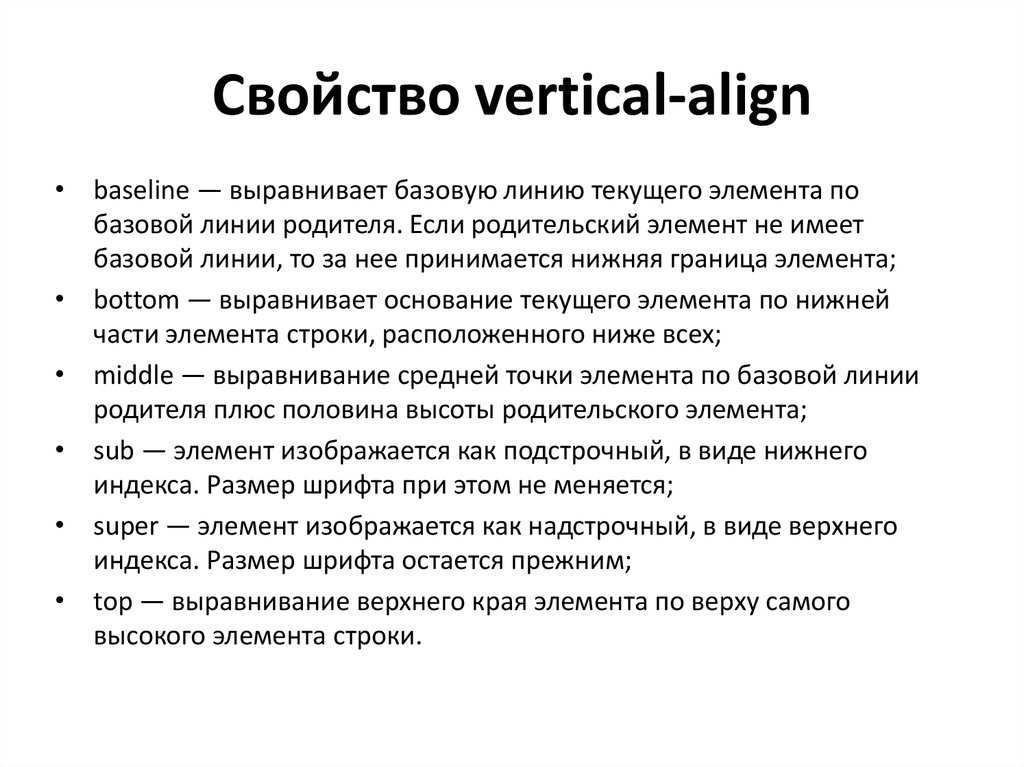
Значения свойств
| Значение | Описание | Воспроизвести |
|---|---|---|
| baseline | Элемент выравнивается по базовой линии родителя. Это показатель | Воспроизвести » |
| length | Повышает или понижает элемента до указанной длины. Допускаются отрицательные значения.Прочитать о Eдиницы длины | Воспроизвести » |
| % | Повышает или понижает элемента в процентах из свойства line-height. Допускаются отрицательные значения | Воспроизвести » |
| sub | Элемент выровнен с subscript базовой линии родителя | Воспроизвести » |
| super | Элемент выровнен с superscript базовой линии родителя | Воспроизвести » |
| top | Элемент выровнен с верхней части самого высокого элемента в строке | Воспроизвести » |
| text-top | Элемент выровнен с верхней части шрифта родительского элемента. | Воспроизвести » |
| middle | Элемент находится в центре родительского элемента | Воспроизвести » |
| bottom | Элемент совпадает с минимальным элементом в строке | Воспроизвести » |
| text-bottom | Элемент совмещен с нижней частью шрифта родительского элемента. | Воспроизвести » |
| initial | Устанавливает это свойство в значение индекса. Прочитать о initial | Воспроизвести » |
| inherit | Наследует это свойство от родительского элемента. Прочитать о inherit |
Выравнивание текста по центру CSS
Как правило, совместно с задачей выровнять текст по вертикали необходимо сделать выравнивание текста по центру в CSS. Для этого мы можем использовать стандартное свойство text-align со значением center, которое нужно задать для родительского элемента, то есть для блока, в котором находится нужный текст.
Зададим для блока с текстом, который мы использовали в первом примере, выравнивание текста по ширине в CSS:
CSS
.text-vertical-al p{
display:table-cell;
vertical-align:middle;
text-align:center;
}
|
1 |
.text-vertical-al p{ displaytable-cell; vertical-alignmiddle; text-aligncenter; } |
Теперь текст выровнен точно по центру блока:
Выравнивание текста по вертикали CSS
Обратите внимание! Свойство text-align:center; задано для тега , так как в данном случае абзац является родительским блоком для текста.
CSS Vertical Align Text with CSS Flexbox
So we want to vertically align text in a div or some other container.
One way to do this, is to use CSS Flexbox. If you’re unfamiliar with Flexbox, it’s a CSS layout module that makes it easier to make your layout design more flexible and responsive.
Flexbox allows you to have a little more control over your layout and makes vertically aligning text a breeze using the align-items selector.
Let’s take a look at the code:
See the Pen
CSS Vertical Align Text Scenario 1 – Flex by Kris Barton (@TheWebDeveloperGuide)
on CodePen.
Here, I’m using 3 CSS Flexbox selectors:
- I’m declaring it a Flexbox item using display: flex; This means that I’m making it possible for anything inside that div (child elements) to be controlled by CSS Flexbox.
- I’m using justify-content: center to center the text horizontally.
- I’m using align-items: center to align the text vertically.
Can I Use Flexbox Align-Items?
Before you take this as your final solution, you should probably first work out whether you’re able to actually use CSS Flex and the align-items selector.
Why can’t I use it? You might be asking yourself. The answer is simple: browser support. CSS Flex doesn’t work all that great in older browser – particularly IE (surprise, surprise).
In fact, even IE11 is listed as having only partial support (IE Edge supports it completely).
So if you need to support older browsers for any reason, just be aware of this. You can find out more about the browser support for the align-items CSS selector at CanIUse.com.
CSS Table Method
Above I mentioned that vertical-align applies to table cells which leads us to this method. We’ll display our elements as table and table cell and then use the vertical-align property to center the content.
Note: CSS tables are not the same as html tables.
{code type=html}
Content here
{/code}
css
{code type=css}
#parent {display: table;}
#child {
display: table-cell;
vertical-align: middle;
}
{/code}
We set the parent div to display as a table and the child div to display as a table-cell. We can then use vertical-align on the child div and set its value to middle. Anything inside this child div will be vertically centered.

Unlike the method above the content can be dynamic as the div will grow with what’s placed inside. The downside of this method is it doesn’t work in older versions of IE, though there is a fix, which is to add display: inline-block to the child element.
{code type=css}
#child {
display: inline-block;
}
{/code}
- Flexible height vertical centering with CSS, beyond IE7
- CSS Vertical Centering
About Baselines, Tops and Bottoms
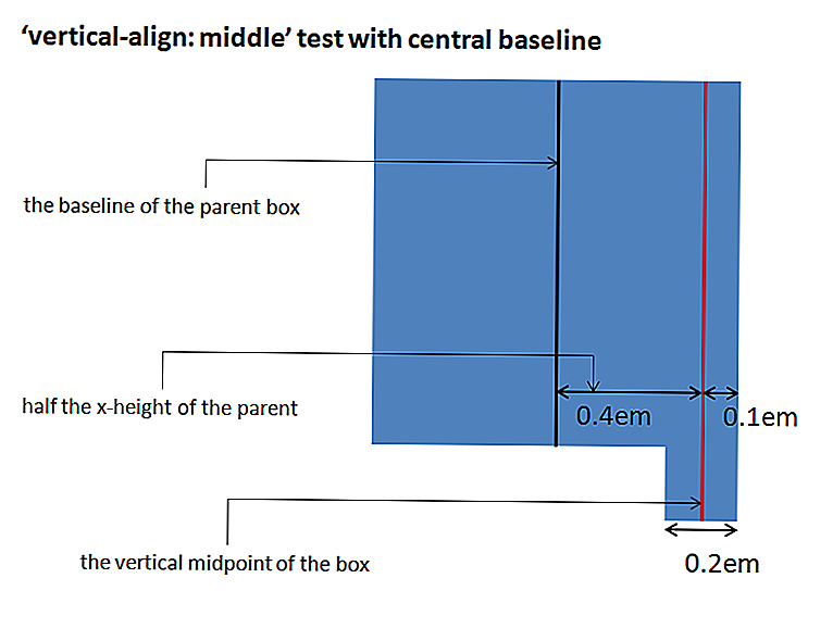
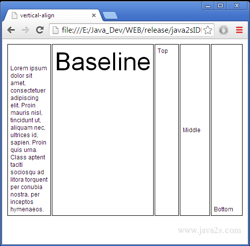
The most important reference point to align vertically is the baseline of the involved elements. In some cases the top and bottom edge of the elements’ enclosing box becomes important, too. Let’s have a look where the baseline and outer edges live for each involved type of element:
Inline Element
aAÄ qQ


aAÄ qQ


        aAÄ qQ
Here you see three lines of text next to each other. The top and bottom edge of the line height is indicated by red lines, the height of the font by green lines and the baseline by a blue line. On the left, the text has a line height set to the same height as the font-size. The green and red line collapsed to one line on each side. In the middle, the line height is twice as large as the font-size. On the right, the line height is half as large as the font-size.
The inline element’s outer edges align themselves with the top and bottom edge of its line height. It does not matter, if the line height is smaller than the height of the font. So, the outer edges are the red lines in the figure above.
The inline element’s baseline is the line, the characters are sitting on. This is the blue line in the figure. Roughly speaking, the baseline is somewhere below the middle of the font’s height. Have look at the W3C Specs for a .
Inline-Block Element
            c


            c
From left to right you see: an inline-block element with content (a “c”), an inline-block element with in-flow content and and an inline-block element with no in-flow content (but the content area has a height). The boundaries of the margin is indicated by red lines, the border is yellow, the padding green and the content area blue. The baseline of each inline-block element is shown as a blue line.
The Inline-block element’s outer edges are the top and bottom edge of its . These are the red lines in the figure.
The Inline-block element’s baseline depends on whether the element has in-flow content:
- In case of in-flow content the baseline of the inline-block element is the baseline of the last content element in normal flow (example on the left). For this last element its baseline is found according to its own rules.
- In case of in-flow content but an property evaluating to something other than , the baseline is the bottom edge of the margin-box (example in the middle). So, it is the same as the inline-block element’s bottom edge.
- In case of no in-flow content the baseline is, again, the bottom edge of the margin-box (example on the right).
Line Box
        x
            This

            can
You’ve already seen this setting above. This time I drew in the top and bottom of the line box’s text box (green, more on this below) and the baseline (blue), too. I also highlighted the area of the text elements by giving them a grey background.
The line box has a top edge aligned to the top edge of the top-most element of this line and a bottom edge aligned to the bottom edge of the bottom-most element of the line. This is the box indicated by the red lines in the figure above.
The line box’s baseline is variable:
This is probably the most confusing part, when working with vertical-align. It means, the baseline is placed where ever it needs to be to fulfil all other conditions like vertical-align and minimizing the line box’s height. It is a free parameter in the equation.
Since the line box’s baseline is invisible, it may not immediately be obvious where it is. But, you can make it visible very easily. Just add a character at the beginning of the line in questions, like I added an “x” in the figure. If this character is not aligned in any way, it will sit on the baseline by default.
Around its baseline the line box has what we might call its text box. The text box can simply be thought of as an inline element inside the line box without any alignment. Its height is equal to the font-size of its parent element. Therefore, the text box only just encloses the unformatted text of the line box. The box is indicated by the green lines in the figures above. Since this text box is tied to the baseline, it moves when the baseline moves. (Side note: this text box is called in the W3C Specs)
Phew, this was the hard part. Now, we know everything to put things into perspective. Let’s quickly sum up the most important facts:
- There is an area called line box. This is the area in which vertical alignment takes place. It has a baseline, a text box and a top and bottom edge.
- There are inline-level elements. These are the objects that are aligned. They have a baseline and a top and bottom edge.