Wrapping-up
An alternate name of word-wrap’s legacy name is overflow-wrap. The two can therefore be used interchangeably. Despite this, overflow-wrap properties are not well supported by all browsers.
If you want near-universal browser support, you should use word-wrap instead of overflow-wrap. Word-wrap should continue to be supported by browsers and user agents for legacy reasons, according to the draft CSS3 specification.
If It might suffice to use overflow-wrap or its legacy name word-wrap if you are looking to handle the content overflow.
The word-break function can also be used to break a word between two characters when the word exceeds its container. With word-break, you should use caution because browser support is limited, similarly to overflow-wrap.
Overflow-wrap vs Word-break
Though overflow-wrap and word-break behave similarly there are differences between them. The overflow-wrap property breaks the word if it cannot be placed on the line without overflowing regardless of the language used. The word-break property is used for non-English languages and specifies wraps between letters of languages like Chinese, Japanese, and Korean.
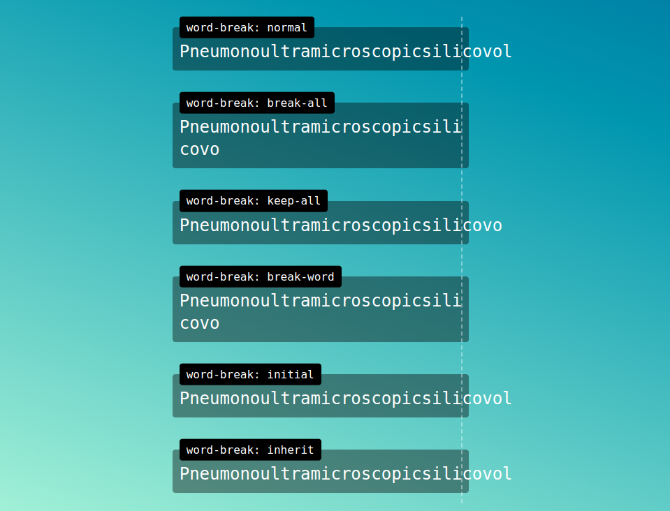
Word-break
The word-break property has a few common values listed below, you can see how these effect contained content in our visual examples to help guide you to your wanted result.
- word-break: normal; Default value. Uses default line break rules.
- word-break: break-all; To prevent overflow, word may be broken at any character.
- word-break: keep-all; Word breaks should not be used for Chinese/Japanese/Korean (CJK) text. Non-CJK text behavior is the same as value “normal”.
As well as Initial for setting the property to it’s default value, and Inherit to inherit the property value from it’s parent element.
word-break:break-all
This is an example of how the css property and corresponding value works, with super-long words such as thisisahugestringoftextthatdoesnthavespaceswhatsoever and thisisasimilarlongwordwhichiknowyourtryingtoread, you can see from this example how the text behaves, where it will break and where it will not break.
word-break:break-word
This is an example of how the css property and corresponding value works, with super-long words such as thisisahugestringoftextthatdoesnthavespaceswhatsoever and thisisasimilarlongwordwhichiknowyourtryingtoread, you can see from this example how the text behaves, where it will break and where it will not break.
word-break:keep-all
This is an example of how the css property and corresponding value works, with super-long words such as thisisahugestringoftextthatdoesnthavespaceswhatsoever and thisisasimilarlongwordwhichiknowyourtryingtoread, you can see from this example how the text behaves, where it will break and where it will not break.
Overflow-wrap & word-wrap
The overflow-wrap property has a few common values listed below but generally works very similar to word-wrap, you can see how these effect contained content in our visual examples to help guide you to your wanted result.
- word-break: normal; Default value. Uses default line break rules.
- overflow-break: anywhere; To prevent overflow, word may be broken at any character.
- overflow-wrap: break-word; To prevent overflow, word may be broken at arbitrary points.
- word-wrap: break-word; To prevent overflow, word may be broken at arbitrary points.
As well as Initial for setting the property to it’s default value, and Inherit to inherit the property value from it’s parent element.
overflow-wrap:anywhere
This is an example of how the css property and corresponding value works, with super-long words such as thisisahugestringoftextthatdoesnthavespaceswhatsoever and thisisasimilarlongwordwhichiknowyourtryingtoread, you can see from this example how the text behaves, where it will break and where it will not break.
overflow-wrap:break-word
This is an example of how the css property and corresponding value works, with super-long words such as thisisahugestringoftextthatdoesnthavespaceswhatsoever and thisisasimilarlongwordwhichiknowyourtryingtoread, you can see from this example how the text behaves, where it will break and where it will not break.
word-wrap:break-word
This is an example of how the css property and corresponding value works, with super-long words such as thisisahugestringoftextthatdoesnthavespaceswhatsoever and thisisasimilarlongwordwhichiknowyourtryingtoread, you can see from this example how the text behaves, where it will break and where it will not break.
votes
Article Rating
Breaking words with word-wrap and table-layout
Associate and works to break long words in a table cell, but this solution has some constraints you should consider carefully.
By using with value you change the algorithm used to lay out table cells, rows, and columns:
- In Firefox, paddings and borders are not taken into account in the calculation of the column widths. That means columns won’t size exactly the way you defined them.
- In all browsers, if no width has been defined, columns will all get the same size which is maybe not what you want.
| ** Not 75% in Firefox ** Lorem ipsum dolor sit amet, consectetur adipiscing elit. Mauris lobortis dui. | Loremipsumdolorsitamet |
Example # 3:
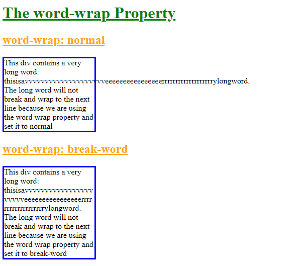
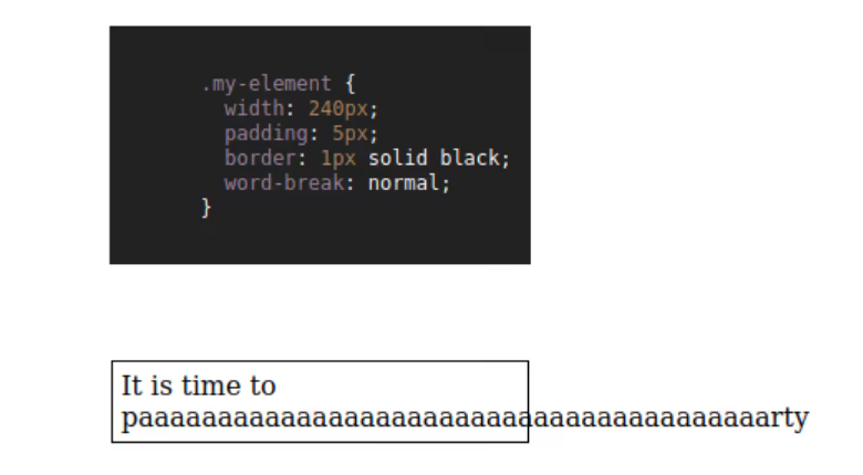
We have two headings “h1” and “h2”. Below these headings, we have two different divs with the name “a”, and “b”. We write the text inside both divs and put a long word in each div. Now, we are creating a CSS file in which we will utilize the “word-wrap” property.
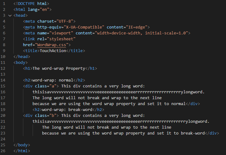
We use the “color” property and define it as “green” to decorate the heading as well as the “text-decoration” property and the keyword “underline” for this “text-decoration” property. We also use “orange” as the “color” for the next heading and we implement “text-decoration” with “underline” as the setting. We set the “width” of the “div” as “180px”, which will set this width for both divs because we don’t mention the name of any div here. We also utilize the “border” property which also applies to both divs. The “width” of the border for both divs is “3px”, “solid” type and “blue” is set for the “color” of the border.
We mention the name of the first div which is “div. a” and then the “word-wrap” attribute is applied. The value is set to “normal” which is also the “default” value. The long word is not broken for this div. The long word will be displayed exactly as it is typed in HTML code. Now, we have the second div which is “div. b”. For this, we are utilizing the “word-wrap” property and the “break-word” value is used. The long word will be broken according to the provided space with this value. By leveraging this property and value, we will be able to see how the long word splits in the output.
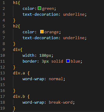
The long word of the first div is not broken because we use “normal” as the value of “word-wrap” for the “div. a”. But in the second div, you can see that the long word is also adjusted in the specified space. This long word that is present inside the second div is broken. This is because of the usage of the “break-word” value of the “word-wrap” property.
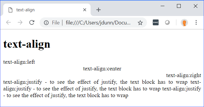
Выравнивание текста с помощью CSS
Начнем с атрибутов стиля, управляющих выводом текста в блочных элементах. Начнем со свойства text-align, которое является фактически заменой атрибута align (используется для выравнивания содержимого html-элементов, например абзацев p).
Свойство стиля text-align задает горизонтальное выравнивание текста и имеет всего четыре возможных значения:
Доступные значения этого правила определяют выравнивание, соответственно: left — по левому краю, right — по правому краю, center — по центру и justify — по ширине страницы (одновременно по левому и правому краю за счет увеличения расстояния между словами). Для примера, текст этой статьи выравнен по ширине страницы (если вы заметили у него ровные границы и слева и справа) с помощью правила text-align:justify.
По умолчанию, горизонтальное выравнивание выполняется по левому краю, поэтому специально указывать text-align:left не обязательно, если в родительских элементах не было указано другого выравнивания.
Примеры использования свойства:
Следующее свойство CSS text-ident задает отступ для красной строки, например для текста в теге абзаца p. Это правило также, как и text-align, применимо только для блочных элементов. Синтаксис:
Здесь допускаются абсолютные и относительные величины отступа. Абсолютные значения (px — пикселы, em, ex и др.) можно указывать как со знаком плюс, так и со знаком минус. Относительная величина обычно задается в процентах (%). Относительное значение рассчитывается от ширины области, которая отведена под текст. Так, css правило text-indent:50% задаст красную строку равную половине длины этой самой строки. По умолчанию отступ «красной строки» равен нулю. Пример:
Далее рассмотрим вертикальное выравнивание — свойство vertical-align. Это свойство применимо уже для всех html элементов и практически для всех означает выравнивание между собой строчных элементов с текстом относительно их базовой линии. Кроме тегов таблицы td и th, в которых по вертикали будет выравниваться весь контент. Синтаксис:
Рассмотрим каждое значение подробнее:
- baseline — выравнивание фрагмента текста по базовой линии родительского элемента. Это значение по умолчанию;
- sub — фрагмент текста изображается в виде нижнего индекса или подстрочным для родительского элемента;
- super — фрагмент текста изображается в виде верхнего индекса или надстрочным для родительского элемента;
- top — выравнивание фрагмента текста по верхнему краю родительского элемента;
- text-top — выравнивание фрагмента по верхнему краю текста родительского элемента;
- middle — выравнивание центра фрагмента текста по центру родительского элемента;
- bottom — выравнивание фрагмента текста по нижнему краю родительского элемента;
- text-bottom — выравнивание фрагмента по нижнему краю текста родительского элемента;
На рисунке ниже можно посмотреть поведение фрагментов теста при различных значениях свойства vertical-align в браузере Internet Explorer 11:
Кроме вышеперечисленных значений, можно указывать числовые значения. Так, правило CSS vertical-align:0 будет означать тоже самое, что и запись vertical-align:baseline. А правило vertical-align:10px будет смещать текст вверх на 10 пикселей относительно базовой линии. Для смещения текста вниз значение необходимо указывать с минусом.
Сдвиг также можно задавать в относительных единицах измерения, например в em и в ex или в процентах.
Для вертикального выравнивания содержимого ячеек таблицы в vertical-align следует использовать значения:
- top — для выравнивания содержимого по верхней границе ячейки;
- bottom — для выравнивания содержимого по нижней границе ячейки;
- middle — для выравнивания по центру ячейки (используется по умолчанию).
Для достижения нужного результата, обычно приходится экспериментировать с различными значениями свойства стиля vertical-align. Многочисленные возможные значения дают слишком разный результат в различных случаях.
Example # 1:
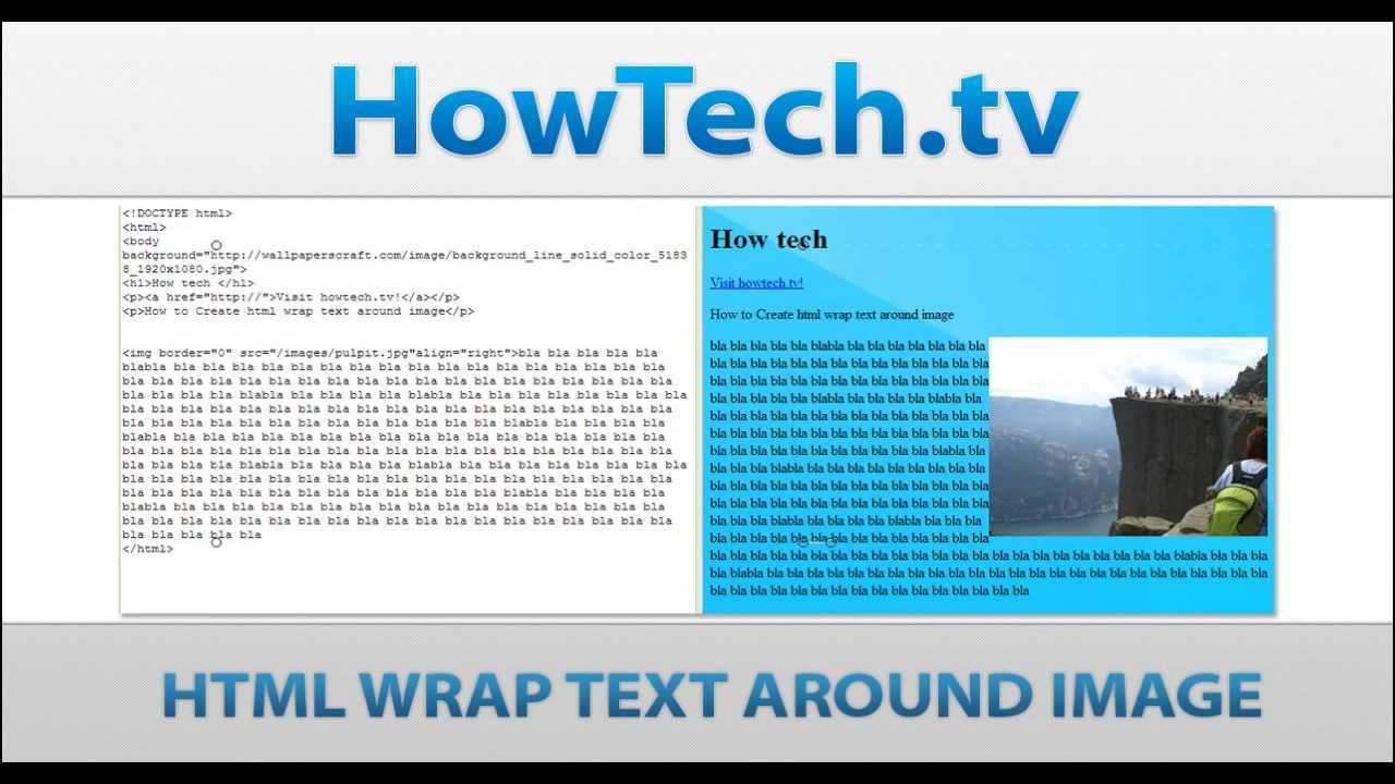
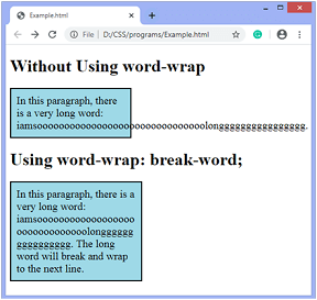
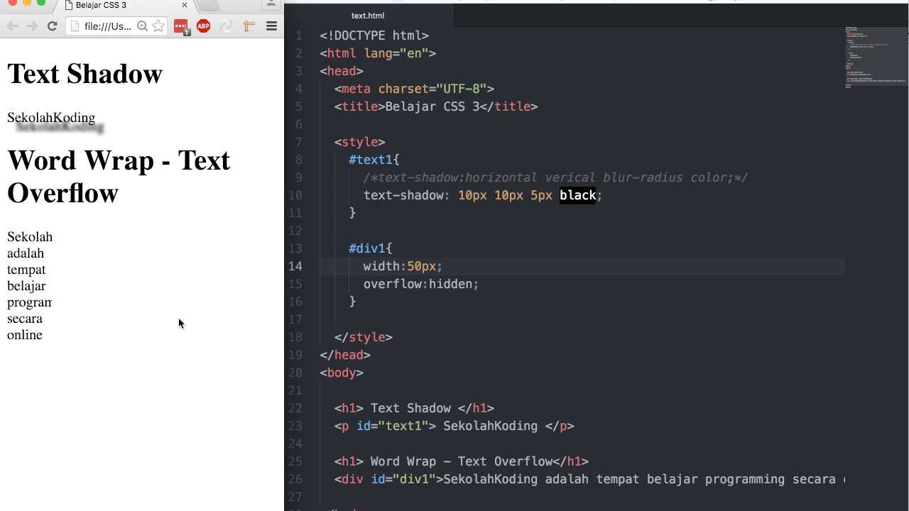
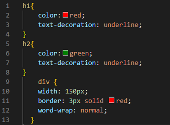
We are going to begin our code and run it in Visual Studio Code. We start by launching a new file and then select HTML as the language. Now, type “!” and press “Enter.” Here you will find all the HTML basic tags. As a result, we won’t have to manually add all these tags. After all this, we just insert the name of the CSS file in the “link” tag in the “head”. We put two headings in the body and create a div in which we write one long word so that we will use the “word-wrap” property in CSS and will show you how it works.
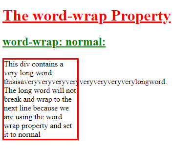
We are decorating the heading by applying “color” and setting it to the “red” using the “text-decoration” property and using the keyword “underline” for this property. We apply styling to this heading to make it attractive. We also decorate the second heading: “green” as the “color” and apply the “text-decoration” and set it to “underline”. We are setting the “width” of the “div” as “150px” and creating a “border” around it. This border is about “3px” in its “width” and it is a “solid” type, “red” in the “color”.
Here, we are applying the “word-wrap” property and setting it to “normal” which is also the “default” value. It will not break the long word. The long word will appear as it is written in the HTML code. It will cross the border which we have created for the div and the long text remains the same, it will not break this word.
The output shows that the long word appears the same as we write it in the HTML file. It crosses the borderline and appears in one line. The long word is not broken here because it sets the “word-wrap” property to “normal” which is the same as the “default”.
Опции CSS для выравнивания текста: text-align
Свойство используется в вебе уже давно. Оно контролирует выравнивание строчного контента (текста или изображений) внутри блочного контейнера. Ключевые слова и выравнивают содержимое по соответствующим краям контейнера. — выравнивает по центру, а делает все строки одинаковой длины (кроме последней в абзаце).
В спецификации появилась пара новых значений, полезных для сайтов,использующих написание справа налево (RTL): и .
Для обычных языков (LTR) они соответствуют и соответственно. А для языков (RTL) соответствует , а — .
Применение к дочернему элементу вынудит его унаследовать тоже выравнивание, что и у родительского элемента. И значения и в таком случае будут расчитаны исходя из направления языка родительского элемента.
#1 overflow-wrap
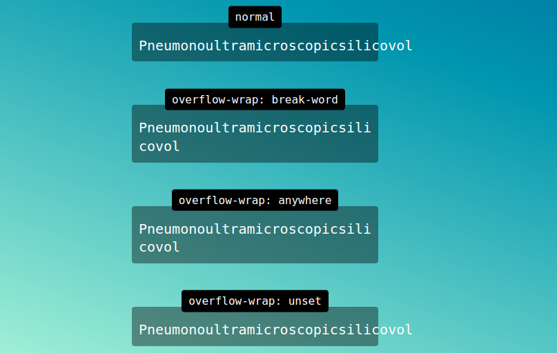
By defining , the browser is able to break lines within an unbreakable string to prevent overflowing content.
Values
In the property, there are only three values: normal, break-word, and anywhere. Defining the word-wrap property using overflow-wrap is considered a standard name.
i.) normal
Lines will only be broken in accordance with normal line-breaking rules. In the case of overflowing the container, words will not break. As a default, this property takes this value.
ii.) anywhere
Unless there are other acceptable breakpoints in the line, long words and URLs will break at any point. Even if the hyphens property is set, the hyphenation character will not be broken.
iii.) break-word
In order to force a line break, long words and strings of characters that do not fit inside their container will break at an arbitrarily placed point, but soft wrapping opportunities familiarised by word breaks are not taken into statement when computing min-content intrinsic sizes.
Property: overflow-wrap (alias word-wrap)
This property applies to inline elements. It determines whether the browser should break an otherwise unbreakable string to avoid it from overflowing its parent’s width.
It has the following possible keyword values.
- normal
- Anywhere
- break-word
overflow-wrap: normal
When set to normal, the browser will break the string on default/natural opportunities, such as a blank space or a hyphen (‘-’) character. It will also leverage soft-hyphen entity to break.This is the initial value of the property. So by default, every string will be broken at soft wrap opportunities, if any, on overflow.
This is how ‘ContentOverflowing’ and ‘Content-Overflowing’ will be handled.
ContentOverflowing
Content-Overflowing
overflow-wrap: anywhere;
This value allows the browser to break the string anywhere to avoid overflow.
Consider the following scenario with the default value for a fixed-width container.
ContentOverflow
There is no blank space, a hyphen, or any other soft wrap opportunity in the string. Therefore, it overflows. If we apply , we get the following, wrapped result.
ContentOverflow
overflow-wrap: break-word;
It behaves the same as . The difference is that the former does not consider soft-wrap opportunities when calculating min-content intrinsic sizes. In case you have not explored extrinsic vs intrinsic sizing, Ahmed Shadeed provides a great . It breaks only those words which have a width smaller than the available width.
Content is Overflowing
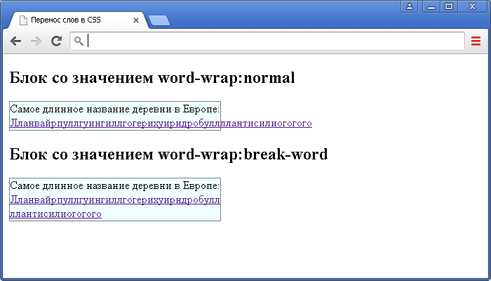
Управляем переносом строки с разбитием слов
Иногда дизайн портиться из-за отдельных очень длинных слов, не переносящихся на следующую строку и переполняющих контейнер. Это может быть длинный URL или комментарий с зажатой клавишей.
Для таких случаев у нас есть специальные свойства CSS.
Свойство
Свойство (раннее известное как и до сих пор ) работает, если свойство допускает перенос в соответствии с размером строки. Возможные значения — и .
Со значением слова разбиваются на всех традиционных маркерах — пробелы, дефисы и т.д.
Значение позволяет разбить длинные слова, если иначе строка будет превышать доступный размер.
На картинке ниже изображен пример длинного слова, выходящего за пределы контейнера:
Теперь зададим этому элементу свойство (и свойство для совместимости) в значение :
Теперь сверхдлинное слово разбито на несколько строк, заполняющих всю ширину контейнера.
Свойство
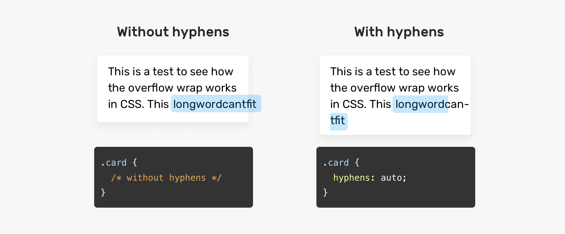
Разбитие длинных слов это, конечно, хорошо. Однако, полученный текст может смутить читателей. Лучше будет, если разбитие слова будет сопровождаться установкой дефиса. Таким образом, читателям сразу становится ясно, что это одно слово, разделенное между строками. Этого можно достичь используя свойство , его можно сочетать с .
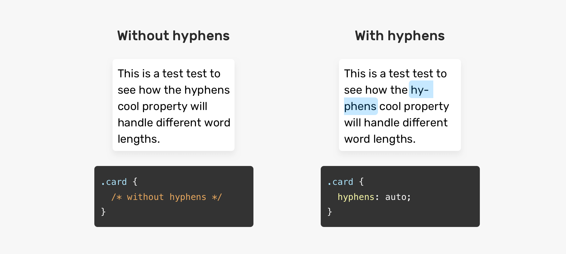
Конкретно это значит, что значение свойства позволяет вывести дефис на месте разбития слова, если язык документа позволяет это делать в имеющемся источнике HTML. Чтобы это сработало, не забудьте задать правильный атрибут своему документу:
Вы также можете отключить вывод дефисов, задав значение :
Также у вас есть возможность вывести дефисы на разрывах строки там, где вы поставили их в разметке. Это делается с помощью значения :
Основные браузеры , но в реализации есть некоторые различия. Последние на момент написания статьи версии Chrome (44) и Opera (30) не поддерживали значение .
Summary
| Property | Value | Behavior | When To Use | Example |
|---|---|---|---|---|
| Break at natural line breakpoints such as blank space, a hyphen | When overflow is determined to not be a possibility |
Content |
||
| Break between any 2 characters where the overflow occurs and consider soft wrap opportunities when calculating the min-content intrinsic sizes | When overflow should be handled by breaking long words. As discussed, the alternative option of produces visually better results |
ContentOverflow |
||
| Break between any 2 characters but do not consider soft wrap opportunities when calculating the min-content intrinsic sizes | When overflow should be handled by breaking only those words which have a width smaller than the available width |
Content is Overflowing |
||
| Break at default rules | When overflow is determined to not be a possibility |
Content |
||
| Break exactly where the content overflows | When overflow should be handled by breaking text exactly at the point of overflow — even if placing the word on a new line eliminates the overflow |
Content is Overflowing Again |
||
| Same as and — Break can create gaps unlike | When placing the overflowing word onto the next line eliminates overflow. This can cause gaps. |
Content is Overflowing Again |
Examples
Here are examples from the above summary in a codepen to help demonstrate what the CSS code should look like:
<section class="centered">
  <h2>Without Handling Overflow</h2>
<div>Content with aVeryVeryVeryLongWord</div>
<!---->

<h2>Handling Overflow with overflow-wrap</h2>

<h3>overflow-wrap: normal;</h3>
<div class="ow-normal">Content with aVeryVeryVeryLongWord</div>

<h3>overflow-wrap: anywhere;</h3>
<div class="ow-anywhere">Content with aVeryLongWordThatDoesNotFit</div>

<h3>overflow-wrap: break-word;</h3>
<div class="ow-break-word">Content with aVeryLongWordThatDoesNotFit</div>
<!---->

<h2>Handling Overflow with word-break</h2>


<h3>word-break: normal;</h3>
<div class="wb-normal">Content with aVeryVeryVeryLongWord</div>

<h3>word-break: break-all;</h3>
<div class="wb-break-all">Content with aVeryLongWordThatDoesNotFit</div>

<h3>word-break: break-word;</h3>
<div class="wb-break-word">Content with aVeryLongWordThatDoesNotFit</div>
</section>
* { font-family: sans-serif; }

section.centered { text-align: center; }

div {
  display: inline-block;
  width: 130px;
  border: 3px solid #48abe0;
  text-align: left;
}

.ow-normal {
  overflow-wrap: normal;
}

.ow-anywhere {
  overflow-wrap: anywhere;
}

.ow-break-word {
  overflow-wrap: break-word;
}

.wb-normal {
  word-break: normal;
}

.wb-break-all {
  word-break: break-all;
}

.wb-break-word {
  word-break: break-word;
}

h3 {
  font-weight: normal;
  font-style: italic;
  border-top: 1px solid #b5b5b5;
  width: 30%;
  margin-left: auto;
  margin-right: auto;
  margin-top: 20px;
  padding-top: 20px;
}
The optimal way: CSS
There are 4 CSS properties that can help to handle text wrapping:
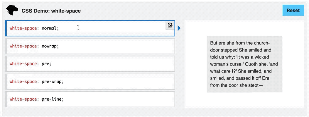
white-space
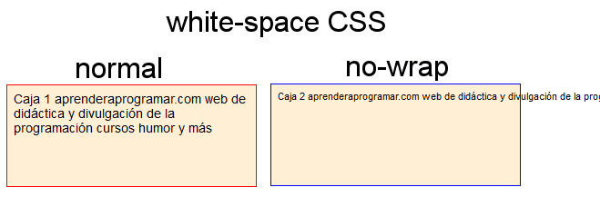
The is managing how spaces are rendered; and can take 6 values:
- (default value)
white-space: normal
The default value renders text based on the following rules:
- The text is wrapped to fit the container.
- Multiple spaces and tabs are collapsed to a single space.
- Soft break lines are converted to single space.
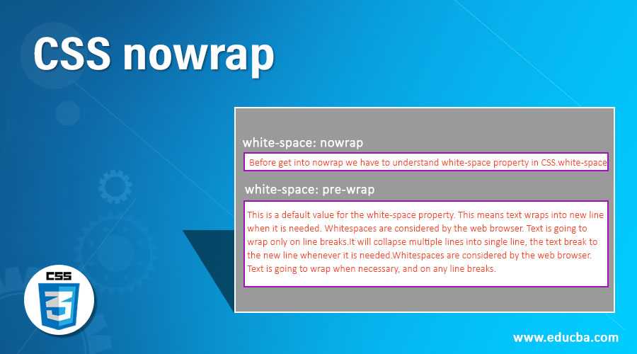
white-space: nowrap
The value renders text based on the following rules:
- The text is not wrapped to fit the container.
- Multiple spaces and tabs are collapsed to a single space.
- Soft break lines are converted to single space.
white-space: pre
The value renders text based on the following rules:
- The text is not wrapped to fit the container.
- Multiple spaces and tabs are preserved as is.
- Soft break lines are also preserved.
white-space: pre-wrap
The value renders text based on the following rules:
- The text is wrapped to fit the container.
- Multiple spaces and tabs are preserved as is.
- Soft break lines are also preserved.
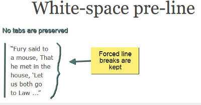
white-space: pre-line
The value renders text based on the following rules:
- The text is wrapped to fit the container.
- Multiple spaces and tabs are collapsed to a single space.
- Soft break lines are preserved as is.
white-space: break-spaces
The value renders text based on the following rules:
- The text is wrapped to fit the container.
- Multiple spaces and tabs are preserved but are hanged at the end of the line.
- Soft break lines are also preserved.
word-break
The is managing how line breaks are rendered; and can take 4 values:
- (default value)
word-break: keep-all
The value is applied only on CJK languages, where it keeps the text lines and is not inserting any line breaks. For all other languages, is the same as the value.
word-break: break-word
The value inserts a line break only when is required, to avoid an overflow.
overflow-wrap / word-wrap
The is enabling the line breaks. The legacy property name is which was .
It can take 3 values:
- (default value)
overflow-wrap: break-word
The value inserts line breaks when words are exceeding the width of the container, to avoid overflow; but soft wraps are not calculated in the content sizes.
line-break
The is managing how line breaks are rendered mainly for CJK languages; and can take 5 values:
- (default value)
line-break: strict
The value uses the strict line break rules; For example the Japanese yōon kana (拗音) characters are never breaking within.
line-break: anywhere
The value inserts line breaks in any position on the words, without following any hypheration rules (such as the Unicode Line Breaking Algorith) and without adding any hyphernation character.
The renders similar as if we inserted a character after every character or space.
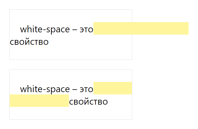
Обработка пробелов: white-space
Когда вы нажимаете клавишу , пробел или форсированно обрываете строку (с клавишей или тегом ), вы создаете пробелы в своем документе.
По умолчанию браузеры объединяют все последовательности пробелов в один, удаляют обрывы строки и заставляют строки занимать ширину контейнера. Это удобно потому что позволяет делать отступы и разделять фрагменты текста, сохраняя исходник документа читаемым и поддерживаемым, не заботясь о его отображении в браузере.
Однако, что делать, если у нас другая цель? Предположим, вы хотите сохранить все пробелы, которые вы создали в HTML-документе. Или вы хотите, чтобы фрагмент текста выводился как сниппет кода, со всеми отступами. Или же вы хотите вывести текст в одну линию, без переносов.
В тех случаях, когда вам нужно изменить дефолтное поведение браузера, свойство предлагает несколько интересных вариантов.
Ключевое слово идентично дефолтному поведению — все лишние пробелы схлопываются в один, строка переводится после достижения края контейнера.
Значение
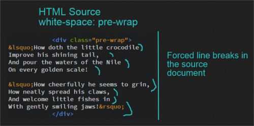
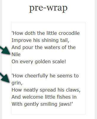
Ключевое слово позволяет вам вывести текст с сохранением всех пробелов и всех форсированных переводов строки в исходнике. И при превышении пределов контейнера строка не будет обрываться.
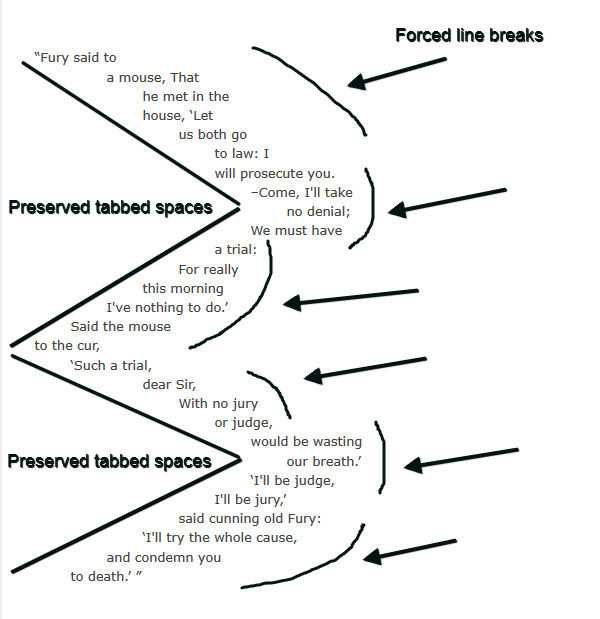
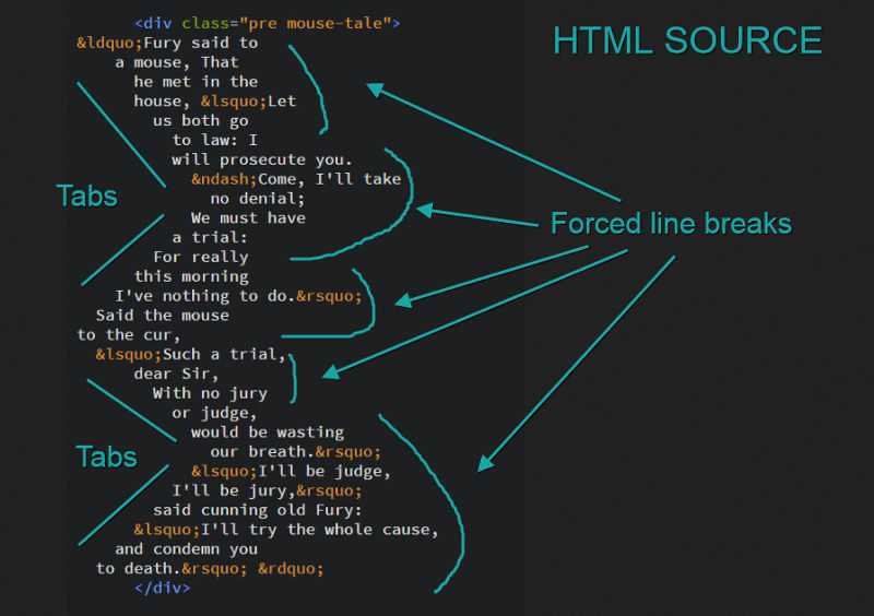
Если вы используете табы, то вы можете управлять их размером в пробелах с помощью свойства . Оно принимает значение в виде целого числа.
Свойство поддерживают , но если вы уверены, что вам это надо, используйте полифилл.
Значение
Это значение позволяет сохранить все множественные пробелы на месте, но если строка не вмещается в контейнер, она автоматически переносится.
Ключевое слово позволяет вам достигнуть желаемого результата.
Отметьте, как каждая строка, выведенная в браузере, повторяет все переводы строки из исходника при наличии места в контейнере.
Однако, если вы уменьшите ширину браузера, вы заметите, что все строки ограничены шириной контейнера.
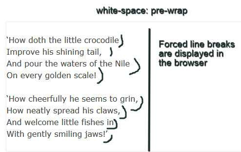
Значение
И, наконец, еще одно интересное значение свойства — . Оно действует как дефолтное в части схлопывания пробелов в один и ограничения строки размером контейнера. Однако оно отрабатывает все форсированные переводы строки.

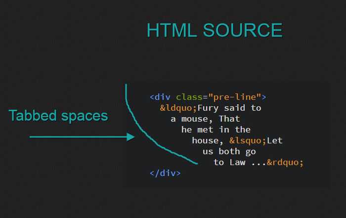
Значение
это, возможно, самое известное значение для . Сталкивались вы с необходимостью задать какому-либо элементу дизайна неразрывность вне зависимости от ширины контейнера? Это делается с помощью .
Луис Лазарис указывает на следующий случай использования этого значения.
На примере выше ссылка обозначена символом и переносить его на следующую линию не желательно.
В этом и подобных случаях поможет значение .
Другой интересный случай использования описан Сарой Суайдан в справочнике по CSS от Codrops. Сара указывает, что это значение можно применять к любому строчному контенту, включая изображения.
Я проиллюстрирую это предложение, создав с использованием . Вот демо:
CSS Справочники
CSS СправочникCSS ПоддержкаCSS СелекторыCSS ФункцииCSS ЗвукCSS Веб шрифтыCSS АнимацииCSS ДлиныCSS Конвертер px-emCSS Названия цветаCSS Значения цветаCSS по умолчаниюCSS Символы
CSS Свойства
align-content
align-items
align-self
all
animation
animation-delay
animation-direction
animation-duration
animation-fill-mode
animation-iteration-count
animation-name
animation-play-state
animation-timing-function
backface-visibility
background
background-attachment
background-blend-mode
background-clip
background-color
background-image
background-origin
background-position
background-repeat
background-size
border
border-bottom
border-bottom-color
border-bottom-left-radius
border-bottom-right-radius
border-bottom-style
border-bottom-width
border-collapse
border-color
border-image
border-image-outset
border-image-repeat
border-image-slice
border-image-source
border-image-width
border-left
border-left-color
border-left-style
border-left-width
border-radius
border-right
border-right-color
border-right-style
border-right-width
border-spacing
border-style
border-top
border-top-color
border-top-left-radius
border-top-right-radius
border-top-style
border-top-width
border-width
bottom
box-decoration-break
box-shadow
box-sizing
caption-side
caret-color
@charset
clear
clip
color
column-count
column-fill
column-gap
column-rule
column-rule-color
column-rule-style
column-rule-width
column-span
column-width
columns
content
counter-increment
counter-reset
cursor
direction
display
empty-cells
filter
flex
flex-basis
flex-direction
flex-flow
flex-grow
flex-shrink
flex-wrap
float
font
@font-face
font-family
font-kerning
font-size
font-size-adjust
font-stretch
font-style
font-variant
font-weight
grid
grid-area
grid-auto-columns
grid-auto-flow
grid-auto-rows
grid-column
grid-column-end
grid-column-gap
grid-column-start
grid-gap
grid-row
grid-row-end
grid-row-gap
grid-row-start
grid-template
grid-template-areas
grid-template-columns
grid-template-rows
hanging-punctuation
height
hyphens
@import
isolation
justify-content
@keyframes
left
letter-spacing
line-height
list-style
list-style-image
list-style-position
list-style-type
margin
margin-bottom
margin-left
margin-right
margin-top
max-height
max-width
@media
min-height
min-width
mix-blend-mode
object-fit
object-position
opacity
order
outline
outline-color
outline-offset
outline-style
outline-width
overflow
overflow-x
overflow-y
padding
padding-bottom
padding-left
padding-right
padding-top
page-break-after
page-break-before
page-break-inside
perspective
perspective-origin
pointer-events
position
quotes
resize
right
tab-size
table-layout
text-align
text-align-last
text-decoration
text-decoration-color
text-decoration-line
text-decoration-style
text-indent
text-justify
text-overflow
text-shadow
text-transform
top
transform
transform-origin
transform-style
transition
transition-delay
transition-duration
transition-property
transition-timing-function
unicode-bidi
user-select
vertical-align
visibility
white-space
width
word-break
word-spacing
word-wrap
writing-mode
z-index
#3 word-break
When the content box would otherwise overflow, line breaks are inserted using the word-break CSS property.
A line break is usually only inserted when there is a space or hyphen in the space. Nevertheless, when the word-break property is set to break-all, the browser breaks lines wherever they occur.
By using the word-break CSS property, words can be broken or split depending on where they appear in a line. Using the word-wrap property, long words can be split/broken and wrapped into the next line.
Values
Below is a list of values that can be used to specify the property.
i.) normal
ii.) break-all
By specifying this value, a break will be generated exactly where the text would overflow the container if it was left unbroken. Consequently, it will be difficult to read as it breaks the word in any character.
iii.) keep-all
It is not recommended to use word breaks when writing Chinese/Japanese/Korean (CJK) text. The behaviour of non-CJK texts is the same as it is for CJK texts.
iv.) break-word
If it is left unchanged, the text will overflow the container at the exact point where it would otherwise break. As a result, the word will be difficult to read if it is broken by any character.