
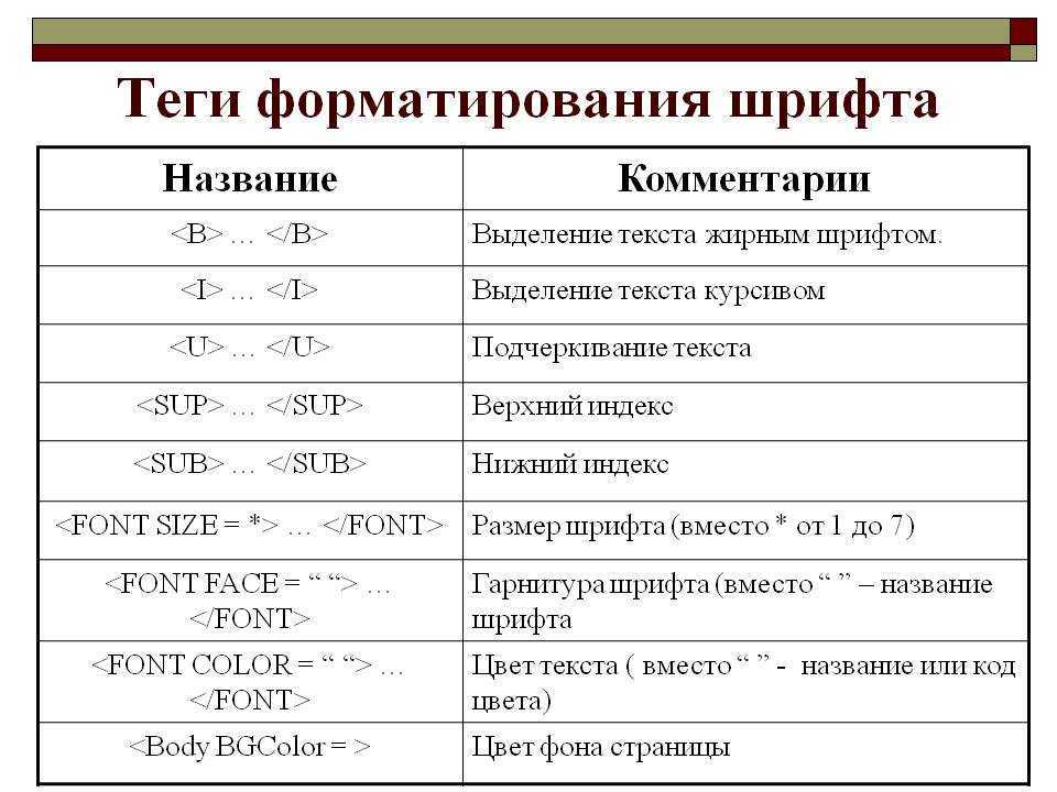
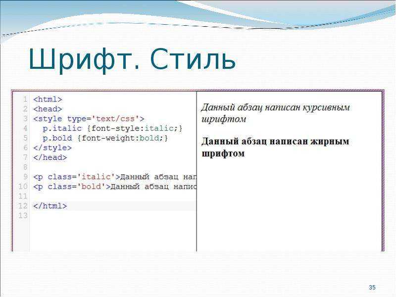
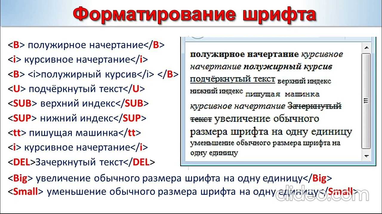
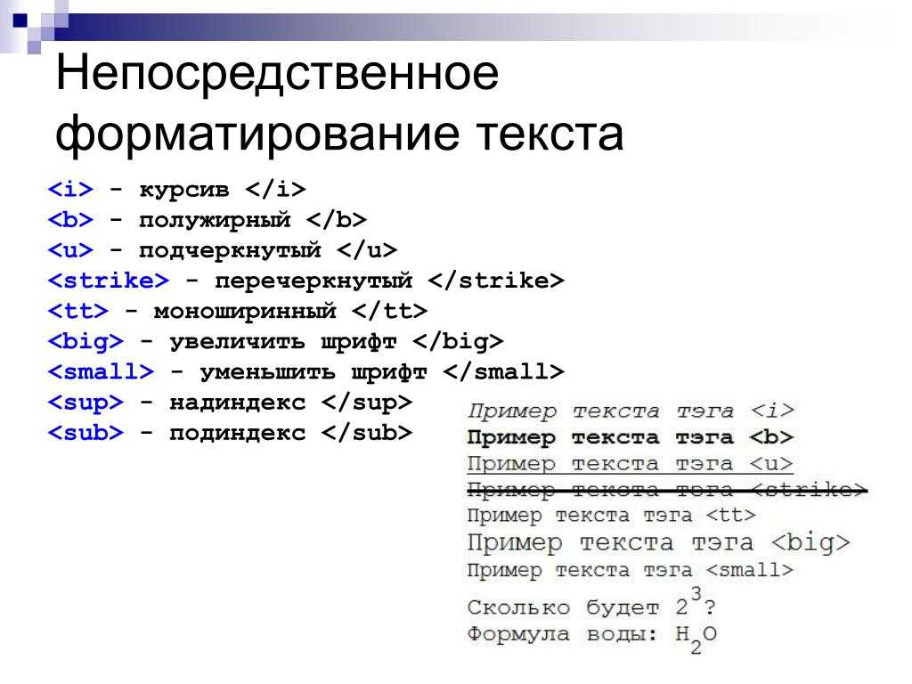
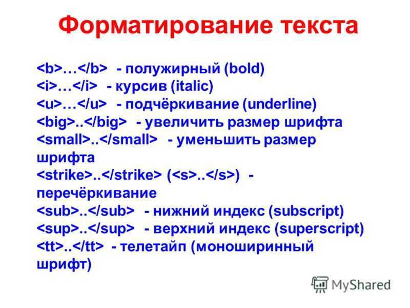
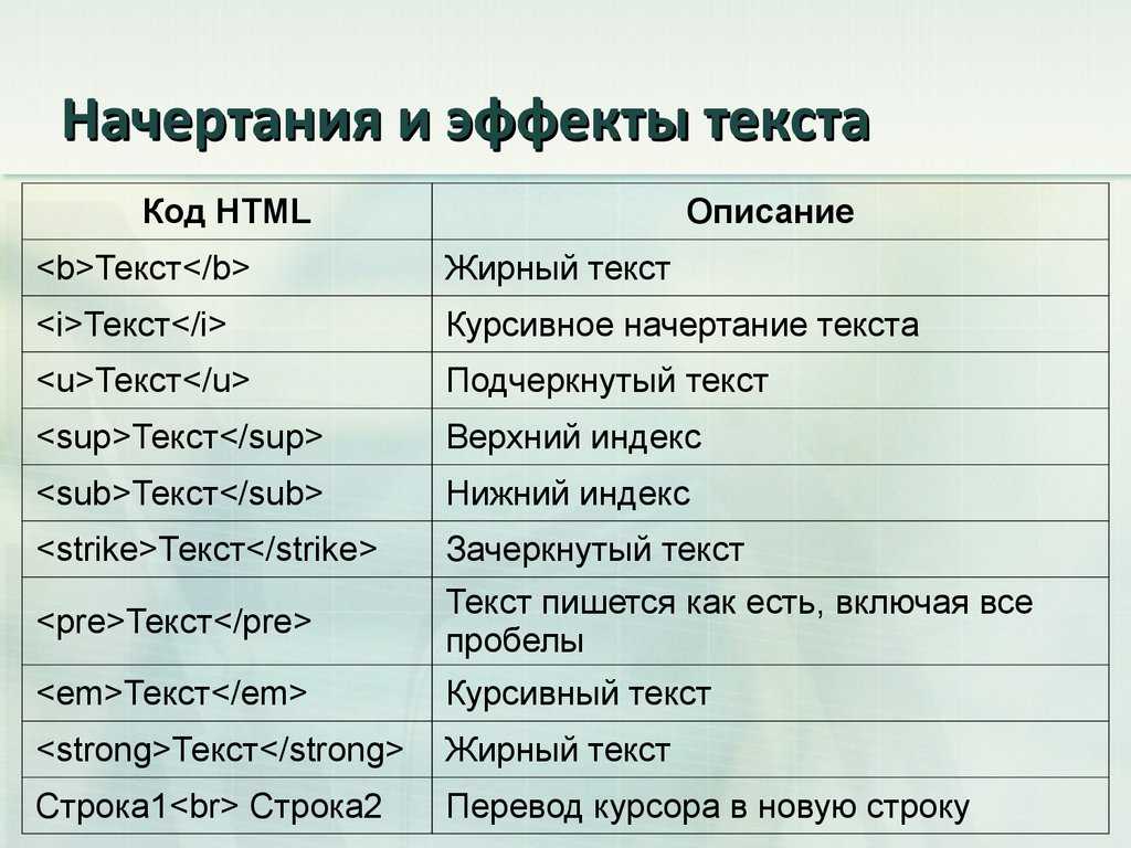
§Применение font-weight\font-style
Весь фокус подхода в том, что для начертаний задается одинаковый font-family, но разные сочетания свойств. Пример font-face:
@font-face {
    font-family: 'Droid Serif';
    src: url('droidserif-regular.eot');
    src: url('droidserif-regular.eot?#iefix') format('embedded-opentype'),
         url('droidserif-regular.woff') format('woff'),
         url('droidserif-regular.ttf') format('truetype');
    font-weight: normal;
    font-style: normal;
}

@font-face {
    font-family: 'Droid Serif';
    src: url('droidserif-italic.eot');
    src: url('droidserif-italic.eot?#iefix') format('embedded-opentype'),
         url('droidserif-italic.woff') format('woff'),
         url('droidserif-italic.ttf') format('truetype');
    font-weight: normal;
    font-style: italic;
}
По сути, указывая значения для font-weight и font-style, мы создаем «ключ», по которому браузер будет искать нужный файл для указанного в селекторе начертания.
Например:
p{
    font-family: 'Droid Serif';
    font-weight: normal;
    font-style: normal;
}
и
p{
    font-family: 'Droid Serif';
    font-weight: normal;
    font-style: italic;
}
Встречая «ключ», браузер по нему обратится к font-face с соответствтующими значениями и применит нужный файл. Таким образом, в первом случае будет выведено начертание regular, а во втором italic. Этот способ более универсален и исключает ситуации с псевдоначертаниями. Кроме того, font-family можно задать единожды для всего документа или блока, а внутри него уже управлять свойствами или отдать все на откуп тегам.
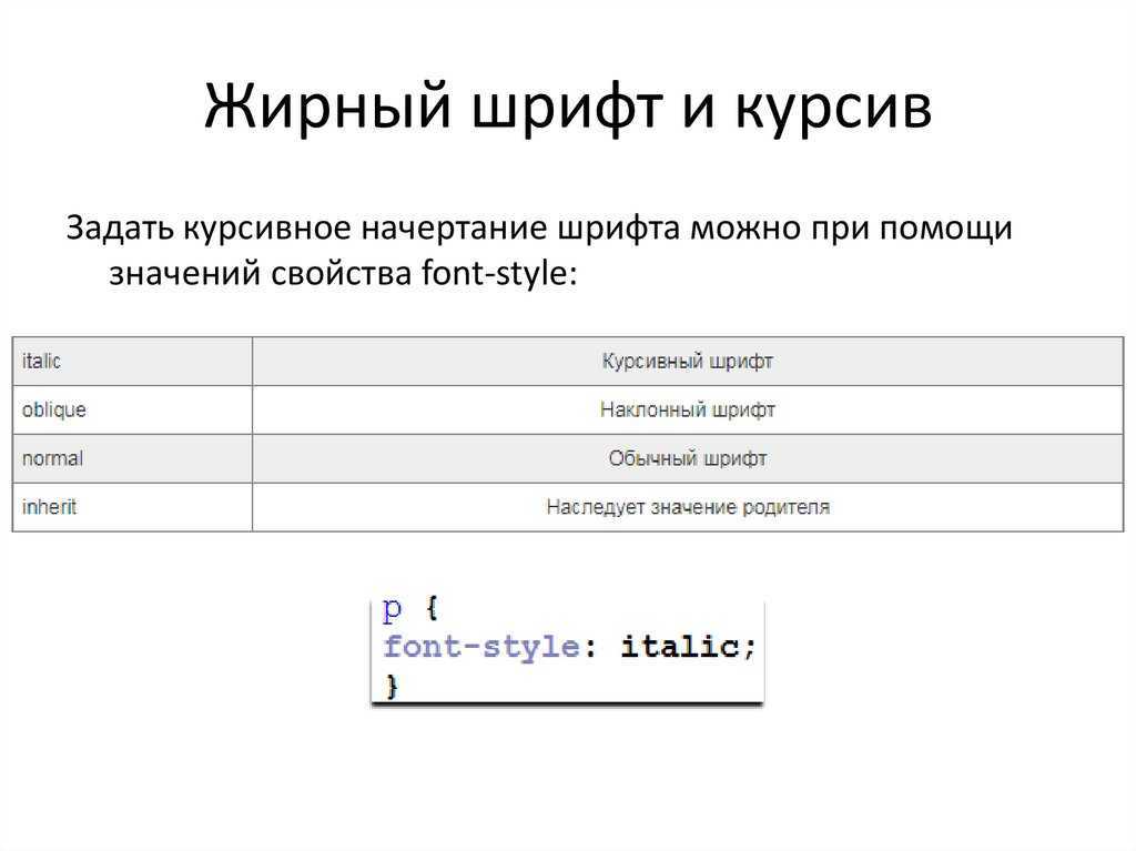
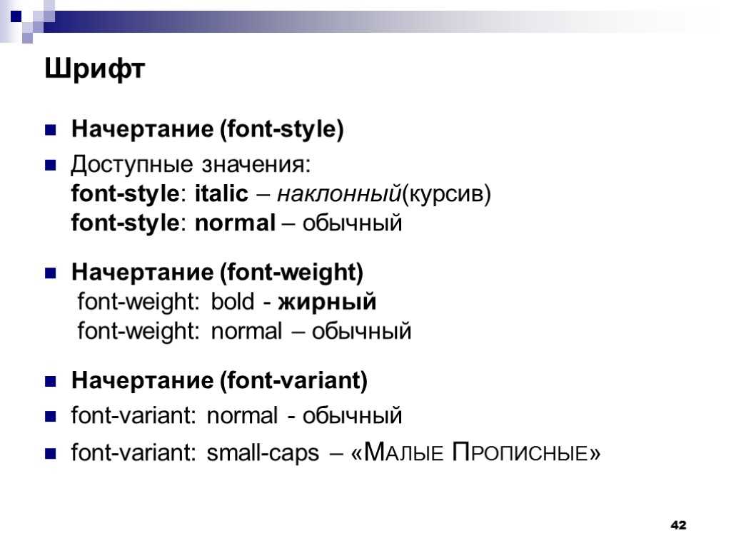
Стиль шрифта и css-свойство font-style
Кроме насыщенности, конечно же, нас интересует и возможность выделять слова и фрагменты текста курсивом. CSS
дает нам такую возможность за счет применения наследуемого свойства font-style,
которое определяет начертание шрифта и может принимать следующие значения:
- normal – шрифт отображается стандартным способом; значение используется браузером по умолчанию;
- italic – шрифт отображается курсивом;
- oblique – шрифт отображается наклонным.
Следует отметить, что понятия курсивного и наклонного начертания
несколько различаются, поскольку курсивное начертание предусматривает наличие специального шрифтового набора символов со скругленными формами штрихов,
что делает его похожим на рукописный текст, а наклонное начертание представляет собою всего лишь обычный прямой шрифт слегка наклоненный вправо.
Более того, не всякий шрифт предусматривает курсив, поэтому даже в случае указания в свойстве
font-style значения italic, символы в них будут
отображаться просто наклонными.
Также хотелось бы напомним, что все свойства CSS могут принимать значение inherit,
которое сообщает браузеру о том, что значение свойства должно быть унаследовано от родителя.
Font Size
| Syntax: | font-size: <absolute-size> | <relative-size> | <length> | <percentage> |
|---|---|
| Possible Values: |
|
| Initial Value: | medium |
| Applies to: | All elements |
| Inherited: | Yes |
The font-size property is used to modify the size of the displayed font. Absolute lengths (using units like pt and in) should be used sparingly due to their weakness in adapting to different browsing environments. Fonts with absolute lengths can very easily be too small or too large for a user.
Some example size assignments would be:
Authors should be aware that Microsoft Internet Explorer 3.x incorrectly treats em and ex units as pixels, which can easily make text using these units unreadable. The browser also incorrectly applies percentage values relative to its default font size for the selector, rather than relative to the parent element’s font size. This makes rules like
dangerous in that the size will be twice IE’s default font size for level-one headings, rather than twice the parent element’s font size. In this case, BODY would most likely be the parent element, and it would likely define a medium font size, whereas the default level-one heading font size imposed by IE would probably be considered xx-large.
Given these bugs, authors should take care in using percentage values for font-size, and should probably avoid em and ex units for this property.
How Are Relative Keyword Values Used in CSS Font-Weight?
We learned earlier in this article that the lighter and bolder values are relative keywords values. Therefore, they provide the result relative to their parent element, but they can only offer four values according to their parent’s property values.
Those four weights are thin, normal, bold, and heavy. This means that, if you want values other than these four values, you should not be using the relative keywords values. But then, how is the absolute font-weight determined?
Here is the list stating all the parent values and possible results on their child element.
If the parent’s font-weight is among the 100, 200, or 300, the child’s font-weight would be 400 provided you use the bolder property, and 100 provided you use the lighter property.
If the parent’s font-weight is 400 or 500, the child element will receive the weight of 700 and 100 in bolder and lighter values, respectively.
When the font-weight of the parent element is 600 or 700, the font-weight of the child element would be 900 and 400 as a result of bolder and lighter values, respectively.
If the font-weight of the parent element is 800 or 900, the child element would still get the same 900 weight in case of the bolder value, but it will change font weight CSS to 700 in case of the lighter value.
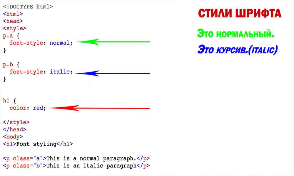
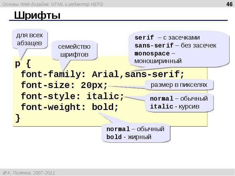
Установка шрифта (font-family)
Установка шрифта в CSS осуществляется с помощью свойства . В качестве значения мы можем указать как один шрифт, так и несколько, перечислив их через запятую:
CSS
В этом примере мы для тега установили шрифты в следующем порядке:
- Segoe UI;
- Arial;
- sans-serif.
— это не шрифт, а ключевое слово в CSS, с помощью которого мы указываем общее семейство шрифтов. В данном случае, семейство шрифтов без засечек. По факту оно будет обозначать шрифт, который установлен в браузере по умолчанию для этого семейства шрифтов.
В большинстве случаев указание нескольких шрифтов в нужно лишь для того, чтобы улучшить качество отображения текста на различных устройствах. Так как не на каждом из них имеется тот или иной шрифт.
В этом случае сначала указывают самый желаемый шрифт, потом менее желаемый, и завершают этот список обычно общим типом шрифта. Чтение этого списка браузер выполняет слева направо до первого найденого шрифта. Таким образом, как только браузер обнаружит какой-то из перечисленных шрифтов, он его сразу же будет использовать. Продолжать идти дальше по списку и проверять оставшиеся шрифты он не будет.
В случае, когда ни один из заданных шрифтов не найден, будет использоваться тот, который указан в настройках браузера по умолчанию. В Chrome посмотреть, какой шрифт используется по умолчанию можно в разделе «Настроить шрифты»: «Настройки» -> «Внешний вид» -> «Настроить шрифты». Кстати, здесь же его при необходимости можно изменить на другой:
В настройках браузера можно изменить не только общий шрифт по умолчанию, но и шрифты для некоторых общих категорий шрифтов. В основном для , и . Изменить дефолтный шрифт для других семейств (, и так далее) в большинстве случаев нельзя.
Пример, как в очень популярном CSS-фреймворке Bootstrap 5 выполняется установка шрифта для тега и, следовательно, по умолчанию для всех вложенных в него элементов:
CSS
Шрифты, в названии которых имеется хотя один пробел, должны быть заключены в кавычки. Наприпер: «Segoe UI», «Helvetica Neue» и так далее.
В конце как правило после всех шрифтов необходимо указать их общее семейство. Так как нет гарантии, что эти шрифты имееются на устройстве пользователя. В этом случае хотя бы будет использоваться шрифт из этого семейства, а неизвестно какой. В этом примере как раз для этого случая указано семейство шрифтов .
Кроме этого в начале указано ключевое слово . Какой шрифт оно обозначает? Чтобы это понять, рассмотрим какие вообще имеются основные ключевые слова, которые могут использоваться для указания общих семейств шрифтов:
- – общее семейство системных шрифтов; оно указывает, что в качестве шрифта будет использоваться системный шрифт операционной системы, но так как разные операционные системы используют разные системные шрифты, то в Windows это будет «Segoe UI», в macOS – «San Francisco», в Android – «Roboto».
- – обозначает, что на устройствах Apple (iPhone, iPad и Mac) нужно использовать системный шрифт операционной системы.
- – шрифт с засечками. Например: Georgia, Times New Roman.
- – шрифт без засечек. Например: Arial, Tahoma, Trebuchet MS, Verdana, San Francisco, Segoe UI.
- – моноширинный шрифт, то есть такой у которого все символы (глифы) имеют одинаковую ширину. Например: SFMono-Regular, Menlo, Monaco, Consolas, Liberation Mono, Courier New.
- – шрифты, имитирующие почерк. Например: Comic Sans MS, Comic Sans, Apple Chancery, Bradley Hand, Snell Roundhand.
- – декоративные шрифты, которые в основном используются для названий, заголовков и так далее. Например: Impact, Luminari, Chalkduster, Jazz LET, Stencil Std.
- – шрифты, специально предназначенные для отображения эмодзи. Например: Apple Color Emoji, Segoe UI Emoji.
Свойство является . Это значит, что при его установке некоторому элеиенту, оно по цепочке вложенности передаётся всем его потомкам.
Поэтому шрифт, который должен иметь основный текст на странице обычно устанавливают на уровне . А отдельным элементам, например, заголовкам задают его уже на уровне этих элементов:
CSS
Курсив и наклон
Курсивные и наклонные начертания часто встречаются в современных шрифтовых семействах в дополнение к прямым. При этом они имеют различные функции и смысл.
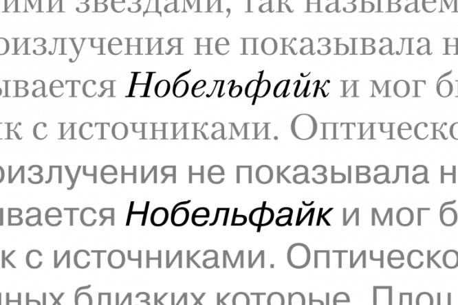 Курсивное начертание – шрифт Kudryashev Italic, наклонное начертание – шрифт Pragmatica Italic.
Курсивные начертания (Italic) отличаются от прямых более рукописной формой, потому что они произошли от распространенного итальянского почерка эпохи Возрождения. С XVI века и до наших дней, италик используется для выделений в тексте. Наклон указывает на смену интонации при чтении. Кроме того, в рукописной форме букв меньше прямых линий и больше изящных изгибов, что придает выделенной фразе приятный вежливый характер. Все, что напоминает почерк, кажется более личным и доверительным, чем ровные «печатные» буквы, поэтому в большинстве поздравлений и приглашений используются рукописные шрифты или близкие к рукописным курсивные начертания шрифтов с засечками.
Наклонные начертания (Oblique) получаются путем скоса прямых букв и служат в основном для придания надписи ощущения скорости, но иногда и для выделений в тексте. После скоса все вертикальные линии становятся наклонными, даже круглые формы под наклоном теряют часть уникальности. Более монотонная надпись, как бы покосившаяся от ветра, воспринимается как нечто быстрое и стремительное. Поэтому наклонные шрифты – отличный выбор для спортивной или автомобильной тематики.
Подключение шрифтов с Google Fonts
Google Fonts – это бесплатный сервис, с помощью которого можно очень просто подключить на страницу нестандартный шрифт. Google Fonts содержит более 1500 семейств шрифтов и все они имеют открытый исходный код.
Наиболее популярными семействами на этом сервисе являются: Roboto, Open Sans, Noto Sans, Montseratt, Lato, Poppins, Inter, Oswald и так далее.
Для подключения шрифтов необходимо выбрать нужные семейства и в них одно или несколько необходимых начертаний:
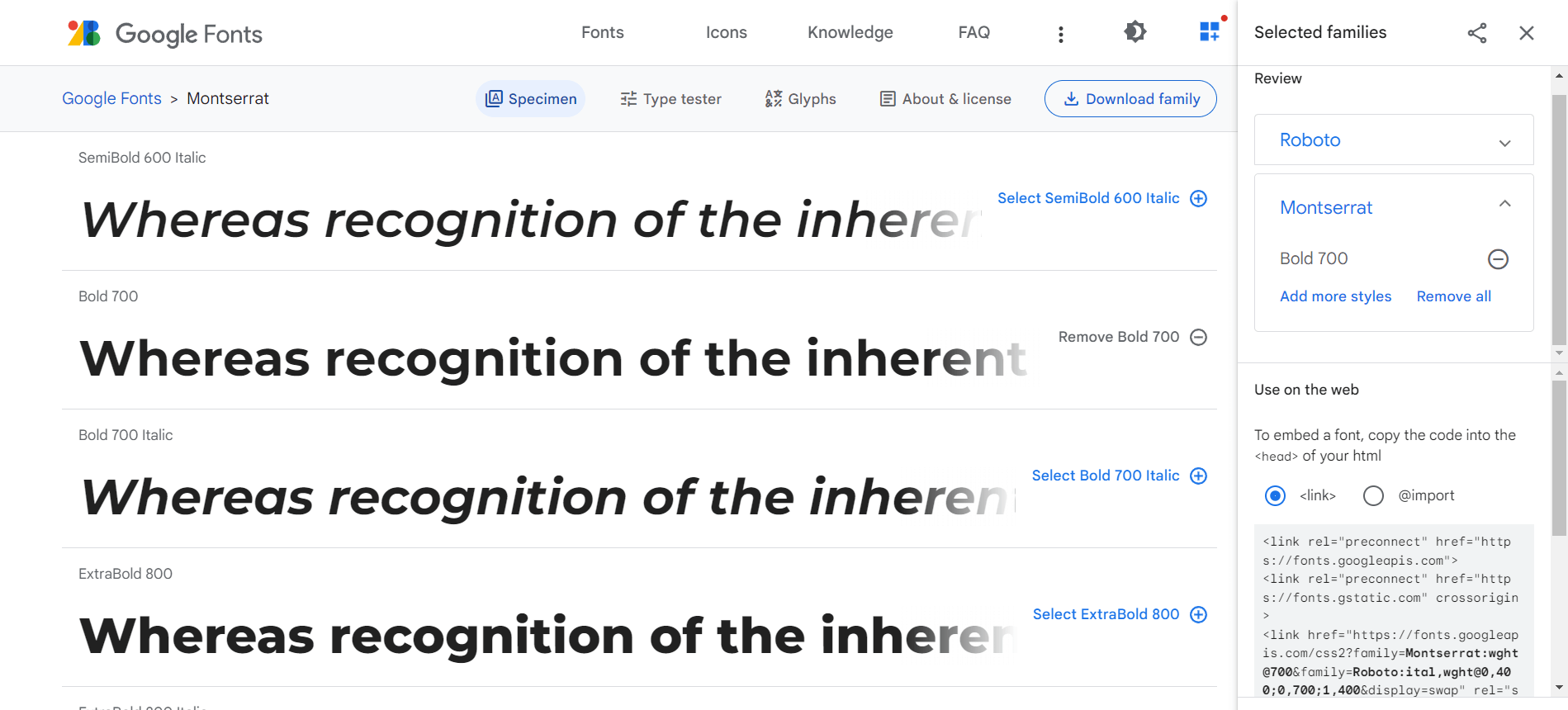
После этого скопировать сгенерированный HTML-код и вставить его раздел :
CSS
Теперь выбранные шрифты можно использовать в свойстве :
Из интересных свойств, которые мы ещё не рассматривали – это и .
Свойство предназначено для настройки поведения текста на странице во время загрузки шрифта. Этому свойству можно установить одно из следующих значений:
- – определяется браузером; в большинстве своём он близок к ;
- – если в течение 3 секунд нужный шрифт не загрузился, браузер его покажет невидимым запасным шрифтом; после загрузки отображение текста будет переключено на него;
- – если менее чем за 100мс шрифт не загрузился, то текст будет отображён запасным шрифтом; после того как нужный шрифт будет загружен текст будет переключен на него;
- – если менее чем за 100мс шрифт не загрузился, то текст будет отображён запасным шрифтом; после этого, если в течение 3 секунд нужный шрифт загрузился, то текст будет переключен на него; но если этого не произошло, текст останется на запасном шрифте;
- – похож на , но в отличие от него здесь период для замены 3 секунды не задан; поэтому решение переключать отображение текста или нет на нужный шрифт остаётся за браузером.
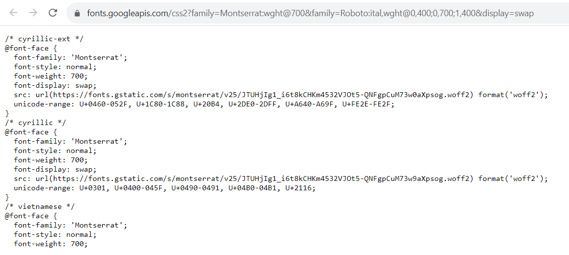
Свойство позволяет указать диапазон символов Unicode, которые необходимо загрузить из шрифта. То есть с помощью него мы можем уменьшить количество загружаемых данных, так как из шрифта будут загружаться только те символы, которые действительно нужны.


Например, такой диапазон символов Unicode используется в Google Fonts для поддержки кириллицы:
CSS
Насыщенность шрифта и css-свойство font-weight
Насыщенность (жирность) шрифта устанавливается при помощи наследуемого свойства
font-weight, принимающего ряд значений, определяющих степень жирности:
normal (по умолчанию), bold, bolder,
lighter и числа от 100 до 900 с шагом
100, где bolder и lighter определяют,
соответственно, жирность меньшую или большую, чем у родительского элемента (см. пример №3).
<!DOCTYPE html>
<html>
<head>
	<meta charset="utf-8">
	<title>Установка насыщенности шрифта</title>

	<style>

		p{
		width: 400px;
		margin: 2em;
		}

		.weight_1{font-weight: normal;}
		.weight_2{font-weight: bold;}
		.weight_3{font-weight: bolder;}
		.weight_4{font-weight: lighter;}
		.weight_5{font-weight: 600;}

	</style>

</head>
<body>

	<p class="weight_1">
		normal соответствует значению 400,
		значения 100, 200, 300 не будут работать.
	</p>

	<p class="weight_2">
		bold соответствует значению 600.
	</p>

	<p class="weight_3">
		У родительского элемента, т.е. у тела документа,
		по умолчанию браузер использует жирность normal,
		поэтому значение bolder повышает ее до bold.
	</p>

	<p class="weight_4">
		 lighter не сработает, т.к. браузеры на данный
		 момент поддерживают только значения 400 и 600.
	</p>

	<p class="weight_5">
		600 соответствует bold.
	</p>

</body>
</html>
Пример №3. Установка насыщенности шрифта
На данный момент значения 100 – 500 свойства
font-weight соответствуют нормальному начертанию шрифта, а
600 – 900, соответственно, жирному начертанию. В дальнейшем возможно станут
доступны и остальные числовые значения.
What’s the best way to pick a font-weight?
Whenever you’re designing a site, think about the impact you want to have. What key values, principles, emotions, impressions, or vibes do you want to convey? Then whenever you have a design decision to make, you can ask yourself, which of my options does this best?
For example, take a look at this example with Montserrat (the text is just filler from JeffSum, it doesn’t mean anything). This uses and , the default values:
See the Pen
on CodePen.
Pretty standard bold text. Now look what happens if we change this to ‘100’ and ‘800’, a more extreme difference:
See the Pen
on CodePen.
The first one is completely conventional, it looks like most text you’ll see in normal life. What does that convey? Maybe tradition, following the rules, conforming to agreed standards, things like that. If you’re designing a site for a law firm, that’s probably the vibe you’re going for. No need for anything too creative or outrageous.
The second conveys that there are just a couple of key points to learn here, and everything else is much less important. If you were designing a magazine cover, or a landing page, this might be worth considering.
Keep in mind also, that font weights aren’t equivalent from one font to another. Using for normal and for bold might look great on one font, but terrible on another. If you change a font, always check how the bold text looks, too.
Finally, make sure you check your font weights across multiple browsers, especially if you’re using a less common font, or a weight other than the standard and values, as they sometimes don’t display in exactly the same ways.
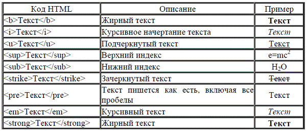
How to Underline Text in HTML
To underline text in HTML and CSS, use the CSS text-decoration property set to underline.
You can also underline text with the <u> element, but this should generally not be used. The <u> element is meant for specific use cases like marking up misspelled words, denoting proper names in Chinese text, or indicating family names.
Let’s look at both methods below.
How to Underline Text in HTML with the Unarticulated Annotation Element
If you’d like to display text that is unarticulated or has a non-textual annotation, place the text inside <u> tags. For example:
Here’s the result:
![]()
How to Underline Text in HTML with the CSS Text-Decoration Property
If you’d like to underline text for decoration, rather than to represent a non-textual annotation, then you’d use the CSS text-decoration property, like so:
Here’s the HTML and CSS:
And here’s the result:
![]()
How to Render Strikethrough Text in HTML
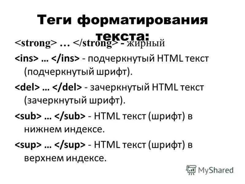
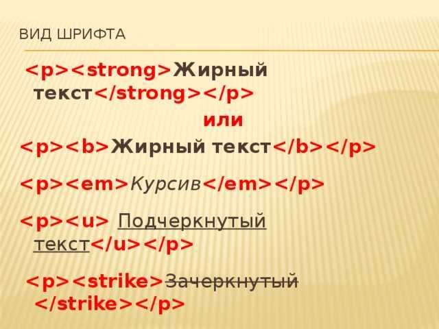
There are multiple ways to render strikethrough text in HTML, which is text displayed with a horizontal line through it. You can use the <s> tag to indicate that the text is now incorrect, inaccurate, or irrelevant. If you want to indicate text that has been deleted, use the <del> tag.
If you want to show the text as strikethrough for another reason, use the CSS text-decoration-line property and set this property to line-through.
Also, note that the HTML <strike> element has been deprecated and is no longer a viable option for rendering strikethrough text.
Let’s look at examples of the three methods supported in the current version of HTML.
How to Strikethrough Text in HTML with the Strikethrough Element
If you’d like to strikethrough text to show that it is no longer correct, accurate, or relevant, place the text inside <s> tags.
Here’s the HTML:
Here’s the result:
![]()
How to Strikethrough Text in HTML with the Deleted Text Element
To strikethrough text to show that it has been deleted, place the text inside <del> tags. Let’s see an example with a list element:
Here’s the HTML:
Here’s the result:
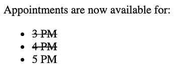
How to Strikethrough Text in HTML with the CSS Text-Decoration-Line Property
To strikethrough text for another purpose, use the CSS text-decoration-line property.
Here’s the HTML and CSS:
Here’s the result:
![]()
Значения свойств
| Значение | Описание | Воспроизвести |
|---|---|---|
| normal | Определяет обычные символы. Это значение по умолчанию | Воспроизвести » |
| bold | Определяет толстые символы | Воспроизвести » |
| bolder | Определяет толще символы | Воспроизвести » |
| lighter | Определяет тоньше символы | Воспроизвести » |
| 100 200 300 400 500 600 700 800 900 |
Определяет от тонкого к толстому символу. 400 такой же, как и обычный, и 700 такая же, как смелый | Воспроизвести » |
| initial | Устанавливает для этого свойства значение по умолчанию. Прочитать о initial | Воспроизвести » |
| inherit | Наследует это свойство от родительского элемента. Прочитать о inherit |
Examples
HTML
<p>
  Alice was beginning to get very tired of sitting by her sister on the
  bank, and of having nothing to do: once or twice she had peeped into the
  book her sister was reading, but it had no pictures or conversations in
  it, 'and what is the use of a book,' thought Alice 'without pictures or
  conversations?'
</p>

<div>I'm heavy<br/>
  <span>I'm lighter</span>
</div>
CSS
/* Set paragraph text to be bold. */
p {
  font-weight: bold;
}

/* Set div text to two steps darker than
   normal but less than a standard bold. */
div {
 font-weight: 600;
}

/* Sets text enclosed within span tag
   to be one step lighter than the parent. */
span {
  font-weight: lighter;
}
§На заметку
- — по умолчанию большинство тегов имеет font-weight: normal и font-style: normal;
- — популярные теги, которые включают bold: <b>, <strong>, заголовки <h1><h6>;
- — популярные теги, которые включают italic: <i>, <em>;
- — список значений font-weight: 100|200|300|400|500|600|700|800|900;
- — опциональные значения font-weight: bolder|lighter изменяют жирность относительно родителя в обе стороны соответственно(см. табличку ниже);
- — font-weight: normal соответствует значению 400, для bold — 700;
| исходное значение | bolder | lighter |
| 100 | 400 | 100 |
| 200 | 400 | 100 |
| 300 | 400 | 100 |
| 400 | 700 | 100 |
| 500 | 700 | 100 |
| 600 | 900 | 400 |
| 700 | 900 | 400 |
| 800 | 900 | 700 |
| 900 | 900 | 700 |
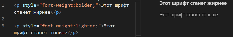
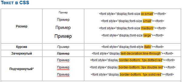
Как выделить текст в CSS
Определите, какой участок текста необходимо выделить и используйте CSS-свойство , которое отвечает за толщину шрифта.
Часто встречающиеся значения:
- или — обычный шрифт, значение по умолчанию;
- или — полужирный шрифт.
Например:
Красота текста — это не только хороший дизайн и качественный контент, но и правильная вёрстка текста, и единообразие. Под единообразием мы имеем в виду, что редакция выработала общее представление о строчной вёрстке текста и придерживается его.
Весь текст, размеченный классом , станет жирным.
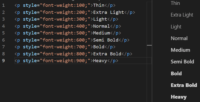
Свойство может принимать одно из девяти числовых вариантов насыщенности:
- 100: Thin;
- 200: Extra Light (Ultra Light);
- 300: Light;
- 400: Normal;
- 500: Medium;
- 600: Semi Bold (Demi Bold);
- 700: Bold;
- 800: Extra Bold (Ultra Bold);
- 900: Black (Heavy).
Все эти числовые значения задают степень толщины шрифта от самого тонкого до самого толстого.
Но в большинстве системных шрифтов есть только два варианта толщины: обычный (400) и полужирный (700). Поэтому остальные значения свойства используются реже.
Кроме числовых значений, у есть ещё два относительных значения: и . Они делают шрифт жирнее и тоньше, чем текущее или унаследованное значение.
Выделение отдельных предложений и слов
Чтобы выделить отдельные фразы или слова жирным шрифтом, нужные участки текста разметьте отдельными тегами с использованием классов. Например:
И затем в стилях пропишите:
Теперь все слова, обёрнутые в тег с классом , станут жирными.
Как и многие языки программирования, медиавыражения поддерживают логические операторы, поэтому мы можем комбинировать выражения
Эффективно и доступно
Что, если весь жирный текст сразу разметить в файле HTML? Для этого же есть специальные теги и .
Теги и используют в особых случаях, при этом важно знать несколько моментов:
Тег предназначен для выделения текста с целью привлечения к нему внимания, но без придания ему особой важности. Использовать его нужно только в случае, когда остальные теги выделения не подходят.
Тег указывает на важность отмеченного текста и используется для выделения предупреждений или части документа, которую пользователь должен увидеть раньше остального.. В каких случаях предпочтительно использовать свойство :
В каких случаях предпочтительно использовать свойство :
Для совместной работы над проектом. Если кто-то из команды захочет изменить стиль текста, ему не придётся искать и изменять каждый элемент HTML. Нужно будет просто изменить стили шрифтов в CSS.
Для обеспечения доступности. Скринридер при чтении сайта учитывает насыщенность шрифта. Скринридер выделяет слова с тегом интонационно, в отличие от простого выделения с помощью
Если чтение с интонацией не нужно, а важно лишь расставить визуальные акценты в тексте, то лучше использовать свойство .
Making your fonts bold in CSS
The CSS property you use is , which accepts the following values:
- — we’ll get into what numbers you can use below
The default value is , which is the font-weight of the text you’re reading right now. If you want to make your font bold in CSS, you simply give a value of :
In many cases, that’s all you’ll need. In fact, if you’re using or you won’t even have to do that, because they both have applied by default!
However, as you may imagine, you have a bit more flexibility than that. Instead of and , you can provide a number, and more finely control the level of boldness your text displays.
With most fonts, you have somewhere between 1 and 9 different weights to play with, which are labelled in increments of 100, from 100 to 900. These map on to the OpenType specifications developed by Microsoft and Adobe — you may be familiar with some of these terms:
See the Pen
on CodePen.
As you can see here, is the same as , and is the same as .
Note also the line at the top:
Each of these different font weights is technically a separate font, and you’ll need to import them separately, either from a service like Google Fonts (as I have done here), or by downloading the font files and serving them directly from your own site.
Values: Bold and Lighter
CSS provides a good variety of CSS font-weight values. You can use some keywords values, some values in numbers, and you can also use global values. Let’s go ahead and check them out:
– Keywords Values
CSS provides two keyword values to use for the font-weight property.
Normal
The normal value is the default value of the CSS font-weight property. If you are not using the front-weight property on your paragraph’s text, its size will be set as default. So if you are okay with the normal font size, you don’t need to use this property. The normal font size is mostly used in the body portion of the web page.
This is how the syntax of property and value looks like:
| p.normal {font-weight: normal;} |
Bold
This keyword is mostly used for headings on pages to make the text bold. Moreover, the bold characters are very thick in size than the normal font size.
Use its syntax below to change your headings or text on your webpage too/
| p.bold {font-weight: bold;} |
– Values in Numbers
CSS allows you to use any number value if you are not happy with the normal keyword values. That value starts from one and goes up to 100. As the number goes higher, the thickness factor of the letters is increased too. Therefore, the “100” value results in a tiny font-weight size, while the 900 will display the boldest size.
What’s more, the variable fonts accept all the numeric values while the non-variable fonts accept only the following numeric values: ‘“100”, “200”, “300”, “400”, “500”, “600”, “700”, “800”, and “900”. Any value other than these is not acceptable by the non-variable fonts.
In case you are assigned any value other than these, that value will be translated to any of the available values following some rules. That translation will be done using the fullback system that we will learn about later in this article.
In the following short syntax use, the font-weight is set at the “600” value:
| p.number {font-weight: 600;} |
– Keyword Values Relative to Their Parent Element
If the element has a parent element and you want the child element to have the size relative to its parent element, you can use “lighter” or “border” or values.
Bolder
This value makes the font heavier than its parent elements. Moreover, only four values are valid for this property. This means that, after using this value, the child element can only have four values according to the value of its parent’s font-weight.
Moreover, you can achieve heavier font by using this syntax:
| p.bolder {font-weight: bolder;} |
Lighter
The lighter value works the same as the bolder value but is its reverse. As the bolder makes the font-weight of child elements thicker than its parent’s elements, the lighter value makes the child element’s font-weight lighter than its parent elements font-weight. Moreover, the lighter value has only four valid values, like the bolder value. So, the child element can only have one out of those four values according to the font-weight of its parent.
But what are those four available values? How bolder or lighter would the child element’s font-weight be than its parent element? You will get these answers later in this article so take a look at at this value’s syntax:
| p.lighter {font-weight: lighter;} |
– Global Values
The font-weight property accepts global values, so each weight provides a different result. Let’s see how we can use global values in the font-weight property.
Inherit
The inherited property is used to inherit the value of its parent elements property. When we use the “inherit” value with a child element, it will use the font-weight value of its parent element.
This is its syntax:
| p.inherit {font-weight: inherit;} |
Initial
The initial value will set the property to its default value. Using this value on the font-weight property will get you the result using the normal value:
| p.initial {font-weight: initial;} |
Unset
The unset value works according to the nature of the property. If the property is inherited, this value works as the ‘inherited’ value. If the property is not inherited, then this value acts as the initial value. Since the font-weight property isn’t inherited, this value will work as the initial value:
| p.unset {font-weight: unset;} |
CSS Font Weight Example
Suppose we are designing a website for The Seattle Stamp Club, a local stamp society. The stamp society has asked us to make the
About Us
heading on the
About
page of their website appear in bold. This will draw the visitor’s attention to the heading.
The stamp club has asked us to add a block of text to their website with the history of the club. This block of text should appear in the normal font-weight. Certain phrases, which the club wants to attract the viewer’s attention to, should appear in bold.
We could use the following code to create this block of text, with certain phrases emboldened:
<html>

<p>The Seattle Stamp Club, established in 2009, is a community that encourages and promotes the collection of stamps. The Club <span>welcomes all</span>, from beginners to experts, and hosts monthly meetings where members can show each other their stamps, discuss the latest news in stamps, and bond over their shared interests. Right now, the club has <span>250 members</span>.</p>

<style>

span {
	font-weight: bolder;
}
Click the
button in the code editor above to see the output of our HTML/CSS code.
In our HTML file, we have defined a paragraph of text enclosed within <p> tags. We have also enclosed certain phrases within <span> tags, which we are going to embolden in our CSS code.
Next, in our CSS file, we defined a style rule that sets the font style weight of every
<span> tag
to
bolder
. This means that the text enclosed within any <span> tag will appear bolder than the parent element.
When we run our code, our paragraph appears with normal font-weight, and the phrases enclosed within <span> tags appear in bold. In this example, the phrases
welcomes all
and
250 members
are enclosed in <span> tags.
How to Italicize Text in HTML
To italicize the text in HTML, you can use either the <em> tag or the <i> (italics) tag. Both of these tags italicize the text, but the <em> tag indicates that the text has stress emphasis when read. You can also italicize text with the CSS font-style property set to italic.


Like <strong> and <b>, the <em> tag is generally preferred over the <i> tag as it is a semantic element, so we’ll be using it in our HTML examples.
Learn More: The Beginner’s Guide to HTML & CSS
Want to learn more about HTML? Download our free guide for best practices for getting started with HTML.
How to Italicize Text in HTML with the Emphasis Element
To define text with stress emphasis, place the text inside <em> tags. Let’s see an example.
Here’s the HTML:
Here’s the result:
![]()
How to Italicize Text in HTML with the CSS Font-Style Property
To italicize text for decoration, use the CSS font-style property. Imagine you want to italicize a word inside a paragraph. First, wrap the word in <span> tags, then apply the font-style property to the span element only.
Here’s the HTML and CSS:
Here’s the result:
![]()
Обобщенное правило
Теперь, для работы со шрифтами, вы знаете все основные правила. Это:
Их можно указывать не только по отдельности, но и все вместе с помощью одного CSS правила . Шесть разных правил внутри одного! Это может быть удобно, если действительно нужны все значения. При этом вы не обязаны указывать все значения. Единственное ограничение — наличие значений для и . Остальные значения можно не указывать. Укажем значения для всех этих свойств внутри правила :
Важно обратить внимание на запись. Внутри правила так обозначаются свойства и
Использование одного правила или нескольких
Этот раздел относится не только к правилу , но и ко всем обобщенным правилам, которые вы изучите в процессе прохождения курсов. С одной стороны, использование одного правила сокращает количество строк, которые используются в CSS. Это действительно так, но есть две основные проблемы использования таких свойств:
- Запоминание правильного порядка значений. Используя обобщенные свойства вам всегда стоит держать в голове верный порядок значений свойств. В этом легко можно ошибиться на первых этапах изучения. Хорошим вариантом будет использование отдельных свойств, но в том порядке, в котором они идут в обобщенном свойстве. С опытом вы сможете переключиться на одно правило.
Best Practices for Using Bold Text in HTML
While using bold text in HTML can help emphasize important information, it is essential to follow best practices to ensure the text remains readable and accessible.
Here are some best practices for using bold text in HTML:
Choosing the right font-weight: When using bold text, it is essential to choose the right font-weight to ensure the text is clear and easy to read.
While a heavier font-weight may be suitable for headlines, a lighter weight may be more appropriate for body text. It is also important to ensure that the bold text is not too overwhelming and does not detract from other elements on the page.
Balancing bold text with other formatting options: While bold text can be a powerful way to draw attention to important information, it is important to balance it with other formatting options to create visual hierarchy.
You can use other styles such as italics, underline, or a different font size or color to distinguish different levels of importance.
Avoiding overuse of bold text: Overusing bold text can make the text harder to read and detract from the page’s overall design.
It is important to use bold text sparingly and only where it is necessary to emphasize important information. Avoid using bold text for entire paragraphs or blocks of text, as this can make it difficult for readers to distinguish important information from regular text.
Testing for accessibility: When using bold text, it is essential to ensure it is accessible to all users, including those with visual impairments.
Screen readers can have difficulty reading heavily styled text, so it is important to test the page using accessibility tools to ensure the bold text is properly formatted and accessible.
Examples
HTML
<p>
  Alice was beginning to get very tired of sitting by her sister on the
  bank, and of having nothing to do: once or twice she had peeped into the
  book her sister was reading, but it had no pictures or conversations in
  it, "and what is the use of a book," thought Alice "without pictures or
  conversations?"
</p>

<div>I'm heavy<br/>
  <span>I'm lighter</span>
</div>
CSS
/* Set paragraph text to be bold. */
p {
  font-weight: bold;
}

/* Set div text to two steps heavier than
   normal but less than a standard bold. */
div {
 font-weight: 600;
}

/* Set span text to be one step lighter
   than its parent. */
span {
  font-weight: lighter;
}