Значения свойства
Примечание: первые 4 значения, описываемые в таблице, указываются с помощью единиц измерения поддерживаемых в CSS.
| Значение | Описание |
|---|---|
| смещение-x и смещение-y | Первые два значения устанавливают смещение тени. Первое значение (смещение-x) указывает расстояние смещения по горизонтали. Отрицательные значения располагают тень слева от элемента. Второе значение (смещение-y) указывает расстояние смещения по вертикали. Отрицательные значения располагают тень над элементом. Если оба значения 0, тень располагается за элементом и её не будет видно, так как по умолчанию тень имеет тот же размер, что и элемент. (обязательные параметры) |
| размытие | Третье значение устанавливает степень размытия тени. Чем больше это значение, тем сильнее размытость — тень становится более большой и светлой. Отрицательные значения не допускаются. Если значение отсутствует или равно 0, это означает, что тень будет без размытия — с острыми углами. (необязательное значение) |
| размер тени | Четвёртое значение изменяет размер тени. Положительное значение увеличивает размер тени со всех сторон, отрицательное — уменьшает. Если значение отсутствует или равно 0, это означает, что тень будет того же размера, что и элемент. (необязательное значение) |
| цвет | Определяет цвет тени. Цвет можно установить различными способами, например: указать имя цвета, использовать шестнадцатеричные значения (HEX), с помощью синтаксиса RGB (RGBA) или HSL (HSLA). Всегда указывайте цвет тени, так как браузеры по разному обрабатывают отсутствие значения цвета. |
| inset | Ключевое слово, указывающее, что тень должна располагаться внутри элемента. Внутренняя тень создаёт эффект вдавленности и располагается над фоновым цветом и/или фоновым изображением, но под любым содержимым элемента. Если ключевое слово не указано, тень будет отбрасываемая, т.е. будет располагаться под элементом. Ключевое слово может быть расположено в качестве первого или последнего значения. (необязательное значение) |
| none | Указывает на отсутствие тени. |
Пример
CSS Свойство:
box-shadow:
Результат:
CSS Код:
div#myDIV { background-color: yellow; width: 200px; height: 100px; box-shadow: 10px 10px black; }
Кликните на любое значение свойства, чтобы увидеть результат
What is a box shadow?
The box shadow property allows you to add multiple shadows to an HTML element. You can customize each shadow‘s effect by placing a comma between each set of values. The offset-x and offset-y values determine the shadow’s position in relation to the HTML element.
A shadow can have a maximum of six values. The offset-x and offset-y values are required. Let’s take a look at what these values can be.
Offset-x
This value controls the horizontal distance of the shadow from the element. Changing the value sign from positive to negative affects its position. A positive value moves the shadow to the right, whereas a negative value moves the shadow to the left.
Offset-y
This value controls the vertical distance of the shadow from the element. Changing the value sign from positive to negative affects its position. A positive value moves the shadow down, while a negative value moves it up.
Blur-radius
This value specifies the amount of blurring applied to the shadow. The higher the value, the softer and bigger the blur. If no value is specified, the default value is 0.
Spread-radius
This value controls how far the shadow spreads outward from the HTML element. A positive value makes the shadow more significant, and a negative value makes it smaller. If no value is specified, the default value is 0.
Color
This property specifies the color of the shadow. You can set the color using different CSS color formats, including named colors, hexadecimal, RGB, and HSL values.
If not specified, this property defaults to the current color, which is inherited from the color property.
Inset
This specification uses the word “inset” instead of numbers like a few other properties. This value indicates that the shadow should be inside of the element.
Shadow Syntax
Before we jump into inset shadows, let’s look at the basic syntax for building the two different types of CSS shadows. Even if you’ve coded these before, it’s worth a quick review just so we’re all on the same page.
Box-Shadow
Box-shadows are probably the most common type of CSS shadows. The potential uses here are incredibly diverse and developers have come up with all kinds of crazy awesome applications. The box-shadow syntax is actually fairly complex and includes six separate values. We’ll start off by taking a look at five of the most common of these.
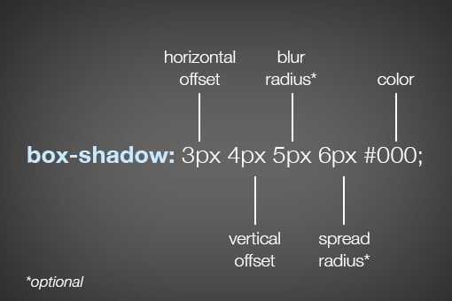
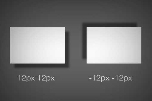
As you can see, listed above in order, the order of values is horizontal offset, vertical offset, blur radius, spread radius and color. The first two values, horizontal and vertical offset, are fairly straightforward. Positive values will push the shadow right and downward respectively and negative values will push the shadow left and upwards. Here’s an example of both:
The latter two values, blur radius and spread radius are a bit more complicated. The biggest question that you might have is, what’s the difference? To answer this, let’s first look at the one that you’re probably the most familiar with: blur radius.
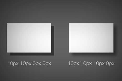
As you can see, no blur radius produces a shadow with a hard edge and a high blur radius produces a blurry edge. Pretty simple right? So what about the spread radius then? How does that differ? A picture is worth a thousand words so here’s an example:
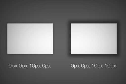
As you can see, without affecting how blurry the shadow is, the spread of the shadow essentially grows and shrinks the surface area occupied by the shadow. If you thought of it as the size of the shadow, you wouldn’t be too far off.
If you leave off either the blur or spread radius, their values will default to zero. Looking around the web, you’re likely to see that most demos that you come across, including those on Design Shack, have no spread radius defined.
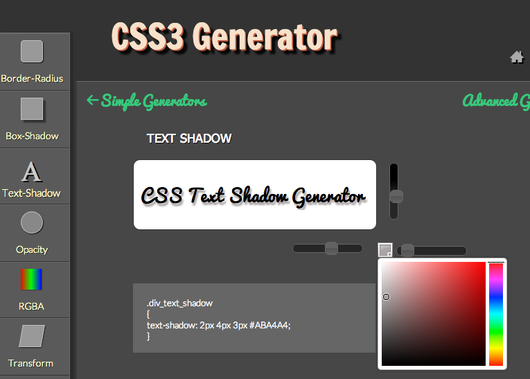
Text Shadow
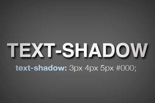
Now that we have a solid understanding of how the box-shadow syntax works, we can take a look at the syntax for the other type of CSS shadow: the text-shadow. Fortunately, this syntax is even simpler than that for box-shadow.
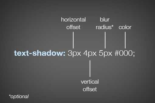
As you can see, most of the values are the same here, so if you understand one, you understand the other. Interestingly enough though, you don’t have access to a shadow’s spread with text-shadow. It would be great if you did, but unfortunately the feature simply isn’t there.
Understanding Box Shadow Syntax
Here’s the basic syntax for a box shadow:
There are 5 important parts in the above code snippet. Let’s understand what they mean:
- Horizontal Offset: in the above example. This indicates how far the shadow will be from the card horizontally. Positive means to the right, negative means to the left.
- Vertical Offset: in the above example. This indicates how far the shadow will be from the card vertically. Positive means to the bottom, negative means to the top.
- Blur: in the above example. This indicates how blurry the shadow will look. Higher radius means more blur.
- Spread: in the above example. This indicates how far the shadow will spread in all directions.
- Color: in the above example. This determines the color of the shadow. If not supplied, the default text color will be used. Color values can be Hex, RGB, or HSL.
Let’s see the above code in action:
Final Thoughts: CSS Box Shadow
The property can be overwhelming at first. It’s one of those properties that takes a lot of values so it might look more complicated than it actually is. Hopefully, this CSS box-shadow tutorial has put that feeling to rest.
Above, we have gone over what CSS is and how it works. We have explained the syntax, values, and how they work together. In addition, we went over a number of examples for how to use CSS box shadows in real life, including markup you can use right away. Finally, for those that want a little help, we listed a number of CSS generators that can do a lot of the heavy lifting for you.
By now, you should feel able to use this CSS feature on your website. We look forward to seeing what you do with it.
How are you using CSS box shadow on your website? Any exciting use cases we have not covered above? Let us know in the comments below!
Tips on using box-shadow
The is a really nice way to make your website look good, but it could easily ruin your project if it’s not used properly. Here are some tips to consider when styling shadows:
Less is more
When layering shadows, the browser does more work. This might not be an issue on fast modern devices, but you always have to consider users with older, slower devices or poor internet connections.
Be consistent
You can’t have your shadows looking haphazard! All your shadows should look similar because you should be using a single light source.
Use animations sparingly
A quick way to reduce performance is by animating the . Plus, this property already looks great on its own, so there’s really no need for animation.
Animations can be a simple to , add minimally.
Use a shadow layering tool
Now, if you don’t feel like writing multiple lines of code, you’re tired, or just feeling lazy, there’s a great tool at shadows.brumm.af that can help you create layered shadows. It allows you add as many as 10 layers to your object, which saves time as you don’t have to manually enter multiple values to get the perfect shadow. Plus, you can get more intricate shadow values a bit more quickly.
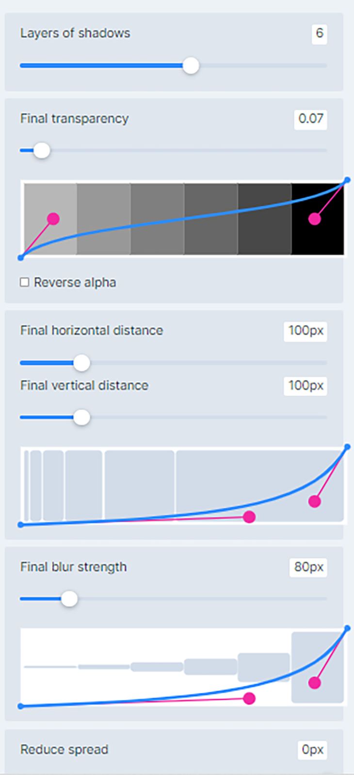
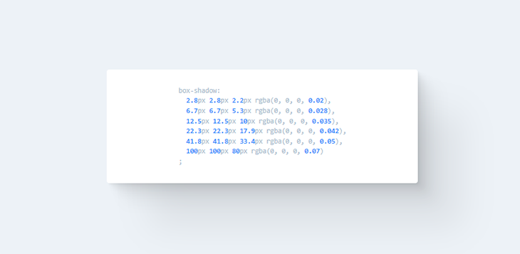
Simply set the properties, preview the , copy and paste the code in your project and you’re set!
Inset Box-Shadows
All righty, now that we’ve laid a basic foundation and you completely understand CSS shadow syntax, it’s time to jump into creating “inner” or “inset” shadows. To shift a shadow to an inset shadow, all we really need to do is add a single word, “inset.”
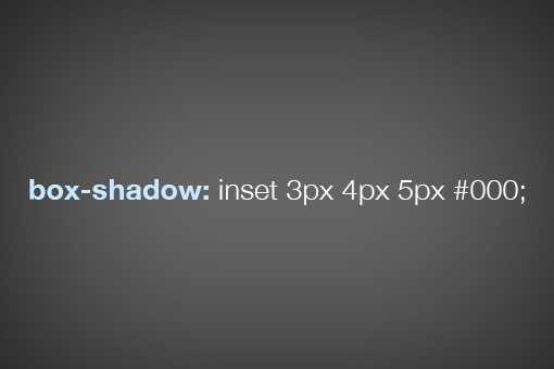
This is why we started with the basic syntax. As a whole, the box-shadow chunk of code can look pretty intimidating, but if you break it down as we have done, it’s actually really simple.
All of the values here essentially perform the same way, only the shadow is placed inside of the box. Here we can see how the spread of a shadow can still have a big impact on how the shadow looks:
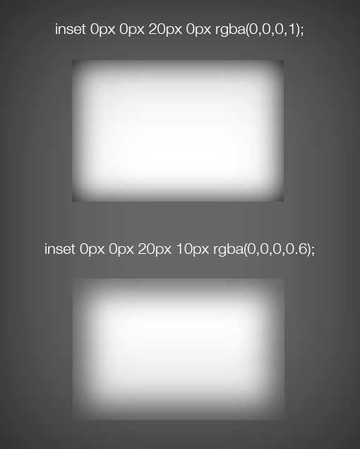
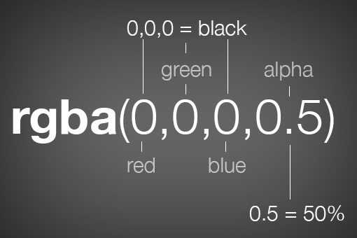
Notice that this time I actually used RGBa color instead of a hex value. This is great for shadows because the alpha value provides a quick and easy way to lighten or darken the shadow.
With Images
It’s easy enough to throw a box-shadow onto an empty div, but what if you want to place one on an image. It sounds simple, but the reality is a little tricky. Let’s look at some code and its ultimate effect. We’ll begin with an plain old image tag.
| 1 | <img src=»http://lorempixum.com/800/400/transport/2″alt=»airplane»> |
Now we’ll target this in our CSS and add an inset box-shadow. You’d think that something like this would work:
|
1 |
img { box-shadowinset0px0px10pxrgba(0,0,0,0.5); } |
Unfortunately, this gives us the following result. The picture is working fine, but the shadow isn’t visible!

So how do we pull off an inner shadow on an image? There are quite a few different ways to do it, all of which have their pros and cons. Let’s take a look at two popular solutions.
The first solution is to wrap the image in a div that’s constrained to the same size as the image, then set the shadow to that div while using some relative positioning and z-index voodoo on the image itself. Here’s what that looks like in code:
|
1 |
<div> <img src=»http://lorempixum.com/800/400/transport/2″alt=»airplane»> </div> |
|
1 |
div { height200px; width400px; box-shadowinset0px0px10pxrgba(0,0,0,0.9); } img { height200px; width400px; positionrelative; z-index-2; } |

This solution is workable, but it involves a little extra markup and quite a bit of extra CSS. As an alternative, you could simply drop the HTML image and insert a background image via CSS. Using this method, the image doesn’t cover up the shadow but instead is placed under it by default.
|
1 |
<div> <!— just an empty div —> </div> |
|
1 |
div { height200px; width400px; backgroundurl(http//lorempixum.com/400/200/transport/2); box-shadowinset0px0px10pxrgba(0,0,0,0.9); } |
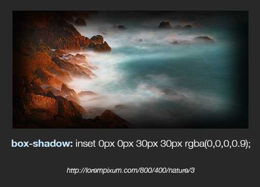
If we combine these techniques with a heavy spread, we can achieve a pretty dramatic image vignette effect using only CSS.
Best Box Shadow Generators
As we have covered, takes a whole lot of values. Therefore, it can take a bit of trial and error until you arrive at the kind of shadow you want.
To make it easier, there are a whole lot of box-shadow generator tools out there that allow you to play with their controls, see the results right away, and then simply copy the markup once satisfied.
Here are the best options for box shadow generators:
- box-shadow.dev — This single-purpose tool has all the functionality you need and the best user interface of the bunch. You can use , create several box shadows, control the offsets, blur, and spread via sliders, and input colors manually. When satisfied, click Show code to copy the CSS markup. The only downside is that it does not provide code for older browsers.
- CSSmatic Box Shadow CSS Generator — Similar to the above. Allows you to control the properties via sliders and also enter numbers manually. Has its own control for opacity, which is nice. On the other hand, it is missing functionality for multiple shadows. The code markup you get includes older browsers.
- Box Shadow CSS Generator — A solid option that also has a color picking ability and gives you code for older browser as well. You can copy it with a simple click. It has opacity control but can only create one drop shadow.
- CSS3gen CSS3 Box Shadow Generator — Another drop-shadow generator. A cool feature here is that, instead of x and y offsets, you can select the shadow angle and distance and the tool will do the rest automatically. For some reason and have their own menu. The CSS you can simply copy and paste also includes markup for older browser generations.
Property Values
| Value | Description | Demo |
|---|---|---|
| none | Default value. No shadow is displayed | Demo ❯ |
| h-offset | Required. The horizontal offset of the shadow. A positive value puts the shadow on the right side of the box, a negative value puts the shadow on the left side of the box |
Demo ❯ |
| v-offset | Required. The vertical offset of the shadow. A positive value puts the shadow below the box, a negative value puts the shadow above the box |
Demo ❯ |
| blur | Optional. The blur radius. The higher the number, the more blurred the shadow will be |
Demo ❯ |
| spread | Optional. The spread radius. A positive value increases the size of the shadow, a negative value decreases the size of the shadow |
Demo ❯ |
| color | Optional. The color of the shadow. The default value is the text color. Look at CSS Color Values for a complete list of possible color values.Note: In Safari (on PC) the color parameter is required. If you do not specify the color, the shadow is not displayed at all. | Demo ❯ |
| inset | Optional. Changes the shadow from an outer shadow (outset) to an inner shadow | Demo ❯ |
| initial | Sets this property to its default value. Read about initial | |
| inherit | Inherits this property from its parent element. Read about inherit |
Tip: Read more about allowed values (CSS length units)
Box shadow CSS свойство
box-shadow — это CSS3 свойство, которое позволяет создавать эффект тени для,
практически, любого элемента веб страницы. Оно похоже на эффект Drop Shadows в Photoshop, с помощью этого
свойства
создается иллюзия глубины на 2-мерных страницах.
Синтаксис
Свойство принимает составное значение из пяти разных частей: горизонтальное смещение, вертикальное смещение,
размытие, растяжение, цвет тени. К тому же можно указать будет ли тень внешней или внутренней.
В отличие от других свойств, каких как border, которые разбиты на подсвойства (border-width, border-style и
тд),
box shadow CSS стоит особняком. Соответственно, важен порядок, в котором вы записываете значения свойства.
Горизонтальное смещение (по оси X)
Первое значение offset-x — смещение тени по оси X. Положительное значение
сместит тень
вправо, а отрицательное — влево.
.box-1
.box-2
Вертикальное смещение (по оси Y)
Второе значение offset-y — смещение тени по оси Y. Положительное значение
сместит тень
вниз, а отрицательное — наверх.
.box-1
.box-2
Размытие
Третье значение (blur) представляет собой радиус размытия тени, посмотрите как он работает на box
shadow
генераторе выше.
Значение означает, что тень будет совсем не размыта, края и стороны будут абсолютно четкие. Чем
выше
значение, тем более мутную и размытую тень вы получите. Отрицательные значения не допускаются.
.box-1
.box-2
.box-3
Растяжение
Четвертое значение (spread) представляет собой размер тени или дистанции от тени до элемента. При
положительном
значении тень увеличится, выйдет за пределы элемента. Отрицательное значение уменьшит и сожмет тень.
.box-1
.box-2
.box-3
Цвет
Цвет тени может быть абсолютно любым и записан в разных форматах, доступных в CSS (HEX, RGB, RGBA и пр),
попробуйте
разные оттенки в css box shadow generator.
.box-1
.box-2
Внешняя/внутренняя
Значение inset определяет положение тени. По умолчанию оно не указано, это означает, что тень будет
снаружи
элемента. Для того, чтобы тень была внутри элемента, необходимо в конце добавить ключевое слово inset.
.box-1
.box-2
Simplest Form
In this usage, you simply provide the 2 required length values: and . These 2 values are, as you might have guessed, the horizontal and vertical distance from the element’s top-left corner, at which the shadow will be drawn.
Positive values move the shadow to the right & bottom, while negative values offset it to the left and top.
In this form, the shadow will be sharp edged and fully opaque, using for the colour — which is whatever value is being applied (inherited or explicitly set) to the element.
To understand this better, it helps to compare to IRL shadows; these offsets are like changing the position of a light source along the x or y axis of a plane, above an object which casts a shadow onto a surface.
How to Use CSS Text Shadow
CSS text shadows are like box shadows, though they have fewer values to modify. The syntax for a CSS text shadow looks like this:
But how does these values work?
CSS Text Shadow Position
CSS text shadow offsets work very similarly to the same box shadow values:
Positive values will position the shadow below and right of the text.
Negative values do the opposite, placing the shadow above and left of the text.
You can mix negative and positive values to position your CSS text shadow perfectly.
CSS text shadow blur radius enables you to blur the shadow behind your text.
The default for this value is 0 (no blur).
CSS Text Shadow Color
By default, CSS text shadows match the color of the text. You can change the color of your text by adding it to the end of the CSS text shadow property.
Like CSS box shadow colors, you must use a CSS legal color for this.
CSS Box Shadow in Action
On a live web page, it’s common to see tabs that you can click on to navigate to new pages or different sections. Let’s check out a real-world example that uses tabs, Smashing Magazine.

Smashing Magazine is an online publication and community for web designers that features resources. Designers can find free fonts, icons, and templates to use in their work.
Smashing uses tabs to help readers quickly identify where to click to access specific categories. In this example, when users click on each tab, a darker red box highlights the section to let the reader know what page they’re currently on.
This highlighting feature is best used to help avoid confusion and provide a clear context for readers on what they are viewing.
CSS Box and Text Shadow Design Examples
You can start to experiment with your use of CSS box and text shadows once you understand the basics. The ideas below should inspire you to come up with your own creative ways to use these CSS properties.
Dual-Color Borders With Two CSS Box Shadows
You can add more than one box shadow or text shadow to an HTML element. As long as they have commas between them, you can add new shadows to a single property.
This dual-color border is a good example of this. Two CSS box shadows with opposing positions and no blur/spread produce an excellent creative border.
Dual CSS Text Shadows for Dramatic Effect
In a similar vein to the idea above, you can add and position text multiple text shadows for interesting results.
This example shows a line of text with a shadow above and a shadow below, both of which have text-based color values.
Multicolor Backgrounds With Inset CSS Box Shadows
CSS is powerful enough to create unique and interesting assets without any external files. Using an inset CSS box shadow as a background is a great example of this.
This box has a white background, along with three inset shadows in different colors. The shadows overlap one another to create a unique background.
Enhancing this effect further is a simple matter of adding a stylish CSS background gradient to your element.
Wrapping it Up
As the quest for improving user experience is increasing rapidly in the developer and designer community, features such as CSS box shadows effects have started to play a mainstream role in website design. They help us to bring realism to the user’s online experience.
In this blog on CSS box shadow effects, we have discussed why to use CSS box shadow, what is CSS box shadow, and how to implement CSS box shadow effects. Moreover, we have also discussed the different ways of styling CSS box shadow effects that include layered, neon, and neomorphic shadows.
With this summary, I hope you have gained a firm grasp of CSS box shadow effects. Practice is the key to mastering a skill. So go and use box shadows on your website. Remember to experiment with different colors and key values to see what works and what does not.
Happy styling!!
How do you put a shadow inside a box?
To add a shadow inside a box, you can use the CSS box-shadow property. This property allows you to specify the shadow effect to be applied to an element, and it can be used to add a shadow inside a box by setting all four values of the box-shadow property to positive values.
How do you add a box shadow to all sides in CSS?
To add a box shadow to all sides of an element in CSS, you can use the box-shadow property and specify values for all four parameters: offset-x, offset-y, blur-radius, and spread-radius. The offset-x and offset-y values control the position of the shadow relative to the element, and the blur-radius and spread-radius values control the blur and spread of the shadow.
How to Create a Box Shadow with CSS
This section will give you step-by-step instructions on creating your own box shadow.
1. Decide which HTML elements you want to add a box shadow to. This example will use a button. In your HTML file, type the following code.
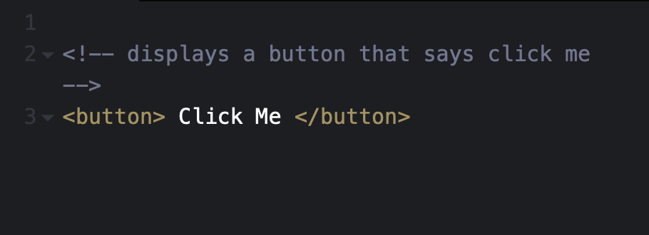
The following button will display on your webpage:

Use the CSS type selector in your CSS file to select the button element and add styles.
2. This step is optional. Use the width and height properties to control the size of the button.
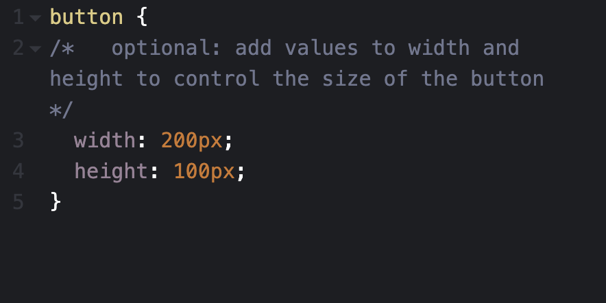
The button should display bigger on your web page like the following:

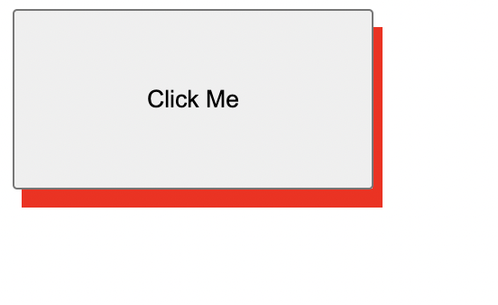
3. Remember, the horizontal and vertical offset values are required. In this example, the shadow will set the horizontal offset to 5px and the vertical offset to 10px.
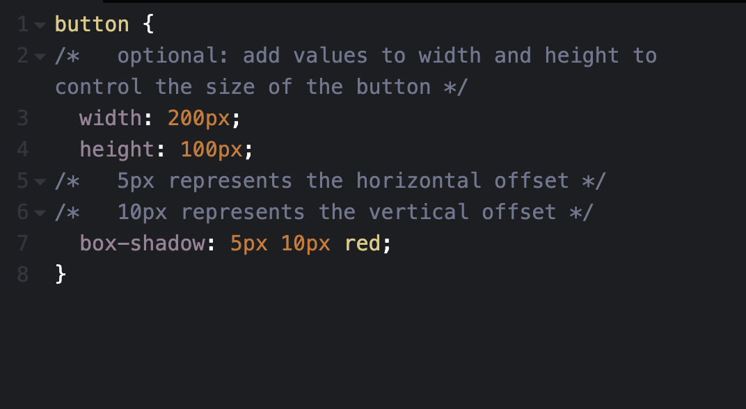
Your button will have a red shadow effect like the following:
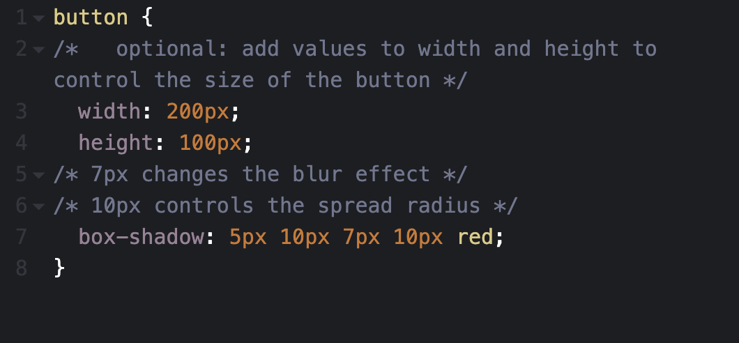
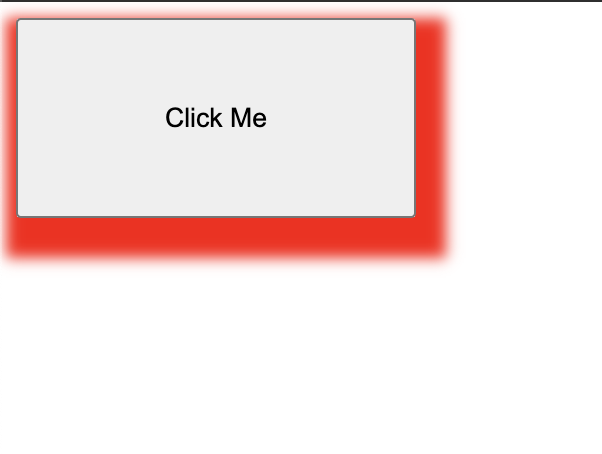
4. The box shadow can take up to six values. Let’s add 7px to the blur effect and 10px to spread the radius.
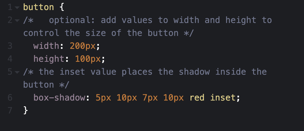
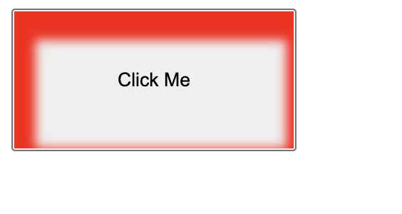
5. Use the inset keyword after your specified color to make the shadow sit inside the button.
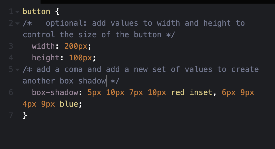
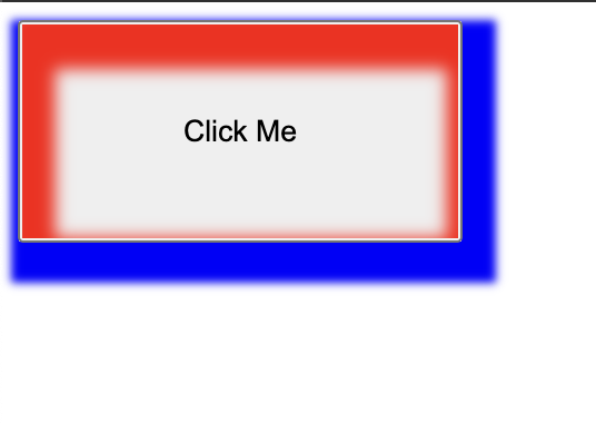
6. To add multiple shadows to the button, add a comma after your first set of values and specify new ones.
Creating neon shadows with CSS box-shadow
Real-life shadows are usually black or gray, with varying amounts of opacity. But what if shadows had colors?
In the real world, you get colored shadows by changing the color of the light source. There’s no “real” light source equivalent to change on a website, so you get this neon effect by changing the color value on the .
Let’s change the color on our first example:
.box{
  box-shadow: 0px 5px 10px 0px rgba(0, 0, 0, 0.7);
}
.box2{
  box-shadow: inset 0px 5px 10px 0px rgba(0, 0, 0, 0.7);
}
This is the output:
See the Pen
Neon Shadows by Oscar-Jite (@oscar-jite)
on CodePen.
You can get a more vibrant glow by layering the shadows:
box-shadow: 0px 1px 2px 0px rgba(0,255,255,0.7),
            1px 2px 4px 0px rgba(0,255,255,0.7),
            2px 4px 8px 0px rgba(0,255,255,0.7),
            2px 4px 16px 0px rgba(0,255,255,0.7);
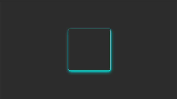
The best way to showcase colored shadows, especially neon ones, is on a dark-themed webpage. Dark themes are very popular and this effect can complement it nicely if you use the right colors.
All the heavy lifting has been done in the previous examples, so let’s darken the earlier site demo and see the result!
See the Pen
Neon Shadow Demo by Oscar-Jite (@oscar-jite)
on CodePen.
It’s best to use colors that contrast well, as we’ve done in this demo. The blue stands out well against the dark background. To make it brighter, you can increase the opacity.
CSS Box-Shadow
Let’s take a look at what the box-shadow CSS property is and the values it allows.
Syntax:
Example:
Box-Shadow Values Explained
x-offset — This is the horizontal offset of the shadow. Higher values will move the shadow to the right like it is traversing the x-axis of a graph. Negative values will move the shadow to the left.
y-offset — This is the vertical offset of the shadow. Higher values will move the shadow further below your object or down the page. Negative values will move the shadow higher vertically up the page. This is the opposite direction you might think of when looking at a graph with the y-axis.
blur-radius — Higher values will increase the blurriness and also increase the size of the shadow leading the shadow to become lighter in color. This number can’t be less than 0.
spread — Higher values will increase the size of the shadow without causing any loss of sharpness.
color — Specifies the color of the shadow.
* outset / inset — You can specify the box-shadow to be inset instead of the default outset. This will make the shadow appear inside of the object instead of outside of it. This article is about outset shadows and won’t touch on inset shadows.
There’s a little bit more to the box-shadow that I did not cover here and I encourage you to look it up elsewhere if you need to know more. This is a good basic understanding for us to use.
The thing that isn’t obvious while working with box-shadows is that you can specify multiple shadows on the same element. Simply, use commas to separate multiple values.
Inset Text-Shadows
Even at their most complex, inset box-shadows are pretty easy to wrap your mind around. Toss in the word “inset” and your drop shadow becomes an inner shadow. Super simple.
Unfortunately, text-shadow gives us a lot more trouble here. The “inset” value isn’t compatible with text-shadow so something like this simply won’t work:

Instead, we have to hack it together. How it works is pretty bizarre so we’ll build it in two steps so that you can see what’s happening. First, we’re going to type out an h1 and apply the following styles:
|
1 |
h1 { background-color#565656; colortransparent; text-shadow0px2px3pxrgba(255,255,255,0.5); } |
Already we’re in some weird territory. We’ve set a dark background color, a white text-shadow and a fill color of transparent. If you think that’s weird, check out the result:

This isn’t what we want at all! Interestingly enough, we’re off to the perfect start. The secret ingredient to make everything work is the “background-clip” property with the value set to “text.”
|
1 |
h1 { background-color#565656; colortransparent; text-shadow0px2px3pxrgba(255,255,255,0.5); -webkit-background-cliptext; -moz-background-cliptext; background-cliptext; } |
By setting the background-clip property to text, we can effectively clip anything going on in the background (images, gradients, colors, etc.) to the bounds of the text. When we do that with the code that we already had set up, this is the result:

As you can see, we’ve pulled off a really nice letterpress effect. That blurry edge is being cropped and now creates the illusion of an inset shadow. Meanwhile, the white text-shadow is providing us with the degree of lightness for the background fill and a little bevel effect outside the text. If we bump that shadow from 0.5 to 03., the text gets darker.

Browser compatibility for CSS box-shadow property
While most browsers support the box-shadow property; there are very few that do not fully support it.

This property is supported in Chrome from version 4 to 9 using the prefix -webkit- and fully supported from version 10.
-webkit-box-shadow: 8px 6px 10px rgba(0, 0, 0, 0.3);
| 1 | -webkit-box-shadow8px6px10pxrgba(,,,0.3); |
Mozilla Firefox versions 2 and 3 do not support CSS box-shadow. Version 3.5 and 3.6 support the box shadow with the prefix -moz-. And from version 4, this property is fully supported.
-moz-box-shadow: 8px 6px 10px rgba(0, 0, 0, 0.3);
| 1 | -moz-box-shadow8px6px10pxrgba(,,,0.3); |
For the Safari browser, versions 3.1 and 4 partially support this feature with the prefix -webkit- but version 5 completely supports it.
Opera browser also supports the box-shadow property except for version 10.1.
The CSS properties you use in your website must be cross-browser compatible. This is why you must check the browser compatibility of your features.
To check that, you can use a cloud-based testing platform like LambdaTest that offers an online browser farm of 3000+ real browsers and operating systems combinations to test your websites (and web apps). It lets you perform tests at scale to detect cross browser compatibility issues in HTML/CSS and fix them so that your website (or web app) works seamlessly across different browsers & OS combinations.
Subscribe to LambdaTest YouTube Channel and get detailed tutorials around Selenium automation testing, Cypress testing, and more.
The following is an example of testing browser support for CSS box-shadow:
Spread
This value determines the ‘size’ of the shadow cast by the element. By default, this is the same as the size of element casting it.
Think of it as being similar to the distance of the light source from the object which casts the shadow; the closer (larger values) the light source gets to the object, the bigger the shadow.
It’s the fourth length value you provide, before any colour value.
box__a
box__b
Spread also accepts negative values, which has the effect of making the shadow smaller than the element casting it. This is useful if you want to apply more blur, but reduce how far the blur extends beyond the edges of the element.
box__a
box__b
Описание
CSS свойство позволяет добавить одну или более тень для блока. Тень блока не влияет на размер и расположение самого элемента (несмотря на то, что тень может быть расположена далеко за его пределами), но она может перекрываться другими элементами, расположенными в коде после текущего элемента, или перекрывать другие элементы, расположенные в коде перед текущим элементом.
Для каждой тени можно задать от 2 до 6 параметров. Если добавляется несколько теней, то список параметров для каждой тени указывается через запятую:
div {
  width: 300px;
  height: 200px;
  margin: 100px;
  background-color: silver;
  box-shadow: 0 0 10px 5px black,
              40px -30px 15px lime,
			  40px 30px 50px red,
			 -40px 30px 15px yellow,
			 -40px -30px 50px blue;
}
Попробовать »
При наложении теней друг на друга каждая последующая тень в списке будет располагаться под предшествующей.
Тень блока может быть как внешней, так и внутренней. Внутренняя тень задаётся с помощью ключевого слова , которое указывается в параметрах тени первым или последним.
Примечание: для добавления тени к тексту используйте CSS свойство text-shadow.
| Значение по умолчанию: | none |
|---|---|
| Применяется: | ко всем элементам |
| Анимируется: | да |
| Наследуется: | нет |
| Версия: | CSS3 |
| Синтаксис JavaScript: | object.style.boxShadow=»10px 10px 5px #888888″ |
Examples of the CSS box-shadow property
CSS box shadow effects can be created in many different ways. You can create a typical CSS box shadow using just three values or create a smoother shadow effect by combining multiple shadows separated by a comma.
A bottom-right box shadow using XY offset, blur radius, and color:
CSS:
div{
/* offset-x | offset-y | blur-radius | color */
box-shadow: 8px 6px 10px rgba(0, 0, 0, 0.3);
}
|
1 |
div{ /* offset-x | offset-y | blur-radius | color */ box-shadow8px6px10pxrgba(,,,0.3); } |
Output:
See the Pen
box-shadow by Tahera Alam (@alam_tahera)
on CodePen.
In this example, we set offset-x to 8px and offset-y to 6px, resulting in a shadow on the right and bottom sides of the box. The third value sets the blur radius to 10px, and the fourth value specifies the color of the shadow. You can also use spread radius, but we are not using it in this example.
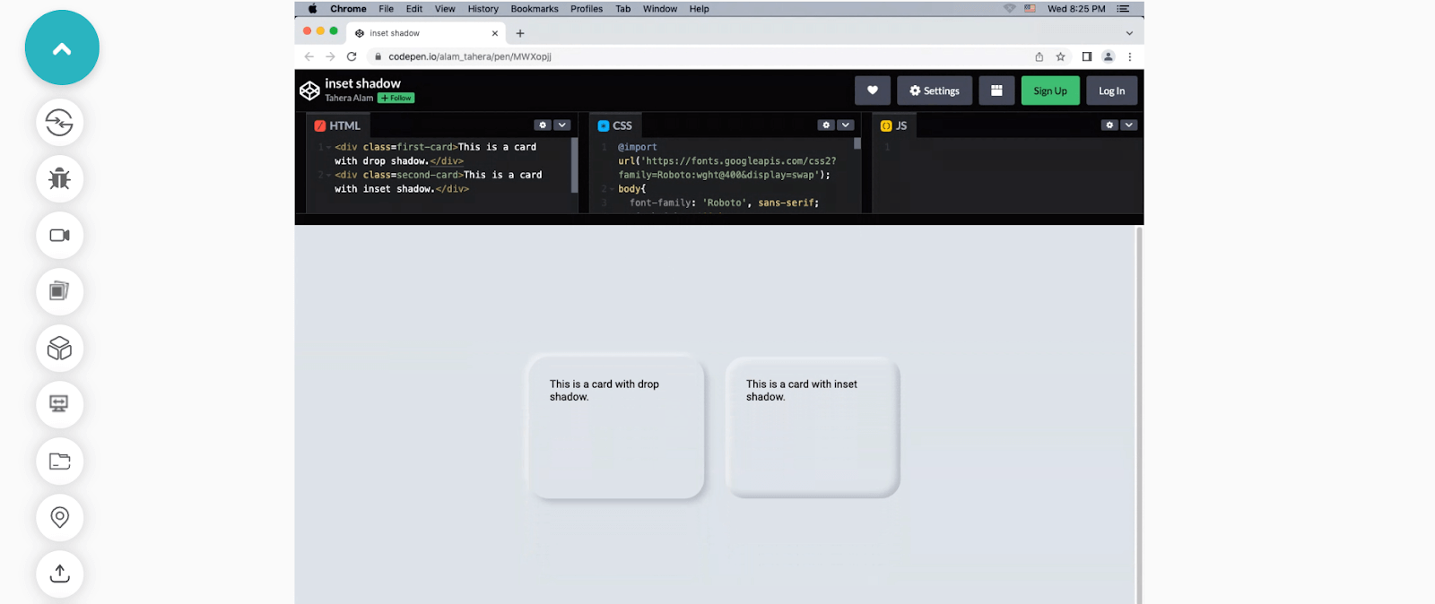
An inner box shadow using inset, XY offset, blur, spread, and color:
CSS:
div{
/*inset | offset-x | offset-y | blur-radius | spread-radius | color */
box-shadow: inset 0px 10px 20px 2px #3a86ff;
}
|
1 |
div{ /*inset | offset-x | offset-y | blur-radius | spread-radius | color */ box-shadowinset0px10px20px2px#3a86ff; } |
Output:
See the Pen
inset box shadow by Tahera Alam (@alam_tahera)
on CodePen.
Here we set inset as the first value that makes the shadow inner. Then we set the vertical offset to 10px, blur radius to 20px, and spread to 2px, resulting in an inner shadow from the top direction. Finally, the last value sets the color.
A smooth box shadow combining multiple shadows separated by a comma:
CSS:
div{
/* offset-x | offset-y | blur-radius | color, offset-x | offset-y | blur-radius | color, */
box-shadow: 0px 3px 6px rgba(0, 0, 0, 0.16), 0px 3px 6px rgba(0, 0, 0, 0.23);
}
|
1 |
div{ /* offset-x | offset-y | blur-radius | color, offset-x | offset-y | blur-radius | color, */ box-shadow0px3px6pxrgba(,,,0.16),0px3px6pxrgba(,,,0.23); } |
Output:
See the Pen
multiple box shadow by Tahera Alam (@alam_tahera)
on CodePen.
In this example, we create a smooth shadow effect by adding two shadows separated by a comma. We specify x and y-offsets to be consistent in both the shadows and the blur radius to be sharper by defining a value of 6px.
Примеры
Пример
Добавить эффект размытия к тени:
#example1 { box-shadow: 10px 10px 8px #888888;
}
Пример
Определить радиус распространения тени:
#example1 { box-shadow: 10px 10px 8px 10px #888888;
}
Пример
Определить несколько теней:
#example1 { box-shadow: 5px 5px blue, 10px 10px
red, 15px 15px green;
}
Пример
Добавить врезное ключевое слово::
#example1 { box-shadow: 5px 10px inset;}
Пример
Изображения брошены на стол. В этом примере показано, как создавать «полароидные» изображения и поворачивать их:
div.polaroid { width: 284px;
padding: 10px 10px 20px 10px; border: 1px solid
#BFBFBF; background-color: white; box-shadow: 10px 10px 5px #aaaaaa;}


