

Creating Styles for a Button
Next, you will create a custom, button-like style with a class selector so the styles can be used on either a or an element. Unlike elements, which are used throughout text content, the element has a more intentional purpose. This makes it less necessary to create generic styles for the element, and instead allows you to always add a attribute.
Start by opening up in your text editor. Create a new class selector called . The styles here will redefine many of the properties that were reset in the previous step on the element selector. You will add color to the text with the property, fill the shape with the property, then provide some definition with the property. Afterward you will give a rounded corner to the button with the property. Finally, you will use the shorthand to give space above and below the text, then double that amount on the left and right.
The following code block contains these values:
styles.css
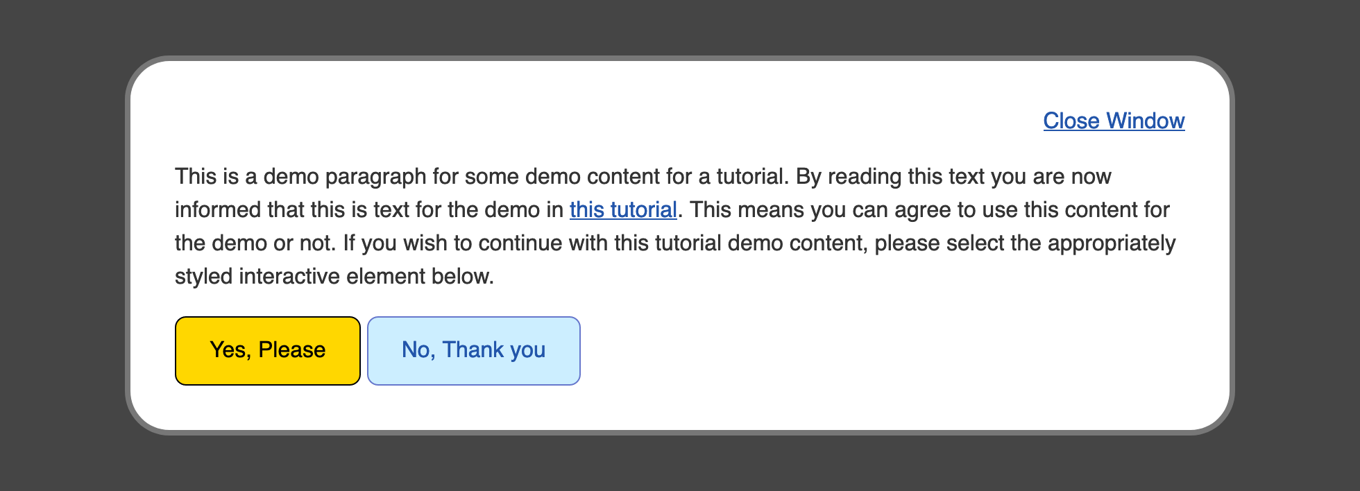
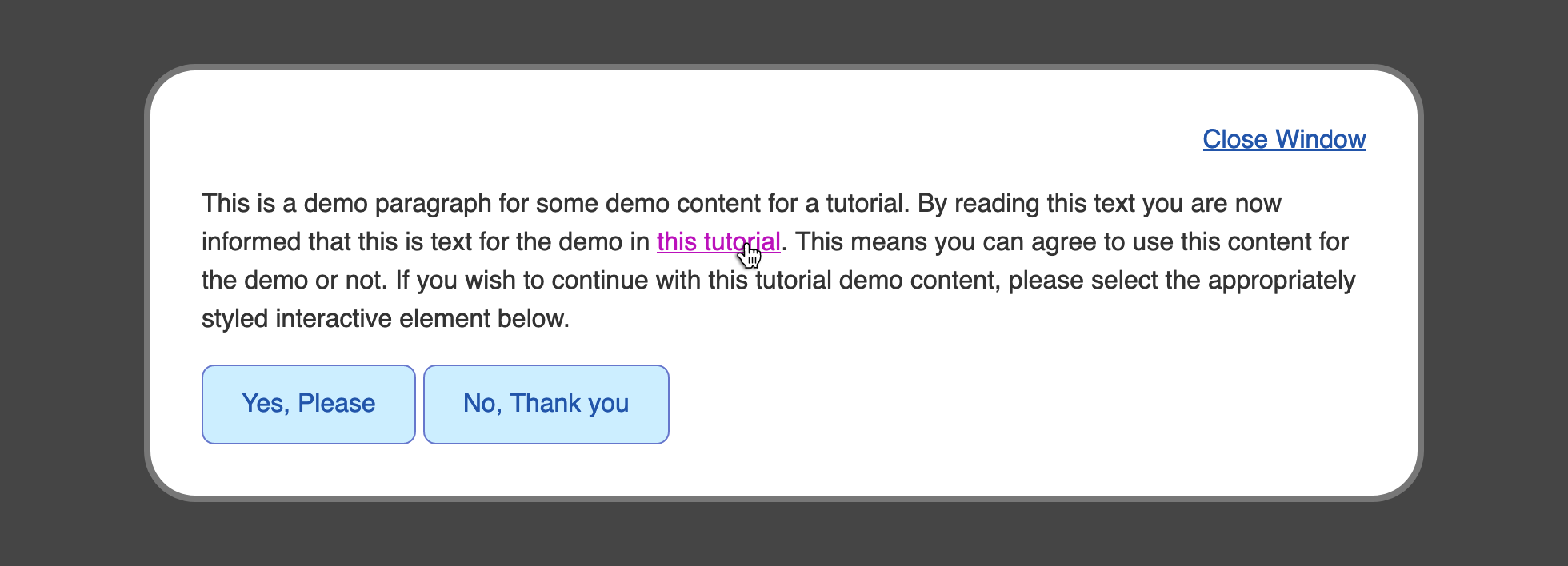
Save your changes to and return to your browser to refresh the file. The look of the Yes, Please and No, Thank you buttons will change to match the properties. The text is the same blue as the default style, with a much lighter blue in the background, and another deep blue for the border. The next image demonstrates how this will appear in the browser:
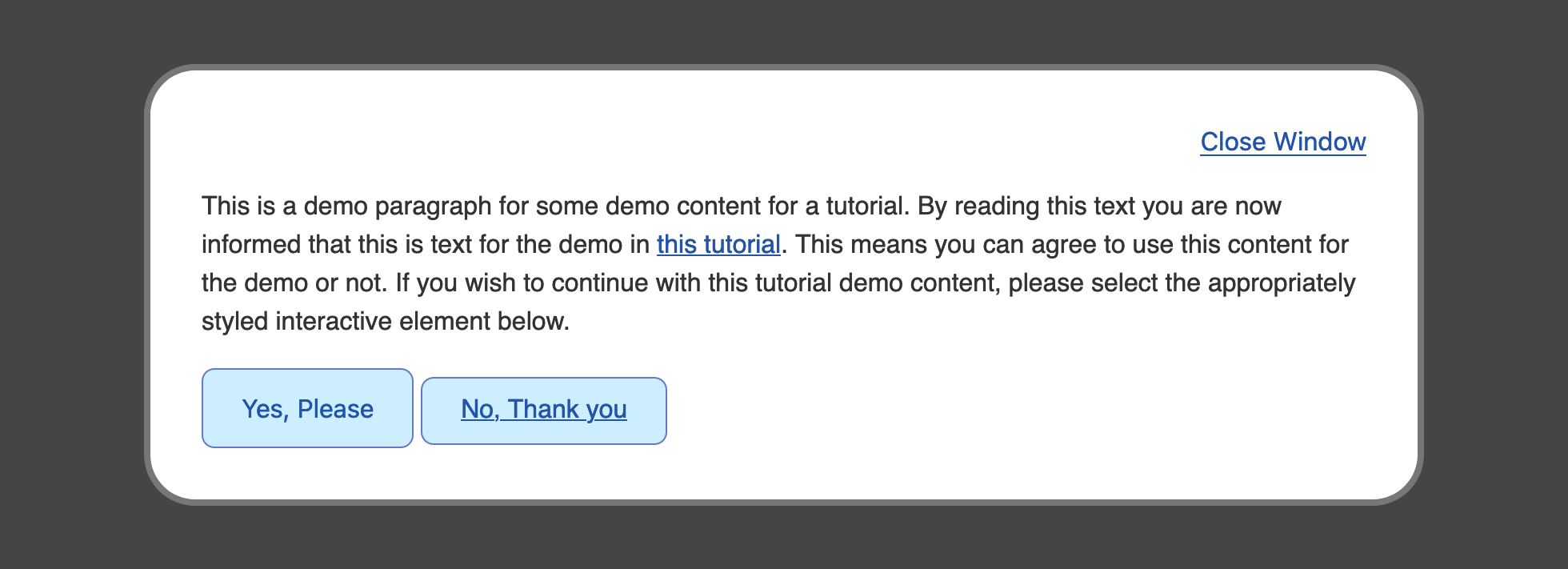
There is a noticeable difference in size between the two buttons. Since the No, Thank you button is using an element instead of a , there are a few additional properties that need to be added to the selector to equalize the defaults between these two elements.
Return to in your text editor and go to the class selector. To begin, add a , which is the default style on elements. Next, add a to remove the underline from the element. As you did with the selector, add a to the selector to get the pointing hand icon when a mouse cursor is over the element. Lastly, add a rule. This last property isn’t necessary for all browsers, but it defines where the bottom of elements are positioned on a line:
styles.css
Save these additions to and then refresh in your browser. The two buttons are now equivalent in visual appearance and have borrowed default attributes from one another, so they are perceived to have a similar interaction.

You created a custom class selector to style both and elements with a button-like style in this section. Next, you will create a conditional style when a mouse cursor is on top of the interactive elements.
Interactive states #
The following pseudo-classes apply due to an interaction a user has with your page.
Browser support
- Chrome 1, Supported 1
- Firefox 1, Supported 1
- Edge 12, Supported 12
- Safari 2, Supported 2
If a user has a pointing device like a mouse or trackpad, and they place it over an element, you can hook on to that state with to apply styles. This is a useful way to hint that an element can be interacted with.
Browser support
- Chrome 1, Supported 1
- Firefox 1, Supported 1
- Edge 12, Supported 12
- Safari 1, Supported 1
This state is triggered when an element is actively being interacted with— such as a click—before click is released. If a pointing device like a mouse is used, this state is when the click starts and hasn’t yet been released.
, , and
Browser support
- Chrome 1, Supported 1
- Firefox 1, Supported 1
- Edge 12, Supported 12
- Safari 1, Supported 1
If an element can receive focus—like a — you can react to that state with the pseudo-class.
You can also react if a child element of your element receives focus with .
Focusable elements, like buttons, will show a focus ring when they are in focus—even when clicked. In this sort of situation, a developer will apply the following CSS:
This CSS removes the default browser focus ring when an element receives focus, which presents an accessibility issue for users who navigate a web page with a keyboard. If there is no focus style, they won’t be able to keep track of where focus currently is when using the tab key. With you can present a focus style when an element receives focus via the keyboard, while also using the rule to prevent it when a pointer device interacts with it.
Browser support
- Chrome 1, Supported 1
- Firefox 1, Supported 1
- Edge 12, Supported 12
- Safari 1.3, Supported 1.3
The pseudo-class selects an element that has an matching a URL fragment. Say you have the following HTML:
You can attach styles to that element when the url contains .
This is useful for highlighting areas that might have been specifically linked to, such as the main content on a website, via a skip link.
Псевдоселекторы, псевдоэлементы и псевдоклассы в CSS
Псевдоклассы — это селекторы, которые определяют элементы на странице не по классам, прописанным разработчиком, а по специфическому состоянию HTML-элементов. Например, когда на элемент страницы наводится курсор мыши, он переходит в специфическое состояние. Чтобы задать обычный стиль этому элементу, мы используем какой-нибудь основной селектор, а чтобы задать стиль при наведении курсора на него, мы используем псевдокласс. При описании стилей псевдокласса его селектор всегда начинается с «двоеточия»:
:<имя псевдокласса> {
<описываем стили>
}
Псевдоклассы бывают разные. Одни могут отвечать за действия пользователя на странице, а другие — за расположение дочернего элемента относительно родительского.
Псевдоклассы CSS, которые отвечают за действия пользователя
Псевдоклассы, которые «включаются» при определенных действиях пользователя:
«:hover». Этот псевдокласс используется, когда мы хотим задать стили элементу, на который навели курсор. В этом случае синтаксис селектора будет таким: « :hover».
«:focus»
Этот псевдокласс помогает задать стиль элементу, на котором сфокусировано внимание пользователя. Например, пользователь заполняет какую-то форму на сайте
В момент заполнения формы ее можно как-то выделить при помощи данного псевдокласса.
«:link» и «visited». Эти псевдоклассы применяются исключительно к ссылкам. Первый задает стили ссылке, которую еще не посетили, а второй — ссылке, которую уже посетили.
«:active». Этот псевдокласс используется в тот момент, когда пользователь активно взаимодействует с элементом страницы. Например, пользователь только нажал на ссылку или кнопку, но еще не отпустил их.
Псевдоклассы, которые определяют «соседство» html-элементов
Псевдоклассы, которые отвечают за расположение дочернего элемента в родительском, иногда называю псевдоклассами «соседства».
Псевдоклассы «соседства»:
-
«:first-child». Этот псевдокласс всегда определяет первый элемент собственного родителя. Например, у нас есть большой текст, и мы хотим выделить в нем стилями первый абзац. В этом случае мы к тексту применяем данный псевдокласс и описываем стили. Псевдокласс «привязывается» не к конкретному элементу, а лишь к его расположению. Например, в начале нашего текста добавляем новый абзац — теперь он будет попадать под действие этого псевдокласса.
-
«:last-child». Работает точно так же, как и первый псевдокласс, но только с последними дочерними элементами родителя.
-
«:only-child». Этот псевдокласс определяет все дочерние элементы родительского класса, при условии что они являются единственными у своего родителя.
-
«:nth-child(номер элемента)». Этот псевдокласс позволяет обратиться к конкретному номеру элемента своего родителя. Например, у вас на сайте реализован список, вы хотите выбрать конкретный пункт списка и выделить его стилями — тогда вам поможет данный псевдокласс.
Это не все псевдоклассы. Если в описанных выше псевдоклассах заменить слово «child» на «of-type», тогда мы получим серию псевдоклассов, которые будут определять дочерний элемент по его типу, а не место расположения. Например, у вас есть некий блок, внутри которого много разных элементов:
<section>
<h2>…</h2>
<p>…</p>
<form>…</form>
<h3>…</h3>
<p>…</p>
<p>…</p>
</section>
Если прописать псевдокласс «p: first-child», тогда в этом случае ни один элемент не будет выбран, потому что первым дочерним элементом не является абзац. Но если прописать псевдокласс «p:first-of-type», тогда будет выбран «первый абзац», хотя фактически он является вторым дочерним элементом. В остальном «child» и «of-type» работают идентично. Но и на этом псевдоклассы не заканчиваются. Мы привели лишь те, которые наиболее часто применяются.
Псевдоэлементы CSS
Псевдоэлементы работают по похожему принципу, как и псевдоклассы, однако они работают так, будто на странице добавлен новый элемент, а не применены стили к существующему элементу. Каждый псевдоэлемент обозначается с использованием 2-х двоеточий:
::<имя псевдоэлемента>
Несколько основных псевдоэлементов, которые наиболее часто используются
-
«::after». Определяет псевдоэлемент, который появится после существующего, родительским элементом.
-
-
«::before». Определяет псевдоэлемент, который появляется перед существующим, родительским элементом.


Эти два псевдоэлемента используются наиболее часто в таблицах стилей. Есть еще несколько, но они используются в специфичных случаях и крайне редко.
Псевдоклассы
Последнее обновление: 21.04.2016
В дополнение к селекторам тегов, классов и идентификаторов нам доступны селекторы псевдоклассов, которые несут дополнительные
возможности по выбору нужных элементов.
Список доступных псевдоклассов:
-
:root: позволяет выбрать корневой элемент веб-страницы, наверное наименее полезный селектор, так как на правильной веб-странице
корневым элементом практически всегда является элемент -
:link: применяется к ссылкам и представляет ссылку в обычном состоянии, по которой еще не совершен переход
-
:visited: применяется к ссылкам и представляет ссылку, по которой пользователь уже переходил
-
:active: применяется к ссылкам и представляет ссылку в тот момент, когда пользователь осуществляет по ней переход
-
:hover: представляет элемент, на который пользователь навел указатель мыши. Применяется преимущественно к ссылкам, однако может также применяться
и к другим элементам, например, к параграфам -
:focus: представляет элемент, который получает фокус, то есть когда пользователь нажимает клавишу табуляции или нажимает кнопкой мыши
на поле ввода (например, текстовое поле) -
:not: позволяет исключить элементы из списка элементов, к которым применяется стиль
-
:lang: стилизует элементы на основании значения атрибута
-
:empty: выбирает элементы, которые не имеют вложенных элементов, то есть являются пустыми
При применении псевдоклассов перед ними всегда ставится двоеточие. Например, стилизуем ссылки, используя псевдоклассы:
<!DOCTYPE html>
<html>
    <head>
        <meta charset="utf-8">
        <title>Псевдоклассы в CSS3</title>
        <style>
            a:link    {color:blue; text-decoration:none}
            a:visited {color:pink; text-decoration:none}
            a:hover   {color:red; text-decoration:underline}
            a:active  {color:yellow; text-decoration:underline}
			input:hover {border:2px solid red;}
        </style>
    </head>
    <body>
        <a href="index.html">Учебник по CSS3</a>
		<input type="text" />
    </body>
</html>
Селектор :not
Селектор :not() позволяет выбрать все элементы кроме определенных, то есть исключить некоторые элементы из выбора.
<!DOCTYPE html>
<html>
    <head>
        <meta charset="utf-8">
        <title>Селекторы в CSS3</title>
        <style>
			a:not(.blueLink) { color: red; }
        </style>
    </head>
    <body>
		<a>Первая ссылка</a><br/>
		<a class="blueLink">Вторая ссылка</a><br/>
		<a>Третья ссылка</a>
    </body>
</html>
Селектор применяет стиль ко всем ссылкам за исключением тех, которые имеют класс «blueLink». В скобки псевдоклассу
not передается селектор элементов, которые надо исключить.
Псевдокласс :lang
Селектор :lang выбирает элементы на основании атрибута :
<!DOCTYPE html>
<html>
    <head>
        <meta charset="utf-8">
        <title>Селекторы в CSS3</title>
        <style>
            :lang(ru) {
				color: red;
			}
        </style>
    </head>
    <body>
		<form>
			<p lang="ru-RU">Я изучаю CSS3</p>
			<p lang="en-US">I study CSS3</p>
            <p lang="de-DE">Ich lerne CSS3</p>
        </form>
    </body>
</html>
НазадВперед
5.9 Селекторы ID
Языки документов могут содержать
атрибуты, которые объявлены как имеющие тип ID.
Особенностью атрибутов типа ID является то,
что они могут иметь одно значение;
независимо от языка документа, атрибут ID
может использоваться для уникальной
идентификации элемента. В HTML все атрибуты ID
именуются «id»; приложения XML могут
именовать атрибуты ID по-разному, но с
применением одинаковых ограничений.
Атрибут
ID языка документа позволяет авторам
назначать идентификатор объекту элемента в
дереве документа. В CSS ID-селекторы совпадают
с объектом элемента на базе идентификатора. ID-селектор
CSS содержит «#» непосредственно перед
значением ID.
Следующий
ID-селектор совпадает с элементом H1, чей
атрибут ID имеет значение «chapter1»:
H1#chapter1 { text-align: center }
В следующем пример правило
таблицы стилей устанавливает
совпадение элементом, чьё значение ID — «z98y».
Правило, таким образом, совпадает для
элемента P:
<HEAD>
  <TITLE>Match P</TITLE>
  <STYLE type="text/css">
    *#z98y { letter-spacing: 0.3em }
  </STYLE>
</HEAD>
<BODY>
   <P id=z98y>Wide text</P>
</BODY>
В следующем пример, однако, правило стиля
совпадает только с тем элементом H1, который
имеет значение ID — «z98y». Правило в этом
примере не совпадает с элементом P:
<HEAD>
  <TITLE>Match H1 only</TITLE>
  <STYLE type="text/css">
    H1#z98y { letter-spacing: 0.5em }
  </STYLE>
</HEAD>
<BODY>
   <P id=z98y>Wide text</P>
</BODY>
ID-селекторы имеют более высокий приоритет,
чем селекторы атрибутов. Например, в HTML
селектор #p123 более специфичен,
чем , в терминах каскада.
Примечание. В XML 1.0
информация о том, какой атрибут содержит ID-ы
элемента, находится в ОТД. При разборе XML, ПА
не всегда читают ОТД и поэтому могут не
знать, какой ID у элемента. Если дизайнер
таблицы стилей знает или предполагает, что
это именно данный случай, он должен
использовать нормальные селекторы
атрибутов: вместо .
Однако каскадный порядок нормальных
селекторов атрибутов отличается от ID-селекторов.
Может понадобиться добавить приоритет «!important»
в объявления: . Конечно, элементы в
документах XML 1.без ОТД не имеют ID-ов вообще.
Using transition to Animate Between States
When working with states of elements, a shift in styles between the states can be abrupt. The property is used to blend and animate the styles from one state to the next state to avoid this abruptness. The property is a shorthand property that combines the , , and properties.
The can be any property that has a value calculated between two given values. Colors are included in this, as they are numerical values, even when a color name is used. The property is a numeric value for how long the transition should occur. The value for the duration is often represented in seconds, with the unit, or milliseconds, with the unit. Lastly, the controls how the animation will play out over time, enabling you to make subtle changes to enhance the animation.
To begin working with the property, open your file and go to the group selector and the group selector. Add a property with a value of . The is the value for the , which tells the browser to animate all the properties that change between the states. The is the value and equates half a second; this can also be represented as . Lastly, the position is the value, which tells the browser to move from one value to the next in a constant increment throughout the duration:
styles.css
Save your changes to and then open in your web browser. Once the page loads, begin interacting with the link and button elements and pay attention to how the styles animate between the different states. The following animation shows the button style transitioning from the default state to the pseudo-class state:
To make the animations feel more snappy and natural, return to your file and adjust the property values. For the group selector, change the duration from to , which is half the duration compared to what it was before. Then change the timing function value to . This will create an animation that starts off slow, speeds up in the middle, and slows down to the end. Then, for the group selector, change the duration to a quicker and set the timing function to the same value as the link:
styles.css
Save these changes to your file and then refresh the page in your web browser. The transition animations between states will still animate, but are now much quicker and feel faster, too. With the property, it is important to play around with the values to find an animation that fits the design. The following animation demonstrates the faster transition of the button from the default state to the state to the state.
You have now created an animation between states. The property helps make changes between states more engaging and fun.
Combining :hover, :focus, and :active #
One thing you may have noticed is that the conditions in which each of these pseudo-classes can be applied are not mutually exclusive. In fact, most times when an element is being clicked with a mouse, all three conditions are valid — the mouse if over the element, the element is in focus, and the element is being activated.
We can test this by only changing the background of the button if all three conditions apply.
If you click and hold the button below, you’ll see that it turns yellow. But if you click and hold while dragging your mouse away from hovering over it, you’ll see that it loses the colour.
Click me, hold, then drag your mouse around
This ability to combine the pseudo-classes can be really helpful for fine-tuning how we want to style the different states.
Order of styles — then then
Due to the fact that these conditions can and frequently are applied at the same time, the order in which we add these styles is important.
Let’s say we have the following styles:
Only the :hover styles will be visible
Try to get the hover, focus, and active styles
When you hover and interact with the element above, only the styles applied to will prevail as long as you are still hovering over it. As we’ve seen, since all three events are applied during a typical click event, the cascade takes over and the last-defined style wins.
This is why it’s important to define these styles in the order in which they typically happen, so it becomes clear to the user when a new interaction is recognised. Typically, a user will first hover over an element, then bring it to focus, then activate it. So, the best way to order your pseudo-class styles are then then .
All styles will be visible
Try to get the hover, focus, and active styles
Historic states #
Browser support
- Chrome 1, Supported 1
- Firefox 1, Supported 1
- Edge 12, Supported 12
- Safari 1, Supported 1
The pseudo-class can be applied to any element that has a value that hasn’t been visited yet.
You can style a link that’s already been visited by the user using the pseudo-class. This is the opposite state to but you have fewer CSS properties to use for security reasons. You can only style , , , and the color of SVG and .
Order matters
If you define a style, it can be overridden by a link pseudo-class with at least equal specificity. Because of this, it’s recommended that you use the LVHA rule for styling links with pseudo-classes in a particular order: , , , .
Applying the :focus Pseudo-Class
Instead of using a mouse or a touch screen, website visitors will sometimes use their keyboard to navigate and interact with elements of a page. This is most often done by using the key, which will cycle through the interactive elements on the page. The default style uses the property to give a visual indicator that the element has focus. This style can be customized by using the pseudo-class to apply property values for this situation.
To begin working with the focus state of the elements on the page, open your file in your text editor. Start with a new selector below the group selector with a new group selector for the focus state: .
The most important part of customizing the focus state is to make sure it is noticeably different from the default state. Here, you will make the pseudo-class styles have black text with a gold background:
styles.css
In this case, you set the property to and the property to . You also used the property, which added some gold color around the edges of the text, outside where the property can reach.


The property works similar to the shorthand property, as it accepts a width, a style, and a color. However, unlike the properties, always goes around the whole element and can not be set to a specific side. Also, unlike , the does not affect the box-model; the shape is only applied visually and does not change the flow of content.
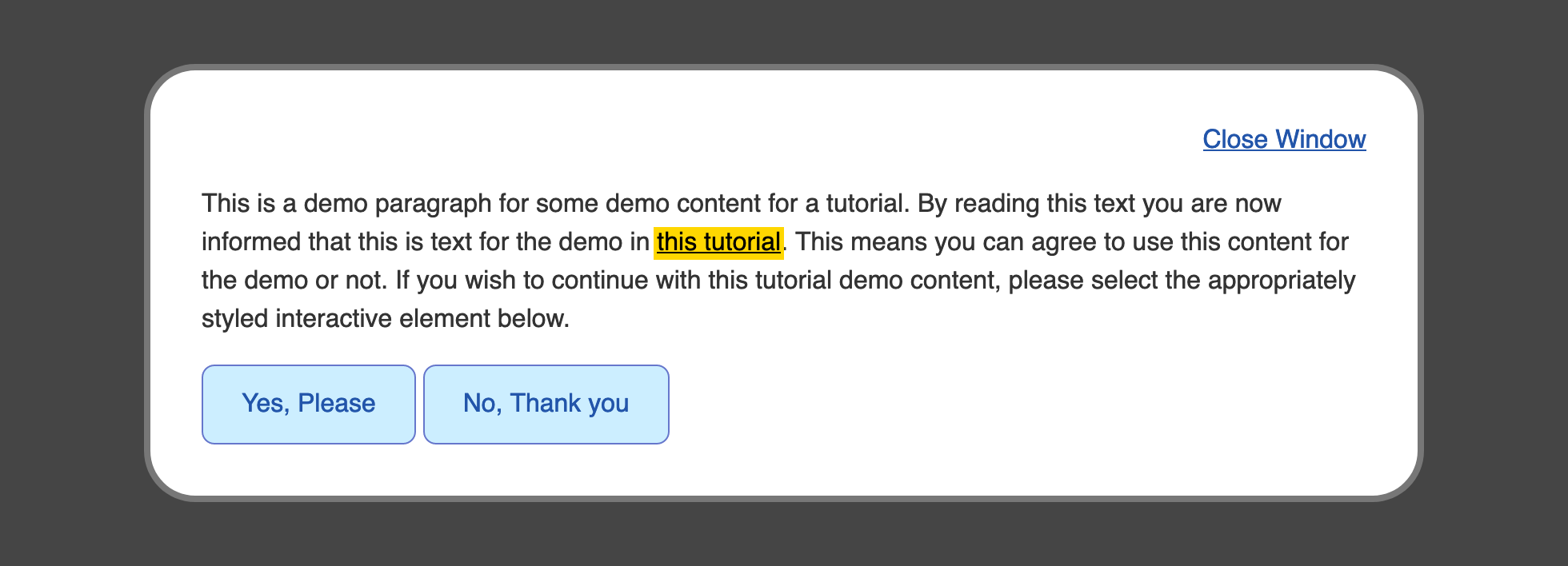
Save your changes to and refresh in your web browser. Begin pressing the key until the browser brings focus to the Close Window and this tutorial elements highlight with a gold background. The following image shows what the this tutorial link looks like in the browser when it has focus:
Next, to apply a similar custom focus style to the class elements, begin by creating a class and pseudo-class selector. Since the element is already using a , you will use that to indicate focus, and so remove the default by setting the property to have a value of . Like the link before, the property will be set to and the property will be set to . Last, set the property to have a value of :
styles.css
Be sure to save your additions to and then return to you browser to refresh your file. Again, using the key, cycle through the keyboard-focusable elements on the page until you reach the elements. They will now light up with a gold background and black text with a black border. The following image demonstrates how the Yes, Please button appears in the browser when focused:
In this section, you used the pseudo-class to create custom styles that appear when the website visitor uses their keyboard to navigate the page. In the next section, you will use the pseudo-class to indicate when a user is interacting with an element via a mouse click or a keypress.
Вес CSS-селектора, или специфичность
Для одного и того же элемента веб-страницы можно прописать сколько угодно стилей. Если в разных местах CSS-файла какому-то его свойству заданы разные значения, то браузер должен выбрать одно из них.
Обычно подключается правило, которое определено последним, но так происходит не всегда. Дело в том, что одни селекторы обладают более высокой специфичностью, чем другие.
Специфичность — это показатель, по которому браузер определяет, какие стили применить к элементу. Её можно представить в виде четырёх чисел 0.0.0.0, где каждый разряд — это вес, определяемый специальными правилами.
Вот эти правила:
- Наивысший приоритет — у стилей, прописанных в атрибуте style (1.0.0.0).
- На втором месте — селекторы по идентификатору (0.1.0.0).
- Затем идут три равноправные группы: селекторы по классу, атрибуту и псевдоклассы (0.0.1.0).
- На четвёртом месте — селекторы по тегу и псевдоэлементы (0.0.0.1).
- Комбинаторы ~, >, + и универсальный селектор * веса не добавляют.
- Вес псевдоклассов :is(), :has() и :not() равен весу самого специфичного селектора внутри скобок.
Чтобы определить самый «тяжёлый» селектор, браузер сначала взвешивает каждый, а затем сравнивает их поразрядно.
Попробуем порассуждать как браузер. Допустим, на странице есть элемент, на который указывают два CSS-селектора:
Рассчитаем их вес:
- Класс .container добавляет 1 в третий разряд, а div и ul — по единице в четвёртый. Результат: 0.0.1.2.
- Идентификатор our_team добавляет 1 во второй разряд, тег div — 1 в четвёртый разряд, а класс .developers — 1 в третий. Получаем 0.1.1.1.
Браузер применит стили селектора #our_team div.developers, потому что он указывает на идентификатор (см. правило №2 в списке).
А если бы исследуемый элемент обладал атрибутом style, то и считать ничего бы не пришлось. Ведь, как мы уже знаем, style обладает наивысшим приоритетом:
А теперь секретный приём. Вы можете перебить любое правило, если добавите к нему ключевое слово !important. В таком случае стили намертво приклеятся к элементу:
После этого изменить начертание текста в ссылках можно будет, только если использовать !important в более специфическом селекторе. Например, таком:
Приоритизация селекторов
При наличии ряда правил, регламентирующих один и тот же стиль оформления какому-либо элементу, приоритет отдается самому «весомому» селектору.
Специфичность селекторов записывается посредством числового ряда из 4 позиций: 0,0,0,0.
Вес селектора усиливается слева направо. Если на первой позиции число больше, то этот селектор будет приоритетным, и стиль, заданный в нем и будет применяться к элементу. При равенстве чисел на позиции, сравнению подлежат следующие, расположенные правее и так далее.
Если числовой ряд полностью совпадает, то будет применяться тот селектор, который ниже расположен в коде.
Что означают числа на этих четырех позициях? Вес селектора зависит от его типа:
- селектор универсальный (без добавления веса) – 0,0,0,0;
- селекторы по элементу выглядят так – 0,0,0,1;
- селекторы по классу и по атрибуту смещают единицу на третью позицию – 0,0,1,0;
- селектор по id – 0,1,0,0;
Атрибут style элемента, содержит наиболее специфичные свойства, поэтому единица занимает самое приоритетную (левую) позицию – 1,0,0,0.
Пример:
* – 0,0,0,0;
li – 0,0,0,1;
li::before – 0,0,0,2;
ul > li – 0,0,0,2;
div input+label – 0,0,0,3;
h1 + div – 0,0,1,2;
.btn.show – 0,0,2,0;
ul li a.item – 0,0,1,3;
#aside div.show – 0,1,1,1;
style=»…» – 1,0,0,0;
Можно вручную повысить вес CSS стиля, для этого надо прописать оператор !important, который сделает селектор более специфичным. Если же написать два таких слова, то возникнет конфликт, который решается сравнением весов селекторов.
Например:
<div class=»alert-warning» style=»background-color: black;»> … </div>
В CSS:
.alert-warning {
background-color: white !important;
}
Этот пример иллюстрирует приоритетность правила со словом !important. Цвет фона будет белым.
Освойте новую интересную профессию Frontend-разработчика. Всё, что нужно для старта: основы веб-разработки и создания пользовательских интерфейсов для сайтов и приложений. Вы научитесь проектировать, разрабатывать и тестировать фронтенд-часть проектов, используя современные технологии и инструменты. Присоединяйтесь к команде преподавателей и студентов. Ваш профессиональный успех начинается здесь и сейчас.
Как уже говорилось выше, применение !important к нескольким элементам запустит механизм определения приоритетного свойства CSS путем сравнения веса селекторов.
Будет применен тот стиль, который описывается селектором с большим приоритетом.
Если же добавить !important к CSS свойству расположено в style, у которого и так наивысший приоритет, то эффект специфичности станет максимальным, и будет производиться выполнение этого стиля.
Приведем пример:
<p id=»message» style=»font-size: 22px !important;»>…</p>
CSS:
p#message {
font-size: 14px !important;
}
Популярные статьи
Высокооплачиваемые профессии сегодня и в ближайшем будущем
Дополнительный заработок в Интернете: варианты для новичков и специалистов
Востребованные удаленные профессии: зарабатывайте, не выходя из дома
Разработчик игр: чем занимается, сколько зарабатывает и где учится
Как выбрать профессию по душе: детальное руководство + ценные советы
Этот пример иллюстрирует, что к элементу #message будет применен стиль «размер шрифта» со значением 22px, потому что вес Style (1.0.0.0) имеет наивысший приоритет, а слова !important в данном случае уравниваются.
В CSS отсутствует селектор для получения родительского элемента. Возможно, в следующей версии CSS появится такая фича, но в текущей CSS3 такого выбора нет.
Надеемся, что в этой статье вы получили полезный практический опыт применения с CSS селекторов. Все эти методы предназначены для удобства указания определенных html-элементов для применения к ним различный стилей оформления.
Селекторы по атрибуту
Эти селекторы предназначены для выбора элементов по имени атрибута или по атрибуту с указанным значением:
- – по имени атрибута;
- – по имени и значению атрибута;
- – по имени и значению, с которого оно должно начинаться;
- – по имени атрибута и его значению, которое равно или начинается со ;
- – по имени атрибута и значению, на которое оно должно заканчиваться;
- – по указанному атрибуту и значению, которое должно содержать ;
- – по имени атрибута и значению, которое содержит отделённое от других с помощью пробела.
1. С атрибутом :
CSS
2. С атрибутом :
CSS
3. С атрибутом и значением, которое должно начинаться с :
CSS
4. С атрибутом и значением, которое равно или должно начинаться с (после дефиса идёт остальное содержимое значения этого атрибута):
CSS
5. С атрибутом и значением, которое заканчивается на :
CSS
6. С атрибутом и значением, которое содержит подстроку (пример элемента, соответствующего этому селектору: ):
CSS
7. С атрибутом и значением, которое содержит строку , отделённую от других слов с помощью пробела (пример элемента, соответствующего этому селектору ):
CSS
Applying the :hover Pseudo-Class to the Link and Button
Now you will use the pseudo-class to create an alternative style that displays when the cursor is on the element. Pseudo-classes are a special group of conditions that are defined by a colon () and the name of the condition appended to the selector. For example, the element selector with a hover pseudo-class becomes .


Open in your text editor. Below the group selector for , add a new selector for the hover state by appending each selector with the pseudo-class: . Then, to make a noticeable change when the cursor hovers over the element, add a property with a value of , which is a dark pink color:
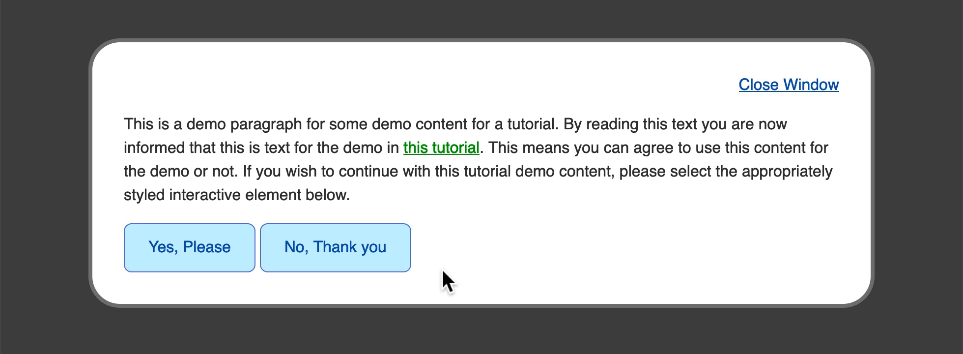
styles.css
Save the changes to your file and refresh in your browser. Hover over either the this tutorial link or the Close Window button to initiate the color change on hover. The following image shows what the hover state looks like when the cursor is over the this tutorial link.
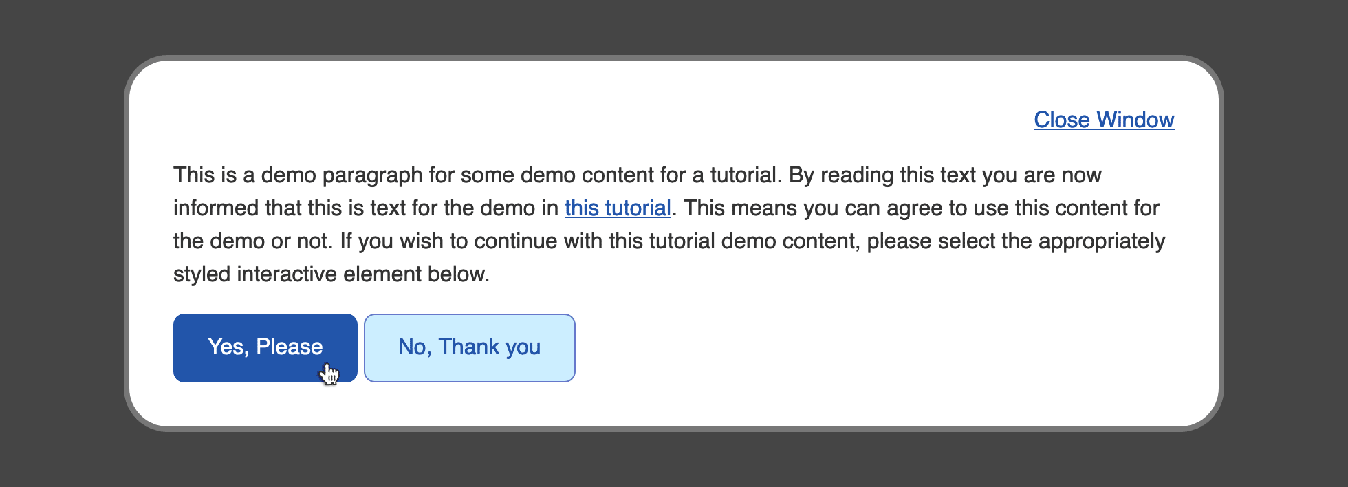
Next, to add a hover state to the elements, return to in your text editor. Below the class selector, add a selector to create styles specifically for hover interaction. Next, within the selector, add color properties that will change the button appearance when the cursor is on the buttons. Set a property to , then create a and a with both properties set to :
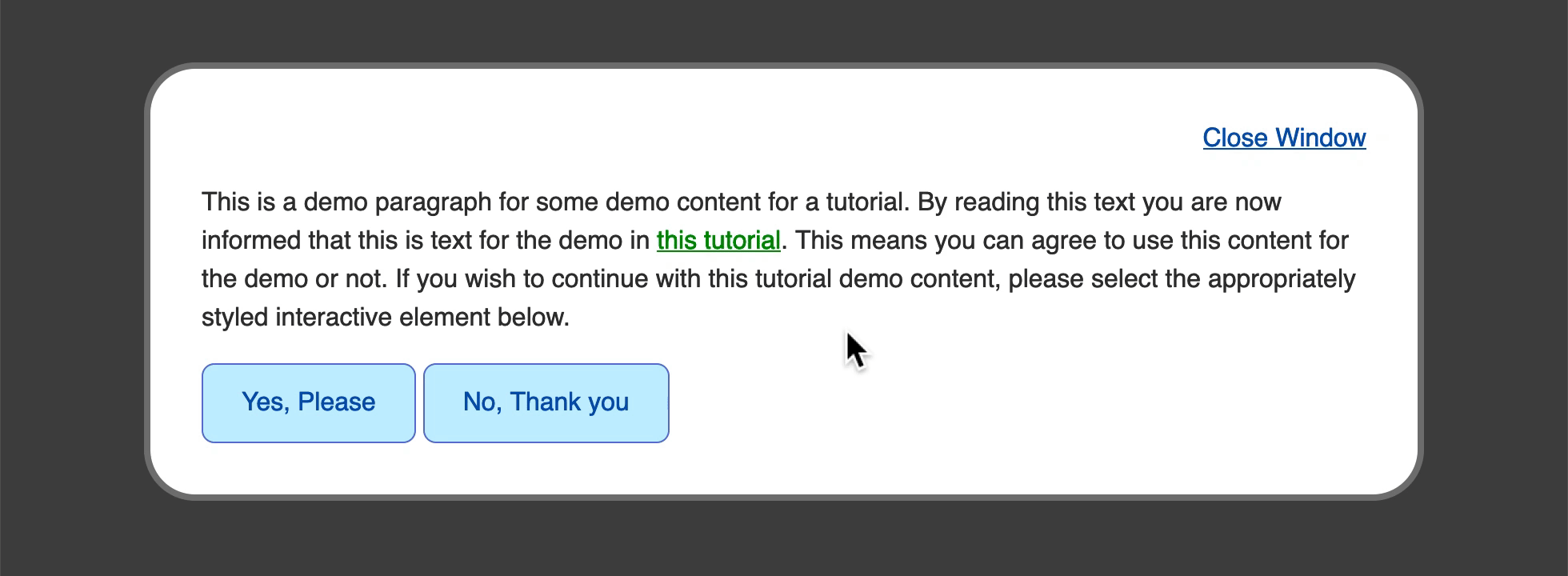
styles.css
Save these changes to your file and return to your browser to refresh the file. Now, take your mouse cursor and hover over one of the two buttons on the bottom. The styles change from the light blue background with a deep blue text and border to a deep blue background with white text. The following image shows what the hover style looks like when the mouse cursor is over the Yes, Please button.

You used the pseudo-class in this section to create style changes to the element based on the cursor being positioned on top of the element. In the next section, you will apply this same concept to a condition when a keyboard is used to navigate through the page.
Applying the :active Pseudo-Class
The next pseudo-class that you will work with is the state of an interactive element. The active state is the state at which an element is interacted with, typically via a mouse down or mouse click action. This provides the opportunity to give the visitor a clear state to indicate a successful mouse click and button press.
To begin working with the pseudo-class, open in your text editor. Following the group selector block for , add a new selector block with the group selector . Give a value of , which will create a darker pink than the state.
Note that some browsers will mix the styles of a pseudo-class and an pseudo-class. To prevent this, you will need to remove the and properties by setting them to and , respectively:
styles.css
Save the addition of the pseudo-class to your file, then reload in your web browser. The following animation shows how the state changes from the pink to darker pink as the mouse is clicked while over the this tutorial link.

Next, to apply an active state to , return to in your text editor. Add a pseudo-class selector and apply styles that are dark variants of the styles. For the property, set the value to a light gray with . For both the and properties, set the value to a dark blue with a value of . The highlighted sections of the following code block demonstrate how this is written:
styles.css
Be sure to save these changes to , then return to your browser to refresh . Hover your mouse cursor over one of the two buttons in the bottom of the content and then click down. The button will change from a light blue background with blue text and border to a full blue button with white text when hovered, then to a dark blue button with light gray text when clicked. The following animation demonstrates how this change from the to the state appears as the mouse button is clicked:
You created a visual indicator of a mouse button press event by using the pseudo-class to change the styles when that event occurs. In the next section, you will use the pseudo-class to provide an indicator of which elements with a attribute have visited that link.