
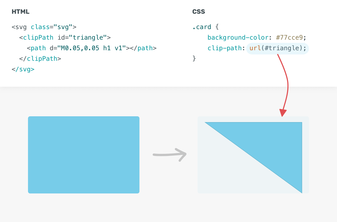
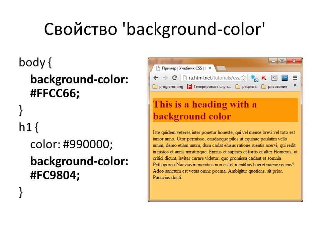
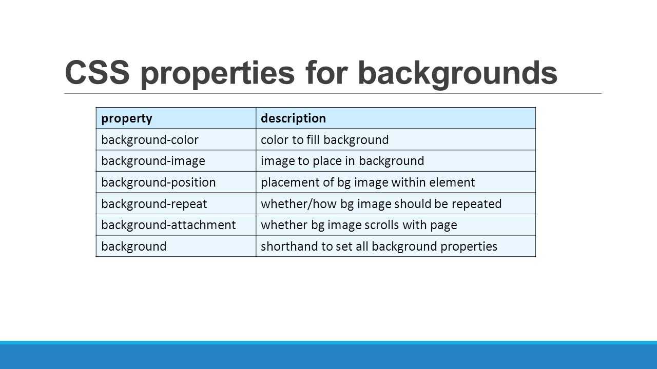
Background Property
To put an image on a web page, you can use the <image> HTML tag with a link to a picture (<img src=»shark.jpg» />) or apply CSS rules to an element with the help of the background property.
background is a shorthand for several other properties:
- background-image: applies an image (.gif, .jpg, .png, ,svg, .webp) or gradient to the background of an element, e. g. url(‘shark.jpg’) or linear-gradient(blue, green)
- background-position: allows moving a background image or gradient within its container, e. g. 120px 10px or bottom 10px right 20px
- background-size: sets the width and height of the background image or gradient, e. g. 250px 100px or cover (resizes the image to cover the entire container) or contain (resizes the image to make sure it is fully visible)
- background-repeat: allows repeating the image horizontally (repeat-x), vertically (repeat-y), both vertically and horizontally (repeat), to repeat as much as possible without clipping (space), to repeat and squish or stretch to fill the space (round) or not to repeat the image (no-repeat)
- background-attachment: allows scrolling the image with the main view (scroll), makes the image stay fixed inside the local view (fixed) or makes the image scroll both with the main view and the local view (local)
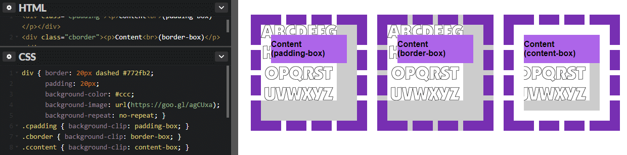
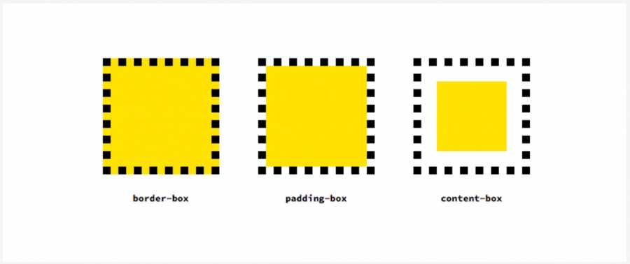
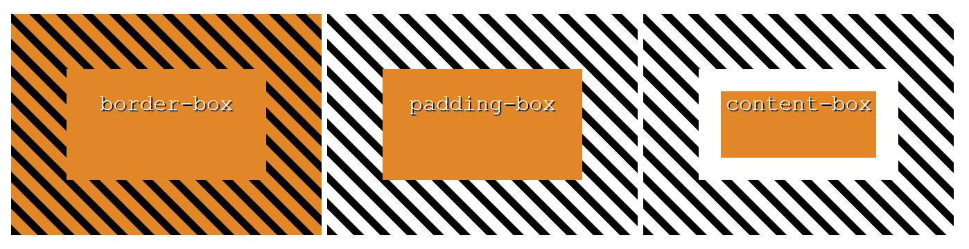
- background-origin: specifies the origin position of the image that can start from the upper left corner of the padding edge (padding-box), of the border (border-box) or of the content (content-box)
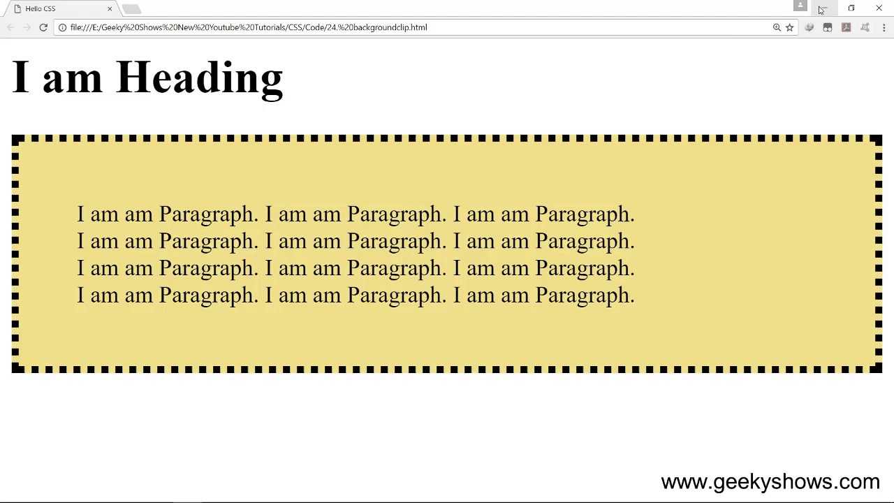
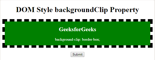
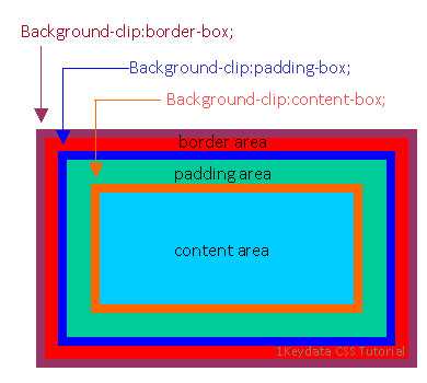
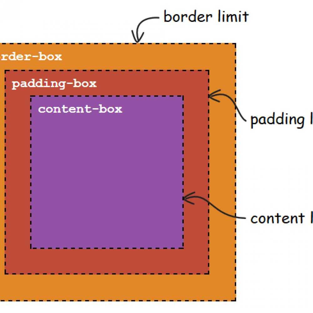
- background-clip: allows controlling how far a background image or color extends beyond an element’s border (border-box), padding (padding-box) or content (content-box)
- background-color: applies colors as background on an element, e. g. #000
You can use them in the recommended order as indicated above (IPSRABC) using the shorthand background property. Some values may be missing, for example:
Always add background-color as a backup for background-image. Otherwise, if the website loads slowly, the user won’t see your background and maybe even some text written on that background would stay invisible for some time.
However, if you put specific background properties before the background property, like this:
…the background will be transparent, instead of blue. To fix it, define background-color after background, or use the shorthand: e. g. background: url(…) blue;.
Here’s the right method:
Padding Color CSS
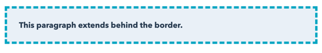
To add color to CSS padding, you can use the background-clip property and the box-shadow property.
Background-clip Property
The background-clip function allows you to define how far the background extends into the element. It’s possible to set the color so that the background extends to the outer edge of the border.
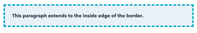
 You can also set the color to stop on the inside of the border.
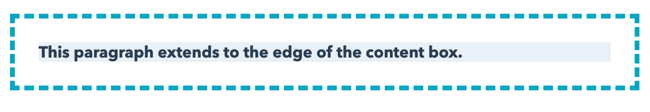
Another option is to create empty space between the background and the border, as shown below.
Box-shadow Property
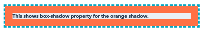
Instead of leaving the padding transparent, you can add color since the background color doesn’t fully extend past the text element. This is where you can use the box-shadow property. There are four values for the box-shadow: 0 0 0 15px.
The first three zeros define h-shadow (horizontal shadow), v-shadow (vertical-shadow), and blur. For the property to work, each item must have a value — even if that value is zero.
The last value — 15px — is the value for the solid shadow, which extends inward to meet the content box. The value of the shadow must be the same as the padding.
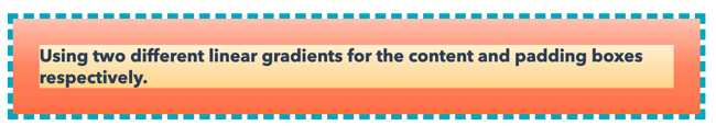
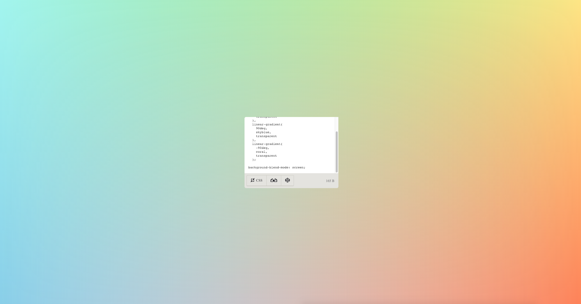
 Using the linear-gradient property, you can achieve a similar effect to the box-shadow property. The two linear-gradient values can be set for the background, defining the content-box and padding-box, respectively.
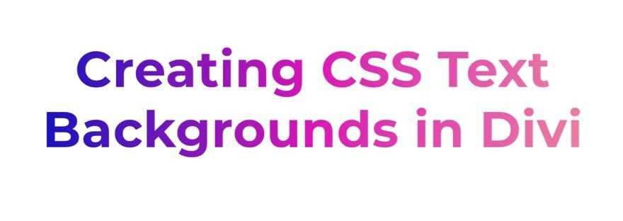
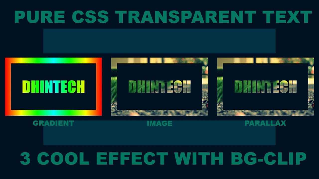
How to Use background-clip with Text
Before we start building our examples in Divi, let’s first get a better understanding of the CSS code needed to pull off a custom text background in CSS.
Let’s say we have an H2 heading element that looks like this.
First, you need to establish the background you want to use. In this example, we are going to add a gradient background to our h2 element using linear-gradient.
h2 {
  background: linear-gradient(to right, #1613bd 0%, #d915b5 50%,#ea7ea2 100%);


}
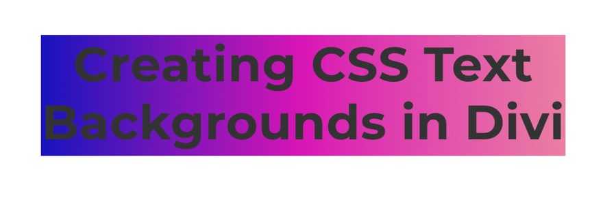
Next, we add background-clip:text along with the necessary “-webkit” prefix version to show the background of the element only behind the text.
h2 {
  background: linear-gradient(to right, #1613bd 0%, #d915b5 50%,#ea7ea2 100%);
  background-clip: text;
  -webkit-background-clip: text;

}
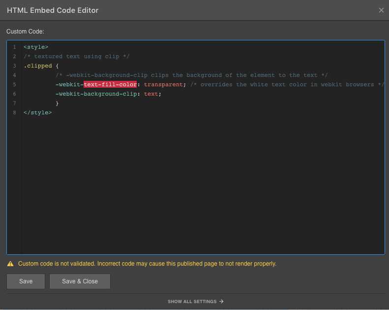
Then, we add -webkit-text-fill-color: transparent to override the color of the text and make it transparent.
h2 {
  background: linear-gradient(to right, #1613bd 0%, #d915b5 50%,#ea7ea2 100%);
  background-clip: text;
  -webkit-background-clip: text;
  -webkit-text-fill-color: transparent;
}
Then we add the browser prefixes needed to make the linear-gradients more browser-friendly:
h2 {
  background: -webkit-linear-gradient(to right, #1613bd 0%, #d915b5 50%,#ea7ea2 100%);
  background: -moz-linear-gradient(to right, #1613bd 0%, #d915b5 50%,#ea7ea2 100%);
  background: linear-gradient(to right, #1613bd 0%, #d915b5 50%,#ea7ea2 100%);
  background-clip:text;
  -webkit-background-clip: text;
  -webkit-text-fill-color: transparent;
}
As you can see, this example uses three colors to create a gradient, but you can easily add as many as you want.
That’s really all there is to it. Of course, it helps to have a better understanding of how to use the linear-gradient function to design the type of gradient background you want.
For more check out the documentation on the linear-gradient function. You can also explore this CSS Text Gradient Generator to explore some fun options.
And, if don’t want to use a gradient, you could use an actual image background. The code would look something like this:
h2 {
  background: center / cover url("add image URL");
  background-clip:text;
  -webkit-background-clip: text;
  -webkit-text-fill-color: transparent;
}
Now that we have a better understanding of the CSS, let’s dive into the tutorial.
Background clip #
Browser support
- Chrome 1, Supported 1
- Firefox 4, Supported 4
- Edge 12, Supported 12
- Safari 5, Supported 5
The property controls what is visually seen from a background layer regardless of the bounds created by the property.
Like the regions that can be specified are , , and corresponding to where a CSS background layer can be rendered. When these keywords are used, any rendering of the background further than the region specified will be cropped or clipped.
The property also accepts a keyword that clips the background to be no further than the text within the content box. For this effect to be evident in the actual text within a CSS box, the text must be partially or completely transparent.
A relatively new property, at the time of this writing, Chrome and most browsers require the prefix to use this property.
Browser support
- Chrome 1, Supported 1
- Firefox 4, Supported 4
- Edge 12, Supported 12
- Safari 5, Supported 5
CSS Padding Shorthand
Like most CSS properties that need to be repeated often, there is a shorthand method for applying CSS padding.
If you follow the long form method, you’ll have to apply padding to every side of the element individually in this CSS padding order:
-
padding-top
-
padding-right
-
padding-bottom
-
padding-left
In other words, doing so means a lot of extra lines of code which bloats your website. And you know what a bloated website means — a slow website. And a slow website means unhappy visitors that bounce when the page doesn’t load quickly enough.


The long-form system gets the job done, but it isn’t efficient for your site’s performance. The shorthand version can save a significant amount of time — especially if you have a lot of elements on your website.
With shorthand, you can define one, several, or all aspects of padding within just a single line of code.
To use CSS padding shorthand, here’s what you need to know:
In a situation where you provide only one padding value, it is assumed that all four sides of the element should be padded at that value, such as:
padding: 10px;
If you provide two padding values, the first one is understood as the top and bottom padding and the second as the left and right padding, such as:
padding: 2px 4px;
If you provide three values, the first one corresponds to top padding, the second value is for both left and right padding, and the third one refers to the bottom padding. That’s the correct CSS padding order. Here’s what it looks like in practice:
padding: 15px 10px 15px;
Finally, if there are four values present, they represent, according to CSS padding order, top, right, bottom, and left:
padding: 15px 10px 15px 10px;
While the long-form method might seem easier to recall, it helps understand the shorthand version’s directional relevance because it’s so straightforward. Specifically, when defining four values, they match up with the top of an element then clockwise, according to the CSS padding order.
CSS-свойство background
В CSS свойство предназначено для управления фоном любого элемента.
Это универсальное свойство, которое позволяет вам сразу установить несколько параметров. А именно:
- фоновое изображение или градиент;
- начальную позицию фонового изображения и его размер;
- повтор фонового изображения;
- перемещение фона относительно области просмотра браузера и элемента;
- цвет и т.д.
Универсальное свойство состоит из восьми других свойств (в скобках указано значение по умолчанию, которое имеет каждое из них):
- (none);
- (0% 0%);
- (auto);
- (repeat);
- (scroll);
- (padding-box);
- (border-box);
- (transparent).
Вы можете указывать их все и при этом практически в любом порядке (хотя порядок, рекомендованный в спецификации, приведён выше). Те свойства, которые вы не указали в , будут иметь значения по умолчанию (указанные в скобках).
Размер фоновой картинки
Свойство background-size устанавливает размеры фоновой картинки. Оно определяет
не размер фона, а именно размер изображения. Размеры фона зависят от размеров блока. А свойство
background-size влияет на картину, которая становится фоном. Значение свойства
можно указать в единицах измерения CSS или процентах.
Сначала пишется ширина и через пробел высота. Если не соблюсти
пропорции ширины и высоты, то изображение искажается.
Также у свойства background-size есть такие значения:
background-size: auto — если указано только это значение, то изображение
имеет свои реальные размеры. Если один из размеров задан в единицах измерения, то второму размеру можно
указать auto, чтобы у картинки были правильные пропорции.
background-size: cover — картинка заполняет весь фон, сохраняя пропорции.
background-size: contain — вся картинка отображается в фоне.
Значения cover и contain есть также у
свойства object-fit. В теме про него эти значения
рассмотрены более подробно.
Укажем размер фоновой картинке:
| 25 |
background-size: 480px 280px; |
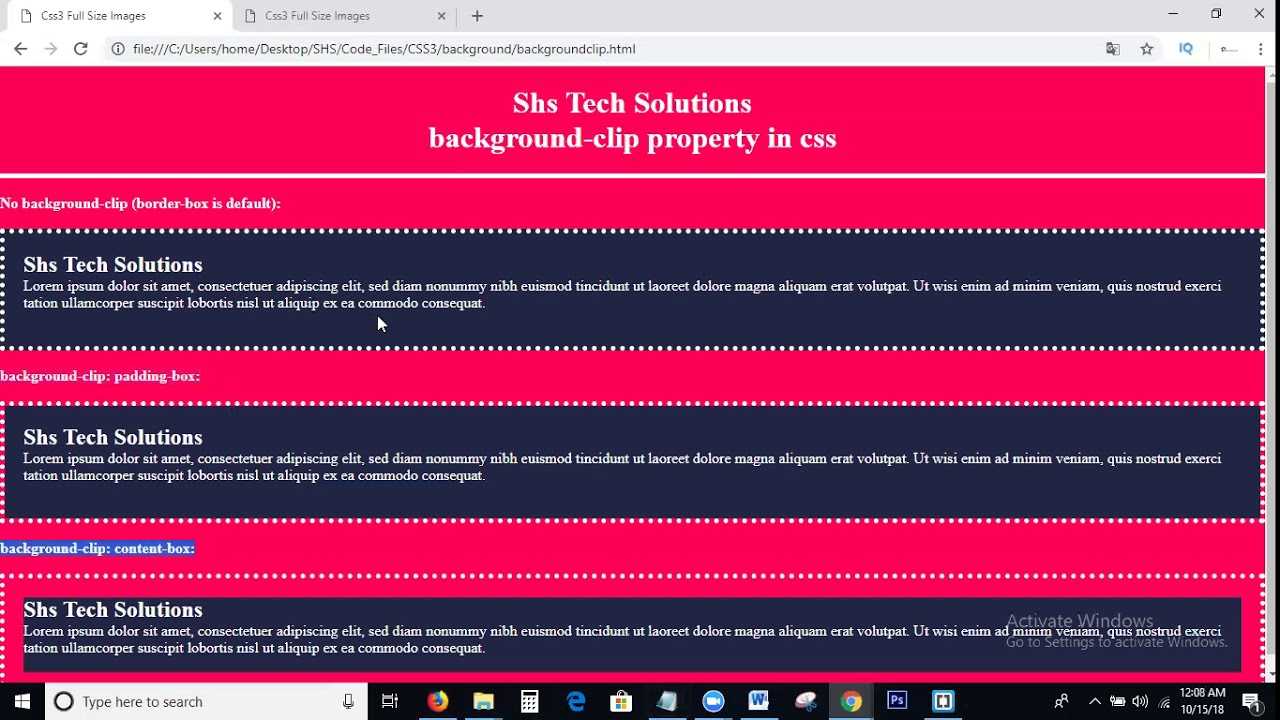
Background-clip: свойство для обрезки фона
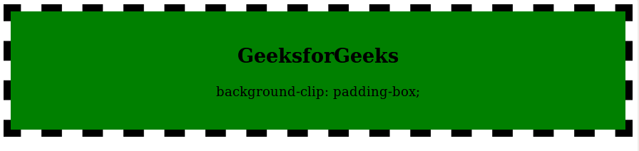
Свойство позволяет определять, какую область элемента фон заполняет, а какую — нет. Согласно спецификации, свойство принимает следующие значения:
- — фон заполняет элемент, включая его отступы, и не заполняет область границ, так что в просветах пунктирной или точечной рамки фон не будет виден.
- (значение по умолчанию) — фон заполняет элемент, включая область рамки (при этом рамка накладывается поверх фона). В случае с фоновым рисунком эффект данного значения будет заметен только при условии, что он повторяется.
- — фон заполняет элемент, включая его содержимое, и не заполняет область отступов и границ.
Примеры для неповторяющегося фонового рисунка:
Примеры для повторяющегося фонового рисунка:
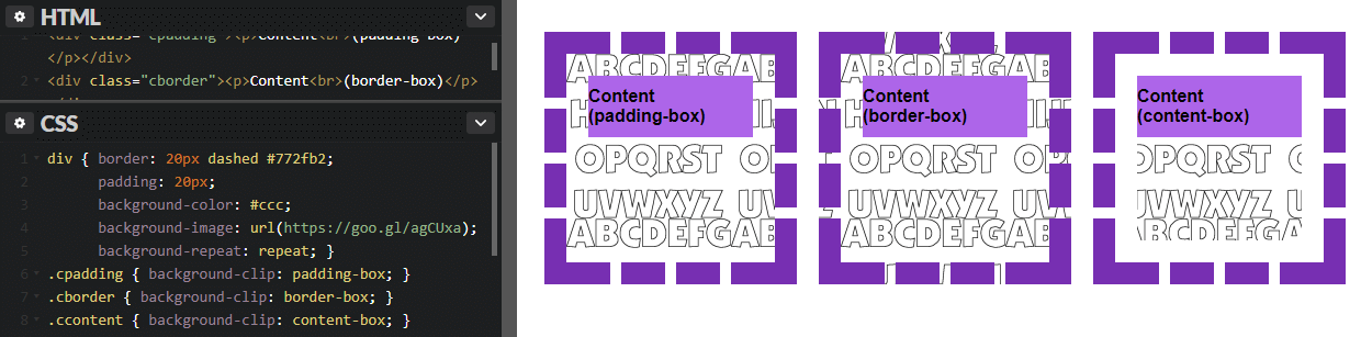
Заметьте, что background-clip не меняет начальную точку позиционирования фона, поэтому верхняя и левая стороны фонового рисунка могут обрезаться, если позиционирование у него осталось по умолчанию (это видно на примере с ).
Background-origin: позиционирование фонового рисунка
Если свойство предназначено для указания начальной позиции фонового рисунка по осям, то управляет его позицией относительно рамки (border), отступа (padding) или содержимого элемента. По умолчанию фоновый рисунок отображается, накладываясь на отступы элемента (если они есть), и не подкладывается под рамку. Это положение можно менять, используя следующие значения background-origin:
- (значение по умолчанию) — фоновое изображение располагается в верхнем левом углу элемента, который является областью отступов padding.
- — фоновое изображение располагается в верхнем левом углу элемента, который является областью рамки (при этом рамка накладывается на фон, перекрывая его часть).
- — фоновое изображение располагается в верхнем левом углу, который принадлежит содержимому элемента.
Конечно же, настройка background-origin будет иметь смысл только при условии, что у элемента есть рамка и/или отступы. Ниже вы можете посмотреть, как работают разные значения данного свойства. Для примера мы создали блок с большими отступами и толстой фиолетовой рамкой (к тому же пунктирной, чтобы вам было лучше видно поведение фона под ней). Также у блока есть контент, фоновый цвет которого мы для наглядности сделали фиолетовым:
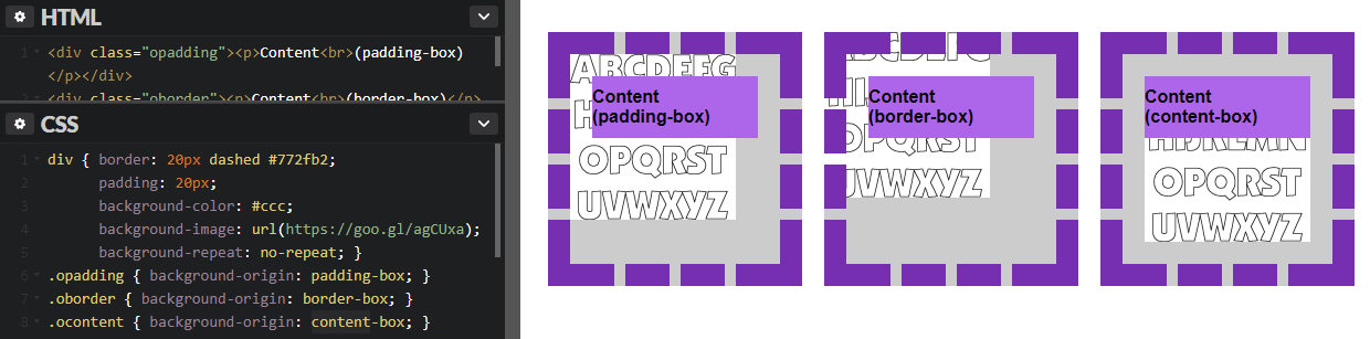
В нашем примере повторение фонового рисунка отключено. Что будет, если включить его? Смотрите пример:
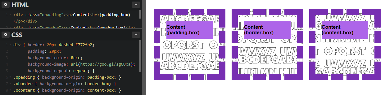
Как видим, фоновый рисунок дублируется, но начальная точка отличается в зависимости от значения background-origin. Если рисунок будет бесшовным, то влияние background-origin может быть практически незаметным:

И еще одна особенность: наверное, вы заметили, что у самого блока есть два фона — сплошной серый цвет и изображение с алфавитом. На примере видно, что свойство background-origin влияет только на позиционирование фонового рисунка, но не цвета фона (который всё равно виден в пробелах пунктирной линии). Как повлиять на цвет фона? В этом нам поможет следующее свойство — .
background-position
А вот одно из самых важных свойств. Определяет, где конкретно будет расположен фон. По умолчанию, он располагается в верхнем левом углу окна браузера. Можно устанавливать положение по горизонтали, вертикали или по обеим сторонам. В случае горизонтали это центр, слева и справа (center, left,right), вертикаль это центр, сверху и снизу (center, top, bottom). Также прекрасно распознаются значения в процентах или пикселах, например так:
|
1 2 3 |
Эта запись означает, что фон будет располагаться справа и на 20px смещен вниз. Когда используется два значения — первое обозначает горизонтальное расположение, а второе — вертикальное. Когда только одно значение — второе по умолчанию будет в центре.
При процентной записи — отсчет идет из верхнего левого угла. Например, такая запись:
|
1 2 3 |
переместит фон на 10px от нижнего края и на 20% от правого.
CSS background-image — фоновая картинка на сайте
Свойство CSS background-image — позволяет установить фоновое изображение на сайте.
Синтаксис CSS background-image
Например, для установки общего (глобального) фона:
Например фоновая картинка:
После двоеточия указывается адрес изображения. Можно использовать как относительный так и прямой адрес.
В CSS3 можно задать несколько фоновых изображений (они как бы накладываются друг на друга как слои).
Задавая фон в виде картинки есть возможность настраивать так же ряд важных свойств CSS
- background-repeat
- background-attachment
- background-position
- background-size
- background-clip
Рассмотрим в отдельности эти параметры
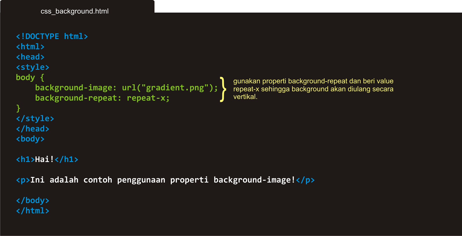
4.1. CSS background-repeat
Свойство CSS background-repeat определяет повторять ли фон. Можно отдельно настраивать повторение по вертикали и горизонтали.
Синтаксис CSS background-repeat
Где value может принимать следующие значения:
- repeat-x — повторять фоновое изображение по горизонтали;
- repeat-y — повторять фоновое изображение по вертикали;
- no-repeat — не повторять фоновое изображение;
- repeat (по умолчанию) — повторять фоновое изображение по горизонтали и вертикали;
- space — все пространство заполняется максимально возможным количеством изображений, первое и последнее (по горизонтали и вертикали) поровну обрезаются;
- round — аналогично предыдущему, с тем отличием, что первое и последнее масштабируются для заполнения;
Например, по горизонтали не повторять, по вертикали повторять фоновое изображение:
4.2. CSS background-attachment
Свойство CSS background-attachment задает привязки фона изображения. Можно зафиксировать задний фон, чтобы при прокрутке скроллом он не крутится или же наоборот фон будет прокручиваться вместе с сайтом.
Синтаксис CSS background-attachment
Где value может принимать следующие значения:
- scroll (действует по умолчанию) — фон прокручивается вместе с сайтом;
- fixed — при прокрутке скролла фон остается неизменными;
- local — изображение прокручивается с контентом, но не с элементом, его содержащим;
Я думаю, что Вы видели такие сайты и понимаете о чем идет речь.
4.3. CSS background-position
Свойство CSS background-position задает расположение фона относительно левого верхнего угла.
Синтаксис CSS background-position
В параметрах мы указываем выравнивание (смещение) в пикселях или процентах сначала по оси Х, потом по оси У. value, value2 может принимать следующие значения:
- top — выравнивание по верхнему краю;
- left — выравнивание с левого края;
- right — выравнивание с правого края;
- bottom — выравнивание по нижнему краю;
- center — выравнивание по центру;
- число/проценты — можно задавать отступ в виде числа или процентов;
По умолчанию фон располагается в верхнем левом углу.
Можно указывать в пикселях Npx задание отступа от разных краев. Проще понять это на примере:
Фон будет выравнивать по правому краю со смещением 50 пикселей вниз.
Или например сместим фон на 100px вправо и расположим его по центру относительно высоты.
Все эти параметры можно задать в таблице стилей CSS. Этот параметр выравнивает расположение фона на странице.
4.4. CSS background-size
Свойство CSS background-size позволяет задавать размеры фона.
Синтаксис CSS background-size
Где первый параметр задает значение по оси Х, второй параметр по оси У. Можно задавать как в процентах, так и пикселях.
Так же может принимать два статичных параметра
- contain — масштабирует изображение по длинной стороне (заполняет все пространство)
- cover — масштабирует изображение по короткой стороне (заполняет все пространство)
Напоследок запишем все атрибуты вместе:
Для обращения к float из JavaScript нужно писать следующую конструкцию:
Как сделать фон в виде картинки в CSS?
Для этого нам нужно будет:
- 1.К себе на сайт в определённую папку с картинками загрузить изображение, которое мы хотим использовать в качестве фона.
-
2.Задать его в CSS
PHP
background:url(images/bg.jpg);
1 backgroundurl(imagesbg.jpg);
В скобочках указываем путь к картинке.
Путь указывается относительно файла CSS, в котором вы пишете это свойство.
Так же если изображение у вас небольшое то будьте готовы увидеть такую картину:
Вы можете отключить повторение фона для маленьких изображений, дописав no-repeat:
PHP
background:url(images/bg.jpg) no-repat;
| 1 | backgroundurl(imagesbg.jpg)no-repat; |
Так же можно сделать чтобы он повторялся только по горизонтали:
PHP
background:url(images/bg2.jpg) repeat-x;
| 1 | backgroundurl(imagesbg2.jpg)repeat-x; |
Или только по вертикали:
PHP
background:url(images/bg2.jpg) repeat-y;
| 1 | backgroundurl(imagesbg2.jpg)repeat-y; |
Кроме того мы можем управлять расположением фонового изображения для элемента. Для этого нам нужно дописать следующе:
- top – для выравнивание по верхнему краю
- bottom — для выравнивания по нижнему краю
- left – выравниваем по левому краю
- right – по правому
- center – выравниваем по центру (можно использовать как для выравнивания по горизонтали так по вертикали)
Так же можно сочетать эти выравнивания.
PHP
background:url(images/bg2.jpg) no-repeat top center;
| 1 | backgroundurl(imagesbg2.jpg)no-repeat top center; |
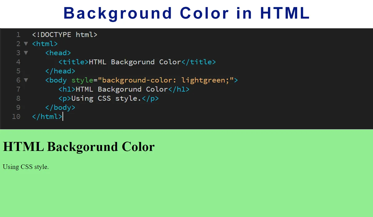
background-color
Я более чем уверен — вы уже неоднократно делали назначение цвета фона. Сделать это можно используя несколько видов записи: обычную(используется название цвета), шестнадцатиричную или RGB-запись. Каждый тип равнозначен, используйте какой больше нравится. Я стараюсь использовать наиболее короткий вариант, и для восприятия попроще и файл стилей чуть поменьше получается размером.
|
1 2 3 4 |
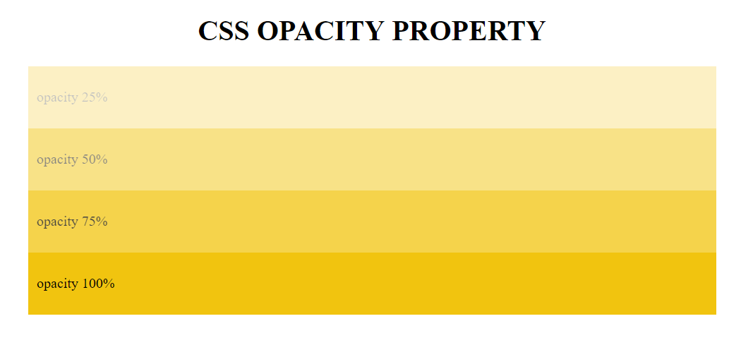
В CSS3 внедрена поддержка прозрачности, поэтому можно и ее добавить к нашему цвету, например так:
| 1 |
Последней цифрой установили прозрачность в 50%. Можно установить значение прозрачности от 0 (полностью прозрачный фон) до 1 (полностью непрозрачный).


Fluid Background
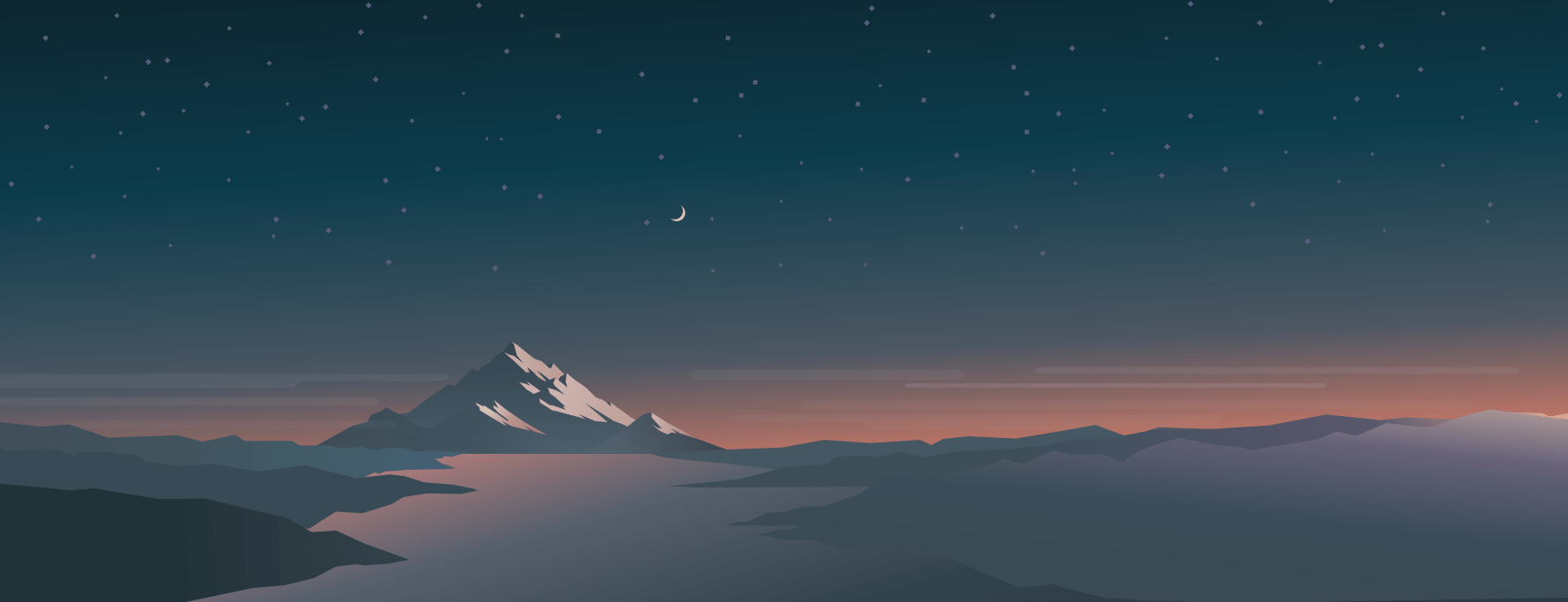
You can create a flexible background that always stays in the center of the page, on all devices, no matter how wide or narrow the viewport is.
To center the background image, use background-position: center;. To make sure the image is fully visible, use background-size: contain;. Set the height of the container at 100vh — it means that the height will be equal to that of the viewport. Images in .svg format are best fit for this purpose.
This way, your background image is constantly centered in full height and width of the browser window.
To add some responsive text to your responsive background, apply position: relative; to the container and position: absolute; to the text. The margin-left: auto; margin-right: auto; and text-align: center; will help center the text. You can also add media queries to make the text smaller on mobile devices.
This way, your text will always be in the center of your responsive background.
CSS Свойства
align-contentalign-itemsalign-selfallanimationanimation-delayanimation-directionanimation-durationanimation-fill-modeanimation-iteration-countanimation-nameanimation-play-stateanimation-timing-functionbackface-visibilitybackgroundbackground-attachmentbackground-blend-modebackground-clipbackground-colorbackground-imagebackground-originbackground-positionbackground-repeatbackground-sizeborderborder-bottomborder-bottom-colorborder-bottom-left-radiusborder-bottom-right-radiusborder-bottom-styleborder-bottom-widthborder-collapseborder-colorborder-imageborder-image-outsetborder-image-repeatborder-image-sliceborder-image-sourceborder-image-widthborder-leftborder-left-colorborder-left-styleborder-left-widthborder-radiusborder-rightborder-right-colorborder-right-styleborder-right-widthborder-spacingborder-styleborder-topborder-top-colorborder-top-left-radiusborder-top-right-radiusborder-top-styleborder-top-widthborder-widthbottombox-decoration-breakbox-shadowbox-sizingcaption-sidecaret-color@charsetclearclipcolorcolumn-countcolumn-fillcolumn-gapcolumn-rulecolumn-rule-colorcolumn-rule-stylecolumn-rule-widthcolumn-spancolumn-widthcolumnscontentcounter-incrementcounter-resetcursordirectiondisplayempty-cellsfilterflexflex-basisflex-directionflex-flowflex-growflex-shrinkflex-wrapfloatfont@font-facefont-familyfont-kerningfont-sizefont-size-adjustfont-stretchfont-stylefont-variantfont-weightgridgrid-areagrid-auto-columnsgrid-auto-flowgrid-auto-rowsgrid-columngrid-column-endgrid-column-gapgrid-column-startgrid-gapgrid-rowgrid-row-endgrid-row-gapgrid-row-startgrid-templategrid-template-areasgrid-template-columnsgrid-template-rowshanging-punctuationheighthyphens@importisolationjustify-content@keyframesleftletter-spacingline-heightlist-stylelist-style-imagelist-style-positionlist-style-typemarginmargin-bottommargin-leftmargin-rightmargin-topmax-heightmax-width@mediamin-heightmin-widthmix-blend-modeobject-fitobject-positionopacityorderoutlineoutline-coloroutline-offsetoutline-styleoutline-widthoverflowoverflow-xoverflow-ypaddingpadding-bottompadding-leftpadding-rightpadding-toppage-break-afterpage-break-beforepage-break-insideperspectiveperspective-originpointer-eventspositionquotesresizerighttab-sizetable-layouttext-aligntext-align-lasttext-decorationtext-decoration-colortext-decoration-linetext-decoration-styletext-indenttext-justifytext-overflowtext-shadowtext-transformtoptransformtransform-origintransform-styletransitiontransition-delaytransition-durationtransition-propertytransition-timing-functionunicode-bidiuser-selectvertical-alignvisibilitywhite-spacewidthword-breakword-spacingword-wrapwriting-modez-index
How does it work?
We’re using custom CSS code to bring features that aren’t yet natively supported by Webflow. Custom code can be placed at many level in a Webflow project: at site level (in the Custom code tab of the site Settings), at Page level (in the page settings) or within the page itself, using the Custom Code Component.
For our experiments, prefer using the Custom Code Component from the Add+ menu. Place it anywhere in the page (it won’t be visible). This way, you will see the effects of your custom code right in the Designer, without having to publish most of the time.
The blue box will show the custom code used
Parallax Scrolling
Parallax scrolling is an effect of the background image moving at a different speed than the text content of the page while scrolling.
Create a container element (e. g. .parallax) and add a background image with a specific height (px, %, vh, etc.) to the container. Then apply background-attachment: fixed; to create the actual parallax effect. The other background properties are used to center and scale the image.
Parallax scrolling doesn’t always work on mobile devices which may have a problem with background-attachment: fixed. You can use media queries to turn off the effect on mobile devices:
Summary
CSS backgrounds are something you no doubt use on every site. However you may not have been familiar with each of the different background properties available or some of the values for the properties you do know.
While much of the time you’ll happily let defaults reign with most of these properties, a few give you some nice control over how and where your background images display.
Browsers support is generally good for multiple images and the three new properties, origin, clip, and size, but do know that IE8 and below won’t support them.
That may or may not be an issue depending on which browsers you need to support and how you’re using these properties.
Hopefully this post has given you a greater understanding of a property you likely know well. Have you used any of the new properties or worked with multiple background images yet? If so how have you used them and how have they worked for you?
« Prev PostNext Post »
Download a free sample from my book, Design Fundamentals.