
Описание
CSS свойство, позволяющее разработчикам определять, как скругляются границы блока. Кривость каждого угла определяется с помощью одного или двух радиусов, определяя его форму: круг или эллипс.
Радиус применяется ко всему , даже если элемент не имеет границы; точное положение отсечения определяется свойством .
Это свойство короткая запись для четырёх свойств , , и .
Как и при любой короткой записи свойств, значение inherit можно задать при короткой записи свойства, например, , но это может переопределить существующие свойства. В этом случае следует использовать длинные записи свойства.
| Начальное значение | как и у каждого из подсвойств этого свойства: |
|---|---|
| Применяется к | все элементы, но браузеры не применяют к элементам и , когда :. Поведение на внутритабличных элементах не определено.. Это также применяется к . |
| Наследуется | нет |
| Проценты | относятся к соответствующему размеру границы элемента |
| Отображение | визуальный |
| Обработка значения | как и у каждого из подсвойств этого свойства:
|
| Анимируемость | как и у каждого из подсвойств этого свойства:
|
| Канонический порядок | уникальный неоднозначный порядок, определённый формальной грамматикой |
Определение и использование
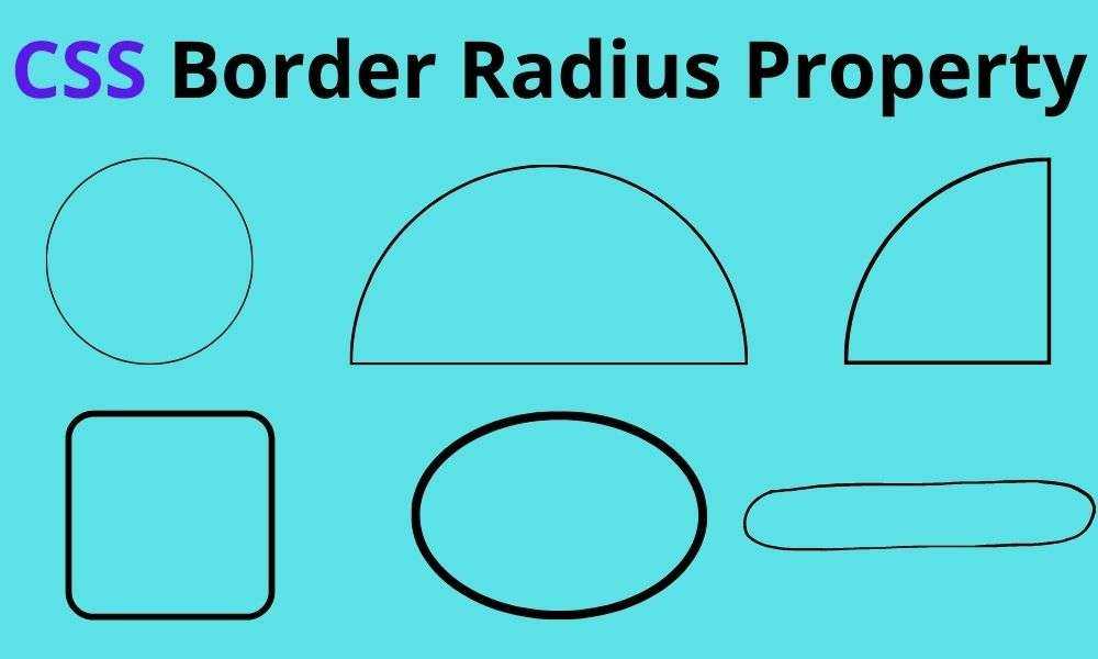
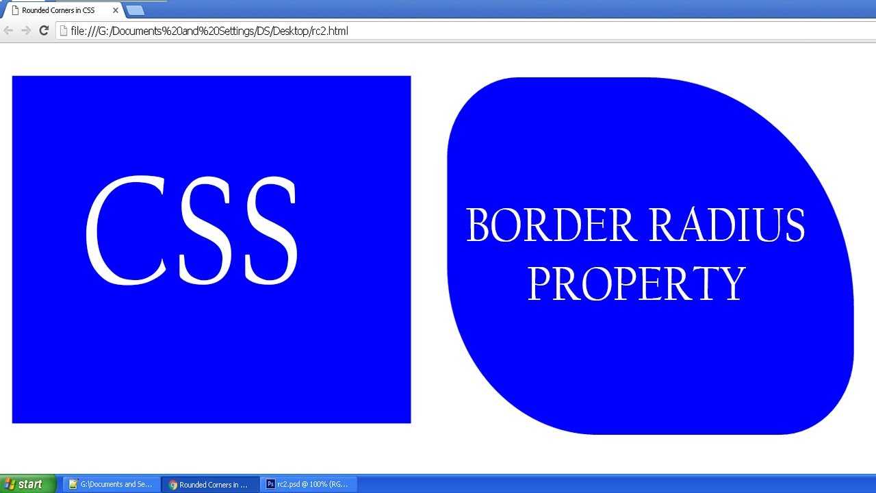
Свойство определяет радиус углов элемента.
Совет: Это свойство позволяет добавлять закругленные углы к элементам!
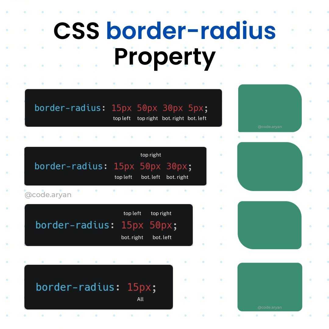
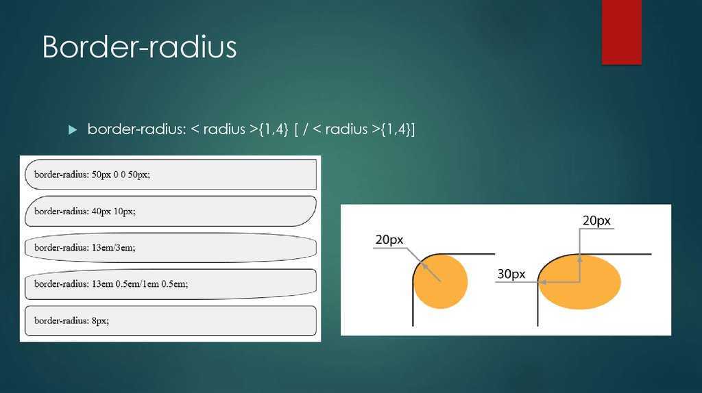
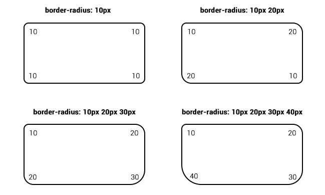
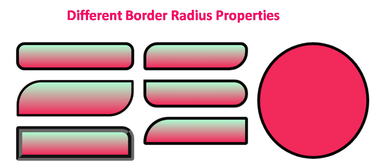
Это свойство может иметь от одного до четырех значений. Вот такие правила:
Четыре значения — border-radius: 15px 50px 30px 5px; (первое значение применяется к верхнему левому углу, второе значение применяется к верхнему правому углу, третье значение применяется к нижнему правому углу, а четвертое значение применяется к нижнему левому углу):
Три значения — border-radius: 15px 50px 30px; (первое значение применяется к верхнему левому углу
второе значение применяется к верхнему правому и нижнему левому углам, а третье значение применяется к нижнему правому углу):
Два значения — border-radius: 15px 50px; (первое значение относится к верхнему левому и нижнему правому углам, а второе — к верхнему правому и нижнему левому углам):
Одно значение — border-radius: 15px; (значение применяется ко всем четырем углам, которые закруглены одинаково:
| Значение по умолчанию: | |
|---|---|
| Унаследованный: | нет |
| Анимируемый: | да. Прочитать о animatable Попробовать |
| Версия: | CSS3 |
| JavaScript синтаксис: |
object.style.borderRadius=»25px» Попробовать |
Vendor Prefixes
For maximum browser compatibility many web developers add browser-specific properties by using extensions such as for Safari, Google Chrome, and Opera (newer versions), for Internet Explorer, for Firefox, for older versions of Opera etc. As with any CSS property, if a browser doesn’t support a proprietary extension, it will simply ignore it.
This practice is not recommended by the W3C, however in many cases, the only way you can test a property is to include the CSS extension that is compatible with your browser.
The major browser manufacturers generally strive to adhere to the W3C specifications, and when they support a non-prefixed property, they typically remove the prefixed version. Also, W3C advises vendors to remove their prefixes for properties that reach Candidate Recommendation status.
Many developers use Autoprefixer, which is a postprocessor for CSS. Autoprefixer automatically adds vendor prefixes to your CSS so that you don’t need to. It also removes old, unnecessary prefixes from your CSS.
You can also use Autoprefixer with preprocessors such as Less and Sass.
Example
We will discuss the border-radius property below, exploring examples of how to use this property in CSS with 1, 2, 3, or 4 values.
One Value in Set
Let’s look at a CSS border-radius example where we provide one value in a set.
In this CSS border-radius example, we have provided one value of 2px which would apply to all 4 corners of the box, both horizontal and vertical radius.
Next, we’ll look at a CSS border-radius example where we provide one value set for the horizontal radius and one value set for the vertical radius.
In this CSS border-radius example, we have provided a value of 2px which would apply to the horizontal radius for all 4 corners of the box. The value of 3px would apply to the vertical radius for all 4 corners of the box.
Two Values in Set
Let’s look at a CSS border-radius example where we provide two values in a set.
In this CSS border-radius example, we have provided the value of 2px which would apply to the top-left and bottom-right corners of the box, both horizontal and vertical radius. The second value of 3px would apply to the top-right and bottom-left corners of the box, both horizontal and vertical radius.
Next, we’ll look at a CSS border-radius example where we provide two values in a set for the horizontal radius and two values in a set for the vertical radius.
In this CSS border-radius example, we have provided the value of 2px which would apply to the top-left and bottom-right corners of the box for the horizontal radius. The second value of 3px would apply to the top-right and bottom-left corners of the box for the horizontal radius. The third value of 5px would apply to the top-left and bottom-right corners of the box for the vertical radius. The fourth value of 4px would apply to the top-right and bottom-left corners of the box for the vertical radius.
Three Values in Set
Let’s look at a CSS border-radius example where we provide three values in a set.
In this CSS border-radius example, we have provided the value of 1px which would apply to the top-left corner of the box, both horizontal and vertical radius. The second value of 2px would apply to the top-right and bottom-left corners of the box, both horizontal and vertical radius. The third value of 3px would apply to the bottom-right corner of the box, both horizontal and vertical radius.
Next, we’ll look at a CSS border-radius example where we provide three values in a set for the horizontal radius and three values in a set for the vertical radius.
In this CSS border-radius example, we have provided the value of 1px which would apply to the top-left corner of the box for the horizontal radius. The second value of 2px would apply to the top-right and bottom-left corners of the box for the horizontal radius. The third value of 3px would apply to the bottom-right corner of the box for the horizontal radius.
The fourth value of 6px would apply to the top-left corner of the box for the vertical radius. The fifth value of 5px would apply to the top-right and bottom-left corners of the box for the vertical radius. The sixth value of 4px would apply to the bottom-right corner of the box for the vertical radius.
Four Values in Set
Let’s look at a CSS border-radius example where we provide four values in a set.
In this CSS border-radius example, we have provided the value of 1px which would apply to the top-left corner of the box, both horizontal and vertical radius. The second value of 2px would apply to the top-right corner of the box, both horizontal and vertical radius. The third value of 3px would apply to the bottom-right corner of the box, both horizontal and vertical radius. The fourth value of 4px would apply to the bottom-left corner of the box, both horizontal and vertical radius.
Next, we’ll look at a CSS border-radius example where we provide one value for the horizontal radius and one value for the vertical radius.
In this CSS border-radius example, we have provided the value of 1px which would apply to the top-left corner of the box for the horizontal radius. The second value of 2px would apply to the top-right corner of the box for the horizontal radius. The third value of 3px would apply to the bottom-right corner of the box for the horizontal radius. The fourth value of 4px would apply to the bottom-left corner of the box for the horizontal radius.
The fifth value of 8px would apply to the top-left corner of the box for the vertical radius. The sixth value of 7px would apply to the top-right corner of the box for the vertical radius. The seventh value of 6px would apply to the bottom-right corner of the box for the vertical radius. The eighth value of 5px would apply to the bottom-left corner of the box for the vertical radius.
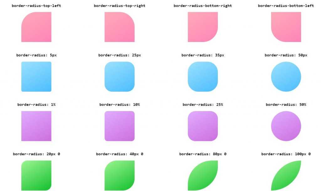
Как скруглить углы в HTML через CSS
Рассмотрим примеры скругления углов через CSS. Например
В этом случае все 4 края элемента будут скруглены по 30px.
Значение скругления означает то, какой радиус окружности должен быть в уголке.
Можно скруглять каждый угол с разными радиусами. Для этого нужно написать
Последовательность этих цифр следующая:
- Верхний левый угол (в примере это 10px)
- Верхний правый угол (в примере это 7px)
- Нижний правый угол (в примере это 0px)
- Нижний левый угол (в примере это 0px)
Например
Результат:
Чтобы не запоминать какое значение за каким идет можно писать в CSS в отдельности каждый угол
Помимо этого, можно также изменять и радиус для каждого угла в отдельности для горизонтальной и вертикальной плоскостей.
Задание второго радиуса нужно задавать через слэш «/» в случае border-radius или вторым значением рядом в случае прямого указания каждого угла радиуса
Первый параметр отвечает за горизонтальный радиус, второй за вертикальный.
Например, с помощью этих свойств можно сделать эллипс:
Результат:
Примечание
Значения 100px 100px 100px 100px / 200px 200px 200px 200px можно было бы написать еще компактнее:
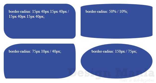
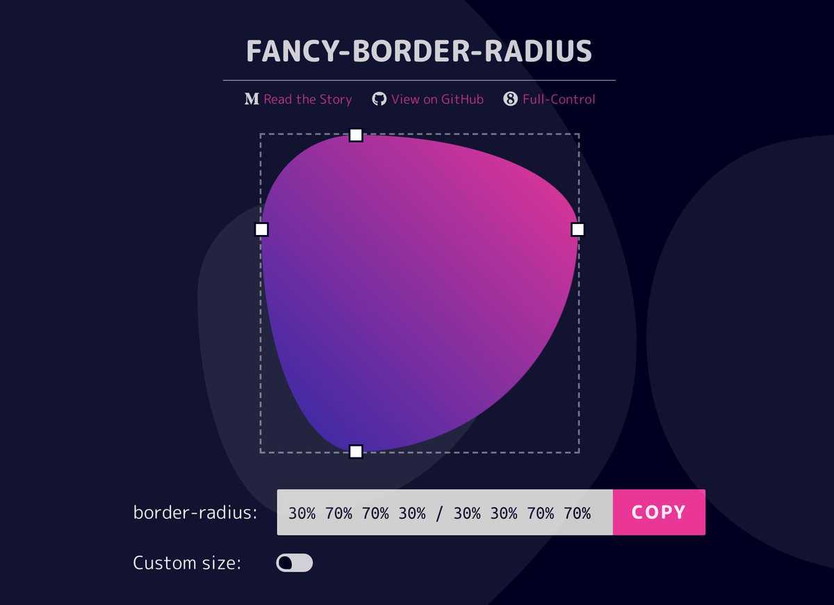
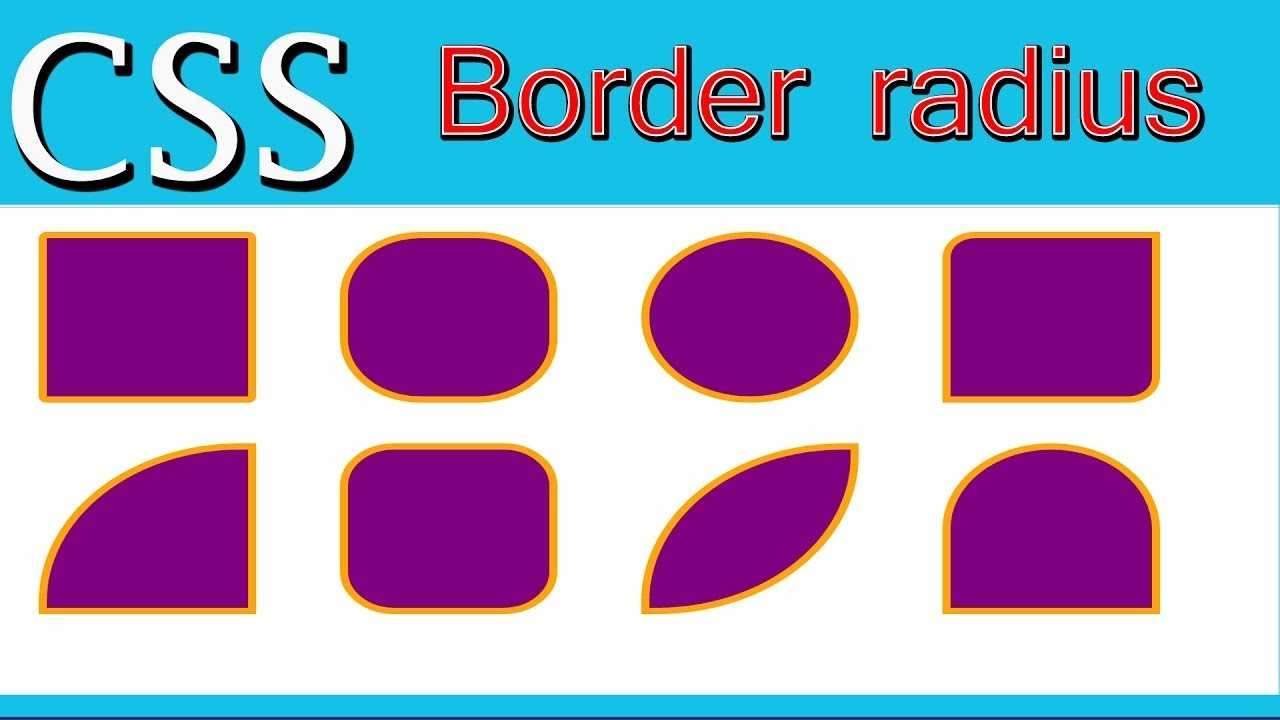
Изменяя параметры каждого из углов, можно сделать различные интересные скругленные элементы. Например, можно сделать круг, эллипс, каплю, камень, яйцо и т.п.
Logical properties for border-radius
If we are working with different languages on our website we might want our border radii to change according to the writing mode or direction of our text. Logical properties give us flow-relative values. For example for Arabic text, which is written right-to-left, the border radii might need to be applied on the left side of the element, while in European languages it would be applied on the right. Fortunately there are logical property equivalents for the longhand properties.
Logical properties typically refer to the inline or block axis, which are different depending on the direction or writing mode. In English, which is written left-to-right, the inline axis refers to the horizontal axis and the block axis refers to the vertical axis. The start of the inline axis would be the left, the end would be the right. In a vertical writing mode, the inline axis would be the vertical axis, and the block axis would be the horizontal one.
The logical properties for border radius refer to the start and/or end of the inline or block axis. Of all the logical properties, they’re perhaps the most confusing to read. Let’s compare defining the top left, top right, bottom right and bottom left radii, and their logical property equivalents:
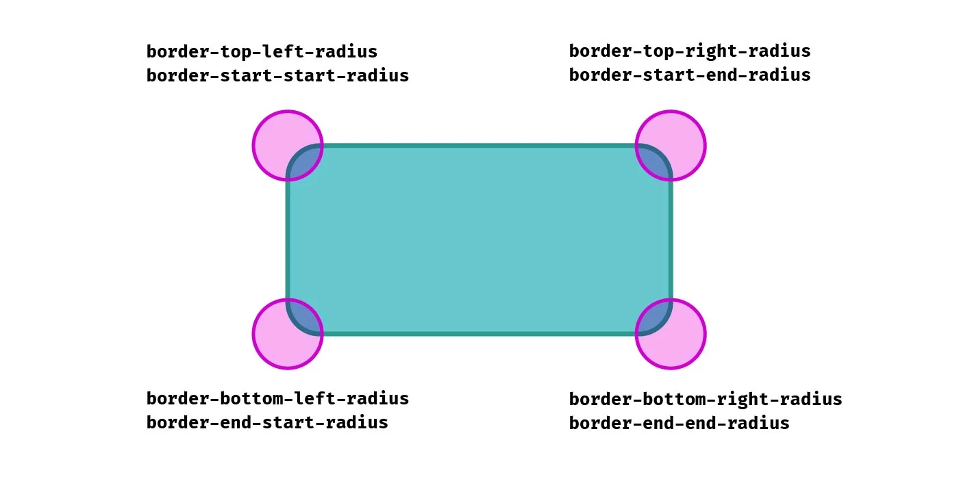
Getting used to writing is certainly a bit of a mental leap for me! It’s written like that because it’s the start of the block axis and the start of the inline axis, while refers to the start of the block axis and the end of the inline axis, and so on.
As you can see in the following demo, when the direction of the text is switched from left-to-right to right-to-left, as well as the order of items being reverse, the border radii are switched for the elements that use logical properties, whereas the ones using directional properties remain the same.
See the Pen
Logical border-radius by Michelle Barker (@michellebarker)
on CodePen.
Logical properties and unequal radii
Somewhat confusingly, although the property name refers to the block axis then the inline axis, the radius value is written inline axis first, then block axis. This makes it consistent with the order of the physical properties (e.g. and would refer to the same corner, and the order of values would be the same), but might still be confusing! I suppose we could think of it as the block edge is the one that is getting the rounding treatment first, despite it referring to the horizontal radius.
Vertical writing modes
Here’s an interesting quirk: In a vertical writing mode, logical border radius properties don’t behave exactly as I would expect when using an elliptical border radius (i.e. more than one value). In this demo, I’m applying the writing mode to the second element.
See the Pen
Logical border-radius by Michelle Barker (@michellebarker)
on CodePen.
As I would expect, what was the top left corner effectively becomes the top right corner as the element is now laid out vertically. But contrary to what I would expect, the two property values are reversed. The corner goes from a long, shallow curve along the block-start edge (the edge above the text) to a narrow, deep curve in a vertical writing mode. This surprised me, as I expected the corners to behave in much the same way as if I had rotated the element using a transform. In order to force the intended appearance, we need to reverse the values:
I’m not sure whether I’m misunderstanding something in the spec or whether this is a bug (the fact that it works the same in Chrome and Firefox would suggest otherwise), but it seems counter-intuitive to me.
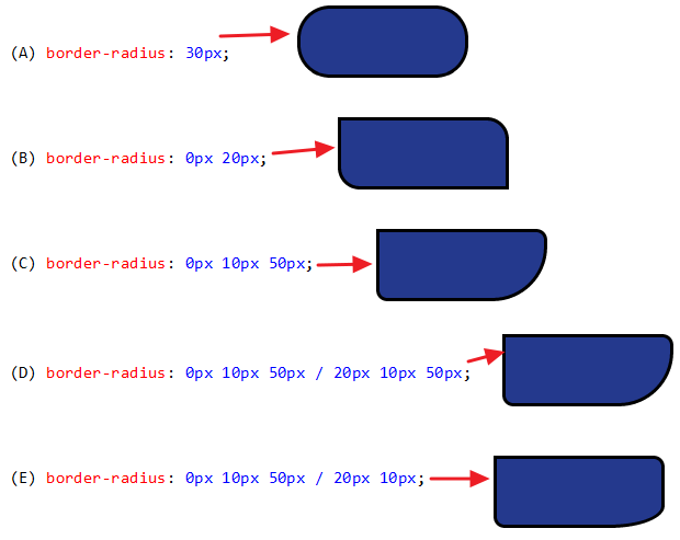
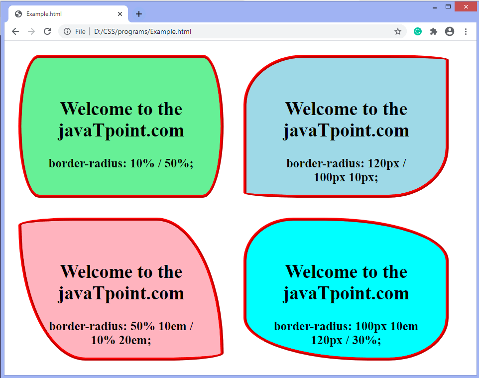
Different Values for Horizontal and Vertical Radii
Because the standard way of declaring the values (discussed above) has become so widespread, you may not be aware of an alternative syntax for this property.
Take a look at the following code example:
When I first saw that style of syntax, with the slash in between the two values, my first reaction was: That can’t be right! But it is. Here’s how explains it:
Below is an image of what the element looks like with the above syntax, and with dimensions of 200px by 200px and a gray background. Bear in mind, a CSS3-capable browser would be required to see the HTML rendition.
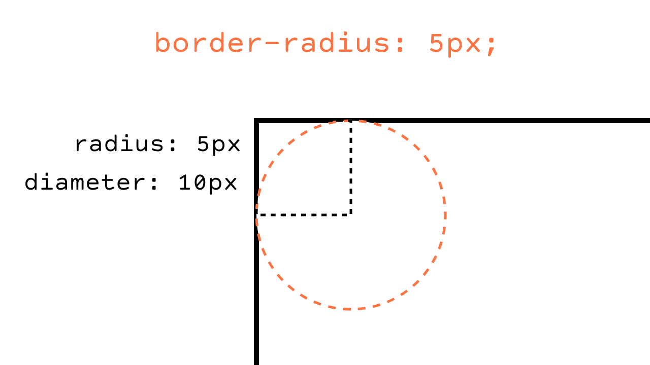
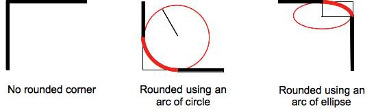
The slash-based syntax might be a difficult thing to wrap your mind around, so let’s examine how the syntax relates to what’s happening to the shape of the corners on that element.
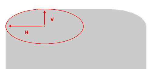
In the above image, I’ve blown up the element and placed an ellipse into the corner so that the upper curve of the ellipse overlaps the rounded corner as closely as possible. A “radius”, according to the dictionary definition is “a straight line extending from the center of a circle or sphere to the circumference or surface.”
According to the spec, the values you give the property “define the radii of a quarter ellipse that defines the shape of the corner of the outer border edge.” Thus, if you add the full ellipse (as I’ve done above), you’ll see exactly how the radii are calculated. In the image, I’ve drawn arrows indicating the horizontal and vertical radii (marked with “H” and “V”).
Keep in mind that because of pixelation (in the original and the blown up version), this can’t be an exact science; that would be something more appropriate when dealing with vector-based shapes.
CSS Справочники
CSS СправочникCSS ПоддержкаCSS СелекторыCSS ФункцииCSS ЗвукCSS Веб шрифтыCSS АнимацииCSS ДлиныCSS Конвертер px-emCSS Названия цветаCSS Значения цветаCSS по умолчаниюCSS Символы
CSS Свойства
align-content
align-items
align-self
all
animation
animation-delay
animation-direction
animation-duration
animation-fill-mode
animation-iteration-count
animation-name
animation-play-state
animation-timing-function
backface-visibility
background
background-attachment
background-blend-mode
background-clip
background-color
background-image
background-origin
background-position
background-repeat
background-size
border
border-bottom
border-bottom-color
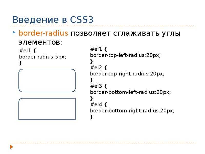
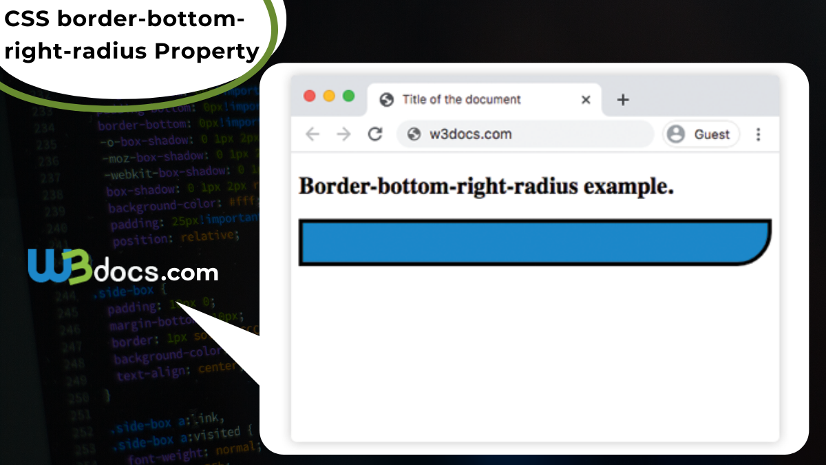
border-bottom-left-radius
border-bottom-right-radius
border-bottom-style
border-bottom-width
border-collapse
border-color
border-image
border-image-outset
border-image-repeat
border-image-slice
border-image-source
border-image-width
border-left
border-left-color
border-left-style
border-left-width
border-radius
border-right
border-right-color
border-right-style
border-right-width
border-spacing
border-style
border-top
border-top-color
border-top-left-radius
border-top-right-radius
border-top-style
border-top-width
border-width
bottom
box-decoration-break
box-shadow
box-sizing
caption-side
caret-color
@charset
clear
clip
color
column-count
column-fill
column-gap
column-rule
column-rule-color
column-rule-style
column-rule-width
column-span
column-width
columns
content
counter-increment
counter-reset
cursor
direction
display
empty-cells
filter
flex
flex-basis
flex-direction
flex-flow
flex-grow
flex-shrink
flex-wrap
float
font
@font-face
font-family
font-kerning
font-size
font-size-adjust
font-stretch
font-style
font-variant
font-weight
grid
grid-area
grid-auto-columns
grid-auto-flow
grid-auto-rows
grid-column
grid-column-end
grid-column-gap
grid-column-start
grid-gap
grid-row
grid-row-end
grid-row-gap
grid-row-start
grid-template
grid-template-areas
grid-template-columns
grid-template-rows
hanging-punctuation
height
hyphens
@import
isolation
justify-content
@keyframes
left
letter-spacing
line-height
list-style
list-style-image
list-style-position
list-style-type
margin
margin-bottom
margin-left
margin-right
margin-top
max-height
max-width
@media
min-height
min-width
mix-blend-mode
object-fit
object-position
opacity
order
outline
outline-color
outline-offset
outline-style
outline-width
overflow
overflow-x
overflow-y
padding
padding-bottom
padding-left
padding-right
padding-top
page-break-after
page-break-before
page-break-inside
perspective
perspective-origin
pointer-events
position
quotes
resize
right
tab-size
table-layout
text-align
text-align-last
text-decoration
text-decoration-color
text-decoration-line
text-decoration-style
text-indent
text-justify
text-overflow
text-shadow
text-transform
top
transform
transform-origin
transform-style
transition
transition-delay
transition-duration
transition-property
transition-timing-function
unicode-bidi
user-select
vertical-align
visibility
white-space
width
word-break
word-spacing
word-wrap
writing-mode
z-index
Синтаксис
/* Первый радиус примяется ко всем четырем углам */
border-radius: 10px;

/* top-left-and-bottom-right | top-right-and-bottom-left */
border-radius: 10px 5%;

/* top-left | top-right-and-bottom-left | bottom-right */
border-radius: 2px 4px 2px;

/* top-left | top-right | bottom-right | bottom-left */
border-radius: 1px 0 3px 4px;

/* Синтиксис второго радиуса применяется ко всем четырем углам */
/* (первые значения радиуса) /радиус */
border-radius: 10px 5% / 20px;

/* (первые значения радиуса) / top-left-and-bottom-right | top-right-and-bottom-left */
border-radius: 10px 5% / 20px 30px;

/* (первые значения радиуса) / top-left | top-right-and-bottom-left | bottom-right */
border-radius: 10px 5px 2em / 20px 25px 30%;

/* (первые значения радиуса) / top-left | top-right | bottom-right | bottom-left */
border-radius: 10px 5% / 20px 25em 30px 35em;

border-radius: inherit;
Значения
| radius | или обозначает радиус, использумый для границы в каждом углу границы. Он используется только в синтаксисе для одного значения. | |
| top-left-and-bottom-right | или обозначает радиус, используемый для границы в верхнем левом и нижнем правом углах рамки элемента. Используется только в синтаксисе двух значений. | |
| top-right-and-bottom-left | или обозначает радиус, используемый для границы в верхнем-правом и нижнем левом углах рамки элемента. Он используется только при двух или трех значениях. | |
| top-left | или обозначает радиус, используемый для границы в верхнем левом углу элемента. Используется в синтаксисе трех и четырех значений. | |
| top-right | или обозначает радиус, используемый для границы в верхнем правом углу элемента. Используется только при указании четырех значений. | |
| bottom-right | или обозначает радиус, используемый для границы в нижнем правом углу элемента. Используется в синтаксисе трех и четырех значений. | |
| bottom-left | или обозначает радиус, используемый для границы в нижнем левом углу элемента. Используется только при указании четырех значений. | |
| Это ключевое слово указывает, что все четыре значения наследуются от родителя. |
- Обозначает размер радиуса окружности или полу-основных и полу-малой осей эллипса. Может быть выражена в любых единицах CSS . Отрицательные значения не принимаются.
- Обозначает размер радиуса окружности, или полу-крупные и мелкие полу-оси эллипса, используя процентные значения. Проценты по горизонтальной оси относятся к ширине элемента, проценты по вертикальной оси к высоте. Отрицательные значения недействительны.
Например:
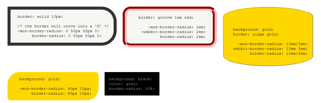
border-radius: 1em/5em;

/* эквивалентно этому: */

border-top-left-radius:     1em 5em;
border-top-right-radius:    1em 5em;
border-bottom-right-radius: 1em 5em;
border-bottom-left-radius:  1em 5em;
border-radius: 4px 3px 6px / 2px 4px;

/* эквивалетно этому: */

border-top-left-radius:     4px 2px;
border-top-right-radius:    3px 4px;
border-bottom-right-radius: 6px 2px;
border-bottom-left-radius:  3px 4px;
Примеры
Пример
Установить скругленные углы для элемента с цветом фона:
#rcorners1 { border-radius: 25px; background: #73AD21; padding: 20px; width: 200px; height: 150px; }
Пример
Установить скругленные углы для элемента с границей:
#rcorners2 { border-radius: 25px; border: 2px solid #73AD21; padding: 20px;
width: 200px; height: 150px; }
Пример
Установить скругленные углы для элемента с фоновым изображением:
#rcorners3 { border-radius: 25px; background: url(paper.gif); background-position: left top;
background-repeat: repeat; padding: 20px; width: 200px; height: 150px; }
Пример
Также обратите внимание на это:
#example1 { border-radius: 2em / 5em;}/* эквивалентно:border-top-left-radius: 2em 5em;
border-top-right-radius: 2em 5em;
border-bottom-right-radius: 2em 5em;
border-bottom-left-radius: 2em 5em; */#example2 { border-radius: 2em 1em 4em / 0.5em 3em;
}/* эквивалентно:border-top-left-radius: 2em 0.5em;
border-top-right-radius: 1em 3em;
border-bottom-right-radius: 4em 0.5em;
border-bottom-left-radius: 1em 3em; */
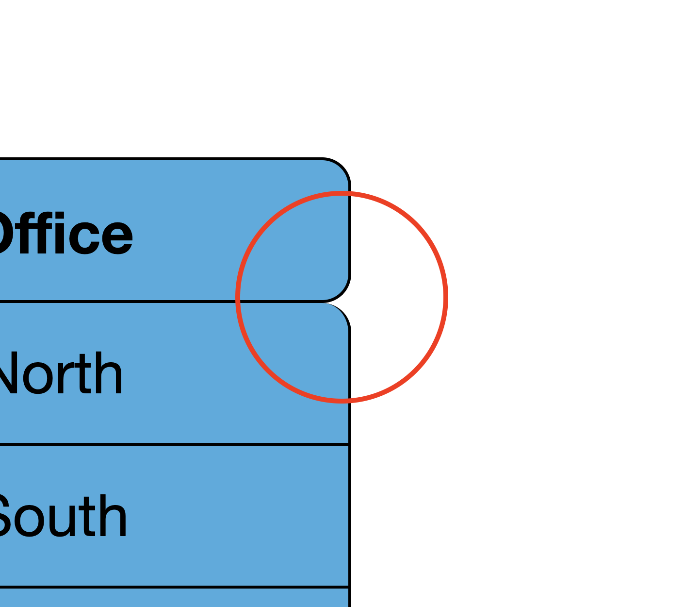
Rounding Internal Corners
While the above works great if all you want to do is round the outer 4 corners of the table, it doesn’t work so well if you want to round any of the other corners. Lets say, for example, you wanted to round the corners of the table headings so it looks separate from the body. If we use the previous trick using , then the background will show outside the rounded corners between the heading and the body. We can easily fix this by applying the background to the individual cells, but we now have the problem of actually creating the border around these rounded corners. We can apply the border to the individual cells, but then we get the minimum 2px internal borders. If we just apply the border to one side of each cell boundary, then we lose part of the border on the internal rounded corners:
| Name | Department | Office |
|---|---|---|
| John | Admin | North |
| Smith | Logistics | South |
| David | Transport | East |
It almost works perfectly, apart from these bits here:
Box Shadow To The Rescue
Instead of using borders, we can use a little trick involving a on every cell to create the effect that we’re after. It actually makes our border code surprisingly simple:
Now we can style the rest of the cells and round their corners as much as we want:
And the results are just right
| Name | Department | Office |
|---|---|---|
| John | Admin | North |
| Smith | Logistics | South |
| David | Transport | East |
Syntax
The CSS border-radius property can be expressed with one, two, three or four values provided, followed by an optional slash (/) and second set of values.
Syntax — One Value
The syntax for the CSS border-radius property (with 1 value) is:
When one single value is provided, the border-radius value will apply to all four corners of the box (ie: top-left, top-right, bottom-right, bottom-left).
If a slash (/) and another set of border-radius values are provided, then the first set of radius values applies to the horizontal radius and the second set of values applies to the vertical radius. If the slash and second set of values are omitted, then the same values are applied to both the horizontal and vertical radius.
Syntax — Two Values
The syntax for the CSS border-radius property (with 2 values) is:
When two values are provided, the first value will apply to the top-left and bottom-right corners of the box. The second value will apply to the top-right and bottom-left corners of the box.
If a slash (/) and another set of border-radius values are provided, then the first set of radius values applies to the horizontal radius and the second set of values applies to the vertical radius. If the slash and second set of values are omitted, then the same values are applied to both the horizontal and vertical radius.
Syntax — Three Values
The syntax for the CSS border-radius property (with 3 values) is:
When three values are provided, the first value will apply to the top-left corner of the box. The second value will apply to the top-right and bottom-left corners of the box. The third value will apply to the bottom-right corner of the box.


If a slash (/) and another set of border-radius values are provided, then the first set of radius values applies to the horizontal radius and the second set of values applies to the vertical radius. If the slash and second set of values are omitted, then the same values are applied to both the horizontal and vertical radius.
Syntax — Four Values
The syntax for the CSS border-radius property (with 4 values) is:
When four values are provided, the first value will apply to the top-left corner of the box. The second value will apply to the top-right corner of the box. The third value will apply to the bottom-right corner of the box. The fourth value will apply to the bottom-left corner of the box.
If a slash (/) and another set of border-radius values are provided, then the first set of radius values applies to the horizontal radius and the second set of values applies to the vertical radius. If the slash and second set of values are omitted, then the same values are applied to both the horizontal and vertical radius.
The top-left, top-right, bottom-right, and bottom-left values can be one of the following:
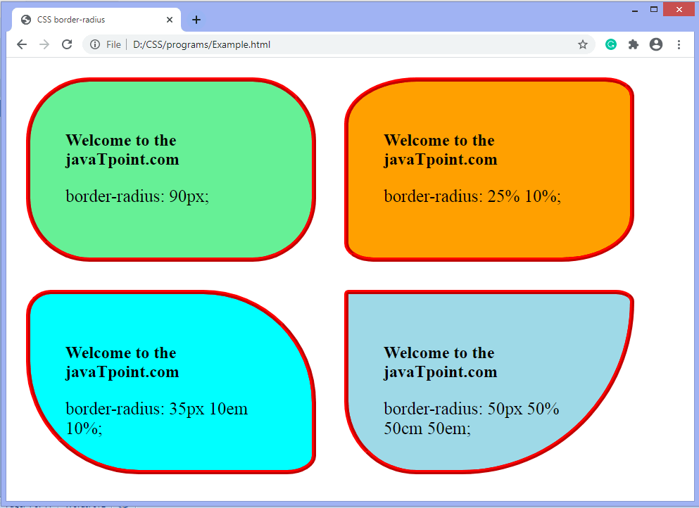
More Examples
Example
Set rounded corners for an element with a background color:
#rcorners1 { border-radius: 25px; background: #73AD21; padding: 20px; width: 200px; height: 150px; }
Example
Set rounded corners for an element with a border:
#rcorners2 { border-radius: 25px; border: 2px solid #73AD21; padding: 20px;
width: 200px; height: 150px; }
Example
Set rounded corners for an element with a background image:
#rcorners3 { border-radius: 25px; background: url(paper.gif); background-position: left top;
background-repeat: repeat; padding: 20px; width: 200px; height: 150px; }
Example
Also notice this:
#example1 { border-radius: 2em / 5em;}/* is equivalent to:border-top-left-radius: 2em 5em;
border-top-right-radius: 2em 5em;
border-bottom-right-radius: 2em 5em;
border-bottom-left-radius: 2em 5em; */#example2 { border-radius: 2em 1em 4em / 0.5em 3em;
}/* is equivalent to:border-top-left-radius: 2em 0.5em;
border-top-right-radius: 1em 3em;
border-bottom-right-radius: 4em 0.5em;
border-bottom-left-radius: 1em 3em; */