
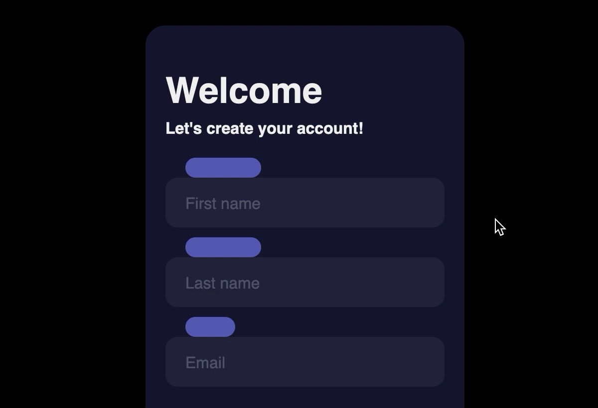
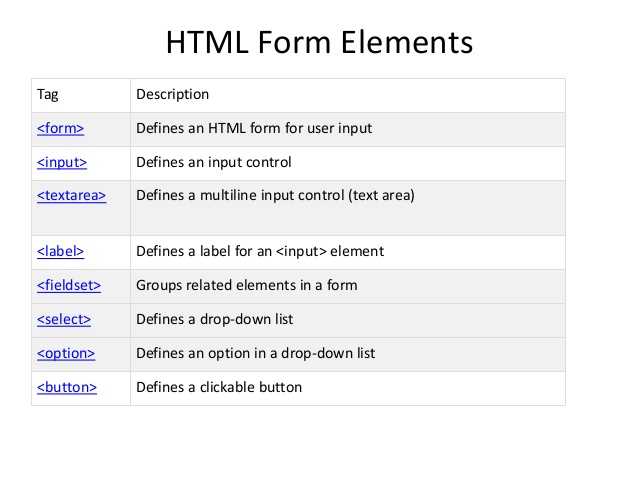
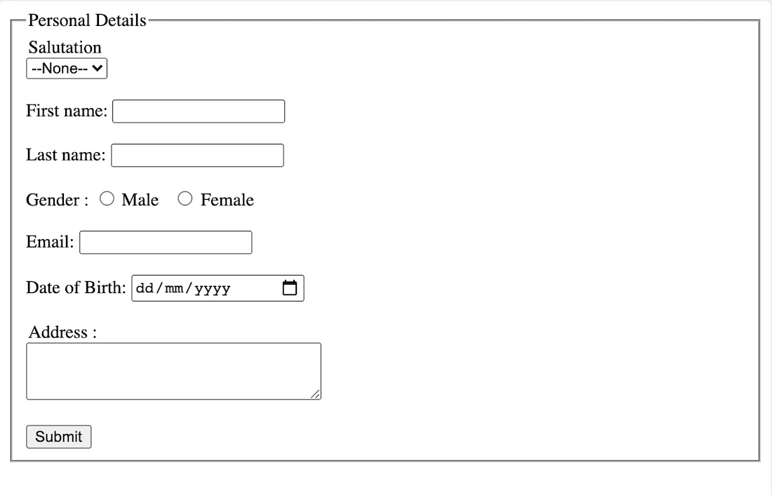
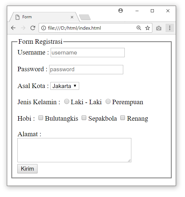
Creating Interactive Button Styles
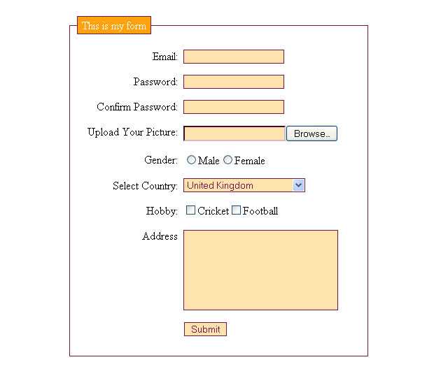
In web forms, elements are often used to submit or reset a form. In , there are two buttons, one with a of and the other of . Both are functionally useful, but perform opposing actions. The button will send the form along to a processor, while the button clears all entered data from the form. Due to these different actions, the elements need to look visibly different as well.
To begin, open in your text editor and create a element selector. In this selector block, you will add the styles that are shared between the and elements, as highlighted in the following code block:
styles.css
The sets both buttons to have the same font style and size. Then the adds a rounded corner to both buttons. The property changes the style of the cursor to be the hand-style pointer. Lastly, the property defines the space around the inside of the button.
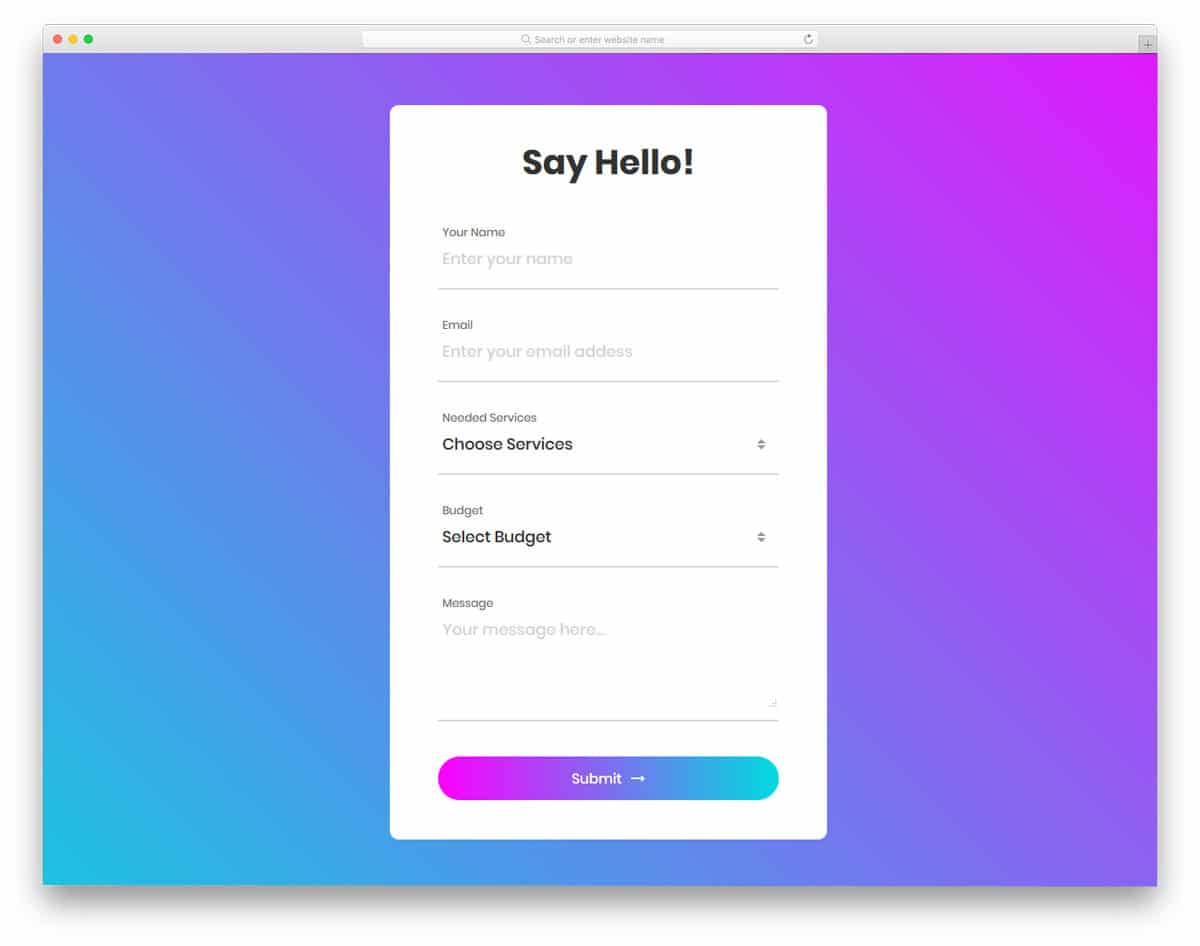
Save your changes to and then open in your web browser. The text in the button will grow and the spacing between the text will increase visually due to the padding. The following image shows how the buttons are rendered in the browser:
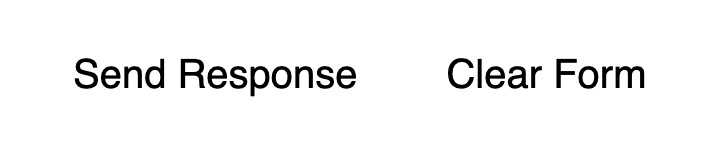
Next, return to to add styles for each button by using an attribute selector targeting each. For the button, add a blue and text color. The button will gain a link-like underline and a to add more space between the buttons. Add the highlighted CSS from the following code block to your file:
styles.css
Save these additions to then refresh in your text editor. The button is now a prominent blue and white, while the is subdued underlined text, as rendered in the following image:
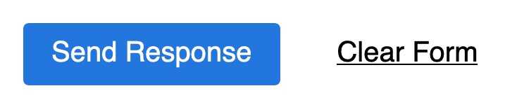
The element does not have a state by default, so you will now add this to your style. A state is useful to help cursor users have visual feedback that the cursor is situated on the buttons.
To create states for these elements, return to in your text editor. Set the button’s to darken on hover. Then, make the button drop the underline when hovered. The highlighted HTML in the following code block indicates how to write these styles:
styles.css
Save your changes to and then return to the browser to refresh . As the following animation portrays, the elements shift their styles when the mouse cursor hovers over them:
In this section, you created styles for the elements so to make their differences visually noticeable. You changed how the cursor appears on hover by adjusting the property. You also created custom styles to apply to each button to provide further visual feedback. In the last section, you will provide further visual activity feedback by creating styles when a form element is presently in use with the pseudo-class.
Кармашки для меток
Для кармашков подойдут контейнеры со скругленными углами того же цвета, что и фон.
 кармашки для прыгающих
На картинке для наглядности цвет контейнеров-кармашков показан ярким и четким. Он иллюстрирует форму HTML-узлов, которые для этого используются.
Может показаться излишним использовать два элемента для и его подложки вместо того, что окажется одним. Однако так будет проще нарисовать кармашек поверх существующей разметки и добавить ему какие-нибудь трансформации для эффектного появления.
Тогда для перемещения кармашка-подложки можно использовать точно такую же логику трансформации как для текста. Единственное отличие состоит в том, что контейнер со скругленными углами по вертикали перемещается в противоположном направлении навстречу тексту.
How To Make A Line Unselectable
If you wish to make the select option disappear after the user clicks on it, you may do so with the use of the “none” value. Furthermore, in order to stop validating the text under the select box placeholder, you need to set the :invalid pseudo-class.
In CSS, the invalid pseudo-class allows plenty of styling options for specific portions in the <select> elements, including while it is in the “placeholder” state. Since the placeholder option has an empty value, the invalid value would work here. However, if you try to set any value in the select box, then the invalid pseudo-class will not work. In that case, you may try the valid pseudo-class in this case.
Conclusion
Forms are a common element of web design. They allow users to interact with apps, search content, and provide feedback. In this tutorial, you created and styled a full-fledged form. You removed the browser default styles with the property, and created a new custom aesthetic across various elements. You used the pseudo-class to make selected states for radio buttons and checkboxes. Then you added content and matched the styling with the pseudo-element. After you created custom button styles, you applied styles giving valuable visual interaction feedback to the form users.
If you would like to read more CSS tutorials, try out the other tutorials in the How To Style HTML with CSS series.
How to use placeholder attribute in HTML?
To provide a hint for the
input field
text area, utilize the HTML
placeholder attribute
. The hint serves as the anticipated value that appears prior to the user inputting information such as name, details, and so on.
Example
To gain knowledge about using placeholder attribute in HTML, attempt to execute the subsequent code.
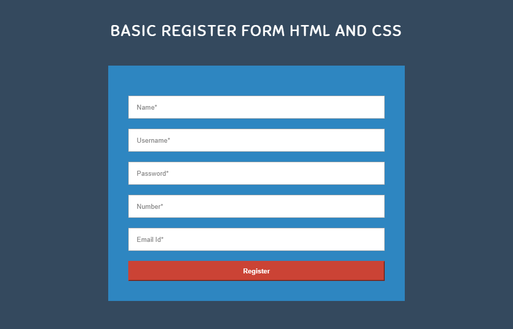
Register
HTML | DOM Input Text placeholder Property, The Input Text Placeholder property in HTML DOM is used to set or return the value of the placeholder attribute of a text field.
Tags:
append placeholder text to a pre populated number input
Basic HTML and HTML5: Add Placeholder Text to a Text Field
Placeholder text allows the programmer to put text in the background of an ‘input’ HTML
Duration: 1:05
Add Placeholder Text to a Text Field, freeCodeCamp review html
freeCodeCamp tutorials, review and help, in this challenge we learn how to add place holder
Duration: 2:12
How to create html form with placeholder?
How to create html form with placeholder? Download Source code from here: https
Duration: 8:24
PlaceHolder + @Html.TextBox issue
Question:
Achieve the effective utilization of the
characteristic in the implementation of the
procedure.
The problem
My application includes the succeeding syntax.
When the
is utilized, the
attribute of
becomes
. This implies that the
attribute functions not as an attribute, but as the
‘s
.
Knowledge
Despite searching on both Google and
Stack Overflow
, I haven’t been able to find an answer to this question yet.
The syntax in the solution provided in this link is identical to mine. However, passing the second parameter to
results in it being displayed as a value, while the third parameter (in this case,
) remains unaffected.
Solution 1:
The second parameter is being interpreted as
instead of
because you are using the
overload of the method. The recommended solution is to use a different overload, such as
, and specify an empty
.
Solution 2:
try this for an empty @
Html.Textbox
Solution 3:
There is a third param you need:
The final parameter allows for the inclusion of any desired attributes in the HTML output relating to the input field.
Adding HTML Within Placeholder, The placeholder attribute has plain text as its value, by definition. No tags are recognized. Character references are recognized,
How can I append placeholder text to a pre-populated number input?
Question:
This is what my HTML input looks like:
I am retrieving the party size value from a cookie/storage that was set on a previous screen. The previous screen requested the party size information.
The screen lacks clarity on the meaning of 33 from a UX standpoint. As I am filling in the input, I cannot utilize placeholder text. Therefore, I am curious if there is a method to incorporate «People» after the value.
The UI appears neat to me even without the
visible form
labels, hence, I prefer not to include them if it’s possible.
This is my current state:
The objective I am striving to achieve is depicted in the red text in the following image:
I want to maintain the spacing’s neatness and precision, even if it’s just a basic
background image
. Your recommendations are greatly appreciated.
Solution:
You may want to consider trying a similar approach, as it could potentially guide you towards the correct path.
HTML:
SCSS:
How do I make a placeholder for a ‘select’ box?, All you have to do is create a simple list with few data attributes. The code automatically turns the list into a selectable dropdown. It also adds a hidden
Текстовые поля
Последнее обновление: 21.05.2016
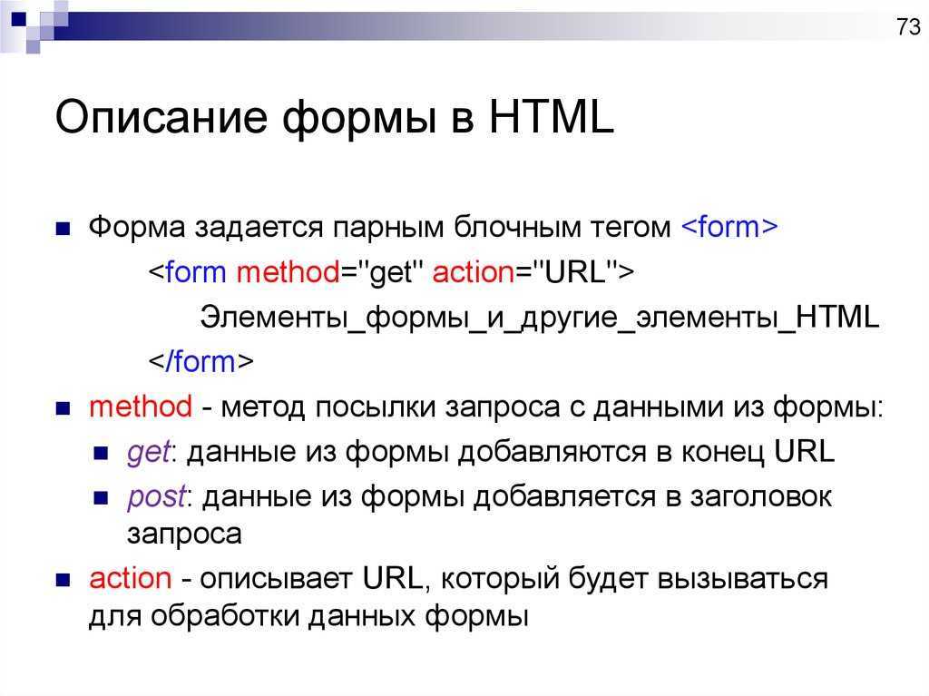
Однострочное текстовое поле создается с помощью элемента input, когда его атрибут имеет значение :
<input type="text" name="login" />
С помощью ряда дополнительных атрибутов можно настроить текстовое поле:
-
dir: устанавливает направление текста
-
list: устанавливает список подсказок для ввода в поле
-
maxlength: максимально допустимое количество символов в текстовом поле
-
pattern: определяет шаблон, которому должен соответствовать вводимый текст
-
placeholder: устанавливает текст, который по умолчанию отображается в текстовом поле
-
readonly: делает текстовом поле доступным только для чтения
-
required: указывает, что текстовое поле обязательно должно иметь значение
-
size: устанавливает ширину текстового поля в видимых символах
-
value: устанавливает значение по умолчанию в текстовом поле
Применим некоторые атрибуты:
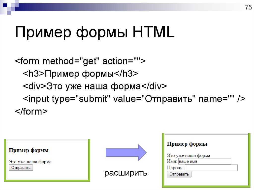
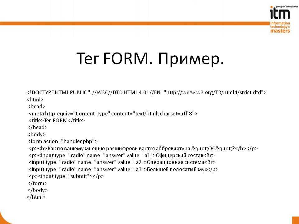
<!DOCTYPE html>
<html>
	<head>
		<meta charset="utf-8">
		<title>Текстовые поля в HTML5</title>
	</head>
	<body>
		<form>
			<p><input type="text" name="userName" placeholder="Введите имя" size="18" /></p>
			<p><input type="text" name="userPhone" placeholder="Введите номер телефона" size="18" maxlength="11" /></p>
			<p>
				<button type="submit">Отправить</button>
				<button type="reset">Отмена</button>
			</p>
		</form>
	</body>
</html>
В этом примере во втором текстовом поле сразу устанавливаются атрибуты и . При этом size — то есть количество
символов, которые помещаются в видимое пространство поля больше, чем допустимое количество символов. Однако все равно ввести символов больше, чем
maxlength, мы не сможем.
В данном случае также важно различать атрибуты и , хотя оба устанавливают видимый текст в поле. Однако устанавливает своего рода подсказку или приглашение к вводу, поэтому он обычно отмечается серым цветом
В то время как
значение представляет введенный в поле текст по умолчанию:
<p><input type="text" name="userName" value="Том" /></p>
<p><input type="text" name="userPhone" placeholder="Номер телефона" /></p>
Атрибуты и делают текстовое поле недоступным, однако сопровождаются разным визуальным эффектом. В случае с
disabled текстовое поле затеняется:
<p><input type="text" name="userName" value="Том" readonly /></p>
<p><input type="text" name="userPhone" value="+12345678901" disabled /></p>
Среди атрибутов текстового поля также следует отметить такой атрибут как list. Он содержит ссылку на элемент datalist,
который определяет набор значений, появляющихся в виде подсказки при вводе в текстовое поле. Например:
<!DOCTYPE html>
<html>
	<head>
		<meta charset="utf-8">
		<title>Текстовые поля в HTML5</title>
	</head>
	<body>
		<form>
			<p><input list="phonesList" type="text" name="model" placeholder="Введите модель" /></p>
			<p>
				<button type="submit">Отправить</button>
			</p>
		</form>
		<datalist id="phonesList">
			<option value="iPhone 6S" label="54000"/>
			<option value="Lumia 950">35000</option>
			<option value="Nexus 5X"/>
		</datalist>
	</body>
</html>
Атрибут текстового поля указывает на id элемента datalist. Сам элемент datalist с помощью вложенных элементов
определяет элементы списка. И при вводе в текстовое поле этот список отображается в виде подсказки.
Направление текста
Атрибут dir задает направление ввода текста. Он может принимать два значения: ltr (слева направо) и
rtl (справа налево):
<input type="text" name="username" dir="rtl" />
Поле поиска
Для создания полей поиска предназначен элемент input с атрибутом . Формально он представляет собой простое текстовое поле:
<!DOCTYPE html>
<html>
	<head>
		<meta charset="utf-8">
		<title>Поиск в HTML5</title>
	</head>
	<body>
	<form>
		<input type="search" name="term" />
		<input type="submit" value="Поиск" />
	</form>
	</body>
</html>
Поле ввода пароля
Для ввода пароля используется элемент input с атрибутом . Его отличительной чертой является то, что вводимые символы маскируются точками:
<form>
	<p><input type="text" name="login" /></p>
	<p><input type="password" name="password" /></p>
	<input type="submit" value="Авторизация" />
</form>
НазадВперед
Technically Correct
Inputs are the gates through which nearly all e-commerce has to pass. Regardless of your feelings on the place of empathy in design, unusable inputs leave money on the table.
The presence of a placeholder attribute won’t be flagged by automated accessibility checking software. However, this doesn’t necessarily mean it’s usable. Ultimately, accessibility is about people, not standards, so it is important to think about your interface in terms beyond running through a checklist.

Call it remediation, inclusive design, universal access, whatever. The spirit of all these philosophies boils down to making things that people—all people—can use. Viewed through this lens, simply doesn’t hold up.
Плейсхолдеры и доступность
Последняя важная проблема, которую надо рассмотреть, заключается в том, что текст плейсхолдера в целом плох для доступности. Конечно, специальное ПО и современные браузеры улучшаются, но впереди у них ещё долгий путь. Вот три крупнейшие проблемы, связанные с доступностью:
- Светло-серый цвет текста плейсхолдера по умолчанию имеет слабый контраст по сравнению с цветом большинства фонов. Для пользователей со зрительным нарушением слабый контраст цвета делает такой текст сложным для восприятия. Поскольку не все браузеры позволяют изменить стиль текста плейсхолдера, используя CSS, это остаётся важным моментом.
- Пользователи с когнитивными или двигательными нарушениями сильнее обременены. Как мы уже видели, у всех пользователей могут быть проблемы с плейсхолдерами: исчезающие плейсхолдеры увеличивают нагрузку на память; постоянные затемнённые плейсхолдеры вызывают замешательство, когда выглядят кликабельными, но таковыми не являются, и плейсхолдеры, которые не исчезают, требуют больше действий с клавиатурой или мышкой для их удаления. Эти сложности имеют большее значение для людей с когнитивными или двигательными нарушениями.
- Не все средства для чтения с экрана озвучивают текст плейсхолдера. Слепые пользователи или пользователи с нарушением зрения могут полностью пропустить подсказку, если их ПО не озвучивает содержимое плейсхолдера.
Help users by showing the data they previously entered #
Imagine you have a checkout form with multiple steps. How do you ensure the previously entered values are still there when the user returns to a previous step? Use the attribute to show values already completed.
There are multiple ways to retrieve the value of a form control in JavaScript. You can use the property, or you can access the value with . There is one big difference, the property always returns the current value, and using always returns the initial value.
Try it out! Change the text of the name field and watch the console. Notice how the property returns the currently visible text, while always returns the initial value.
Learn more about the difference between .
For elements of type or use the attribute. Add it if the user selected an option and remove it otherwise.
Убираем placeholder при нажатии на поле
По-умолчанию браузеры скрывают плейсхолдер только после начала ввода текста. Но не сложно сделать чтобы он ичезал сразу после установки курсора в поле ввода. Для этого для полей с фокусом напишем стиль, в котором сделаем подсказку полностью прозрачной.
  :focus::-webkit-input-placeholder {opacity:0;}/* webkit */
  :focus::-moz-placeholder          {opacity:0;}/* Firefox 19+ */
  :focus:-moz-placeholder           {opacity:0;}/* Firefox 18- */
  :focus:-ms-input-placeholder      {opacity:0;}/* IE */
Скрывать плейсхолдер при форкусе можно по разному, например, плавно изменяя прозрачность или цвет. А можно настроить и css анимацию, когда подсказка будет плавно уезжать за пределы поля. Всё это возможно благодаря CSS, но большого смысла я в этом не вижу, так как кроссбраузерность таких прелестей будет страдать, а пользы от этих эффектов практически никакой.
Рассуждения о семантике
Всю HTML-разметку веб-страницы можно сделать с помощью только . Это легко и часто даже как-то работает. По ситуации легко стилизовать и получить результат, который будет выглядеть приемлемо. Но такой способ работы обманчив. Многие вещи не будут работать нормально. В частности, у таких веб-страниц будут серьёзные проблемы с доступностью. Многие функции доступности встроены в HTML и работают “из коробки” при правильном применении HTML-элементов. Но если их использовать не по назначению, например заменить кнопки и метки абстрактными элементами, типа , браузер не получит достаточного представления об их использовании и назначении. Программы чтения с экрана и другие вспомогательные инструменты не смогут правильно интерпретировать эти элементы.
Это плохо не только для доступности, но и для самой HTML-разметки, состоящей из элементов одинакового типа, например, из одних . Поначалу с этим ещё можно справляться, но по мере развития кода, отсутствие семантики в разметке доставит немало проблем с его поддержкой и расширением. Поэтому следует использовать правильные HTML-элементы в правильном контексте, т.е. в соответствии с их назначением. Так можно бесплатно получить много готовых решений и обойтись без изобретения велосипедов.
В случае с текстовыми полями и метками к ним, для обоих есть соответствующие HTML-элементы: и . У HTML-элемента есть атрибут , который позволяет связать метку и текстовое поле . Вот как это выглядит в коде:
Плейсхолдеры, замещающие лейблы
В некоторых формах лейблы заменяются расположенным внутри текстом плейсхолдера. Это помогает уменьшить хаос на странице или сократить размер формы. Несмотря на то, что этот подход основан на хороших намерениях, наши исследования показывают, что это влечёт за собой много негативных последствий.
Худший вариант: в этом примере, текст плейсхолдера используется вместо лейбла
Ниже приводятся 7 основных причин, почему плейсхолдеры не должны использоваться, как замена для лейблов.
2. Без лейблов пользователь не сможет проверить свою работу до отправки формы
В отсутствии лейблов пользователям становится невозможно понять, верно ли они заполнили форму. Помимо этого браузеры, автоматически заполняя поля формы, могут заполнить их неверной информацией. Если не будет лейблов или специальные инструкции перестанут отображаться, пользователям придётся проверять указанное значение, удаляя введённый ранее текст. В действительности же, многие даже не осознают, что существует вероятность ошибки, и они не будут прилагать дополнительные усилия для двойной проверки.
3. Когда появляется сообщение об ошибке, люди не знают как решить проблему
Если форма была заполнена, но нет лейблов или инструкций, находящихся вне полей формы, тогда пользователям придётся поочерёдно возвращаться к каждому полю, чтобы открыть описания и исправить ошибку.
5. На поля с надписью внутри обращается меньше внимания
Изучение движения глаз показывает, что взгляд пользователей будет сконцентрирован на пустых полях. Как минимум им будет неудобно, так как они потратят больше времени на обнаружение непустых полей. В худшем же случае, полностью пропустят такое поле, а это уже потенциальная убивающая бизнес катастрофа.
7. Иногда пользователям приходится удалить текст плейсхолдера вручную
Иногда плейсхолдеры не исчезают, когда пользователи помещают курсор в поле. Если плейсхолдер остаётся внутри поля как редактируемый текст, пользователям придётся вручную выделять его и удалять. Это создаёт ненужную нагрузку на пользователей и увеличивает стоимость взаимодействия с заполняемой формой.Бывает, что плейсхолдер тускнеет при размещении курсора в текстовом поле. К сожалению, такой шаблон взаимодействия достаточно редок и пользователи незнакомы с ним: некоторые до сих пор считают, что им придётся вручную удалять этот текст. Это обычно приводит к нескольким неудачным попыткам и множеству кликов до того, как они поймут, что можно начать печатать прямо по потускневшему тексту.
A Solution
To recap, the placeholder attribute:
- Can’t be automatically translated;
- Is oftentimes used in place of a label, locking out assistive technology;
- Can hide important information when content is entered;
- Can be too light-colored to be legible;
- Has limited styling options;
- May look like pre-filled information and be skipped over.
Eesh. That’s not great. So what can we do about it?
Design
Move the placeholder content above the input, but below the label:
This approach:
- Communicates a visual and structural hierarchy:
- What this input is for,
- Things you need to know to use the input successfully, and
- the input itself.
- Can be translated.
- Won’t look like pre-filled information.
- Can be seen in low vision circumstances.
- Won’t disappear when content is entered into the input.
- Can include semantic markup and be styled via CSS.
Additionally, the help content will be kept in view when the input is activated on a device with a software keyboard. If placed below the input, the content may be obscured when an on-screen keyboard appears at the bottom of the device viewport:
Development
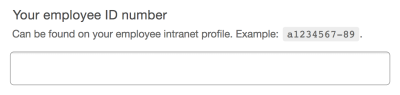
Here’s how to translate our designed example to code:
This isn’t too much of a departure from a traditional accessible / attribute pairing: The element is programmatically associated with the via its declaration of “employee-id”. The element placed between the and elements acts as a replacement for a attribute.
“So,” you may be wondering. “Why don’t we just put all that placeholder replacement content in the element? It seems like it’d be a lot less work!” The answer is that developer convenience shouldn’t take priority over user experience.
By using to programmatically associate the with the element, we are creating a priority of information for screen readers that has parity with what a person browsing without a screen reader would experience. ensures that the content will be described last, after the ’s content and the kind of input it is associated with.
In other words, it’s what content the input is asking for, what type of input it is, then additional help if you need it — exactly what someone would experience if they look at form input.
User experience encompasses all users, including those who navigate with the aid of screen readers. The help content is self-contained and easy to navigate to and from, should the person using a screen reader need to re-reference it. As it is a self-contained node, it can also be silenced (typically with the Control key) without risking muting other important information.
Including the help content as part of the makes it unnecessarily verbose. s should be meaningful, but also concise. Adding too much information to a label may have the opposite of the desired effect, making it too long to recall or simply too frustrating to listen to all the way through. In fact, the Web Content Accessibility Guidelines has rules that specifically address this: Success Criteria 2.4.6 and 3.3.2.
Example
Here is the solution implemented in live code:
See the Pen Don’t use the placeholder attribute by Eric Bailey (@ericwbailey) on CodePen.
And here’s a video demonstrating how popular screen readers handle it:
Text Box Examples
Below are text box examples with commonly specified attributes.
Text Box with Maxlength Attribute
To specify a maximum number of characters that a user can enter into the text box, you must specify the maxlength attribute with an integer value of 0 or higher. If no maxlength is specified, or an invalid value is specified, the text box has no maximum length.
See the Pen Text box example with maxlength attribute by HubSpot (@hubspot) on CodePen.
Text Box with Minlength Attribute
To specify a minimum number of characters that a user must enter into the text box, you must specify the minlength attribute as an integer value that is not negative and is at least equal to or smaller than the value specified by the maxlength attribute. If no minlength is specified, or an invalid value is specified, the text box has no minimum length.
See the Pen Text box example with minlength attribute by HubSpot (@hubspot) on CodePen.
Text Box with Placeholder Attribute
To provide more context about how the user should fill out a text box, you can specify the placeholder attribute. This should contain a word or short phrase that indicates what kind of information is expected.
See the Pen Text box example with placeholder attribute by HubSpot (@hubspot) on CodePen.
Text Box with Size Attribute
To set the size of a text box, you can specify the size attribute. This should be a numeric value greater than 0. If no size is specified, then the text box will be 20 characters wide by default.

See the Pen Text box example with size attribute by HubSpot (@hubspot) on CodePen.
HTML Form with Text Boxes
Below is an example of an HTML form with multiple input fields, including two text boxes, a password, and submit button, and a text area.
See the Pen Untitled by HubSpot (@hubspot) on CodePen.
Атрибуты #
Мы рассмотрели подробно атрибут type. Давай посмотрим список других возможных атрибутов в теге input: autocomplete, list, maxlength, minlength, pattern, placeholder, readonly, required, size, spellcheck.
autocomplete
Браузеры запоминают, что мы вводим в формулярах. И мы можем отключить эти данные для всей формы или для отдельных полей.Мне тяжело сейчас придумать, где именно вебмастер может решить, что он умнее пользователя. И на самом деле я считаю, что вмешивание в поведение браузера достаточно смелое решение. Но ситуации бывают разные, возможность для этого есть и мы должны её знать.
И с помощью этих строчек мы получили выпадающий список с выбором.
Как вариант такой список может выглядеть и вот так.
pattern
В паттернах у нас есть возможность писать регулярные выражения, которые будут проверять значения на валидность. Регулярные выражения не самая важная тема в программировании. Её можно опустить, уверен что тебе есть что сейчас учить.
spellcheck
С помощью этого атрибута можно отключить проверку орфографии.
Я бы сказал это удобно, особенно для моей фамилии. Не очень приятно читать, что фамилия написана с ошибкой.