
Conformance
Document conventions
Conformance requirements are expressed with a combination of
descriptive assertions and RFC 2119 terminology. The key words “MUST”,
“MUST NOT”, “REQUIRED”, “SHALL”, “SHALL NOT”, “SHOULD”, “SHOULD NOT”,
“RECOMMENDED”, “MAY”, and “OPTIONAL” in the normative parts of this
document are to be interpreted as described in RFC 2119.
However, for readability, these words do not appear in all uppercase
letters in this specification.
All of the text of this specification is normative except sections
explicitly marked as non-normative, examples, and notes.
Examples in this specification are introduced with the words “for example”
or are set apart from the normative text with ,
like this:
This is an example of an informative example.
Informative notes begin with the word “Note” and are set apart from the
normative text with , like this:
Note, this is an informative note.
Advisements are normative sections styled to evoke special attention and are
set apart from other normative text with , like
this: UAs MUST provide an accessible alternative.
Tests
Tests relating to the content of this specification
may be documented in “Tests” blocks like this one.
Any such block is non-normative.
Conformance classes
Conformance to this specification
is defined for three conformance classes:
- style sheet
- A .
- renderer
- A that interprets the semantics of a style sheet and renders
documents that use them. - authoring tool
- A that writes a style sheet.
A style sheet is conformant to this specification
if all of its statements that use syntax defined in this module are valid
according to the generic CSS grammar and the individual grammars of each
feature defined in this module.
A renderer is conformant to this specification
if, in addition to interpreting the style sheet as defined by the
appropriate specifications, it supports all the features defined
by this specification by parsing them correctly
and rendering the document accordingly. However, the inability of a
UA to correctly render a document due to limitations of the device
does not make the UA non-conformant. (For example, a UA is not
required to render color on a monochrome monitor.)
An authoring tool is conformant to this specification
if it writes style sheets that are syntactically correct according to the
generic CSS grammar and the individual grammars of each feature in
this module, and meet all other conformance requirements of style sheets
as described in this module.
Partial implementations
So that authors can exploit the forward-compatible parsing rules to
assign fallback values, CSS renderers must treat as invalid (and ) any at-rules, properties, property values, keywords,
and other syntactic constructs for which they have no usable level of
support. In particular, user agents must not selectively
ignore unsupported component values and honor supported values in a single
multi-value property declaration: if any value is considered invalid
(as unsupported values must be), CSS requires that the entire declaration
be ignored.
Implementations of Unstable and Proprietary Features
To avoid clashes with future stable CSS features,
the CSSWG recommends for the implementation of features and to CSS.
Non-experimental implementations
Once a specification reaches the Candidate Recommendation stage,
non-experimental implementations are possible, and implementors should
release an unprefixed implementation of any CR-level feature they
can demonstrate to be correctly implemented according to spec.
To establish and maintain the interoperability of CSS across
implementations, the CSS Working Group requests that non-experimental
CSS renderers submit an implementation report (and, if necessary, the
testcases used for that implementation report) to the W3C before
releasing an unprefixed implementation of any CSS features. Testcases
submitted to W3C are subject to review and correction by the CSS
Working Group.
Further information on submitting testcases and implementation reports
can be found from on the CSS Working Group’s website at http://www.w3.org/Style/CSS/Test/.
Questions should be directed to the public-css-testsuite@w3.org mailing list.
Where to Next?
This introduction to CSS Background Position should provide a starting point for further inquiry into text design, layout, and practical applications with HTML and CSS.
We will continue to explore other areas of design in the next blog. The hope for this introduction is that it piques your interest, inspires you to explore further, and dive deeper into the world of web design.
HTML is a great way to start learning code, but the professional world demands more and more. Why not supercharge your skills and options by taking it even further. Enroll in our Intro to Programming Nanodegree program today!
<p><a class=”btn btn-primary” href=”https://www.udacity.com/course/intro-to-programming-nanodegree–nd000” target=”blank” rel=”noopener noreferrer”>Start Learning</a></p>
Универсальное свойство background
Мы с Вами рассмотрели все свойства, которые предназначены для работы с фоновыми изображениями. В большинстве случаев вводить длинные названия рассмотренных выше свойств непродуктивно, но это не значит, что мы зря потратили на это время — без понимания как они работают по отдельности, вы не сможете грамотно их применять в одном объявлении.
Существует более простой метод задать значения всех свойств для работы с задним фоном в одном объявлении, используя универсальное свойство background.
Свойство background имеет следующий синтаксис:
background: "color image position/size repeat origin clip attachment;
Где значения соответствуют вышерассмотренным нами свойствам:
- background-color (color | transparent).
- background-image (url | none).
- background-position (значение).
- background-size (auto | length | cover | contain).
- background-repeat (repeat | repeat-x |repeat-y | no-repeat).
- background-origin (padding-box | border-box | content-box).
- background-clip (border-box | padding-box | content-box).
- background-attachment (scroll | fixed | local).
Давайте рассмотрим пример использования универсального свойства background:
Пример использования универсального свойства background
И так, что мы сделали в этом примере:
- Мы установили для элементов <html> и <body> высоту 100%, убрали внутренние и внешние отступы.
- Для элемента <header> задали минимальную высоту равную 34% от родительского элемента, ширину установили 100%. В качестве заднего фона установили изображение — url(‘cat_g.jpg’), позиционировали его по низу и масштабировали фоновое изображение под размеры элемента (center / contain — background-position / background-size). Без косой черты, как и без позиции фонового изображения работать не будет.
- Для элемента <div> с классом .primer2 задали минимальную высоту равную 66% от родительского элемента, ширину установили 100%. В качестве заднего фона установили два различных изображения, позиционировали их по центру (center) и масштабировали их (первое изображение полностью помещается — значение contain, второе изображение масштабируется под размеры элемента cover ).
Результат нашей работы:
Рис. 122 Пример использования универсального свойства background.
Обращаю Ваше внимание на то, что установка нескольких фоновых изображений в качестве заднего фона для одного элемента выполнена для демонстрации возможностей CSS. В большинстве случаев проще установить один задний фон для одного элемента, а уже этот элемент настроить и позиционировать в документе как вам необходимо
Подробное изучение позиционирования элементов будет освещено далее в учебнике в статье «Позиционирование элементов в CSS».
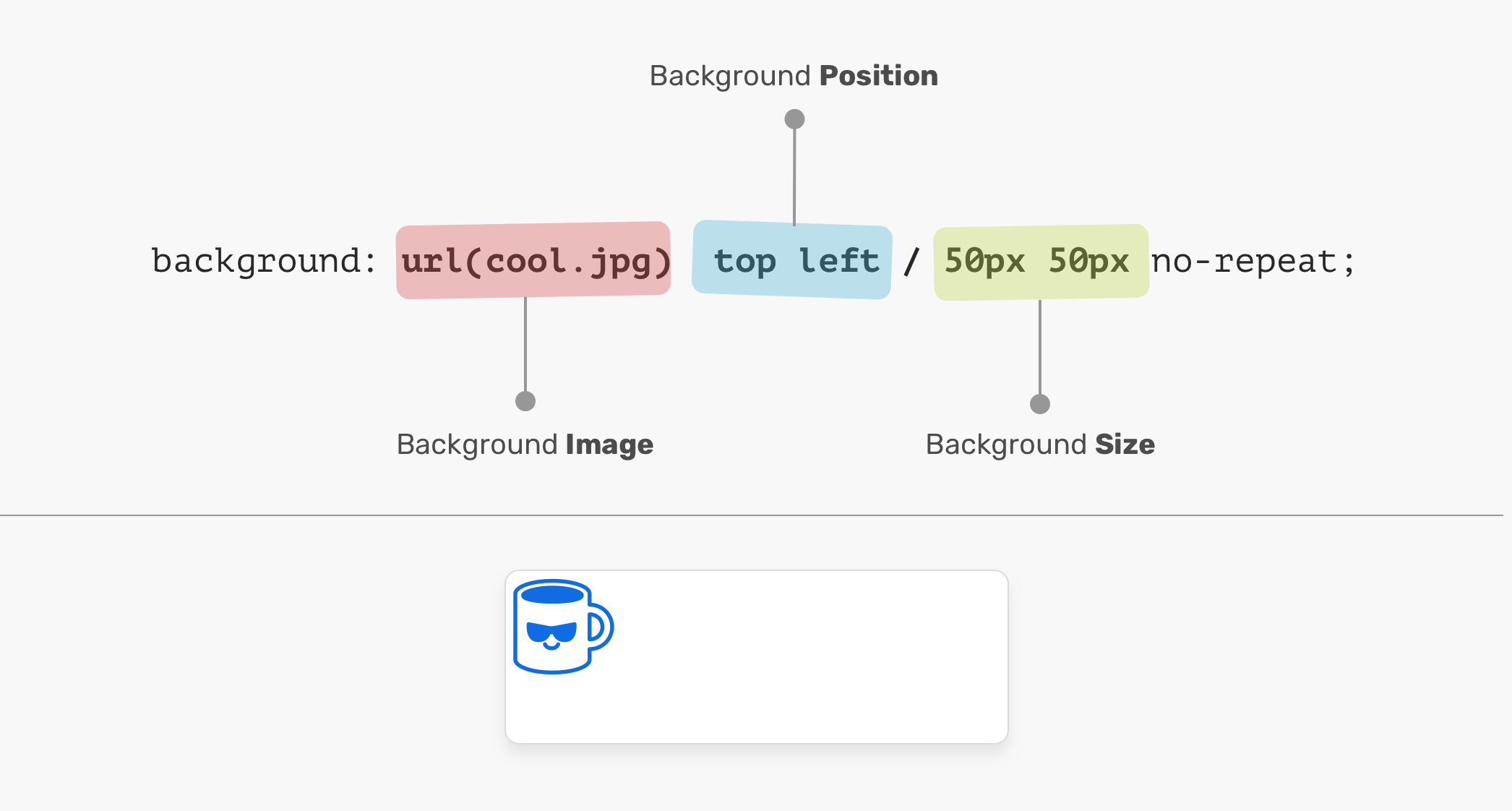
Multiple backgrounds #
As mentioned at the beginning of the module, the background layer allows multiple sublayers to be defined. For brevity, I’ll refer to these sublayers as backgrounds.
Multiple backgrounds are defined top to bottom; The first background is the closest to the user, while the last background is the furthest from the user.
The only background defined or the last layer is designated the final background layer by the browser. Only this layer is allowed to assign a .
Multiple layers can be individually configured using most background-related CSS properties that are comma separated, as demonstrated in the code snippet and live demo below.
Property Values
| Value | Description | Demo |
|---|---|---|
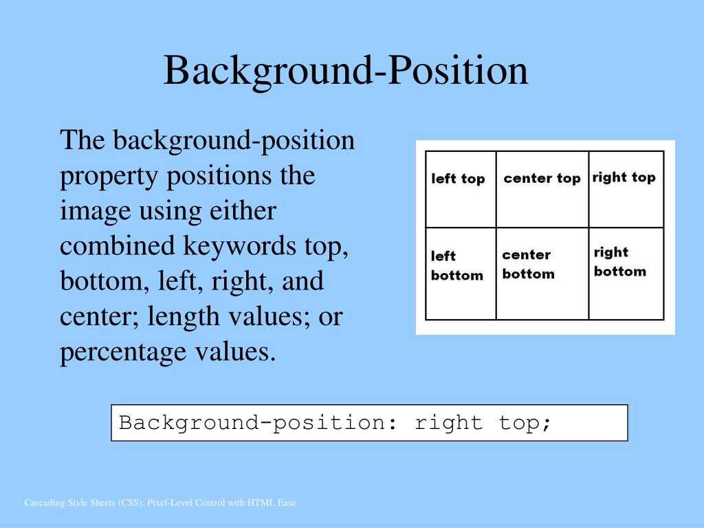
| left | Positions background left side on x-axis. | Demo ❯ |
| right | Positions background right side on x-axis. | Demo ❯ |
| center | Positions background center on x-axis. | Demo ❯ |
| x% | Left side is 0% on x-axis, and right side is 100%. Percentage value refers to width of background positioning area minus width of background image. | Demo ❯ |
| xpos | Horizontal distance from left side. Units can be pixels (0px) or any other CSS units. |
Demo ❯ |
| xpos offset | Two value syntax, only supported in Firefox and Safari. — xpos is set either to «left» or «right». — offset is horizontal distance from background image and «left» or «right» side set with xpos. Units can be pixels or any other CSS units. |
|
| initial | Sets this property to its default value. Read about initial | |
| inherit | Inherits this property from its parent element. Read about inherit |
Using background-origin
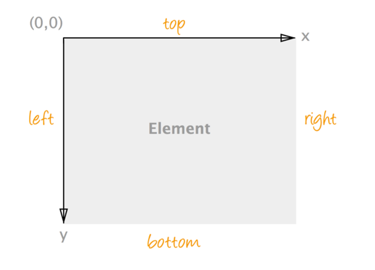
Here is another important property that can be used to alter the position of a background image. This property relies on the box model so let’s get a quick reminder about how that works:
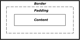
Each element has 3 different boxes inside it: border-box, padding-box, and the content-box. specifies which box we need to consider to do all our previous calculations.
![Css background-position property [with examples]](https://rwvt.ru/wp-content/uploads/6/2/1/6213e817af882a96f9bd921eeacd4f28.jpeg)
Here is a self-explanatory example:
It’s clear that when we don’t have padding is equivalent to , when we don’t have border is equivalent to , and with no padding and no border, all the 3 are equivalent.
It’s important to notice that is affected by this property when used with percentage values.
We also have the property but this one doesn’t affect the calculation. It only affects the visual result by clipping some part of the background.
Changing the reference
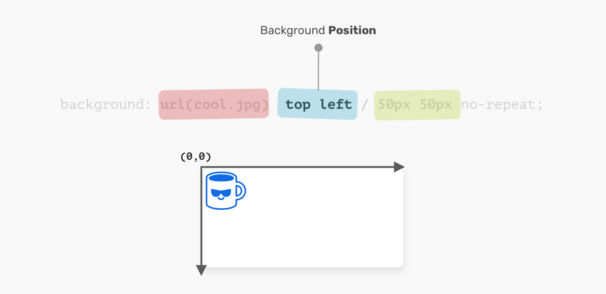
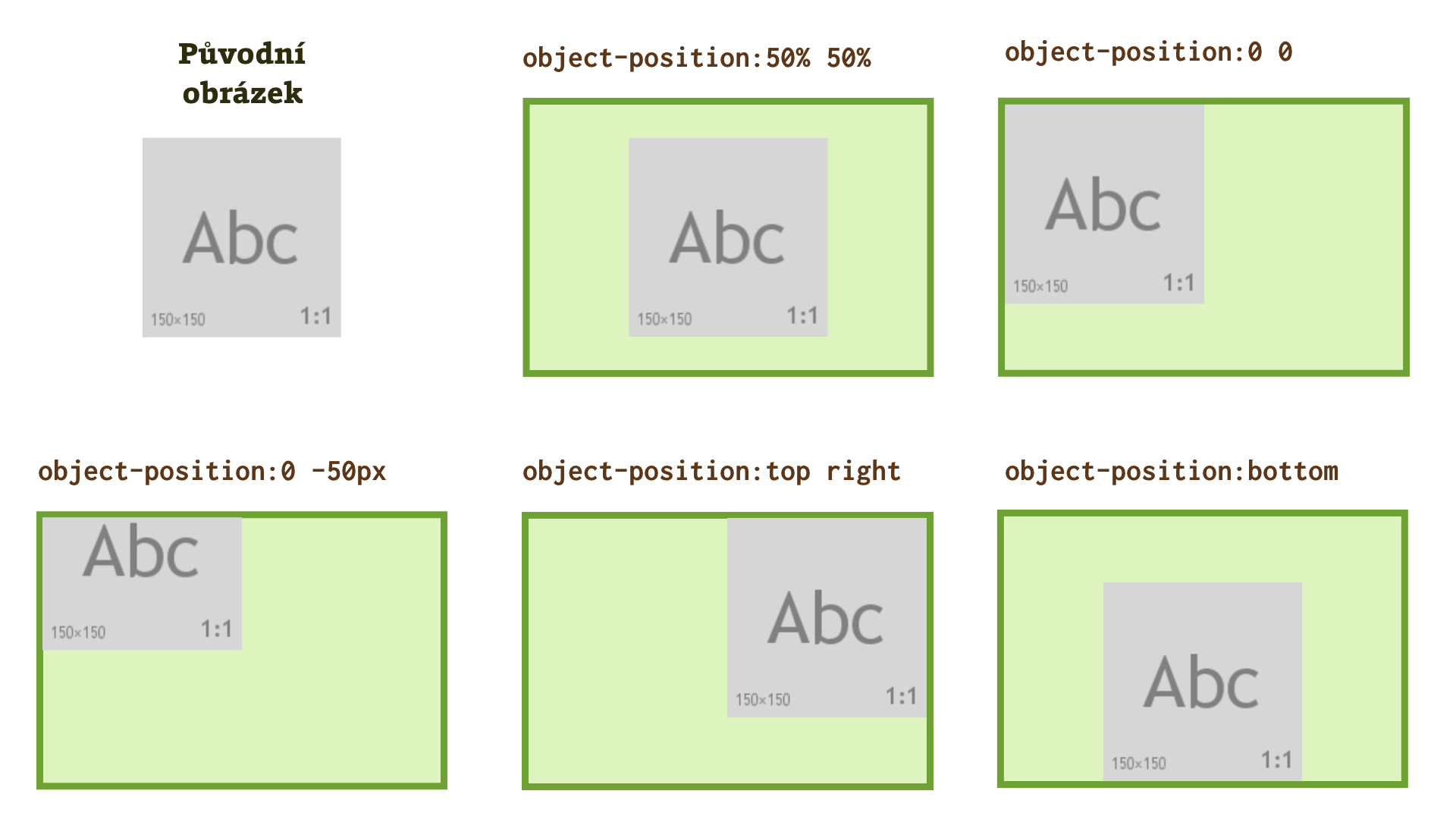
In the above calculations, we always considered the top/left corner of the image and the container to apply our logic either for pixel values or percentage values. This reference can be changed by adding more values to .
By default is equivalent to (position at X from the left and at Y from the top). By adjusting and/or we change the reference and how the image is placed.
Here are some examples:
It’s clear that with the value we can only use and (the horizontal position) while with the value we can only use and (the vertical position). With all the different combinations we logically obtain the 4 different corners.
This feature is also useful to optimize some calculation. In the example of the , we did the first calculation to hide the image on the left and then another one to hide it on the right. If we consider changing the reference we only need to do one calculation. We take the formula used for the left side and we use the same on the right side.
Here is the new version:
For we will no more animate from to BUT it will be from to .
Here is another example using pixel values where we can see how easy is to deal with the calculation when changing the reference:
It would be tricky to achieve the same animation by keeping the same reference.
Another gold rule :if you want to have a symmetrical animation, do your logic on one side and use the same on the other side by changing the reference.
background-repeat
You know those tiled backgrounds? Often this looks ugly but can work well with repeating textures. In this case, we’re just going to use our mountain image so that the tiling is more obvious. Let’s see what happens when we tile an image:
Result: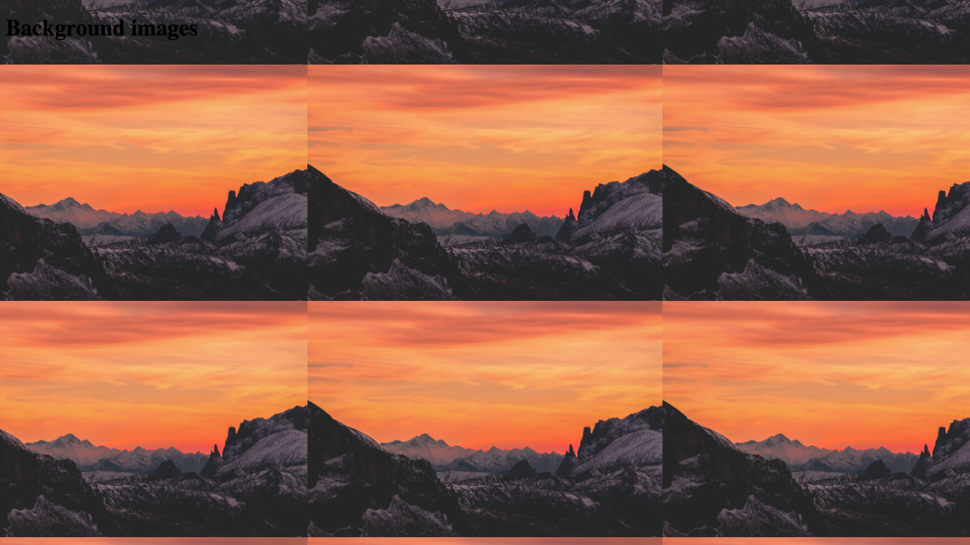
Wait, what? But this is a rip-off! We didn’t even use !
This is because a background has turned on by default. The only reason that it didn’t happen before was that our image was so large that it didn’t need tiling.
The property has two main values: and . It’s as simple as that!
By default is set to , so you will not usually need to use that. However, what if you want to turn off the tiling? Let’s try it out:
Result: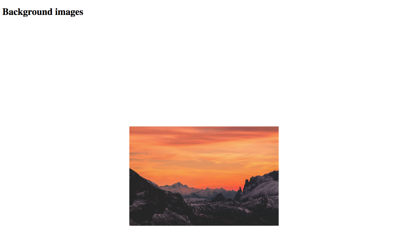 (the reason that the image is near the bottom of the screen is because the body height is 150%, remember?)
There we go! That’s how the property works in CSS!
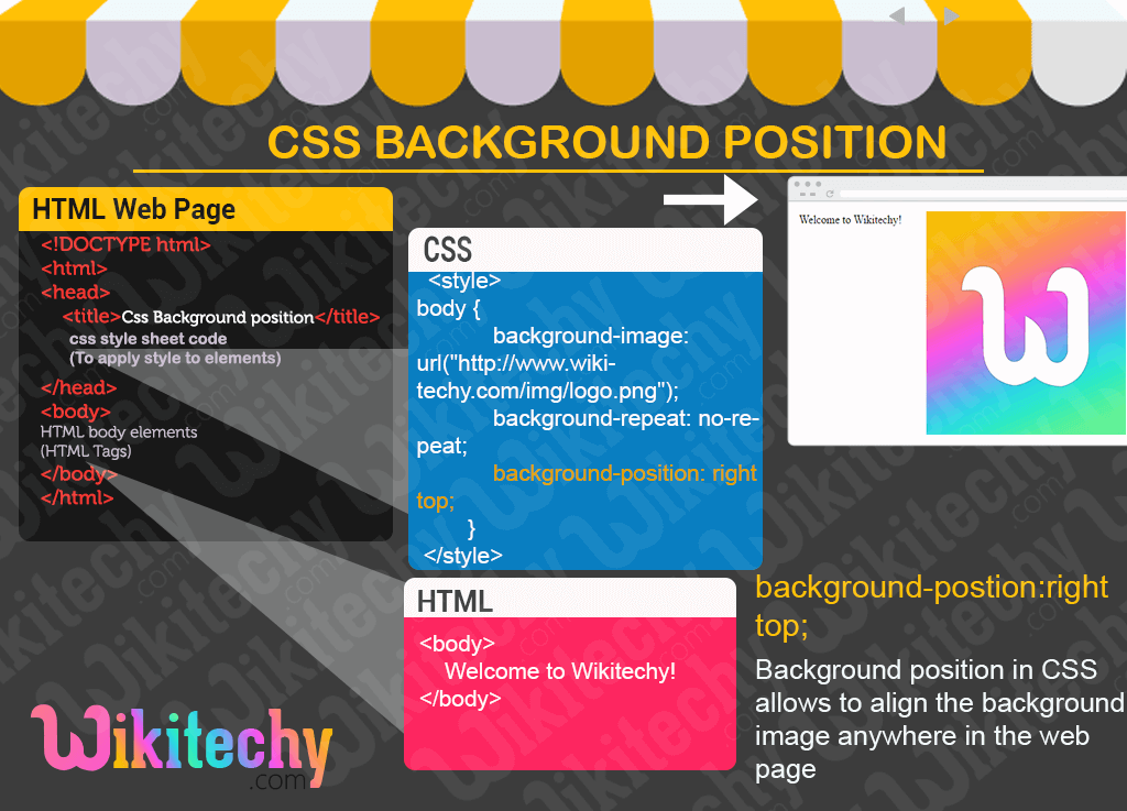
Examples of the CSS Background Position Property
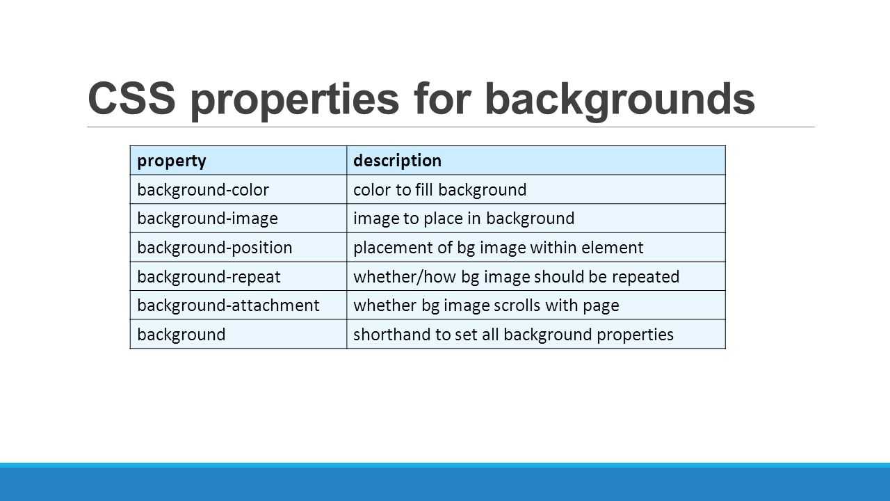
In the examples below, you’ll see the background position property combined with other properties defining the background image, color, position, and more. The background-repeat property, for example, sets if a background image will be repeated and how, while the background-attachment property sets whether a background image is fixed or scrolls with the rest of the page.
These properties can all be spelled out on their own line, or combined in one line using the background shorthand property. The examples below will show both formats as well as different types of CSS selectors.
These examples were created using Code Pen and have a 636 x 365 container. You can click any of the Source links to see the full code snippet behind the example and try your own.
Length Values Example
The example below uses the length value “10px” to position the HubSpot sprocket logo. The assumed second value is therefore 50%. Notice that it also uses an ID selector to target the <body> element with the ID name “length.”
Here’s the HTML:
Here’s the CSS:
Here’s the result:
See the Pen
CSS Background Position Property by HubSpot (@hubspot)
on CodePen.
Percentages Example
The example below uses the percentage values “70% 35%” to position the HubSpot logo. Notice that it also uses a class selector to target the <body> element with the class name “snug.”
Here’s the HTML:
Here’s the CSS:
Here’s the result:
See the Pen
CSS Background Property Percentage Example by HubSpot (@hubspot)
on CodePen.
Keywords Example
The example below uses the keyword values “bottom right” to position the HubSpot logo. Notice that it also uses a type selector to target the <body> element.
Here’s the HTML:
Here’s the CSS:
Here’s the result:
See the Pen
CSS Background Position Property Keyword Example by HubSpot (@hubspot)
on CodePen.
Four-value Syntax Example
The example below uses keyword and percentage values to position the W3Schools.com logo. Notice that it also uses the background shorthand property and an attribute selector to target the <body> element with the title attribute «example.”
Here’s the HTML:
Here’s the CSS:
Here’s the result:
See the Pen
CSS Property Position Four-Value Example by HubSpot (@hubspot)
on CodePen.
background-image – фоновое изображение или градиент
CSS-свойство позволяет в качестве фона устанавливать обычные изображения (например, PNG, SVG, JPG, GIF, WebP) и градиенты. По умолчанию данное свойство имеет значение .
Использовать в качестве фона изображение очень просто. Осуществляется это так:
CSS
Значение позволяет указать путь к файлу изображения, и оно будет отображаться в качестве фона для этого элемента.
Если размеры подключенной картинки меньше размеров области фона, то она по умолчанию будет повторяться бесконечное количество раз по горизонтали и вертикали пока не заполнит весь фон. Изменить это можно с помощью свойства .
В задать изображение можно также через URI данные:
CSS
кроме установки изображений, позволяет также задать линейный, радиальный или конический градиент.
Пример двухцветного линейного градиента, идущего сверху вниз:
CSS
С указанием угла и нескольких цветов:
CSS
Радиальный градиент указывается с помощью :
CSS
Пример конического градиента:
CSS
Кроме этого в CSS имеются повторяющиеся градиенты (, и ), с помощью них можно например, создавать различные узоры.
CSS
В приведенных выше примерах используется только один градиент, но вы можете накладывать несколько градиентов друг на друга. Используя эту технику можно создавать различные узоры, например:
CSS
Repeating background images #
Browser support
- Chrome 1, Supported 1
- Firefox 1, Supported 1
- Edge 12, Supported 12
- Safari 1, Supported 1
By default, background images repeat horizontally and vertically to fill the entire space of the background layer.
Change this by using the property with one of the following values:
- : The image repeats within the space available, cropping as necessary.
- : The image repeats horizontally and vertically to fit as many instances into the space available, without cropping, compressing, or stretching it.
- : The image repeats horizontally and vertically to fit as many instances within the space available without cropping—spacing out instances of the image as needed. Repeating images touch the edges of the space a background layer occupies, with white space evenly distributed between them.
The property allows you to set the behavior for the x and y axis independently. The first parameter sets the horizontal repeat behavior, and the second parameter sets the vertical repeat behavior.
If you use a single value, it will be applied to both the horizontal and vertical repeats.
The shorthand also has convenient one-word options to make your intent clearer.
The value repeats an image only horizontally; this is equivalent to .
The following demo demonstrates these capabilities of the property:
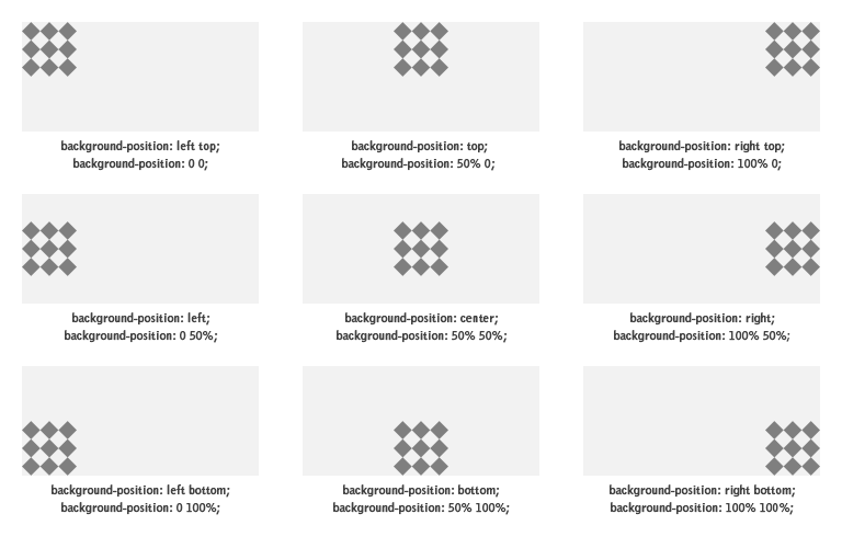
Значения background-position
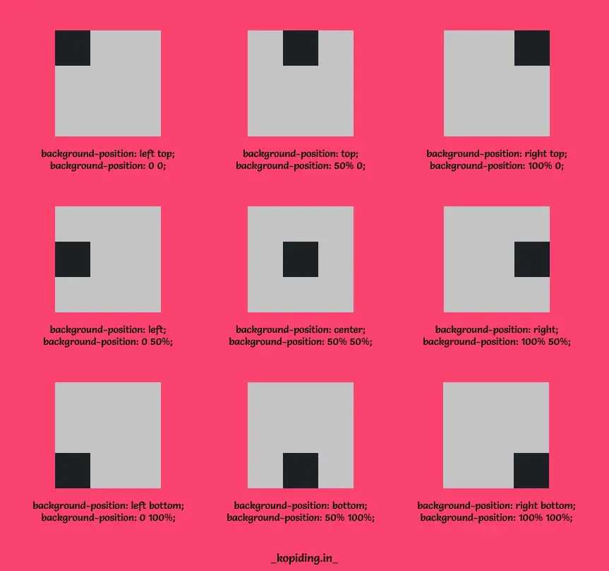
В качестве значений могут выступать как специальные ключевые слова, так и числовые значения в единицах измерения CSS — процентах, пикселях и т. д.
Ключевые слова для горизонтального позиционирования
- — фоновый рисунок прилеплен к левой стороне элемента;
- — фоновый рисунок расположен в центре оси x;
- — фоновый рисунок прилеплен к правой стороне элемента.
div {
	background-position-x: left;
}
Ключевые слова для вертикального позиционирования
- — фоновый рисунок прилеплен к верхней стороне элемента;
- — фоновый рисунок расположен в центре оси y;
- — фоновый рисунок прилеплен к нижней стороне элемента.
div {
	background-position-y: bottom;
}
Сокращенная запись для двух осей
Часто позиционирование фона задается сразу для двух осей. Для этого удобно пользоваться сокращенной записью, т. е. свойством background-position. Оно принимает одно либо два значения (для позиционирования сразу по двум осям либо по каждой отдельно соответственно).
Ниже — различные примеры позиционирования фона с помощью ключевых слов:
background-position: top center; /* фон вверху по центру */
background-position: top right; /* фон в верхнем правом углу */
background-position: bottom left; /* фон в левом нижнем углу */
background-position: center right; /* фон справа по центру */
Значения можно менять местами — они будут работать так же.
Примеры выравнивания фона с помощью background-position
Если вы установили повтор фона с помощью свойства , то будет определять, от какой точки будет начинаться дублирование изображения.
Для позиционирования фона можно использовать и одно значение для двух осей сразу:
background-position: center; /* фон по центру */
background-position: left; /* фон слева по центру */
background-position: right; /* фон справа по центру */
background-position: top; /* фон вверху по центру */
background-position: bottom; /* фон внизу по центру */
Точные значения в единицах измерения CSS
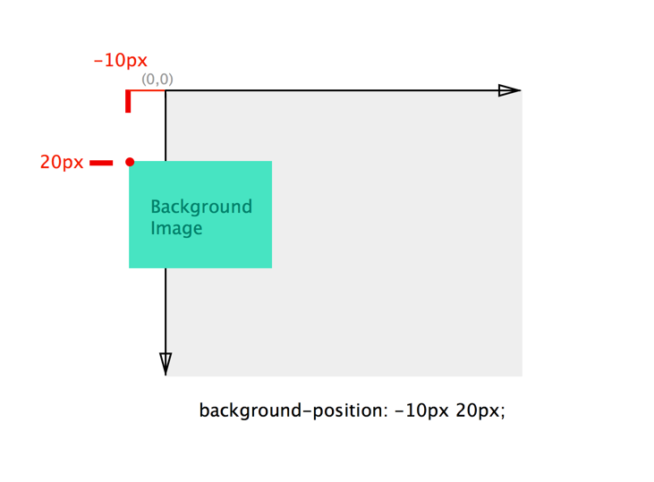
Вы можете управлять расстоянием фона от левого и верхнего краев элемента с помощью точных значений, указанных в единицах измерения CSS (например, в пикселях либо em). Пример:
div {
background-position: 10px 25px;
}
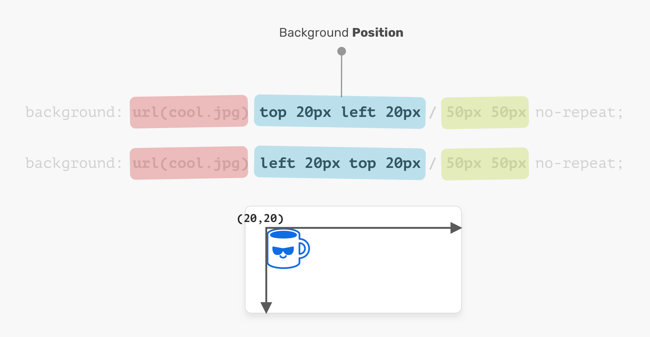
Такая запись означает, что фон удален от левого края на 10 пикселей и от верхнего края на 25 пикселей. Здесь важен порядок записи значений: первое значение отвечает за положение фонового рисунка по горизонтали, второе — по вертикали. Допустимы и отрицательные значения (например, они могут быть полезны в случае, если с левой или верхней стороны фоновой картинки есть область, которую необходимо спрятать).
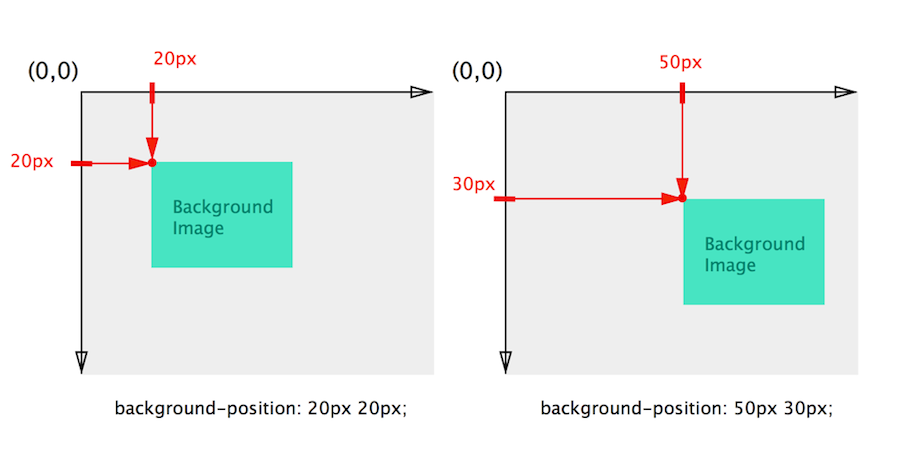

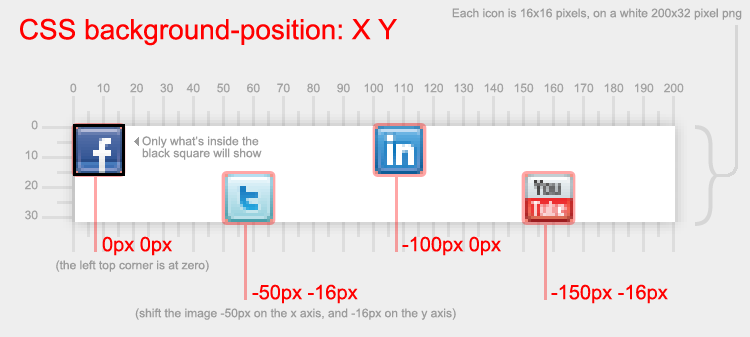
Регулировать расстояние фона, отталкиваясь от правой или нижней стороны элемента, можно с помощью специального значения, которое записывается так:
div {
background-position: right 15px bottom 40px;
}
Здесь ключевые слова и говорят браузеру, что вы хотите делать отсчет от правой и нижней стороны. Следом за каждым из ключевых слов записывается желаемое значение. Так, — это расстояние между фоном и правой стороной элемента, а — расстояние между фоном и нижней стороной элемента.
Процентные значения
Большое удобство предоставляет возможность записи значений в процентах. Расстояние вычисляется, исходя из размеров элемента с заданным фоном. Допустимы отрицательные процентные значения, но результат здесь может быть неожиданным.
Лучший способ понять, как перемещается фон под управлением процентных значений — это попрактиковаться. А пока что покажем несколько примеров позиционирования фона через проценты:
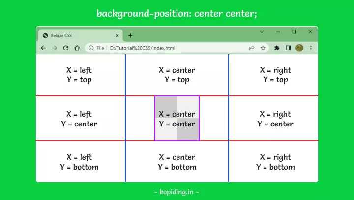
Обратите внимание: значение идеально центрирует фоновое изображение (как по вертикали, так и по горизонтали), поскольку точка центра устанавливается в середине фона, а не в его начале или конце
Комбинирование значений
Да, вы можете записывать для каждой из осей свое значение в необходимых единицах измерения (либо используя ключевое слово). Комбинируйте точные значения с относительными, ключевые слова со значениями в единицах измерения — полная свобода действий. Примеры:
Relation between pixel and percentage values
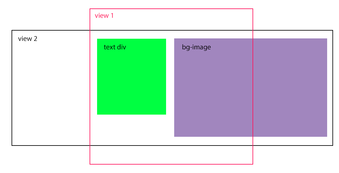
Let’s define a way to calculate percentage values based on pixel values, or vice versa (i.e. the formula to convert between both). To do this we simply need to consider the reference points.
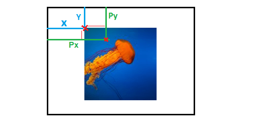
When using pixel values, we will consider the blue lines and we will have .
When using percentage values, we will consider the green lines and we will have .
The formula will be as follow: where is the width of the image and is the width of the container (same formula for the Y-axis considering height).
We will have . From this formula we can validate the gold rules explained previously:
- When , the formula is no longer valid, which confirms that percentage values have no effect when the size of the image is the same as the container; thus there is no relation between pixel and percentage values.
-
and will have the same sign when and will have the opposite sign when . This confirms that percentage values behave differently depending on the size of the image.
We can also express the formula differently if we consider percentage values of . We will have .
Here is an animation to illustrate the above calculation:
Syntax
/* Keyword values */
background-position-x: left;
background-position-x: center;
background-position-x: right;

/* <percentage> values */
background-position-x: 25%;

/* <length> values */
background-position-x: 0px;
background-position-x: 1cm;
background-position-x: 8em;

/* Side-relative values */
background-position-x: right 3px;
background-position-x: left 25%;

/* Multiple values */
background-position-x: 0px, center;

/* Global values */
background-position-x: inherit;
background-position-x: initial;
background-position-x: unset;
The property is specified as one or more values, separated by commas.
Values
- Aligns the left edge of the background image with the left edge of the background position layer.
- Aligns the center of the background image with the center of the background position layer.
- Aligns the right edge of the background image with the right edge of the background position layer.
- The offset of the given background image’s left vertical edge from the background position layer’s left vertical edge. (Some browsers allow assigning the right edge for offset).
- The offset of the given background image’s horizontal position relative to the container. A value of 0% means that the left edge of the background image is aligned with the left edge of the container, and a value of 100% means that the right edge of the background image is aligned with the right edge of the container, thus a value of 50% horizontally centers the background image.