

Пример использования
<!DOCTYPE html>
<html>
<head>
<title>Пример изменения курсора в CSS</title>
<style>
.hidden {
visibility : hidden; /* скрываем блок (место под него остается) */
width : 125px; /* устанавливаем ширину невидимого блока */
text-align : center; /* выравниваем текст по центру */
}
.button {
visibility : visible; /* внутри скрытого блока элемент будет отображаться */
border : 1px solid orange; /* сплошная граница оранжевого цвета размером в 1 пиксель */
}
.hidden:hover {
visibility : visible; /* при наведении мышкой скрытый блок будет отображен */
cursor : wait; /*  при наведении курсор примет вид "программа занята" */
}
</style>
</head>
<body>
	<div class = "hidden">Пожалуйста, подождите...
		<div class = "button">Наведи на меня.</div>
	</div>
</body>
</html>
Результат примера:
Открыть пример в новом окнеCSS свойства
Cursor Ideas
If you’re feeling inspired by the examples above, then you want to implement cursor effects on your own site. Below are ideas sourced from CodePen so you can easily copy and paste the code.
1. Shadow Cursor
See the Pen Animated cursor with Kinet by Georgy Marchuk (@gmrchk) on CodePen.
In the example above, the default mouse pointer has a blue shadow. It trails the pointer as it moves, then wobbles back into place when the pointer stills.
What we like: This colorful cursor helps users easily locate where they are on a black and white website.
2. Animated Icon Cursor on Hover
See the Pen Animated cursor on :hover by Nharox (@Nharox) on CodePen.
Above, you’ll see the default mouse pointer of your OS — unless you’re hovering over one of the colorful blocks. Then the cursor becomes animated, starting as an “X” icon and rotating until it’s a white plus icon in a circle.
What we like: This cursor subtly differentiates clickable elements from the background of the web page.
3. Trailing Cursor
See the Pen React Animated Custom Cursor by Stephen Scaff (@StephenScaff) on CodePen.
This cursor combines the purposes of the two examples above. The red dot cursor is trailed by a semi-transparent dot when moving. However, it turns into an after shadow when the cursor lands on a link.
What we like: This cursor makes the scrolling experience more engaging and differentiates links from text.
4. Cursor with Spinning Text
See the Pen Animated Cursor Interaction by Sikriti Dakua (@dev_loop) on CodePen.
In the Pen above, you’ll see a cursor made up of two circles. When hovering over one of the elements, the second circle will transform into text. For example, if hovering over the YouTube icon, the circle cursor will be surrounded by spinning text that says “YouTube.” If hovering over the link, the spinning text will say “Go here!”
What we like: This cursor helps provide additional context to users so they know exactly what they’re hovering over and can either click away from the page confidently, or keep scrolling.
5. Expanding Cursor on Hover
See the Pen Animated Cursor + link hover effect by roeslein (@roesinn) on CodePen.
In the Pen above, the cursor begins as a white circle. When hovering over one of the words, the white circle expands. The cursor becomes a hand pointer with a white shadow. Against the black background of the web page, the cursor looks like it’s a spotlight.
What we like: This cursor effect makes the text representing different navigation options the focal point on hover.
If you want to know how to code this type of animated cursor from scratch, check out this video by CodeGrid:
How to Make an Animated Cursor
You have two options for making an animated cursor. You can use an editor like IcoFX to make an animated cursor for your operating system, or code one from scratch and embed it on your website. The latter requires HTML, CSS, and JavaScript and is best for experienced developers.
For users with less technical experience, let’s walk through how to create an animated cursor with the IcoFX editor.
How to Make an Animated Cursor with IcoFX
The IcoFX allows you to create a custom cursor or customize one of their preloaded animated cursors. Below we’ll outline the process for creating a custom cursor.
1. Open the IcoFX Editor and select the «File/New/New Cursor…» menu item to open a New Cursor dialog.
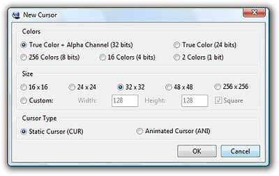
2. Then select the color and size of the cursor you want to create, and select the Animated Cursor radio button. Click OK.
3. Use the «Image/Add new Image» menu item to insert multiple frames to make your cursor animated.
4. You can change the order of frames, delete them, or duplicate them as needed.
5. Use the «Image/Animation/Frame Rate…» menu item to change the frame rate.
6. Use the «Image/Cursor/Hot Spot…» menu item to set the hot spot of your cursor.

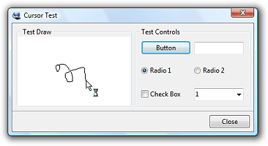
7. Use the «Image/Cursor/Test Cursor…» menu item to test it.
8. When you’re ready, use the «File/Save…» menu item to save it.
How to Make an Animated Cursor with CSS and JavaScript
If you’d prefer to build one from scratch, here’s a video by Dev Ed that walks through how to create an animated cursor with CSS and JavaScript:
https://youtube.com/watch?v=TpwpAYi-p2w
More Event Listeners
To make the webpage more interesting, let’s add more functionality to the cursor:
Mouseup and Mousedown
In the file, we will utilise the and event types which will listen for when the mouse button is being pushed.
Enter fullscreen modeExit fullscreen mode
For the effect to work on only the left mouse is clicked, we use the property to select what part of the mouse will be used. Check the documentation for more info on the property.
Then, head over to the to add the styling for this new effect:
Enter fullscreen modeExit fullscreen mode
This is the resulting effect

Mouseover and Mouseleave
In the app.js file, to get all the social media links from the DOM, use a querySelectorAll on the parent element of the links:
Enter fullscreen modeExit fullscreen mode
Now, using the ES6 syntax, the method to listen for events on each link:
Enter fullscreen modeExit fullscreen mode
In the code above,
- We’re listening for a event on each of the .
- We’re adding a class of to the in Javascript, and later set it up in SCSS
- We’re adding a class of to the to change the appearance of the individual links when the cursor hovers over them.
The styling for the new classes:
Enter fullscreen modeExit fullscreen mode
This means that when the cursor hovers over any of the ,
- the will expand/scale to 1.5 times its original size.
- The will change the text colour of the links.
This is the result we have

The scaling works alright, but there are a few things you’ll notice:
- The still remains active even though the links were no longer being hovered on.
- The cursor is no longer centred.
- The link does not turn white. Did the class not work?
- The link goes under the mouse.
These were the challenges I discovered while working on it, and you may experience them as well; here’s how I dealt with them.
To solve issue #1
This is where we introduce the event which is fired when the cursor moves out of the target element.
Still in the block, add the following code:
Enter fullscreen modeExit fullscreen mode
Basically, we just remove the and when the mouse moves out of the .
To solve issue #2
The problem here is that the does not scale as it should.
We’ll experiment with the property here:
Enter fullscreen modeExit fullscreen mode
This defines the point around which a transformation is applied. In this case, we set it to on the left and right, and on the top and bottom.


Check out MDN to learn more about this property.
Here’s what we get after solving issues 1 and 2
To solve issue #3
The does work, but if we take a look using Chrome Dev Tools, the actual source of the problem is that the link’s colour takes precedence over this new class.
To fix this, we can use the property, and it will work. But using this property isn’t advisable to use because it generally breaks the natural cascading of stylesheets. It should be used sparingly.
A better option is to be more specific with the styling by using
Enter fullscreen modeExit fullscreen mode
To learn more about specificity and the property here.
To solve issue #4
If you recall, we gave our cursors a of so that they would be on top of every element on the page, including the links.
So here’s a quick fix:
Final Result

Awesome! We were able to resolve the issues we were having. We’re also done adding the custom cursor, and we have explored several interactions using the mouse event listeners.
Правильное использование курсора
Правильное использование курсора или мыши важно для комфортной работы за компьютером. Для этого рекомендуется соблюдать следующие правила:
- Используйте правую руку для управления мышью, а левую – для управления клавиатурой.
- Размещайте мышь на удобной для руки поверхности, чтобы избежать напряжения в руках и плечах.
- Старайтесь двигать мышь ровно и без рывков, чтобы избежать непреднамеренных действий.
- Постарайтесь использовать короткие движения мыши, а не двигать ее по всей рабочей области экрана.
- Следите за положением курсора и мыши, чтобы избежать случайных нажатий.
Соблюдение этих правил поможет вам работать за компьютером без напряжения и усталости, что способствует повышению производительности и улучшению качества работы. Кроме того, регулярное упражнение рук и запястий поможет укрепить мышцы и снизить риск разработки мышечных спазмов. Если вы чувствуете боль в руках или запястьях во время работы за компьютером, стоит обратиться к специалисту для получения рекомендаций по улучшению рабочей организации.
Cursor Editor Help
Table of contents
- Drawing a cursor — about pencil, eraser, line, etc.
- Blending mode — mixing drawn and previous pixels.
- Setting cursor hot spot — the «clicking-point» of a cursor.
- Selecting a color — pick color to draw with.
- Downloading a cursor — get the result of your work.
- Using templates — start making a new cursor.
- Applying effects — about colorize and drop shadow.
- Using cursor on your computer — changing mouse pointers.
Drawing tools
| Activate pencil by clicking on it. Then press and hold the mouse button on the canvas, move the mouse and release the button. | |
| Eraser works similarly as pencil, but instead of drawing, it erases the pixels. | |
| Lines, rectangles and ellipses are drawn by pressing mouse button in one corner of the shape and releasing it in the opposite corner. | |
| Press mouse button to change color of all adjacent pixels to the active color. |
Hot spot
Each mouse cursor has one special pixel (called hot spot) that controls the actual position of a click. For arrows, it is usually the upper left corner, for a sniper scope-like cursor, it may be in the center.
| Select the «Hot spot» tool and then click on a pixel. The clicked pixel becomes hot spot. Look at the preview in the lower left corner — the hot spot pixel is always in the center of the cross. |
Blending mode
If the opacity of the currently selected color is less than 100%, the blending mode controls whether pixels are replaced or drawn over the previous content.
| In «blend» mode, the pixels are painted over the previous content. | |
| «Replace» mode removes previous color and opacity of a pixel and uses the currently selected one. |
Downloading
Before you can use a cursor on your computer, you need to download it.
| Fill in a name for your cursor and then click the «Download» button in the lower area of the window. |
Important: When your browser asks you what to do with the file, do NOT try to open it. Instead, SAVE it to a folder of your choice. Only then you can make it your cursor.
Selecting color
Many of the drawing tools and effects are making use of the current color and opacity. You can select color and opacity by clicking in the color areas by the right side of the window.
Select hue by clicking in the top bar, select saturation and brightness in the middle square. Opacity (alpha) can be selected using the lower bar.
| The «Dropper» tool can be used to make color of a pixel on a canvas active. Click the tool and then the pixel. Previously active tool is re-activated automatically. |
Using templates
You can quickly delete all pixels or initialize the canvas with one of the common arrows.
Click on an image (or the empty space) in the «Templates» panel. It may take a second or more depending on your computer and internet browser (Internet Explorer is extremely slow).
Applying effects
There is a couple of effects that can be applied by clicking on them in the top toolbar. It may take a second or more depending on your computer and internet browser (Internet Explorer is extremely slow).
| Re-color all pixel using currently selected hue and saturation. | |
| Add a dark shadow around the drawn pixels. Repeat for more intense shadow. |
Setting the scene and creating our elements
Create a cursor-wrapper div with the following parameters:
- Display: flex
- Align: center
- Justify: center
- Position: fixed
- Alignment full
- Z-index: 100 (this has to be the highest number on your site)
This div will contain our always-on-top cursor. We centered the cursor’s children to create the interaction that follows the pointer device.
Now we’ll create the actual cursor object. Since we’re going to create a slightly complex cursor, the object will consist of two elements: an inner dot and an outer circle.
The inner dot is a div with these parameters:
- Width and height: 10px
- A bright color: I used #f07
- Border-radius: 50% for the perfect roundness
The outer circle is a div with these parameters:
- Width and height: 40px
- Position: absolute (do not align it in any way or the centering will be off)
- Border-radius: 50%
- Borders: solid 2px line with the color of #f07 (we may make it transparent so that it doesn’t get in the way too much)
Voila! Your beautiful cursor is ready to be used!
Hiding the default cursor
We can hide the default cursor with the following simple CSS:
But what about devices that don’t have a cursor, like touch screens? To accommodate for that, we’ll only hide the cursor on devices that have a pointing device which is also accurate (mouse, trackpad, etc.). We can do this with the CSS pointer media feature. This media query has one of three values:
-
none – the device doesn’t have a pointing device.
-
coarse – the device has a pointing device of limited accuracy (things like gaming consoles or cars with which you can access the internet).
-
fine – the device has an accurate pointing device, like a mouse or a trackpad.
We only want to show our cursor on devices with an accurate pointing device, meaning that we’ll only hide the default cursor on those devices.
But at the same time, we also need to hide our new cursor at those other devices. That’s why I prefer to do this:
And here we have our fully working custom cursor!
Why are the Codepen banners not working?
If you’re viewing this page on a mobile device, the cursor will not be visible in the Codepen embed, because the Codepen acts like your browser. Thus, if you view this on a touch device, you should not see the cursor because it would be a redundant element without function.

![15 animated cursor effects & ideas for your website [+ how to make one]](https://rwvt.ru/wp-content/uploads/8/e/e/8eeb79a593f5c18929672e263ddb3a07.jpeg)
Adding hover effects
Now that we have a fully functioning cursor, we can start to add hover effects.
First, we’ll register two functions. The first function adds a certain class to the variable. The second one removes the class. Now, what we’re doing is basically adding an to every link and to every item on the page that need to be hovered.
As you see, we’ll select every link (every ). Then we’ll add two s. One listens to the moment that the cursor moves over the element (‘). The other listens to the moment that the mouse leaves the element (), just like we did with the element.
These simple CSS styles result in the following great effect:
Adding hover effects to clickable elements that are not <a>
The above example works great for elements. But on most websites, there will also be elements clickable that are not an . Think of elements and submit buttons in forms. Or an other element to open the mobile menu. To add the hover effect to them is really easy too.
For each (sort of) element you want the hover effect to appear on, add the following lines. You only need to change the parameter of the . You can just use normal CSS selectors. Repeat for each element you want the hover effect for.
Check out the below demo webpage, featuring the four sorts of elements I mentioned (, , & ).
Examples of CSS cursor effects
Now that you have the framework for creating custom cursors, you can creating different variants on the cursor. For example changing the colors, the opacity, adding a border, etc. Below I created a few variants of the cursor.
Cursor with border
A custom cursor like this gives a website a whole new look and feel. I’ve used it on several websites and it’s a great way to enhance a site. Let me know if you have used this on a website!
copied = false, 3000)»>
Copy share link
Link copied!
How to change a mouse cursor to a pointer
Say you have a table and you’d like for the mouse cursor to change to a pointer (i.e, the hand icon) whenever a user hovers over a row in the table. You can achieve this using the CSS property.
Here’s an example:
<style>
  /* Style the table */
  table {
    font-family: arial, sans-serif;
    border-collapse: collapse;
    width: 100%;
  }

  /* Style the table cells */
  td, th {
    border: 1px solid #dddddd;
    text-align: left;
    padding: 8px;
  }

  /* Style the table rows */
  tr:hover {
    cursor: pointer;
  }
</style>

<table>
  <tr>
    <th>Name</th>
    <th>Age</th>
    <th>City</th>
  </tr>
  <tr>
    <td>John</td>
    <td>30</td>
    <td>New York</td>
  </tr>
  <tr>
    <td>Jane</td>
    <td>25</td>
    <td>Chicago</td>
  </tr>
  <tr>
    <td>Bill</td>
    <td>35</td>
    <td>Los Angeles</td>
  </tr>
</table>
In the above code, we use the selector to apply the property to all table rows when the mouse hovers over them. The property is set to , which changes the mouse cursor to a hand icon.
Пример применения курсора
Пояснения
В данном примере объявлен счетчик , по умолчанию проинициализированный 0, курсор , перебирающий значение столбца из таблицы . Далее в бесконечном цикле (так как мы не имеет возможности написать условие выхода из цикла):
- определяем переменную , в которой будем хранить имя студента
- достаем следующую запись в эту переменную (напоминание: по умолчанию — это )
- проверяем, если текущее имя имя соответствует выделенному имени , то увеличиваем счетчик.
Повторяем данные операции до тех пор, пока у нас не случится , при возникновении которого в обработчике обновим данные статистики и (по определению обработчика в sql) выйдем из блока, в котором был объявлен — то есть в данном случае выйдем из блока процедуры.
Обработчик может быть только один. Если бы у нас было несколько курсоров, и мы бы захотели знать в обработчике, в каком из курсоров закончились данные, то предварительно вели бы записи в переменные, из каких курсоров планируем достать данные. И в обработчике проверили бы значение переменных.
Данные пример написан исключительно для демонстрации работы с курсорами. В реальной жизни подобное поведение может быть достигнут проще с использованием и .
Примечания
Некоторые базы данных позволяют проверить, есть ли в курсоре еще данные. В этих случаях пишется цикл с вызовом метода проверки. Однако стандартом наличие этой проверки не предусмотрено.
Особенности курсоров
Курсоры, описанные в данной статье, являются внутренними. Они существуют внутри базы данных, используются, в том числе для взаимодействия между различными частями базы данных при планировании.
Внешние курсоры
Результат запроса к базе данных может быть слишком велик и стать виной нехватки памяти как на стороне клиента, так и на стороны сервера, увеличить нагрузку на сеть, вызывать и другие проблемы. Поэтому наружу данные выдаются в виде внешнего курсора. После исполнения команды select выдается внешний курсор на данные, аналогично внешний курсор выдается при возврате результата из хранимой процедуры.
Размер выборки
Может быть указан для внешнего курсора каким-либо образом (в количестве записей или в объеме данных, который выдается за один раз).
При выдаче курсора приходит метаинформация о курсоре и первая порция данных, размер которой мы указали. Для получения последующих порций данных необходимо обращаться к серверу, что будет медленнее, чем получение первой порции. В конце сервер сообщит о том, что данные закончились, автоматически освободит ресурсы.
Возникают альтернативы:
- Малый размер выборки — много повторных обращений к серверу базы данных, а так как обычно такое обращение происходит по сети, то взаимодействие не слишком быстрое.
- Большой размер выборки — требуется много памяти, как со стороны сервера для генерации данных, так и со стороны прикладного приложения.
Выдача курсора приводит к расходу ресурсов сервера (память, возможно дисковая память, блокировки и так далее). Поэтому внешний курсор стоит закрыть как можно раньше.
Однако чтобы не получить слишком много данных по запросу, они выдаются в виде внешнего курсора.
How to Customize a Mouse Cursor with CSS
Customizing a mouse cursor with CSS is pretty simple, as CSS already has a property to handle this. All we need to do is identify this property and use it.
As Frontend Engineers we use this property often – it is none other than the almighty property. Yes, that property is what gives us the power to make a custom cursor of our choice.
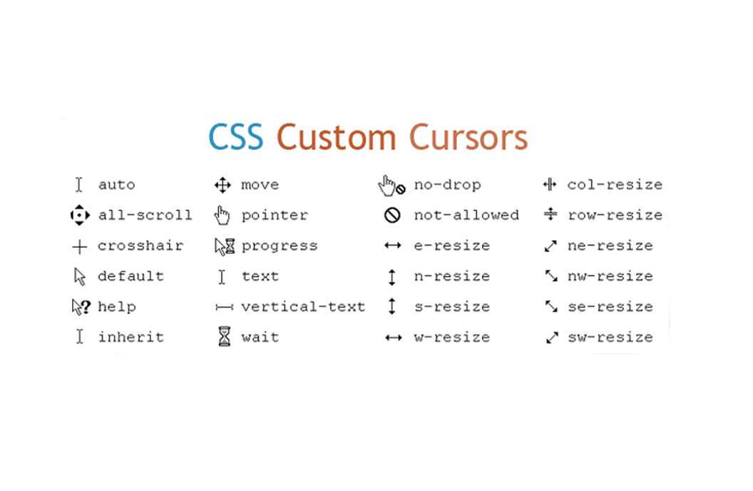
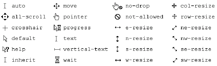
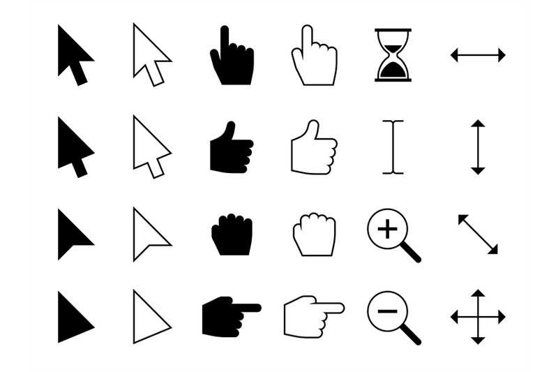
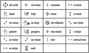
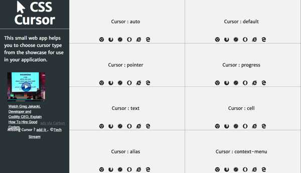
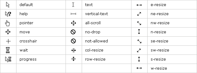
Before we go to a practical example, let’s look at the values associated with the CSS property. While most developers just use a few important ones, there are more we should look at.
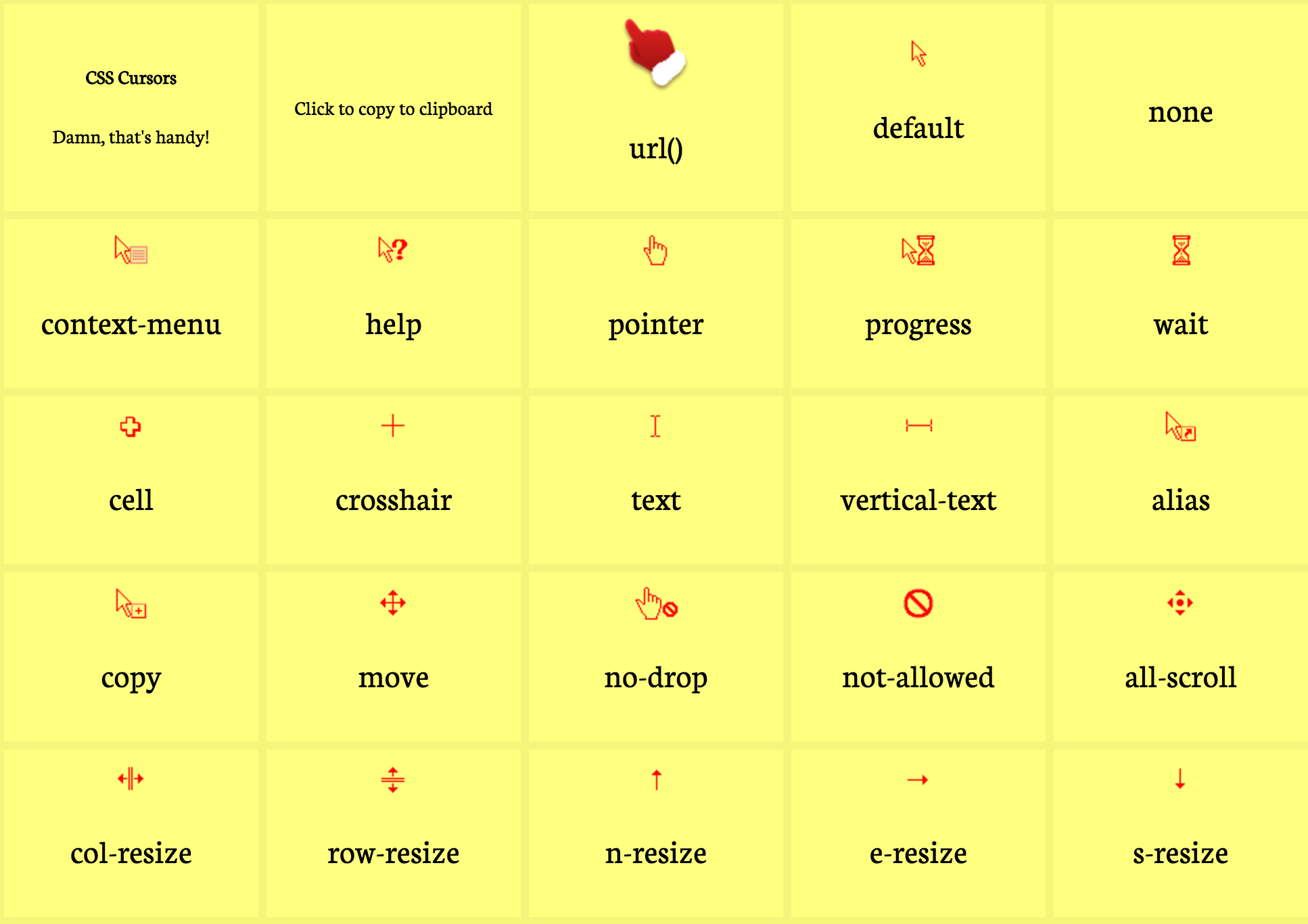
A visual representation of all the CSS cursors.
From the above code snippet and from the results, you can see and test out different mouse cursors that CSS has by hovering your mouse cursor on each of those boxes containing the name of each CSS property value.
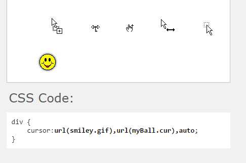
Now how do I use CSS to customize a mouse cursor? To use this, you just have to tell CSS what image you intend to use and point the cursor property to the image URL using the value.
From the code snippet above, you can see I set this on the document body, so it can apply to the cursor no matter where it moves. It has the image specified in .
The next value of the property is a fallback, just in case the image doesn’t load or can not be found maybe due to some internal glitches. I’m sure you wouldn’t want your website to be «cursor-less», so adding a fallback is very important. You can also add as many fallback URLs as you can or want.
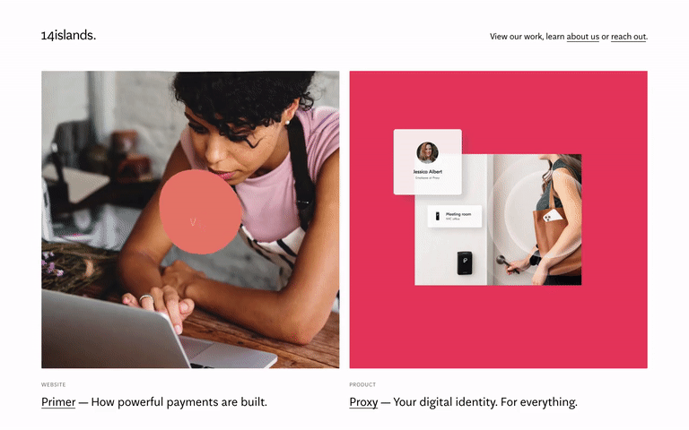
You can also customize the cursor on a particular element or section of your webpage. Below is a CodePen example:
Using different customized cursor on different element on a webpage.
That is all there is to customizing cursors in CSS. Now let’s see how we can do this is JavaScript.
UX and browser compatibility when creating a custom cursor
When creating a custom cursor, you should always keep the user’s best interests in mind. One way to do this is by creating a cursor that best represents or translates the essence of an element.
While custom cursors give your website a nice touch and a unique feel, it is important to not overdo it. Overcustomizing your cursor can frustrate and confuse your users by complicating their experience on your website.
Before you decide to create a custom cursor, you should consider its functionality. For example, will a custom cursor’s features work well on an old browser?
Note that some older browsers do not have the capability to support a lot of new CSS and JavaScript features. If you design certain areas of your website around a custom cursor that uses technologies beyond your users’ browsers, they won’t be able to engage with your website.


Объявление курсора
Чувствительность курсора
Данные из курсора обрабатываются по одной строке (способа получить более одной строки за один раз нет). Мы напишем цикл, в рамках которого будут выбираться данные из курсора, и возможно будут меняться данные в нашей базе данных. Получаем, что во время таких итераций можно поменять данные самой таблицы, по которой построен текущий курсор. Представим ситуацию, что мы в сделанном курсоре в явной форме написали update на ту таблицу или таблицы, по которым сделан курсор. Что должно произойти в таком случае? В зависимости от желаемого поведения можно выбрать разную чувствительность курсора.
- — курсор, чувствительный к изменениям. Измененные данные можно будет увидеть в курсоре, если эти данные еще не были пройдены. Иначе, если изменённые данные были просмотрены в прошлом и у нас не scrollable курсор, то они не обновятся. В некотором смысле это итерация по реальным данным, динамическая.
- — курсор фиксированных данных. Данные зафиксированы на момент открытия курсора. Никакие изменения данных не будут отображены через курсор. В некотором смысле это итерация по временной копии таблицы.
- — курсор, наиболее предпочтительный для данной СУБД. Связано с различными способами реализациями СУБД: для одних легче реализуем sensitive cursor, а для других — insensitive. Существует два подхода к реализации СУБД: snapshot-based и lock-based, для них либо sensitive, либо insensitive варианты предпочтительны. Ни одна из опций не является дешевой по умолчанию, поэтому и есть значение asensitive: сама СУБД будет решать, какую чувствительность курсора использовать. Для lock-based проще сделать курсор, чувствительный к изменениям, так как для insensitive потребовалось бы дополнительное копирование. Для snapshot-based предпочтительнее insensitive, так как не потребуется специальным образом учитывать обновления.
Если данные во время использования курсора меняться не будут, то чувствительность курсора не важна.
- — по такому курсору можно ходить только по одной записи вперед, как из обычного итератора в Java.
- — по такому курсору можно ходить не только по одной записи вперед, но и вперед, назад, в начало или конец. Такой курсор больше похож на итератор из языка С++.
Примеры
Взятие курсора на чтение для всех студентов, упорядоченных по идентификатору:
Взятие курсора с правом на изменение поля SName для студентов группы M3439 в произвольном порядке: