Attributes
| Attribute | Value | Description |
|---|---|---|
| autofocus | autofocus | Specifies that a button should automatically get focus when the page loads |
| disabled | disabled | Specifies that a button should be disabled |
| form | form_id | Specifies which form the button belongs to |
| formaction | URL | Specifies where to send the form-data when a form is submitted. Only for type=»submit» |
| formenctype | application/x-www-form-urlencoded multipart/form-data text/plain |
Specifies how form-data should be encoded before sending it to a server. Only for type=»submit» |
| formmethod | getpost | Specifies how to send the form-data (which HTTP method to use). Only for type=»submit» |
| formnovalidate | formnovalidate | Specifies that the form-data should not be validated on submission. Only for type=»submit» |
| formtarget | _blank _self _parent _topframename |
Specifies where to display the response after submitting the form. Only for type=»submit» |
| name | name | Specifies a name for the button |
| type | button reset submit |
Specifies the type of button |
| value | text | Specifies an initial value for the button |
Attributes
This element’s attributes include global attributes.
| Attributes | Description |
|---|---|
| autofocus (HTML5 Boolean attribute) | Specifies that the button should have input focus when the page loads. Only one element can have this attribute. Value «autofocus» |
| disabled (Boolean attribute) | It cannot be pressed or focused. Value «disabled» |
| form (HTML5) | Specifies which form the button belongs to. Value «form_id» |
| formaction | Specifies where to send the form-data when a form is submitted. Only for type=»submit». Value «URL». |
| formenctype (HTML5) | If the button is a submit button, (associated with a <form> and doesn’t have type=»button»), specifies how to encode the form data that is submitted. Value «application/x-www-form-urlencoded», «multipart/form-data». |
| formmethod (HTML5) | Specifies how to send the form-data (which HTTP method to use). Only for type=»submit». Value «get, post». |
| formnovalidate (HTML5) | This attribute is also available on <input type=»image»> and <input type=»submit»> elements. Value «formnovalidate» |
| formtarget (HTML5) | Where to display the response from submitting the form. Value «_blank», «_self», «_parent», «_top», «framename». |
| name | Specifies a name for the button. Value «name» |
| type | Specifies a type for the button. Value «button, reset, submit» |
| value | Specifies an initial value for the button. Value «text» |
That is the basic tutorial about the HTML Button Elements. If you want to try the demo of the example, You can find the full source code of these examples on our GitHub.
Thanks!
HTML Справочник
HTML по алфавитуHTML по категориямHTML Поддержка браузераHTML АтрибутыHTML Глобальные атрибутыHTML СобытияHTML ЦветаHTML CanvasHTML Аудио/видеоHTML Наборы символовHTML Типы документовHTML URL КодировкаHTML Коды языкаHTML Коды странHTTP СообщенияHTTP МетодыКонвертер PX в EMКомбинации клавиш
HTML Теги
<!—Комментарий—>
<!DOCTYPE>
<a>
<abbr>
<acronym>
<address>
<applet>
<area>
<article>
<aside>
<audio>
<b>
<base>
<basefont>
<bdi>
<bdo>
<big>
<blockquote>
<body>
<br>
<button>
<canvas>
<caption>
<center>
<cite>
<code>
<col>
<colgroup>
<data>
<datalist>
<dd>
<del>
<details>
<dfn>
<dialog>
<dir>
<div>
<dl>
<dt>
<em>
<embed>
<fieldset>
<figcaption>
<figure>
<font>
<footer>
<form>
<frame>
<frameset>
<h1> — <h6>
<head>
<header>
<hr>
<html>
<i>
<iframe>
<img>
<input>
<ins>
<kbd>
<label>
<legend>
<li>
<link>
<main>
<map>
<mark>
<meta>
<meter>
<nav>
<noframes>
<noscript>
<object>
<ol>
<optgroup>
<option>
<output>
<p>
<param>
<picture>
<pre>
<progress>
<q>
<rp>
<rt>
<ruby>
<s>
<samp>
<script>
<section>
<select>
<small>
<source>
<span>
<strike>
<strong>
<style>
<sub>
<summary>
<sup>
<svg>
<table>
<tbody>
<td>
<template>
<textarea>
<tfoot>
<th>
<thead>
<time>
<title>
<tr>
<track>
<tt>
<u>
<ul>
<var>
<video>
<wbr>
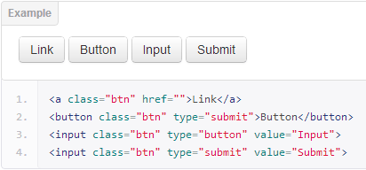
How to Add Buttons to your Websites with an Anchor Tag
You can also add buttons to your websites with the anchor tag. The anchor tag is primarily used to add links to your websites, but you can style it with CSS to look like an actual button.
The advantage of this is approach is that you can link to a page without any JavaScript.
In the example below, I make a button with the anchor tag and link it to the freeCodeCamp official website:
It looks like a link in the browser: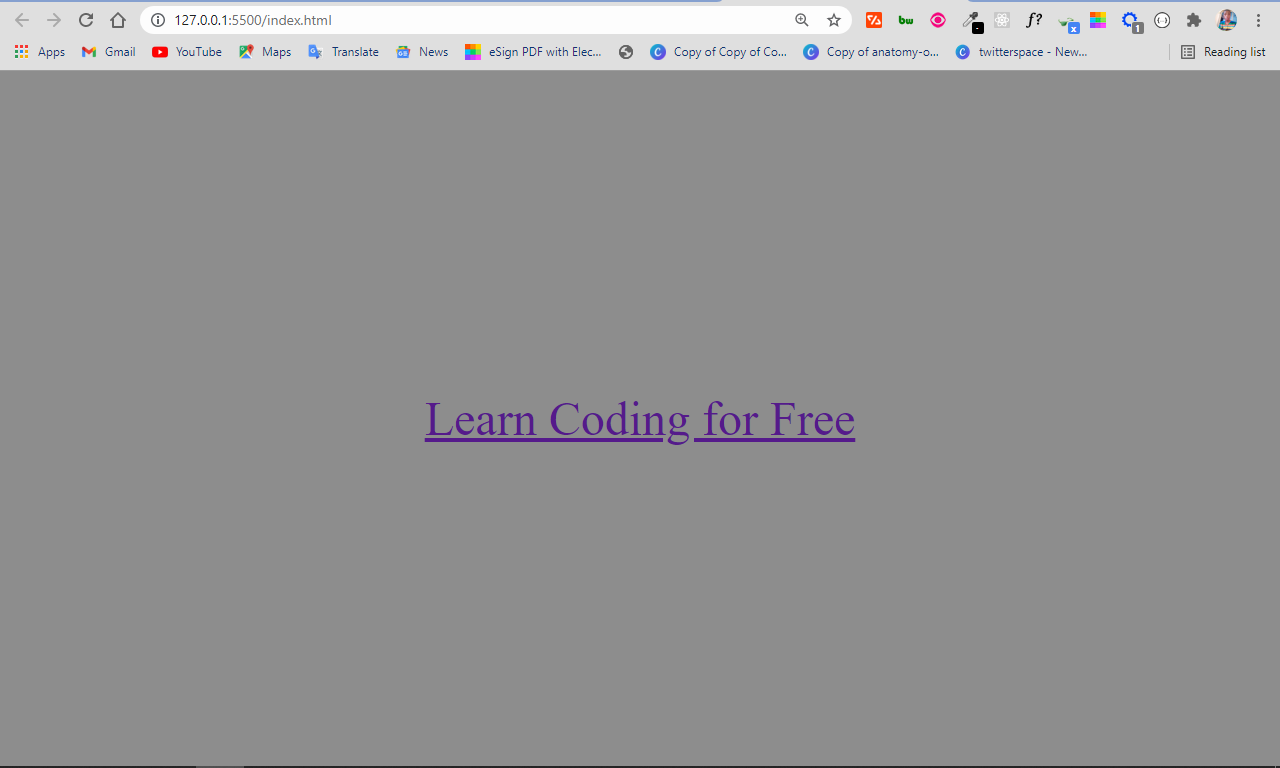
You can make it look like a button with some CSS by removing the default underline and text color, setting a backgound color and foreground color with the color properties, and adding padding and a border radius:
All I did in the CSS was try to mimic the default appearance given to buttons in HTML.
The anchor tag now looks like this: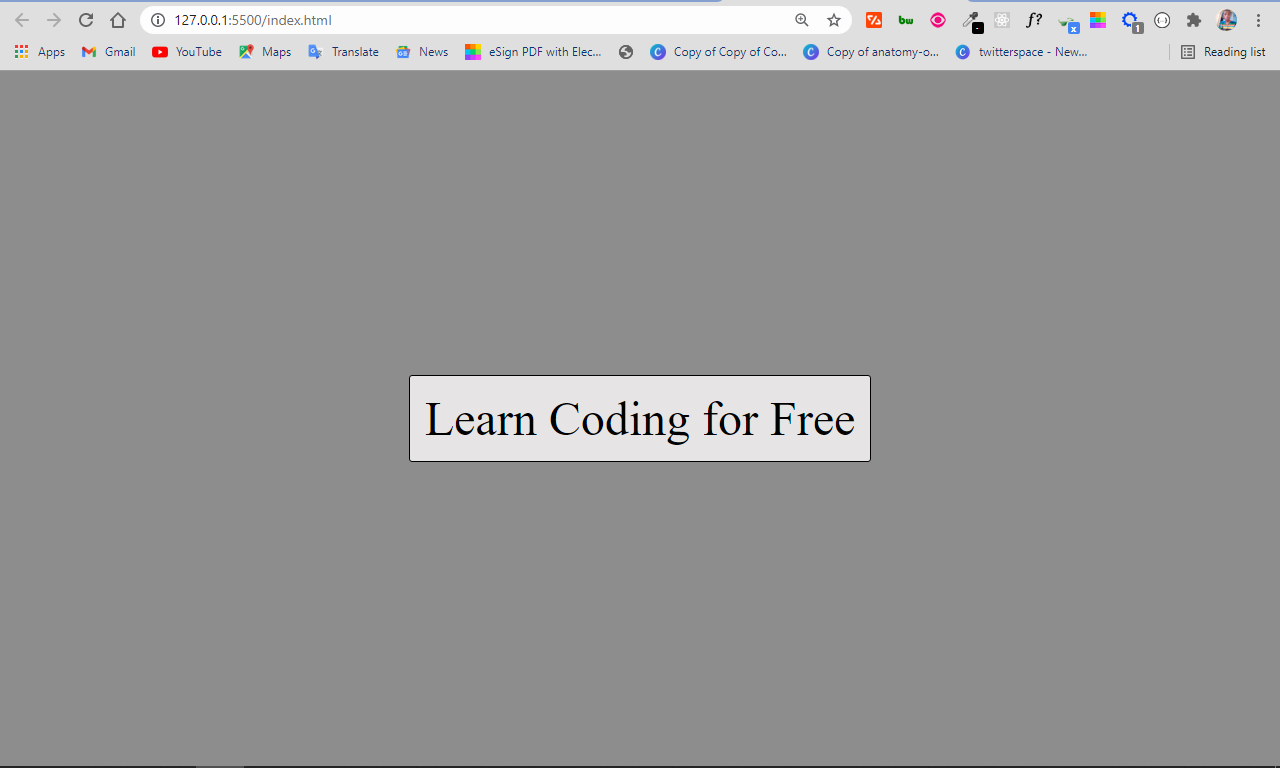
HTML Tags
<!—><!DOCTYPE><a><abbr><acronym><address><applet><area><article><aside><audio><b><base><basefont><bdi><bdo><big><blockquote><body><br><button><canvas><caption><center><cite><code><col><colgroup><data><datalist><dd><del><details><dfn><dialog><dir><div><dl><dt><em><embed><fieldset><figcaption><figure><font><footer><form><frame><frameset><h1> — <h6><head><header><hr><html><i><iframe><img><input><ins><kbd><label><legend><li><link><main><map><mark><meta><meter><nav><noframes><noscript><object><ol><optgroup><option><output><p><param><picture><pre><progress><q><rp><rt><ruby><s><samp><script><section><select><small><source><span><strike><strong><style><sub><summary><sup><svg><table><tbody><td><template><textarea><tfoot><th><thead><time><title><tr><track><tt><u><ul><var><video>
More Examples
Example
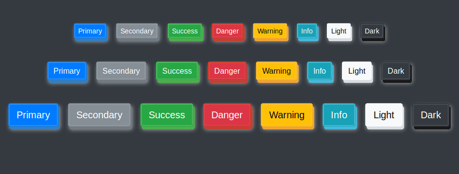
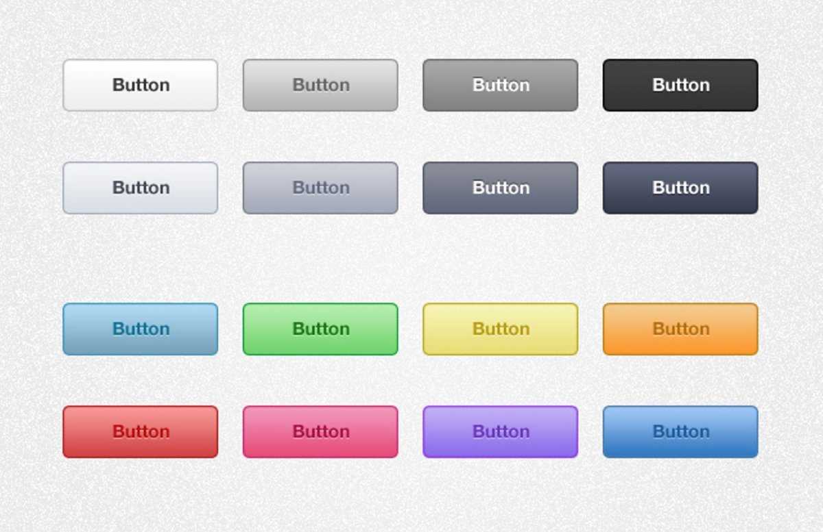
Use CSS to style buttons:
<!DOCTYPE html><html><head><style>.button {
border: none; color: white; padding: 15px 32px;
text-align: center; text-decoration: none; display:
inline-block; font-size: 16px; margin: 4px 2px;
cursor: pointer;}.button1 {background-color:
#4CAF50;} /* Green */.button2 {background-color: #008CBA;} /* Blue */
</style></head><body><button class=»button
button1″>Green</button><button class=»button button2″>Blue</button></body></html>
Example
Use CSS to style buttons (with hover effect):
<!DOCTYPE html><html><head><style>.button {
border: none; color: white; padding: 16px 32px;
text-align: center; text-decoration: none; display:
inline-block; font-size: 16px; margin: 4px 2px;
transition-duration: 0.4s; cursor: pointer;}.button1 {
background-color: white; color: black; border: 2px
solid #4CAF50;}.button1:hover { background-color: #4CAF50;
color: white;}.button2 { background-color: white; color:
black; border: 2px solid #008CBA;}.button2:hover {
background-color: #008CBA; color: white;}</style></head><body>
<button class=»button button1″>Green</button><button class=»button
button2″>Blue</button></body></html>
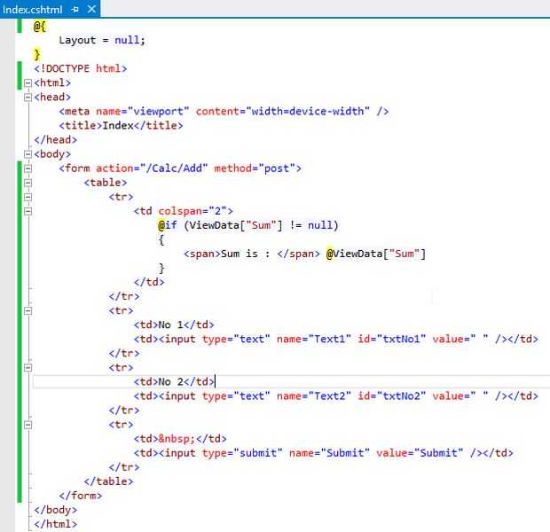
Using HTML Form Submit Button
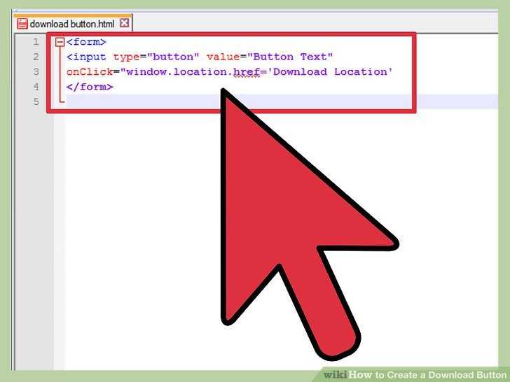
You can use an HTML button wrapped inside a element with the attribute specified. This would redirect you to the URL specified by the attribute when the form is submitted. For example:
<form action="link.html" method="get" target="_blank">
    <button type="submit">Link</button>
</form>
As an alternative, you can also use the HTML5 attribute on the element:
<form>
    <button type="submit" formaction="link.html">Link</button>
</form>
Some of the downsides of using these approaches might be:
- Although it validates as valid markup, it may not always be semantically correct because the form data is not being submitted (which is what it’s telling the browser it’s meant to do, code-wise) but instead it’s being used as a link;
- Submitting with will leave a trailing at the end of the resulting URL;
- Requires an extra element.
HTML Теги
<!—Комментарий—><!DOCTYPE><a><abbr><acronym><address><applet><area><article><aside><audio><b><base><basefont><bdi><bdo><big><blockquote><body><br><button><canvas><caption><center><cite><code><col><colgroup><data><datalist><dd><del><details><dfn><dialog><dir><div><dl><dt><em><embed><fieldset><figcaption><figure><font><footer><form><frame><frameset><h1> — <h6><head><header><hr><html><i><iframe><img><input><ins><kbd><label><legend><li><link><main><map><mark><meta><meter><nav><noframes><noscript><object><ol><optgroup><option><output><p><param><picture><pre><progress><q><rp><rt><ruby><s><samp><script><section><select><small><source><span><strike><strong><style><sub><summary><sup><svg><table><tbody><td><template><textarea><tfoot><th><thead><time><title><tr><track><tt><u><ul><var><video>
HTML References
HTML by AlphabetHTML by CategoryHTML Browser SupportHTML AttributesHTML Global AttributesHTML EventsHTML ColorsHTML CanvasHTML Audio/VideoHTML Character SetsHTML DoctypesHTML URL EncodeHTML Language CodesHTML Country CodesHTTP MessagesHTTP MethodsPX to EM ConverterKeyboard Shortcuts
HTML Tags
<!—>
<!DOCTYPE>
<a>
<abbr>
<acronym>
<address>
<applet>
<area>
<article>
<aside>
<audio>
<b>
<base>
<basefont>
<bdi>
<bdo>
<big>
<blockquote>
<body>
<br>
<button>
<canvas>
<caption>
<center>
<cite>
<code>
<col>
<colgroup>
<data>
<datalist>
<dd>
<del>
<details>
<dfn>
<dialog>
<dir>
<div>
<dl>
<dt>
<em>
<embed>
<fieldset>
<figcaption>
<figure>
<font>
<footer>
<form>
<frame>
<frameset>
<h1> — <h6>
<head>
<header>
<hr>
<html>
<i>
<iframe>
<img>
<input>
<ins>
<kbd>
<label>
<legend>
<li>
<link>
<main>
<map>
<mark>
<meta>
<meter>
<nav>
<noframes>
<noscript>
<object>
<ol>
<optgroup>
<option>
<output>
<p>
<param>
<picture>
<pre>
<progress>
<q>
<rp>
<rt>
<ruby>
<s>
<samp>
<script>
<section>
<select>
<small>
<source>
<span>
<strike>
<strong>
<style>
<sub>
<summary>
<sup>
<svg>
<table>
<tbody>
<td>
<template>
<textarea>
<tfoot>
<th>
<thead>
<time>
<title>
<tr>
<track>
<tt>
<u>
<ul>
<var>
<video>
<wbr>
Атрибуты
| Атрибут | Значение | Описание |
|---|---|---|
| autofocus | autofocus | Указывает, что кнопка должна автоматически получать Фокус при загрузке страницы |
| disabled | disabled | Указывает, что кнопка должна быть отключена |
| form | form_id | Указывает, к какой форме относится кнопка |
| formaction | URL | Указывает, куда отправлять данные формы при отправке формы. Только для type=»submit» |
| formenctype | application/x-www-form-urlencoded multipart/form-data text/plain |
Указывает, как данные формы должны быть закодированы перед отправкой на сервер. Только для type=»submit» |
| formmethod | getpost | Указывает, как отправить данные формы (какой метод HTTP использовать). Только для type=»submit» |
| formnovalidate | formnovalidate | Указывает, что данные формы не должны проверяться при отправке. Только для type=»submit» |
| formtarget | _blank _self _parent _topframename |
Указывает, где будет отображаться ответ после отправки формы. Только для type=»submit» |
| name | name | Задает имя для кнопки |
| type | button reset submit |
Указывает тип кнопки |
| value | text | Задает начальное значение для кнопки |
Examples
Basic tag usage
Here we use a standalone button (i.e. not attached to a form). We keep things simple by using JavaScript to display an alert box when the user clicks on the button.
Button Associated to a Form
Here we associate the button to a element by using the attribute (i.e. we insert the form as the value). By doing this, we don’t need to nest the element inside the element.

About Form-Associated Elements
Some HTML elements can have a «form owner». This means that the element is associated with the form and it can be used as though it was part of that form. This can be handy if you have one or more forms on a page and the element is not nested within any of them.
The following HTML elements are «form-associated elements»:
The ability to associate a form control with a form can overcome the lack of support for nested elements. Although nested elements are not supported in the HTML specification, it is possible that a script could manipulate the DOM in a way that results in nested elements. The HTML5 specification acknowledges this situation and , while warning about the non-conformance of nested elements.
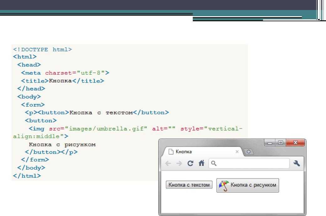
Button with an Image
You can include an element inside your element to display the image on the button. You can still add text to the button, resulting in a combination of image and text.
Like this:
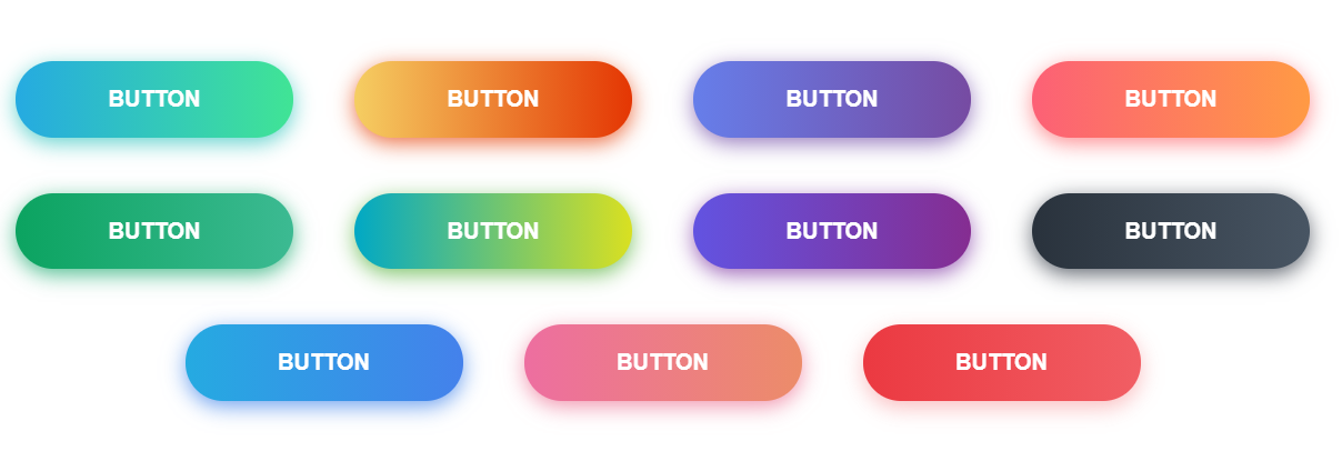
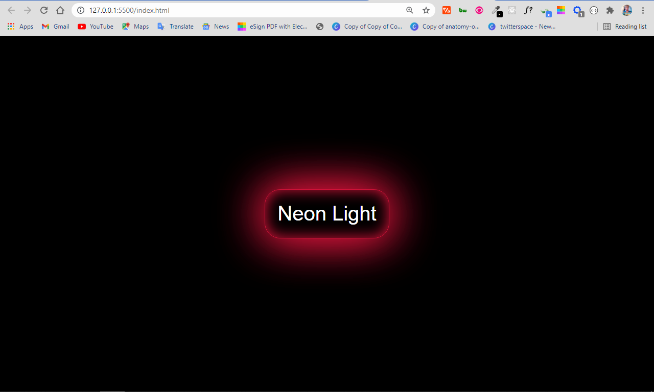
Mini Project: How to Make a Neon Light Button with HTML and CSS
The neon light button is a design trend that’s making waves because it’s beautiful. With what you’ve learned in this article, you can make one with a button tag and some CSS.
Firstly, you have to change the default styles of the button:
So far, the button looks like this: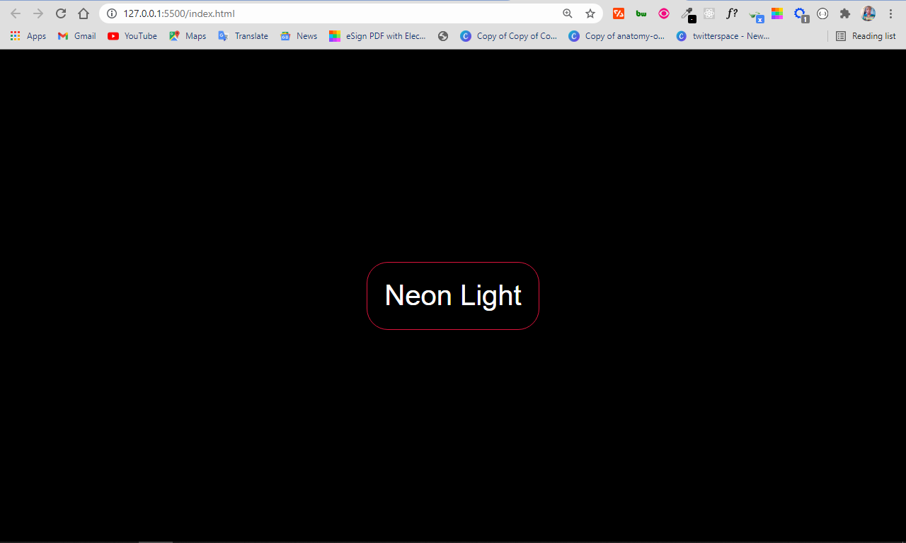
To implement the neon light effect, you can use the property. It allows multiple values, which will be instrumental in making the neon light effect.
In the property:
- the first value represents the offset on the x-axis
- the second value represents the offset on the y-axis
- the third value represents the blur radius
- the fourth value represents the spread radius
- the fifth value is the color to be applied to the shadow
I only wanted the spread radius and color, so I set other values to zero. Then I made the last of the box-shadow values apply to the inside of the button by attaching to it.
There is now a neon light effect on the button:
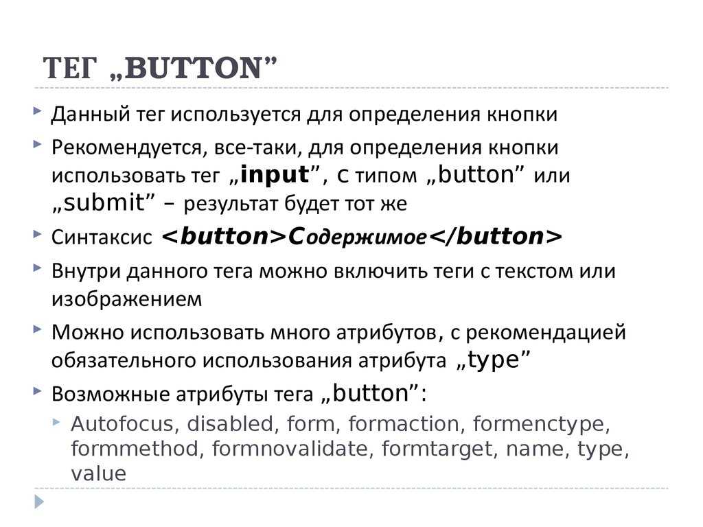
Attributes
Attributes can be added to an HTML element to provide more information about how the element should appear or behave.
The element accepts the following attributes.
| Attribute | Description |
|---|---|
| Automatically gives focus to this control when the page loads. This allows the user to start using the control without having to select it first. There must not be more than one element in the document with the autofocus attribute specified.
This is a boolean attribute. If the attribute is present, its value must either be the empty string or a value that is an ASCII case-insensitive match for the attribute’s canonical name, with no leading or trailing whitespace (i.e. either or ). Possible values: |
|
| Disables the control. Therefore, if the user tries to use the control, nothing will happen.
This is a boolean attribute. If the attribute is present, its value must either be the empty string or a value that is an ASCII case-insensitive match for the attribute’s canonical name, with no leading or trailing whitespace (i.e. either or ). Possible values: |
|
| Specifies the ID of a form to which this control belongs.
Possible values: |
|
| Specifies the URL of the file that will process the control when submitted. | |
| Specifies the content type used to encode the form data set when it’s submitted to the server.
Possible values:
|
|
| Specifies the HTTP method to use when the control is submitted.
Possible values:
|
|
| Specifies that the form is not to be validated during submission.
This is a boolean attribute. If the attribute is present, its value must either be the empty string or a value that is an ASCII case-insensitive match for the attribute’s canonical name, with no leading or trailing whitespace (i.e. either or ). Possible values: |
|
| Specifies the browsing context to load the destination indicated in the attribute.
Possible values: |
|
| If the attribute has a value of , the attribute must be provided in order to specify the element’s menu. The value must be the ID of a element in the same home subtree whose attribute is in the popup menu state.
The attribute can only be used when the attribute has a value of . |
|
| Assigns the name of the control. | |
| Specifies the type of button.
Possible values:
|
|
| Assigns an initial value to the control. A button (and its value) is only included in the form submission if the button itself was used to initiate the form submission. |
Global Attributes
The following attributes are standard across all HTML elements. Therefore, you can use these attributes with the tag , as well as with all other HTML tags.
For a full explanation of these attributes, see HTML 5 global attributes.
Event Handlers
Event handler content attributes enable you to invoke a script from within your HTML. The script is invoked when a certain «event» occurs. Each event handler content attribute deals with a different event.
Most event handler content attributes can be used on all HTML elements, but some event handlers have specific rules around when they can be used and which elements they are applicable to.
For more detail, see HTML event handler content attributes.
Using a Link Styled as an HTML Button
You can style the HTML anchor element as an HTML button. For example, to style an HTML anchor element similar to the browser’s default styling of a button, you can do the following:
CSS:
a.button {
    display: inline-block;
    box-sizing: border-box;
    margin: 0;
    padding: 1px 6px;

    font: 13.3333px Arial;
    text-rendering: auto;
    text-align: center;
    text-transform: none;
    text-decoration: none;
    text-indent: 0;
    text-shadow: none;
    letter-spacing: normal;
    word-spacing: normal;
    color: buttontext;

    border: 2px outset buttonface;
    border-image: initial;

    background-color: buttonface;

    -webkit-appearance: button;
    -moz-appearance: button;
    appearance: button;

    cursor: default;
}

a.button:active { border-style: inset; }
Some of the downsides of using this approach might be:
- Browser support for the CSS property might be limited;
- Requires complex styling to get the default button styling (which may work only on certain browsers);
- Poor accessibility — does not trigger a click event when the SPACE keyboard key is pressed on link when it has focus.
Еще примеры
Пример
Используйте CSS для стилизации кнопок:
<!DOCTYPE html><html><head><style>.button {
border: none; color: white; padding: 15px 32px;
text-align: center; text-decoration: none; display:
inline-block; font-size: 16px; margin: 4px 2px;
cursor: pointer;}.button1 {background-color:
#4CAF50;} /* Зеленый */.button2 {background-color: #008CBA;} /* Синий */
</style></head><body><button class=»button
button1″>Зеленый</button><button class=»button button2″>Синий</button></body></html>
Пример
Используйте CSS для стилизации кнопок (с эффектом наведения курсора мыши):
<!DOCTYPE html><html><head><style>.button {
border: none; color: white; padding: 16px 32px;
text-align: center; text-decoration: none; display:
inline-block; font-size: 16px; margin: 4px 2px;
transition-duration: 0.4s; cursor: pointer;}.button1 {
background-color: white; color: black; border: 2px
solid #4CAF50;}.button1:hover { background-color: #4CAF50;
color: white;}.button2 { background-color: white; color:
black; border: 2px solid #008CBA;}.button2:hover {
background-color: #008CBA; color: white;}</style></head><body>
<button class=»button button1″>Зеленый</button><button class=»button
button2″>Синий</button></body></html>
Overlaying an Invisible Link on an HTML Button Element
You can overlay the HTML button with a link to keep the default appearance of the button, whilst using the functionality of a link:
CSS:
.btn-link {
    display: inline-block;
    position: relative;
}

.btn-link > a {
    margin: auto;

    position: absolute;
    top: 0;
    right: 0;
    bottom: 0;
    left: 0;
    z-index: 2;

    cursor: default;
}

.btn-link > a:active + button {
    border-style: inset;
}

.btn-link > button {
    position: relative;
    z-index: 1;
}
Some of the downsides of using this approach might be:
- Uses an empty anchor tag;
- Requires an extra parent container element;
- Button (and other) state styling might have to be done manually and may not resemble default active button styling 100%;
- Poor accessibility — does not trigger a click event when the SPACE keyboard key is pressed on link when it has focus.
How to Add Buttons to your Websites with the Input Type Submit
You usually use the input type of submit inside a form element so that the data filled in by the user gets submitted when the button is clicked.
Just like the input type of button, it’s an empty element, so you need a value attribute to communicate to the user what the button is about.
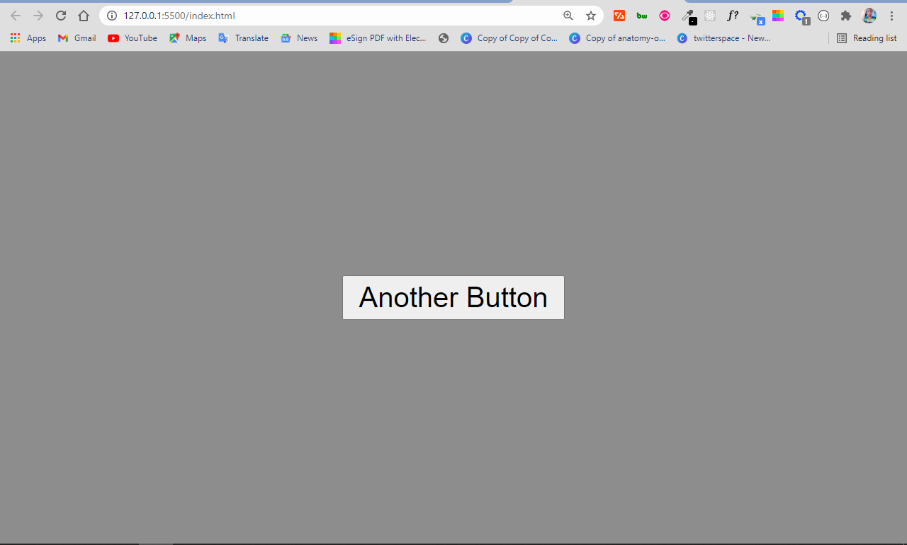
The difference between the input type button and input type submit is that when you use the submit button type in a form, the data get submitted without any manipulation with JavaScript.
But the input type button, on the other hand, needs some manipulation with JavaScript to work. So when you use an input type of button inside a form element, the data doesn’t get submitted automatically when it is clicked.
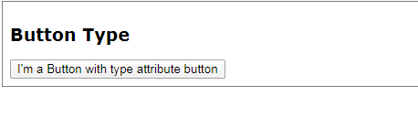
Button type Attribute
HTML button must have a type attribute. If the <button> element did not have a type attribute, the button type will set default by the browser. Different browser use different default types for the <button> element. You must specify the type for the <button> element.
Example 2:
Is not change the style of button, but have a different type:
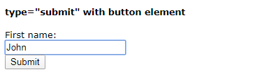
You can set the type attribute with «submit» to submit a form, or «reset» to reset the text field. But, the <button> must be associated with the <form> element.
See this example to use the «submit» type.
Example 3:
This is how the HTML code above will be displayed in a browser:
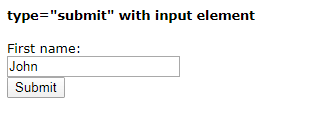
You can use the <button> element or <input> element to represent the button.
Example 4:
It has no difference.
To use the reset button type, just follow this example.
Example 5:
This is how the HTML code above will be displayed in a browser:
When you click the button, the name in the text field will reset (to the first values). In this example, the form element no have value. So, the text field will empty.