
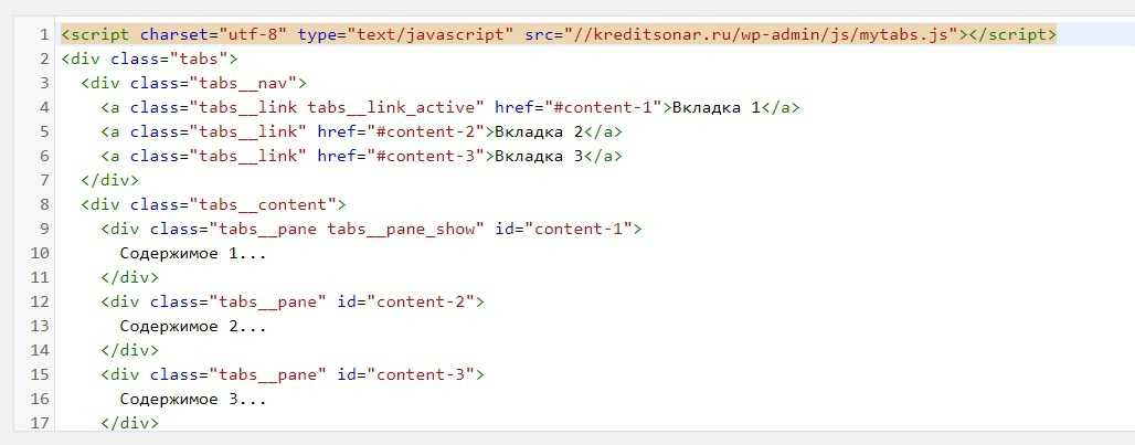
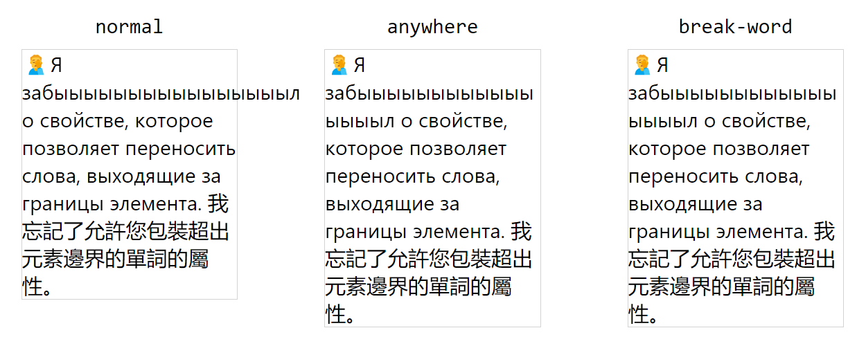
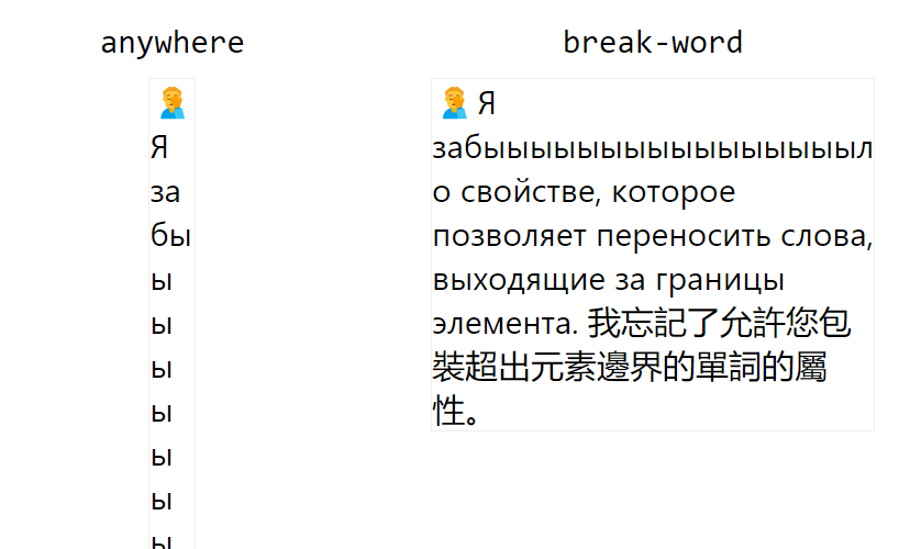
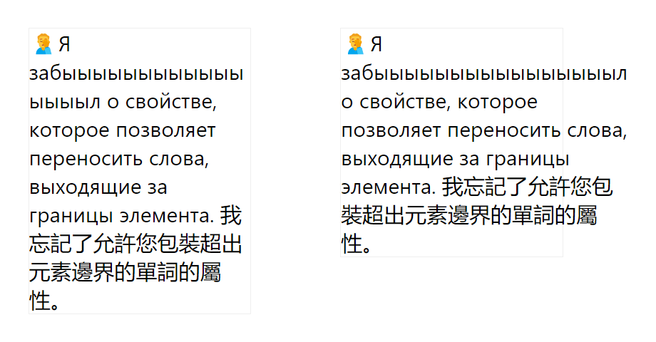
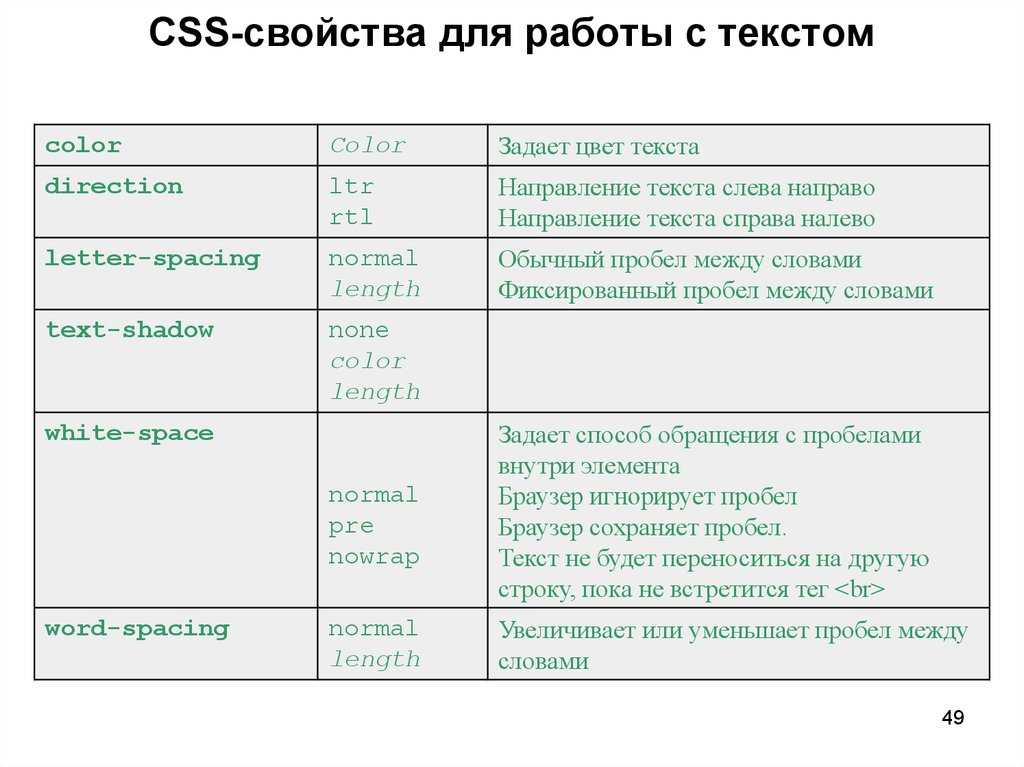
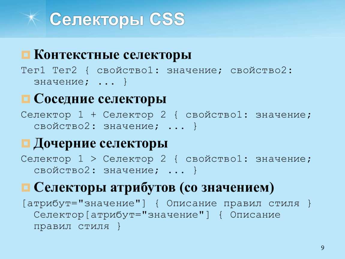
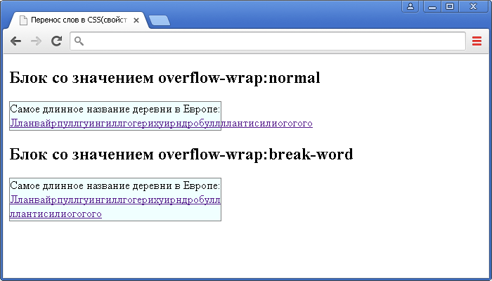
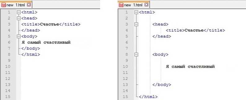
Перенос слов при переполнении (overflow-wrap)
– это CSS-свойство, которое позволяет указать необходимо ли переносить слова, выходящие за границы элемента. По умолчанию имеет значение . Это означает, что слова могут разрываться только в определённых местах, например, когда имеется пробел или дефис.
Два других значения ( и ) указывают браузеру, что он должен вставлять разрывы в неразрывную строку. При этом разрыв создается только в том случае, если всё слово не может быть помещено в отдельную строку без переполнения. В этом случае разорвано слово может быть на любом символе, если в ней нет других приемлемых точек разрыва.
 HTML
HTML
Браузер, когда нам необходимо, чтобы контент занимал минимальную ширину (), при установке может расставлять мягкие переносы на своё усмотрение:
CSS
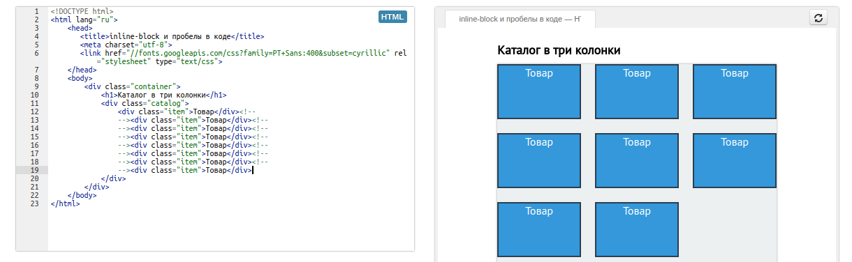
Ещё один интересный пример с текстом в анинимном flex-элементе:
HTML
Переполнение при происходит потому, что flex-элемент по умолчанию имеет в качестве минимальной ширины значение , то есть . Так как стилизиовать анонимный flex-элемент мы не можем, то чтобы исправить эту ситуацию, нам необходимо обернуть текст в какой-нибудь тег, например, и установить ему :
HTML
В CSS, кроме , имеются ещё следующие свойства: и .
Свойство существовало до . Оно было не официальным, но поддерживалось в то время большинством браузеров. Сейчас данное свойство использовать не рекомендуется. Его имеет смысл использовать, только если нужно обеспечить поддержку старых браузеров:
CSS
Свойство определяет нужно ли разрывать слово при достижении границы родительского элемента. Данное свойство имеет следующие значения:
- (по умолчанию) – слова и строки с неразрывным пробелом могут разрываться только в определённых местах, например, когда имеется пробел или дефис;
- – выполняет разрыв слова именно в том месте, в котором происходит переполнение, но только для текста не на китайском, японском и корейском языках (CJK);
- – запрещает перенос текста на китайском, японском или корейском языках (CJK), на других языках аналогично значению ;
- (устаревшее, использовать не рекомендуется) – делает тоже самое, что и .
На практике значение может использоваться для корейского языка (в котором используются пробелы между словами), а также для текста со смешанным шрифтом, где фрагменты CJK смешиваются с другим языком, который использует пробелы для разделения. Значение может применяться для текста, преимущественно состоящего из символов CJK с короткими выдержками, отличными от CJK.
Для разрыва строк текста на китайском, японском и корейском языках (CJK) имеется ещё свойство . Оно определяет строгость правил разрыва строк и имеет следующие значения: (по умолчанию), , , и . Эти свойства ( и ) играют важную роль для текстов CJK.
Property Values
| Value | Description | Demo |
|---|---|---|
| normal | Sequences of whitespace will collapse into a single whitespace. Text will wrap when necessary. This is default | Demo ❯ |
| nowrap | Sequences of whitespace will collapse into a single whitespace. Text will never wrap to the next line. The text continues on the same line until a <br> tag is encountered |
Demo ❯ |
| pre | Whitespace is preserved by the browser. Text will only wrap on line breaks. Acts like the <pre> tag in HTML |
Demo ❯ |
| pre-line | Sequences of whitespace will collapse into a single whitespace. Text will wrap when necessary, and on line breaks | Demo ❯ |
| pre-wrap | Whitespace is preserved by the browser. Text will wrap when necessary, and on line breaks | Demo ❯ |
| initial | Sets this property to its default value. Read about initial | |
| inherit | Inherits this property from its parent element. Read about inherit |
CSS White-space vs Word-wrap
CSS white-space and its values control white space in a text. Word-wrap allows you to break an unbreakable long string into a new line. An “unbreakable long string” means the text should not have any spaces in it.
The next code block shows how word-wrap works in a web browser, so all you have to do is run the code and observe what happens. Also, when you delete the word-wrap from the CSS code, the text will overflow its container:
| <main> <span class=”wrap-info”> <code>white-space vs word-wrap</code> </span> <div class=”white-space-word-wrap”> <p>Theisisanunbreakabletext.Theisisanunbreakabletext.Theisisanunbreakabletext.Theisisanunbreakabletext.Theisisanunbreakabletext.</p> </div> </main> * { margin: 0; padding: 0; box-sizing: border-box; } body { display: grid; place-items: center; height: 100vh; } main { width: 50%; border: 5px solid #3677f4; padding: 2em; font-size: 1.2em; line-height: 1.168; position: relative; } .wrap-info { position: absolute; bottom: -3.2em; left: -0.25em; padding: 1em; background-color: #3677f4; color: #ffffff; font-weight: bold; } .white-space-word-wrap { width: 200px; /* This will restrict the text */ } p { /*white-space: nowrap;*/ word-wrap: break-word; } |
Управляем пространством между словами и буквами
Читаемость фрагмент текста зачастую зависит от нескольких факторов. В некоторых случаях, уменьшение или увеличение пространства между словами или буквами, то есть трекинг существенно улучшает читаемость.
В CSS есть свойства и для управления расстоянием между словами и буквами соответственно.
Свойство
Это свойство может принимать следующие значения:
- (задание непосредственно числового значения в абсолютных единицах)
- (задание значения в процентах)
выводит заданное по умолчанию расстояние между буквами. Это расстояние зависит от используемого шрифта и браузера.
Числовое значение добавляет указанный промежуток к дефолтному ( вычитает, если задано отрицательное значение):
Значение в процентах работает также как и числовое. На данный момент оно не поддерживается браузерами и, скорее всего, будет удалено из будущих черновиков спецификации.
Свойство
Свойство принимает два вида значений: или числовое значение с единицами измерения.
Свойство сбрасывает любое раннее установленное значение на дефолтное. Например, если вы задали родительскому элементу в , вы можете отменить это для дочерних с помощью .
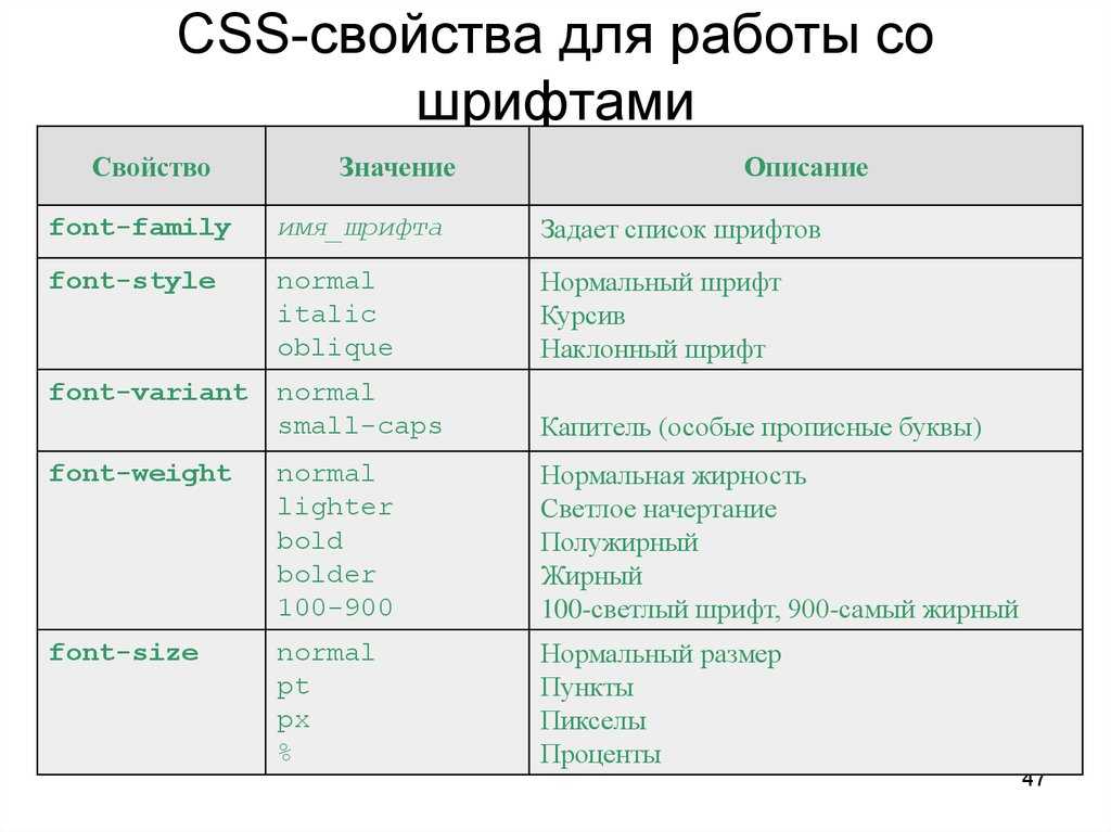

Числовое значение задается в единицах исчисления, например в или в пикселях, вы можете увеличить расстояние дефолтное расстояние или уменьшить задав отрицательное значение.
Дополнение
применимо не только к словам — его можно использовать с любым строчным или строчно-блочным содержимым.
Также вы можете анимировать и . Однако в CSS-переходах значение в не работает в Firefox (39), просто замените значение на .
Вот , использующей и :
Examples
Line breaks inside <pre> elements
HTML
<div id="css-code" class="box">
  p { white-space:
  <select>
    <option>normal</option>
    <option>nowrap</option>
    <option>pre</option>
    <option>pre-wrap</option>
    <option>pre-line</option>
    <option>break-spaces</option>
  </select> }
</div>
<div id="results" class="box">
  <p>    Lorem ipsum dolor sit amet, consectetur adipiscing elit, sed do eiusmod tempor incididunt ut labore et dolore magna aliqua.

    Ut enim ad minim veniam, quis nostrud exercitation ullamco laboris nisi ut aliquip ex ea commodo consequat.

    Duis aute irure dolor in reprehenderit in voluptate velit esse cillum dolore eu fugiat nulla pariatur.

    Excepteur sint occaecat cupidatat non proident, sunt in culpa qui officia deserunt mollit anim id est laborum.</p>
</div>
.box {
  width: 300px;
  padding: 16px;
  border-radius: 10px;
}

#css-code {
  background-color: rgb(220, 220, 220);
  font-size: 16px;
  font-family: monospace;
}

#css-code select {
  font-family: inherit;
}

#results {
  background-color: rgb(230, 230, 230);
  overflow-x: scroll;
  height: 400px;
  white-space: normal;
  font-size: 14px;
}
var select  = document.querySelector("#css-code select");
var results = document.querySelector("#results p");
select.addEventListener("change", function(e) {
  results.setAttribute("style", "white-space: "+e.target.value);
})
<p> Lorem ipsum dolor sit amet, consectetur adipiscing elit, sed do eiusmod tempor incididunt ut labore et dolore magna aliqua. Ut enim ad minim veniam, quis nostrud exercitation ullamco laboris nisi ut aliquip ex ea commodo consequat. Duis aute irure dolor in reprehenderit in voluptate velit esse cillum dolore eu fugiat nulla pariatur. Excepteur sint occaecat cupidatat non proident, sunt in culpa qui officia deserunt mollit anim id est laborum.</p>
Используемые значения
- sWrap
- Строка, которая может определять и принимать одно из следующих значений:
-
- normal
- Значение по умолчанию. Переносы строк устанавливаются автоматически. Содержимое переносится на следующую строку, если оно превышает ширину объекта.
- nowrap
- Переносы строк запрещены. Содержимое не переносится на следующую строку.
- pre
- Переносы строк и другие пробелы, установленные при форматировании, сохраняются. Чтобы был видимый эффект от задания этого значения, необходимо в объявлении !DOCTYPE указать режим standards-compliant (совместимые стандарты). Иначе, даже если вы установите значение pre, оно будет эквивалентно значению normal.
- pre-line
- В Internet Explorer 8.0 последовательности пробелов и переносов строк сохраняются.
- pre-line
- В Internet Explorer 8.0 последовательности пробелов и переносов строк не сохраняются.
Это свойство читается/записывается для всех объектов, кроме currentStyle (только чтение). Значением по умолчанию является normal для всех объектов со следующими исключениями:
| :after | pre-line |
| :before | pre-line |
| PRE | pre |
Атрибут Каскадных таблиц стилей (CSS) наследуется.
Dropbox
Dropbox’s child-like illustrations and calming color tones make their service look fun, approachable, and exciting. The negative space lets the graphics and compelling text float to the surface.
Dropbox offers a complex service that many people might not understand or trust. Therefore, the brand had to invest time to provide context and simplify these complex concepts. It did it with clever, intuitive illustrations and a clean layout that quickly leads users along their journey. And it’s with this negative space that an intuitive user experience is created.
 White space sits as the perfect background for the creative imagery that lives on the Built By Buffalo web page.
# Assume Positive Intent When Working on Existing Code Base
So I noted that is the default. That means this overlap would never had happen if we didn’t implement . That means someone actually wrote this style into our codebase Before you get …
When you’re working on existing codebase, we often run into code that doesn’t makes sense. But before you go all , let’s assume positive intent. As developers, we always try to plan for the edge cases. But often, we won’t really know until we push up the code and let our users start using it. It’s very difficult to 100% understand the full extent of our implementation. We do our best but we might miss a few spots. Quite frankly, it’s why developers still have a job. Most of the time, we’re doing bug fixes
We shouldn’t be afraid to make changes. In fact, it’s how we progress and become better. During our attempt to improve things, we’re going to make mistakes. When that happens, don’t spin your wheels playing the blame game or be quick to negative judgement. We need to be empathetic that we all went in with the best intention. The important thing is, we need to learn from our mistakes, fix it swiftly, and continue moving forward
Built by Buffalo
White space isn’t necessarily synonymous with minimalism. You can have a clean, breathable layout and use a more complex design. The clustered hexagons on Buffalo’s homepage would be overwhelming without the negative space. But, because they are coupled with colorful icons, the white line constantly holds your interest in the main categories while scrolling down.
The white space gives the almost-chaotic designs on the homepage room to thrive and breathe. They’re colorful and creative, with a personality that captures the brand’s essence.
 Everlane includes white space in its photography in a stunning way.
Примеры
<!DOCTYPE html>
<html>
<head>
	<meta charset="utf-8">
	<title>Пример №1</title>

	<style>

		p{
		width: 450px;
		margin: 3em;
		}

		.p_1{
		white-space: normal;
		background-color: red
		}

		.p_2{
		white-space: pre;
		background-color: blue
		}

		.p_3{
		white-space: nowrap;
		background-color: green
		}

		.p_4{
		white-space: pre-wrap;
		background-color: yellow
		}

		.p_5{
		white-space: pre-line;
		background-color: violet
		}

	</style>
</head>
<body>

	<p class="p_1">
normal:	используется    значение браузера по умолчанию, т.е. все пробельные
		символы и переносы строк    в коде HTML преобразуются в один пробел,
		        а разрывы строк добавляются браузером автоматически.
	</p>

	<p class="p_2">
pre: текст форматируется аналогично содержимому элемента «pre», т.е.
	отображается так, как вводит его пользователь: сохраняются все подряд идущие
пробельные символы и переносы строк, автоматические переносы не добавляются.
	</p>

	<p class="p_3">
nowrap: текст отображается одной строкой, подряд идущие пробельные символы <br>
		заменяются одним пробелом, переносы строк в коде HTML игнорируются  , <br>
	автоматические переносы строк не добавляются, действительны только 	<br>
	принудителььные разрывы строк, сделанные <br>
		при помощи элементов «br».
	</p>

	<p class="p_4">
pre-wrap: все подряд идущие пробельные символы и переносы строк сохраняются  ,
	но разрывы    строк добавляются 	браузером автоматически.
	</p>

	<p class="p_5">
pre-line: все подряд идущие пробельные символы заменяются одним пробелом, но
	переносы строк в коде HTML сохраняются     , а также по необходимости
	браузером добавляются
			автоматические переносы.
	</p>

</body>
</html>
Пример №1
Вернуться назад
Readable File References
The gist of this next suggestion comes from a tweet by Twitter Bootstrap cofounder Jacob Thornton. The idea here is that if a list of file references is contained in your document, you can make them easier to read by doing something like the following:
The example above is taken directly from Bootstrap. Here, all attributes of the elements are aligned. This makes it easier to refer to or adjust a tag because the update will usually be to the value of the attribute.
Of course, this somewhat violates the rules of indenting HTML. So, alternatively, you could opt for this:
This latter example seems cleaner and has the bonus of aligning the other attributes, although that’s not as necessary in my opinion.
But wait. What if you don’t care that the attribute is listed last (which seems to be the custom and is unnecessary for validation)? Then you could do this instead:
No white space tricks needed here, because the attributes align just fine. But if you’re bothered by the lack of alignment of the other attributes, or if you just can’t stand the thought of the attribute being listed first, then you’ll have to opt for one of the preceding solutions.
Readable Conditional Classes
The concept behind the alignment of attributes is nothing new. HTML5 Boilerplate has been doing this sort of thing for some time now with its IE conditional classes. Here’s what that chunk of code looks like in the latest version:
In this case, the class attribute on the opening tag in each conditional (and, incidentally, the tag itself) is being aligned, because this is the part of the code that’s most relevant to readability and maintenance, and the part of the code that would suffer most in readability if this alignment were not present.
Margins
Change or reset default margins using the white space scale.
Negative x-axis margins are used to offset margins and padding of child elements.
Margin auto is used to horizontally center block-level elements with a set width.
.m0  { margin:}
.mt0 { margin-top:}
.mr0 { margin-right:}
.mb0 { margin-bottom:}
.ml0 { margin-left:}

.m1  { margin:        var(--space-1) }
.mt1 { margin-top:    var(--space-1) }
.mr1 { margin-right:  var(--space-1) }
.mb1 { margin-bottom: var(--space-1) }
.ml1 { margin-left:   var(--space-1) }

.m2  { margin:        var(--space-2) }
.mt2 { margin-top:    var(--space-2) }
.mr2 { margin-right:  var(--space-2) }
.mb2 { margin-bottom: var(--space-2) }
.ml2 { margin-left:   var(--space-2) }

.m3  { margin:        var(--space-3) }
.mt3 { margin-top:    var(--space-3) }
.mr3 { margin-right:  var(--space-3) }
.mb3 { margin-bottom: var(--space-3) }
.ml3 { margin-left:   var(--space-3) }

.m4  { margin:        var(--space-4) }
.mt4 { margin-top:    var(--space-4) }
.mr4 { margin-right:  var(--space-4) }
.mb4 { margin-bottom: var(--space-4) }
.ml4 { margin-left:   var(--space-4) }

.mxn1 { margin-left: -var(--space-1); margin-right: -var(--space-1); }
.mxn2 { margin-left: -var(--space-2); margin-right: -var(--space-2); }
.mxn3 { margin-left: -var(--space-3); margin-right: -var(--space-3); }
.mxn4 { margin-left: -var(--space-4); margin-right: -var(--space-4); }

.mx-auto { margin-left: auto; margin-right: auto; }
The Take-away
White space (negative space) is the area between design elements. It’s another tool for designers to design for the user experience (UX). Remember that white space is not necessarily white; it’s just the name to indicate spaces where there are neither user interface (UI) elements nor specific content.
As a designer, you can introduce white space based on four main factors:
-
Content,
-
Design,
-
user and
-
brand
Use macro white space to organize content in the layout and direct the user through the blocks of content shown. Use micro white space inside the design element features as seen in the text, images and content blocks.
We can also approach white space as being passive or active. Passive white space does not have a specific role in the design other than facilitating the user experience. It is all about being easier to read. Active white space guides the focus and attention of users. It is more about standing out and making a statement.
CSS white-space Property
CSS property sets how white space inside an element is handled.
Example
HTML Online Editor
<!DOCTYPE html>
<html lang=»en-US»>
<head>
<style>
div{
border: 1px solid black;
padding:10px;
width: 300px;
}
#point{
white-space: normal;
}
#point1{
white-space: nowrap;
}
#point2{
white-space: pre;
}
#point3{
white-space: pre-line;
}
#point3{
white-space: pre-wrap;
}
</style>
</head>
<body>
<h1>CSS white-space Property</h1>
<h2>white-space: normal;</h2>
<div id=»point»>
This is some text. This is some text. This is some text.
This is some text. This is some text. This is some text.
</div>
<h2>white-space: nowrap;</h2>
<div id=»point1″>
This is some text. This is some text. This is some text.
This is some text. This is some text. This is some text.
</div>
<h2>white-space: pre;</h2>
<div id=»point2″>
This is some text. This is some text. This is some text.
This is some text. This is some text. This is some text.
</div>
<h2>white-space: pre-line;</h2>
<div id=»point3″>
This is some text. This is some text. This is some text.
This is some text. This is some text. This is some text.
</div>
<h2>white-space: pre-wrap;</h2>
<div id=»point4″>
This is some text. This is some text. This is some text.
This is some text. This is some text. This is some text.
</div>
</body>
</html>
Как понять
Скопировать ссылку «Как понять» Скопировано
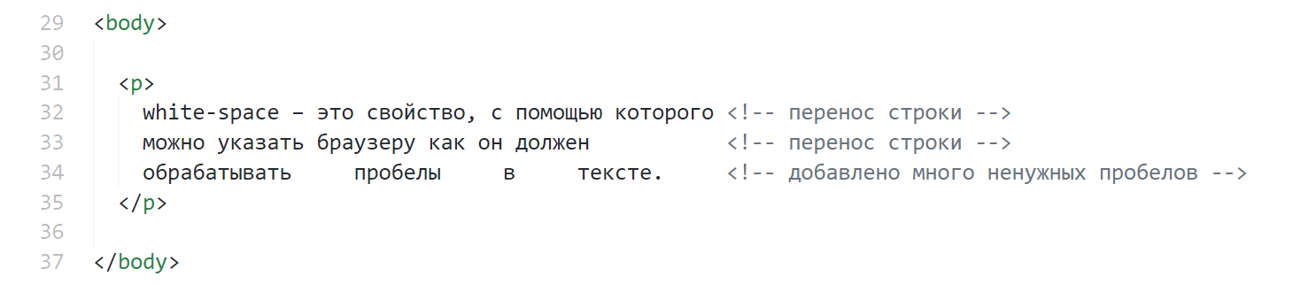
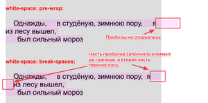
Если текста в элементе много (больше, чем может вместить ширина элемента), то по умолчанию браузер пытается переносить слова на новую строку. Перенос в общем случае выполняется по символам пробела либо по символам переноса строк. Разговор сейчас идёт именно про форматирование текста прямо внутри HTML. Ведь мы можем в HTML длинный абзац оставить одной строкой, а можем разбить на несколько строк, используя клавишу Enter. По умолчанию браузер игнорирует форматирование в HTML. Он ориентируется только на теги, и выводит текст на экран, опираясь на текущий способ обработки пробельных символов. Но мы можем изменить этот способ, используя различные значения свойства white — space .
normal
Скопировать ссылку «normal» Скопировано
Если в строке есть несколько подряд идущих пробелов, то браузер схлопывает их в один пробел. Я из лесу вышел = Я из лесу вышел . Все переносы строк в HTML внутри тега также заменяются на пробел:
Скопировать Скопировано Не удалось скопировать
Значения
-
normal – все пробельные символы и переносы строк в коде
HTML преобразуются в один пробел, а разрывы строк добавляются браузером автоматически. -
pre – текст форматируется аналогично содержимому тега
<pre>, т.е. отображается так, как вводит его пользователь: сохраняются все
подряд идущие пробельные символы и переносы строк, автоматические переносы не добавляются. -
nowrap – текст отображается одной строкой, подряд идущие пробельные символы заменяются
одним пробелом, переносы строк в коде HTML игнорируются, автоматические переносы строк не добавляются,
действительны только принудительные разрывы строк, сделанные при помощи тегов <br>. -
pre-wrap – все подряд идущие пробельные символы и переносы строк сохраняются, но разрывы
строк добавляются браузером автоматически. -
pre-line – все подряд идущие пробельные символы заменяются одним пробелом, но переносы строк
в коде HTML сохраняются, а также по необходимости браузером добавляются автоматические переносы.
Text alignment
Easily realign text to components with text alignment classes. For start, end, and center alignment, responsive classes are available that use the same viewport width breakpoints as the grid system.
Start aligned text on all viewport sizes.
Center aligned text on all viewport sizes.
End aligned text on all viewport sizes.
Start aligned text on viewports sized SM (small) or wider.
Start aligned text on viewports sized MD (medium) or wider.
Start aligned text on viewports sized LG (large) or wider.
Start aligned text on viewports sized XL (extra-large) or wider.
Note that we don’t provide utility classes for justified text. While, aesthetically, justified text might look more appealing, it does make word-spacing more random and therefore harder to read.


Значения свойств
| Значение | Описание | Воспроизвести |
|---|---|---|
| normal | Последовательность пробелов свернутся в один пробел. Текст будет обернут, когда это необходимо. Это показатель | Воспроизвести » |
| nowrap | Последовательность пробелов свернутся в один пробел. Текст никогда не будет переноситься на следующую строку. Свойство текст продолжается в той же строке, пока не будет обнаружен тег <br> | Воспроизвести » |
| pre | Пробелы сохраняются браузером. Текст будет переноситься только на разрывы строк. Действует как в теге <pre> HTML | Воспроизвести » |
| pre-line | Последовательность пробелов свернутся в один пробел. Текст будет переноситься при необходимости, и на разрывы строк | Воспроизвести » |
| pre-wrap | Пробелы сохраняются браузером. Текст будет переноситься при необходимости, и на разрывы строк | Воспроизвести » |
| initial | Устанавливает это свойство в значение индекса. Прочитать о initial | Воспроизвести » |
| inherit | Наследует это свойство от родительского элемента. Прочитать о inherit |
Значения
| Значение | Описание |
|---|---|
| nowrap | Запрещает тексту переносится на другую строку, даже если он не помещается в ширину контейнера (в этом случае текст просто вылезет за его границы). Однако, добавление тега br заставит текст перенестись на новую строку. |
| pre | Текст показывается так, как был набран в блокноте при верстке сайта: со всеми пробелами и enter-ами (если в коде набрано несколько пробелов — на экране тоже будет несколько). При этом браузер не будет переносить текст на новую строку, если он не помещается в контейнер — текст просто вылезет за его границы. Аналог тега pre, но в отличие от него не меняет шрифт на моноширинный (про моноширинный шрифт см. свойство font-family . |
| pre-wrap | То же самое, что и pre, отличие в том, что если текст слишком длинный и не влазит в контейнер — браузер перенесет его на другую строку. |
| pre-line | Браузер учитывает только Enter-ы в HTML коде и игнорирует все остальное (несколько пробелов будут выглядеть как один, браузер сам расставляет разрывы строк). |
| normal | Стандартное поведение: браузер сам расставляет разрывы строки так, чтобы слова поместились в контейнер. Несколько пробелов в коде будут выглядеть как один на экране. |
Значение по умолчанию: normal .
What is White Space?
White space is the area between design elements. It is also the space within individual design elements, including the space between typography glyphs (readable characters).
Despite its name, white space does not need to be white. It can be any color, texture, pattern, or even a background image.
White space can cause problems between designers and clients. Design theory promotes the use of white space for elegance and ensuring a quality user experience. Sadly, many clients and managers consider white space wasted space. They think it could be used to house more information or other visual elements.
On the contrary, white space is a great tool to balance design elements and better organize content to improve the visual communication experience. If you were a technical writer in charge of composing hundreds of manuals for a kitchen appliance company, you would work to find a superb balance of words and images. Few people read manuals for pleasure; it is then crucial to hold the readers’ attention! For that, the white space is the real star of the show, working between the words and the pictures. It keeps each page from looking busy. Instead of calling the helpline, readers will digest the troubleshooting advice.
People get frustrated when information bombards them. We’re humans, not machines. White space calms us, letting us “breathe”.
As with the other user interface elements, you as a designer need to understand the role white space plays and experiment to find the right balance between it and the rest of the elements.
Airbnb
The white space on Airbnb’s homepage emphasizes its message and tells you clearly and concisely who they are and how they can help you. Most importantly, it gets you straight to what interests you — to search for a room, which is a CTA in disguise without being pushy.
The UX has heightened thanks to Airbnb’s awareness. It knows what users want and connects them with it immediately — with this copious white space helping them navigate to the sections they want to see. It eliminates confusion and creates a concise and clear user journey.
 Chanel’s use of white space promotes elegance and sophistication.