
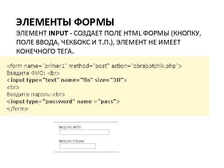
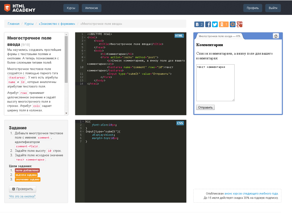
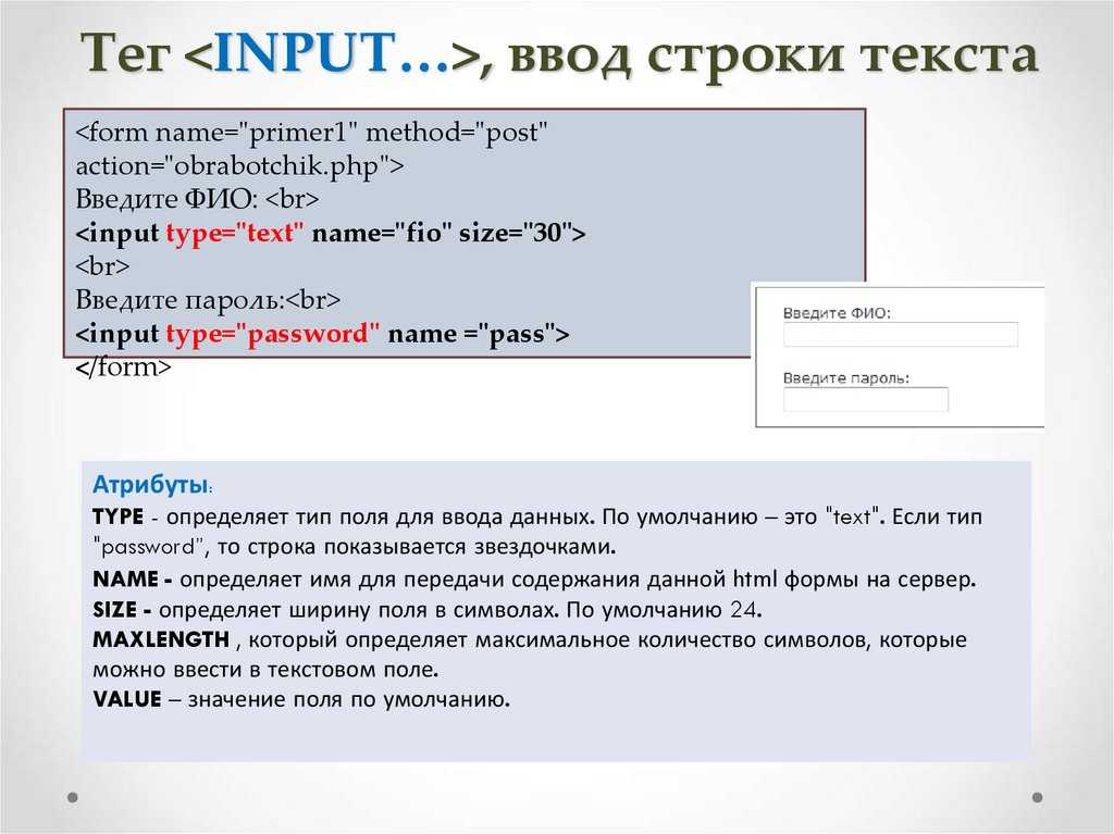
1) Input Type «number»
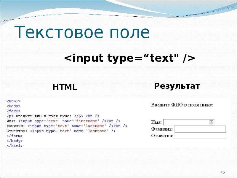
Usually, the default type of an input element is text. Every browser understands this element even when we declare the element using just the tag.
<input />
If we add the above tag on our webpage without mentioning type, it will behave like an input box. HTML5 has introduced the type number, specifically to accept numerical values (+ve and -ve values). At first sight, it looks like an ordinary text box. However, when we set focus on the input box (or hover over the box), you will see that it is a spinner.
Note: Wrap the input element inside the <form> tag to get the desired result.
<form method="get" action="">
Choose a number <br />
<input type="number" name="number-game" />
</form>
Try it
A spinner control allows users to select values by clicking or holding the up or down arrow.
image
Browser Support: Chrome — Yes | Edge — Yes | FireFox — Yes
Including Validation for the Entered Date Values
Any entered date values will not go through the validation process with the default values in the HTML input element. Though the browser will not let you enter any symbol that is not a date, it will still not prevent you from leaving an empty field or entering an invalid date.
A way you can prevent this from happening is to include a validation value inside your HTML syntax that will display an error if you enter an invalid date format in the user interface. Even if you include the min and max attributes, the validation value is the best way to solve the issue of having incorrect date formats.
Let us observe the following HTML syntax:
| <form> <div> <label for=”party”> Choose your preferred date for the party: (required, June 1st to 24th): </label> <input type=”date” id=”party” name=”party” min=”2021-06-01″ max=”2021-06-24″ required> <span class=”validity”> </span> </div> <div> <input type=”submit”> </div> </form> |
As you can see, the validity value is included in the HTML span element. All you have to do is to include the class attribute and assign it with the validity value and the browser is going to do all the job for you. Another method of resolving this issue is including the required attribute inside the HTML syntax. This is going to create a user interface that the user cannot bypass unless they include a correct date format.
– Including Validation for the Entered Date Values: Styling the Element
As previously mentioned, it is highly recommended to style the visual output of the default appearance of your HTML elements.
In this section of the article, we are going to provide you with a CSS syntax that is going to style the previous example containing the validation value. The syntax is going to contain some basic styling properties but you can include as many as you need, or you are required to.
Please observe the following CSS syntax:
| div {margin-bottom: 9px;display: flex;align-items: center;}label {display: inline-block;width: 285px;}input:invalid+span:after {content: ‘ x’;padding-left: 7px;}input:valid+span:after {content: ‘✓’;padding-left: 7px;} |
We have included styling attributes for each HTML element, so the browser is going to display the correct symbol if the user enters a valid date format and it is going to display a false symbol if the date format is incorrect. Though there are not many properties, there are still enough to change the visual output and improve the user’s experience.
Несколько необычных атрибутов элемента
Стандарт HTML5 признает еще несколько атрибутов, используемых для управления браузером при заполнении форм. Не все эти атрибуты поддерживаются всеми браузерами. Тем не менее, с ними хорошо экспериментировать:
- Атрибут spellcheck
-
Некоторые браузеры пытаются заполнить пробелы в знаниях правописания пользователя, проверяя орфографию вводимого текста. Очевидная проблема с этой услугой заключается в том, что не весь текст состоит из настоящих слов, и роспись волнистых красных подчеркиваний может очень быстро начать действовать пользователю на нервы. Чтобы браузер не проверял орфографию текста в поле, присвойте атрибуту spellcheck значение false, а для проверки — значение true.
По умолчанию разные браузеры действуют по-разному в отношении проверки орфографии, а установка атрибута spellcheck приводит к единообразному поведению.
- Атрибут autocomplete
-
Некоторые браузеры пытаются сэкономить время пользователя, предлагая при вводе информации в поле значения, которые вводились в это поле ранее. Такое поведение не всегда желательно — как указывается в спецификации HTML5, некоторая информация может быть конфиденциальной (например, коды для запуска ядерных ракет
 или оставаться актуальной только непродолжительное время (например, одноразовый пароль входа в банковскую систему самообслуживания). Для таких полей установите значение атрибута autocomplete в off, чтобы браузер не предлагал возможных вариантов завершения вводимого в поле текста. А чтобы выполнять автозаполнение для определенного поля, установите значение его атрибута autocomplete в on.
 - Атрибуты autocorrect и autocapitalize
-
Эти атрибуты применяются для управления возможностями автоматического исправления и капитализации на некоторых мобильных браузерах, а именно в версиях Safari для iPad и iPhone
- Атрибут multiple
 или оставаться актуальной только непродолжительное время (например, одноразовый пароль входа в банковскую систему самообслуживания). Для таких полей установите значение атрибута autocomplete в off, чтобы браузер не предлагал возможных вариантов завершения вводимого в поле текста. А чтобы выполнять автозаполнение для определенного поля, установите значение его атрибута autocomplete в on.
Handling of Non-numeric Input
Since entering non-numeric data is easily done, this begs the question “how does the browser handle such invalid data?” Well, it depends on the browser and whether or not the field is mandatory. On a non-mandatory field, the browser parses its value and only retains valid characters, including digits, the minus sign(-) and period(.). On mandatory fields, which include the “required” attribute, the browser may display an error message – as in the case of Opera 11.5x – or simply parse out any non-valid characters – as is done by Safari 5.1:
Note that, in my tests of Windows Safari 5.1, the browser displayed the controls correctly and parsed out invalid characters, but displayed no validation messages, even when a required field contained no input!
16) Input Type «time»
The type time allows users to select time (digital) using a spinner control. Many browsers still do not support this type. Works fine with latest versions of Chrome and Edge.
<form method="get" action="">
<input type="time" name="nop" />
</form>
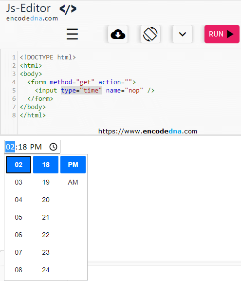
When we add the above tag, it shows an input box with hyphens and colon. However, you can add default values. For example, we want to show the time 12:51 pm then add this value.
<input type="time" value="12:51" />
If you want to show the time as «12:51:20 am», then the values look like this.
<input type="time" value="00:51:20" />
Browser Support: Chrome — Yes | Edge — Yes | FireFox — No
HTML | step Attribute
The HTML step attribute is utilized to establish the discrete step size of the
element, with a default value of 1 for number inputs. This attribute is compatible with input types such as number, range, date, datetime-local, month, time, and week. The syntax for implementing this attribute is as follows:
The attribute values consist of a single value, namely a number, that indicates the acceptable range for the number field. The default value is set to 1.
Example:
html
Output:
The following browsers are supported by the «step» attribute:
-
Google Chrome
6.0 - Internet Explorer 10.0
-
Firefox
16.0 - Opera 10.6
- Safari 5.0
HTML: HyperText Markup, The step attribute is a number that specifies the granularity that the value must adhere to, or the special value any, See the HTML step attribute. Non Standard Attributes. orient. Similar to the -moz-orient non-standard CSS property impacting the <progress> and <meter> elements, the orient attribute defines the orientation …
Input type search
The purpose of this type is to denote that the field is a search field. On the face of it, it is not that much different from text input type, at the time of writing. For most browsers, a field of this type is indistinguishable from the text input type. However, with a little digging, there are some subtleties to it. For example, if a attribute is added (i.e. something like
| 1 | <input type=»search»results=»10″/> |
), then at least some webkit browsers (for example Chrome mobile & desktop, but not stock Android) will display a small magnifying glass icon in the search box, as illustrated below.
In addition, once you begin typing, many browsers will display a small ‘x’ at the right side of the text box, to easily remove any typed text. And a contextualised keyboard is displayed in most supporting browsers too: the iOS keyboard shows a Search instead of the usual Go; similarly, Android displays a magnifying glass icon on the submit button of the virtual keyboard.
Usage:
| 1 | <input type=»search»/> |
Try it:Depending on your browser, you may notice a small magnifying glass in the textfield below, and you may see a small ‘x’ on the right of the field once you start typing. No special restrictions or validations are performed.
Input type search rendered on Chrome for Android browser
Browser support and fallbacks
| Android | iOS | IE Mobile | Opera Mobile | Opera Classic | Opera Mini | Firefox Mobile | Chrome for Android | |
|---|---|---|---|---|---|---|---|---|
| search | ||||||||
| (Sources: caniuse.com, DeviceAtlas, mobilehtml5.org) |
This field is indistinguishable from a text field with respect to the values it submits. However, implementations across mobile browsers differ in terms of how the field is styled by the browser. It has also been reported that styling this field can be problematic when the browser does interpret this field as a search field. See this discussion on styling limitations for more details. While most mobile browsers will present an optimised keyboard (the action button shows a magnifying glass, or is labeled Search), there are differences between browsers in terms of the visual candy shown, such as the magnifying glass in the field itself.
Custom Validation Messages
In the last section we saw how we can trigger client side validation through various new attributes that can be applied to input elements. In some cases however, we may well want to tweak the validation message displayed by the browser. For instance, if we have a complex regular expression to validate or restrict an input, then we might want to instruct the user in a natural language as to what input is expected, rather than displaying the regular expression and hoping that they will know how to interpret and satisfy it.
|
1 |
<form> Email<br/> <input type=»email»name=»email»id=»email»required/> </form> |
| 1 | varemail=document.getElementById(«email»); |
We can now attach an event handler to this element in which we set a new invalid message, so that whenever the state is detected our new message is displayed instead of the default.
|
1 |
email.oninvalid=function(e){ e.target.setCustomValidity(«»); if(!e.target.validity.valid){ e.target.setCustomValidity(«Email, yo!»); } } |
In the handler function we check the validity of the element using the
| 1 | validity.valid |
property, and when it’s not valid, we use the
| 1 | setCustomValidity |
method to apply our custom message.
Finally, we can add a little panache using the CSS pseudo class to apply a visual cue to the validity of the input as it is being entered. Here we set a green background for valid input:
|
1 |
valid{ background#98FB98; } |
Form validation browser support
HTML5 form validation is widely supported across desktop and mobile browsers alike. Few exceptions exist. Before version 10.1, Safari desktop only delivered partial support in that WebKit did not support HTML interactive form validation, which occurs when a form is submitted. This is coming in version 10.1, although there is no ETA for Safari Mobile.
| Android | iOS | IE Mobile | Opera Mobile | Opera Classic | Opera Mini | Firefox Mobile | Chrome for Android | |
|---|---|---|---|---|---|---|---|---|
| Formvalidation | ||||||||
| (Sources: caniuse.com, DeviceAtlas, mobilehtml5.org) |
Как изменить вид ползунка
Для изменения внешнего вида ползунка можно использовать CSS. Первым шагом необходимо задать класс или id для ползунка. Например, класс «slider» для input элемента, который является ползунком.
Далее нужно определить стили для этого класса. Например, при помощи свойства «background-color» можно изменить цвет полосы, по которой перемещается ползунок. А свойством «border-radius» можно задать закругленные углы ползунка.
Также можно изменить внешний вид бегунка — элемента, который перемещается по полосе. Для этого нужно задать стили для псевдоэлемента «::-webkit-slider-thumb» в случае использования Google Chrome или Safari. Для других браузеров можно использовать соответствующие псевдоэлементы.
Пример стилей для изменения внешнего вида ползунка:
.slider {
  width: 100%;
  height: 10px;
  -webkit-appearance: none;
  appearance: none;
  background-color: #ddd;
  border-radius: 5px;
}

.slider::-webkit-slider-thumb {
  -webkit-appearance: none;
  width: 20px;
  height: 20px;
  background-color: #333;
  border-radius: 50%;
  cursor: pointer;
}
Эти стили задают ползунку серый цвет и закругленные углы, а бегунку черный цвет и закругленную форму.
Input type date
When supported, interacting with a field using this input type will display a native-like date picker widget.
Usage:
| 1 | <input type=»date»/> |
Try it:
Date input type as implemented on Opera Mobile for Android, and iOS 7
Note that the input type, as well as variants and offer useful attributes, such as and that can restrict and validate the user input data. We take a closer look at this in the section below on .
Browser support and fallbacks
| Android | iOS | IE Mobile | Opera Mobile | Opera Classic | Opera Mini | Firefox Mobile | Chrome for Android | |
|---|---|---|---|---|---|---|---|---|
| date | ||||||||
| (Sources: caniuse.com, DeviceAtlas, mobilehtml5.org) |
Although the implementations are different across the various mobile OS platforms, support is quite widespread, with the exception of the stock Android browser.
For this browser and for low-end devices a simple text field will be displayed. This is not very user-friendly for date input. A JavaScript datepicker can be implemented for high-end devices which do not support this field. A good server-side fallback for low-end devices is to build three dropdowns, for year, month, and day.
On desktop browsers too, this input type is widely supported, with the exception of Safari, Internet Explorer and Firefox. However, IE Edge does support input types, and it’s under development in Firefox (and available in Firefox Nightly builds).
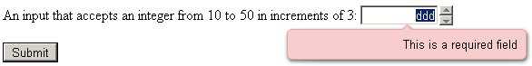
The Range Input Type
Similar to the number type, the “range” input type sets a numeric value using a slider control. It’s supposedly for “imprecise” numeric input, where the specific number chosen is not as important as the its general location on a scale. For that reason, the browser does not display the chosen value. Here is the code to convert the intNumber element above from a number to a range input type:
<label for="intNumber">An input that accepts an integer from 1 to 20 in increments of 1:</label>
<input id="intNumber" type="range" min="1" max="20" />
The above code produces the following in Opera 11.51:
For greater control over the range input, you can add an <DIV> or readonly textbox to display the current value, or better still, the HTML5 output tag, whose purpose is to display the result of a calculation. In the following example, a range control is set with the default value of ten. The one-liner updateRangeValue() function sets the intNumberValue <output> to the intNumber control’s starting value:
<label for="intNumber">An input that accepts an integer from 1 to 20 in increments of 1:</label>
<input id="intNumber" type="range" min="1" max="20" value="10" onchange="updateRangeValue();" />
<strong><output id="intNumberValue"> </output></strong>
<script type="text/javascript">
function updateRangeValue() {
intNumberValue.innerHTML = intNumber.value;
}
var intNumber = document.getElementById("intNumber");
var intNumberValue = document.getElementById("intNumberValue");
updateRangeValue();
</script>
Now it’s clear what the value is at all times, thus allowing for precise number inputting:
Необходимые инструменты для создания ползунка
Создание ползунка в HTML требует нескольких инструментов. Во-первых, нужна интегрированная среда разработки (IDE) или текстовый редактор, чтобы создавать и редактировать HTML-файлы. Во-вторых, нужно знать язык программирования JavaScript, так как он является необходимым для создания интерактивных элементов на странице.
Для создания ползунка также потребуется CSS, чтобы задавать стили элементов HTML, включая ползунок. Также понадобится изображение, которое будет использоваться в качестве ползунка.
Важно понимать, что создание ползунка в HTML может быть сложным процессом, особенно для начинающих разработчиков. Однако, если компетенции в IT-сфере есть, а также есть терпение и упорство, то можно создать ползунок самостоятельно, используя доступные инструменты, библиотеки и ресурсы
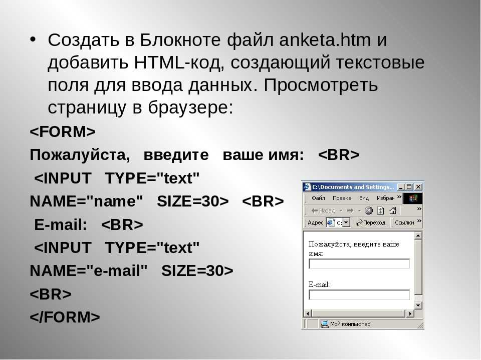
Input Syntax
Creating an HTML date input syntax does not have to be a complicated process and the syntax is actually quite simple. Besides using the HTML input element and its attribute with the date value, you are also supposed to include the HTML label element to create a text field.
This text field is used to tell users what date they are supposed to select. However, you need to remember to associate those two elements by accordingly using their attributes with the exact name value.
![How to make an html text box [examples]](https://rwvt.ru/wp-content/uploads/1/4/3/143f429ef72da85a6b68d24007b32b56.png)

Let us take a look at a simple HTML date input example:
| <label for=”birth”> Enter your date of birth: </label><input type=”date” id=”birth” name=”trip-start”value=”2018-07-22″min=”1900-01-01″ max=”2021-12-31″> |
As you can see, this example contains a date input interface used for entering the user’s date of birth. The type attribute inside the HTML input element contains the name “date”, which tells the browser exactly what it is supposed to do. We have included other attributes in the same tag to show you that the syntax can remain simple yet contain different information and functions. However, it is always recommended to include specific styling properties for these elements to visually change their output, and this is easily done using a simple CSS syntax.
– Including CSS Properties
There is no better way to style any HTML element than using specific CSS styling attributes. The CSS syntax allows web developers to style the visual output of their HTML elements, which sometimes is essential for a better user experience. Though you can include the CSS syntax inside the head of your HTML document, it is highly recommended to write it on a separate document and then link them together.
The CSS syntax can get quite complex but for the sake of this example, we have kept things short and precise:
| label {display: block;font: 2rem ‘Fira Arial’, arial;}input,label {margin: .5rem 0;} |
By creating a couple of CSS classes and including specific styling properties, you have successfully altered the visual output of your HTML date input. This is the easiest way to change the font, margins, or display. We highly encourage you to give it a try and include as many CSS styling properties as you need to see how easy and simple the process is.
19) Input Type «range»
The type range is the most useful type designed by HTML5. This is my personal opinion. It shows a slider control on the web page, which you can slide from least value to max value. Designing a slider would require lots of scripting in previous versions of HTML. However, now we have a readymade control, which is easy to use and simple to make it function.
<input type="range" name="carat-range" />
Since its a range, it must have a minimum value and maximum value. For this, we will add the min and max attribute with the type range.
<input type="range" min="1" max="10" value="3" name="carat-range" />
So now, the range has a min value of 1 and max value of 10. Its default value is 3.
Try it
Browser Support: Chrome — Yes | Edge — Yes | FireFox 34.0 — Yes | Internet Explorer 10 — Yes
← PreviousNext →