
Техники рендеринга
Сегодня существует несколько алгоритмов визуализации, которые используют рендеры для получения конечной фотореалистичной картинки. Но большинство из них объединены общей целью — создать изображение, опираясь на особенности попадания света на определенный объект. Фотореализм достигается как раз благодаря грамотному распределению пучков света по объекту. Для этого ПО может использовать следующие техники рендеринга.
Растеризация. Один из самых старых методов, которые используют рендеры. При растеризации модель разделяется на множество полигонов при помощи сетки. Вершины полигонов несут в себе информацию о цвете, текстуре и положении. В процессе рендеринга вершины проецируются перпендикулярно камере на пустую плоскость. Эффект перспективы относительно наблюдателя при растеризации не рассматривается. Метод рендеринга считается самым быстрым и сегодня используется в сферах, требующих обработки изображения в реальном времени: видеоиграх, симуляциях, при работе интерактивного графического интерфейса.
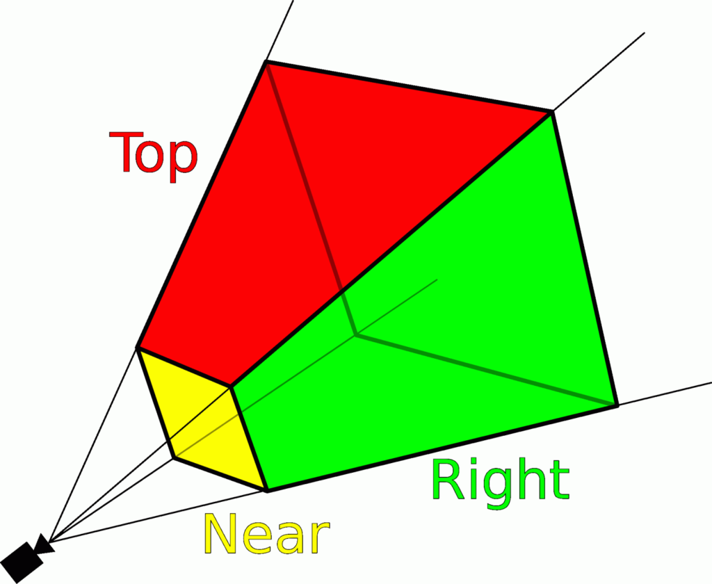
Схематическое изображение процесса растеризации. Источник
Лучевое литье (рейкастинг). При наличии в сцене перекрывающих друг друга объектов растеризация не сможет обработать изображение корректно: часть изображений при рендеринге может отразиться и привести к искажению цены. В таком случае уместно использовать приведение лучей, при котором свет направляется на модель с точки зрения наблюдателя. При использовании такой технологии лучи будут выводиться на все пиксели на плоскости изображения. В процессе рендеринга будет отрисована та поверхность, на которую лучи попадут в первую очередь.
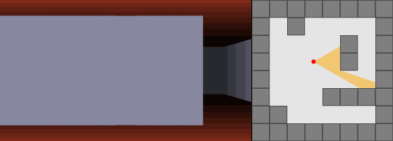
Пример работы рейкастинга. Источник
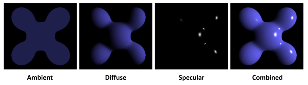
Трассировка лучей. Лучевое литье не рассчитано на корректное отображение теней, создание преломлений и отражений. Развитие 3D требовало появления новых технологий, и разработчики смогли создать метод трассировки лучей. Принцип действия схож с рейкастингом, но отличие в том, что свет отображается более корректно: первичные лучи, направленные на модель, продуцируют вторичные лучи — теневые, преломляющие или отраженные. Трассировка учитывает свойства поверхности модели для создания максимально корректного изображения. Если же путь луча света к модели перегораживается каким-то объектом, то на поверхности модели возникает тень этого объекта. В случае, если поверхность имеет отражающие свойства, луч будет отражен и перенаправлен на другие объекты в сцене с учетом ее геометрии.
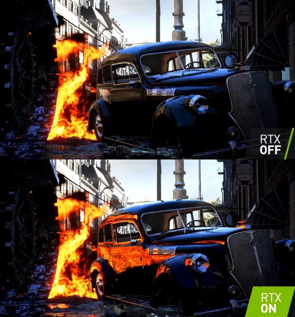
Пример наличия и отсутствия трассировки лучей. Источник
Уравнение рендеринга. Для передачи максимальной реалистичности требуется не просто направление луча света, а обработка сложных математических данных. С этой целью и создано уравнение рендеринга, которое моделирует освещение объектов во всей сцене. Трассировка лучей использует при работе только прямое освещение, в то время как уравнение учитывает все источники света, задействованные в рендере.
Пример изображения, полученного при помощи нескольких уравнений рендеринга. Источник ИСКРА — неделя знакомства с дизайн-профессиями
бесплатно
ИСКРА — неделя знакомства с дизайн-профессиями
Какие они — востребованные в IT дизайн-профессии? Знакомьтесь с ними в течение недели, выбирайте подходящую и получайте полезные подарки каждый день.
разжечь искру
Resolving the Paradox
Equipped with the history and semantics of , we can resolve the paradox!
For pixelart, it is clear the value should be used; that’s what most closely matches the semantics of the art. However, since Firefox does not yet support , we can fall back onto its currently provided solution, , which will resolve to the nearest neighbor algorithm.
Enter fullscreen modeExit fullscreen mode
The fact that is last is very important! If we imagine a future where Firefox has implemented , then we want that value to be applied instead of . Letting the most semantically appropriate value be last future-proofs the solution.
For maximum compatibility, the undead Internet Explorer browser can be supported with .
And what about images which should have high contrast?
Chrome and Safari do not support , but instead support a webkit property called which bears similar semantics. Therefore, rather than use , it is better to use something that more closely resembles what means:
Enter fullscreen modeExit fullscreen mode
And with that, we can celebrate with the final demo!
Step 2: rendering the image
With the , and values ready, we can start building the image component itself. I’ll use Svelte as it’s close to HTML, but you can use these principles with any web framework. Let’s start with the basics:
<script>
	import getImageProps from '../utils/getImageProps';

	export let image;
</script>

<img
  alt={image.alt || " "}
  {// Pass src, srcset and sizes to the image element
    ...getImageProps({
      image,
      maxWidth: 600
    })
  }
/>
With the above, images will load and the browser will choose the proper size for them. BUT all images are loading as soon as the page loads, and what we really want is to only load them when they show up on-screen — the famous lazy loading.
In the past, I’d leverage custom lazy loading code that would hide the image until an IntersectionObserver fired when its parent showed up in the viewport. Then, I’d finally add the element to the DOM and the browser would do its magic.
It worked, but it has a few accessibility and SEO concerns, as the content isn’t all there for non-visual readers & bots. Thankfully, in 2022 the (for images, not iframes) works on all major browsers. So, with one line our images are lazily loaded
<img
  loading="lazy"
  alt={image.alt || " "}
  {// Pass src, srcset, width, height and sizes to the image element
    ...getImageProps({
      image,
      maxWidth: 600
    })
  }
/>
The above won’t be 100% smooth for UX, though, as the browser won’t know what height the image will assume at a given width. This leads to content jumping around as images load and the browser recalculates their dimensions and the page’s layout.
Note
I won’t get into any other image styles here — go wild with your designs, it’s a simple element you can plug anywhere!
In the past, I’d use the padding hack to force a consistent height on the image element (or its parent) and hence prevent content from jumping around. It worked wonderfully but led to extra markup and styles that made it harder to create complex image layouts. Plus, the image component ended up much harder to reason about.
Again, it’s 2022 and the browser now calculates the image’s aspect ratio based on images width and height attributes (supported across all major browsers). As getImageProps is already returning & , all we need to do is set «height: auto» to prevent the image from being distorted! More info on this by Jen Simmons.
<img
  style="height: auto;"
  loading="lazy"
  alt={image.alt || " "}
  {// Pass src, srcset, width, height and sizes to the image element
    ...getImageProps({
      image,
      maxWidth: 600
    })
  }
/>
As an added bonus, our component is now much less tied to framework-specific features. It’s literally a couple of generic JS functions and a single element with dynamic attributes.
React version:
const SanityImage = ({ image }) => {
  return (
    <img
      style={{ height "auto" }}
      ="lazy"
      alt={image.alt || " "}
      {
        ...getImageProps({
          image,
          maxWidth 600
        })
      }
    />
  )
}
Plain JS version:
const SanityImage = ({ image }) => {
  const { src, srcset, sizes, width, height } = getImageProps({
    image,
    maxWidth 600
  });
  return `
    <img
      style="height: auto"
      loading="lazy"
      alt="${image.alt || " "}"
      src="${src}"
      srcset="${srcset}"
      sizes="${sizes}"
      width="${width}"
      height="${height}"
    />
  `
}
Above-the-fold, «eager» image loading
For images above the fold, such as the one in the «hero» (or header) component, you don’t want to lazy load them as you want users to see them as soon as the page is loaded. The image component above could easily support this modification with a configurable property:
<script>
	import getImageProps from '../utils/getImageProps';

	export let image;
	export let loading = "lazy"
</script>

<img
  style="height: auto"
  {loading}
  fetchPriority={loading === "eager" ? "high" : undefined}
  alt={image.alt || " "}
  {// Pass src, srcset and sizes to the image element
    ...getImageProps({
      image,
      maxWidth: 600
    })
  }
/>


<SanityImage image={...} ="eager" />
Notice we’re adding fetchPriority=»high» for eager images, which tells the browser to give preference to loading them sooner, reducing the hit on the Largest Contentful Paint performance benchmark.
Bonus: image loading transition/animation
For a nicer loading effect, we can hide the image until it’s fully loaded, and then trigger an opacity transition for a subtle-yet-elegant animation. Here’s how I achieve that in Svelte:
<script>


  let loaded = false
</script>

<img
  ...
  data-loaded={loaded}
  on:load={() => loaded = true}
/>

<style>
  img {
    transition .15s opacity;
  }
  img {
    opacity 0;
  }
</style>
Once loaded, the browser will call the event, and the attribute will become true, changing the CSS from to the unset, default value of 1, creating the simple transition.
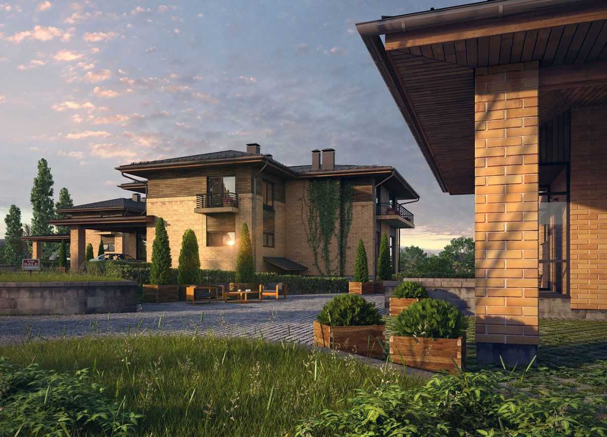
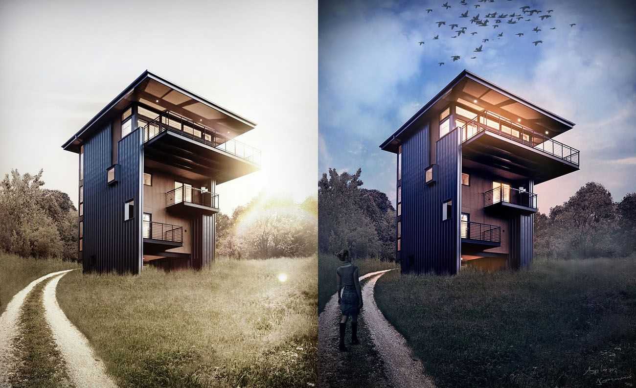
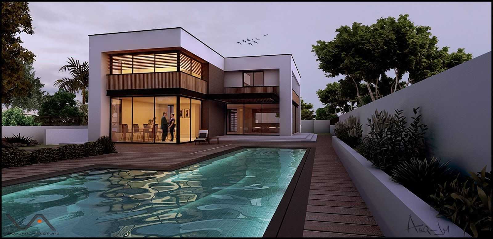
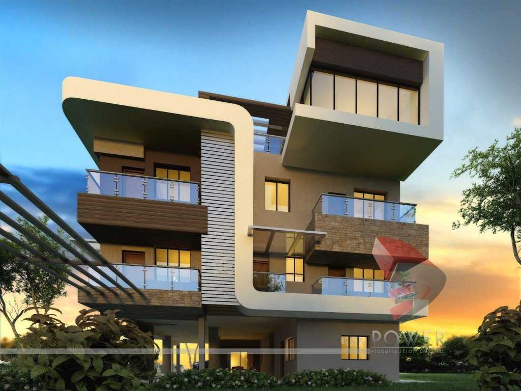
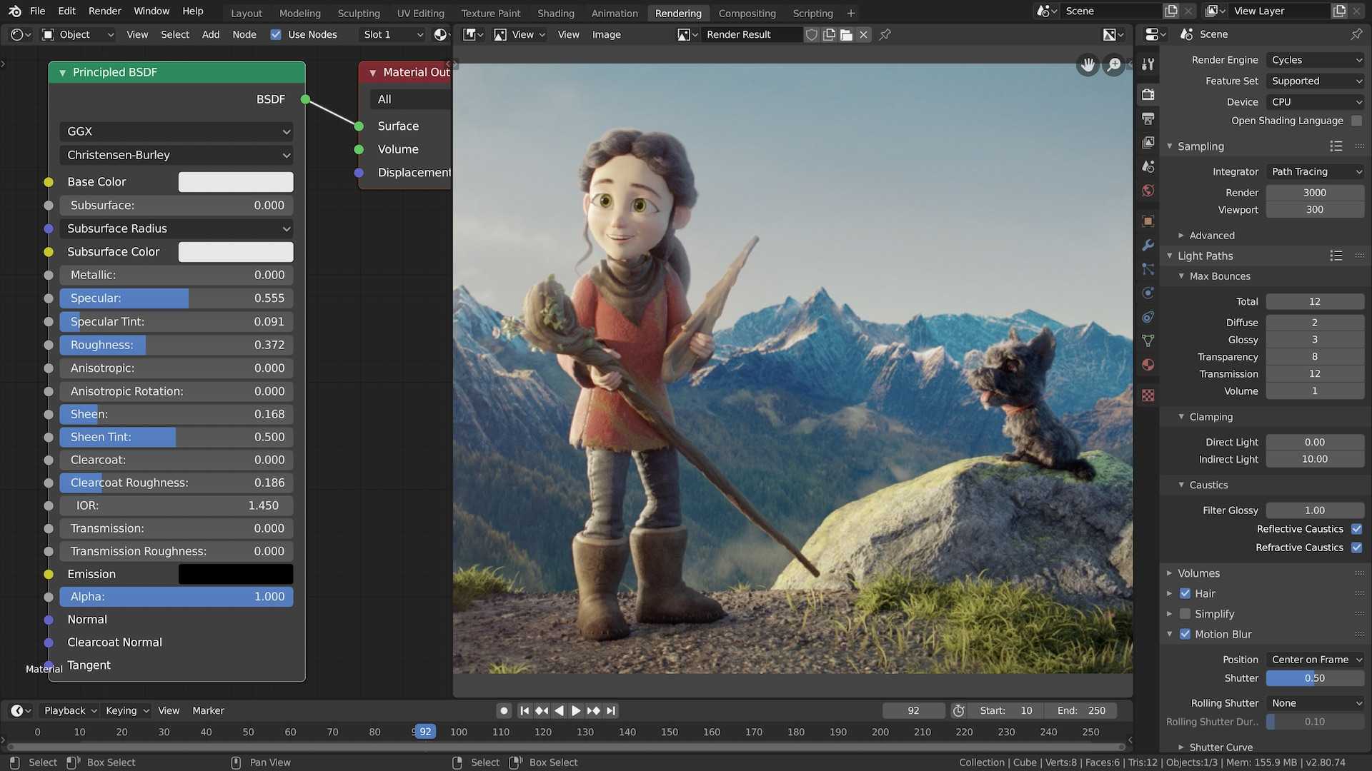
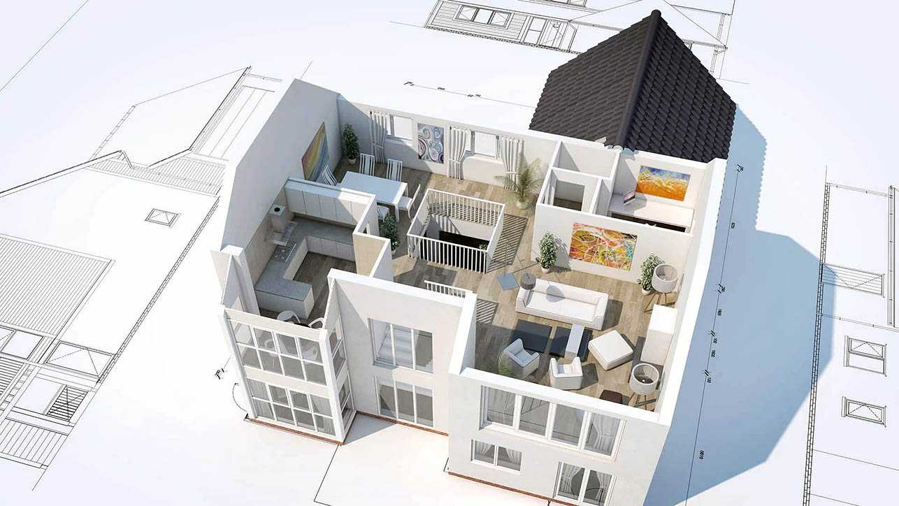
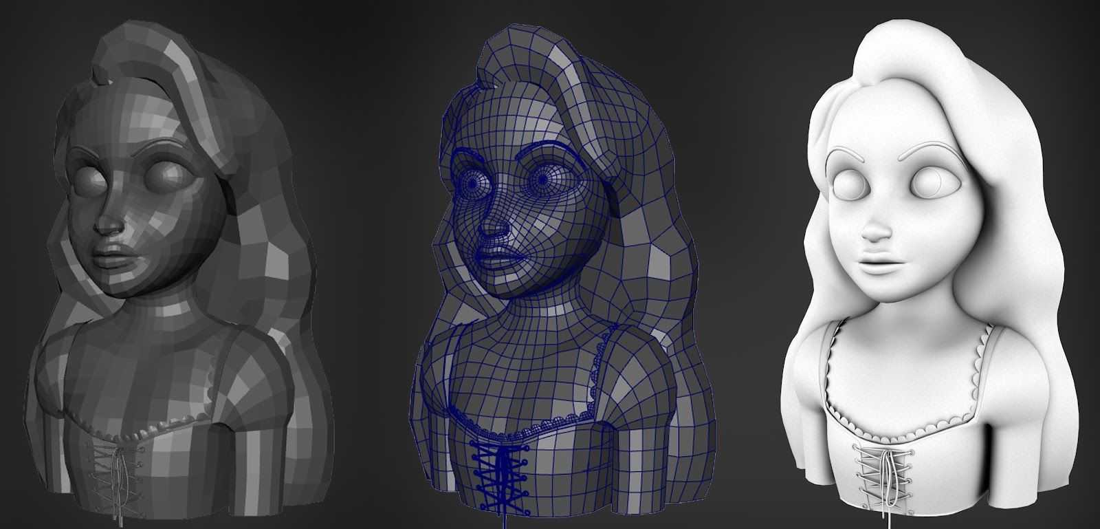
Что такое рендеринг
Рендеринг – это процесс получения плоского растрового изображения (или целой цепочки из таких изображений) на основе 2D- или 3D- моделей, созданных художником, дизайнером или модельером.
Данный процесс относится к компьютерной графике и реализуется с помощью специальной программы, которая переводит модели и сцены в плоское изображение. Сама работа рендеринга представляет собой набор сложных вычислений, что требует наличие мощной, профессиональной аппаратуры. Качество и срок готовности финального изображения напрямую зависит от производительности техники.

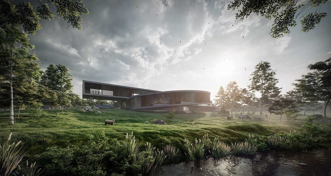
Что такое рендеринг
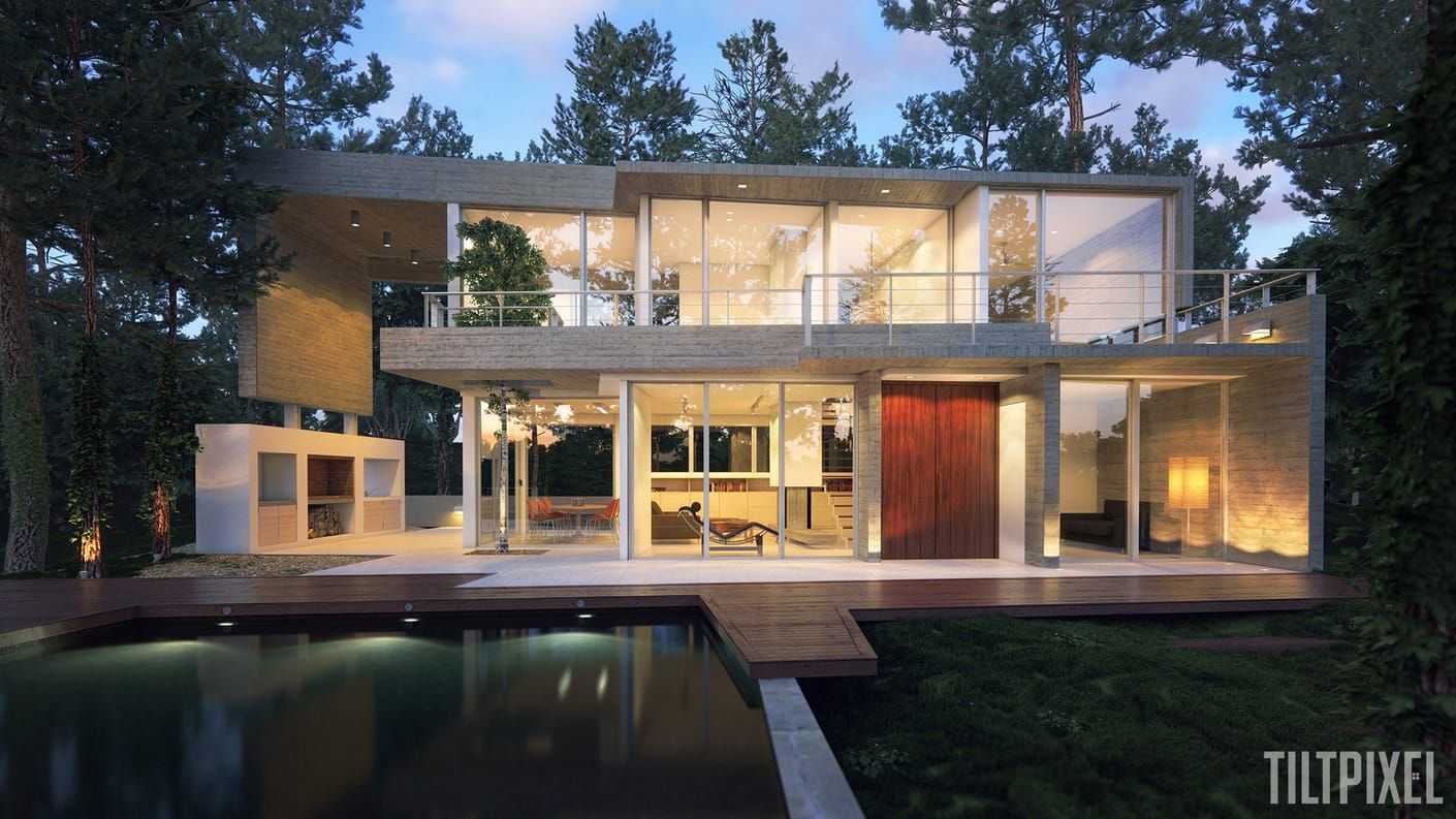
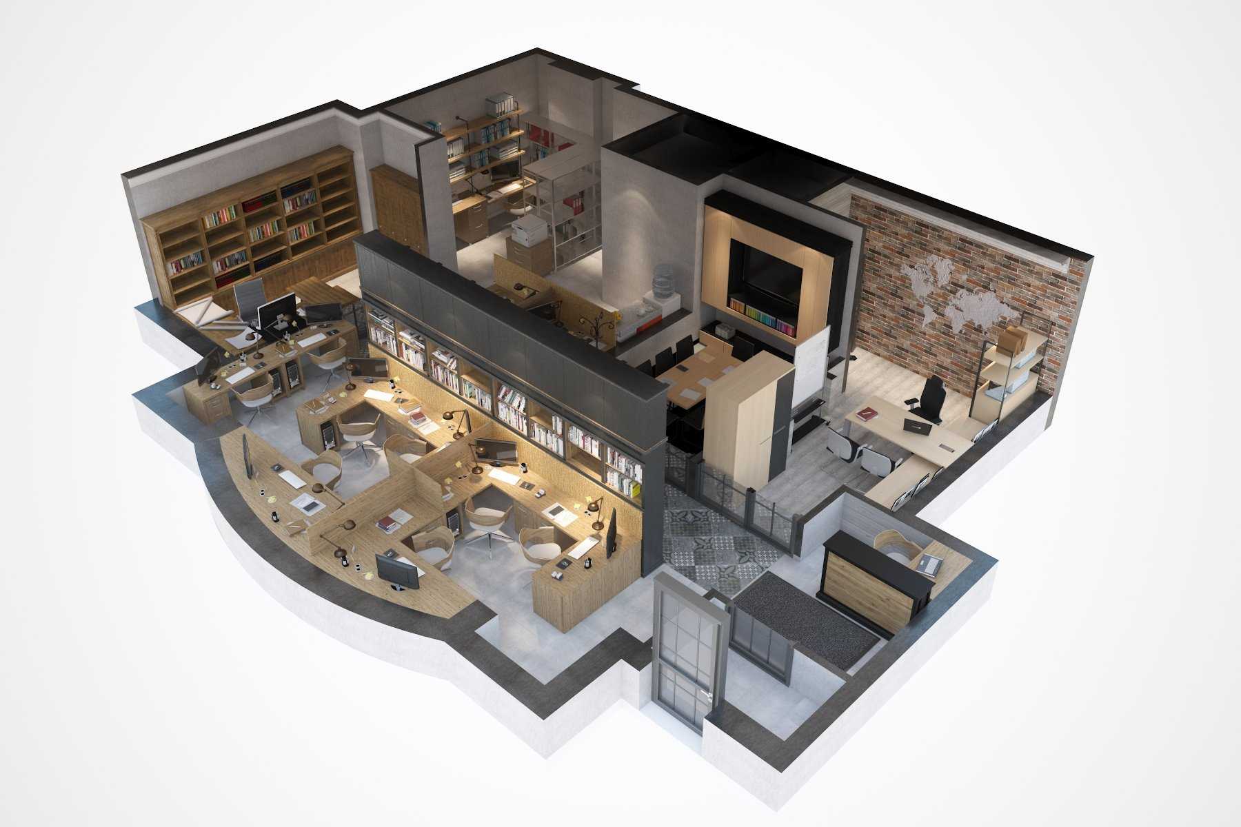
Приводим краткое схематичное описание процесса 3d-рендеринга. Движок рендера работает над большим количеством вычислений по заданным алгоритмам. Каждая сцена и модель, созданная автором, содержит математические данные, которые поэтапно обрабатываются и преобразуются в плоское изображение.
В процессе обработки модели в сцене «обрастают» подробностями: появляются четкие линии контура, цвет и оттенки, модели начинаются отбрасывать тени и отражаться согласно законам физики. Работа происходит над каждым пикселем, и чем больше их обработано, тем четче и более завершенным становится изображение, ранее нарисованное художником в голове.
Готовые визуальные образы можно выстраивать в видеоряд или представлять по отдельности. Все зависит от проекта и задач, которые ставились перед процессом рендеринга.
Background
The ‘image-rendering’ property was defined in
to give a hint as to how an image should be
scaled. Values allowed are:
- auto
- User agent can use nearest neighbor but bilinear resampling preferred.
- optimizeQuality
- User agent should employ a resampling algorithm at least as good as bilinear sampling.
- optimizeSpeed
- User agent should emphasize rendering speed over quality.
SVG 2 adds a condition to auto: For
Conforming High-Quality SVG Viewers, the user agent shall
employ a resampling algorithm at least as good as bilinear
resampling.
SVG 1.1: In all cases, resampling must be done in a
truecolor (e.g., 24-bit) color space even if the original data
and/or the target device is indexed color.
SVG 2: We should add: High quality SVG viewers should perform the
image processing using a linear color space.
The holy grail of web images
In short, we want crisp, fast-loading, accessible images that don’t waste bandwidth. Concretely, they need to:
- Scale to their visual placement on the page — no 3000px-wide file in a tiny 50px avatar component
- Scale to the user’s device pixel density — a 3x retina screen will use 150 actual pixels to render 50 «virtual» pixels (the equivalent of CSS’s )
- Be served in the most effective format — if a simple vector, an SVG will always be smaller & crispier, for example
- If cropped by the layout, they should adapt to their container with proper focus on the most important bits of the picture
- Only load when in view (lazy loading)
- Contain clear descriptions in the property
- Avoid low contrast and other visibility issues
Going deeper
MDN’s responsive images guide is a great read if you want to diver deeper into the points above. It goes beyond the technicalities of s and brushes on art direction, which is often required for specific types of content.
With Sanity’s image CDN we can automate 1, 2 & 3 and give editors the peace of mind of images just working, so they can focus on creating high-quality content and not on scaling files.
For cropping (#4), you can enable and have your front-end(s) react automagically to them, ensuring the most important bits of the image are always shown, as defined by creators.
6 & 7 are out of the front-end’s control, but you can instruct and nudge your editors to help visually impaired readers. See step 3 below.
Now, let’s go through the step-by-step to achieve the holy grail above
Browser compatibility
- Desktop
- Mobile
| Feature | Chrome | Firefox (Gecko) | Internet Explorer | Opera | Safari (WebKit) |
|---|---|---|---|---|---|
| Basic support () | (Yes) | 3.6 (1.9.2) | No support | 11.60 | (Yes) |
| No support | 3.6 (1.9.2)-moz | No support | 11.60-o | (Yes) | |
| 41.0 | No support (bug ) | No support | 26.0 | (Yes) | |
| , | No support | 3.6 (1.9.2) | No support | 11.60 | (Yes) |
| Feature | Android | Firefox Mobile (Gecko) | IE Phone | Opera Mobile | Safari Mobile |
|---|---|---|---|---|---|
| Basic support | 41.0 | ? | ? | ? | ? |
Notes
Internet Explorer 7 and 8 supports the non-standard property with two values ( and ):
- applies only to images (JPG, GIF, PNG, …)
- in IE7 only for images without transparency
- does not inherit
- default value IE7: (low quality)
- default value IE8: (high quality)
- obsolete as of IE9
Supported with a non-standard name: .
WebKit Nightly support, see bug
Canvas can provide a fallback solution for crisp-edge/optimize-contrast through manual imageData manipulation.
What’s with the paradox?
Without being involved in the dialogue directly, it’s hard to pinpoint the precise reasons why has the support it has. After delving through documentation, discussions, and definitions (oh my!), there was one truth underpinning it all.
The rules for how should work are not set in stone.
In fact, despite this property having first appeared in 2012, just a few months ago in February 2021 the changed! And furthermore, it had seen periodic change over its nine-year history. In other words, is undergoing active discussion, at least some of which has come from feedback from browsers implementing the feature for testing.
What is the CSS Specification?The specification is a set of documents detailing what the features of CSS are, how they should be used, and how they should be implemented by browsers. It’s basically the source of truth for what CSS is and will be, and has been in constant development since its inception decades ago. Feel free to read more about the CSS standardization process.
As a result, the property has only ever been implemented to different degrees, with Firefox and Chrome having taken different routes. And since the spec is still under discussion, no one has a complete implementation.
In the end, Firefox developed because it already supported the non-standard property , which was meant to be the same thing. Chrome had implemented because, at the time in 2014, the spec for was more straightforward.
Терминология рендеринга
Перед тем, как начать осваивать рендеринг новичку, нужно понять принцип самой технологии и познакомиться с терминологией.
- Прозрачность – прямое прохождение луча света сквозь объект.
- Полупрозрачность — рассеянный свет лучей, которые проходят сквозь объект.
- Преломление —изменение направления луча света на стыке двух объектов, связано с прозрачностью.
- Дифракция — огибание лучом света границ объекта.
- Непрямое освещение — свет, который отражается от нескольких поверхностей, а не от источника света.
- Каустика — форма непрямого освещения, возникающая от особых линий и особых поверхностей, где лучи света сходятся в одной точке сквозь прозрачный объект.
- Фоггинг —световые лучи становятся тусклыми при прохождении сквозь туман или другие осадки.
Узнай, какие ИТ — профессии входят в ТОП-30 с доходом от 210 000 ₽/мес
Павел Симонов
Исполнительный директор Geekbrains
Команда GeekBrains совместно с международными специалистами по развитию карьеры
подготовили материалы, которые помогут вам начать путь к профессии мечты.
Подборка содержит только самые востребованные и высокооплачиваемые специальности и направления в
IT-сфере. 86% наших учеников с помощью данных материалов определились с карьерной целью на ближайшее
будущее!
Скачивайте и используйте уже сегодня:
Павел Симонов
Исполнительный директор Geekbrains
Топ-30 самых востребованных и высокооплачиваемых профессий 2023
Поможет разобраться в актуальной ситуации на рынке труда
Подборка 50+ бесплатных нейросетей для упрощения работы и увеличения заработка
Только проверенные нейросети с доступом из России и свободным использованием
ТОП-100 площадок для поиска работы от GeekBrains
Список проверенных ресурсов реальных вакансий с доходом от 210 000 ₽
Получить подборку бесплатно
pdf 3,7mb
doc 1,7mb
Уже скачали 22320
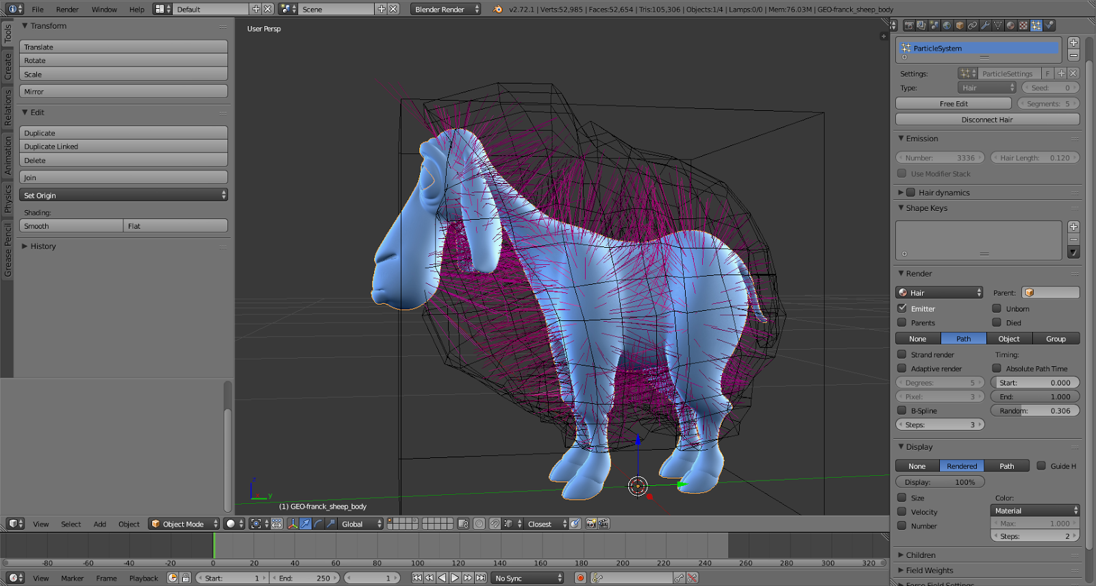
- Бамп-мэппинг — технология создания рельефных контуров на различных поверхностях.
- Шейдинг — регулировка степени яркости оттенков поверхности с помощью освещения.
object-fit CSS property
You can use the CSS property on the element to specify how the image should be resized & cropped to fit the container. Before this CSS property was introduced, we had to resort to using a background image.
Along with , , and , there are 5 more possible values for object-fit:
- : It preserves the original aspect ratio of the image, but the image is resized so that it is fully visible. The longest of either the height or width will fit in the given dimensions, regardless of the size of the containing box.
- : It preserves the original aspect ratio but resizes the image to cover the entire container, even if it has to upscale the image or crop it.
- : This is the default value. The image will fill its given area, even if it means losing its aspect ratio.
- : The image is not resized at all, and the original image size fills the given area.
- : The smaller of either contain or none.
You can use to control the starting position of the image in case a cropped part of the image is being rendered.
Let’s understand these with examples.
The following image’s original width is 1280px and height is 854px. Here it is stretching to maximum available width using .

object-fit:contains
The original aspect ratio of the image is same, but the image is resized so that it is fully visible. We have added border around the image to showcase this.
object-fit:cover
The original aspect ratio is preserved but to cover the whole area image is clipped from the left and right side.
object-fit:fill
Image is forced to fit into a 200px wide container with height 300px, the original aspect ratio is not preserved.
object-fit:none
object-fit:scale-down
object-fit:cover and object-position:right
Examples
/* applies to GIF and PNG images; avoids blurry edges */

img, img {
                   image-rendering: -moz-crisp-edges;         /* Firefox */
                   image-rendering:   -o-crisp-edges;         /* Opera */
                   image-rendering: -webkit-optimize-contrast;/* Webkit (non-standard naming) */
                   image-rendering: crisp-edges;
                   -ms-interpolation-mode: nearest-neighbor;  /* IE (non-standard property) */
                 }
div {
        background: url(chessboard.gif) no-repeat 50% 50%;
        image-rendering: -moz-crisp-edges;         /* Firefox */
        image-rendering:   -o-crisp-edges;         /* Opera */
        image-rendering: -webkit-optimize-contrast;/* Webkit (non-standard naming) */
        image-rendering: crisp-edges;
        -ms-interpolation-mode: nearest-neighbor;  /* IE (non-standard property) */
}
The performance comparison
So how do these different approaches compare with each other?
This project is the result of some performance comparison, running on iPhone 7 iOS 12.2.
The numbers below are the average time it took to load, optimize, and render a large earth image in multiple iterations:
| Time consuming(seconds) | |
|---|---|
| Tip # 1: | 0.1420 |
| Tip # 2: 1 | 0.1722 |
| Tip # 3: | 0.1616 |
| Tip # 4: 2 | 2.4983 |
| Tip # 5: | 2.3126 |
1 Setting different CGInterpolationQuality values gives consistent results, with negligible difference in performance.
2 if in setting kCIContextUseSoftwareRenderer CIContext created value is true, based the results leads to time-consuming than slow an order of magnitude.
How do I Render a Photo?
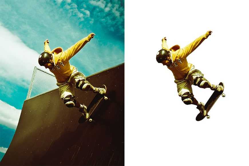
Most of the time photographers aren’t called upon to render images in the technical sense – that’s for your device’s software and/or your browser to do.
If, however, you’re using “render” to mean cutting out the different elements of a composite, how you do this will depend on what software you’re using.
What’s important is that you have an image editor that has layer functionality and a decent tool set for making fine selections.
(Beware, not all selection tools are created equal. Photoshop is still the best software available when it comes to making fine selections.)
If you’re just looking to change the background, many programs will do this automatically. The same is true of switching skies.
The results won’t often be perfect – you’ll still have to put on the final touches – but the technology has definitely come a long way.
If, however, you’re looking to make multiple fine cutouts, using a program like Photoshop or GIMP will be your best bet.
From there, you’ll need to learn your selection tools of choice (there are many). Once the part of the image you want to use is selected, hit “copy” and then “paste” into a separate layer in the composite you’re making.
Once you have all your elements present and aligned, you can then “flatten” your image (i.e. combine all the layers into a single layer). You now have your final render.
Syntax
image-rendering: auto;
image-rendering: crisp-edges;
image-rendering: pixelated;

/* Global values */
image-rendering: inherit;
image-rendering: initial;
image-rendering: unset;
Values
- Default value, the image should be scaled with an algorithm that maximizes the appearance of the image. In particular, scaling algorithms that «smooth» colors are acceptable, such as bilinear interpolation. This is intended for images such as photos. Since version 1.9 (Firefox 3.0), Gecko uses bilinear resampling (high quality).
- The image must be scaled with an algorithm that preserves contrast and edges in the image, and which does not smooth colors or introduce blur to the image in the process. This is intended for images such as pixel art.
- When scaling the image up, the «nearest neighbor» or similar algorithm must be used, so that the image appears to be composed of large pixels. When scaling down, this is the same as ‘auto’.
The values and present in early draft (and coming from its SVG counterpart) are defined as synonyms for the value.
How to set the rendering mode
You can set image rendering mode through the Asset Catalog or programmatically.
Asset Catalog
When adding a new image into Asset Catalog, Xcode will set its rendering mode to Default.
We will discover the default rendering mode in the . Right now, you can think of it as no preference.

You can change image rendering mode by selecting it from the Render As option under the Attributed Inspector.
You can easily change image rendering mode in the Attributed Inspector.
Programmatically via UIKit
We can set image rendering mode by using the instance method, . This method will return a new instance of that uses the specified rendering mode.
Browser compatibility
- Desktop
- Mobile
| Feature | Chrome | Firefox (Gecko) | Internet Explorer | Opera | Safari (WebKit) |
|---|---|---|---|---|---|
| Basic support () | (Yes) | 3.6 (1.9.2) | Not supported | 11.60 | (Yes) |
| Not supported | 3.6 (1.9.2)-moz | Not supported | 11.60-o | (Yes) | |
| 41.0 | Not supported (bug ) | Not supported | 26.0 | (Yes) | |
| , | Not supported | 3.6 (1.9.2) | Not supported | 11.60 | (Yes) |
| Feature | Android | Firefox Mobile (Gecko) | IE Phone | Opera Mobile | Safari Mobile |
|---|---|---|---|---|---|
| Basic support | 41.0 | ? | ? | ? | ? |
Notes
Internet Explorer 7 and 8 supports the non-standard property with two values ( and ):
- applies only to images (JPG, GIF, PNG, …)
- in IE7 only for images without transparency
- does not inherit
- default value IE7: (low quality)
- default value IE8: (high quality)
- obsolete as of IE9
Supported with a non-standard name: .
WebKit Nightly support, see bug
Canvas can provide a fallback solution for crisp-edge/optimize-contrast through manual imageData manipulation.
Final Words
When most people refer to image rendering, they’ll be referring to 3-D renders.
That being said, it’s still important to understand rendering in terms of photography.
From an artistic sense, we want our images to truly capture the essence and experience of the scene we pushed the shutter button on. The closer an image render gets to what we were trying to create, the less post-processing work we’ll have to do to get it there.
From a product photography standpoint, 3-D rendering is changing the way we create and display images online. It may well be the wave of the future.
At this point, technology is now so developed that it’s becoming more and more difficult to determine if a rendering is a photo or a photo is a generated rendering.
So while you may not ever be called upon to render any images, you’re surrounded by them all the time – whether on your camera screen, on the web, or on your gaming system.
Highly Recommended
8 Tools for Photographers
Check out these 8 essential tools to help you succeed as a professional photographer.
Includes limited-time discounts.
Learn more here