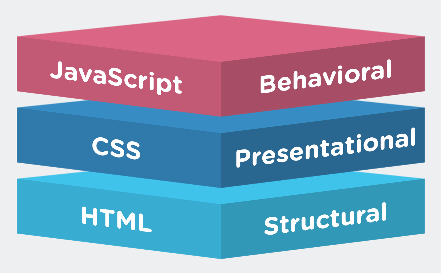
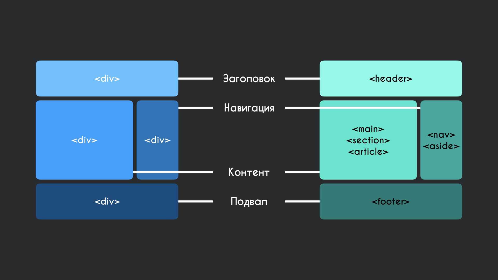
Drop Shadow Effect
Drop Shadow is used to create a shadow of your object at the specified X (horizontal) and Y (vertical) offset and color.
The following parameters can be used in this filter −
| Sr.No. | Parameter & Description |
|---|---|
| 1 |
color The color, in #RRGGBB format, of the dropshadow. |
| 2 |
offX Number of pixels the drop shadow is offset from the visual object, along the x-axis. Positive integers move the drop shadow to the right, negative integers move the drop shadow to the left. |
| 3 |
offY Number of pixels the drop shadow is offset from the visual object, along the y-axis. Positive integers move the drop shadow down, negative integers move the drop shadow up. |
| 4 |
positive If true, all opaque pixels of the object have a dropshadow. If false, all transparent pixels have a dropshadow. The default is true. |
Example
<html>
   <head>
   </head>

   <body>
      <p>Image Example:</p>

      <img src = "/css/images/logo.png"
         alt = "CSS Logo"
         style = "filter:drop-shadow(2px 2px 1px #FF0000);">

      <p>Text Example:</p>

      <div style = "width: 357;
         height: 50;
         font-size: 30pt;
         font-family: Arial Black;
         color: red;
         filter:drop-shadow(3px 3px 2px #000000);">CSS Tutorials</div>
   </body>
</html>
It will produce the following result −
Chroma Filter
Chroma Filter is used to make any particular color transparent and usually it is used with images. You can use it with scrollbars also. The following parameter can be used in this filter −
| Sr.No. | Parameter & Description |
|---|---|
| 1 |
color The color that you’d like to be transparent. |
Example
<html>
   <head>
   </head>

   <body>
      <p>Image Example:</p>

      <img src = "/images/css.gif"
         alt = "CSS Logo" style = "Filter: Chroma(Color = #FFFFFF)">

      <p>Text Example:</p>

      <div style = "width: 580;
         height: 50;
         font-size: 30pt;
         font-family: Arial Black;
         color: #3300FF;
         Filter: Chroma(Color = #3300FF)">CSS Tutorials</div>
   </body>
</html>
It will produce the following result −
Glow Effect
Glow effect is used to create a glow around the object. If it is a transparent image, then glow is created around the opaque pixels of it. The following parameters can be used in this filter −
| Sr.No. | Parameter & Description |
|---|---|
| 1 |
color The color you want the glow to be. |
| 2 |
strength The intensity of the glow (from 1 to 255). |
Example
<html>
   <head>
   </head>

   <body>
      <p>Image Example:</p>

      <img src = "/css/images/logo.png"
         alt = "CSS Logo"
         style = "filter: Chroma(Color = #000000) Glow(Color=#00FF00, Strength=20)">

      <p>Text Example:</p>

      <div style = "width: 357;
         height: 50;
         font-size: 30pt;
         font-family: Arial Black;
         color: red;
         filter: Glow(Color=#00FF00, Strength=20)">CSS Tutorials</div>
   </body>
</html>
It will produce the following result −
Wave Effect
Wave effect is used to give the object a sine wave distortion to make it look wavy. The following parameters can be used in this filter −
| Sr.No. | Parameter & Description |
|---|---|
| 1 |
add A value of 1 adds the original image to the waved image, 0 does not. |
| 2 |
freq The number of waves. |
| 3 |
light The strength of the light on the wave (from 0 to 100). |
| 4 |
phase At what degree the sine wave should start (from 0 to 100). |
| 5 |
strength The intensity of the wave effect. |
Example
<html>
   <head>
   </head>

   <body>
      <p>Image Example:</p>

      <img src = "/css/images/logo.png"
         alt = "CSS Logo"
         style = "filter: Chroma(Color = #000000)
         Wave(Add=0, Freq=1, LightStrength=10, Phase=220, Strength=10)">

      <p>Text Example:</p>

      <div style = "width: 357;
         height: 50;
         font-size: 30pt;
         font-family: Arial Black;
         color: red;
         filter: Wave(Add=0, Freq=1, LightStrength=10, Phase=20, Strength=20)">CSS Tutorials
      </div>
   </body>
</html>
It will produce the following result −
Описание
Фильтр-кабинет Wave Cyber 10×35 с клапаном управления Clack WS1CI применяется для комплексной очистки воды от растворённого и органического железа, марганца, а также солей жёсткости.
Фильтр предусматривает автоматическое проведение регенерации, необходимой для восстановления свойств многокомпонентной смолы от накопившихся во время работы примесей.
Регенерацию фильтр осуществляет с помощью обратной реакции, то есть, восстановления фильтрующего слоя обратным током поступающей воды и разбавленным раствором поваренной соли (NaCl).
При этом, накопившиеся во время работы примеси смываются в дренажный выход управляющего клапана.
Технические характеристики
• Производительность: 1,0 м³/час
• Объём фильтрующего материала: 25 л
• Ресурс (при жёсткости 5 мг-экв/л): 3,5 м³
• Расход соли на регенерацию: 3 кг
• Срок работы фильтрующего материала: до 5 лет
• Рабочее давление: 2-6 бар
• Температура исходной воды: 4-30 ºС
• Электропотребление: 220 В/50 Гц
• Габариты (ДхВхШ): 59х100х34 см
• Вес: 34 кг
• Фильтр умягчитель предназначен для очистки холодной воды!
• Для защиты фильтра умягчителя от механических примесей (песок, окалина, ржавчина) и повышения эффективности его работы — перед ним рекомендуется установка фильтра механической очистки• Инструкция для управляющего клапана Clack WS1CI
Почему фильтр умягчитель безопасен для септика? Регенерация фильтрующей загрузки проводится 4-6%-м раствором поваренной соли (соль таблетирования). Сток представляет собой воду с повышенным значением жёсткости и остатком избытка поваренной соли. В регенерационном стоке будет содержаться (по сравнению с составом исходной воды) до 4 г/л хлорида натрия (поваренной соли) и до 7 г/л хлорида кальция дополнительно. Ни один из этих компонентов в таких концентрациях не оказывает негативного влияния на жизнедеятельность биомассы, напротив, хлорид кальция даже увеличивает её активность. Данный факт также практически подтверждается по опыту владельцев биосептиков, установивших систему водоподготовки, включающую стадию умягчения.
Фильтр включает в себя следующее оборудование• Корпус умягчителя кабинетного типа Wave Cyber 10×35″
• Автоматический клапан управления Clack WS1CI• Фильтрующий материал комбинированная ионообменная загрузка Ecosoft Ecomix A — 25 литров
Всегда готовы принять Вашу заявку или проконсультировать+7(985)928-01-15 info@vodanova.ru
Motion Blur
Motion Blur is used to create blurred pictures or text with the direction and strength. The following parameters can be used in this filter −
| Sr.No. | Parameter & Description |
|---|---|
| 1 |
add True or false. If true, the image is added to the blurred image; and if false, the image is not added to the blurred image. |
| 2 |
direction The direction of the blur, going clockwise, rounded to 45-degree increments. The default value is 270 (left). 0 = Top 45 = Top right 90 = Right 135 = Bottom right 180 = Bottom 225 = Bottom left 270 = Left 315 = Top left |
| 3 |
strength The number of pixels the blur will extend. The default is 5 pixels. |


Example
<html>
   <head>
   </head>

   <body>
      <p>Image Example:</p>

      <img src = "/css/images/logo.png" alt = "CSS Logo"
         style = "Filter: Blur(Add = 0, Direction = 225, Strength = 10)">

      <p>Text Example:</p>

      <div style = "width: 357;
         height: 50;
         font-size: 30pt;
         font-family: Arial Black;
         color: blue;
         Filter: Blur(Add = 1, Direction = 225, Strength = 10)">CSS Tutorials
      </div>
   </body>
</html>
It will produce the following result −
Mask Effect
Mask effect is used to turn transparent pixels to a specified color and makes opaque pixels transparent. The following parameter is used in this filter −
| Sr.No. | Parameter & Description |
|---|---|
| 1 |
color The color that the transparent areas will become. |
Example
<html>
   <head>
   </head>

   <body>
      <p>Image Example:</p>

      <img src = "/css/images/logo.png"
         alt = "CSS Logo"
         style = "filter: Chroma(Color = #000000) Mask(Color=#00FF00)">

      <p>Text Example:</p>

      <div style = "width: 357;
         height: 50;
         font-size: 30pt;
         font-family: Arial Black;
         color: red;
         filter: Mask(Color=#00FF00)">CSS Tutorials
      </div>
   </body>
</html>
It will produce the following result −
Invert Effect
Invert effect is used to map the colors of the object to their opposite values in the color spectrum, i.e., to create a negative image. The following parameter is used in this filter −
| Sr.No. | Parameter & Description |
|---|---|
| 1 |
Invert Maps the colors of the object to their opposite value in the color spectrum. |
Example
<html>
   <head>
   </head>

   <body>
      <p>Image Example:</p>

      <img src = "/css/images/logo.png"
         alt = "CSS Logo"
         style = "filter: invert(100%)">

      <p>Text Example:</p>

      <div style = "width: 357;
         height: 50;
         font-size: 30pt;
         font-family: Arial Black;
         color: red;
         filter: invert(100%)">CSS Tutorials</div>
   </body>
</html>
It will produce the following result −
Wave Filter
Last updated: October 28th, 2008
The Wave Filter performs a sine wave distortion on the content along the
vertical axis. Defined via IE’s CSS property, here is its basic
syntax:
Syntax (post IE8):
-ms-filter:
«progid:DXImageTransform.Microsoft.Wave(attribute1=value1, attribute2=value2,
etc)»;
Note: See «Difference in syntax between pre IE8 and IE8+ browsers»
for more info on the changes to the filter syntax in IE8+.
Example:
<style type=»text/css»>
#somediv{
width: 90%;
-ms-filter: «progid:DXImageTransform.Microsoft.Wave(freq=5, lightStrength=5,
phase=20, strength=5)»;
filter: progid:DXImageTransform.Microsoft.Wave(freq=5, lightStrength=5,
phase=20, strength=5);
}
</style>
<div id=»somediv»>Some
DIV</div>
Syntax via scripting:
//To define a new MotionBlur filter on
an element
object.style.filter =»progid:DXImageTransform.Microsoft.Wave(attribute=value1,
attribute2=value2)»
To access an existing property within the Wave filter:
object.filters.item(«DXImageTransform.Microsoft.Wave»).Property1=value1;
//To access an existing property within the Wave filter via the
filters[] object
object.filters.Property1=value1 //where «x» is
the position of the filter within list of filters on element
When getting or setting a specific filter’s via
scripting, you capitalize the to turn it into a
property.
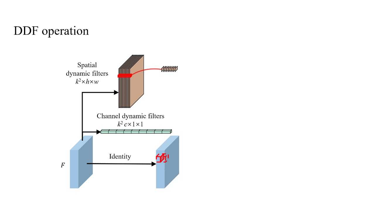
Below lists the attributes/properties of the Wave filter:
Wave Filter attributes (properties)
| Attributes/ Properties | Description |
|---|---|
| add | Boolean value that specifies whether the filter image overlays the original image. Default is . Read/ write. Valid values: true/ false |
| enabled | Sets/ returns whether the filter is enabled or not. Default is .
|
| freq | Sets the number of waves added to the content. Default value is 3. Valid values: Integer greater than 0. Example: <style type=»text/css»> Demo (requires IE5.5+): Some DIV |
| lightStrength | Sets the difference in light intensity between the peaks and troughs of the filter’s waves. Default is 100. Valid values: 0 — 100 |
| phase | Sets the position in which the Sine wave starts as a percentage of one wave cycle. Default is 0. Valid values: 0 — 100 |
| strength | Sets the strength, or distance (in pixels) in which the wave extends. Default is 1. Valid values: Integer |
Grayscale Effect
Grayscale effect is used to convert the colors of the object to 256 shades of gray. The following parameter is used in this filter −
| Sr.No. | Parameter & Description |
|---|---|
| 1 |
grayscale Converts the colors of the object to 256 shades of gray. |
Example
<html>
   <head>
   </head>

   <body>
      <p>Image Example:</p>

      <img src = "/css/images/logo.png"
         alt = "CSS Logo"
         style = "filter: grayscale(50%)">

      <p>Text Example:</p>

      <div style = "width: 357;
         height: 50;
         font-size: 30pt;
         font-family: Arial Black;
         color: red;
         filter: grayscale(50%)">CSS Tutorials</div>
   </body>
</html>
It will produce the following result −
Alpha Channel
The Alpha Channel filter alters the opacity of the object, which makes it blend into the background. The following parameters can be used in this filter −
| Sr.No. | Parameter & Description |
|---|---|
| 1 |
opacity Level of the opacity. 0 is fully transparent, 100 is fully opaque. |
| 2 |
finishopacity Level of the opacity at the other end of the object. |
| 3 |
style The shape of the opacity gradient. 0 = uniform 1 = linear 2 = radial 3 = rectangular |
| 4 |
startX X coordinate for opacity gradient to begin. |
| 5 |
startY Y coordinate for opacity gradient to begin. |
| 6 |
finishX X coordinate for opacity gradient to end. |
| 7 |
finishY Y coordinate for opacity gradient to end. |
Example
<html>
   <head>
   </head>

   <body>
      <p>Image Example:</p>

      <img src = "/css/images/logo.png" alt = "CSS Logo"
         style = "Filter: Alpha(Opacity=100,
         FinishOpacity = 0,
         Style = 2,
         StartX = 20,
         StartY = 40,
         FinishX = 0,
         FinishY = 0)" />
      <p>Text Example:</p>

      <div style = "width: 357;
         height: 50;
         font-size: 30pt;
         font-family: Arial Black;
         color: blue;
         Filter: Alpha(Opacity=100, FinishOpacity=0, Style=1, StartX=0, StartY=0, FinishX=580, FinishY=0)">CSS Tutorials</div>
   </body>
</html>
It will produce the following result −
Flip Effect
Flip effect is used to create a mirror image of the object. The following parameters can be used in this filter −
| Sr.No. | Parameter & Description |
|---|---|
| 1 |
FlipH Creates a horizontal mirror image |
| 2 |
FlipV Creates a vertical mirror image |
Example
<html>
   <head>
   </head>

   <body>
      <p>Image Example:</p>

      <img src = "/css/images/logo.png"
         alt = "CSS Logo"
         style = "filter: FlipH">

      <img src = "/css/images/logo.png" alt = "CSS Logo" style = "filter: FlipV">

      <p>Text Example:</p>

      <div style = "width: 300;
         height: 50;
         font-size: 30pt;
         font-family: Arial Black;
         color: red;
         filter: FlipV">CSS Tutorials</div>
   </body>
</html>
It will produce the following result −
Filter definition
The power filter is a filter circuit composed of capacitors, inductors, and resistors. The filter can effectively filter out the frequency point of a specific frequency in the power line or the frequency other than the frequency point to obtain a power signal of a specific frequency, or eliminate a power signal of a specific frequency.


A filter is a device that filters waves. «Wave» is a very broad physical concept. In the field of electronic technology, «wave» is narrowly confined to specifically describe the process of fluctuations in the values of various physical quantities over time. This process is converted into a time function of voltage or current through the action of various sensors, which is called the time waveform of various physical quantities or called signals.
Radiofrequency interference has always been the natural enemy of wireless communication. It requires designers to take drastic measures to restrain them. With the increasing number of frequency bands supported in each device, today’s wireless devices must simultaneously guard against interference signals from other devices and themselves.
A high-end smartphone must filter the transmission and reception paths of up to 15 frequency bands of 2G, 3G, and 4G wireless access methods. At the same time, the filtering also includes Wi-Fi, Bluetooth, and GPS receiver reception paths. The signal of each receiving path must be isolated. It is also necessary to suppress other external signals that have many sources and are difficult to cite. To do this, a multi-band smartphone requires eight or nine filters and eight duplexers. Without acoustic filtering technology, this would be difficult to achieve.
Many communication systems will have a trend of miniaturization to a certain extent. On the one hand, miniaturization can make the system more portable and effective. On the other hand, the ever-developing IC manufacturing technology can produce large quantities of small products at a lower cost.
MEMS is one of the related technologies of this small product. MEMS can detect changes in the environment and generate related reactions through microcircuits. The main parts of MEMS include sensor (microsensor) or actuator (microactuator) and transducer (transformer), in which the sensor can detect the presence or intensity of a certain physical, chemical or biological, such as temperature, pressure, sound, or chemical composition. A transducer converts one kind of energy into another (for example, from electrical signals to mechanical waves). At present, MEMS is widely used in many fields.
Shadow Filter
Shadow filter is used to create an attenuated shadow in the direction and color specified. This is a filter that lies in between Dropshadow and Glow. The following parameters can be used in this filter −
| Sr.No. | Parameter & Description |
|---|---|
| 1 |
color The color that you want the shadow to be. |
| 2 |
direction The direction of the blur, going clockwise, rounded to 45-degree increments. The default value is 270 (left). 0 = Top 45 = Top right 90 = Right 135 = Bottom right 180 = Bottom 225 = Bottom left 270 = Left 315 = Top left |
Example
<html>
   <head>
   </head>

   <body>
      <p>Image Example:</p>

      <img src = "/css/images/logo.png"
         alt = "CSS Logo"
         style = "filter: Chroma(Color = #000000) Shadow(Color=#00FF00, Direction=225)">

      <p>Text Example:</p>

      <div style = "width: 357;
         height: 50;
         font-size: 30pt;
         font-family:
         Arial Black;
         color: red;
         filter: Shadow(Color=#0000FF, Direction=225)">CSS Tutorials
      </div>
   </body>
</html>
It will produce the following result −
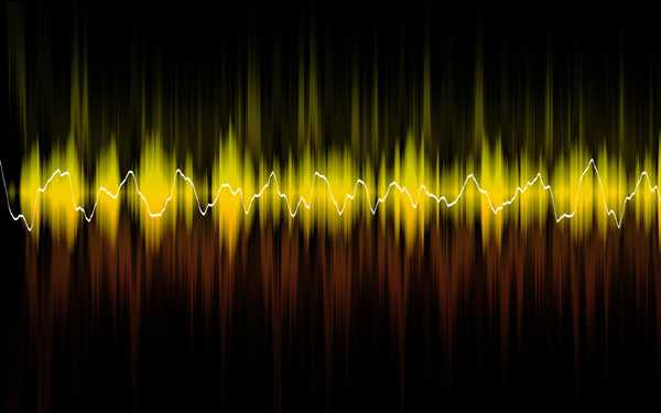
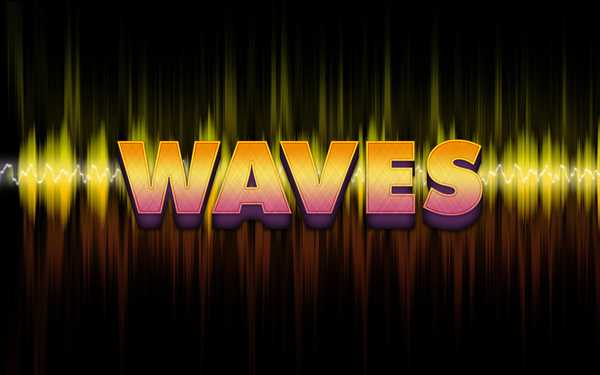
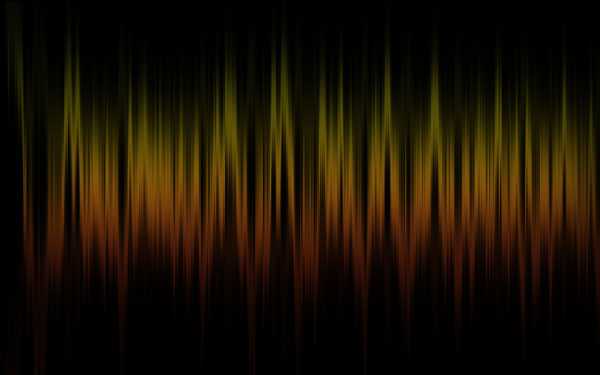
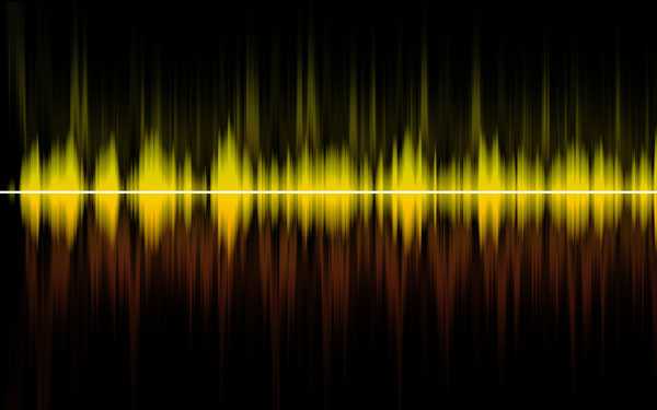
Final Image Preview
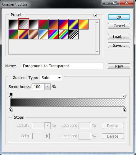
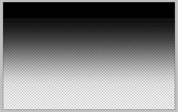
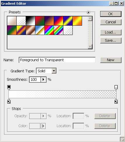
Firstly create a new document (Ctrl+N) in Adobe Photoshop with the size 1900px by 1200px (RGB color mode) at a resolution of 72 pixels/inch. Take the Gradient Tool (G) and open the Gradient Editor from Options Bar:
Choose the Foreground to Transparent gradient.

Apply the gradient from the top to down.
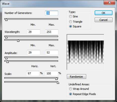
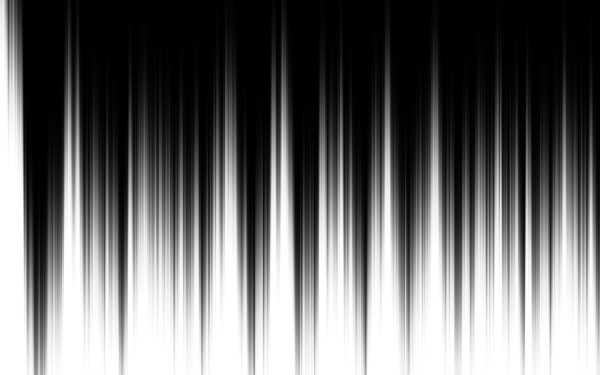
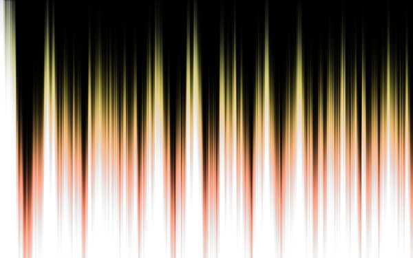
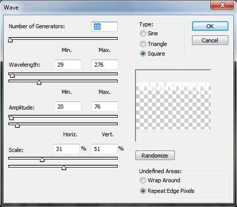
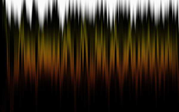
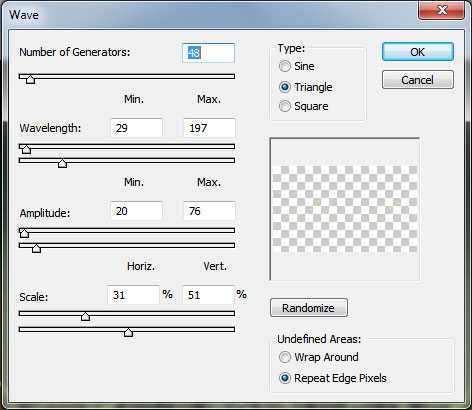
Apply the next filter: Filter>Distort>Wave and choose the next settings:
It’s the result you should get:
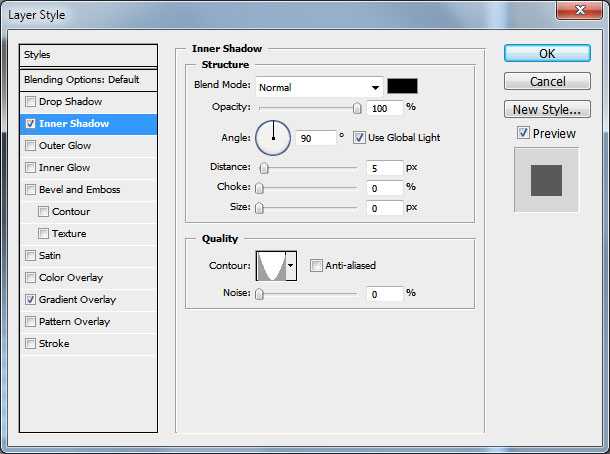
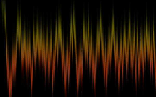
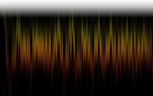
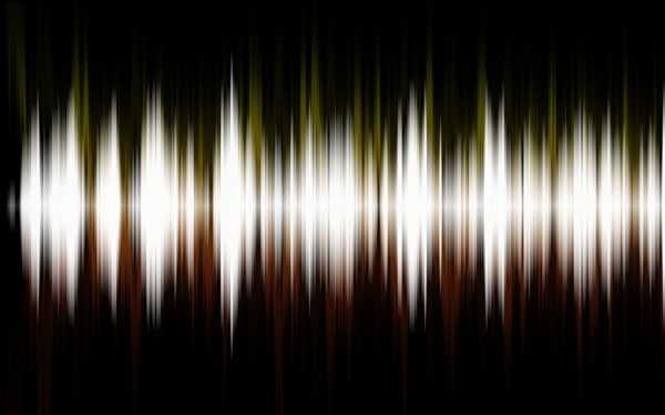
Click on Add a layer style icon from bottom part of the Layers panel and select Inner Shadow.
Add Gradient Overlay:
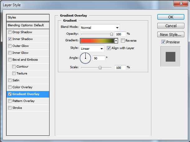
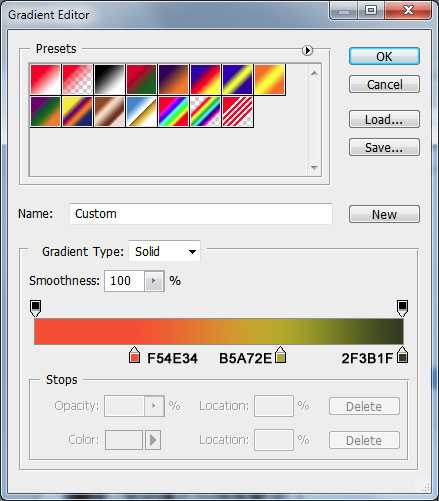
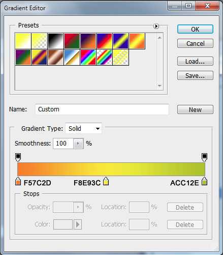
Click in the color bar to open the Gradient Editor and set the color stops as shown. Click OK to close the Gradient Editor dialog box.
We’ve got the next effect:
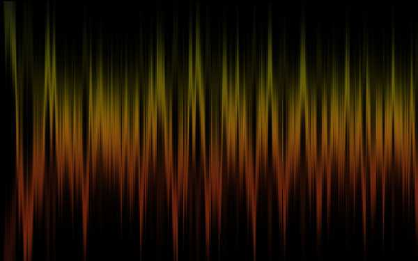
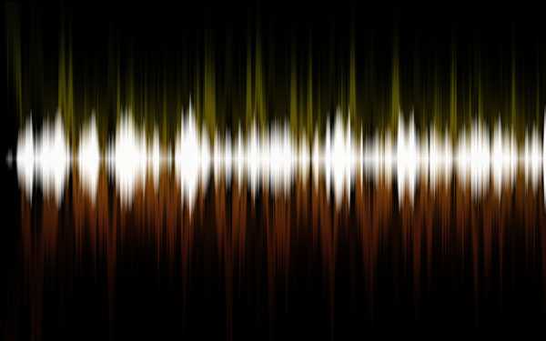
 Create a new layer, fill it with black color applying the Paint Bucket Tool (G) and drag it under layer with gradient in Layer panel.
Back to layer with gradient and make a copy of this layer (Ctrl+J) and apply Edit>Transform>Flip Vertical. Set after that the Opacity the same way demonstrated below:
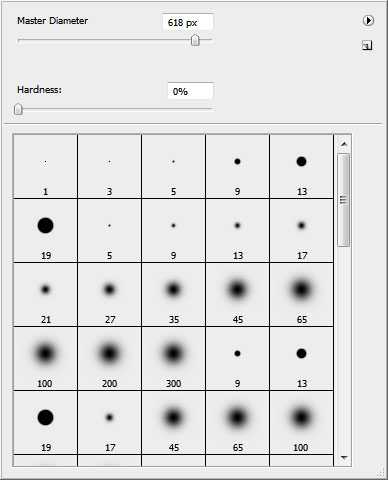
Select the Soft Round brush from Brush Tool (B), set the Opacity to 50% in Options Bar and use black color for Foreground color.
 Create a new layer and use here the selected brush to dark out the background the same way demonstrated next picture.
On the next layer we’ll represent another gradient. Change Foreground color to white, take Gradient Tool (G) and open the Gradient Editor from Options Bar to select the Foreground to Transparent gradient.
Apply the gradient on top.
Go to Filter>Distort>Wave.
The new result should be moved on the central part of the canvas, using in this case the Move Tool (V).
Make a copy of the last made layer, turn it over vertically, select both layers, pressing Shift+left mouse click on the layers on the Layers panel. Then Merge Down the selected layers, pressing Ctrl+E
Press Ctrl+T (Free Transform) and scale down as shown.
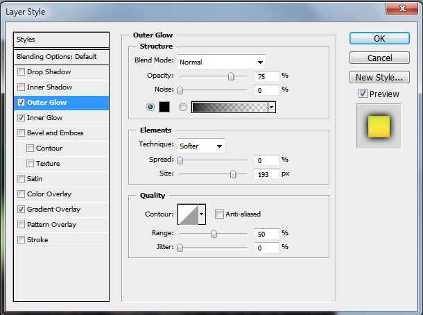
Click on Add a layer style icon from bottom part of the Layers panel and select Outer Glow.
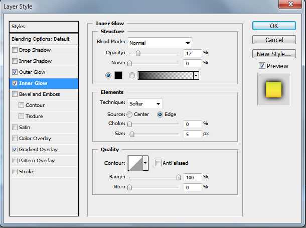
Add Inner Glow:
Apply Gradient Overlay:
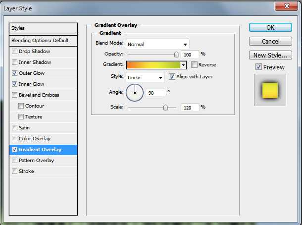
Click in the color bar to open the Gradient Editor and set the color stops as shown. Click OK to close the Gradient Editor dialog box.


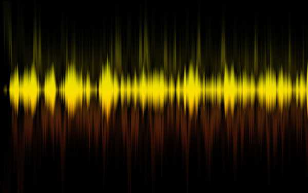
It’s the result you should get:
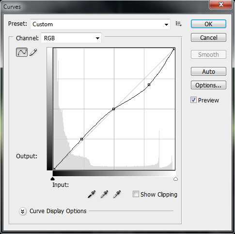
Raise the contrast of our work, using the Create new fill or adjustment layer > Curves:
Adjust the curve shape as shown to make a little color corrections.
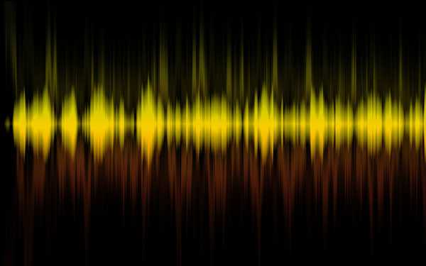
The work became more contrastive.
 Create a new layer, using the Rectangular Marquee Tool (M) create a rectangular selection as shown and fill the selection with white color.
Apply the next filter: Filter>Distort>Wave filter.
It’s the result you should get: