
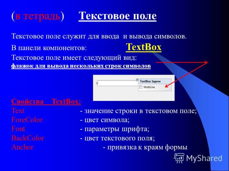
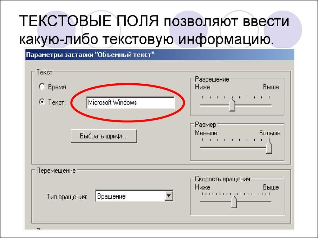
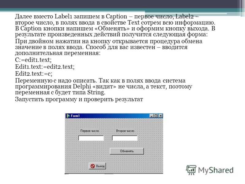
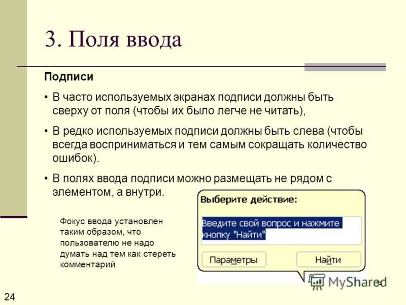
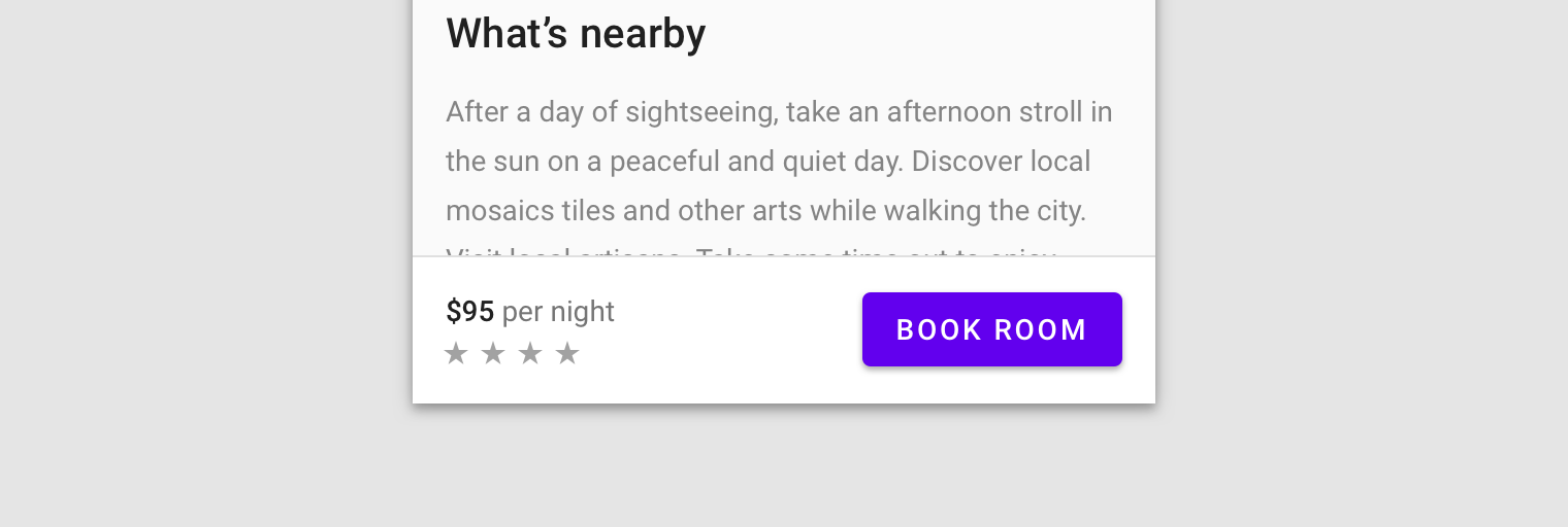
Styling CSS Labels
In addition to adding functionality to your forms, labels can greatly increase readability and play a part in laying out form controls. To illustrate, let’s take a form that accepts user info, with the following HTML markup:
<h2>Styling Form Controls</h2>
<form id="register" name="register" method="post" action="noaction.html">
<fieldset>
<p>
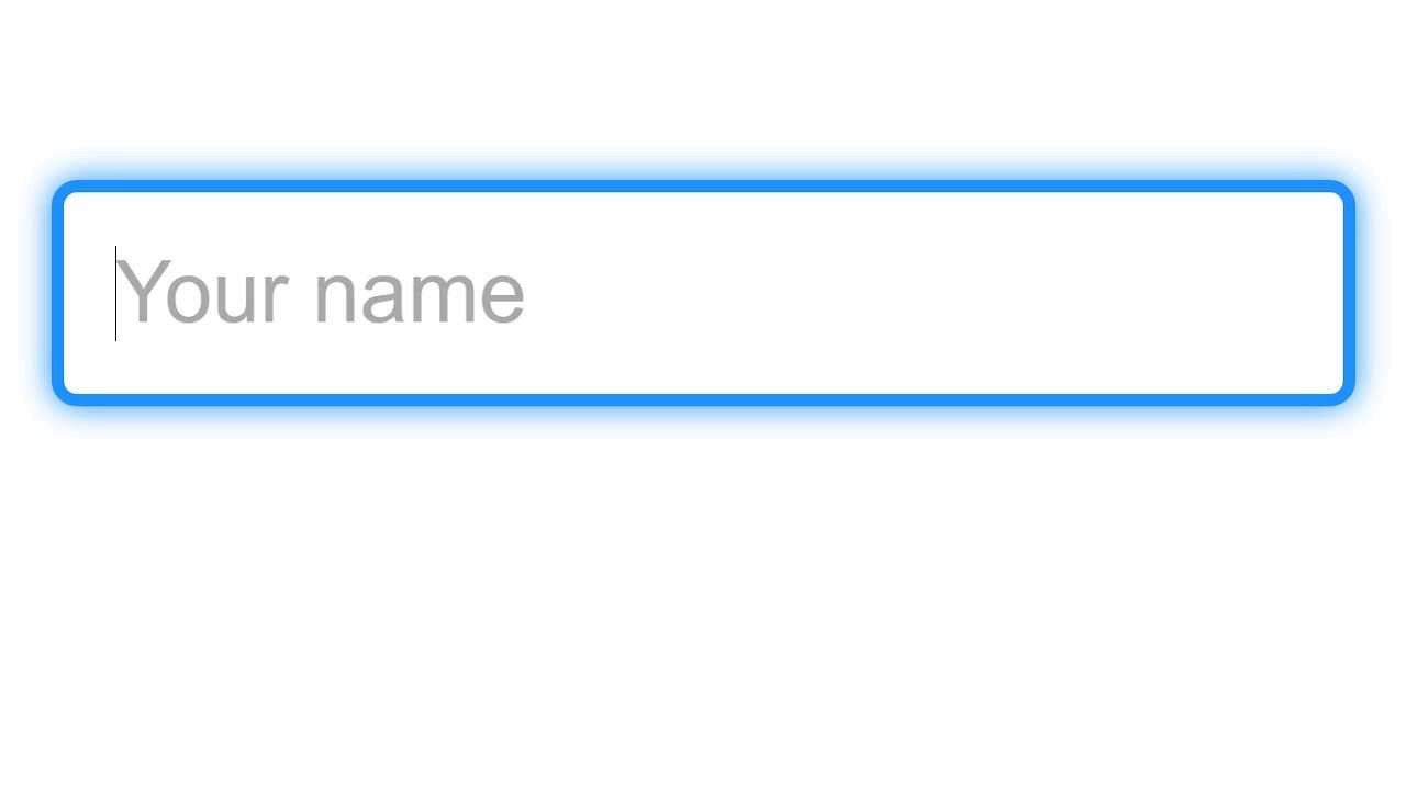
<label for="name">Your Full Name</label>
<input type="text" name="name" id="name">
</p>
<p>
<label for="email">Email</label>
<input type="text" name="email" id="email">
</p>
<p>
<label for="phone">Phone</label>
<input type="text" name="phone" id="phone">
</p>
<p>
<button name="button" id="button">Submit</button>
</p>
</fieldset>
</form>
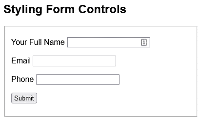
That produces this bare-bones form:
Before we get to the labels, let’s apply a bit of styling to the form and input controls:
* {
  font-family: Arial, Helvetica, sans-serif;
}

#register {
  width: 400px;
}

input {
  padding: 3px;
  box-shadow: 3px 3px 5px grey;
  font-size: 14px;
  font-weight: 600;
  width: 300px;
}
That first rule selects everything on the page using the asterisk (*) wildcard character. Hence, it applies the specified font-family to the entire page.
With the above styles in place, you’ll notice that the label positioning becomes haphazard, in that some appear above the input, while others are aligned to the left:
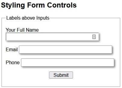
We can position all labels above their associated controls using the following CSS:
label {
  color: #B4886B;
  font-weight: bold;
  display: block;
}
label:after { content: ": " }
The key attribute is “display: block;”. Assigning a value of “block” to the display property makes the element behave as a block element, such as a <p>. Hence, it starts on a new line, and takes up the entire width of the container. We can verify this behavior by inspecting a label with the browser tools:
The “label:after” creates a pseudo-element that is the last child of the selected element. It is often used to add cosmetic content to an element with the content property. In our case, we can use it to append a colon () after each label.
Here is the form with all CSS applied:
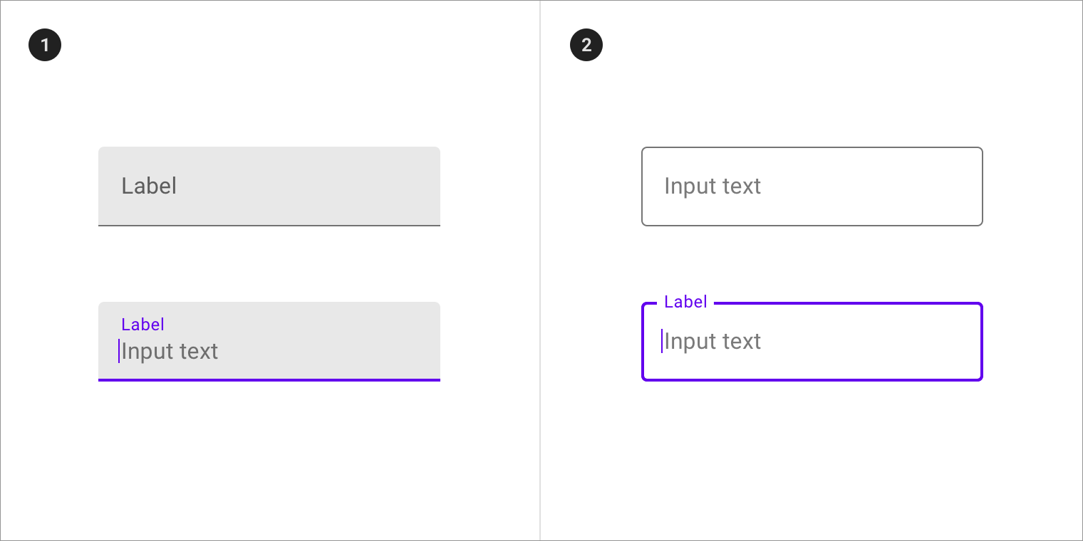
Aligning Labels to the Left of Inputs
Another common layout is to position labels to the left of their associated controls. To do that, we can replace the “display: block;” with two other attributes, i.e. width and float:
label {
  color: #B4886B;
  font-weight: bold;
  width: 130px;
  float: left;

}
label:after { content: ": " }
The width determines how much horizontal space the label “column” takes. The more width is allocated, the further from the controls the labels will be.
Assigning a value of “left” to float positions labels to the left-most edge of their container.
There are a couple of other considerations when positioning labels to the left of their associated controls:
- Make sure that the form’s width is great enough to accommodate both the labels and fields on one line. Otherwise, they may wrap.
- You may want to assign a value to the margin-top so that there is a bit of vertical space between form elements. Without that, they can look like a stack of slices in a loaf of bread!
We’ll deal with both those issues by adding the following CSS:
#register2 {
  width: 500px;
}

#register2 p {
  margin-top: 20px;
}
Here is the updated form with labels to the left of input fields:
HTML Теги
<!—Комментарий—><!DOCTYPE><a><abbr><acronym><address><applet><area><article><aside><audio><b><base><basefont><bdi><bdo><big><blockquote><body><br><button><canvas><caption><center><cite><code><col><colgroup><data><datalist><dd><del><details><dfn><dialog><dir><div><dl><dt><em><embed><fieldset><figcaption><figure><font><footer><form><frame><frameset><h1> — <h6><head><header><hr><html><i><iframe><img><input><ins><kbd><label><legend><li><link><main><map><mark><meta><meter><nav><noframes><noscript><object><ol><optgroup><option><output><p><param><picture><pre><progress><q><rp><rt><ruby><s><samp><script><section><select><small><source><span><strike><strong><style><sub><summary><sup><svg><table><tbody><td><template><textarea><tfoot><th><thead><time><title><tr><track><tt><u><ul><var><video>
Example
We will discuss the <label> tag below, exploring examples of how to use the <label> tag in HTML5, HTML 4.01 Transitional, XHTML 1.0 Transitional, XHTML 1.0 Strict, and XHTML 1.1.
- HTML5
- HTML4
- XHTML
HTML5 Document
If you created a new web page in HTML5, your <label> tag might look like this:
In this HTML5 Document example, we have created two <label> tags. The first <label> tag is the caption for the company <input> and the second <label> tag is the caption for the address <input>. Each <label> is associated to the <input> when the from the <input> tag matches the attribute on the <label> tag.
HTML 4.01 Transitional Document
If you created a new web page in HTML 4.01 Transitional, your <label> tag might look like this:
In this HTML 4.01 Transitional Document example, we have created two <label> tags. The first <label> tag is the caption for the company <input> and the second <label> tag is the caption for the address <input>. Each <label> is associated to the <input> when the from the <input> tag matches the attribute on the <label> tag.
XHTML 1.0 Transitional Document
If you created a new web page in XHTML 1.0 Transitional, your <label> tag might look like this:
In this XHTML 1.0 Transitional Document example, we have created two <label> tags. The first <label> tag is the caption for the company <input> and the second <label> tag is the caption for the address <input>. Each <label> is associated to the <input> when the from the <input> tag matches the attribute on the <label> tag.
XHTML 1.0 Strict Document
If you created a new web page in XHTML 1.0 Strict, your <label> tag might look like this:
In this XHTML 1.0 Strict Document example, we have created two <label> tags. The first <label> tag is the caption for the company <input> and the second <label> tag is the caption for the address <input>. Each <label> is associated to the <input> when the from the <input> tag matches the attribute on the <label> tag.
XHTML 1.1 Document
If you created a new web page in XHTML 1.1, your <label> tag might look like this:
In this XHTML 1.1 Document example, we have created two <label> tags. The first <label> tag is the caption for the company <input> and the second <label> tag is the caption for the address <input>. Each <label> is associated to the <input> when the from the <input> tag matches the attribute on the <label> tag.
Commonly used attributes
The <label> tag supports a few commonly used attributes to enhance its functionality and accessibility. Here are the main attributes used with the <label> tag:
for
This attribute specifies the form element that the label is associated with. The value of the for attribute should match the id attribute of the form control it is labeling. When a user clicks on the label, the associated form control receives focus or activation.
accesskey
This attribute assigns an access key to the label, allowing users to quickly navigate to the associated form control. By pressing the access key along with a modifier key (such as Alt or Ctrl), users can jump directly to the form field or control linked to the label.
form
This attribute specifies the form to which the label belongs. It is used when a <label> element is located outside of a <form> element but still needs to be associated with a specific form. The value of the form attribute should match the id attribute of the <form> element.
Following is an example that demonstrates the usage of these attributes:
In the example above, the first <label> is associated with the nameField input using the for attribute. The second <label> demonstrates the usage of the accesskey attribute (access key «E») and the form attribute (linked to the myForm form).
The tag and accessibility
The <label> tag improves accessibility in several ways:
- Semantic association: The <label> element associates text with a form control, creating a semantic relationship between them. This association is particularly important for users who rely on assistive technologies like screen readers. When a screen reader encounters a <label>, it will announce the associated form control and provide context to the user.
- Clickable area: By clicking on a <label>, users can activate the associated form control. This is especially beneficial for users with motor disabilities or those using alternative input devices. A larger clickable area provided by the <label> makes it easier for them to interact with form elements accurately.
- Improved form comprehension: Labels provide descriptive text that explains the purpose or expected input for a form control. This helps all users, including those with cognitive disabilities, to understand the purpose of each form field. Clear and concise labels reduce confusion and enable users to complete forms more easily.
- Form validation: When a <label> is associated with a form control, it provides a visual indication of which field is being validated or has errors. This helps users identify and correct any input mistakes more efficiently. Screen readers can also announce the validation status along with the associated form control.
Include text alternatives for images and objects #
An should always be accompanied by an attribute to give the image its accessible name. If the image fails to load, the text is used as a placeholder so users have a sense of what the image was trying to convey.
Writing good text is a bit of an art, but there are a couple of guidelines you can follow:
- Determine if the image provides content that would otherwise be difficult to attain from reading the surrounding text.
- If so, convey the content as succinctly as possible.
If the image acts as decoration and does not provide any useful content, you can give it an empty attribute to remove it from the accessibility tree.
Images as links and inputs
An image wrapped in a link should use the ‘s attribute to describe where the user will navigate to if they click on the link:
Similarly, if an element is used to create an image button, it should contain text that describes the action that occurs when the user clicks on the button:
Embedded objects
elements, which are typically used for embeds like Flash, PDFs, or ActiveX, should also contain alternative text. Similar to images, this text is displayed if the element fails to render. The alternative text goes inside the element as regular text, like «Annual report» below:
HTML References
HTML by AlphabetHTML by CategoryHTML Browser SupportHTML AttributesHTML Global AttributesHTML EventsHTML ColorsHTML CanvasHTML Audio/VideoHTML Character SetsHTML DoctypesHTML URL EncodeHTML Language CodesHTML Country CodesHTTP MessagesHTTP MethodsPX to EM ConverterKeyboard Shortcuts
HTML Tags
<!—>
<!DOCTYPE>
<a>
<abbr>
<acronym>
<address>
<applet>
<area>
<article>
<aside>
<audio>
<b>
<base>
<basefont>
<bdi>
<bdo>
<big>
<blockquote>
<body>
<br>
<button>
<canvas>
<caption>
<center>
<cite>
<code>
<col>
<colgroup>
<data>
<datalist>
<dd>
<del>
<details>
<dfn>
<dialog>
<dir>
<div>
<dl>
<dt>
<em>
<embed>
<fieldset>
<figcaption>
<figure>
<font>
<footer>
<form>
<frame>
<frameset>
<h1> — <h6>
<head>
<header>
<hr>
<html>
<i>
<iframe>
<img>
<input>
<ins>
<kbd>
<label>
<legend>
<li>
<link>
<main>
<map>
<mark>
<meta>
<meter>
<nav>
<noframes>
<noscript>
<object>
<ol>
<optgroup>
<option>
<output>
<p>
<param>
<picture>
<pre>
<progress>
<q>
<rp>
<rt>
<ruby>
<s>
<samp>
<script>
<section>
<select>
<small>
<source>
<span>
<strike>
<strong>
<style>
<sub>
<summary>
<sup>
<svg>
<table>
<tbody>
<td>
<template>
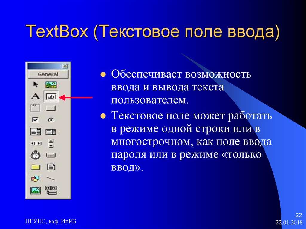
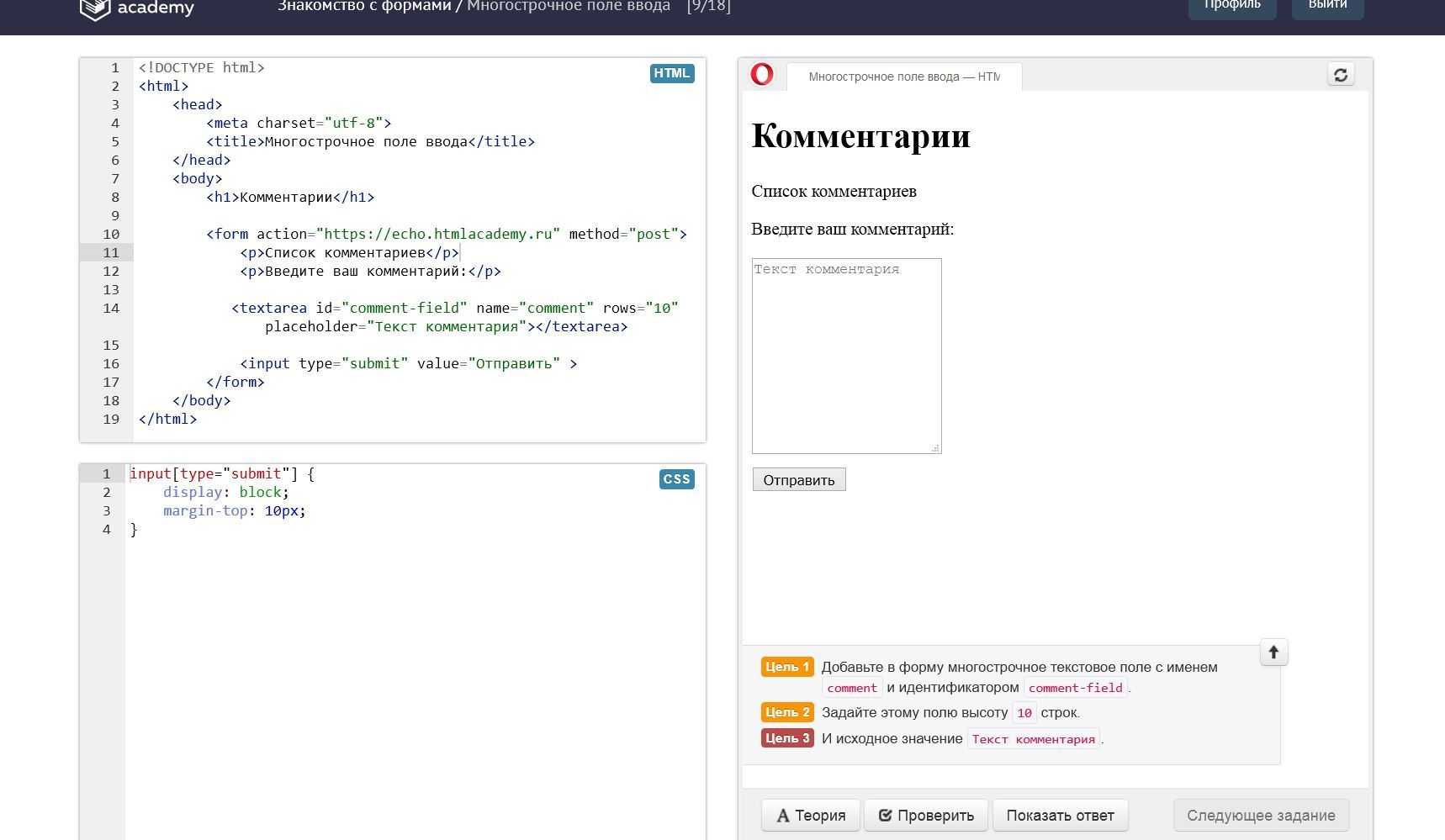
<textarea>
<tfoot>
<th>
<thead>
<time>
<title>
<tr>
<track>
<tt>
<u>
<ul>
<var>
<video>
<wbr>
Definition and Usage
The tag defines a label for several elements:
- <input type=»checkbox»>
- <input type=»color»>
- <input type=»date»>
- <input type=»datetime-local»>
- <input type=»email»>
- <input type=»file»>
- <input type=»month»>
- <input type=»number»>
- <input type=»password»>
- <input type=»radio»>
- <input type=»range»>
- <input type=»search»>
- <input type=»tel»>
- <input type=»text»>
- <input type=»time»>
- <input type=»url»>
- <input type=»week»>
- <meter>
- <progress>
- <select>
- <textarea>
Proper use of labels with the elements above will benefit:
- Screen reader users (will read out loud the label, when the user is focused on
the element) - Users who have difficulty clicking on very small regions (such as
checkboxes) — because when a user clicks the text within the element,
it toggles the input (this increases the hit area).
Responding to Focus and Hover Events in CSS
You might be under the impression that you need JavaScript in order to make a form interactive. Not true! Thanks to the CSS :focus and :hover pseudo-classes, you can change an element’s appearance in response to user actions. As you may have guessed, the :focus pseudo-class governs an element’s appearance when it obtains the focus. Likewise, the :hover pseudo-class sets an element’s appearance when the mouse cursor traverses over it.
Here is a rule that alters the Submit button’s appearance on focus:
#button:focus {
  outline: 2px solid gray;
  font-weight: bold;
  color: white;
}
This rule kicks in when the mouse cursor is traverses over the Submit button:
#button:hover {
  background-color: orange;
  box-shadow: 3px 3px 5px grey;
}
You’ll find the demo for this tutorial on codepen.io.
Label documents and frames #
Every page should have a element that briefly explains what the page is about. The element gives the page its accessible name. When a screen reader enters the page, this is the first text that is announced.
For example, the page below has the title «Mary’s Maple Bar Fast-Baking Recipe»:
Similarly, any or elements should have attributes:
While an ‘s contents may contain their own internal element, a screen reader usually stops at the frame boundary and announces the element’s role—»frame»—and its accessible name, provided by the attribute. This lets the user decide if they wish to enter the frame or bypass it.
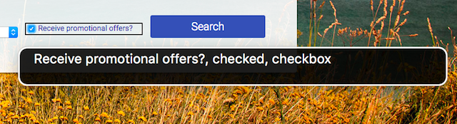
Label form elements #
There are two ways to associate a label with a form element such as a checkbox. Either of the methods causes the label text to also become a click target for the checkbox, which is also helpful for mouse or touchscreen users. To associate a label with an element, either:
Place the input element inside of a label element
Or use the label’s for attribute and refer to the element’s id
When the checkbox has been labeled correctly, the screen reader can report that the element has a role of checkbox, is in a checked state, and is named «Receive promotional offers?» like in the VoiceOver example below:
 Check whether sample HTML elements have accessible names
Does this image have an accessible name?
Yes. Give an image an accessible name by adding an attribute.
Does this object have an accessible name?
No. Give an element a name by providing text content. (An attribute on an object will not be read by assistive technologies.)
This sample renders an icon button:
Does this button have an accessible name?
No. Give a button an accessible name by providing text content, an attribute, or an attribute.
This sample renders an icon button with a tooltip that appears on hover and focus:
Does this button have an accessible name?
Yes. Even if the button’s tooltip is visually hidden using CSS, assistive technologies can still read its text content.
Caution: When visually hiding button text, use CSS rather than the attribute. The attribute removes the element from the accessibility tree.
Does this checkbox have an accessible name?
Yes. The label is associated with the checkbox because the label is the checkbox’s parent. So, assistive technologies treat the label’s text content as the input’s name.
Does this checkbox have an accessible name?
No. The checkbox’s attribute indicates what text will be saved when the form is submitted, but assistive technologies don’t read it. To provide an accessible name, add an attribute with the value to associate the checkbox with the label.
HTML Справочник
HTML по алфавитуHTML по категориямHTML Поддержка браузераHTML АтрибутыHTML Глобальные атрибутыHTML СобытияHTML ЦветаHTML CanvasHTML Аудио/видеоHTML Наборы символовHTML Типы документовHTML URL КодировкаHTML Коды языкаHTML Коды странHTTP СообщенияHTTP МетодыКонвертер PX в EMКомбинации клавиш
HTML Теги
<!—Комментарий—>
<!DOCTYPE>
<a>
<abbr>
<acronym>
<address>
<applet>
<area>
<article>
<aside>
<audio>
<b>
<base>
<basefont>
<bdi>
<bdo>
<big>
<blockquote>
<body>
<br>
<button>
<canvas>
<caption>
<center>
<cite>
<code>
<col>
<colgroup>
<data>
<datalist>
<dd>
<del>
<details>
<dfn>
<dialog>
<dir>
<div>
<dl>
<dt>
<em>
<embed>
<fieldset>
<figcaption>
<figure>
<font>
<footer>
<form>
<frame>
<frameset>
<h1> — <h6>
<head>
<header>
<hr>
<html>
<i>
<iframe>
<img>
<input>
<ins>
<kbd>
<label>
<legend>
<li>
<link>
<main>
<map>
<mark>
<meta>
<meter>
<nav>
<noframes>
<noscript>
<object>
<ol>
<optgroup>
<option>
<output>
<p>
<param>
<picture>
<pre>
<progress>
<q>
<rp>
<rt>
<ruby>
<s>
<samp>
<script>
<section>
<select>
<small>
<source>
<span>
<strike>
<strong>
<style>
<sub>
<summary>
<sup>
<svg>
<table>
<tbody>
<td>
<template>
<textarea>
<tfoot>
<th>
<thead>
<time>
<title>
<tr>
<track>
<tt>
<u>
<ul>
<var>
<video>
<wbr>
HTML Tags
<!—><!DOCTYPE><a><abbr><acronym><address><applet><area><article><aside><audio><b><base><basefont><bdi><bdo><big><blockquote><body><br><button><canvas><caption><center><cite><code><col><colgroup><data><datalist><dd><del><details><dfn><dialog><dir><div><dl><dt><em><embed><fieldset><figcaption><figure><font><footer><form><frame><frameset><h1> — <h6><head><header><hr><html><i><iframe><img><input><ins><kbd><label><legend><li><link><main><map><mark><meta><meter><nav><noframes><noscript><object><ol><optgroup><option><output><p><param><picture><pre><progress><q><rp><rt><ruby><s><samp><script><section><select><small><source><span><strike><strong><style><sub><summary><sup><svg><table><tbody><td><template><textarea><tfoot><th><thead><time><title><tr><track><tt><u><ul><var><video>
Пример использования
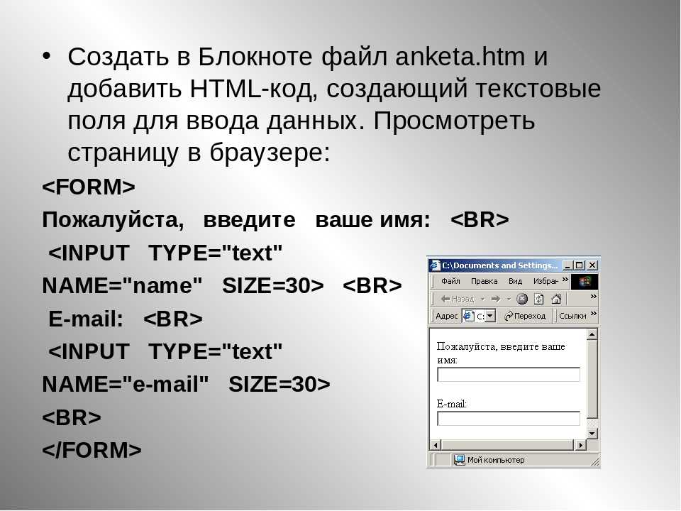
Чтобы определить к какому элементу формы относится текущая метка, необходимо использовать атрибут for тега <label>. Значение атрибута for должно соответствовать значению глобального атрибута id того элемента формы, к которому будет относится метка. Атрибут for можно не использовать, если элемент <input> будет находиться внутри элемента <label>.
Рассмотрим пример использования:
<!DOCTYPE html>
<html>
	<head>
		<title>Пример использования тега <label></title>
	</head>
	<body>
		<form>
			<label for = "yes">Да</label> <!--Здесь мы создаём метку для тега input c id = "yes"-->
			<input type = "radio" id = "yes"name = "choice" value = "yes" checked>
			<label for = "no">Нет</label><!--Здесь мы создаём метку для тега input c id = "no"-->
			<input type = "radio"id = "no" name = "choice" value = "no">
		</form><br>
		<form>
			<label>Да <input type = "radio" name = "choice2" value = "yes"> </label><!--Здесь мы  помещаем теги <input>
			внутрь тегов <label> (при этом атрибут for не требуется)-->
			<label>Нет <input type = "radio"name = "choice2" value = "no" checked></label>
		</form>
	</body>
</html>
В этом примере мы:
Внутри первой формы:
Разместили две радиокнопки () для выбора одного из ограниченного числа вариантов
Еще раз обратите внимание, что для радиокнопок внутри одной формы необходимо указывать одинаковое имя, значения мы указали разные. Для первой радиокнопки мы указали атрибут checked, который указывает, что элемент должен быть предварительно выбран при загрузке страницы (в данном случае радиокнопка со значением yes)
Кроме того, мы указали для радиокнопок глобальные атрибуты id, которые определяют уникальный идентификатор для элемента.
Разместили два элемента , которые определяют текстовые метки для наших текстовых полей. Обратите внимание, что мы использовали атрибут for, чтобы определить к какому элементу формы относится текущая метка. Значение атрибута for соответствует значению глобального атрибута id необходимой нам радиокнопки.
Внутри второй формы:
Разместили две радиокнопки () для выбора одного из ограниченного числа вариантов. Для второй радиокнопки мы указали атрибут checked, который указывает, что элемент должен быть предварительно выбран при загрузке страницы (в данном случае радиокнопка со значением no). Кроме того, мы указали для радиокнопок уникальные значения в рамках формы и одинаковые имена.
Разместили два элемента , внутри них мы разместили наши радиокнопки. В отличии от предыдущего метода отсутствует необходимость указывать для радиокнопок глобальные атрибуты id (идентификатор для элемента), а для текстовых меток использовать атрибут for, чтобы на них сослаться (сделать привязку).
В браузере оба варианта (метода) использования текстовых меток выглядят идентично:
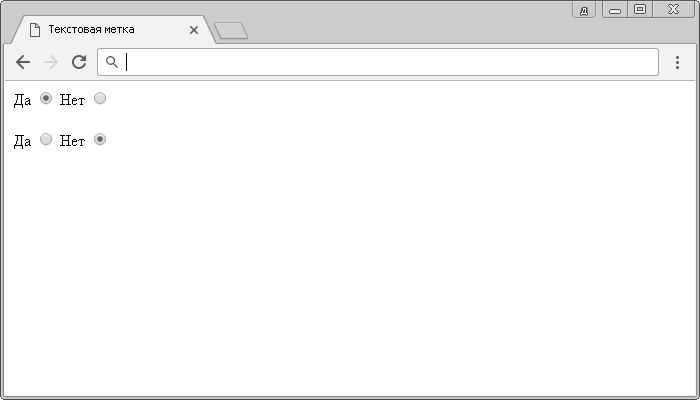
Пример использования HTML тега <label> (использование текстовой метки).
Labeling Textareas
<label for=»message»>Message:</label>
<textarea id=»message» name=»message»></textarea>
Browser View
Message:
The <label> tag is used here to provide a label for the <textarea> element. Users can click on the label to focus the textarea and start typing.
Following is a simple example that demonstrates the usage of the <label> tag in HTML:
In this example, a simple HTML form containing different form elements. Each form element is associated with a corresponding <label> tag to provide a clear description or caption.
Can the <label> tag be used without an associated form element?
Yes, the <label> tag can be used without an associated form element. In HTML, the <label> element is used to provide a text description for a form field or an interactive element on a webpage. It is typically used in conjunction with form elements like <input>, <select>, or <textarea>, where it helps improve accessibility and usability by associating the label text with the corresponding form control.
However, it is not mandatory for a <label> to be associated with a form element. You can use it to label other interactive elements, such as buttons or links, even if they are not part of a form. This can be useful for improving the accessibility and user experience of your website.
Following is an example of using the <label> tag without an associated form element:
<label for=»myButton»>Click me!</label>
<button id=»myButton»>Button</button>
Browser View
Click me!
Button
In the example above, the <label> tag is used to label a <button> element. The for attribute of the specifies which element it is associated with by matching the id attribute of the target element. This association allows users to click the label to interact with the associated button.

Is the tag required for HTML5 validation?
No, the <label> tag is not required for HTML5 form validation. HTML5 form validation primarily relies on attributes like required, pattern, min, max, etc., which are applied directly to the form controls (such as <input>, <select>, <textarea>, etc. ).
The <label> tag is primarily used for labeling form controls, improving accessibility and usability. While it is not required for HTML5 form validation, it is still recommended to use <label> tags to provide clear and descriptive labels for form controls. Associating labels with form controls using the for attribute helps users understand the purpose of each field and improves accessibility by providing context to assistive technologies.
Following is an example that demonstrates the use of HTML5 validation without <label> tags:
In the example above, the required attribute is applied directly to the input fields to enforce mandatory input. The absence of <label> tags does not affect the validation process, but using <label> tags would improve the accessibility and user experience by providing descriptive labels for the input fields.
Label buttons and links #
Buttons and links are often crucial to the experience of a site, and it is important that both have good accessible names.
Buttons
A element always attempts to compute its accessible name using its text content. For buttons that are not part of a , writing a clear action as the text content may be all you need to create a good accessible name.
One common exception to this rule is icon buttons. An icon button may use an image or an icon font to provide the text content for the button. For example, the buttons used in a What You See Is What You Get (WYSIWYG) editor to format text are typically just graphic symbols:
When working with icon buttons, it can be helpful to give them an explicit accessible name using the attribute. overrides any text content inside the button, letting you clearly describe the action to anyone using a screen reader.
Similar to buttons, links primarily get their accessible name from their text content. A nice trick when creating a link is to put the most meaningful piece of text into the link itself, rather than filler words like «Here» or «Read More.»
Not descriptive enough
Useful content!
This is especially helpful for screen readers that offer shortcuts to list all of the links on the page. If links are full of repetitive filler text, these shortcuts become much less useful:
 Example of VoiceOver, a screen reader for macOS, showing the navigate by links menu.