
Examples
One-value syntax
This example shows different values for applied to a paragraph, for left-to-right and right-to-left text.
HTML
<div class="ltr">
  <h2>Left to right text</h2>
  <pre>clip</pre>
  <p class="overflow-clip">Lorem ipsum dolor sit amet, consectetur adipisicing elit.</p>
  <pre>ellipsis</pre>
  <p class="overflow-ellipsis">Lorem ipsum dolor sit amet, consectetur adipisicing elit.</p>
  <pre>" "</pre>
  <p class="overflow-string">Lorem ipsum dolor sit amet, consectetur adipisicing elit.</p>
</div>

<div class="rtl">
  <h2>Right to left text</h2>
  <pre>clip</pre>
  <p class="overflow-clip">Lorem ipsum dolor sit amet, consectetur adipisicing elit.</p>
  <pre>ellipsis</pre>
  <p class="overflow-ellipsis">Lorem ipsum dolor sit amet, consectetur adipisicing elit.</p>
  <pre>" "</pre>
  <p class="overflow-string">Lorem ipsum dolor sit amet, consectetur adipisicing elit.</p>
</div>
CSS
p {
  width 200px;
  border 1px solid;
  padding 2px 5px;


  white-space nowrap;
  overflow hidden;
}

.overflow-clip {
  text-overflow clip;
}

.overflow-ellipsis {
  text-overflow ellipsis;
}

.overflow-string {
  text-overflow " ";
}

body {
  display flex;
  justify-content space-around;
}

.ltr > p {
  direction ltr;
}

.rtl > p {
  direction rtl;
}
Two-value syntax
This example shows the two-value syntax for , where you can define different overflow behavior for the start and end of the text. To show the effect we have to scroll the line so the start of the line is also hidden.
HTML
<pre>clip clip</pre>
<p class="overflow-clip-clip">Lorem ipsum dolor sit amet, consectetur adipisicing elit.</p>
<pre>clip ellipsis</pre>
<p class="overflow-clip-ellipsis">Lorem ipsum dolor sit amet, consectetur adipisicing elit.</p>
<pre>ellipsis ellipsis</pre>
<p class="overflow-ellipsis-ellipsis">Lorem ipsum dolor sit amet, consectetur adipisicing elit.</p>
<pre>ellipsis " "</pre>
<p class="overflow-ellipsis-string">Lorem ipsum dolor sit amet, consectetur adipisicing elit.</p>
CSS
p {
  width 200px;
  border 1px solid;
  padding 2px 5px;


  white-space nowrap;
  overflow scroll;
}

.overflow-clip-clip {
  text-overflow clip clip;
}

.overflow-clip-ellipsis {
  text-overflow clip ellipsis;
}

.overflow-ellipsis-ellipsis {
  text-overflow ellipsis ellipsis;
}

.overflow-ellipsis-string {
  text-overflow ellipsis " ";
}
Syntax
The property may be specified using one or two values. If one value is given, it specifies overflow behavior for the end of the line (the right end for left-to-right text, the left end for right-to-left text). If two values are given, the first specifies overflow behavior for the left end of the line, and the second specifies it for the right end of the line.
Each value is specified as one of:
- one of the keyword values: , ,
- the function , which is passed a or a to control the fade distance
- a .
Values
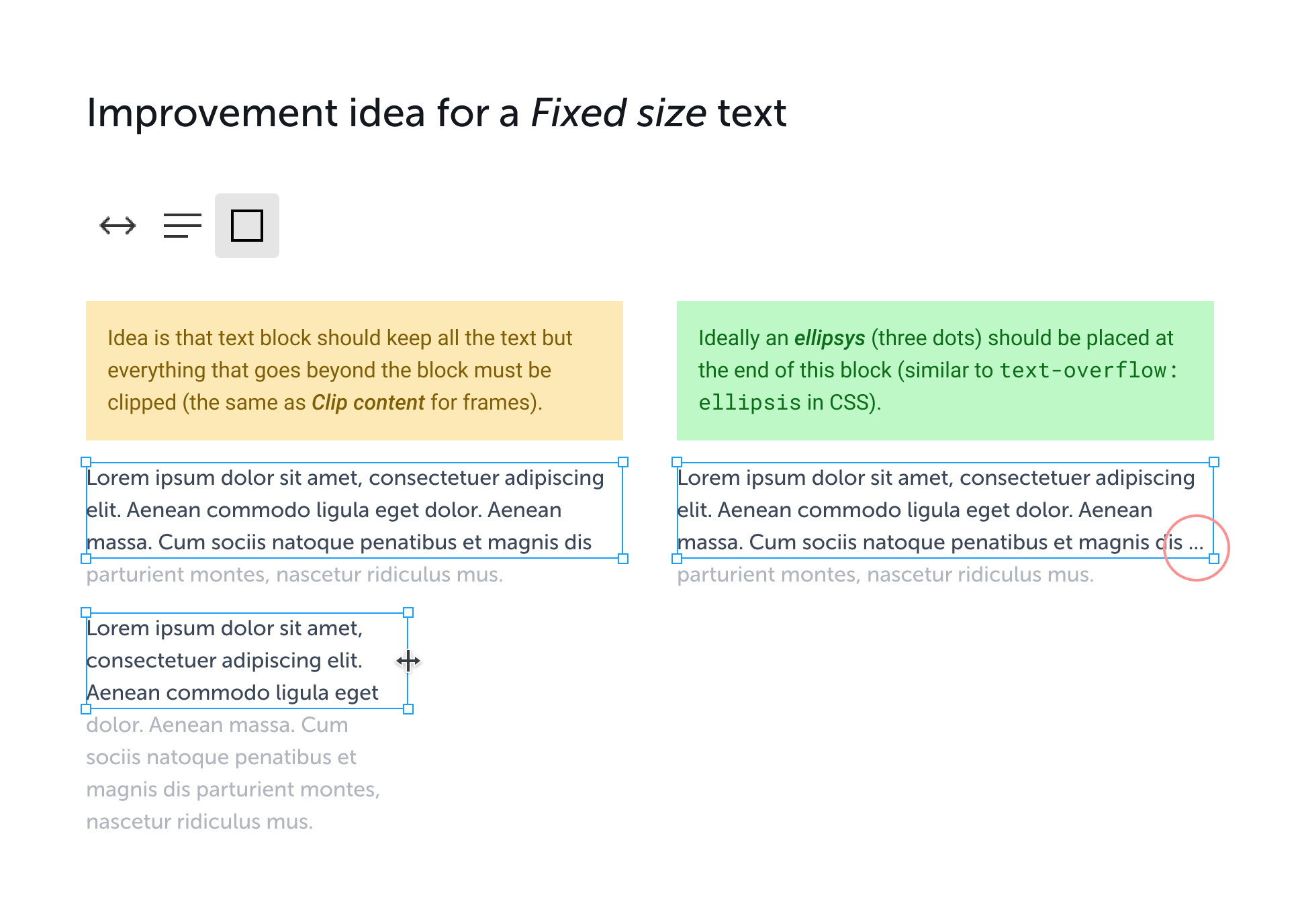
- The default for this property. This keyword value will truncate the text at the limit of the content area, therefore the truncation can happen in the middle of a character. To clip at the transition between characters you can specify as an empty string, if that is supported in your target browsers: .
- This keyword value will display an ellipsis (, ) to represent clipped text. The ellipsis is displayed inside the content area, decreasing the amount of text displayed. If there is not enough space to display the ellipsis, it is clipped.
- ‘
- The to be used to represent clipped text. The string is displayed inside the content area, shortening the size of the displayed text. If there is not enough space to display the string itself, it is clipped.
- ‘
- This keyword clips the overflowing inline content and applies a fade-out effect near the edge of the line box with complete transparency at the edge.
- ‘
- This function clips the overflowing inline content and applies a fade-out effect near the edge of the line box with complete transparency at the edge.
- The argument determines the distance over which the fade effect is applied. The is resolved against the width of the line box. Values lower than are clipped to . Values greater than the width of the line box are clipped to the width of the line box.
CSS Properties
align-contentalign-itemsalign-selfallanimationanimation-delayanimation-directionanimation-durationanimation-fill-modeanimation-iteration-countanimation-nameanimation-play-stateanimation-timing-functionbackface-visibilitybackgroundbackground-attachmentbackground-blend-modebackground-clipbackground-colorbackground-imagebackground-originbackground-positionbackground-repeatbackground-sizeborderborder-bottomborder-bottom-colorborder-bottom-left-radiusborder-bottom-right-radiusborder-bottom-styleborder-bottom-widthborder-collapseborder-colorborder-imageborder-image-outsetborder-image-repeatborder-image-sliceborder-image-sourceborder-image-widthborder-leftborder-left-colorborder-left-styleborder-left-widthborder-radiusborder-rightborder-right-colorborder-right-styleborder-right-widthborder-spacingborder-styleborder-topborder-top-colorborder-top-left-radiusborder-top-right-radiusborder-top-styleborder-top-widthborder-widthbottombox-decoration-breakbox-shadowbox-sizingcaption-sidecaret-color@charsetclearclipclip-pathcolorcolumn-countcolumn-fillcolumn-gapcolumn-rulecolumn-rule-colorcolumn-rule-stylecolumn-rule-widthcolumn-spancolumn-widthcolumnscontentcounter-incrementcounter-resetcursordirectiondisplayempty-cellsfilterflexflex-basisflex-directionflex-flowflex-growflex-shrinkflex-wrapfloatfont@font-facefont-familyfont-kerningfont-sizefont-size-adjustfont-stretchfont-stylefont-variantfont-weightgridgrid-areagrid-auto-columnsgrid-auto-flowgrid-auto-rowsgrid-columngrid-column-endgrid-column-gapgrid-column-startgrid-gapgrid-rowgrid-row-endgrid-row-gapgrid-row-startgrid-templategrid-template-areasgrid-template-columnsgrid-template-rowshanging-punctuationheighthyphens@importisolationjustify-content@keyframesleftletter-spacingline-heightlist-stylelist-style-imagelist-style-positionlist-style-typemarginmargin-bottommargin-leftmargin-rightmargin-topmax-heightmax-width@mediamin-heightmin-widthmix-blend-modeobject-fitobject-positionopacityorderoutlineoutline-coloroutline-offsetoutline-styleoutline-widthoverflowoverflow-xoverflow-ypaddingpadding-bottompadding-leftpadding-rightpadding-toppage-break-afterpage-break-beforepage-break-insideperspectiveperspective-originpointer-eventspositionquotesresizerightscroll-behaviortab-sizetable-layouttext-aligntext-align-lasttext-decorationtext-decoration-colortext-decoration-linetext-decoration-styletext-indenttext-justifytext-overflowtext-shadowtext-transformtoptransformtransform-origintransform-styletransitiontransition-delaytransition-durationtransition-propertytransition-timing-functionunicode-bidiuser-selectvertical-alignvisibilitywhite-spacewidthword-breakword-spacingword-wrapwriting-modez-index
How to Create Multi-line Truncated Text
CSS properties effectively truncate a single line of text or multi-line text spanning two lines or fewer. But it is also possible to achieve text truncation for multi-line text using JavaScript.
In the following sections, we will explore two techniques for multi-line text truncation, one using CSS and the other using JavaScript. By examining both approaches, you can decide which technique is best suited to your needs.
How to Use CSS to Truncate Multi-line Text
CSS properties function well for a single line of text and multi-line text that spans more than two lines.
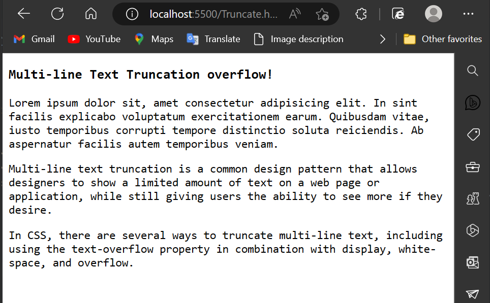
The first step is to specify the height of the . Next, we multiply the by the number of lines we wish to ignore before truncating to get the .
Here’s how it’s done:
Below is the image output of the above HTML code:
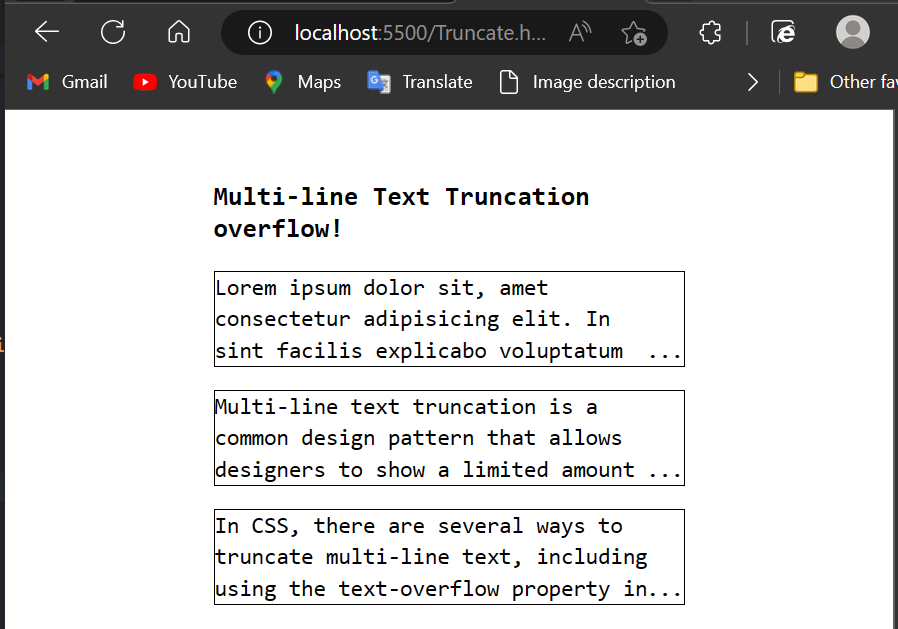
Now let’s set the to and the to our preferred height, the same as the .
Then we have set to , , and set to . We’ll also change the to :
Below is an image showing the multi-line text truncation with pure CSS:
How to Use JavaScript to Truncate Multi-line Text
JavaScript also has the ability to truncate text. Below is an example of how to implement JavaScript to truncate text depending on a certain number of characters.
Let’s have a look at how we can do this with JavaScript. To begin, let’s define a function named and pass the words to be truncated as parameters. We’ll additionally provide a .
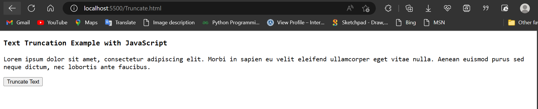
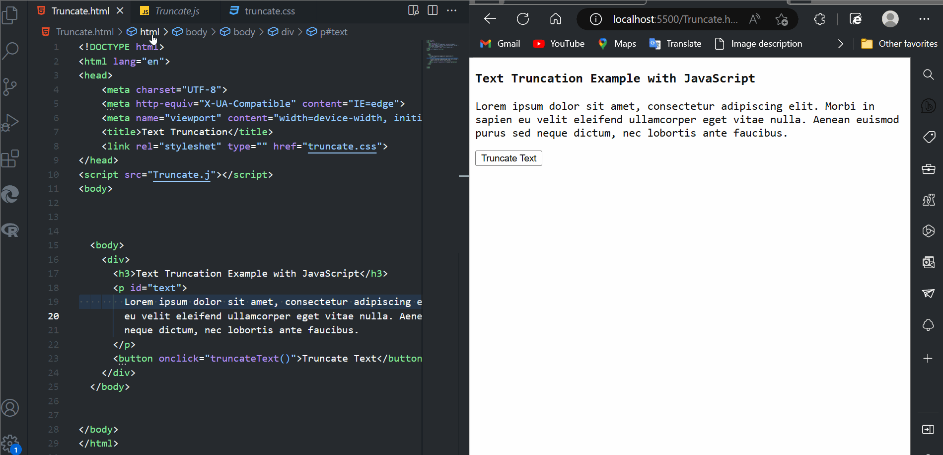
Here’s an example of HTML code for truncating text with JavaScript:
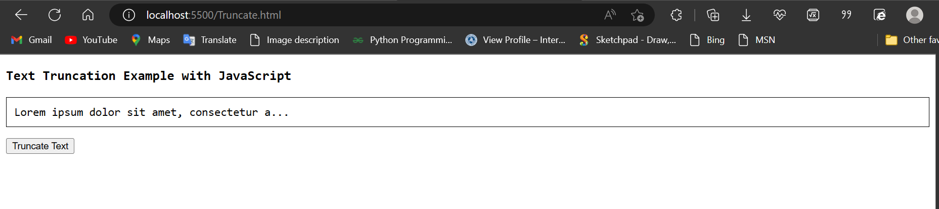
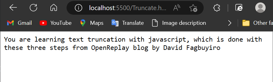
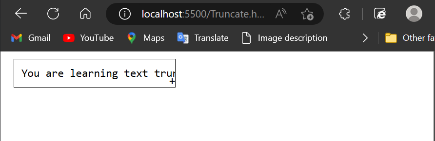
Below is an image output of pure HTML code before adding the JavaScript function and the CSS border function:
Here’s the JavaScript code:
And here’s the CSS code:
The HTML code in the example contains a paragraph with the «text» that contains some sample text. The function in the JavaScript code retrieves the text from the paragraph element.
With these modifications, when the «Truncate Text» button is clicked, the text will be truncated to 50 characters and a border will be added to the truncated text. It also inserts an at the end.
The function is invoked when the user hits the «Truncate Text» button, and the text in the paragraph element is replaced with the truncated content.
Below is an image output after adding both CSS and JavaScript to the HTML code above:
Below is an illustrative GIF to show the output:
This example demonstrates a fundamental approach to truncating text using JavaScript.
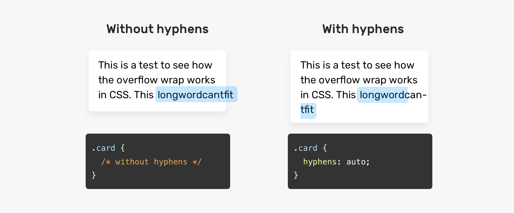
CSS Overflow Wrap
The CSS overflow-wrap property specifies the circumstances when the browser breaks a line of text onto multiple lines. Without this property, a string of text that is too long to fit within the line box would be unbreakable and cause overflow.
To use overflow-wrap, the white-space property must allow wrapping. That means the white-space property must be set to “normal,” “pre-wrap,” and “break-spaces,” or “pre-line.” Most often you’ll see it set to “normal.”
The overflow-wrap property can take three values: normal, anywhere, or break-word.
CSS Overflow Wrap Normal
When overflow-wrap is set to normal, a line of text will only break at unforced break points, like the space between two words.
See the Pen css overflow: overflow-wrap: normal by HubSpot (@hubspot) on CodePen.
CSS Overflow Wap Anywhere
When the anywhere value is applied, lines may break at forced break points if there are no unforced ones.
For example, a long word or URL may be broken to wrap on another line. No hyphen is inserted at the break point.
![Flutter text overflow | 3 steps to instant fix [september 2023 ] - flutterbeads](https://rwvt.ru/wp-content/uploads/d/a/f/daf58ff81a503e71ef302db6c35e87f9.png)
With this value, opportunities to minimize the amount of content overflowing a line by wrapping the line at breakpoint are considered when calculating min-content intrinsic sizes (the smallest size a box could take without causing overflow).
See the Pen css overflow: overflow-wrap: anywhere by HubSpot (@hubspot) on CodePen.
CSS Overflow Wap Break Word
If the break-word value is used, lines may break at forced break points if there are no unforced ones. No hyphen is inserted at the break point.
However, opportunities to minimize the amount of content overflowing a line by wrapping the line at breakpoint are not considered when calculating min-content intrinsic sizes (in other words, the smallest size a box could take without causing overflow).
See the Pen css overflow: overflow-wrap: break-word by HubSpot (@hubspot) on CodePen.
What is overflow in CSS?
In CSS, overflow occurs when an element’s content does not fit entirely inside the element box. This can happen when an element has a specified height that’s too small for the content it contains. You can use the CSS overflow property to control what happens to the overflow.
Before we look at the overflow property, let’s clarify what we meant by the “element box.” According to the CSS box model, a box is generated for HTML elements. This box comprises four layers: the content itself, the padding, the border, and the margin.
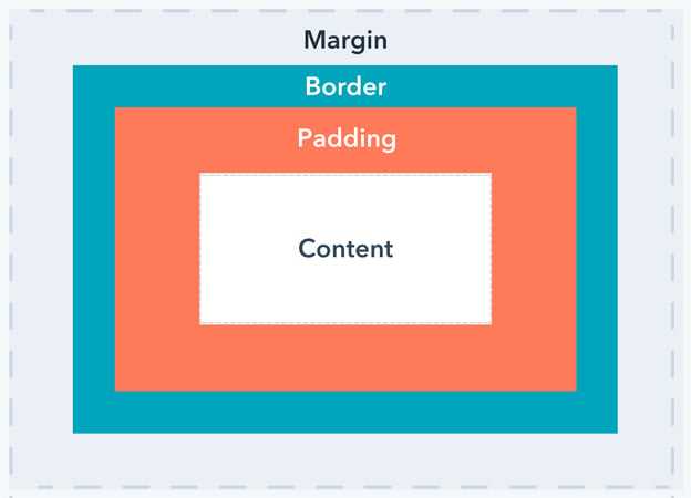
When the content of an HTML element extends beyond any of the box’s edges — whether that’s the content edge, padding edge, border edge, or margin edge — it is called overflow.
Значения свойства
| Значение | Описание |
|---|---|
| clip | Текст обрезается по размеру области содержимого. Это значение по умолчанию. |
| ellipsis | Добавляет троеточие (‘…’, Юникод — U+2026), которое обозначает, что текст был обрезан. Троеточие (горизонтальное многоточие/эллипсис) отображается внутри области содержимого, уменьшая при этом размер отображаемого текста. Если необходимое место для отображения троеточия отсутствует, то оно обрезается. |
| string | Указывает пользовательскую строку для отображения обрезанного текста. В настоящее время поддерживается только в Firefox. |
| initial | Устанавливает свойство в значение по умолчанию. |
| inherit | Указывает, что значение наследуется от родительского элемента. |
CSS, текст shadow и overflow.
Категория: Уроки CSS Просмотров: 2946 Коментариев: Дата: 2018-01-13 Добавил: admin
Итак, мы подошли к финишной прямой по оформлению текста и в этом уроке мы рассмотрим еще два свойства которые могут вам пригодится при работе с текстом. Данные свойства достаточно редко применяются, но о них все же нужно знать.
Свойство text-overflow
Свойство text-overflow: ; используется для определения области видимости текста в блоке, в ситуации, когда текст полностью не помещается в выделенный блок. Данное свойство может принимать два значения:
- clip — текст будет обрезан по размеру области/блока.
- ellipsis — текст будет обрезан и концу добавится многоточие.
Свойство text-overflow: ; будет работать только в том случае, если для блока установлено свойство overflow: ; с значением auto, scroll или hidden.
И свойство white-space, которому нужно указать значение nowrap запрета переноса строк. В итоге получаем вот такой код.
HTML
<!DOCTYPE HTML PUBLIC "-//W3C//DTD HTML 4.01 Transitional//EN" "http://www.w3.org/TR/html4/strict.dtd">
<html>
<head>
    <meta http-equiv="Content-Type" content="text/html; charset=utf-8">
    <title>HTML страница</title>
     <link  href="css/fonts.css" type="text/css" rel="stylesheet">
</head>
<body>
Текст обрезается с помощью свойства text-oveflow
</body>
</html>
И ниже его стили.
CSS
p{
    white-space: nowrap; /* Запрещаем перенос строк */
    overflow: hidden; /* Обрезаем все, что не помещается в область */
    background: #fc0;/* Цвет фона */
    padding: 5px; /* Поля вокруг текста */
    width: 150px; /*Ширина блока*/
    text-overflow: ellipsis; /* Добавляем многоточие */
}
Используя такую структуру кода Вы всегда можете обрезать текст, в зависимости от размера блока.
Свойство text-shadow
Переходим к рассмотрению следующего свойства — это text-shadow. Данное свойство добавляет тень к тексту. Для тени задаются параметры: цвет, смещение относительно надписи и размытие. Также, формируемая тень может иметь разный характер: внутренняя тень текста, тень под текстом и тень вокруг текста.
Для этого свойства используется следующий синтаксис:
CSS
text-shadow: none | тень *
где тень:
<�������������������������������
����метры <�сдвиг по x> <�сдвиг по y> являются обязательными, параметр <�радиус размытия>, по умолчанию установлен в 0, является не обязательным параметром и задает размытие той самой тени.
HTML
<!DOCTYPE HTML PUBLIC "-//W3C//DTD HTML 4.01 Transitional//EN" "http://www.w3.org/TR/html4/strict.dtd">
<html>
<head>
    <meta http-equiv="Content-Type" content="text/html; charset=utf-8">
    <title>HTML страница</title>
     <link  href="css/fonts.css" type="text/css" rel="stylesheet">
</head>
<body>
Текст, которому установлена тень. Свойство text-shadow
</body>
</html>
И ниже его стили.
CSS
.text-shadow p{
    text-shadow: 1px 1px 0 crimson, 3px 8px 18px blue; /* Параметры тени */
    color: green; /* Зеленный цвет текста */
    font-size: 22px; /* Размер текста */
}
Имейте ввиду, что каждый браузер будет отображать тени по своему, в зависимости от его версии. Данное свойство применяется достаточно редко, поэтому для того, чтобы понять как это, все же, работает, стоит самому поэкспериментировать, меняя данные значения text-shadow:1px 1px 0 crimson, 3px 8px 18px blue;.
Вот мы рассмотрели еще свойства относящиеся к тексту. В Демо показано как каждое из этих свойств работает. На этом все, мы рассмотрели все Основные свойства, которые позволяют нам работать и изменять отображаемый вид текста.
<<< Предыдущий материал
Следующий материал >>>
Просмотреть демо: Демо
Скачать исходник: Скачать
- Создание рамок в CSS. Свойство border.
- Подготовка к изучению CSS.
- Создание жирного и курсивного шрифта средствами CSS
- Задаем размер шрифтов CSS
- Оформление текста text-decoration средствами CSS .
- Каскадность и приоритетность в CSS.
- Селекторы предков и потомков CSS.
- Введение в CSS.
Добавить комментарий:
How to Add an Element After the Ellipsis
The (…) is used to represent a text truncation, indicating that some content has been omitted from the display. The text-overflow property is used to specify what happens to the text that overflows the container.
Here’s an example with the HTML code below:
Here’s the image output of the HTML code before introducing the ellipsis:
We added the to the parent to accomplish this. The is then given the and an display. This allows the to appear after the width of the .

![[fix] css text overflow ellipsis not working - articles about design and front end development](https://rwvt.ru/wp-content/uploads/4/d/c/4dce6796cde308dd24f33363917380e1.png)
The is triggered if the defined is exceeded. If there is a , we can have the and the element of the .Below is the CSS code to add an after the :
Here’s the output after introducing the above code:
Browser compatibility
| Desktop | Mobile | |||||||||||
|---|---|---|---|---|---|---|---|---|---|---|---|---|
| Chrome | Edge | Firefox | Internet Explorer | Opera | Safari | WebView Android | Chrome Android | Firefox for Android | Opera Android | Safari on IOS | Samsung Internet | |
| 1 | 12 |
7 Until Firefox 10, handling of on blocks with inline overflow on both horizontal sides was incorrect. Before Firefox 10, if only one value was specified (such as ), text was ellipsed on both sides of the block, instead of only the end edge based on the block’s text direction. |
6 8 |
11 9-15 |
1.3 | ≤37 | 18 |
7 Until Firefox 10, handling of on blocks with inline overflow on both horizontal sides was incorrect. Before Firefox 10, if only one value was specified (such as ), text was ellipsed on both sides of the block, instead of only the end edge based on the block’s text direction. |
11 10.1-14 |
1 | 1.0 | |
| No | No | No | No | No | No | No | No | No | No | No | No | |
| No | No | No | No | No | No | No | No | No | No | No | No | |
| No | No | 9 | No | No | No | No | No | 9 | No | No | No | |
| No | No | 9 | No | No | No | No | No | 9 | No | No | No |
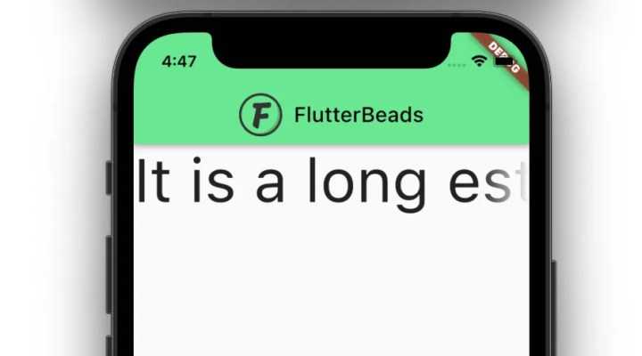
Fading the Text on Overflow
You can also represent the text continuity by fading the text. By default, it shows fading with white color. If the text is a single line it will fade the text from left to right. If it’s multi-line, fading will be shown from bottom to top.
To show fading on overflow:
- Add the overflow parameter.
- Assign TextOverflow.fade to the overflow parameter of the TextField widget.
Code:
Row(
  children: const [
    Expanded(
      child: Text(
        'It is a long established fact that a reader will be distracted by the readable content of a page when looking at its layout.',
        style: TextStyle(fontSize: 58),
        softWrap: false,
        maxLines: 1,
        overflow: TextOverflow.fade, //new
      ),
    ),
  ],
)
Output:
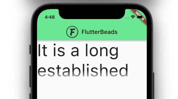
Output after setting maxLines: 2 and softWrap: true on Text Widget:
Пример использования
<!DOCTYPE html>
<html>
<head>
<title>>Переполнение текстом элемента в CSS</title>
<style>
div {
width : 250px; /* задаём ширину блока */
border : 1px solid blue; /* задаём сплошную границу шириной 1px синего цвета */
background : azure; /* задаём цвет заднего фона */
margin : 5px; /* указываем внешний отступ для всех сторон */
overflow : hidden; /* указываем, что при переполнении скрывать содержимое */
white-space : nowrap; /* перенос на новую строку не производится */
}
.test {
text-overflow:clip; /* текст обрезается по размеру области содержимого. */
}
.test2 {
text-overflow:ellipsis; /* добавляет троеточие, которое обозначает, что текст был обрезан */
}
.test3 {
text-overflow:""; /* добавляет "пользовательскую строку"(пользовательское значение), которое обозначает, что текст был обрезан */
}
.test4 {
text-overflow:"" ""; /* добавляет "пользовательскую строку"(пользовательское значение), которое обозначает, что текст был обрезан как в начале, так и конце элемента */
text-indent : -10px; /* задаем отрицательную красную строку */
}
</style>
</head>
<body>
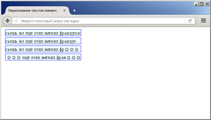
<div class = "test">съешь же ещё этих мягких французских булок, да выпей чаю</div>
<div class = "test2">съешь же ещё этих мягких французских булок, да выпей чаю</div>
<div class = "test3">съешь же ещё этих мягких французских булок, да выпей чаю</div>
<div class = "test4">съешь же ещё этих мягких французских булок, да выпей чаю</div>
</body>
</html>
Пример использования свойства text-overflow(переполнение текстом элемента в CSS).CSS свойства
Understanding the accessibility implications of truncating text
Text truncation can negatively affect readability for users with visual disabilities as it is nearly impossible for such users to access text that has been hidden from the user interface.
According to , in order to be accessible to everyone, web content should be:
- Perceivable
- Operable
- Understandable
- Robust
Here are some ways we can try to solve perceivability issues caused by text truncation:
- Always use relative or flexible positioning (e.g., ems, rems. viewports, percentages)
- Always use scalable fonts as they can adapt to user preferences or to available space
- Always try to use consistent margin, padding, and line-height values; this will ensure that text elements always have adequate space within the elements or containers in which they are situated
- When dealing with user-generated content, find intuitive ways to control the properties related to text visibility, like length
Here’s an example of how we can intuitively handle user-generated content in a way that abides by WCAG guidelines and principles:
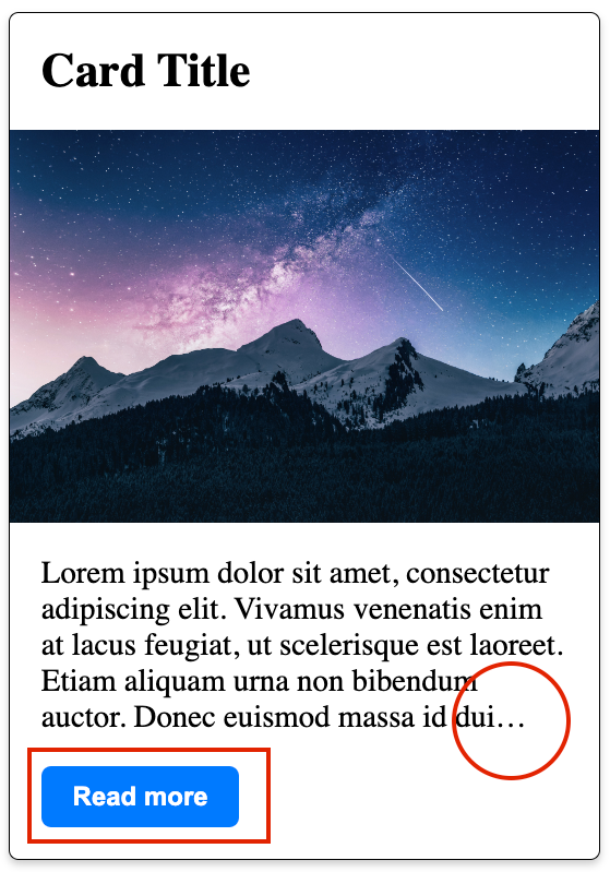
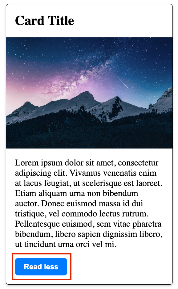
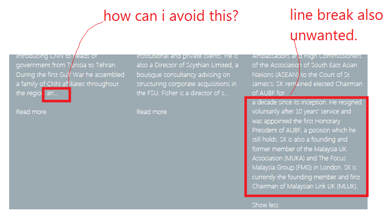
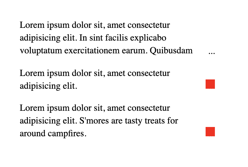
Imagine that this is dynamic content coming from a database and we only want to show five lines of text by default unless the button is clicked. Here, I use the “Read more” button to toggle between the visible and hidden content. The first image shows a truncated text description ending with ellipses and a ”Read more” button.
In the second image, the “Read more” button has already been clicked so more content is visible and the button now says “Read less.” By handling the content in this way, we can abide by the WCAG guidelines and principles.
See the Pen
Hide and show description for hidden text by Chinedu Victor (@chineduvictor7)
on CodePen.
Пример лишнего текста без трех точек.
Для того, чтобы вы увидели лишний текст — вам требуется создать условия. чтобы этот лишний текст появился, для этого вам понадобится:
Один из тегов — пусть это будет div + ему нужен class, чтобы он отличался от всех других div-ов и много текста…
<div class=example>Здесь текст который может быть заменен на три точки вместо лишнего текста…</div>
Далее в стилях прописываем ширину значительно менее текста «width: 300px;» + чтобы не случилось переноса — white-space: nowrap;
<style>.example { width: 300px; white-space: nowrap; border: 1px solid red;}</style>
У нас получился лишний текст за пределами блока…
Syntax
The property may be specified using one or two values. If one value is given, it specifies overflow behavior for the end of the line (the right end for left-to-right text, the left end for right-to-left text). If two values are given, the first specifies overflow behavior for the left end of the line, and the second specifies it for the right end of the line.
Each value is specified as one of:
- one of the keyword values: , ,
- the function , which is passed a or a to control the fade distance
- a .
Values
- The default for this property. This keyword value will truncate the text at the limit of the content area, therefore the truncation can happen in the middle of a character. To clip at the transition between characters you can specify as an empty string, if that is supported in your target browsers: .
- This keyword value will display an ellipsis (, ) to represent clipped text. The ellipsis is displayed inside the content area, decreasing the amount of text displayed. If there is not enough space to display the ellipsis, it is clipped.
- The to be used to represent clipped text. The string is displayed inside the content area, shortening the size of the displayed text. If there is not enough space to display the string itself, it is clipped.
- This keyword clips the overflowing inline content and applies a fade-out effect near the edge of the line box with complete transparency at the edge.
- This function clips the overflowing inline content and applies a fade-out effect near the edge of the line box with complete transparency at the edge.
- The argument determines the distance over which the fade effect is applied. The is resolved against the width of the line box. Values lower than are clipped to . Values greater than the width of the line box are clipped to the width of the line box.
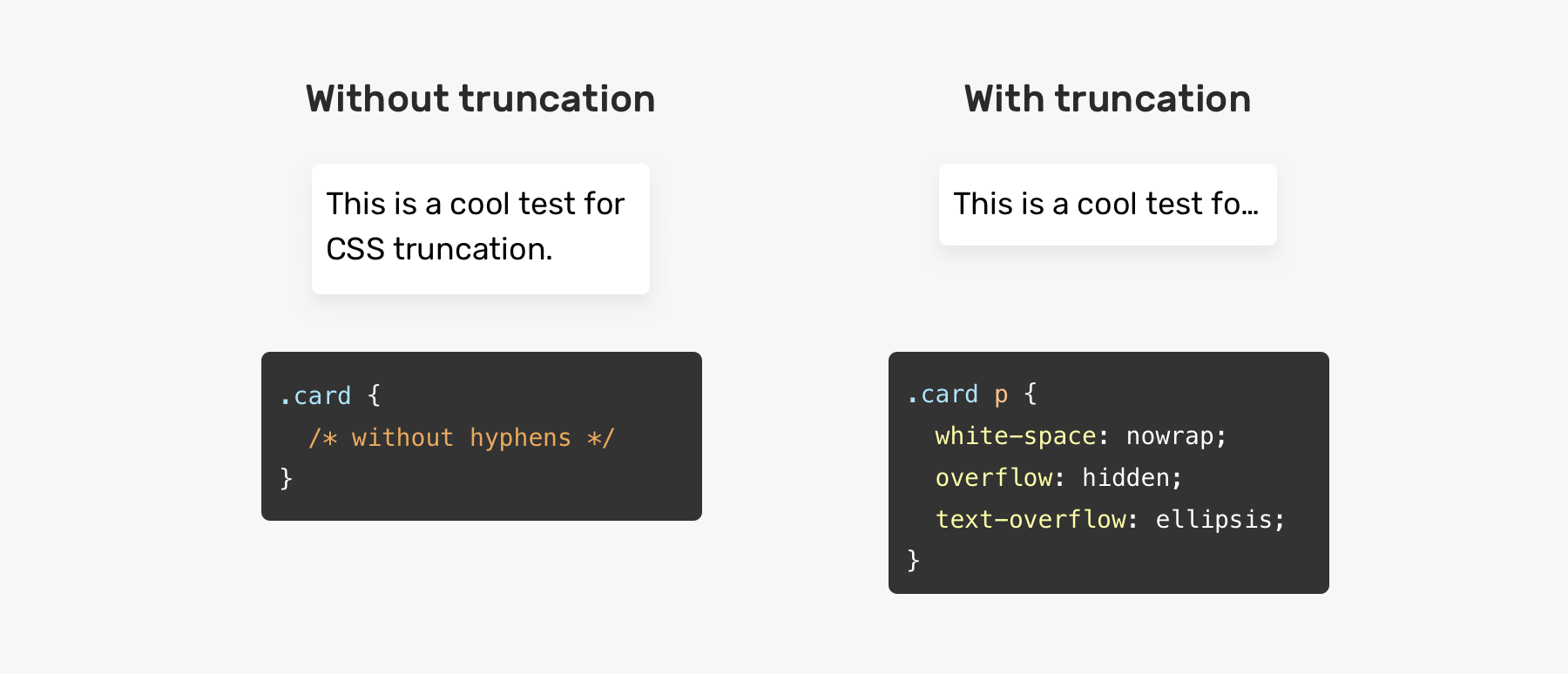
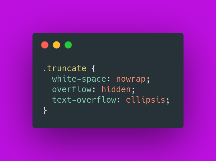
How to Use text-overflow ellipsis in CSS?
The property text-overflow works in combination with the other properties white-space with value nowrap, overflow with value hidden:
white-space nowrap;overflow hidden;text-overflow ellipsis;
The description of the properties is mentioned below:
- “white-space” property with the value “nowrap” is utilized to adjust the text in a straight line.
- “overflow” property with the value “hidden” is utilized to hide the overflow text.
- “text-overflow” property with the value “ellipsis” is utilized to turn the text into an ellipsis.
Output
That’s it! We have successfully learned why CSS text-overflow ellipsis does not work and how to fix it.
Introduction
Have you ever visited a website where the content spills over the edges of its container and obscures other elements on the page? It can be frustrating, making it difficult to read and navigate the site. This is where CSS Overflow comes in. By controlling the overflow of content within an element, developers can prevent these kinds of problems and create a visually appealing and functional website.

In this article, we’ll provide an in-depth guide on CSS Overflow and its different values, as well as how to use it to fix content overflow issues. We’ll also discuss the best practices for using it in responsive design and answer some common questions about it. By the end of this article, you’ll have a comprehensive understanding of CSS Overflow and be equipped to use it effectively in your web design projects.
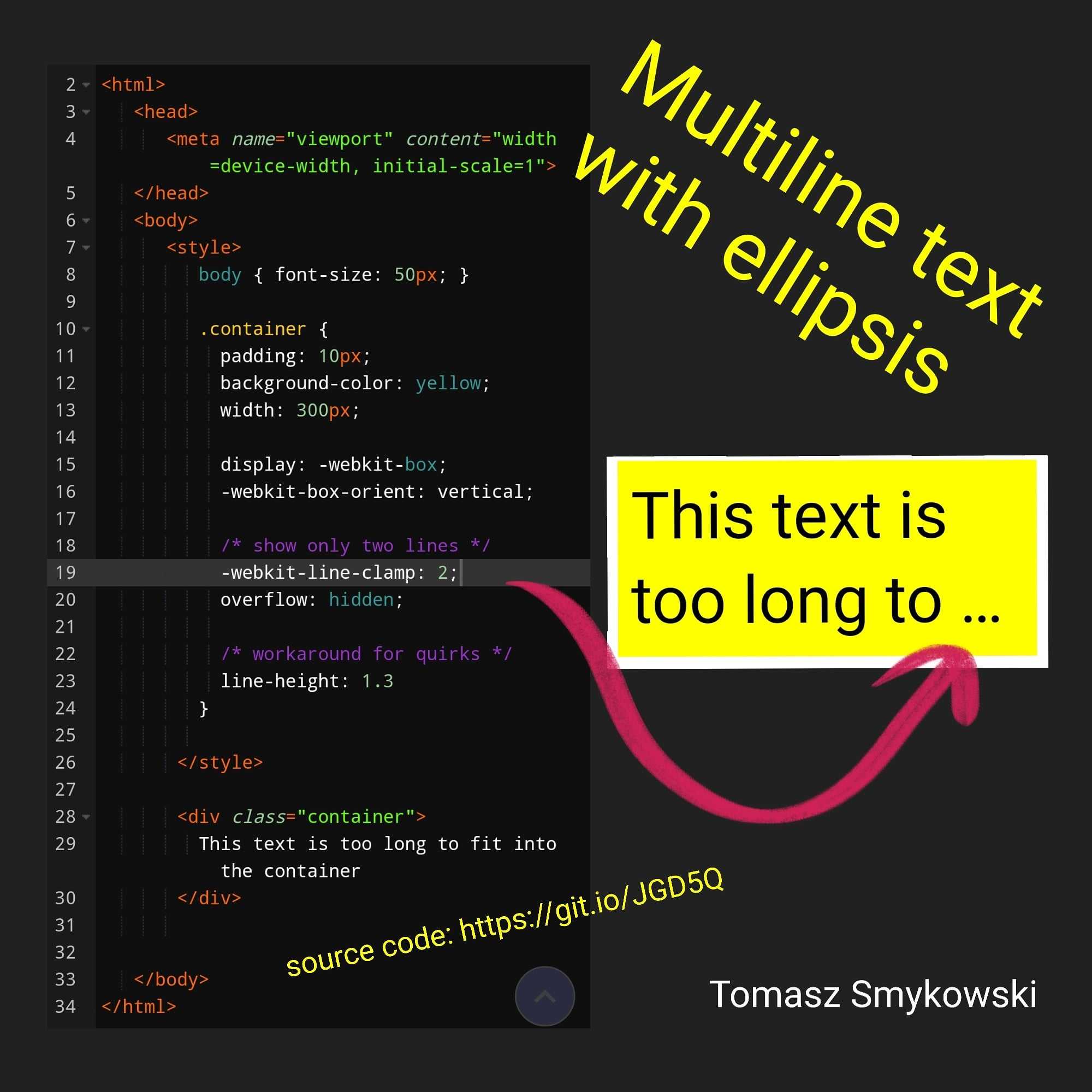
Обрезка до нужного числа строк (с многоточием)
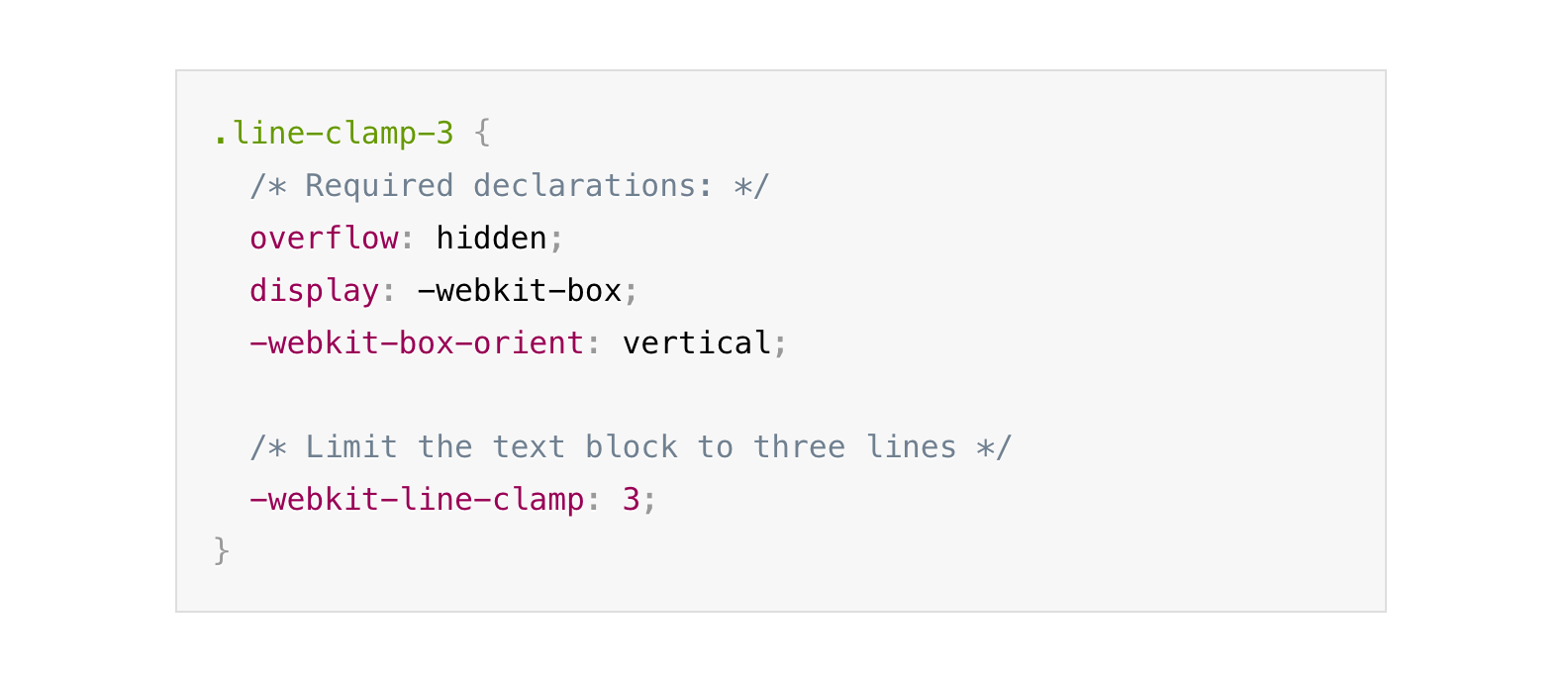
К сожалению, чтобы провернуть нечто подобное с несколькими строками, придётся прибегнуть к ненадёжному методу. Ненадёжный он потому, что используемые в нём свойства не являются частью стандарта, могут поддерживаться не всеми браузерами и их поддержка может быть прекращена в любой момент. Поэтому они не рекомендованы для использования в продакшене. На данный момент приведённое решение будет работать во всех браузерах на основе Webkit (Chrome, Opera), Firefox и Edge.
Сначала рассмотрим, это работает.
.truncate-text {
  width: 200px;
  height: 80px;
  background: #c8ad90;
  padding: 1rem;
  overflow: hidden;
  display: -webkit-box;
  -webkit-line-clamp: 3;
  -webkit-box-orient: vertical;
}
Сочетание трёх последних строк даёт нам добавление многоточия в конце 3-й строки (при этом строки ниже не скрываются, это надо сделать вручную). Также мы снова имеем проблему текста поверх нижнего внутреннего отступа, которую на этот раз мы решим за счёт изменения разметки.
<div class="container">
  <div class="truncate-text">
    Lorem ipsum dolor sit amet, consectetuer adipiscing elit, sed diam nonummy nibh euismod tincidunt ut laoreet dolore magna aliquam erat.
  </div>
</div>
.container {
  width: 200px;
  background: #c8ad90;
  padding: 1rem;
}
.truncate-text {
  overflow: hidden;
  display: -webkit-box;
  -webkit-line-clamp: 3;
  -webkit-box-orient: vertical;
  line-height: 1.3em;
  height: 3.9em;
}
Рассмотрим эти свойства подробнее.
Вообще display: box это старый синтаксис , который используется, например, для поддержки flexbox в старых Safari. При этом обязательно использовать префикс -webkit. В документации Firefox можно найти упоминание значения display: -moz-box, но в поздних версиях оно было заменено на -webkit-box, также Firefox поддерживает значение без префикса (box). Как говорилось выше, это аналог display: flex, и соответственно влияет на расположение дочерних элементов и распределение свободного пространства.
Аналог свойства flex-direction: column. Также является частью flexbox.
Первоначально реализованное в Webkit и в Firefox и Edge свойство, ограничивающее количество строк контента в блоке. Спецификация определяет свойство line-clamp, призванное прийти на замену варианту с префиксом, но для обратной совместимости требуется, чтобы -webkit-line-clamp также поддерживалось. В IE, естественно, это не сработает даже с префиксом.
Живой пример можно найти тут.
Best Practices for CSS Overflow and Responsive Design
Responsive design is an essential part of modern web development. With the increasing number of devices and screen sizes, it’s crucial to make sure that your website looks and functions well on all of them. CSS Overflow is an essential tool for designing responsive layouts that accommodate different screen sizes without sacrificing content.
Here are some best practices for using CSS Overflow in responsive design:
For containers with fixed heights and widths, use “auto” or “scroll” values
This ensures that content within the container will be scrollable if it overflows the fixed size.
.container {
  width: 400px;
  height: 200px;
  overflow: auto;
}
This hides any overflowed content within the container.
.container {
  width: 100%;
  height: 100%;
  overflow: hidden;
}
Use “text-overflow: ellipsis” for long text within fixed-size containers.
This displays an ellipsis (…) at the end of the text when it overflows the container.
.container {
  width: 200px;
  white-space: nowrap;
  overflow: hidden;
  text-overflow: ellipsis;
}
Use media queries to adjust the overflow values for different screen sizes.
For example, you might want to use “scroll” for a container on a desktop screen, but “hidden” on a mobile screen.
@media (max-width: 768px) {
  .container {
    overflow: hidden;
  }
}
@media (min-width: 769px) {
  .container {
    overflow: scroll;
  }
}
Use JavaScript to dynamically adjust the overflow values based on user interactions.
For example, you might want to change the overflow value from “hidden” to “scroll” when the user clicks a “show more” button.
CSS Overflow affects different devices and screen sizes in various ways. For example, overflow values that work well on desktop computers may not work as well on mobile devices, where screen space is limited. Similarly, different browsers may handle overflow differently, so it’s essential to test the design on various devices and browsers.