
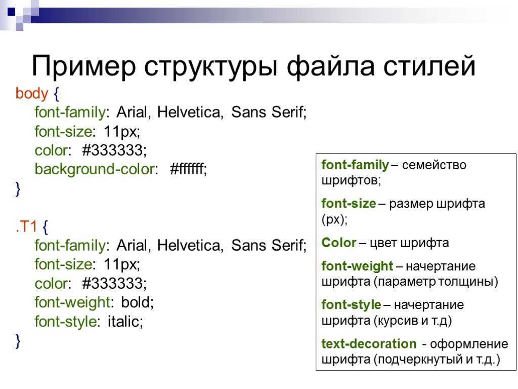
Краткое содержание
- Используйте в HTML элемент <table> для определения таблиц
- Используйте в HTML элемент <tr> чтобы определить строку таблицы
- Используйте в HTML элемент <td> для определения табличных данных
- Используйте в HTML элемент <th> чтобы определить заголовок таблицы
- Используйте в HTML элемент <caption> чтобы определить надпись таблицы
- Используйте в CSS свойство border чтобы определить границы
- Используйте в CSS свойство border-collapse чтобы рухнули границы ячеек
- Используйте в CSS свойство padding чтобы добавить отступы для ячеек
- Используйте в CSS свойство text-align для выравнивания текста в ячейке
- Используйте в CSS свойство border-spacing чтобы задать интервал между ячейками
- Используйте атрибут colspan для создания ячейки охватывают множество столбцов
- Используйте атрибут rowspan чтобы сделать промежуток ячейке несколько строк
- Используйте атрибут id для определения одной таблицы
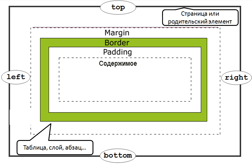
Border
Свойство border — базовый атрибут одновременно определяет стиль, цвет и толщину границы элемента.
Так как атрибут border является базовым, значения родственных свойств указываются в любом порядке через пробел.
Пример:
<!DOCTYPE HTML PUBLIC «-//W3C//DTD HTML 4.01 Transitional//EN» «http://www.w3.org/TR/html4/loose.dtd»><html><head><title>border</title><style type=»text/css»>div{ border: RGB(25, 125, 25) 6px ridge;}</style></head><body><div><h3>А знаете ли Вы что:</h3><p>Слон — символ положительного характера — используется в Азии как царское верховное животное и высоко ценится за ум и хитрость.</p>… … …</div></body></html>
смотреть пример
Однако если Вы хотите присвоить разные свойства различным сторонам границы элемента или только одной из них, пользуйтесь свойствами border-bottom, border-left, border-right, border-top.
border — оформление границ элемента
CSS-свойство предназначено для управления оформлением границ элемента. Границы располагаются перед фоном элемента.
– это универсальное свойство для стилизации границ (рамки) вокруг элемента. Оно позволяет установить сразу три характеристики: толщину границ (), стиль линий () и цвет ().
Например:
CSS
состоит из трёх других свойств (в скобках приведены значения каждого из них, которые они имеют по умолчанию):
- (medium);
- (none);
- (currentcolor).
Свойство устанавливает стили сразу для всех четырёх границ. В отличие от него , и могут принимать до 4 значений, и тем самым стилизовать каждую из сторон по-отдельности.
CSS
При установке меньшего количества значений:
CSS
Tables Backgrounds
You can set table background using one of the following two ways −
-
bgcolor attribute − You can set background color for whole table or just for one cell.
-
background attribute − You can set background image for whole table or just for one cell.
You can also set border color also using bordercolor attribute.
Example
<!DOCTYPE html>
<html>

   <head>
      <title>HTML Table Background</title>
   </head>

   <body>
      <table border = "1" bordercolor = "green" bgcolor = "yellow">
         <tr>
            <th>Column 1</th>
            <th>Column 2</th>
            <th>Column 3</th>
         </tr>
         <tr>
            <td rowspan = "2">Row 1 Cell 1</td>
            <td>Row 1 Cell 2</td>
            <td>Row 1 Cell 3</td>
         </tr>
         <tr>
            <td>Row 2 Cell 2</td>
            <td>Row 2 Cell 3</td>
         </tr>
         <tr>
            <td colspan = "3">Row 3 Cell 1</td>
         </tr>
      </table>
   </body>

</html>
This will produce the following result −
Here is an example of using background attribute. Here we will use an image available in /images directory.
<!DOCTYPE html>
<html>

   <head>
      <title>HTML Table Background</title>
   </head>

   <body>
      <table border = "1" bordercolor = "green" background = "/images/test.png">
         <tr>
            <th>Column 1</th>
            <th>Column 2</th>
            <th>Column 3</th>
         </tr>
         <tr>
            <td rowspan = "2">Row 1 Cell 1</td>
            <td>Row 1 Cell 2</td><td>Row 1 Cell 3</td>
         </tr>
         <tr>
            <td>Row 2 Cell 2</td>
            <td>Row 2 Cell 3</td>
         </tr>
         <tr>
            <td colspan = "3">Row 3 Cell 1</td>
         </tr>
      </table>
   </body>

</html>
This will produce the following result. Here background image did not apply to table’s header.
CSS Border Shadow
You can combine the CSS box-shadow property with the border property when you need to create a shadow effect. Two values are necessary to set the box-shadow property that is the v-offset and the h-offset:
- h-offset: The value defines horizontal shadow offset. A negative value set applies the shadow on the left side while a positive value applies the shadow on the right side.
- v-offset: The value defines the vertical shadow offset. A negative value applies the shadow above while a positive value applies the shadow below the box.
H-offset and v-offset accept four values that translate into shadow. These values include:
- Blur: Add a third value to include a blur effect. The shadow blur increases the higher the number.
- Spread: Add a fourth value that defines the shadow spread. A negative value decreases the shadow size while a positive value increases it.
- Color: Add a color value to establish the shadow color. When you fail to define a shadow color, it will assume the color of the text.
- Inset: Add the inset keyword to define the shadow within the box.
What’s more, you can define various shadows. To do this, you just need to separate the values by commas. Ensure you increase the v- and h-offset values for the cascading shadows to make them visible.
Свойства и параметры html таблиц: отступ, ширина, цвет фона, граница (рамка)
тега tablewidth — ширина таблицы. может быть в пикселях или % от ширины экрана.bgcolor — цвет фона ячеек таблицыbackground — заливает фон таблицы рисункомborder — рамка и границы в таблице. Толщина указывается в пикселяхcellpadding — отступ в пикселях между содержимым ячейки и её внутренней границей
<table border="1" width="300"> <!-- Задаём границу в 1 пиксель и ширину в 300 пикселей -->
без крайне редко применяемых тегов caption и thborder (граница)width (ширина таблицы, строки или ячейки)bgcolor (цвет ячейки)
<html>
   <head>
   <title>Таблица html</title>
   </head>
<body>
<table border="1" width="300"> <!-- Задаём границу в 1 пиксель и ширину в 300 пикселей -->
   <tr bgcolor="Gainsboro">  <!-- Задаём цвет ячеек для всей первой строки -->
        <td>
            Стобец 1
        </td>
        <td>
            Стобец 2
        </td>
   </tr>
   <tr>
        <td>
            Текст в первой ячейке первого столбца
        </td>
        <td>
            Текст во второй ячейке второго столбца
        </td>
   </tr>
</table>
</body>
</html>
frame — атрибут, обозначающий рамку вокруг таблицы. Есть следующие значения:
void — рамки нет,
above — только верхняя рамка,
below — только нижняя рамка,
hsides — только верхняя и нижняя рамки,
vsides — только левая и правая рамки,
lhs — только левая рамка,
rhs — только правая рамка,
box — все четыре части рамки.rules — атрибут, обозначающий границы внутри таблицы, между ячейками. Есть следующие значения:
none — между ячейками нет границ,
groups — границы только между группами строк и группами столбцов (будут рассмотрены чуть позже),
rows — границы только между строками,
cols — границы только между стобцами,
all — отображать все границы.
<html>
   <head>
   <title>Таблица html</title>
   </head>
<body>
<table border="1" width="300" frame="void" rules="rows"> <!-- Задаём границу в 1 пиксель и ширину в 300 пикселей. Внешней рамки нет. Есть граница между строками -->
   <tr bgcolor="Gainsboro">  <!-- Задаём цвет ячеек для всей первой строки -->
        <td>
            Стобец 1
        </td>
        <td>
            Стобец 2
        </td>
   </tr>
   <tr>
        <td>
            Текст в первой ячейке первого столбца
        </td>
        <td>
            Текст во второй ячейке второго столбца
        </td>
   </tr>
</table>
</body>
</html>
| Поскольку атрибутом border теперь редко пользуются, то и я Вам рекомендую не привыкать к нему и следующие примеры будут без указания границ. |
выравнивание в таблицеalign — выравнивание таблицы. Её можно расположить слева (left), справа (right), по центру (center)cellspacing — расстояние между ячейками таблицы. Указывается в пикселях (по умолчанию 0 пикселей)cellpadding — отступ в пикселях между содержимым ячейки и её внутренней границей (по умолчанию 0 пикселей)
<html>
   <head>
   <title>Таблица html</title>
   </head>
<body>
<table width="400" align="center" cellspacing="5" cellpadding="10">
<!-- Задаём ширину 400 пикселей. Таблицу выравниваем по центру. Расстояние между ячейками 5 пикселей. Отступ между содержимым ячейки и её границей 10 пикселей -->
   <tr bgcolor="Gainsboro">  <!-- Задаём цвет ячеек для всей первой строки -->
        <td>
            Стобец 1
        </td>
        <td>
            Стобец 2
        </td>
   </tr>
   <tr>
        <td>
            Текст в первой ячейке первого столбца
        </td>
        <td>
            Текст во второй ячейке второго столбца
        </td>
   </tr>
</table>
</body>
</html>
Внимание! Если не указывать ширину таблицы или ячейки, не задавать отступы и выравнивания, то ширина таблицы будет строиться по содержимому — границы будут примыкать к словам, а ширина будет выбираться автоматически.
What is the CSS border property?
is not all the border property entails – though it is important to note that it’s a very useful shorthand, which we will get to later in this tutorial.
So, in addition there are the , , , and sub-properties. Let’s take a look at each of them one by one.
CSS property
You use the property to specify the width of a border. The value is commonly expressed in pixels (px), but it can be expressed in rem, em, and percentage (%).
And it doesn’t end there – this property also takes , , and as values.
The property is a shorthand for , , and , moving in a clockwise direction. So, if you want, you can apply different width values to the border-top, border-right, border-bottom, and border-right.
CSS property
With the property, you get access to different styles you can apply to the border of a box. It takes (the default), , , , , , , , and .
Just like , is a shorthand for , , and . So again, you can specify different values for the properties if you don’t want to use the shorthand.
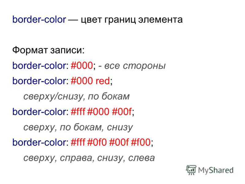
CSS property
The property lets you specify different colors for your border. You can specify this color with named, RGB, and HSL colors – there are no limits.
Black is the default color for this property. So if you don’t specify a value for it, black is automatically set as long as you have the border-width and border-style set to some values.
As it goes with and , you can also specify different colors on all the sides of the border. So, is a shorthand for , , , and .
Below are snippets of code and their respective screenshots showing the three sub-properties of in action:
You can play around with the sub-properties to get a better understanding of how they work.
The shorthand
We’ve applied the sub-properties (, , and ) one by one, but they can be applied together with the shorthand.
This shorthand is useful especially when you want all four sides to be the same like I have done below:
CSS property
With , you can remove sharp edges from the borders in order to make them into rounded corners. I think this makes them more beautiful, too.
The value is specified in pixels (px), and percentage (%) too, depending on how you prefer it.
If you want to, you can also specify a different radius for the top, left, bottom and right edges of the border with , , and . This is because is also a shorthand for those four sub-properties.
We can apply some radii to our borders too:
Logical properties #
In the Logical Properties module you discovered how to refer to block flow and inline flow, rather than explicit top, right, bottom or left sides.
You have this capability with borders, too:
In this example, has all sides defined as having a , dotted border that is the current text color. The border is then defined as , solid and red. This means that in left-to-right languages—like English— the red border will be on the right side of the box. In right-to-left languages—like Arabic— the red border will be on the left side of the box.
Browser support is varied for logical properties in borders, so make sure you check support before using.
# border-image
With the property you have the possibility to set an image to be used instead of normal border styles.
A essentially consist of a
- : The path to the image to be used
- : Specifies the offset that is used to divide the image into nine regions (four corners, four edges and a middle)
- : Specifies how the images for the sides and the middle of the border image are scaled
Consider the following example wheras border.png is a image of 90×90 pixels:
The image will be split into nine regions with 30×30 pixels. The edges will be used as the corners of the border while the side will be used in between. If the element is higher / wider than 30px this part of the image will be stretched. The middle part of the image defaults to be transparent.
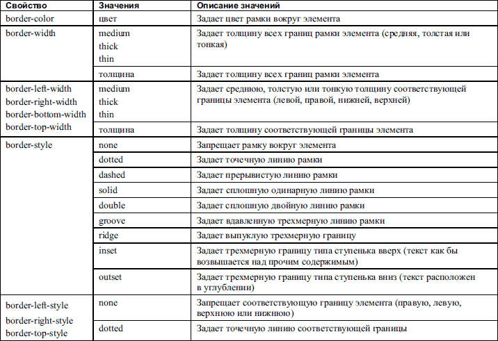
CSS Border Style
The CSS border-style property specifies what type of border to display. There are ten possible values you can use to set the border-style property. Let’s take a quick look at them below.
- None: specifies no border
- Solid: specifies a solid border
- Dashed: specifies a dashed border
- Dotted: specifies a dotted border
- Double: specifies a double border
- Groove: specifies a 3D grooved border
- Ridge: specifies a 3D ridged border
- Inset: specifies a 3D inset border, which makes the element appear embedded
- Outset : specifies a 3D outset border, which makes the element appear embossed
- Hidden: specifies a hidden border
The effect of the groove, ridge, inset, and outset values depends on the value set for the border-color property. If no border-color value is given, then black is the default.
The border-style property can have between one and four values. If only one value is defined, then it applies to all sides of the element. If two values are defined, then the first value represents the top and bottom borders and the second represents the right and left borders. If three values are defined, the first value represents the top border, the second represents the left and right, and the fourth represents the bottom border. If four values are defined, they represent the top, right, bottom, and left, respectively.
Let’s take a look at examples of all these values below.
See the Pen zYZyMmx by Christina Perricone (@hubspot) on CodePen.
Границы таблицы.
Свойство CSS border-collapse определяет стиль отображения границ таблицы.
По умолчанию каждая ячейка таблицы имеет собственную рамку (ну если конечно использован атрибут HTML border или одноимённое свойство CSS), так вот в местах соприкосновения ячеек образуется двойная линия, border-collapse заставляет браузер анализировать таковые места и поступать с ними согласно присвоенному значению данному свойству.
Внешний вид границ таблицы может принимать следующий вид:
- separate — ячейки таблицы отделены друг от друга (по умолчанию).
- collapse — ячейки таблицы не имеют промежутков между собой.
- inherit — свойства наследуются у родителя элемента. (работает далеко не во всех браузерах.)
Пример:
<!DOCTYPE HTML PUBLIC «-//W3C//DTD HTML 4.01 Transitional//EN» «http://www.w3.org/TR/html4/loose.dtd»><html><head><title>Стиль таблицы</title></head><body><table cellpadding=»5″ border=»5″><caption>Таблица с бордюром по умолчанию</caption><tr><td>ячейка</td><td>ячейка</td><td>ячейка</td><td>ячейка</td></tr><tr><td>ячейка</td><td>ячейка</td><td>ячейка</td><td>ячейка</td></tr></table><hr><table cellpadding=»5″ border=»5″ style=»border-collapse: collapse«><caption>А эта таблица использует свойство CSS border-collapse с значением collapse</caption><tr><td>ячейка</td><td>ячейка</td><td>ячейка</td><td>ячейка</td></tr><tr><td>ячейка</td><td>ячейка</td><td>ячейка</td><td>ячейка</td></tr></table> </body></html>
смотреть пример
Свойство border-collapse применяется только к тегу <table> и элементам, у которых атрибут display имет значение table или inline-table.О свойстве display расскажу в отдельной главе.
Table Header, Body, and Footer
Tables can be divided into three portions − a header, a body, and a foot. The head and foot are rather similar to headers and footers in a word-processed document that remain the same for every page, while the body is the main content holder of the table.
The three elements for separating the head, body, and foot of a table are −
-
<thead> − to create a separate table header.
-
<tbody> − to indicate the main body of the table.
-
<tfoot> − to create a separate table footer.
A table may contain several <tbody> elements to indicate different pages or groups of data. But it is notable that <thead> and <tfoot> tags should appear before <tbody>
Example
<!DOCTYPE html>
<html>

   <head>
      <title>HTML Table</title>
   </head>

   <body>
      <table border = "1" width = "100%">
         <thead>
            <tr>
               <td colspan = "4">This is the head of the table</td>
            </tr>
         </thead>

         <tfoot>
            <tr>
               <td colspan = "4">This is the foot of the table</td>
            </tr>
         </tfoot>

         <tbody>
            <tr>
               <td>Cell 1</td>
               <td>Cell 2</td>
               <td>Cell 3</td>
               <td>Cell 4</td>
            </tr>
         </tbody>

      </table>
   </body>

</html>
This will produce the following result −
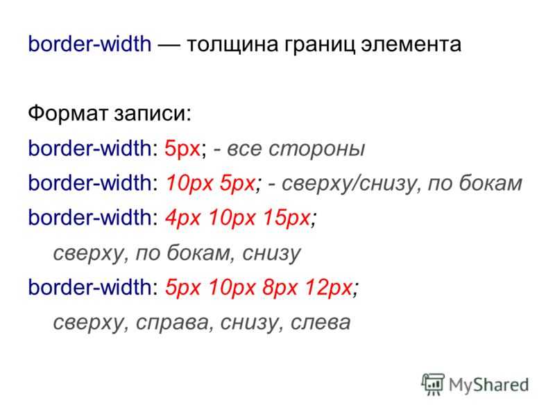
CSS Border Width
The CSS border-width property specifies the width of the border. You can set this property using keyword values or length values. Let’s take a quick look at them below.
- Keyword values: thin, medium, thick
- Length values: px, pt, em, rem, vh, and more
Like the border-style property, the border-width property can have between one and four values. If only one value is defined, then it applies to all sides of the element. If two values are defined, then the first value represents the top and bottom border widths and the second represents the right and left border widths. If three values are defined, the first value represents the top border width, the second represents the left and right, and the fourth represents the bottom width. If four values are defined, they represent the top, right, bottom, and left, respectively.
Let’s take a look at examples defined by different border-width values below.
See the Pen CSS Border Width by Christina Perricone (@hubspot) on CodePen.
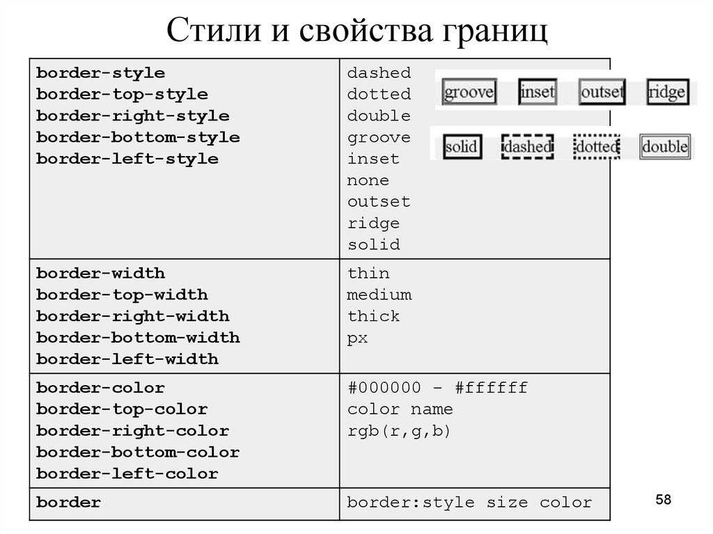
Стиль границы.
Если в HTML бордюр мог быть только в виде сплошной линии вокруг элемента, то в CSS это уже достаточно широкий набор возможных стилей рамок.
Свойство border-style может присваивать элементу один из ниже перечисленных стилей границы.
- none — граница отсутствует (по умолчанию).
- dotted — граница из ряда точек.
- dashed — пунктирная граница.
- solid — сплошная граница
- double — двойная граница
- groove — граница «бороздка»
- ridge — граница «гребень»
- inset — вдавленная граница
- outset — выдавленная граница
Пример:
<!DOCTYPE HTML PUBLIC «-//W3C//DTD HTML 4.01 Transitional//EN» «http://www.w3.org/TR/html4/loose.dtd»><html><head><title>Стиль границы</title><style type=»text/css»>p {background-color: #f5f5f5;text-align: center;}</style></head><body><p style=»border-style: none;«>граница отсутствует</p><p style=»border-style: dotted;«>граница из ряда точек</p><p style=»border-style: dashed;«>пунктирная граница</p><p style=»border-style: solid;«>сплошная граница</p><p style=»border-style: double;«>двойная граница</p><p style=»border-style: groove;«>граница «бороздка»</p><p style=»border-style: ridge;«>граница «гребень»</p><p style=»border-style: inset;«>вдавленная граница</p><p style=»border-style: outset;«>выдавленная граница</p></body></html>
смотреть пример
Стиль бордюра может быть задан как для всех сторон элемента одновременно, так и для каждой его стороны отдельно в зависимости от того, сколько значений присвоено свойству border- style. Таковых значений может быть от одного до четырёх по числу сторон элемента.
В каждом из четырёх случаев действуют свои «правила» по присуждению стиля рамки той или иной стороне элемента, которые приведены в таблице ниже:
| Число значений | Результат |
|---|---|
| 1 |
Пример: div {border-style: solid;} Первое значение — Устанавливает единый стиль бордюра для всех сторон элемента. |
| 2 |
Пример: div {border-style: solid double;}
|
| 3 |
Пример: div {border-style: solid double dashed;}
|
| 4 |
Пример: div {border-style: solid double dashed ridge;}
|
CSS Border Shorthand
CSS shorthand is a group of CSS properties that allow values of multiple properties to be set simultaneously. These values are separated by spaces.

The border property, for example, is shorthand for the individual border properties above: border-width, border-style, and border-color.
So I could write the following declarations in longhand:
Or in one declaration using the shorthand border property:
While this shorthand property can save you time and make your code look cleaner, it does introduce room for error. Let’s take a look at a common issue you may run into when using this shorthand property.
Styling the Top Row Header Cells
Next, you will apply styles to the top row headings. The element will contain the top row, so all styles for this can be applied to that element directly. The intent will be to create a dark gray background with white, all uppercase text.
To start, open in your text editor. Create a new type selector. In the selector block, add a property with a value of , which will create the dark gray color. Then, add a property with a value of :
styles.css
Save you changes to and refresh in your browser. The top heading row is now visually distinctive, with a solid black background and bold white text. The following image shows how this will appear in the browser:
Next, to add a bit more to the aesthetic of the top header, return to in the text editor. Change the size of the text by adding a property with a value of , which will bring the font-size down a little. Then, to make all the letters capitals, add a property with as the value. Finally, to give some space between the letters, use the property and set the value to . This will create a sufficient space between the uppercase characters so they aren’t bunched up, making them easier to read.
The highlighted CSS in the following code block demonstrates how to format these styles:
styles.css
Save your changes to and then return to your browser to refresh . As shown in the following image, the text is now uppercase, a bit smaller in size than the cell contents, but hierarchically clear as a heading:
In this step, you used several properties to provide a discernible style to the top heading row. The HTML for this portion of the table was already accessible for non-sighted and assertive technology users. Now, the visual styles provide more contextual information. Next, you will continue to work with visual aids by adding alternating row colors.
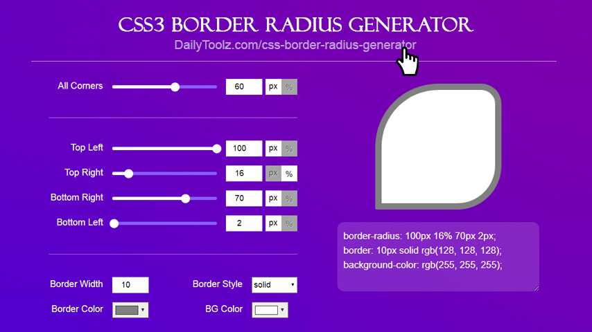
Border radius #
To give a box rounded corners use the property.
This shorthand adds a consistent border to each corner of your box. As with the other border properties, you can define the border radius for each side with , , and .
You can also specify each corner’s radius in the shorthand, which follows the order: top left, top right, bottom right then bottom left.
By defining a single value for a corner, you are using another shorthand because a border radius is split into two parts: the vertical and horizontal sides. This means that when you set , you are setting the top-left-top radius and the top-left-left radius.
You can define both properties, per corner like this:
This adds a value of , and a value of . This converts the top left border radius into an elliptical radius, rather than the default circular radius.
You can define these values in the shorthand, using a to define the elliptical values, after the standard values. This enables you to get creative and make some complex shapes.
Таблица без рамки
Хотя линии между ячейками позволяют четко отделить одни данные от других, ту же самую функцию выполняет и пустое пространство вокруг текста. А чтобы таблица выделялась на веб-страницы, для нее устанавливают определенный цвет фона. Заголовок при этом допустимо задать другого цвета, как показано на рис. 1.
Рис. 1. Вид таблицы без рамки
Для изменения цвета фона таблицы используем атрибут background , добавляя его к селектору TABLE . Для красоты внизу таблицы рисуем линию с помощью параметра border-bottom (пример 1).
Пример 1. Создание таблицы без рамки
TH background: maroon; /* Цвет фона заголовка */ color: white; /* Цвет текста */ text-align: left /* Выравнивание по левому краю */ >
2004 2005 2006
Рубины
43 51 79
Изумруды
28 34 48
Сапфиры
29 57 36
Поскольку содержимое тега исходно выравнивается по центру, то для изменения этой характеристики в данном примере применяется стилевой атрибут text-align со значением left . Можно поступить наоборот и задать выравнивание по центру для ячеек . Но содержимое первой колонки с названиями камней лучше оставить выровненным по левому краю. Чтобы установить для разных колонок различное выравнивание содержимого рассмотрим два способа.
Первый метод заключается в использовании тега , он добавляется в контейнер и устанавливает, в частности, выравнивание для отдельных колонок (пример 2).
Пример 2. Выравнивание с помощью тега
TH background: maroon; /* Цвет фона заголовка */ color: white; /* Цвет текста */ >
Аргумент align тега указывает, по какой стороне выравнивать ячейки колонки, а span определяет число колонок, к которым будут применяться заданные параметры. Если этот атрибут отсутствует, то тег работает только для одной колонки.
Выравнивание содержимого колонок с помощью тега работает в браузере Internet Explorer и не действует в браузере Firefox и некоторых других.
Второй метод универсальный, работает во всех браузерах и основан на добавлении отдельного класса для определенных ячеек.
Создаем стилевой класс, например, с именем jewel и применяем его к ячейкам левой колонки (пример 3).
Пример 3. Выравнивание с помощью стилей
TH background: maroon; /* Цвет фона заголовка */ color: white; /* Цвет текста */ >
TD, TH padding: 3px; /* Поля вокруг текста */ text-align: center /* Выравнивание по центру */ >
TD.jewel text-align: left; /* Выравнивание по левому краю */ background: #ccc /* Цвет фона */ >
2004 2005 2006
Рубины
43 51 79
28
34 48
29
57 36
В данном примере изменяется цвет фона и способ выравнивания для всех ячеек, где установлен параметр class=»jewel» . Результат примера показан на рис. 2.
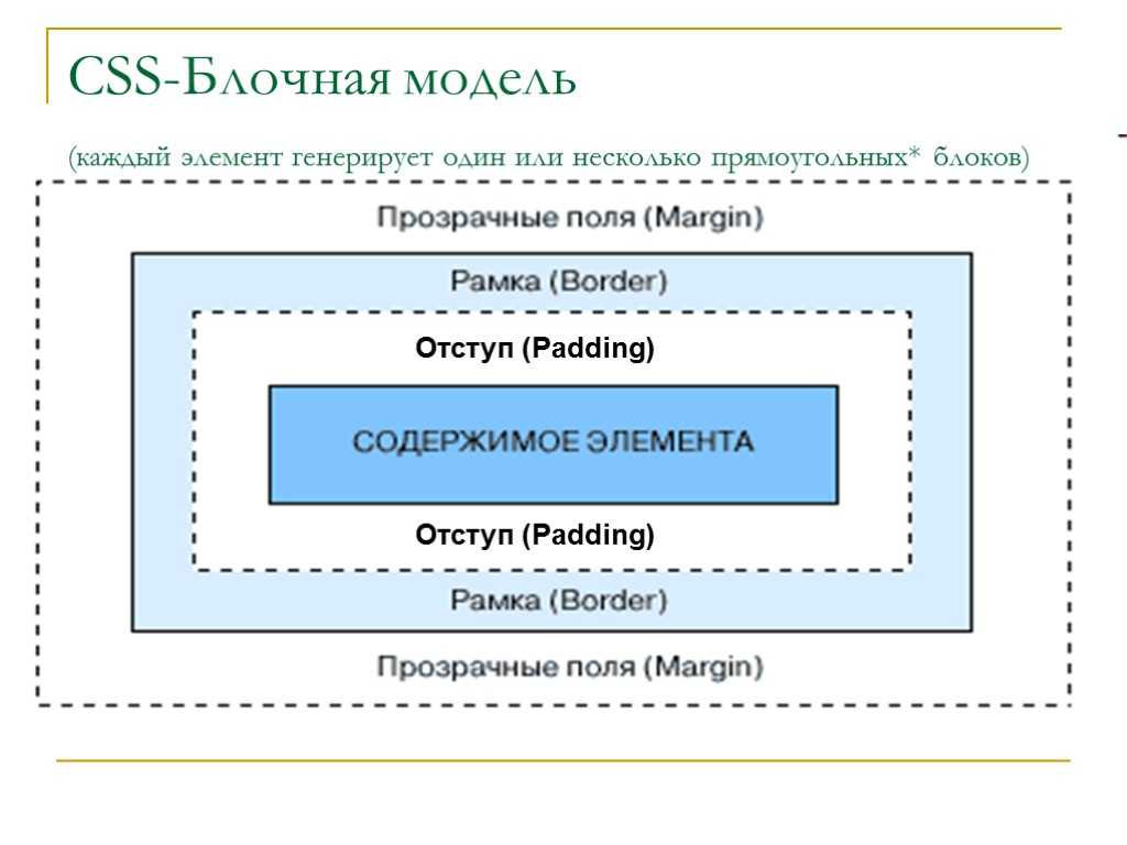
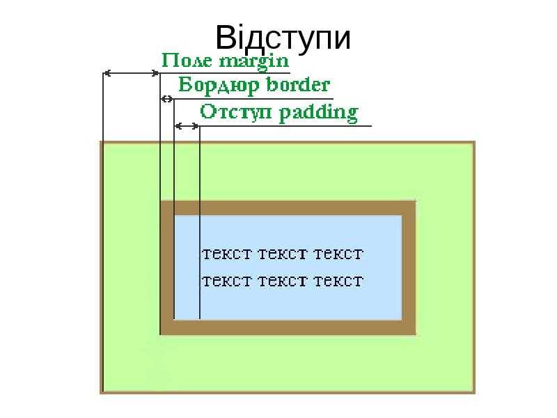
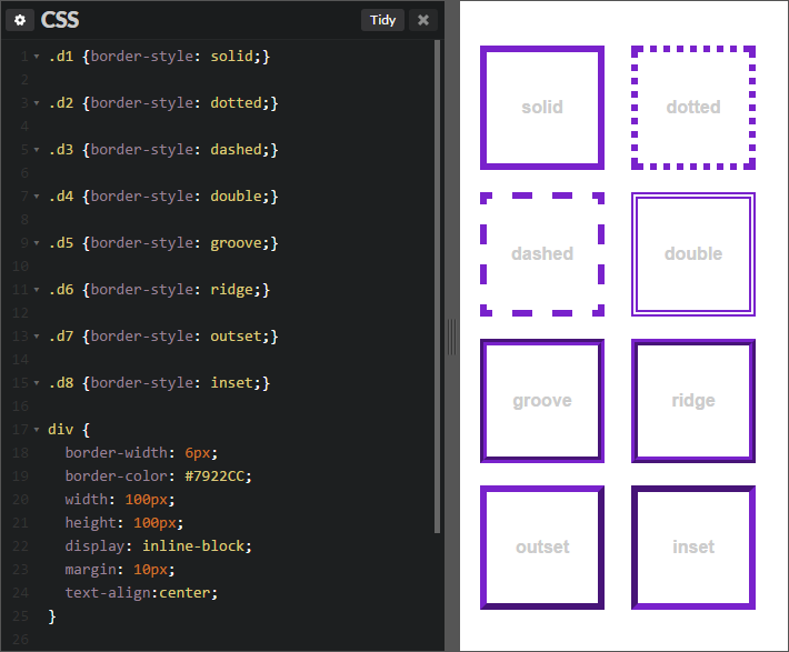


Рис. 2. Таблица без рамки с выделенной левой колонкой
При использовании материалов сайта ссылка на comnew.ru обязательна!
CSS Border Gradient
Through CSS border-image property, web designers can use CSS gradient as a border. This is possible by setting the border-image to repeating-linear-gradient or linear-gradient. Inside the parentheses, include all the colors you want. The color can be a combination of hexadecimal color codes, HSL color values, color names, and RGB color codes.
As well, include a value that defines the border-image-slice property. Ensure you define the border property for the browser to render the gradient border.
– CSS Border Gradient Example
| #gradient {
border: 6px solid; padding: 8px; border-image: repeating–linear-gradient(to bottom right, #FF77CC, #0033CC, #33475B, rgb(250, 120, 90)) 20; } |
# border-[left|right|top|bottom]
The property is used to add a border to a specific side of an element.
For example if you wanted to add a border to the left side of an element, you could do:
**border**
border: border-width border-style border-color | initial | inherit;
border-top: border-width border-style border-color | initial | inherit;
border-bottom: border-width border-style border-color | initial | inherit;
border-left: border-width border-style border-color | initial | inherit;
border-right: border-width border-style border-color | initial | inherit;
**border-style**
border-style: 1-4 none | hidden | dotted | dashed | solid | double | groove | ridge | inset | outset | initial | inherit;
**border-radius**
border-radius: 1-4 length | % / 1-4 length | % | initial | inherit;
border-top-left-radius: length | % | initial | inherit;
border-top-right-radius: length | % | initial | inherit;
border-bottom-left-radius: length | % | initial | inherit;
border-bottom-right-radius: length | % | initial | inherit;
**border-image**
border-image: border-image-source border-image-slice ] border-image-repeat
border-image-source: none | image;
border-image-slice: 1-4 number | percentage
border-image-repeat: 1-2 stretch | repeat | round | space
**border-collapse**
border-collapse: separate | collapse | initial | inherit
border
border-bottom
border-bottom-color
border-bottom-left-radius
border-bottom-right-radius
border-bottom-style
border-bottom-width
border-color
border-image
border-image-outset
border-image-repeat
border-image-slice
border-image-source
border-image-width
border-left
border-left-color
border-left-style
border-left-width
border-radius
border-right
border-right-color
border-right-style
border-right-width
border-style
border-top
border-top-color
border-top-left-radius
border-top-right-radius
border-top-style
border-top-width
border-width
Теги группирования элементов таблиц
Для группирования элементов таблиц служат теги <thead>, <tbody> и <tfoot>.
Так же, как веб-страница может содержать «шапку», «тело» и «подвал», таблица может содержать головную, основную и нижнюю части. Для логического группирования строк в верхней части таблицы (то есть для соз
дания верхней шапки таблицы) используется тег <thead>. Заголовки таблицы
должны быть помещены в элемент <thead>, например:
Основное содержимое (тело) таблицы должно находиться внутри элемента <tbody> (таких блоков в таблице может быть несколько). Для логического группирования строк в нижней части таблицы (то есть для создания «подвала» таблицы) используется тег <tfoot> (в одной таблице допускается не более одного тега <tfoot>). В исходном коде тег <tfoot> ставится до тега <tbody>.
Кроме логического группирования одной из причин использования элементов <thead> и <tfoot> является то, что если ваша таблица слишком длинная для единовременного отображения на экране (или для печати), то браузер будет отображать и заголовок (<thead>) и последнюю строку (<tfoot>), когда пользователь станет прокручивать вашу таблицу.
Пример: Теги <thead>, <tbody> и <tfoot>
- Результат
- HTML-код
- Попробуй сам »
| Это шапка таблицы | |||
|---|---|---|---|
| Это подвал таблицы | |||
| Ячейка 1 | Ячейка 2 | Ячейка 3 | Ячейка 4 |
Несмотря на то, что мы перед <tbody> добавили <tfoot>, он, тем не менее, появляется в конце таблицы.
Это исходит из того, что <tbody> может содержать много строк. Но браузеру нужно отобразить нижнюю часть таблицы до получения всех (потенциально многочисленных) строк данных. Вот почему <tfoot> в коде прописывается перед элементом <tbody>.
Заключение
Чтобы сделать таблицы визуально привлекательными, приходится использовать неочевидные трюки CSS. Но этим и хороши CSS — с их помощью можно решить практически любую задачу по оформлению веб-элементов.
При работе с таблицами возникает соблазн переопределить свойство . Но это приведёт к дополнительным сложностям: придётся вручную определять ширину ячеек, чтобы таблица нормально отображалась. Поэтому удобнее пользоваться предложенными выше трюками, которые позволяют оформлять таблицы элегантно и без лишнего кода.
Адаптированный перевод статьи Styling HTML Tables: How to Apply Margins, Borders and z-index on Table Elements by Markus Oberlehner. Мнение автора оригинальной публикации может не совпадать с мнением администрации «Хекслета».