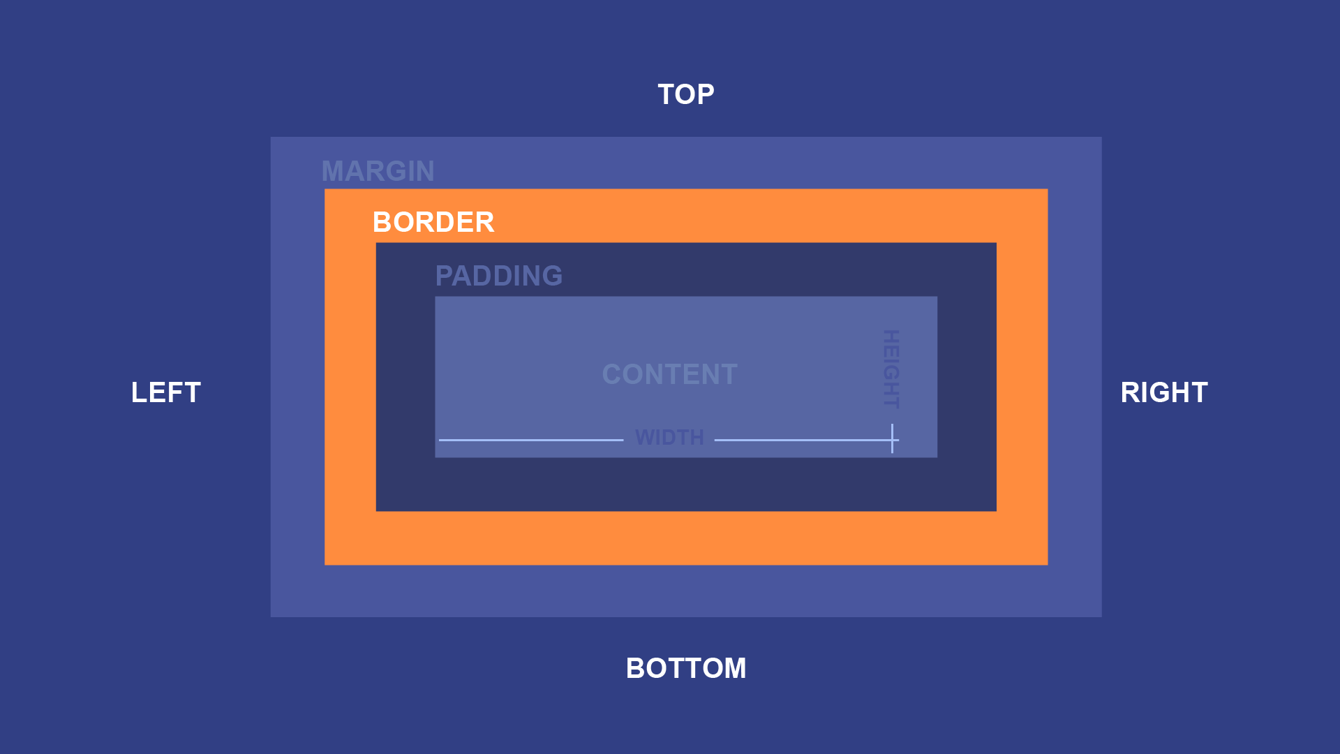
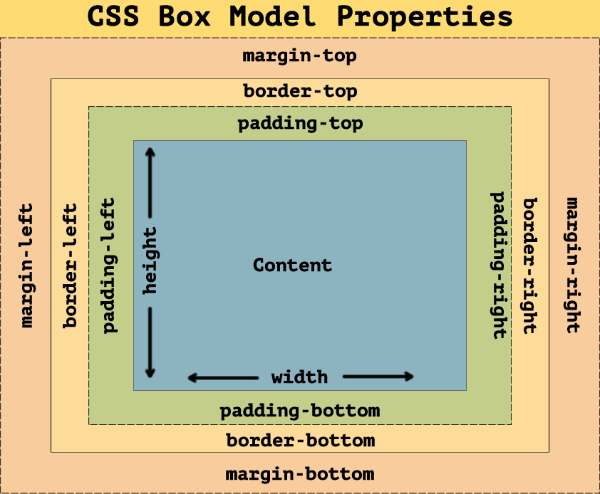
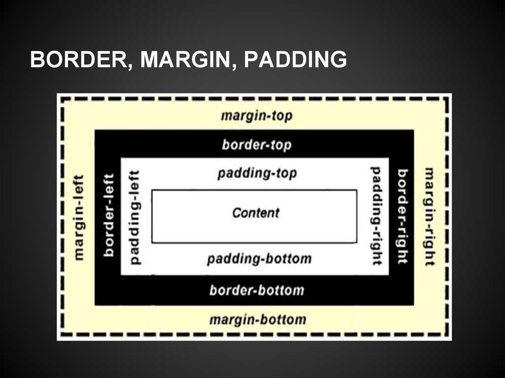
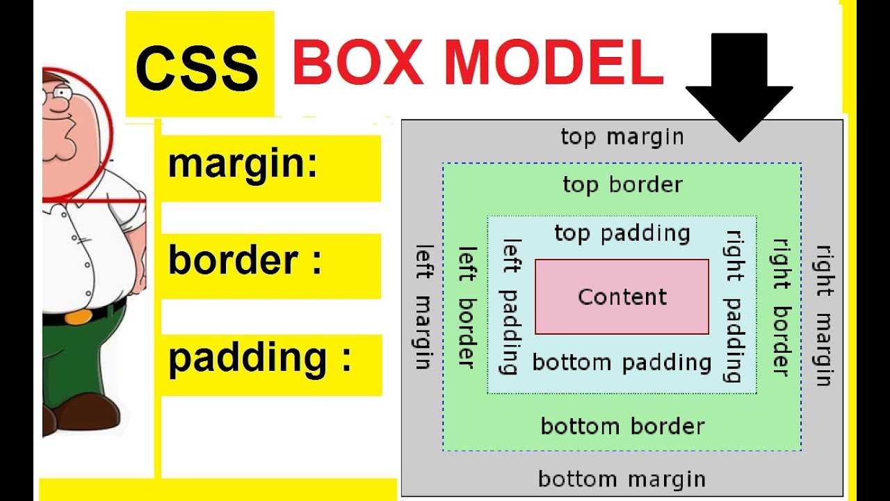
What Are the Options?
Width
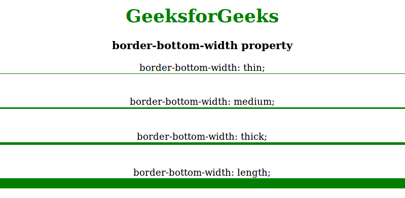
When defining width, you have the following options when using the border-bottom-width property. These values allow you to give “basic” dimensions. Of course you also have the option of using pixels as a value to have full control of very precise measurements of your defining width.
- Medium: Specifies a medium bottom border. This is the default state.
- Thin: Specifies a thin bottom border.
- Thick: Specifies a thick bottom border.
- Length: Allows you to define the thickness of the bottom border.
- Initial: Sets this property to its default value.
- Number of Pixels: Sets the border width using pixels.
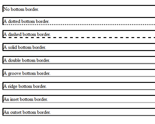
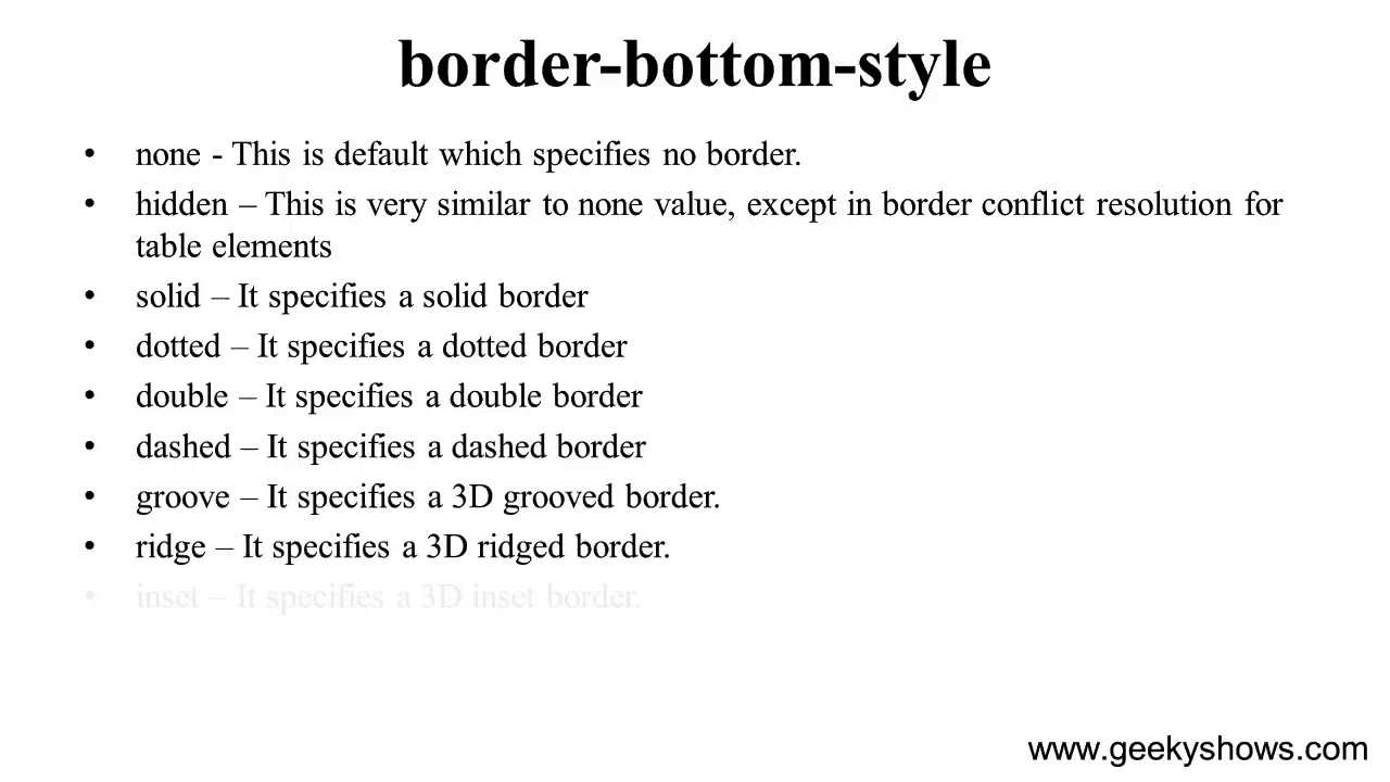
Style
When defining style, you have the following options when using the border-bottom-style property. There is a long list of values that you can play with and each of them gives you something completely different. An example will be provided further in this tutorial.
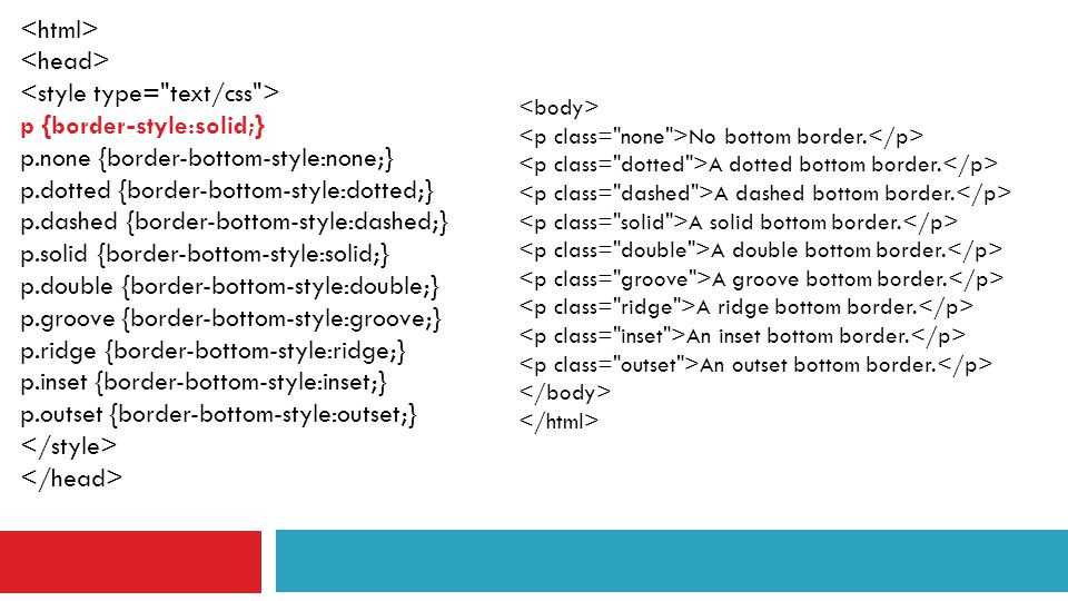
- None: Specifies no border. This is default
- Hidden: The same as “none.”
- Dotted: Specifies a dotted border.
- Dashed: Specifies a dashed border.
- Solid: Specifies a solid border.
- Double: Specifies a double border.
- Groove: Specifies a 3D grooved border. The effect depends on the border-color value.
- Ridge: Specifies a 3D ridged border. The effect depends on the border-color value.
- Inset: Specifies a 3D inset border. The effect depends on the border-color value.
- Outset: Specifies a 3D outset border. The effect depends on the border-color value.
- Initial: Sets this property to its default value.
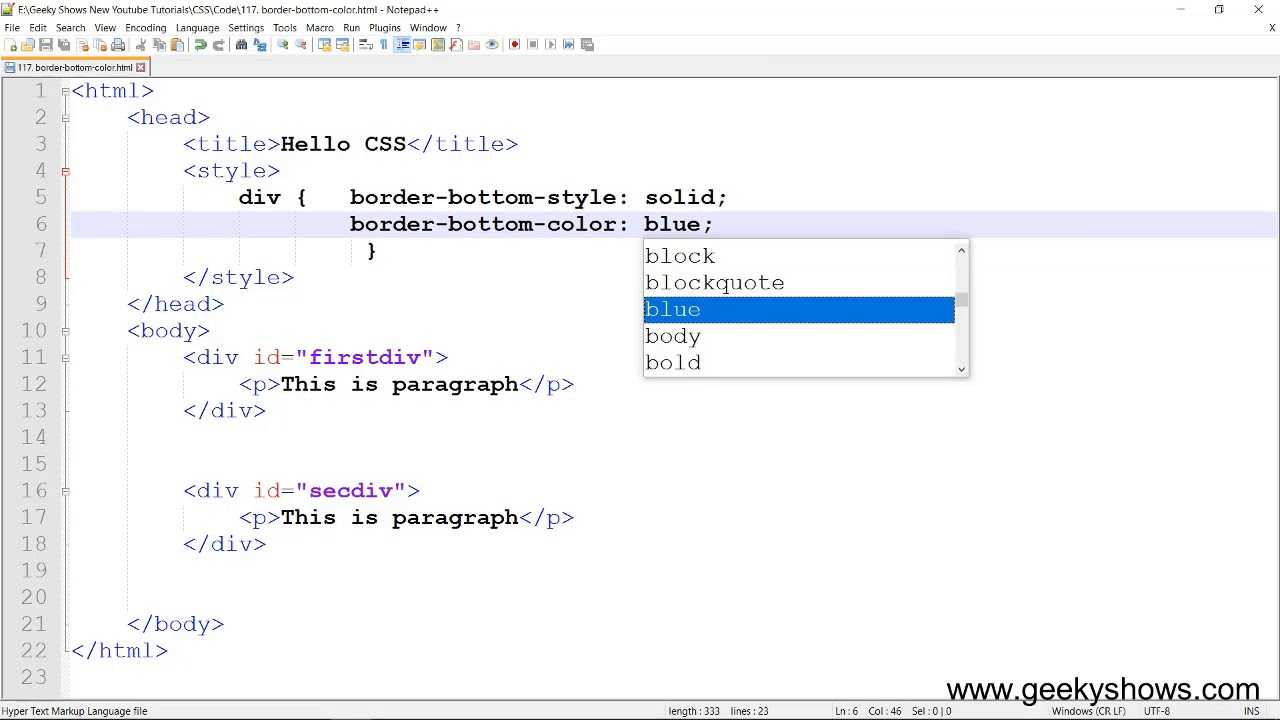
Color
As you define the width, you have the following options for defining the border-bottom-color property. When it comes to color, the options are almost limitless. This is an area where you can really showcase your understanding of the color palette.
Note: You must always declare the border-style or the border-bottom-style property before the border-bottom-color property. An element must have a defined border before you can change the color.
- Color: Specifies the color of the bottom border. Look at CSS Color Values for a complete list of possible color values. Default color is the current color of the element.
- Transparent: Specifies that the border color should be transparent.
- Initial: Sets this property to its default value.
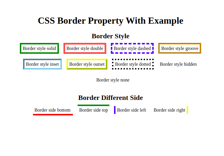
CSS Border Style
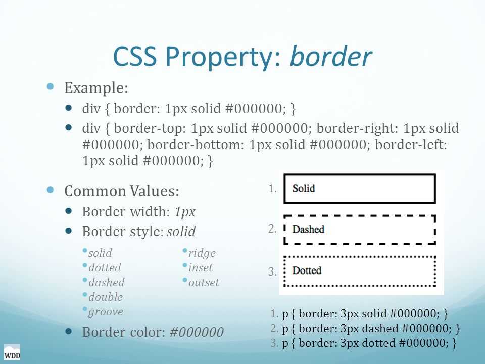
The CSS border-style property specifies what type of border to display. There are ten possible values you can use to set the border-style property. Let’s take a quick look at them below.
- None: specifies no border
- Solid: specifies a solid border
- Dashed: specifies a dashed border
- Dotted: specifies a dotted border
- Double: specifies a double border
- Groove: specifies a 3D grooved border
- Ridge: specifies a 3D ridged border
- Inset: specifies a 3D inset border, which makes the element appear embedded
- Outset : specifies a 3D outset border, which makes the element appear embossed
- Hidden: specifies a hidden border
The effect of the groove, ridge, inset, and outset values depends on the value set for the border-color property. If no border-color value is given, then black is the default.
The border-style property can have between one and four values. If only one value is defined, then it applies to all sides of the element. If two values are defined, then the first value represents the top and bottom borders and the second represents the right and left borders. If three values are defined, the first value represents the top border, the second represents the left and right, and the fourth represents the bottom border. If four values are defined, they represent the top, right, bottom, and left, respectively.
Let’s take a look at examples of all these values below.
See the Pen zYZyMmx by Christina Perricone (@hubspot) on CodePen.
Quick reference
| Class | Properties |
|---|---|
| border-0 | border-width: 0px; |
| border-2 | border-width: 2px; |
| border-4 | border-width: 4px; |
| border-8 | border-width: 8px; |
| border | border-width: 1px; |
| border-x-0 | border-left-width: 0px; border-right-width: 0px; |
| border-x-2 | border-left-width: 2px; border-right-width: 2px; |
| border-x-4 | border-left-width: 4px; border-right-width: 4px; |
| border-x-8 | border-left-width: 8px; border-right-width: 8px; |
| border-x | border-left-width: 1px; border-right-width: 1px; |
| border-y-0 | border-top-width: 0px; border-bottom-width: 0px; |
| border-y-2 | border-top-width: 2px; border-bottom-width: 2px; |
| border-y-4 | border-top-width: 4px; border-bottom-width: 4px; |
| border-y-8 | border-top-width: 8px; border-bottom-width: 8px; |
| border-y | border-top-width: 1px; border-bottom-width: 1px; |
| border-s-0 | border-inline-start-width: 0px; |
| border-s-2 | border-inline-start-width: 2px; |
| border-s-4 | border-inline-start-width: 4px; |
| border-s-8 | border-inline-start-width: 8px; |
| border-s | border-inline-start-width: 1px; |
| border-e-0 | border-inline-end-width: 0px; |
| border-e-2 | border-inline-end-width: 2px; |
| border-e-4 | border-inline-end-width: 4px; |
| border-e-8 | border-inline-end-width: 8px; |
| border-e | border-inline-end-width: 1px; |
| border-t-0 | border-top-width: 0px; |
| border-t-2 | border-top-width: 2px; |
| border-t-4 | border-top-width: 4px; |
| border-t-8 | border-top-width: 8px; |
| border-t | border-top-width: 1px; |
| border-r-0 | border-right-width: 0px; |
| border-r-2 | border-right-width: 2px; |
| border-r-4 | border-right-width: 4px; |
| border-r-8 | border-right-width: 8px; |
| border-r | border-right-width: 1px; |
| border-b-0 | border-bottom-width: 0px; |
| border-b-2 | border-bottom-width: 2px; |
| border-b-4 | border-bottom-width: 4px; |
| border-b-8 | border-bottom-width: 8px; |
| border-b | border-bottom-width: 1px; |
| border-l-0 | border-left-width: 0px; |
| border-l-2 | border-left-width: 2px; |
| border-l-4 | border-left-width: 4px; |
| border-l-8 | border-left-width: 8px; |
| border-l | border-left-width: 1px; |
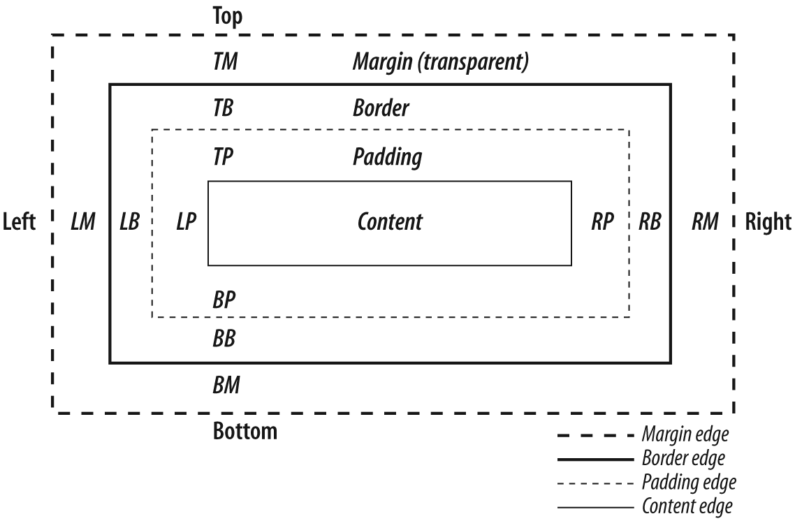
How CSS Border-bottom Property Works
– Syntax and Its Perks
The border-bottom property is the shorthand for defining border-bottom-color, border-bottom-style, and border-bottom-width. It lets you define CSS border bottom only. Furthermore, its syntax is as follows:
| border-bottom: border-bottom-width border-bottom-style border-bottom-color; |
However, it is not a problem if one of the above values is missing, as CSS allows it. For example, you can set a box with a solid yellow bottom border. You accomplish this like so in CSS:
| <div id=”box”> |
Box with only two border-bottom parameters set i.e. border style and color
| </div> #box{ height: 125px; width: 300px; border: solid orange; border-bottom: solid yellow; } |
The default values for the border-bottom property are:
| border-bottom: medium none black; |
Новые свойства text-decoration
Вы помните, что я обещал подробнее поговорить о . Время пришло.
Само по себе это свойство отлично работает, но вы можете добавить несколько экспериментальных свойств для настройки внешнего вида подчеркивания.
Но слишком сильно не радуйтесь… Поддержка в браузерах — как всегда. Такие дела.
text-decoration-color
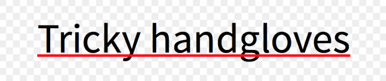
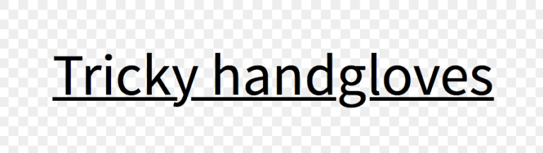
Свойство позволяет вам изменять цвет подчеркивания отдельно от цвета текста. Поддержка этого свойства лучше, чем можно было ожидать — оно работает в Firefox и с префиксом в Safari. Вот в чем загвоздка: если у вас есть выносные элементы, Safari поместит подчеркивание поверх текста.
Firefox:
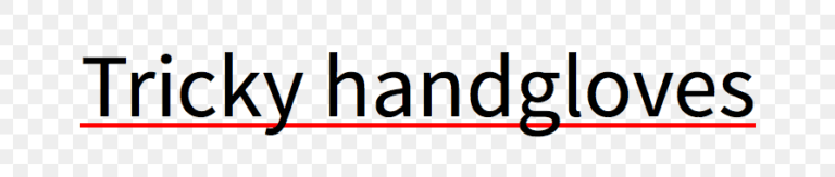
Safari:
text-decoration-skip
Свойство включает пропуск выносных элементов в подчеркиваемом тексте.
Это свойство нестандартное и работает сейчас только в Safari, с префиксом . Safari по умолчанию активирует это свойство, поэтому выносные элементы всегда не перечеркиваются.
Если вы используете Normalize, то учтите, что последние версии отключают это свойство ради последовательного поведения браузеров. И если вы хотите, чтобы подчеркивание не затрагивало выносные элементы, вам надо вручную активировать его.
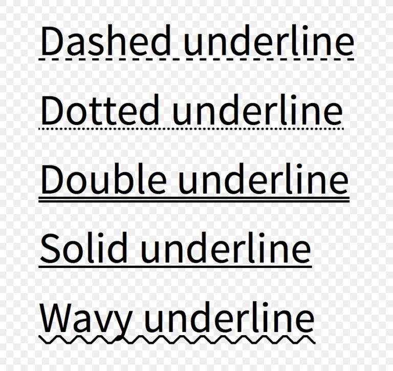
text-decoration-style
Свойство предлагает такие же возможности оформления, что и у свойства , добавляя кроме этого стиль .
Вот список доступных значений:
Сейчас свойство работает только в Firefox, вот скриншот из него:
Чего не хватает
Серия свойств намного более интуитивна в использовании, чем остальные свойства CSS для оформления подчеркивания. Но если взглянуть внимательнее, то для удовлетворения наших запросов не хватает способов задать толщину или позицию линии.
После небольшого исследования, я нашел еще пару свойств:
Судя по всему, они относятся к ранним черновикам CSS, но их так и не реализовали в браузерах из-за отсутствия интереса.
Parameters Associated
– Width
As you define the bottom width, you will have various value options when using the border-bottom-width property. The property supports various values that let you give basic dimensions. What’s more, you have the option of using length values if you wish to have precise control when setting the width.
The width accepts the following values:
- Medium: It lets you set a medium bottom border. It is also the default value.
- Thin: Using this value, you get to set a thin bottom border.
- Length values: It lets you set the thickness of the bottom border using units such as em and rem.
- Thick: Use this value to set a thick bottom border.
- Initial: If you use this value, you set the property to its default value.
- Pixels: You can use pixels to set a precise bottom border.
Example
Say you wish to set CSS table border bottom width to thick; you can accomplish this like so in CSS:
| #box{ height: 10px; width: 300px; Padding: 50px; border-bottom: solid thick hsl(39,26%,44%); } |
– Style
As you set the style of the bottom border, you will have several options when using the border-bottom property. The property supports various values all of which will give you a unique border bottom style; these include:
- None: This value is the default and does not set any border style.
- Hidden: It is the same as none.
- Dashed: It lets you set a dashed border.
- Dotted: The value lets you create a dotted border.
- Solid: This value defines a solid border.
- Groove: With this value, you can create a 3D groove border. However, its effects will depend on the value of the border-color.
- Double: Using this value sets a double border.
- Inset: The value sets a 3D inset border whose effects are under the influence of the border-color.
- Ridge: The value will create a 3D ridge border whose effects are under the influence of the border-color.
- Outset: With this value, you get to set a 3D outset border whose effects depend on the border-color value
- Initial: When you use this value, you set the property to its default value
Example
Say you wish to set groove as the bottom border style for your box. Here is how you can accomplish this in CSS:
| #box{ height: 10px; width: 300px; Padding: 50px; border-bottom: groove thick hsl(39,26%,44%); } |
– Color
When defining the bottom border, you will have different ways of setting the bottom border color. So, the color options at your disposal are almost limitless. If you are good with colors, here is where you can display your knowledge of colors.
Moreover, you should always ensure you define the border-bottom style before setting the border-bottom color. The element must have a set border before you start changing its CSS bottom border color. Usually, the default color is the current color of the element or, in most cases, black.
The bottom-border-color property accepts the following values:
- Hexadecimal representation: This lets you use values such as #FF0000 for the border-bottom-color.
- rgb(): You can also use RGB representation of the border-bottom-color like so: rgb(255,0,100).
- Name: This lets you set the color using the name of the color such as black, red, white, and blue.
- Transparent: With this value, the border is not visible even though it occupies space on the page.
- Inherit: Using the inherit value lets the border-bottom property inherit its color from the parent element:
Besides color names, you can set this property using RGBA values and HSL or HSLA values.
Example
Say you wish to set bronze color for the bottom border using the HSL. You can accomplish this for the box you created earlier like so:
| #box{ height: 10px; width: 300px; Padding: 50px; border-bottom: solid 10px hsl(39,26%,44%); } |
Additional Styling
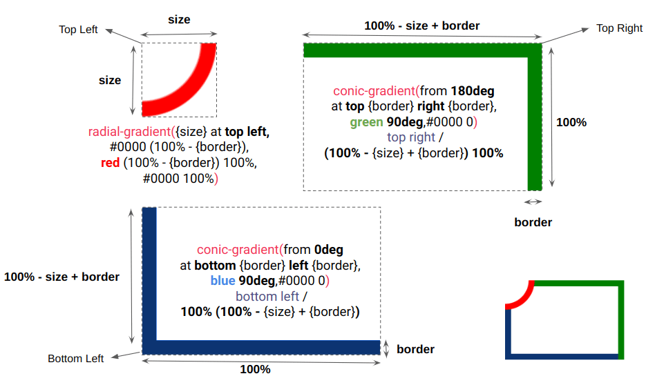
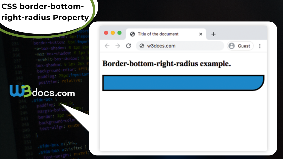
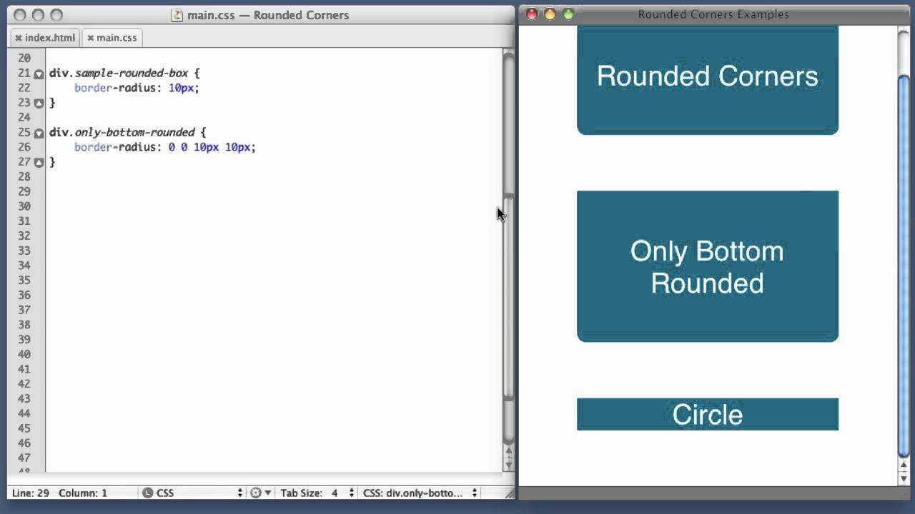
To ensure your box is spectacular, you can use other CSS properties. For instance, you can use the border-radius property to give your box rounded edges.
By default, boxes have 90-degree corners and that may not be what you want your visitors to see. As you increase the border-radius value, you make the corners to be more rounded, like we did in the example below:
| #bordered{ width: 150px; height: 100px; padding: 25px; border: 2px solid blue; border-bottom: 10px orange dashed; border-radius: 14px; } |
In this example, a 14-pixel value is assigned to the border-radius property. This results in more rounded corners compared to a 10-pixel value.
Syntax
The syntax for the border-bottom CSS property is:
Parameters or Arguments
border-bottom-width is the bottom border width of a box and can be one of the following:
(If border-bottom-width is not provided, the default is medium)
| Value | Description |
|---|---|
| fixed | Fixed value expressed in px, em, … div { border-bottom: 2px; } |
| thin | Thin border-bottom width, which might be 1px or 2px depending on the browser div { border-bottom: thin; } |
| medium | Medium border-bottom width, which might be 3px or 4px depending on the browser div { border-bottom: medium; } |
| thick | Thick border-bottom width, which might be 5px or 6px depending on the browser div { border-bottom: thick; } |
border-bottom-style is the line style of the bottom border of a box and can be one of the following:
(If border-bottom-style is not provided, the default is none)
| Value | Description |
|---|---|
| none | No border-bottom (This is the default) div { border-bottom: none; } |
| solid | Single, straight, solid line div { border-bottom: solid; } |
| dotted | Series of dots div { border-bottom: dotted; } |
| dashed | Series of short dashes div { border-bottom: dashed; } |
| double | Two straight lines that total the pixel amount defined by border-bottom-width div { border-bottom: double; } |
| groove | Carved effect div { border-bottom: groove; } |
| ridge | 3D appearance where border-bottom looks like it is «coming out» (opposite of groove) div { border-bottom: ridge; } |
| inset | Embedded appearance div { border-bottom: inset; } |
| outset | Embossed appearance (opposite of inset) div { border-bottom: outset; } |
| hidden | Border is hidden div { border-bottom: hidden; } |
| inherit | Element will inherit the border-bottom-style from its parent element div { border-bottom: inherit; } |
border-bottom-color is the color of the bottom border of a box and can be one of the following: