

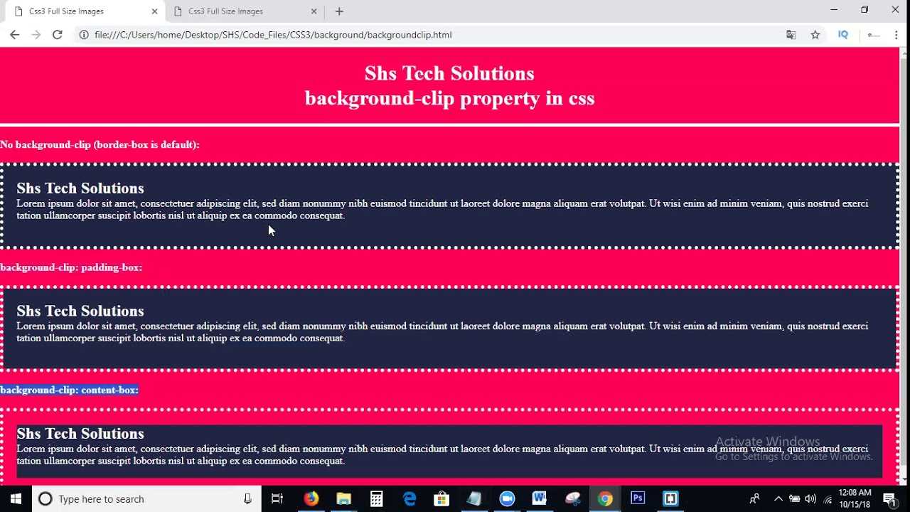
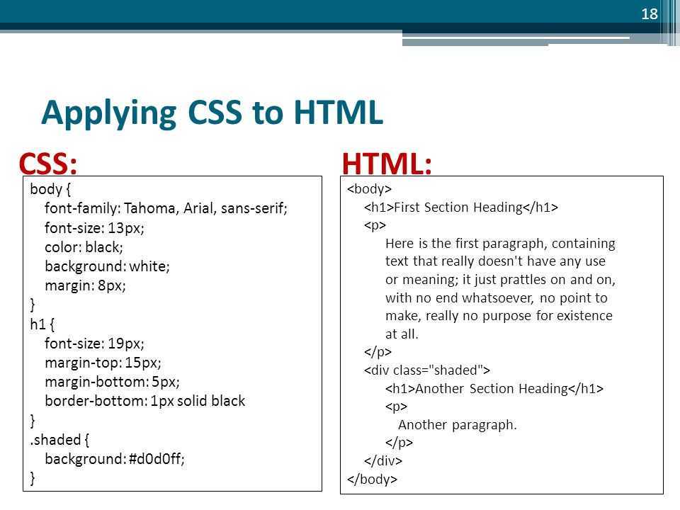
Clipped Images
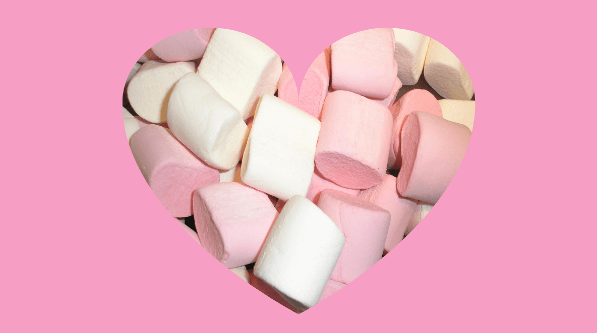
Images can be displayed in the form of diamonds, hearts, ellipses, and other shapes.
To “clip” the image and make it diamond- or heart-shaped, you need to use the clip-path CSS property. It creates a region called a clipping that tells what part of an element is shown on screen. It can accept the following values:
- Shape values: inset, circle, polygon, ellipse, path
- Source value: for example, clip-path: url(#myPath); referencing an SVG <clipPath> element
- Geometry-box values: margin-box, border-box, padding-box, content-box, fill-box, stroke-box, view-box (they define the reference box for the basic shape)
- Combined values: for example, clip-path: padding-box circle(25px at 0 50px);
- Global values: inherit, initial, unset
The clip-path element applies to an<img> HTML element, for example:
Here are several examples of clipped images.
Diamond images
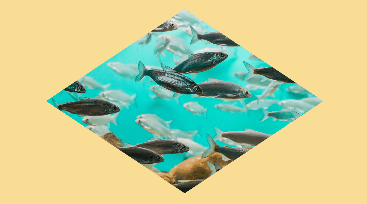
Here the coordinates are given in a clockwise manner. First, move 50% along the x-axis — this will align at the center. While the top x-axis is at 100%, move 50% on the right y-axis — this will take us to the middle of the right y-axis. Then move to 50% of the bottom x-axis — this will be the center of the bottom x-axis. Finally, move back to the center of the left y-axis at 50%.
Here we use SVG:

You can use an online instrument — Clippy CSS clip-path maker —to design CSS images of various shapes.
Images with clipped corners

In this example, the calc() function is used to calculate the parts that will be clipped along the top x-axis and the bottom x-axis. Since the axis is equal to 100% and we start clipping on the x-axis at 20 px, the clip-path property is used to deduct 20 px on each side of the top x-axis and bottom x-axis.
Images with rounded corners
The border-radius property will allow you to create images with rounded corners. You can read more about this property in our article CSS Shapes.
Here’s an example:
The article has been inspired by CSS Secrets by Lea Verou and by many other sources, including CSS Tricks, CodePen, Tympanus, Dev.to, and more.
CSS3 Учебник
CSS3 Закругленные углыCSS3 Изображен. границаCSS3 Слои фона изображ.CSS3 ЦветаCSS Ключевые сл. цветаCSS3 Градиент
Линейные градиенты
Радиальные градиенты
Конические градиенты
CSS3 Тени
Теневые эффекты
Тени бокса
CSS3 Эффект текстаCSS3 Веб шрифтыCSS3 2D ТрансформацияCSS3 3D ТрансформацияCSS3 ПереходCSS3 АнимацияCSS3 Всплыв. подсказкиCSS3 Стиль изображенияCSS3 Отраж. изображенияCSS3 Объект-подгонкаCSS3 Объект-позицияCSS3 МаскировкаCSS3 КнопкиCSS3 ПагинацияCSS3 Несколько столбцовCSS3 ИнтерфейсCSS3 Переменные
Переменная var()
Переопределение
Переменные с JS
Медиа-запросы
CSS3 Размеры боксовCSS3 Медиа запросыCSS3 Медиа примерыCSS3 Флексбокс
CSS Гибкий бокс
CSS Flexbox контейнер
CSS Flexbox элементы
CSS Flexbox отзывчивый
Background Position
| Syntax: | background-position: <value> |
|---|---|
| Possible Values: | {1,2} | || |
| Initial Value: | 0% 0% |
| Applies to: | Block-level and replaced elements |
| Inherited: | No |
The background-position property gives the initial position of a specified . This property may only be applied to block-level elements and replaced elements. (A replaced element is one for which only the intrinsic dimensions are known; HTML replaced elements include IMG, INPUT, TEXTAREA, SELECT, and OBJECT.)
The easiest way to assign a background position is with keywords:
- Horizontal keywords (left, center, right)
- Vertical keywords (top, center, bottom)
and may also be used to assign the position of the background image. Percentages are relative to the size of the element. Although lengths are allowed, they are not recommended due to their inherent weakness in dealing with differing display resolutions.
When using percentages or lengths, the horizontal position is specified first, followed by the vertical position. A value such as 20% 65% specifies that the point 20% across and 65% down the image be placed at the point 20% across and 65% down the element. A value such as 5px 10px specifies that the upper left corner of the image be placed 5 pixels to the right of and 10 pixels below the upper left corner of the element.
If only the horizontal value is given, the vertical position will be 50%. Combinations of lengths and percentages are allowed, as are negative positions. For example, 10% -2cm is permitted. However, percentages and lengths cannot be combined with keywords.
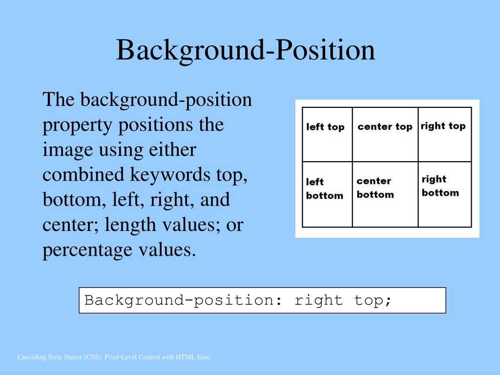
The keywords are interpreted as follows:
- top left = left top = 0% 0%
- top = top center = center top = 50% 0%
- right top = top right = 100% 0%
- left = left center = center left = 0% 50%
- center = center center = 50% 50%
- right = right center = center right = 100% 50%
- bottom left = left bottom = 0% 100%
- bottom = bottom center = center bottom = 50% 100%
- bottom right = right bottom = 100% 100%
If the background image is with regard to the canvas, the image is placed relative to the canvas instead of the element.
Authors may also use the shorthand property, which is currently better supported than the background-position property.
The background shorthand #
To make it easier to style the background layer of a box-especially when multiple background layers are desired–there is a shorthand that follows the following specific pattern:
Order is important in the shorthand form of declaring multiple backgrounds. The position and size values must both be provided, separated by a slash (). Declaring the origin and clip behavior in the correct order allows you take advantage of setting keywords that are valid for both simultaneously
The following declaration clips the background, and originates it from the content box:
With these shorthand semantics in mind, the previous background-related declarations of the code snippet could be rewritten to be following:
More Examples
Example
Repeat a background image both vertically and horizontally (this is default):
Example
Repeat a background image only horizontally:
Example
Do not repeat a background image. The image will only be shown once:
Example
Using background-repeat: space and background-repeat: round:
#example2 border: 2px solid black; padding: 25px; background: url(«w3css.gif»); background-repeat: space;>
#example3 border: 1px solid black; padding: 25px; background: url(«w3css.gif»); background-repeat: round; >
Example
Use different background properties to create a «hero» image:
.hero-image background-image: url(«photographer.jpg»); /* The image used */ background-color: #cccccc; /* Used if the image is unavailable */ height: 500px; /* You must set a specified height */ background-position: center; /* Center the image */ background-repeat: no-repeat; /* Do not repeat the image */ background-size: cover; /* Resize the background image to cover the entire container */>
Рисунок или фотография в качестве фона
Остановимся также и на возможностях языка гипертекста для такой задачи, как сделать изображение фоном в HTML. Существует 3 варианта установки картинок для фона страницы только с применением HTML + CSS (JS не используется).
Дарим скидку от 60% на обучение «Веб-разработчик» до 10 сентября
Уже через 9 месяцев сможете устроиться на работу с доходом от 150 000 рублей
Забронировать скидку
Но сперва определим основные требования к фоновой картинке:
- Изображение должно покрывать всю ширину и высоту страницы сайта.
- В случае необходимости фон может масштабироваться (background растягивается/сжимается с учетом параметров экрана).
- Пропорции изображения сохраняются (aspect ratio).
- Картинка центрируется на странице.
- Фоновой изображение не вызывает скроллов.
- Решение полностью кроссбраузерное.
- Не применяются разные технологии, только CSS
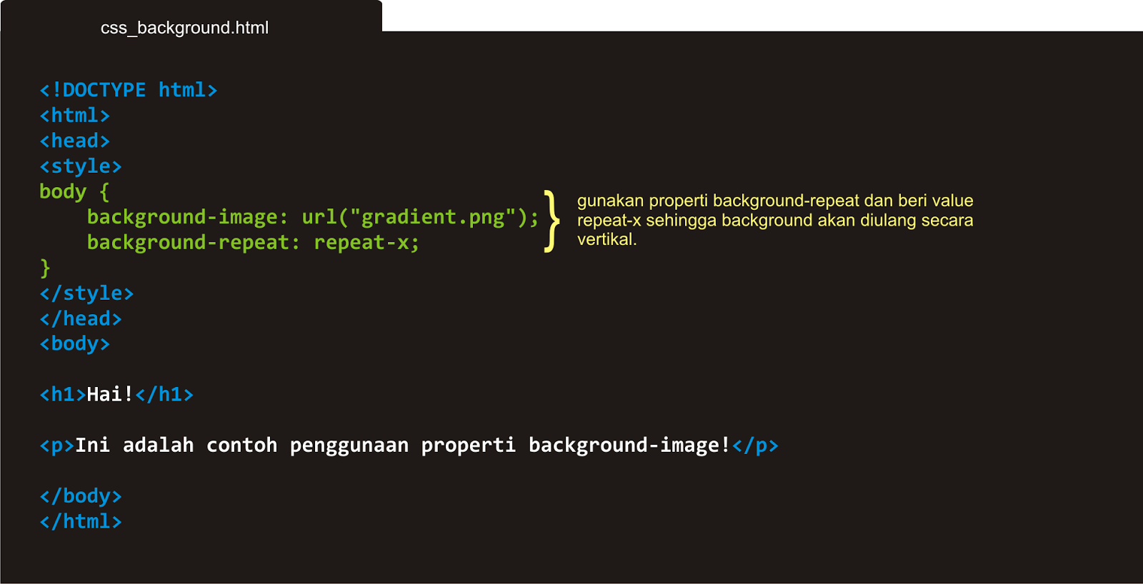
Установка однотонного заднего фона с помощью html
Метод 1
Наиболее простой и прогрессивный способ, как сделать фото фоном в HTML. В этом случае используется свойство CSS3 background-size, в применении к тегу html. Тег body не применяется, потому что он имеет большую высоту, которая определяется высотой окна браузера. Вначале нужно установить центрированную и фиксированную картинку фона, а потом изменить ее размер с помощью background-size: cover.
html {
background-image: url(images/background.jpg);
background-repeat: no-repeat;
background-position: center center;
background-attachment: fixed;
-webkit-background-size: cover;
-moz-background-size: cover;
-o-background-size: cover;
background-size: cover;
}
Copy
Для вас подарок! В свободном доступе до
10.09
Скачайте ТОП-10 бесплатных нейросетей
для программирования
Помогут писать код быстрее на 25%
Чтобы получить подарок, заполните информацию в открывшемся окне
Перейти
Скачать
файл
Этот способ можно использовать в любой версии Chrome, Opera 10+ Firefox 3.6+ Safari 3+ IE 9+
Метод 2
В этом варианте применяется элемента img. Его размер можно изменить с учетом размеров браузера. Для растягивания картинки фона на полный экран следует задать для фона min-height и width с параметром 100%.
Если установить min-width со значением, которое аналогично ширине изображения, то фон будет сжиматься меньше оригинального размера изображения. Для ситуации, когда окно уже ширины картинки, чтобы выровнять бэкграунд по центру устанавливают media query.
<img src=»/images/background.jpg» class=»background» />
Copy
img.background {
min-height: 100%;
min-width: 640px;
width: 100%;
height: auto;
position: fixed;
top: 0;
left: 0;
/* Определяется размером картинки */
@media screen and (max-width: 640px){
img.bg {
left: 50%;
margin-left: -320px;
}
}
}
Метод 3
Еще один способ, как сделать изображение фоном в HTML. Нужно закрепить изображение <img /> на странице вверху слева и растянуть его, используя свойство min-width и min-height 100% (необходимо сохранить соотношение сторон).
Отметим, что при таком решении изображение не центрируется. Чтобы центрировать картинку ее нужно завернуть в <div />, сделав его в 2 раза большим, чем размеры окна. При этом, саму картинку растягиваем и устанавливаем по центру.
<div class=»background»>
<img src=»/images/background.jpg» />
</div>
Copy
div.background {
position: fixed;
top: -50%;
left: -50%;
width: 200%;
height: 200%;
}
img {
position: absolute;
top: 0;
left: 0;
right: 0;
bottom: 0;
margin: auto;
min-width: 50%;
min-height: 50%;
}
Данный метод также может использоваться в хороших браузерах и IE 8+.
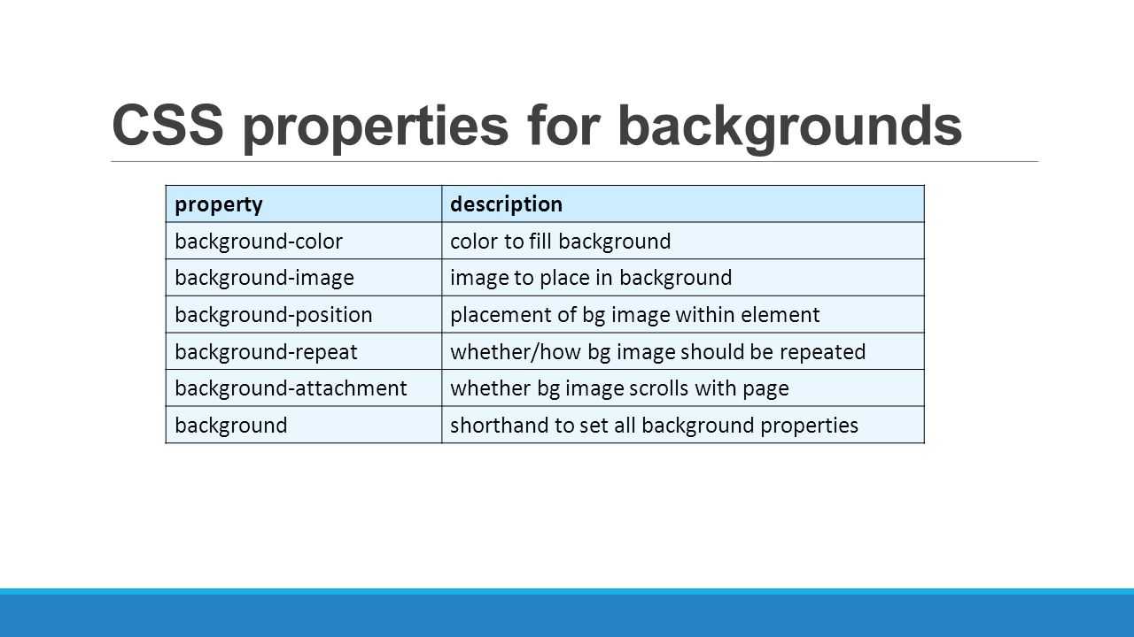
Adding a Background Image
Besides adding a background color to an element, we can also add a background image. Background images work similarly to background colors; however, they offer a few additional properties to finesse the images. As before, we can use the property with a shorthand value, or we can use the property outright. No matter which property we use, there must be an image source identified using a function.
The function value will be the background image’s path, and the familiar rules for creating hyperlink paths apply here. Keep an eye out for different directories, and be sure to show exactly where the image resides. The path will be placed inside parentheses and quoted.
Adding a background image solely using a value can provide undesirable results, as by default the background image will repeat horizontally and vertically from the top left of the given element to fill up the element’s background. Thankfully we can use the and properties to control how or even whether the image repeats.
Background Repeat
By default, a background image will repeat indefinitely, both vertically and horizontally, unless otherwise specified. The property may be used to change the direction in which a background image is repeated, if repeated at all.
The property accepts four different values: , , , and . The repeat value is the default value and will repeat a background image both vertically and horizontally.
The value will repeat the background image horizontally, while the value will repeat the background image vertically. Lastly, the value will tell the browser to display the background image once—that is, do not repeat it at all.
Background Position
By default, background images are positioned at the left top corner of an element. However, by using the property, we can control exactly where the background image is placed relative to that corner.
The property requires two values: a horizontal offset (the first value) and a vertical offset (the second value). If only one value is specified, that value is used for the horizontal offset and the vertical offset will default to .
Because we’re moving the background image from the left top corner of the element, length values specifically will be in relation to that corner.
To set a value, we can use the , , , , and keywords, pixels, percentages, or any length measurement. Keywords and percentages work very similarly. The keyword value is identical to the percentage value , which will keep an image positioned at the left top corner of the element. The keyword value is identical to the percentage value , which will position an image in the right bottom corner of the element.
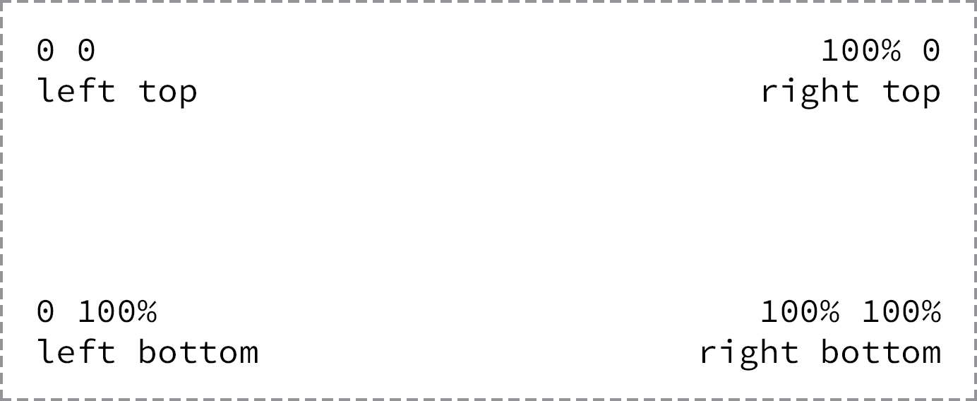 Fig 7
Fig 7
Background images are positioned from the left top corner of an element
Using pixels for a value is also common, as pixels give us precise control over where our background will be positioned.
Shorthand Background Image Values
The , , , and properties may be rolled up into a shorthand value for the background property alone. The order of these properties as a shorthand property value may vary, however it commonly falls as , , , and then .
Background Image Example
In the following example, we’ll use the property with a shorthand value that includes , , , and values.
Please take note that there is both a relative value and an absolute value within the value. The first value, pixels, is the horizontal value, positioning the pixels from the left of the element. The second value, , is the vertical value, which vertically centers the .
A few other properties and values are also included within the class rule set to further style the alert message.
HTML
CSS
Параметры фона сайта
На начальном этапе работы над дизайном сайта необходимо определить его общий фон. Именно этот элемент виден всегда и меняется крайне редко, а потому обязан гармонично сочетаться с гаммой цветов остальных составляющих сайта.
Параметры фона сайта
В этой статье мы рассмотрим, как сделать фон в HTML. Для начала стоит решить, будет ли страница сайта иметь фиксированные размеры или она станет растягиваться на всю ширину монитора. Желательно, чтобы дизайн вашего интернет-ресурса также красиво отображался на больших экранах с высоким разрешением
При этом важно, чтобы страницы не выглядели сильно растянутыми
Часто вебмастера подбирают шаблоны для сайта таким образом, чтобы видимая часть страницы не превышала по ширине 1024 символов. По нашему опыту, такое разрешение подходит большинству интернет пользователей.
Есть два варианта, как сделать задний фон в HTML. Это может быть монотонная цветная подложка или изображение. Каждый вариант имеет свои недостатки и преимущества. Монотонный оттенок не будет «утяжелять» ресурс загрузкой лишних картинок, но фон в виде эффектного изображения добавит бонусов дизайну сайта.
Узнай, какие ИТ — профессии входят в ТОП-30 с доходом от 210 000 ₽/мес
Павел Симонов
Исполнительный директор Geekbrains
Команда GeekBrains совместно с международными специалистами по развитию карьеры
подготовили материалы, которые помогут вам начать путь к профессии мечты.
Подборка содержит только самые востребованные и высокооплачиваемые специальности и направления в
IT-сфере. 86% наших учеников с помощью данных материалов определились с карьерной целью на ближайшее
будущее!
Скачивайте и используйте уже сегодня:
Павел Симонов
Исполнительный директор Geekbrains
Топ-30 самых востребованных и высокооплачиваемых профессий 2023
Поможет разобраться в актуальной ситуации на рынке труда
Подборка 50+ бесплатных нейросетей для упрощения работы и увеличения заработка
Только проверенные нейросети с доступом из России и свободным использованием
ТОП-100 площадок для поиска работы от GeekBrains
Список проверенных ресурсов реальных вакансий с доходом от 210 000 ₽
Получить подборку бесплатно
pdf 3,7mb
doc 1,7mb
Уже скачали 22320
Какими параметрами определяется HTML фон страницы.
- Цветовой оттенок HTML фона сайта определяет CSS атрибут background-color, расположенный в теге <body>.
- HTML фонового цвета фона определенных элементов (блок, параграф или табличная ячейка) определяется таким же атрибутом, который размещен внутри соответствующих тегов.
- HTML фон сайта можно определить во внешнем файле .css.
- HTML картинка. Простой способ, как сделать картинку фоном в HTML- использование атрибута background-image и картинки.
Подробнее рассмотрим каждый способ установки фона на страницах сайта.
Background-size
Определяет размер фонового изображения.
div {
    background url(my-image.jpg);
    background-size 100% 100%;
    background-repeat no-repeat;
}
|
Для свойства есть несколько интересных особенностей. Кроме числовых значений размеров (px,pt) можно использовать процентные или автоматическое вычисление (auto — например для одной из стороны картинки — 500px auto). Данное свойство применяется для создания фона для сайта с картинкой на весь экран.
Если указать значение cover, то фон будет масштабироваться дабы ширина и высота картинки = ширине и высоте блока. Если использовать значение contain, то масштабирование будет с сохранением пропорций чтобы изображение полностью поместилось в блок.
Setting a background image
The most basic way to set a full-page background is to use the CSS property. This property accepts a value that is the URL of the image you want to use as the background.
Here’s an example of how to use the property to set a full-page background:
body {
  background-image: url('/path/to/image.jpg');
}
This will set the body element as the container for the background image, which will cover the entire webpage.
When choosing a background image, it’s important to consider the dimensions of the image in relation to the size of the screen it will be displayed on. If the image is too small, it may appear pixelated or stretched when it’s displayed on larger screens. On the other hand, using an image that is too large can negatively impact performance, as it will take longer to load.
One way to optimize the size and resolution of your background image is to use an image editing tool to resize and crop the image to fit the dimensions of your webpage. You can also use the property to specify how the image should be scaled to fit the webpage:
body {
  background-image: url('/path/to/image.jpg');
  background-size: cover;
}
The value tells the browser to scale the image up or down as needed to fit the entire webpage, maintaining the aspect ratio of the image. This can be a good choice if you want the image to fill the entire webpage but don’t want it to be stretched or distorted.
Here is a CSS sample that sets the body tag to be the size of the visible width and height and sets the background to be of size :
body {
  width: 100vw;
  height: 100vh;
  background: url('https://i.imgur.com/vHHl8Xk.jpg');
  background-size: cover;
}
Here’s what the output will look like:

It looks fine, and when we resize the page, the image will perfectly scale while maintaining its aspect ratio to cover the whole page:

Notice that there are no scrollbars; the image is simply covering the whole background of the body.
Иконка рядом с текстом
На скриншоте выше видно, что значок находится слева от текста. Вспоминаем все свойства background и понимаем, что для размещения слева годится background-position (начальная позиция фонового изображения). Перейдём к коду.


Сперва ничего особенного — обычная ссылка:
Вся магия в CSS:
- Сначала задали путь до изображения.
- Потом установили начальное положение фона (background-position) в left center — ведь наша иконка левее текста (горизонтальная позиция left) и на одном с ним уровне (вертикальная позиция center).
- Размер фонового изображения (background-size) мы задали, чтобы предотвратить отдалённые проблемы.
Дело в том, что иконка может оказаться больше блока, в котором её захотят показать. Тогда она некрасиво обрежется по бокам. Чтобы этого не произошло — указываем размеры, в которые иконка должна вписаться.
И наконец, устанавливаем режим повторения фона (background-repeat) в no-repeat. Без этого фоновая картинка будет дублироваться, пока не заполнит собой блок (как это выглядит — зависит от размеров картинки и HTML-элемента, где она задана фоном).
Что же мы получили:
Не совсем то, чего ожидали. Давайте разбираться.
Наш «конвертик» стал фоновым изображением для блока, который занимает ссылка. Текст ссылки — это содержимое того же блока. Оно и наложилось на наше фоновое изображение.
Значит, нужно отодвинуть это самое содержимое от левой границы блока (помните, мы прижали «конвертик» именно к левому краю). Причём отодвинуть более чем на 20px (ширина фоновой картинки, заданная background-size) — тогда увидеть наш фон уже ничто не помешает.
Делается это с помощью свойства padding (внутренний отступ).
Добавим в код такой отступ слева:
Вот теперь всё вышло как надо: