

Выравнивание изображения
Для работы с фоновыми изображениями в CSS существует целый набор свойств, начинающихся со слова . Например, по умолчанию если размер картинки больше размера элемента, то картинка будет обрезана по краям элемента. Однако это можно исправить благодаря свойству , которое позволяет вписать изображение полностью, подгоняя его под размеры элемента. По умолчанию при значительно меньшем размере изображения, чем у элемента, картинка будет повторяться и занимать все пространство элемента. Это можно исправить свойством .
background-size
Свойство устанавливает размер изображения и может принимать значения:
- – картинка становится размером 100 на 100 пикселей, также можно использовать проценты;
- – устанавливает размер картинки равным размеру элемента;
- – увеличивает размер картинки по горизонтали и по вертикали, пока изображение не покроет весь элемент по горизонтали.
background-origin или background-clip
Идентичные свойства с одинаковыми значениями. Данные свойства указывают, где устанавливается начальная точка вставки изображения. По умолчанию начальная точка находится сразу под границей элемента в верхнем левом углу. У и есть следующие значения:
- – начальная точка вставки изображения располагается в верхней части границы элемента. Сколько пикселей ширина границы, на столько пикселей будет урезан и фон сверху.
- – изображение будет под текстом, где не учитывается.
- – данное значение стоит по умолчанию.
Режим повторения фонового рисунка
Для создания фонового рисунка страницы или любого другого её элемента обычно используются картинки, имеющие небольшие линейные размеры. По умолчанию браузер повторяет указанный в свойстве рисунок по горизонтали и вертикали необходимое количество раз, «замащивая» таким образом всю видимую поверхность страницы или элемента. Это позволяет значительно снизить размер загружаемого файла картинки.
Для управления режимом повторения фонового рисунка ещё в стандарте CSS1 () было введено свойство , которое может применяться ко всем элементам, и не наследуется потомками.
В качестве значения свойства могут использоваться следующие ключевые слова:
- — отменяет повторения картинки;
- — включает повторение картинки. Изображение при этом будет повторяться столько раз, сколько необходимо, чтобы «замостить» всю область элемента; неубравшиеся на экране картинки обрезаются до необходимых размеров. Значение является значением по умолчанию;
- — включает повторение картинки только по горизонтали;
- — включает повторение картинки только по вертикали;
- — значение свойства будет унаследовано от родителя.
Пример использования свойства:
<!DOCTYPE html>
<html>
<head>
   <title>Example</title>
   <style>
      body {

         background-image: url('images/bg.jpg');

         background-color: #c7b39b;

         background-repeat: repeat-y;
      }
   </style>
</head>
<body>
   <h1>Lorem ipsum dolor</h1>
   <p> Lorem ipsum dolor sit
   amet, consectetuer adipiscing elit, sed diem nonummy
   nibh euismod tincidunt ut lacreet dolore magna aliguam
   erat volutpat.</p>
   <p> Duis te feugifacilisi. Duis autem dolor
   in hendrerit in vulputate velit esse molestie consequat,
   vel illum.</p>
</body>
</html>
Результат в браузере:
В стандарт CSS3 () для свойства было добавлено ещё несколько значений. Вот некоторые из них:
- — включить повторение картинки. Изображение при этом будет повторяться так, чтобы в области поместилось целое число рисунков; если это не удаётся, между картинками добавляется пустое пространство (см. рис. ниже). Первое и последнее изображения будут касаться краёв элемента.
- — включить повторение картинки. Изображение при этом будет повторяться так, чтобы в области поместилось целое число рисунков; если это не удаётся сделать, то фоновые рисунки масштабируются (см. рис. ниже).
Пример заполнение области элемента фоновыми рисунками при различных значениях свойства :
Ещё одним нововведением стандарта CSS3 стало то, что задавать режим повторения теперь можно для каждого направления индивидуально. Для этого в свойстве допускается использование двух значений: первое — для горизонтального направления, второе — для вертикального. Например:
background-repeat: repeat no-repeat;
background-repeat: no-repeat repeat;
background-repeat: space space;
background-repeat: round round;
background-repeat: no-repeat no-repeat;
background-repeat: repeat space;
background-repeat: repeat round;
Система координат элемента
По умолчанию, по самой природе боксовой модели элемента в CSS, у каждого элемента есть система координат, которая определяется его высотой и шириной. Эта система координат используется, чтобы позиционировать элемент относительно других элементов и позиционировать потомков элемента относительно него самого.
У HTML-элемента есть система координат в CSS. У SVG-элементов, напротив, нет похожей системы координат, поскольку они не регламентируются концепцией боксовой модели.
Начальная точка системы координат в CSS расположена в левом верхнем углу элемента.
Область позиционирования фона также определяется системой координат, установленной для нее, и служит для позиционирования фонового изображения в этой области. У этой системы координат начальная точка тоже находится в верхнем левом углу области позиционирования.
Поскольку по умолчанию областью позиционирования является padding box, то по умолчанию начальной точкой системы координат области позиционирования фона будет верхний левый угол области внутреннего отступа элемента.
Это означает, что, когда вы применяете фоновое изображение к элементу, браузер будет позиционировать первое и последующие повторения изображения, начиная от верхнего левого угла области внутреннего отступа элемента.
Например, предположим у вас есть фоновое изображение, применённое к элементу, и вы не задали ему повторение (поэтому применяется только один экземпляр этого изображения). Исходной позицией фонового изображения внутри системы координат будет начальная точка системы координат padding box. Поэтому верхний левый угол изображения позиционируется в верхнем левом углу внутреннего отступа элемента. (См. живой пример ниже.)
К элементу применена полупрозрачная граница в 20px. Заметьте, как изображение позиционируется в верхнем левом углу внутреннего отступа элемента.
Изображение любезно предоставлено Freepik.com
Используя свойство , о котором мы поговорим в этой статье, мы можем изменять позицию изображения внутри этой системы координат.
Но как упоминалось ранее, мы можем изменить область позиционирования фона, и это, в свою очередь, изменит начальную точку, используемую для позиционирования изображения внутри области фона элемента.
Изменение области позиционирования фона и системы координат при помощи
Свойство применяется, чтобы изменить начальную точку системы координат, используемую, чтобы позиционировать фоновое изображение в области позиционирования фона.
Оно принимает одно из трёх значений: (значение по умолчанию), и .
В зависимости от выбора области позиционирования фона, соответствующей точке отсчета для фона — начальная точка системы координат, установленной для этой области — изменится, и начальное (по умолчанию) положение фонового изображения тоже.
Следующий живой пример показывает разные исходные точки фона/области позиционирования в действии.
Смотрите пример Сары Суэйден (@SaraSoueidan) «Разные значения background-origin» на CodePen.
Для каждой области позиционирования фона, указанной при помощи , система координат будет сдвигаться, чтобы покрыть эту область.
Затем, в этой системе координат можно указать положение фонового изображения, используя свойство .
Ради простоты, в остальной части этой статьи, мы оставим область позиционирования фона элемента по умолчанию. Поэтому все наши примеры будут применены к элементу, у которого фон позиционируется именно в области отступа.
Background images #
Browser support
- Chrome 1, Supported 1
- Firefox 1, Supported 1
- Edge 12, Supported 12
- Safari 1, Supported 1
On top of the layer, you can add a background image, using the property. A accepts the following:
- An image URL or data URI using the CSS function.
- An image dynamically created by a gradient CSS function.
Setting a background-image with the CSS function
CSS gradient backgrounds
Several gradient CSS functions exist to allow you to generate a background-image, when passed two or more colors.
Regardless of which gradient function is used, the resulting image is to match the amount of space available.
Demo showing example of applying a background-image using gradient functions:
Sizes of Multiple Pictures
The property accepts multiple values to set the sizes for several background images. The sizes apply according to the position of background images in the declaration list.
Example Copy
 Pros
Pros
- Easy to use with a learn-by-doing approach
- Offers quality content
- Gamified in-browser coding experience
- The price matches the quality
- Suitable for learners ranging from beginner to advanced
Main Features
- Free certificates of completion
- Focused on data science skills
- Flexible learning timetable
EXCLUSIVE: 50% OFF  Pros
Pros
- Simplistic design (no unnecessary information)
- High-quality courses (even the free ones)
- Variety of features
Main Features
- Nanodegree programs
- Suitable for enterprises
- Paid Certificates of completion
15% OFF  Pros
Pros
- Easy to navigate
- No technical issues
- Seems to care about its users
Main Features
- Huge variety of courses
- 30-day refund policy
- Free certificates of completion
AS LOW AS 14.99$
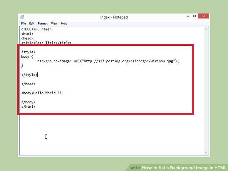
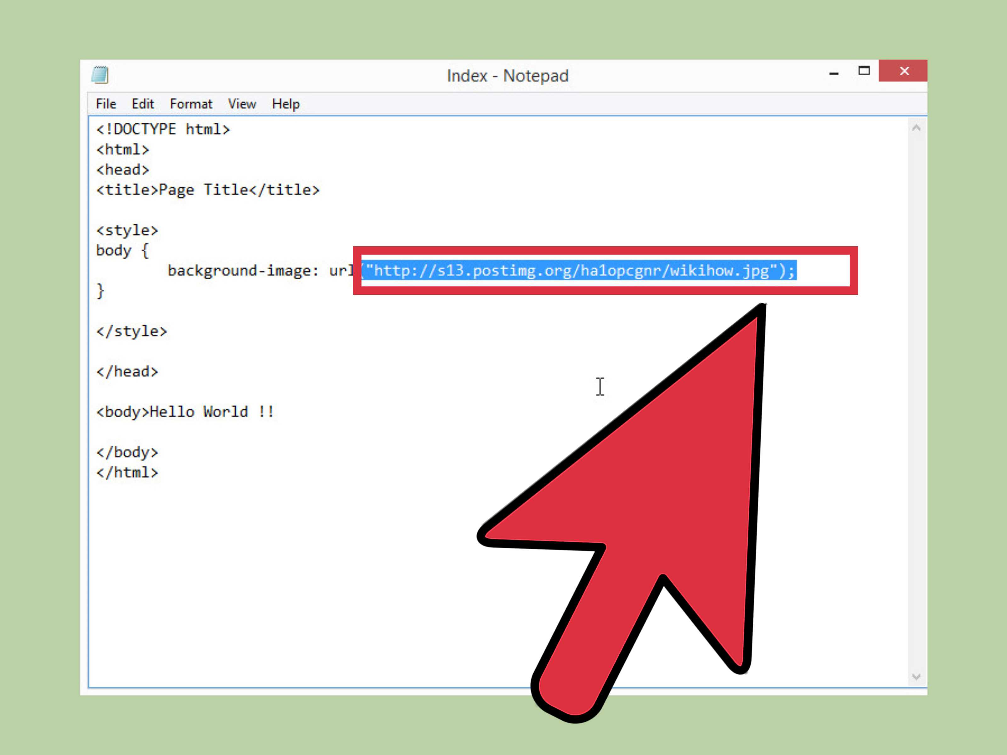
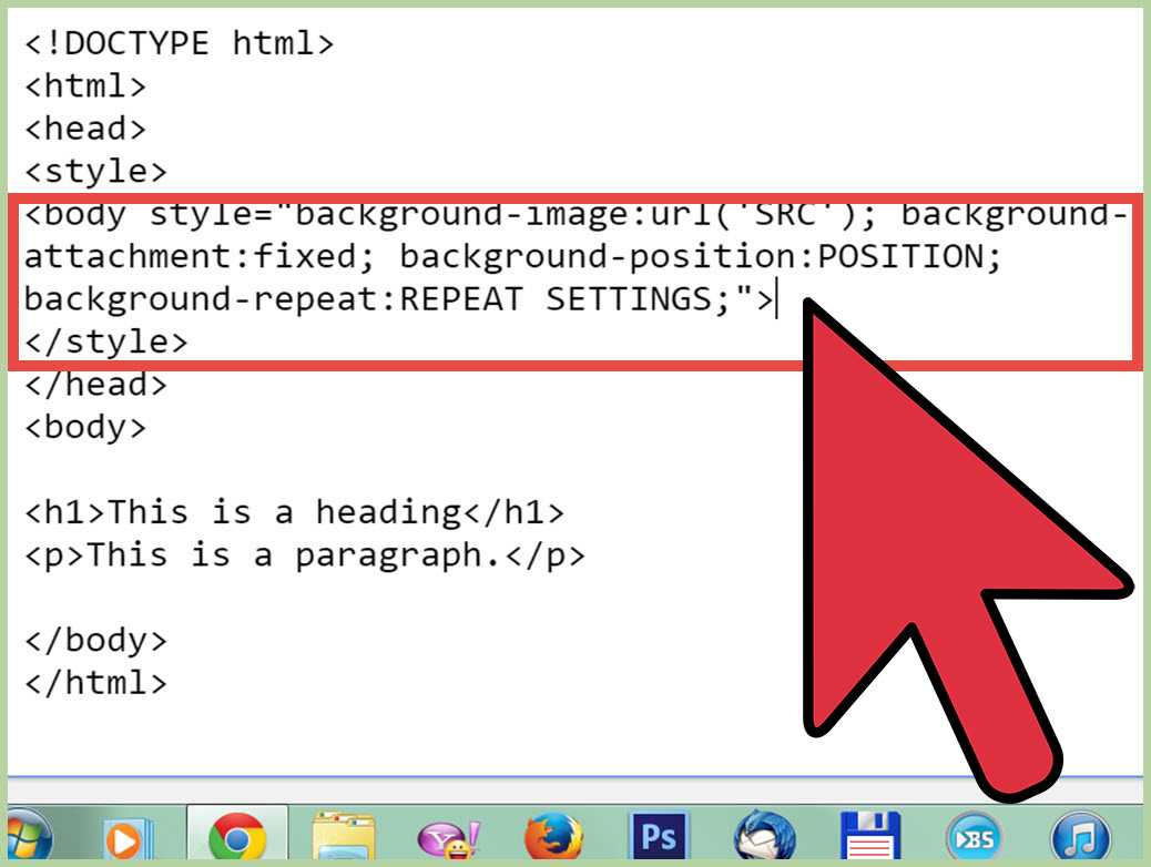
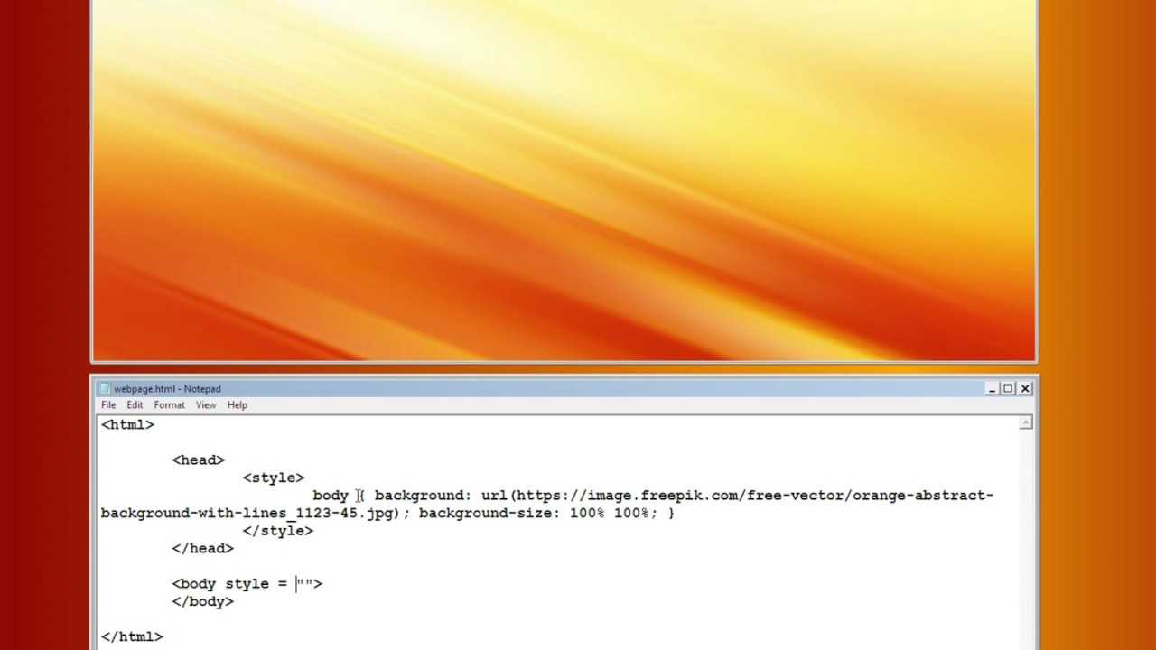
Adding a Background Image With CSS
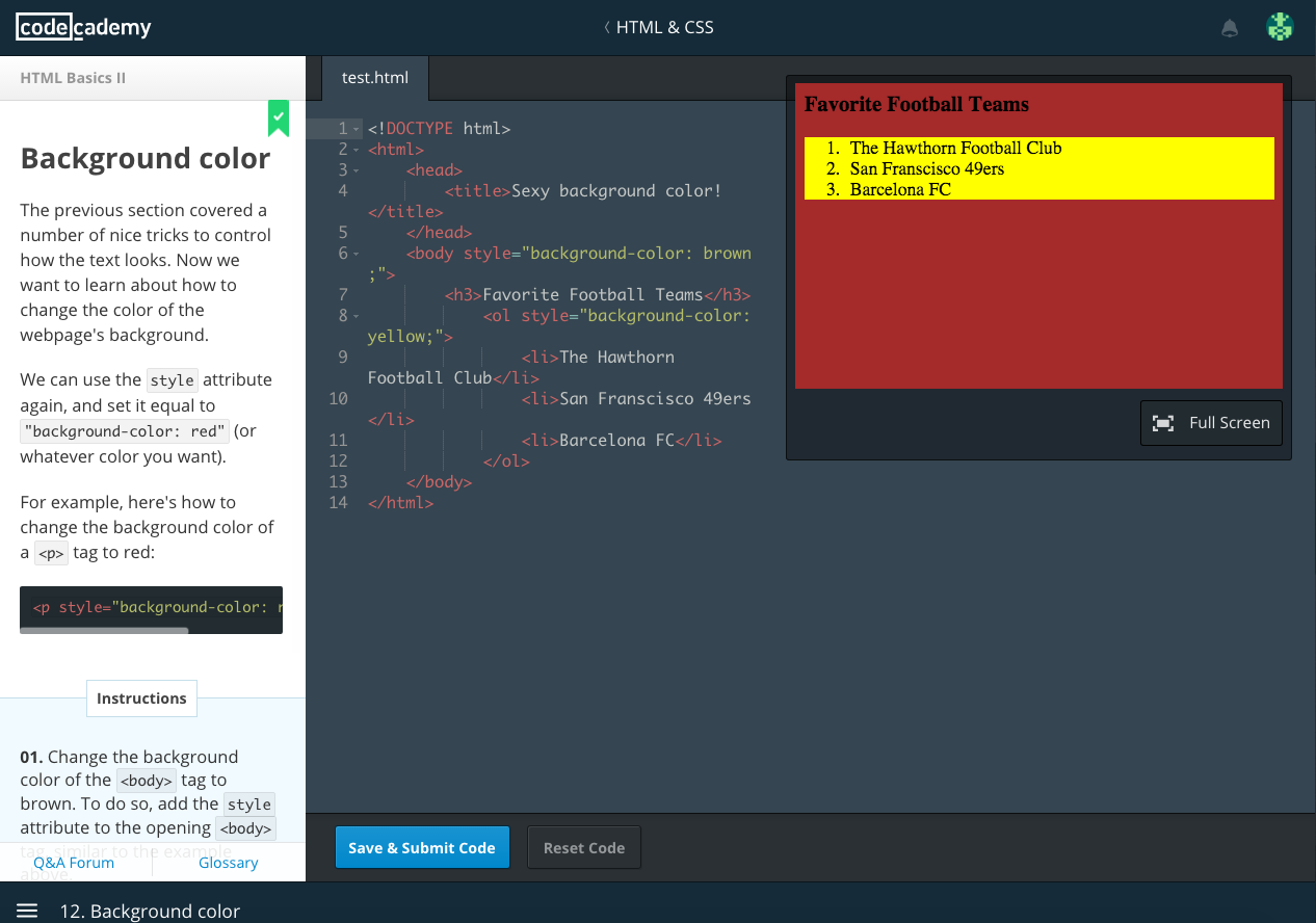
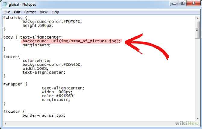
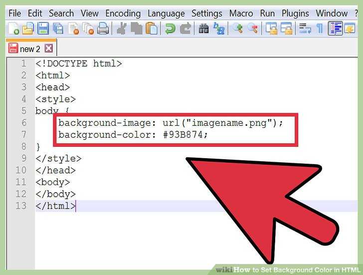
Now that you have a solid base in HTML and CSS, adding a background image will be a piece of cake. First, identify what element you want to give a background image to. In our example, we will add a background to the entire page. This means that we want to change the style of the body. Remember, the body tags contain all the visible elements.
To change the body style in CSS, first use the body keyword. Then add curly brackets as we did before {}. All of the style information for the body must be between the curly brackets. The style attribute we want to change is background-image. There are many style attributes. Don’t expect to memorize them all. Bookmark a CSS properties cheat-sheet with attributes that you want to remember.
After the attribute, use a colon to indicate how you will change the attribute. To import an image, use url(). it indicates that you are using a link to point to the image. Place the file location in the brackets between quotation marks. Finally, end the line with a semicolon. Although white space does not have meaning in CSS, use indentation to make the CSS easier to read.
Our example looks like this:
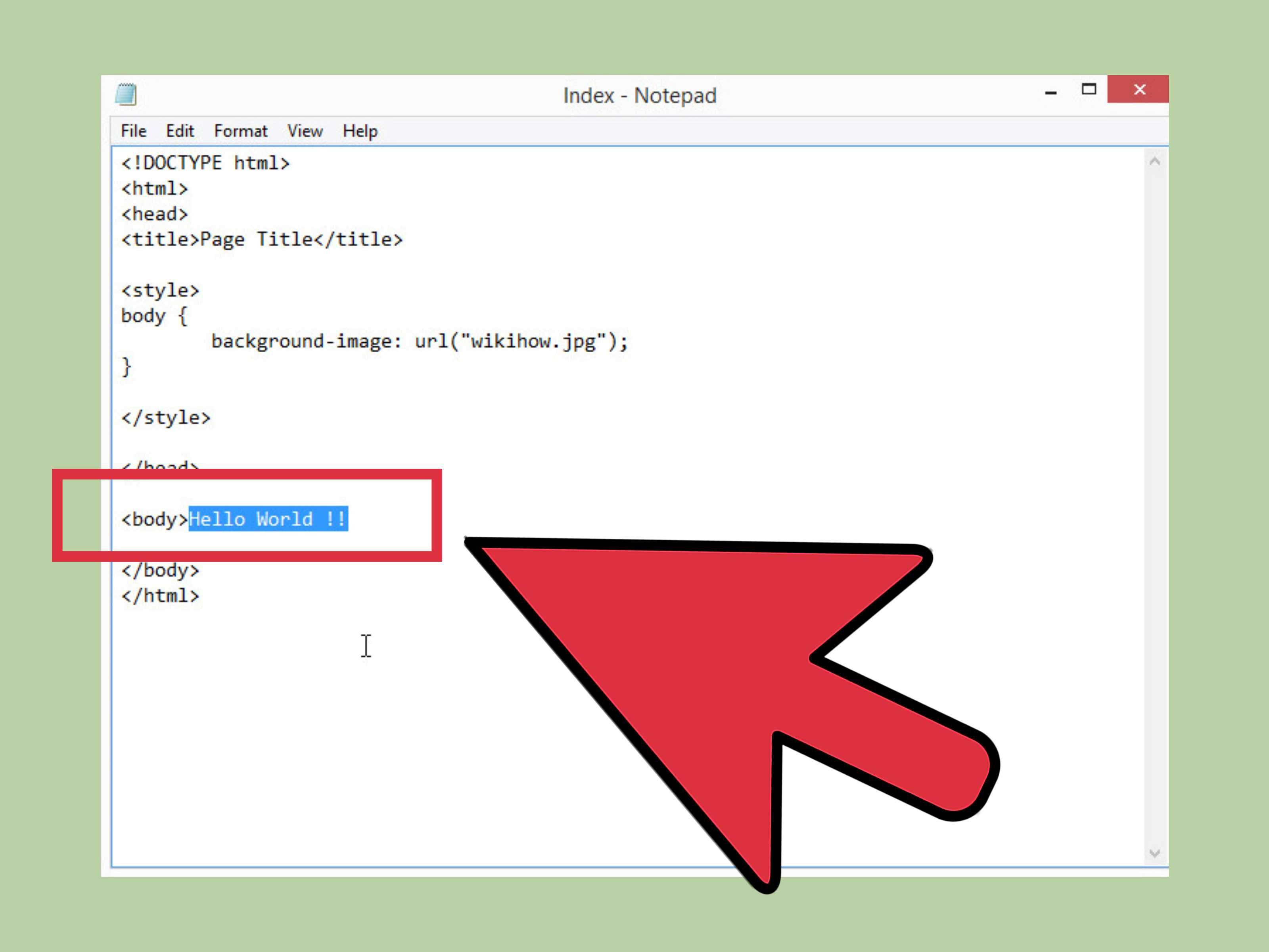
If your image is not displaying correctly because of the size of the image, you can alter the image directly. However, there are background style attributes in CSS that you can use to alter the background. Images that are smaller than the background will automatically be repeated in the background. To turn that off, add background-repeat no-repeat; to your element.
There is also two ways to make an image cover the entire background. First, you can set the background-size to the size of the screen with background-size: 100% 100%;, but this will stretch the image and may distort the image too much. If you do not want the proportions of the image changed, you can also set the background-size to cover. Cover will make the background image cover the background, but not distort the image.
React Background Image Example
We’ll start with a simple example of a background image within a React element. We want to display the following image of the Upmostly logo:
Within a React component. The image is located in the directory as follows:
Let’s try displaying the image using the simplest way possible:
This component renders the following output:
In this example, we first ‘import image’ from the path of the image we want to use. This allows the file to reference the image.
To add the image to the component, we use backgroundImage. We set backgroundImage to the image we specified above.
Notice that we convert the image to a URL with url(). url() is used to include a file within a CSS style (complete reference here). url() needs to be one string, so we concatenate it to the image variable.
However, as we can see, the output may not be what we wanted. Many Upmostly logos get rendered, and they are all cut off so that we can only see the top of them.
By default, background images in React are set to completely fill the bounds of the component, maintaining their original size. Since they are maintaining their original size, images duplicate and crop themselves in order to fully fill the component’s space.
We need to modify the background image’s settings so that it displays what we want it to.
Background position #
Browser support
- Chrome 1, Supported 1
- Firefox 1, Supported 1
- Edge 12, Supported 12
- Safari 1, Supported 1
You may have noticed when some images on the Web are styled with a declaration, such images are displayed top left of their container.
The initial position of background images is top left. The property allows you to change this behavior by offsetting the image position.
As with , the property allows you to position images along the x and y axis independently with two values by default.
When CSS lengths and percentages are used, the first parameter corresponds to the horizontal axis while the second parameter corresponds to the vertical axis.
When keywords are only used the order of the keywords does not matter:
Do
Do
Do
Order does not matter for keywords associated with different axes of position.
Don’t
When CSS values are used alongside keywords, the order matters. The first value represents the horizontal axis and the second the vertical axis.
Don’t
You cannot use keywords associated with the same axis simultaneously.
The property also has a convenient one value shorthand; the omitted value resolves to . Here’s an example that demonstrates this using the keywords the property accepts:
In addition to its default two parameter form and one parameter form; the property also accepts up to four parameters;
When three or four parameters are used, a CSS length or percentage must be preceded by the , , , or keywords in order for the browser to calculate which edge of the CSS box the offset should originate from.
When three parameters are used, a CSS length or value can be the second or third parameter with the other two being keywords; the keyword it succeeds will be used to determine the edge the CSS length or value corresponds to being the offset of. The offset of the other keyword specified is set to 0.
Do
Do
Don’t
CSS length value must be preceded by the , , , or keywords when using three or more parameters.
Do
Do
Don’t
CSS length value must be preceded by the , , , or keywords when using three or more parameters.
If is applied to a CSS background image, the image is placed at the top of the box, the value represents a 20% offset from the left of the box (on the x axis).
If is applied to a CSS background image, the 20% value represents a 20% offset from the top of the CSS box (on the y axis), and the image is placed at the left of the box.
When four parameters are used, the two keywords are paired with two values corresponding to an offset against the origins of each keyword specified. If is applied to a background-image, the background-image is positioned 20% from the bottom, and 30% from the right of the CSS box.
The following demo demonstrates this behavior:
Here are more examples of using the property using a mix of CSS and keyword values:
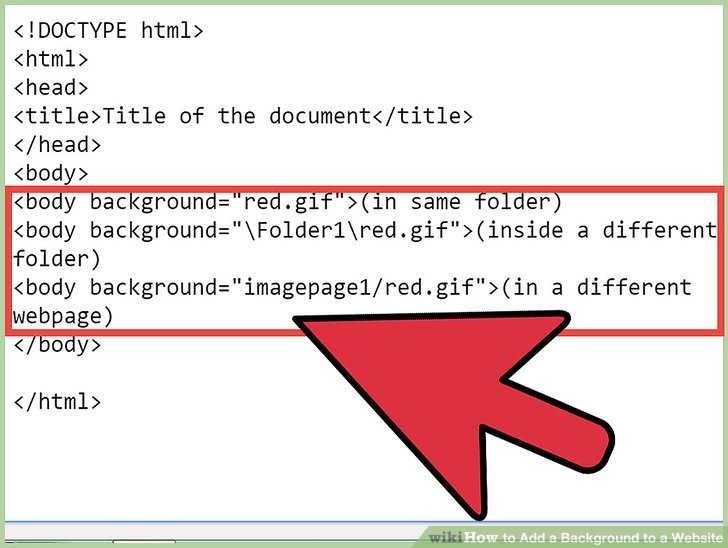
Установка однотонного заднего фона с помощью html
Если существующий дизайн страниц сайта вам надоел и хочется сделать его обновление, стоит разобраться, как сделать новый фон для сайта HTML. Полностью менять дизайн без посторонней помощи – рискованная задача. Для этого нужны специальные знания и навыки.
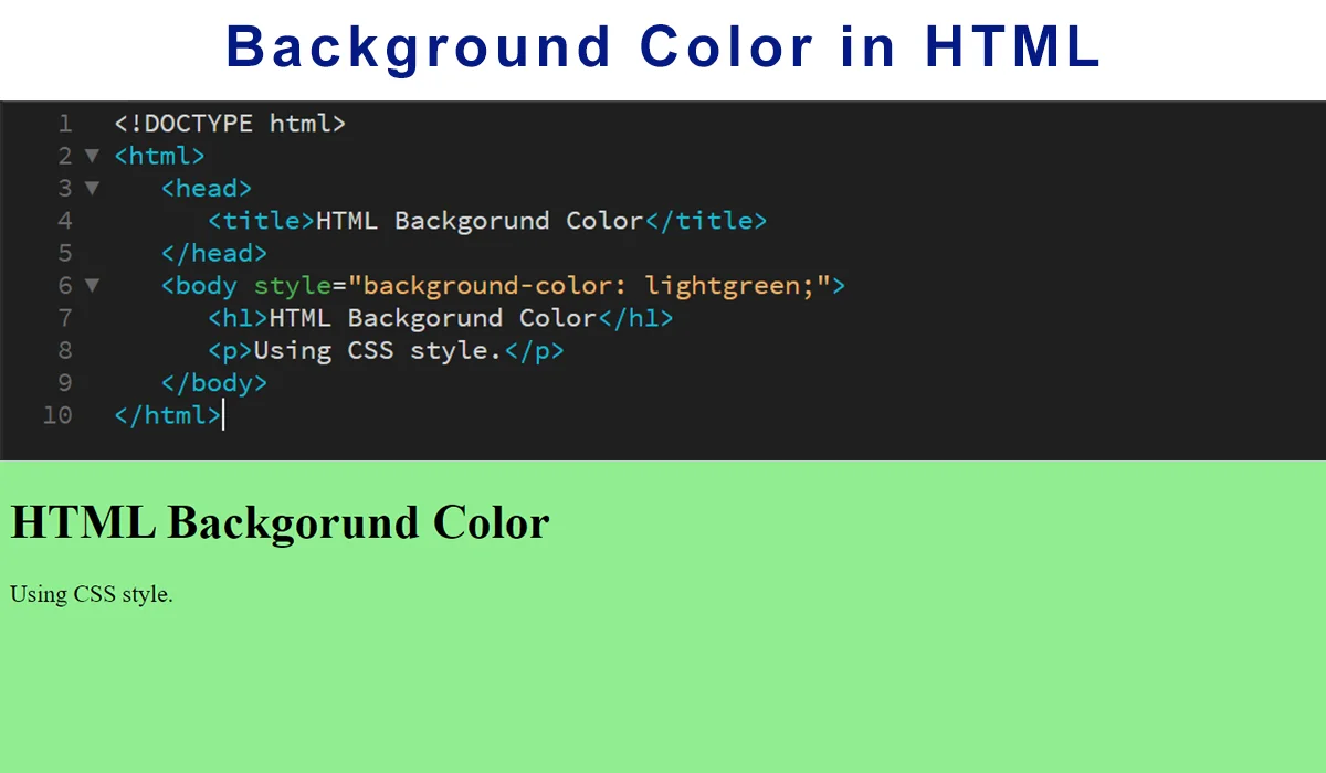
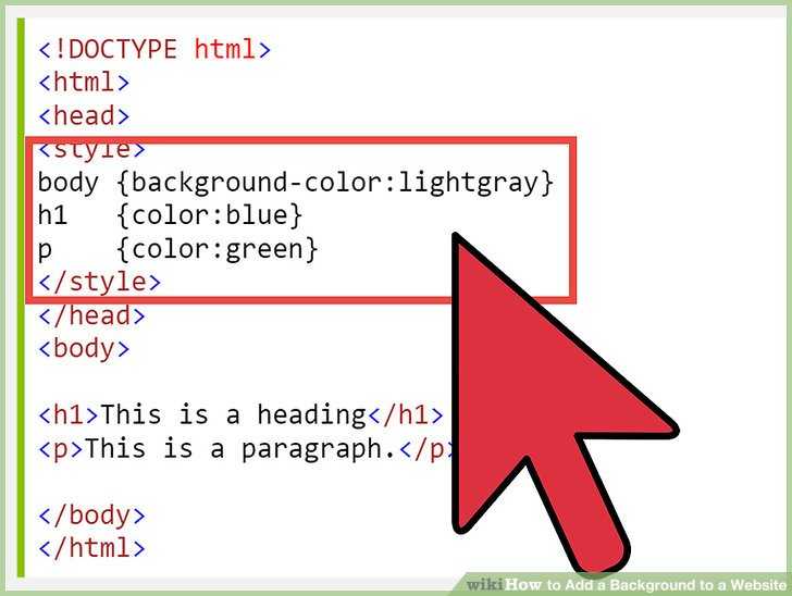
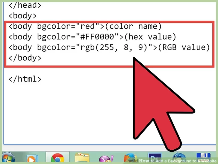
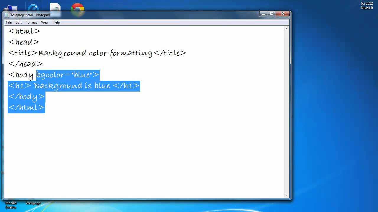
Прежде всего, раскроем особенности изменения фона страниц в HTML. Чтобы установить цветовой оттенок, применяют свойство background-color в стилевом атрибуте style. Таким образом, задать фоновый цвет сайта можно прописав его характеристики в тег <body>. К примеру:
<body style=»background-color: #55D52B»>
<p>Фон сайта #55D52B</p>
</body>
Помимо 16-теричного кода оттенка можно задать цвет фона в виде ключевого слова или RGB. Пример:
<body style=»background-color: rgb(51,255,153)»>
<p>Фон сайта rgb(23,113,44)</p>
</body>
Отметим, что в сравнении с двумя другими вариантами, при установке цвета фона в формате ключевого слова есть несколько ограничений. В html для того, чтобы задать цвет могут применяться только шестнадцать ключей. К примеру, white, red, blue, black, yellow и др. В связи с имеющимися ограничениями мы рекомендуем для установки HTML фона сайта применять16-теричного кода или RGB.

Вы сумеете не только установить цвет фона, но и сделать еще ряд настроек.
Using Multiple Background Images
For the longest time, elements were allowed to have only one background image at a time, which created quite a few constraints when designing a page. Fortunately, with CSS3, we can now use more than one background image on an element by comma-separating multiple background values within a or property.
The background image value that comes first will be the foremost background image, and the background image that’s listed last will be the rearmost background image. Any value between the first and the last will reside within the middle ground accordingly. Here’s an example of the CSS for a element that uses three background images:
The preceding code uses a shorthand value for the background property, chaining multiple background image values together. These shorthand values may also be broken up into comma-separated values across the , , and properties.
Multiple Background Images Example
Let’s go back to the success alert message once more to combine both the tick background image and the linear gradient background image.
In order to do so, we’ll include two values within the second background property. The first value, the foremost image, will be the tick image. The second value, the rearmost image, will be the linear gradient. The two values are comma separated.
HTML
CSS
Множественные фоны в CSS3.
Всем привет! В этой небольшой статье мы с вами разберём, как задать несколько фоновых изображений на CSS3.
HTML у нас снова такой же
И простые стили, чтобы увидеть наш блок, в который затем вставим изображения
В background-image мы указываем путь к картинке, в background-repeat — повторять или не повторять картинку, а в background-position мы указываем позицию картинки в блоке: первое значение по горизонтали, второе по вертикали. Значения так же можно задавать в px.
При использовании изображения, вы также можете использовать цвет. Тогда место, где нет картинки, будет заполнено выбранным вами цветом.
Ещё одно полезное свойство background-attachment, которое позволяет зафиксировать фон в одной позиции независимо от того, как двигается блок.
background-size позволяет изменять размер картинки.
Первое значение по горизонтали, второе по вертикали.
Также данное свойство может иметь текстовые значения: contain и cover. Установив первое значение, картинка отмасштабируется таким образом, чтобы она содержалась полностью в нашем блоке, а при втором значении картинка заполнит весь контейнер, и, если места не хватит, то будет обрезана.
Итак, мы разобрали все основы фоновых изображений и теперь поговорим про множественные фоны.
В CSS3 появилась возможность задавать несколько фонов одному блоку.
Creating a Basic Website With HTML
Since CSS is just a style language, to use it, we first need something to style. A very basic website will be enough for us to begin playing with CSS. Our page will display «Hello World.»
In case you are not familiar with HTML, let’s quickly go over what all of the elements do. As mentioned, HTML is a markup language, which means that it uses tags to mark what the text is. Whenever you see a word surrounded by <> it is a tag. There are two types of tags, a tag that marks the beginning of a section using <> and one that marks the end of a section using </>. The text within a section is also intended to make this distinction easier to see.
In our example, we have four tags. The html tag indicates which elements are part of the website. The head tag contains the header information that is not displayed on the page but is needed to create the page. All of the displayed elements are between the body tags. We only have one displayed element, the p tag. It tells the web browser that the text is a paragraph.
Specifying how the background image tiles
You can see that the background image repeats itself many times, in order to fill the whole page. You can control this tiling effect using the property, as follows:
- Tiles the image both horizontally and vertically. This is the default setting.
- Tiles the image in the horizontal direction only. Good if you want the background running across the top of the page.
- Tiles the image in the vertical direction only. Great for left-hand page borders!
- No repeating takes place; only one copy of the image is displayed. This is good if you want to use a big image that isn’t designed to tile.
Examples:
Tiles the image across the page. See a demo.
Tiles the image down the page. See a demo.
Just displays the image once. See a demo.
Property Values
| Value | Description | Demo |
|---|---|---|
| url(‘URL‘) | The URL to the image. To specify more than one image, separate the URLs with a comma | Demo ❯ |
| none | No background image will be displayed. This is default | |
| conic-gradient() | Sets a conic gradient as the background image. Define at least two colors |
Demo ❯ |
| linear-gradient() | Sets a linear gradient as the background image. Define at least two colors (top to bottom) |
Demo ❯ |
| radial-gradient() | Sets a radial gradient as the background image. Define at least two colors (center to edges) |
Demo ❯ |
| repeating-conic-gradient() | Repeats a conic gradient | Demo ❯ |
| repeating-linear-gradient() | Repeats a linear gradient | Demo ❯ |
| repeating-radial-gradient() | Repeats a radial gradient | Demo ❯ |
| initial | Sets this property to its default value. Read about initial | |
| inherit | Inherits this property from its parent element. Read about inherit |
Conclusion

Majority of website designs and redesigns are taking place with the inclusion of background images. They are so common you don’t even need to work hard to find a website that has one. An important website trend is to build mobile optimized websites that include responsive images as well. This post was dedicated to combining the art of responsive design with background images on a web page.
Throughout this post, we introduced a few properties in CSS and how they are important in building a responsive background image using CSS. In addition, we also evaluated browser compatibility for every property that can be used to create a responsive background image using CSS. You can also easily test your websites and validate different css properties for your targeted browsers by performing cross browser testing on cloud, faster and easier!
As a web developer, I sincerely believe that this is the easiest and quickest approach in building up a responsive background image using CSS. I hope this post will help you in your next venture in website design and will guide you in adding responsive background images on the web page.

How to center a background image in css?
To center a background image in CSS, use “background-position: center center;” within your element’s CSS rules. This aligns the background image both horizontally and vertically at the center of the container.
How do I center my image in CSS?
To center an image in CSS, apply “display: block; margin: 0 auto;” to the image. This horizontally centers it within its container. For vertical and horizontal centering, use “display: flex; align-items: center; justify-content: center;” on the container.
How to Vertically & Horizontally Center an Image in HTML & CSS
To center an image both vertically and horizontally in HTML & CSS, target the div in your CSS. Inside its curly brackets, apply “display: flex;” and set “align-items: center; justify-content: center;” to center the image vertically and horizontally within the div.
How do I center an image in text CSS?
To center an image within text using CSS, employ the “display: block; margin: 0 auto;” combination on the image. This centers the image horizontally while maintaining its inline flow within text content.
How to Center an Image Using Text Align: Center
To center an image using “text-align: center,” apply the “text-align: center;” property to the parent element. Wrap the
<img>
| 1 | <img> |
in a block-level element like a
<div>
| 1 | <div> |
for effective centering.
How do I center an image in CSS responsive?
To center an image in CSS responsive , apply “text-align: center;” to the container. Ensure the image max-width is 100% and max-height is slightly less than the column, like “max-height: 100px;” for better results.
Управление позицией фонового изображения
По умолчанию, фоновое изображение позиционируется в верхнем левом углу элемента, используя CSS свойство background-position мы можем изменить это положение с использованием единиц измерения CSS, либо используя ключевые слова:
| Значение | Описание |
|---|---|
| left topleft centerleft bottomright topright centerright bottomcenter topcenter centercenter bottom | Задает положение изображения. Первое значение-горизонтальное положение, а второе значение вертикальное. Если вы указываете только одно ключевое слово, другое значение будет «center» |
| x% y% | Задает положение изображения. Первое значение — горизонтальное положение, а второе значение вертикальное. Левый верхний угол имеет 0% 0% (это значение по умолчанию). В правом нижнем углу 100% 100%. Если указано только одно значение, то другое значение будет 50%. |
| x y | Задает положение изображения. Первое значение — горизонтальное положение, а второе значение вертикальное. Левый верхний угол имеет 0 0. Значения могут быть в пикселях, или других единицах измерения CSS. Если указано только одно значение, то другое значение будет 50%. Вы можете совместно использовать проценты и единицы измерения. |
Рассмотрим пример использования этого свойства:
<!DOCTYPE html>
<html>
<head>
	<title>Пример позиционирования фонового изображения</title>
<style>
div {
display: inline-block; /* устанавливаем, что элементы становятся блочно-строчными (чтобы выстроились в линейку) */
background-image: url("smile_bg.png"); /* указываем путь к файлу изображения, которое будет использоваться как задний фон */
background-repeat: no-repeat; /**/
width: 100px; /* устанавливаем ширину элемента */
height: 100px; /* устанавливаем высоту элемента */
border: 1px solid; /* устанваливаем сплошную границу размером 1 пиксель */
margin: 10px; /* устанавливаем внешние отступы со всех сторон */
text-align: center; /* выравниваем текст по центру */
line-height: 60px; /* указываем высоту строки */
background-color: azure; /* задаем цвет заднего фона */
}
.leftTop {background-position: left top;} /* задаем позицию ключевыми словами */
.leftCenter {background-position: left center;} /* задаем позицию ключевыми словами */
.leftBottom {background-position: left bottom;} /* задаем позицию ключевыми словами */
.rightTop {background-position: right top;} /* задаем позицию ключевыми словами */
.rightCenter {background-position: right center;} /* задаем позицию ключевыми словами */
.rightBottom {background-position: right bottom;} /* задаем позицию ключевыми словами */
.centerTop {background-position: center top;} /* задаем позицию ключевыми словами */
.centerCenter {background-position: center center;} /* задаем позицию ключевыми словами */
.centerBottom {background-position: center bottom;} /* задаем позицию ключевыми словами */
.userPosition {background-position: 20px 75%;} /* задаем позицию по горизонтали в пикселях, а по вертикали в процентах */
</style>
</head>
	<body>
		<div class = "leftTop">left top</div>
		<div class = "leftCenter">left center</div>
		<div class = "leftBottom">left bottom</div>
		<div class = "rightTop">right top</div>
		<div class = "rightCenter">right center</div>
		<div class = "rightBottom">right bottom</div>
		<div class = "centerTop">center top</div>
		<div class = "centerCenter">center center</div>
		<div class = "centerBottom">center bottom</div>
		<div class = "userPosition">20px 75%</div>
	</body>
</html>
В данном примере, мы создали 10 блоков с различными классами, в которых заданы различные значения, связанные с позиционированием фоновых изображений. Для первых девяти блоков были использованы всевозможные ключевые слова, а для последнего блока было задано значение для горизонтального позиционирования в пикселях, а для вертикального в процентах.
Результат нашего примера:
Рис. 117 Пример позиционирования фонового изображения.
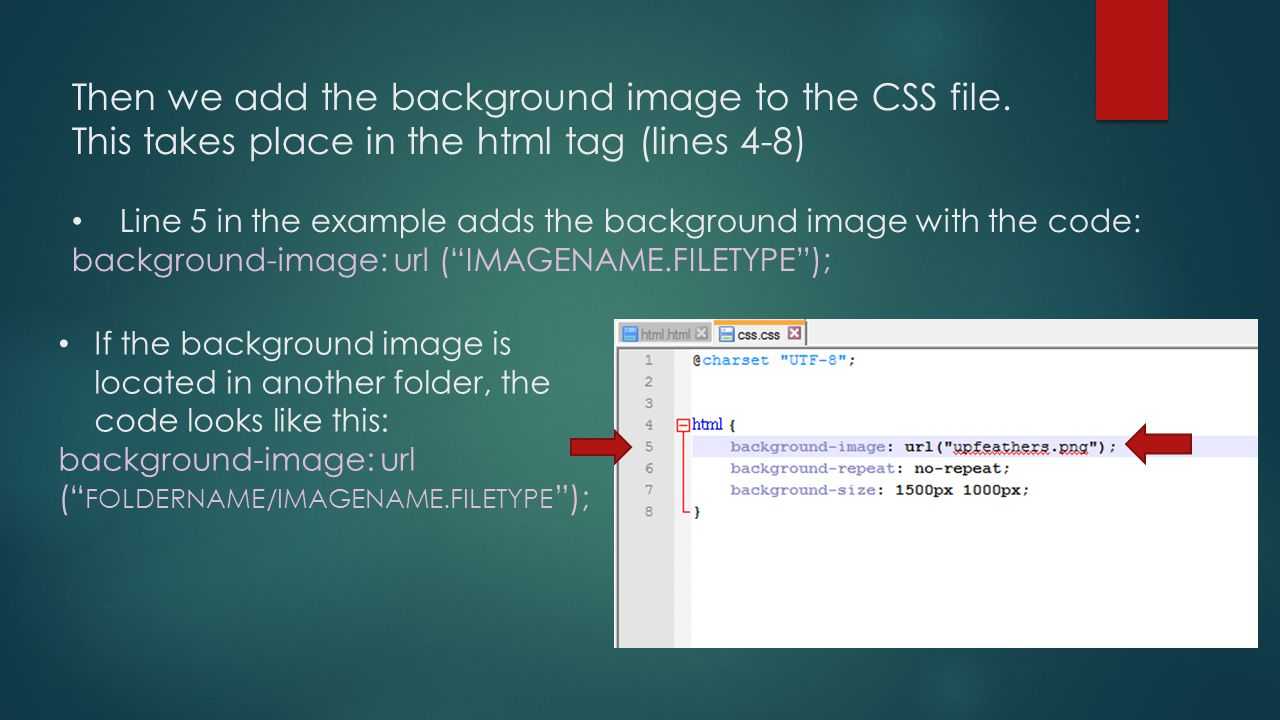
CSS3 Размер фоновых изображений
CSS3 свойство позволяет указать размер фоновых изображений.
Размер может быть указан в длинах, процентах или с помощью одного из двух ключевых слов:
или .
В следующем примере размер фонового изображения намного меньше размера исходного изображения (в пикселях):
Lorem Ipsum Dolor
Lorem ipsum dolor sit amet, consectetuer adipiscing elit, sed diam nonummy nibh euismod tincidunt ut laoreet dolore magna aliquam erat volutpat.
Ut wisi enim ad minim veniam, quis nostrud exerci tation ullamcorper suscipit lobortis nisl ut aliquip ex ea commodo consequat.
Вот код:
Пример
#div1 {
background: url(img_flower.jpg);
background-size: 100px 80px;
background-repeat: no-repeat;}
Два других возможных значения для являться
и .
Ключевое слово масштабирует фоновое изображение настолько, насколько это возможно
(где ширина и высота должны поместиться внутри области содержимого). Таким образом, в зависимости от пропорций фонового
изображения и расположения зоны фона, некоторые области фона, не покрываються фоновым изображением.


Ключевое слово масштабирует фоновое изображение так, чтобы область контента
полностью покрывалась фоновым изображением (его ширина и высота равны или больше область содержимого).
Таким образом, некоторые части фонового изображения могут быть не видимы в зоне расположенной области.
Следующий пример иллюстрирует использование значений и :
Пример
#div1 {
background: url(img_flower.jpg);
background-size: contain;
background-repeat: no-repeat;}#div2 {
background: url(img_flower.jpg);
background-size: cover;
background-repeat: no-repeat;}
Определение размеров нескольких фоновых изображений
Свойство также принимает несколько значений для размера фона
(через запятую), при работе с несколькими фонами.
В следующем примере заданы три фоновых изображения с различными фоновыми размерами каждого изображения:
Пример
#example1 { background: url(img_tree.gif) left top
no-repeat, url(img_flwr.gif) right bottom no-repeat, url(paper.gif) left top
repeat; background-size: 50px, 130px, auto;}
Полный размер фоновое изображение
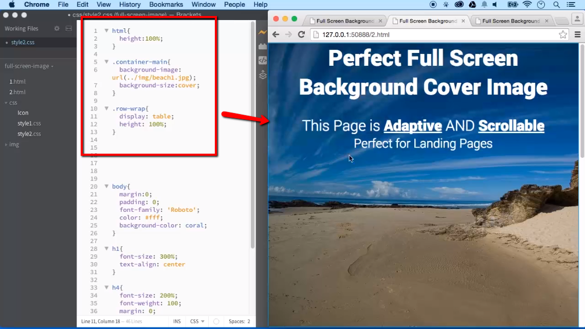
Теперь мы хотим иметь фоновое изображение на веб сайте, которое
появится в окне браузера на все время.
Требования следующие:
- Заполнить всю страницу изображением (без пробелов)
- Масштабировать изображение по мере необходимости
- Центрировать изображение на странице
- Не вызывать полосы прокрутки
В следующем примере показано, как это сделать; используйте элемент html
(html — элемент всегда находится по крайней мере на верху окна браузера). Затем установите фиксированный и центрированный фон на нем.
Затем измените его размер с помощью свойства :
Пример
html { background: url(img_flower.jpg) no-repeat
center fixed; background-size: cover;}
CSS3 свойство background-origin
CSS3 свойство указывает, где находится установленное фоновое изображение.
Свойство принимает три различных значения:
- — фоновое изображение начинается с верхнего левого угла границы
- — (по умолчанию) фоновое изображение начинается с верхнего левого угла края отступа
- — фоновое изображение начинается с верхнего левого угла содержимого
Следующий пример иллюстрирует свойство :
Пример
#example1 {
border: 10px solid black;
padding: 35px;
background: url(img_flwr.gif);
background-repeat: no-repeat;
background-origin: content-box;}
CSS3 Свойство background-clip
CSS3 свойство задает область рисования фона.
Свойство принимает три различных значения:
- — (по умолчанию) фон окрашивается к внешнему краю границы
- — фон окрашен по краям отступа
- — фон окрашивается в боксе содержимого
Следующий пример иллюстрирует свойство :
Пример
#example1 {
border: 10px dotted black;
padding: 35px;
background: yellow;
background-clip: content-box;}
Свойства CSS3 дополнение фона
| Свойство | Описание |
|---|---|
| background | Сокращенное свойство для установки всех свойств фона в одном объявлении |
| background-clip | Определяет область рисования фона |
| background-image | Определяет одно или несколько фоновых изображений для элемента |
| background-origin | Определяет где фоновое изображение(я) является/являются позиционируемыми |
| background-size | Определяет размер фонового изображения(й) |
❮ Назад
Далее ❯
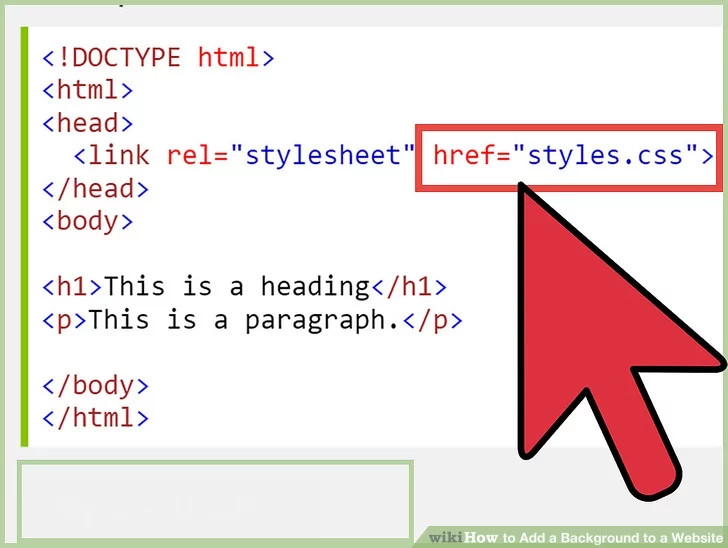
Adding CSS to HTML
Now that we have a simple page, we can customize the style with CSS. Our page is pretty simple right now, and there is not much we can do, but let’s begin by making our paragraph stand out so we can distinguish it from the background by adding a border.
Now, our paragraph will be surrounded by a black border. Adding a style description in CSS to our paragraph tag told the website how to style the paragraph. We can add more descriptions. Let’s increase the white-space, or padding, around our paragraph and center our text.
Our website looks better, but our HTML is starting to look messy with all of those descriptions in the paragraph tag. We can move this information to our header. Our header is for information that we need to display the website correctly.
Now our HTML is easier to read. You will notice that we did have to change some things around. The style tag tells the web browser style information, but also what to style too. In our example, we have used two different ways to tell it what to style. The p in the style tag is telling the web browser to apply that style to all paragraph tags. The #ourParagraph section tells it to only style elements with the id ourParagraph. Notice that id information was added to the p tag in our body.
Email Client Background Image Support
Adding background images can cause some headaches. All desktop versions of Outlook need vector markup language (VML) to display the image correctly, as they use the Microsoft Word rendering engine.
Windows 10 also has similar quirks, but needs even more information than earlier Outlook versions, mainly the width and height being in point (pt) format instead of pixels.
These accounts now support background images on both iOS and Android, thanks to a simple fix using the CSS background property, with the properties values set in shorthand.
The code below covers every instance where background images are now supported. We’re going to go through the below block piece by piece, but you can copy/paste this code into your HTML and simply change the content: